Gattaca is one of those films that stays with you long after the credits roll. Back in 1997, when big-budget sci-fi was starting to chase digital spectacle, Andrew Niccol went the other way. He crafted a cerebral neo-noir that feels more tangible and grounded than almost anything else from that era. As Ethan Hawke has noted, time has been kind to this movie. It’s a cult classic that feels uncomfortably relevant today, but for me, looking at Gattaca is like opening the hood of a perfectly tuned vintage Porsche. Every gear, every bolt, and every choice serves a very specific, high-performance purpose.
About the Cinematographer

The man behind this look is Sławomir Idziak. If you aren’t familiar with the “Polish school” of cinematography, Idziak is its poster child. He doesn’t do “naturalism.” He’s famous for using heavy filtration and aggressive control over his palette to create a specific mood. For Gattaca, he skipped the slick, high-tech tropes of 90s sci-fi and went for something melancholic and grounded. He managed to build a world that looks both pristine and decaying at the same time a “gilded cage” where the architecture is flawless but the soul is missing. His work here isn’t about showing off technology; it’s about using the frame to isolate the human condition.
Color Grading Approach

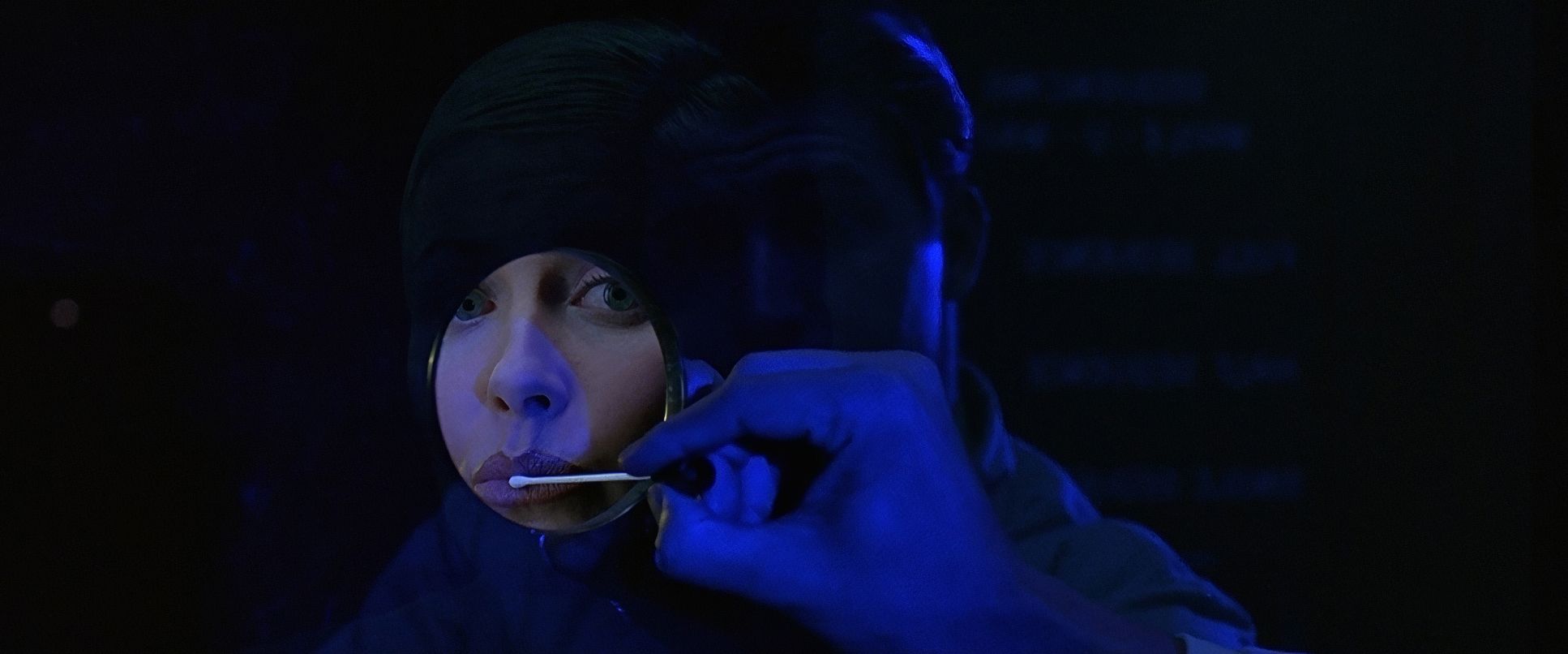
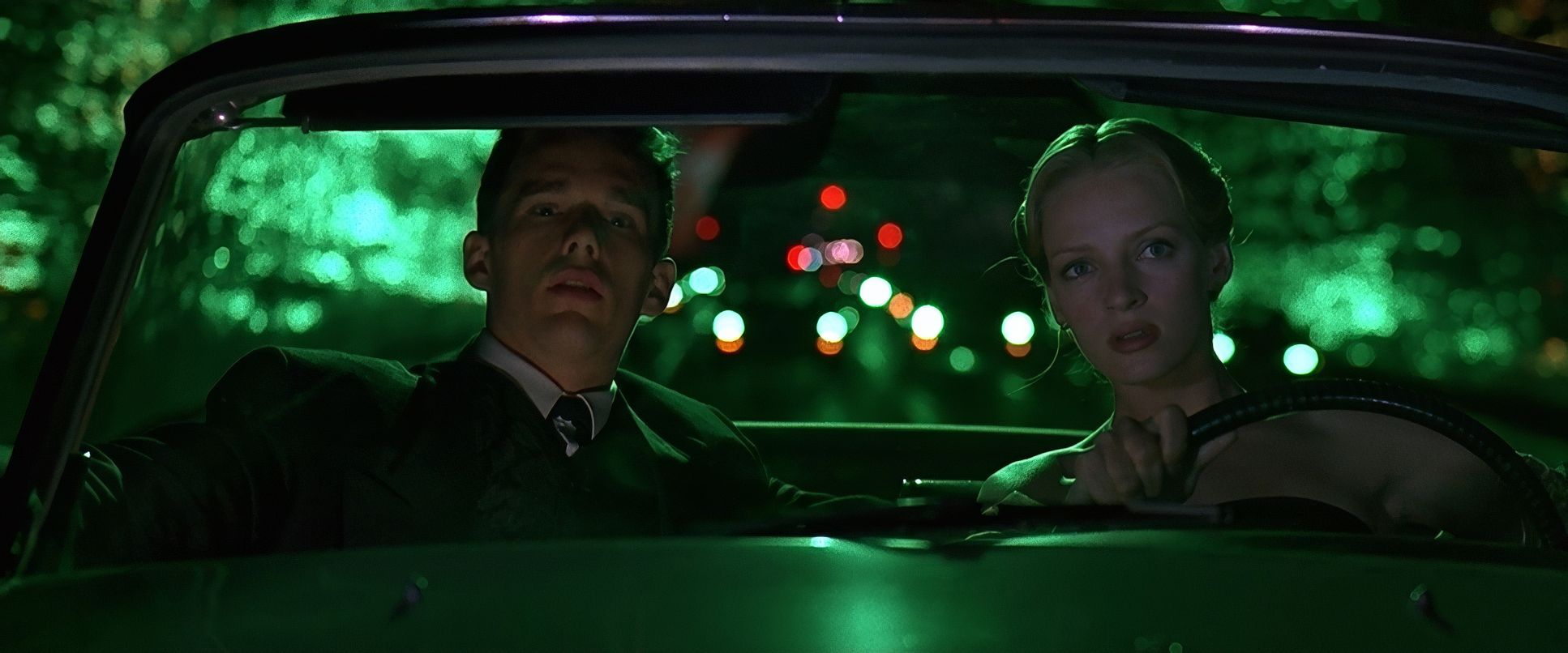
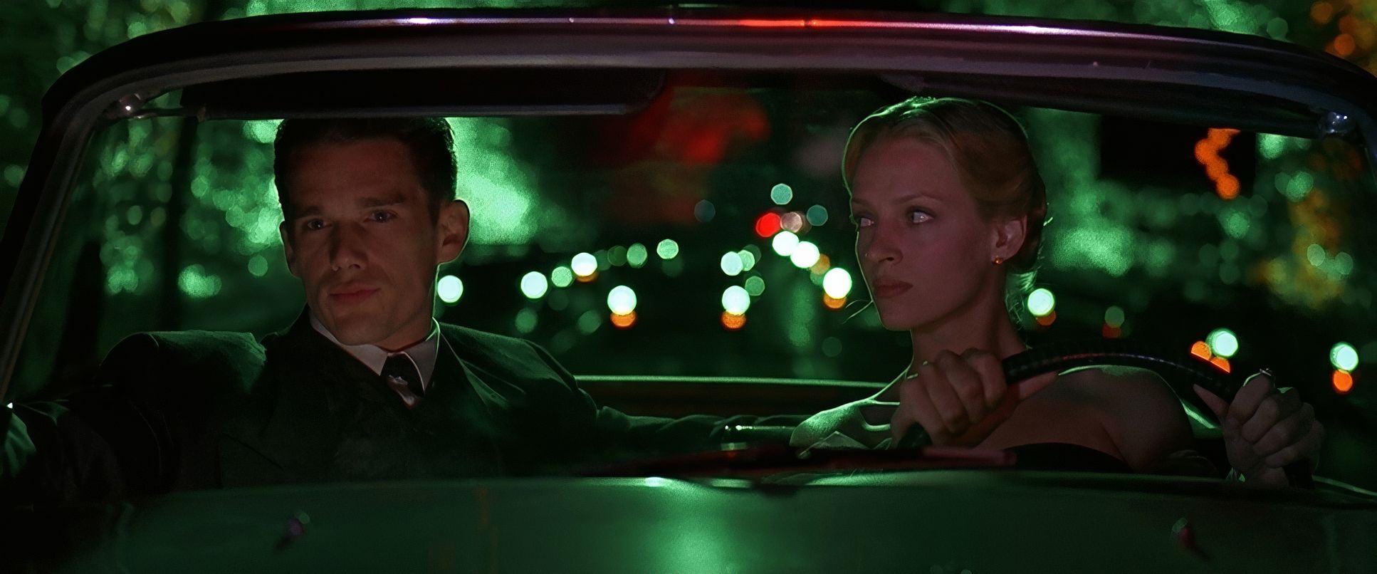
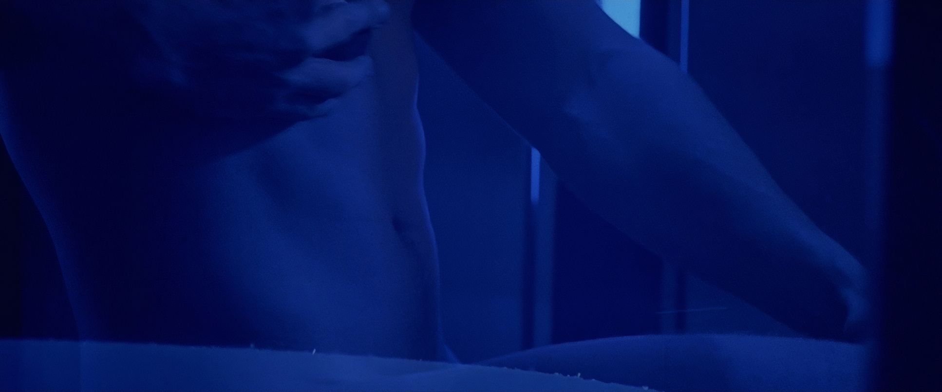
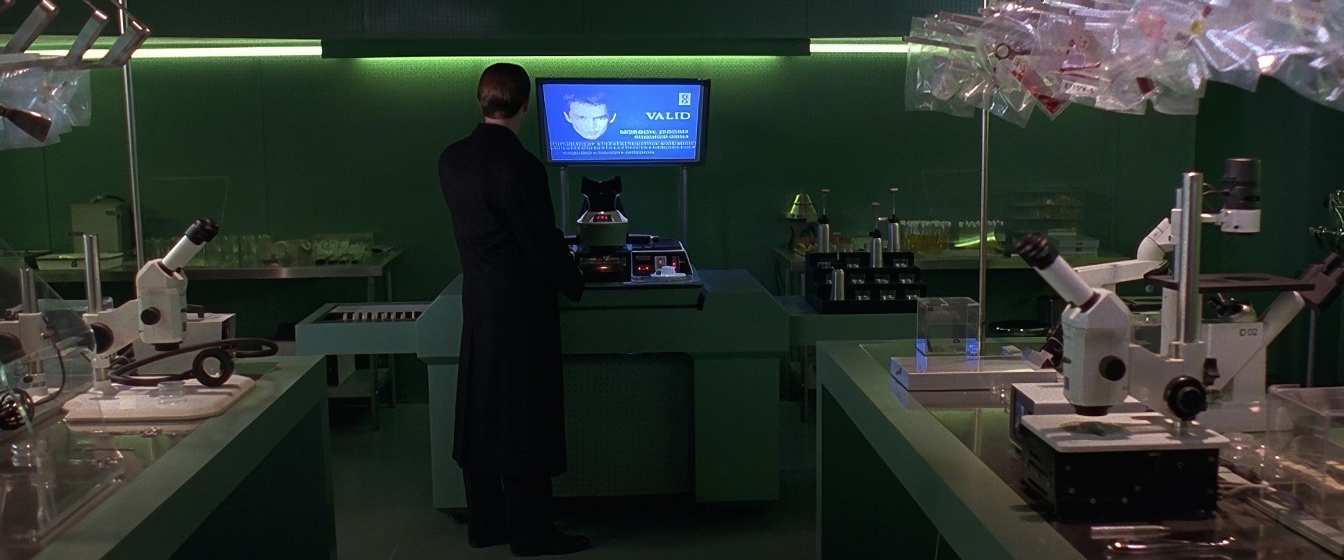
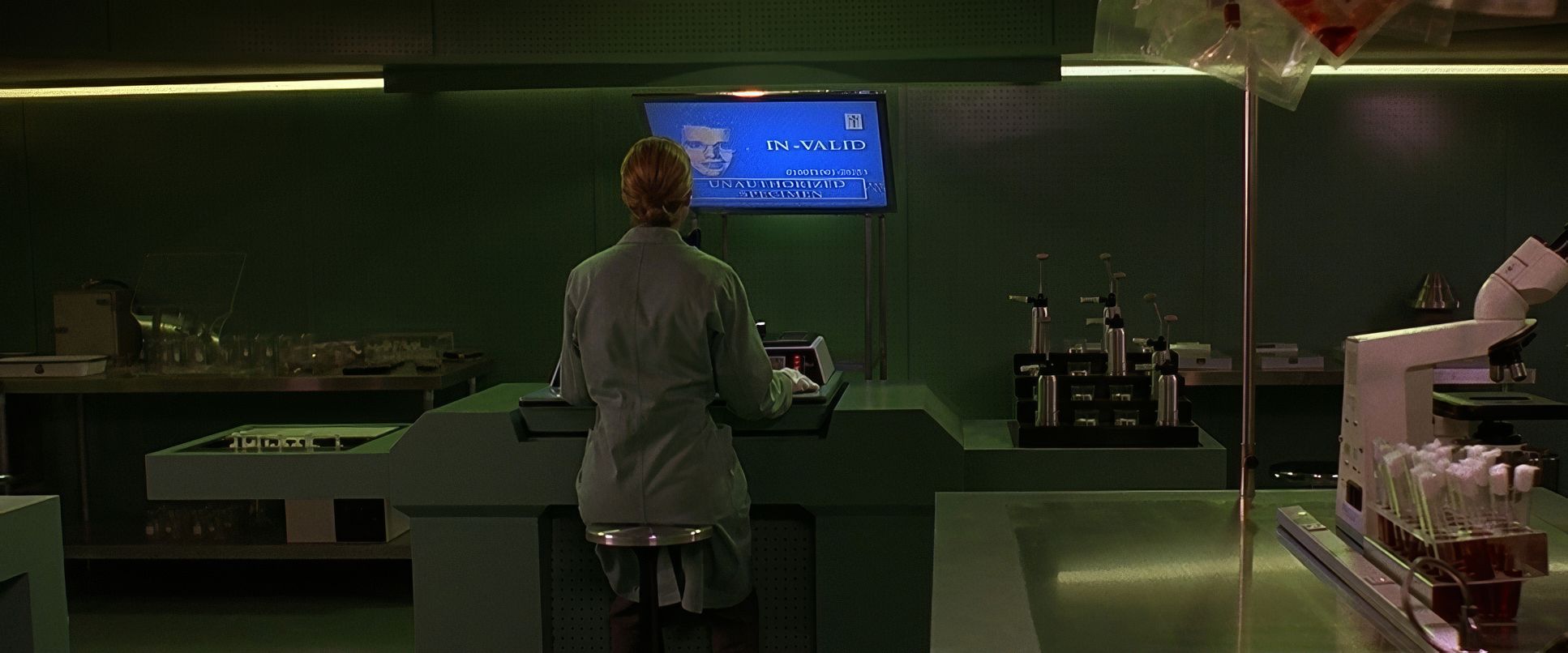
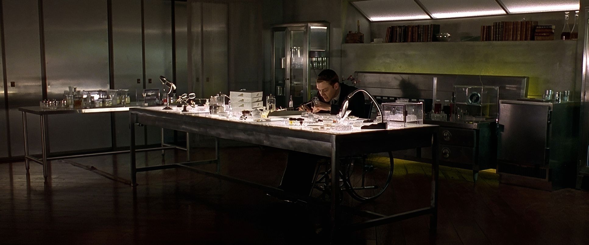
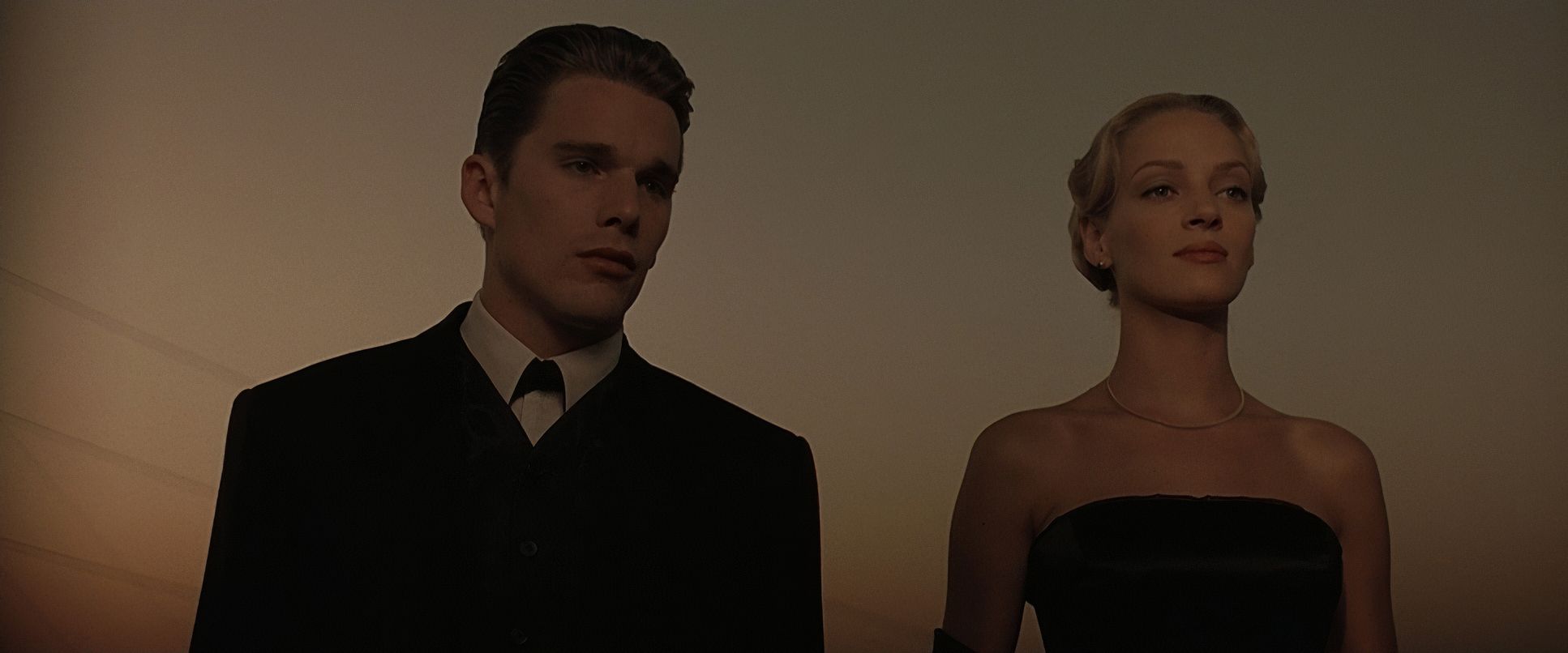
As a colorist, this is where the film really starts to sing for me. The grading in Gattaca feels surgical. We’re talking about a palette dominated by desaturated blues, steely grays, and clinical greens for the institutional scenes. When you look at the separation Idziak achieves, it’s brilliant. He keeps those cyan-heavy shadows from muddying the skin tones, which is a nightmare to balance even with modern tools.
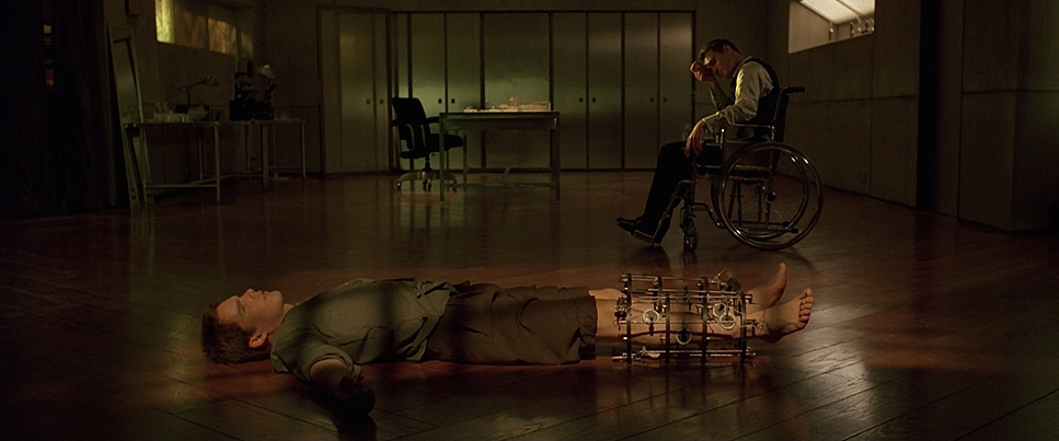
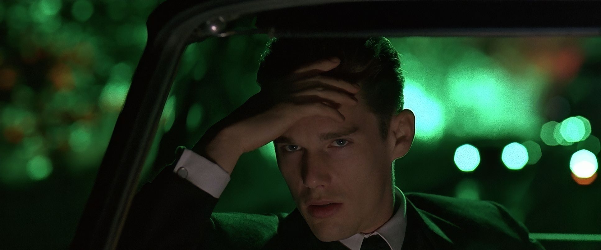
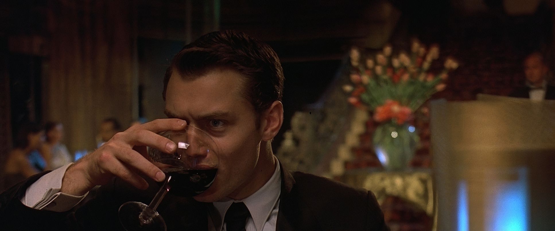
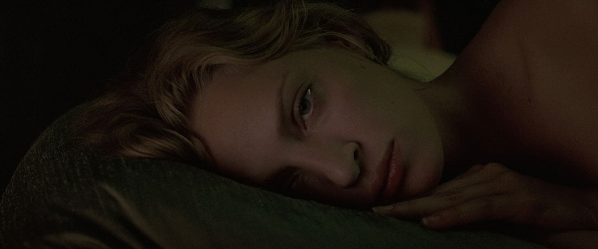
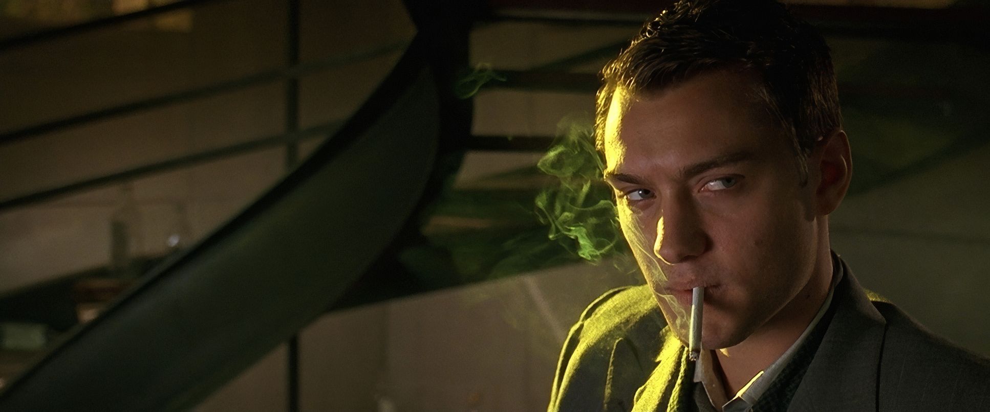
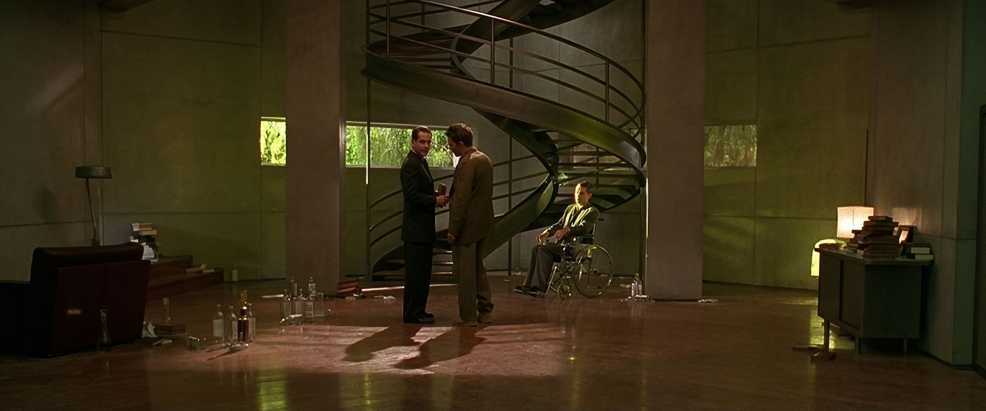
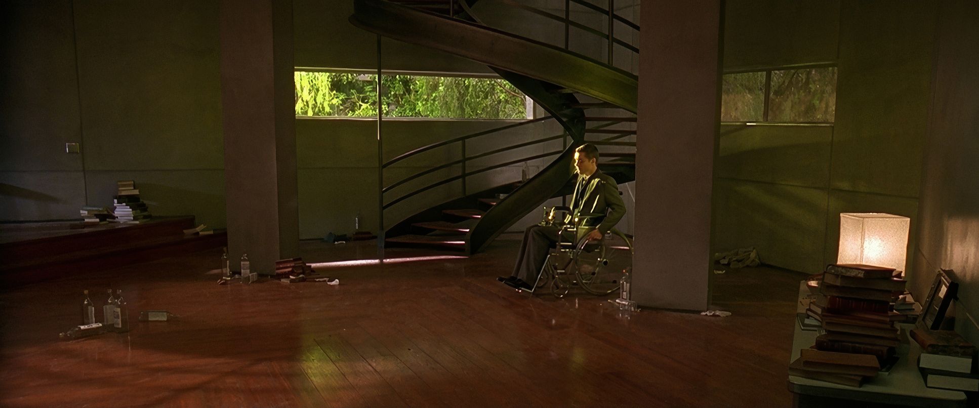
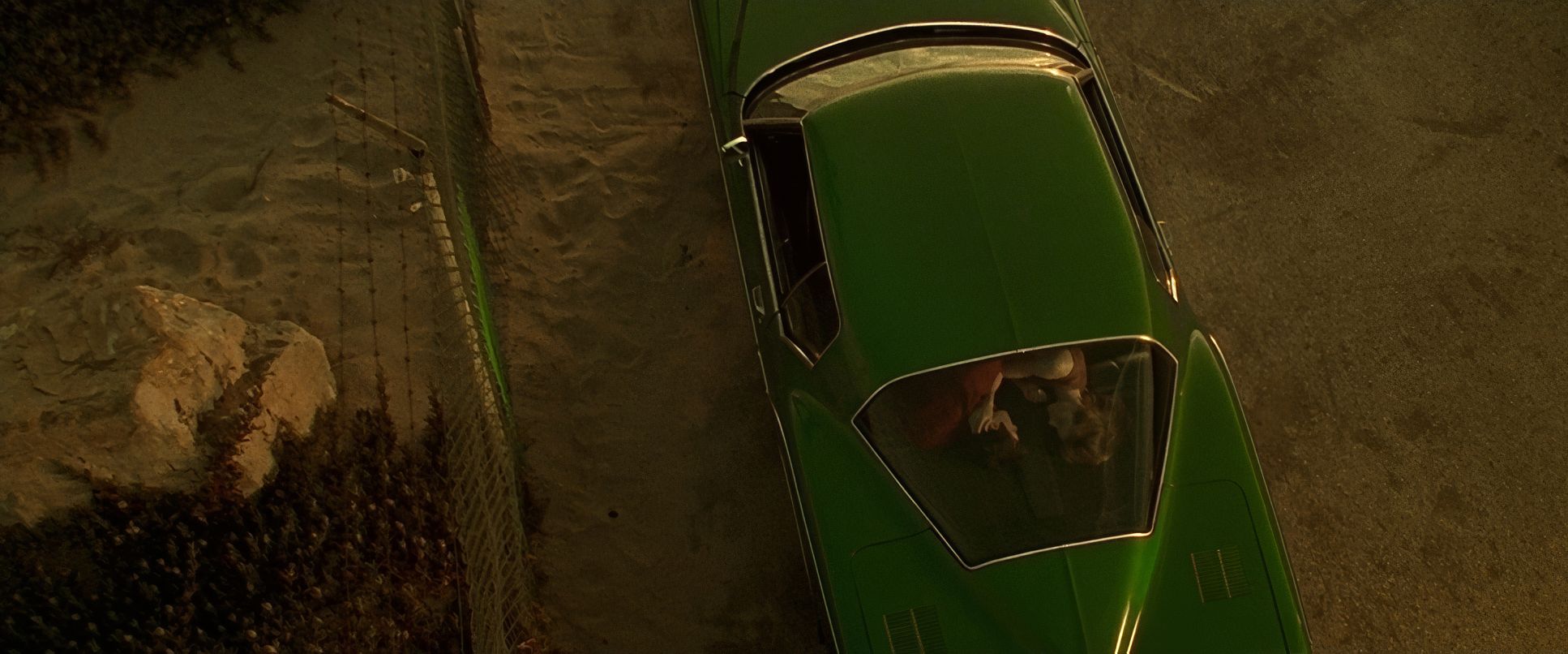
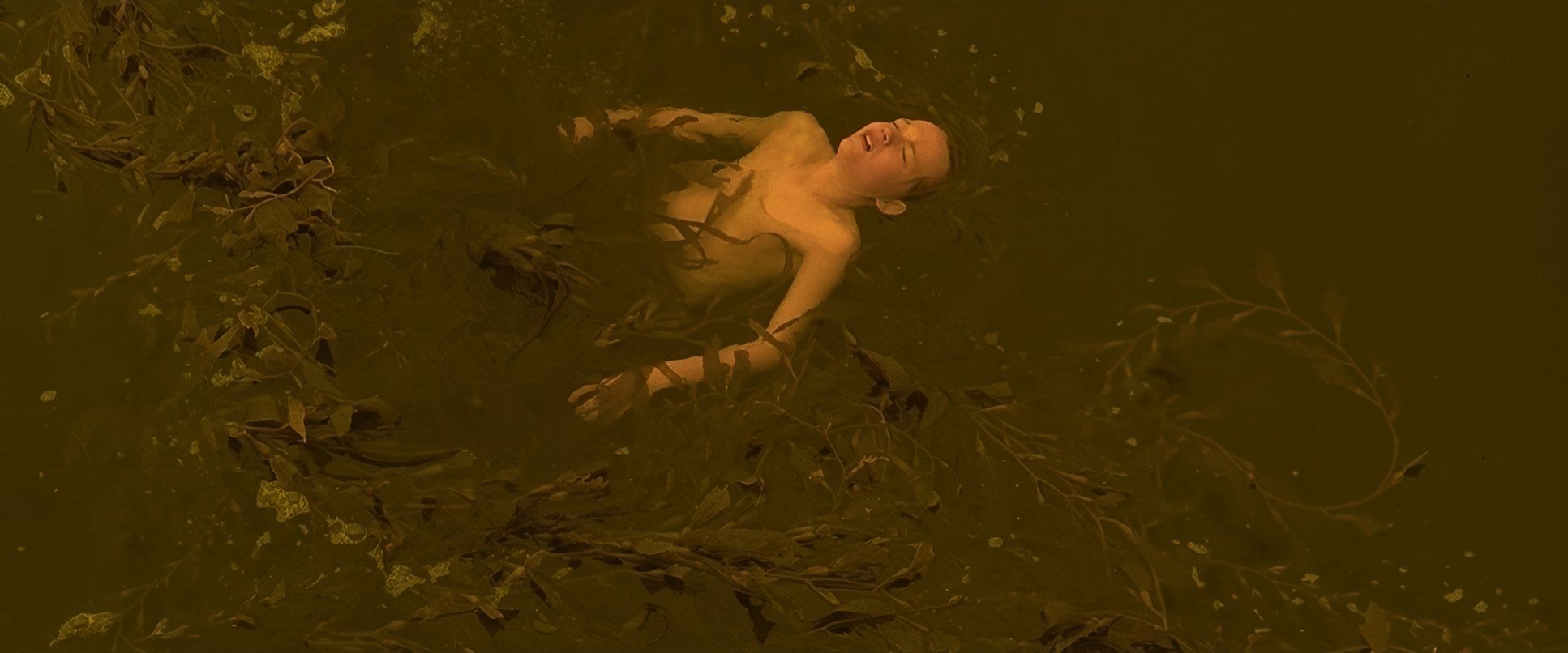
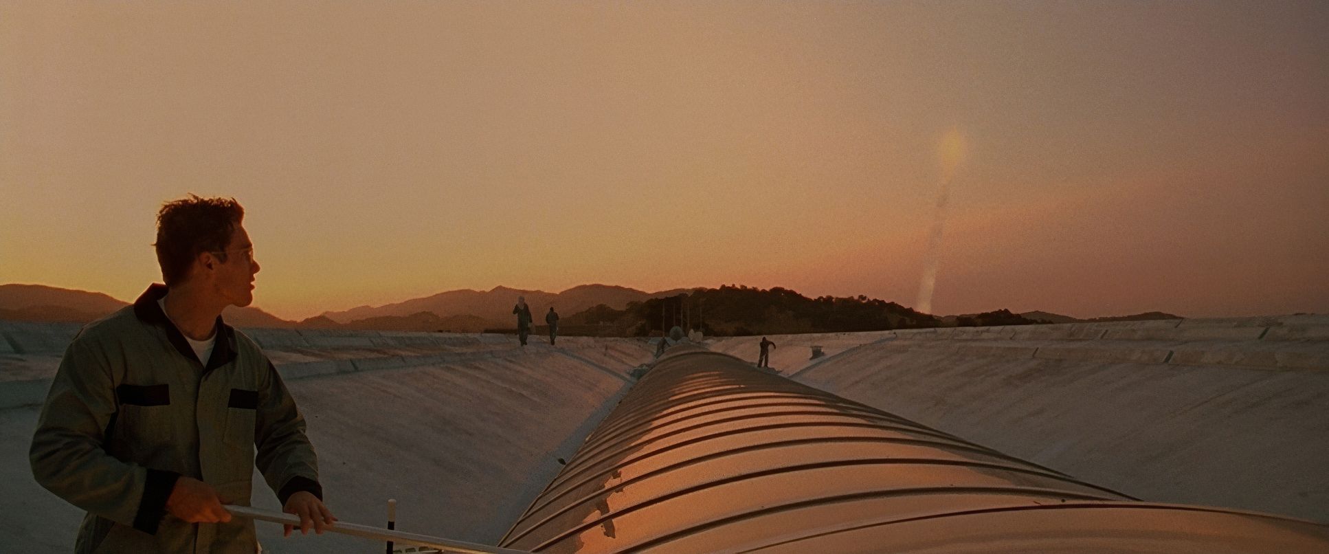
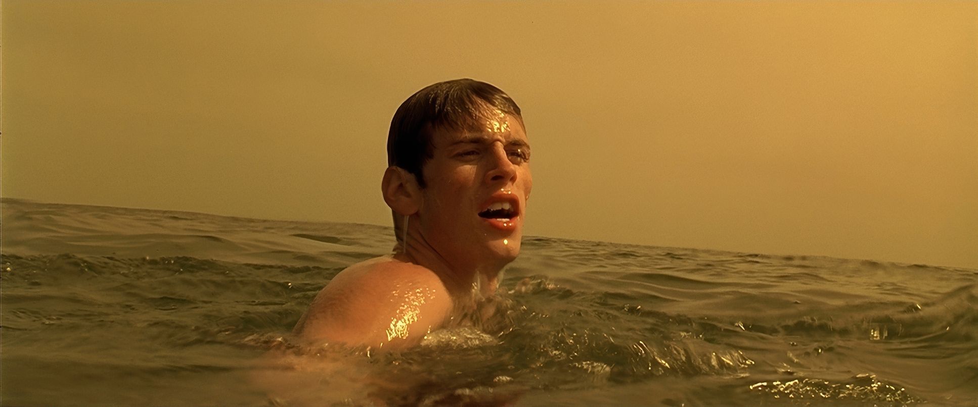
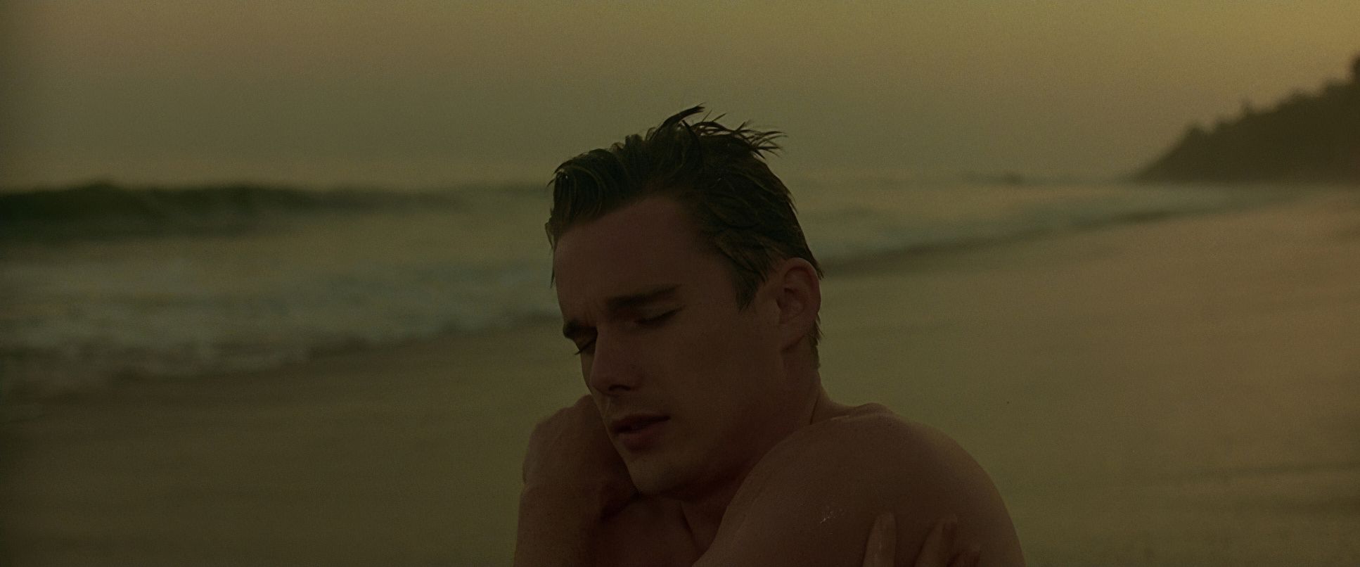
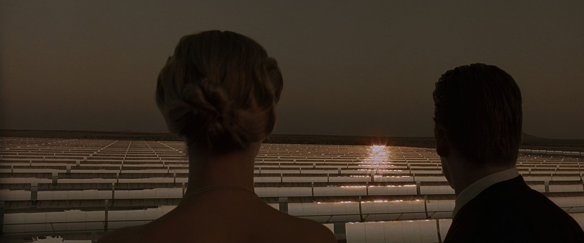
But the real magic is in the tonal sculpting. There’s a constant tension between the “Valid” world and the “In-Valid” world. While the labs at the Gattaca Aerospace Corporation feel like a walk-in freezer, the film introduces these pockets of amber and gold in Vincent and Jerome’s apartment or during the beach sequences. It’s a print-film sensibility that gives the image a rich, painterly texture. The highlight roll-off is classic 35mm; the way the light blooms off those white uniforms has an organic softness you just can’t replicate perfectly on a digital sensor. It’s a masterclass in using color to tell the audience exactly where the “heart” of the story is hiding.
Lighting Style
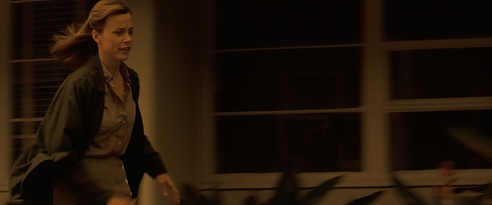
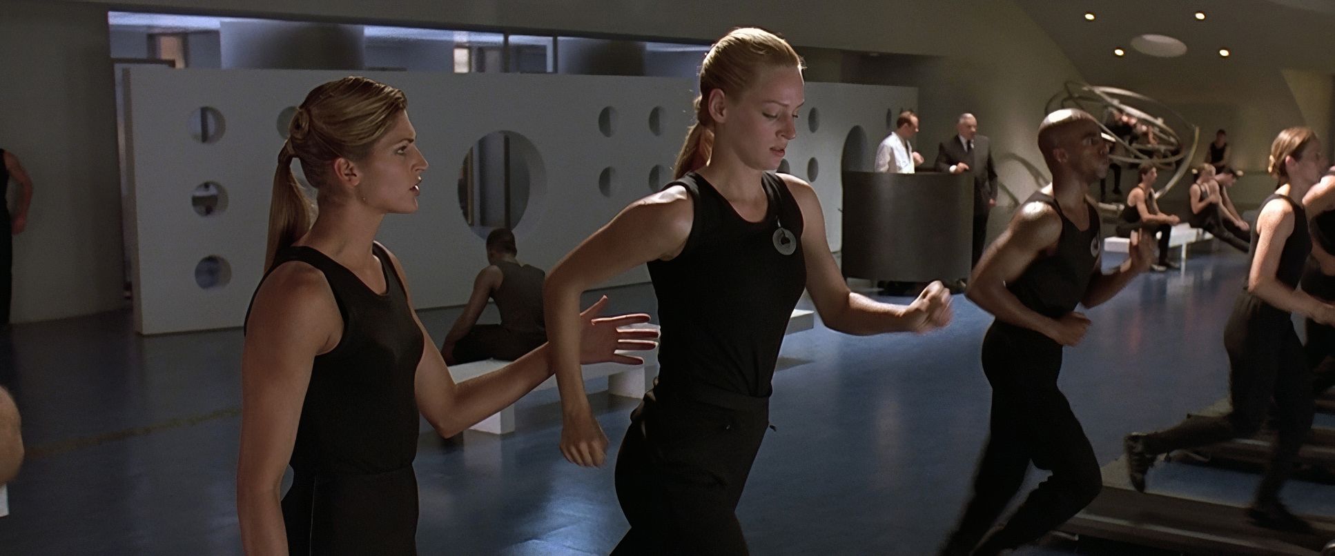
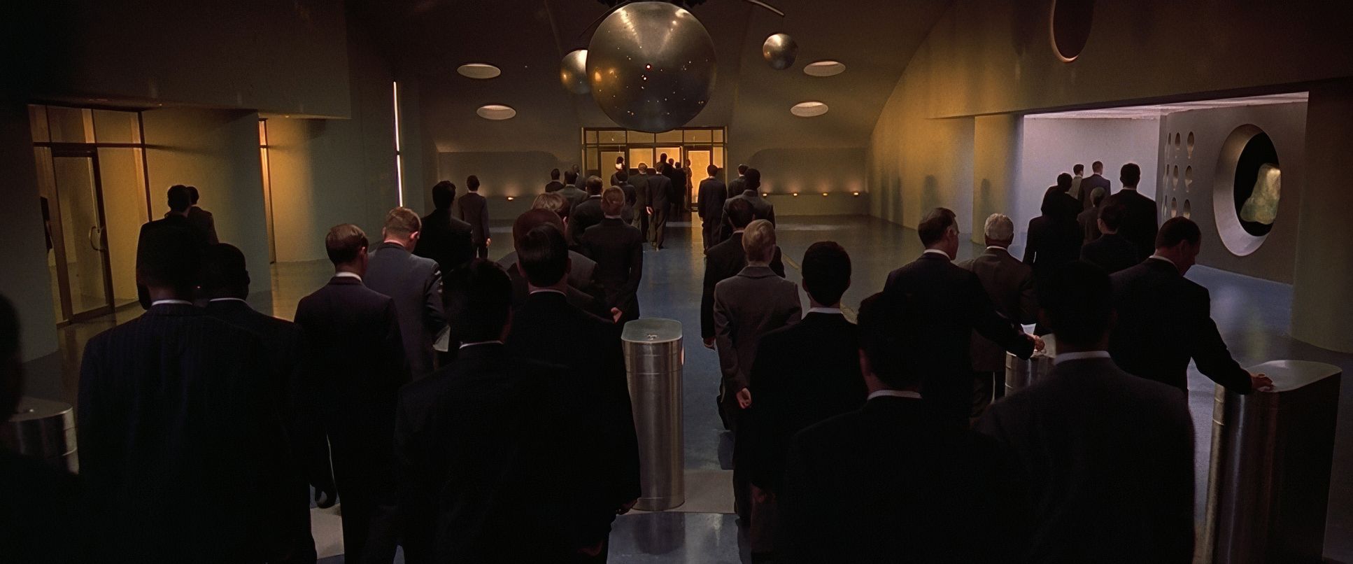
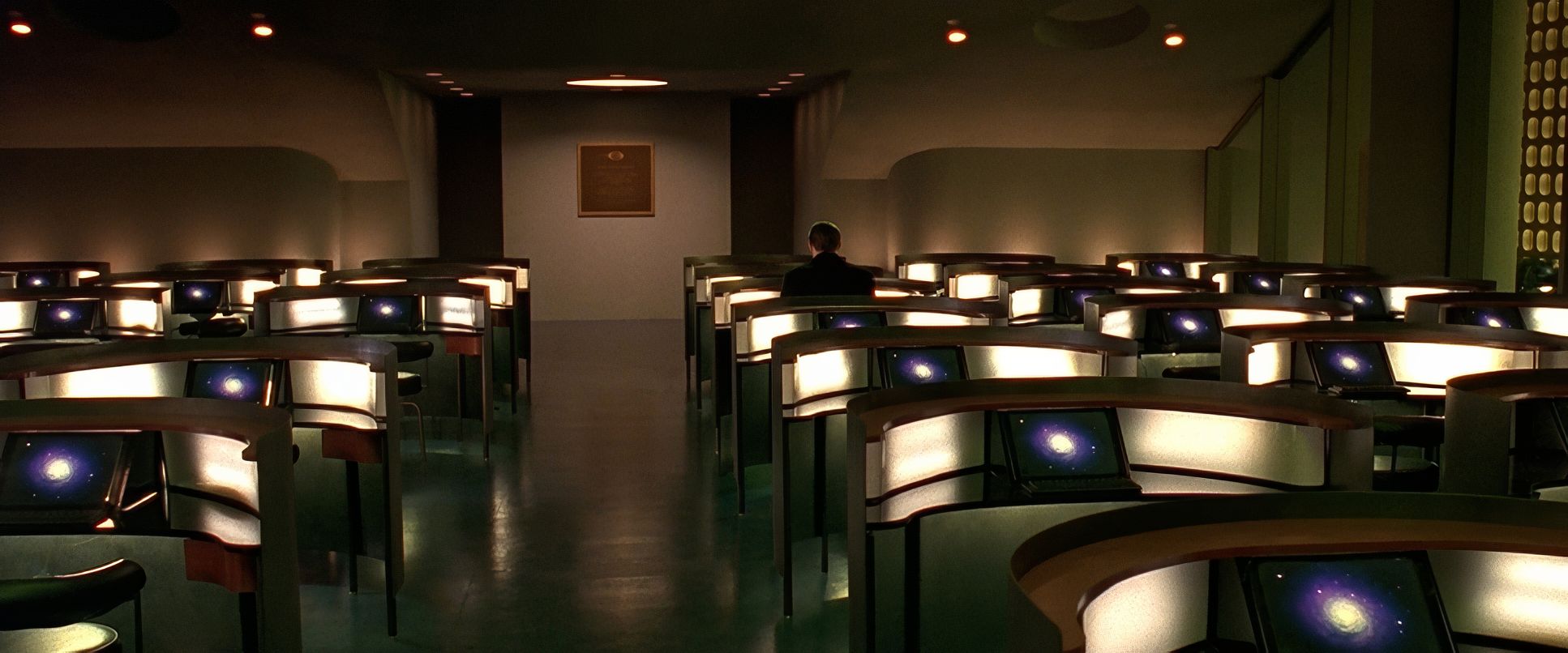
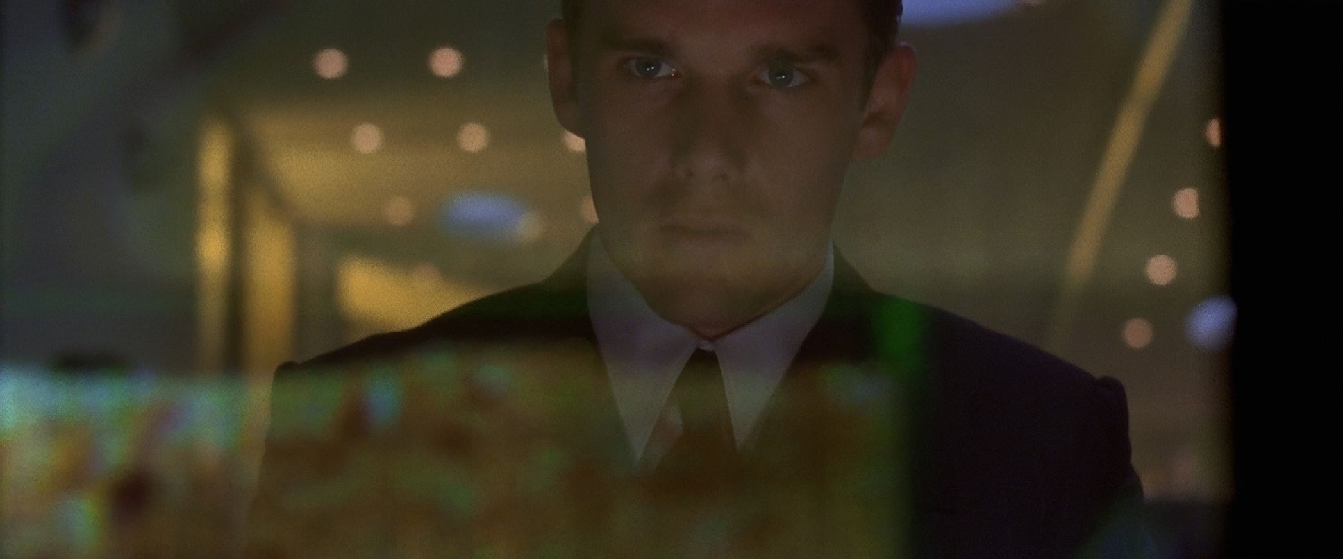
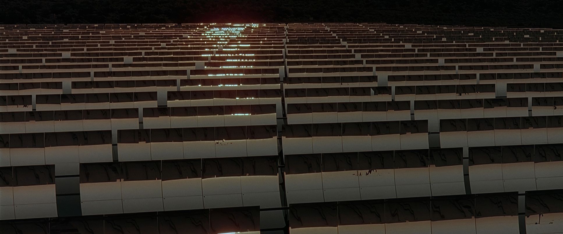
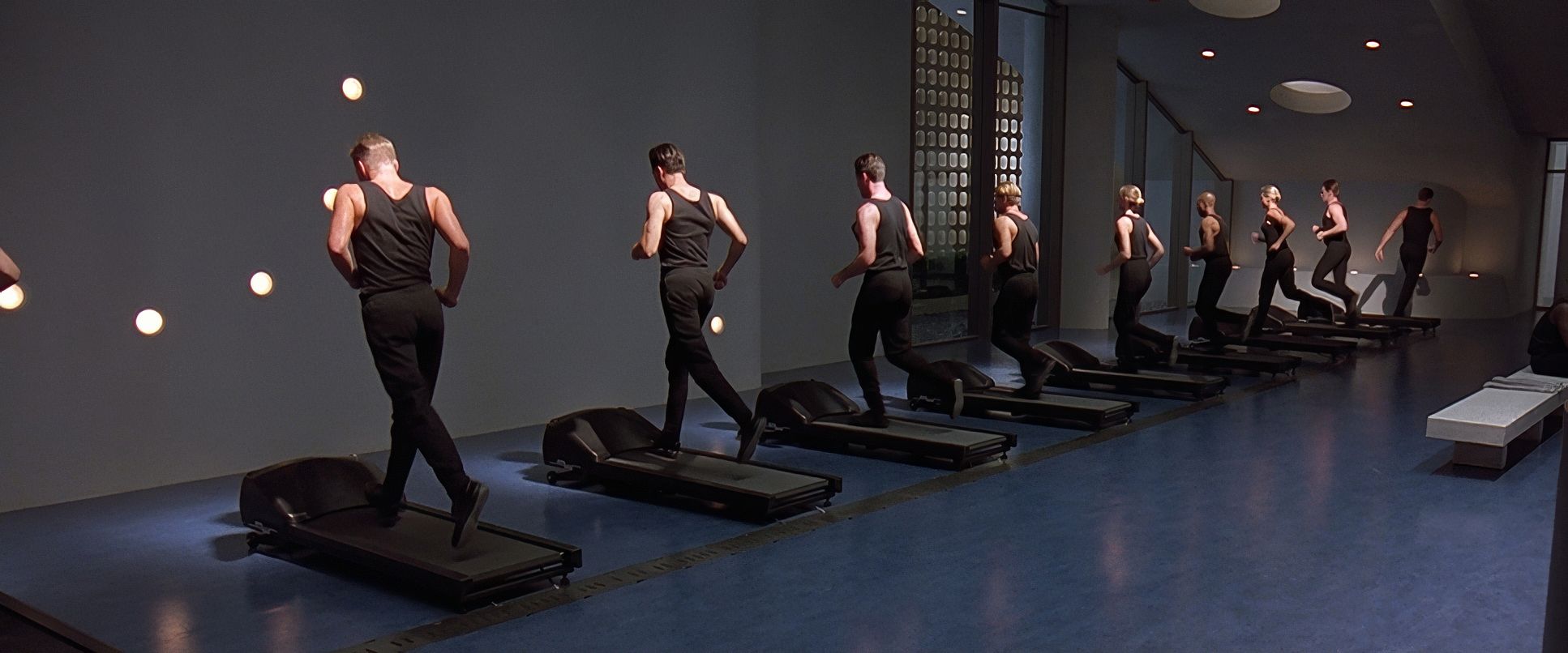
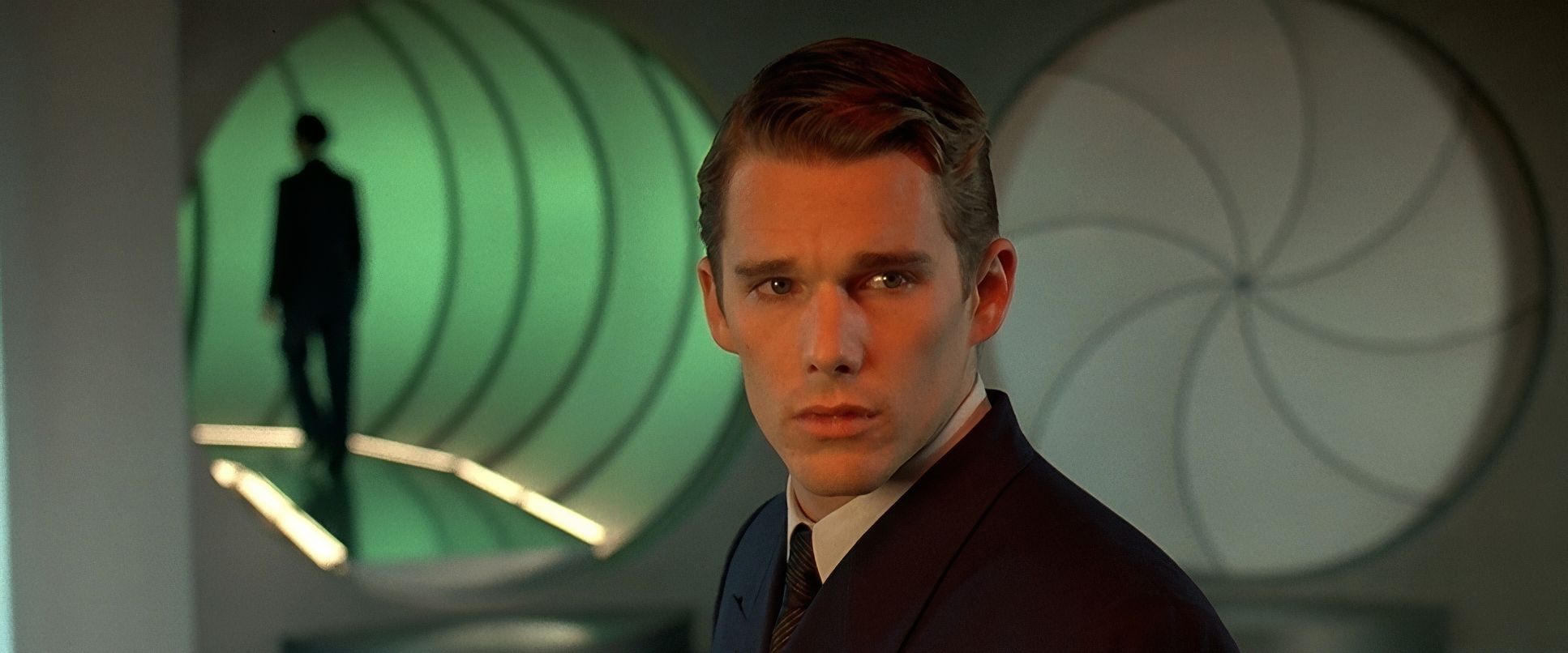
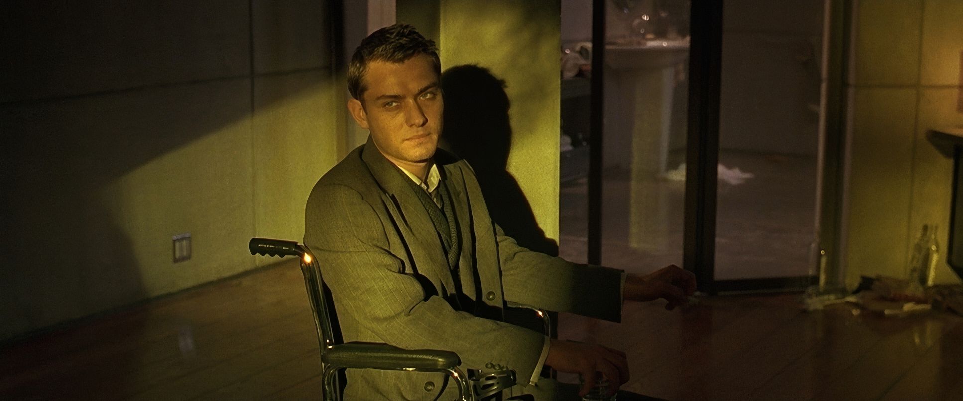
The lighting in Gattaca functions as its own character. It’s hollow, cold, and intentionally lacks empathy, but it’s always grounded in reality. Most of the light in the Gattaca facility feels motivated by practicals fluorescents and massive skylights that feel more like prison bars than windows.
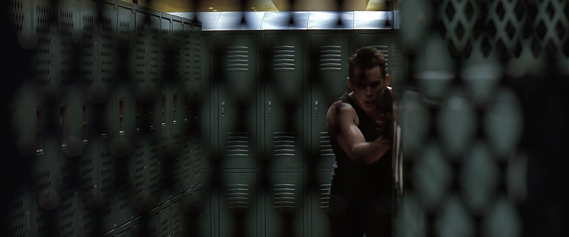
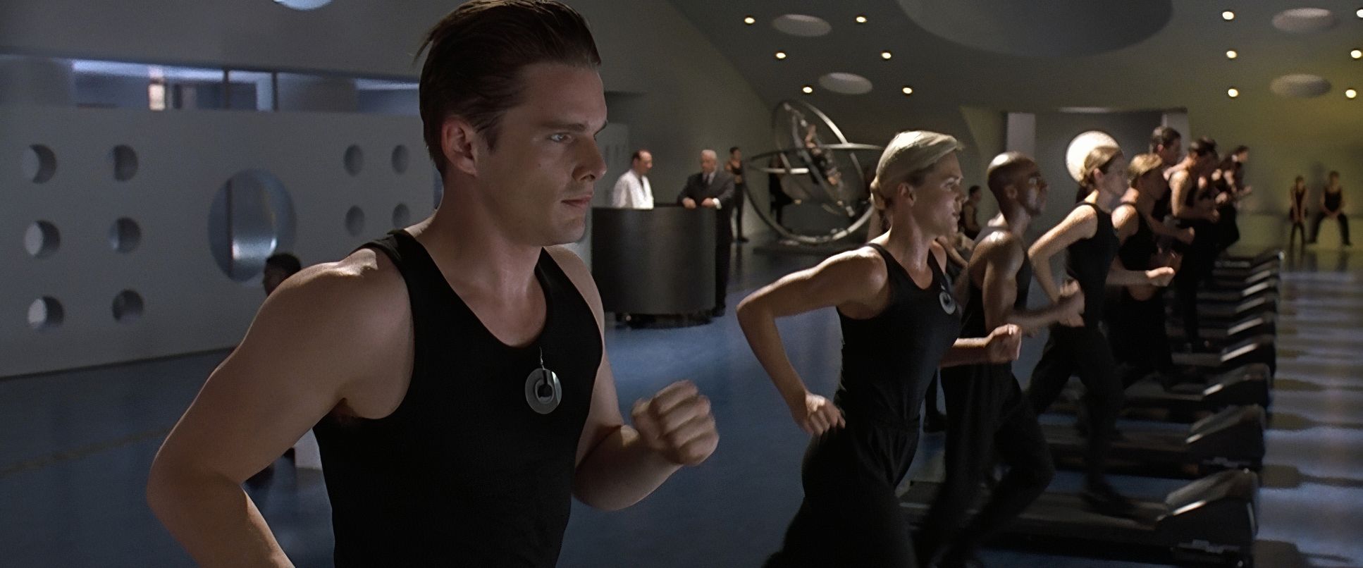
However, there’s a fascinating contrast if you look closely at specific sequences, like the training facility. While the overall vibe is “sterile blue,” Idziak often hits the actors with hard, side-lit artificial light. This creates a high-contrast, noir-ish look that reminds you of the grit beneath the polish. He’s modulating the contrast constantly; he keeps the institutional settings crisp and detailed but allows the blacks to stay deep and foundational. It’s a sophisticated interplay of cold surveillance and hidden secrets.
Inspiration Behind the Cinematography
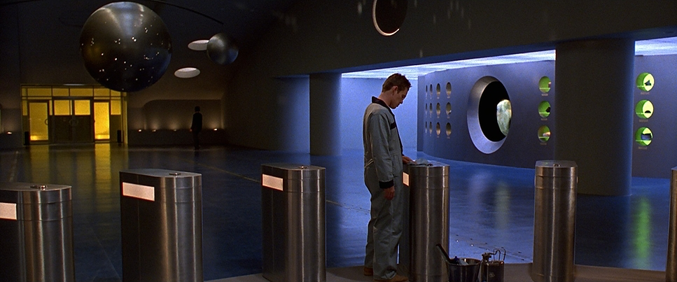
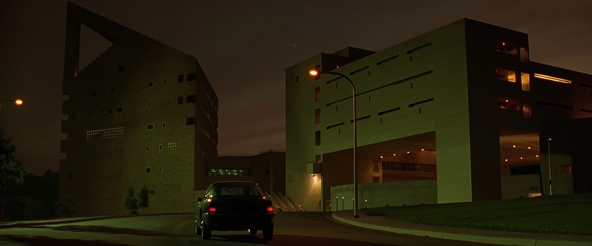
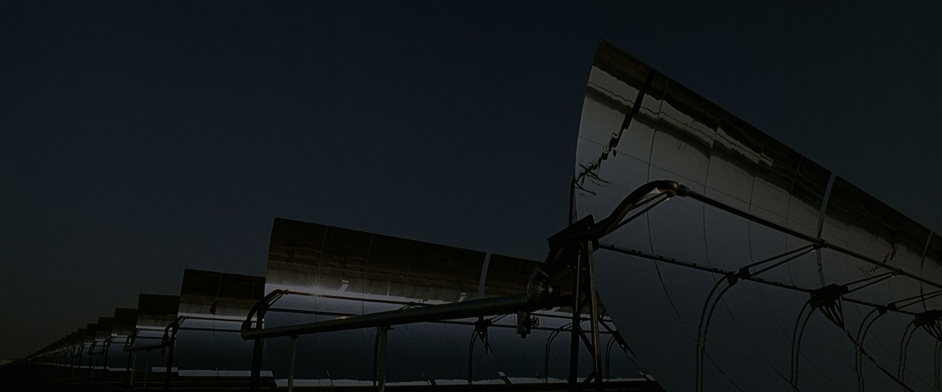
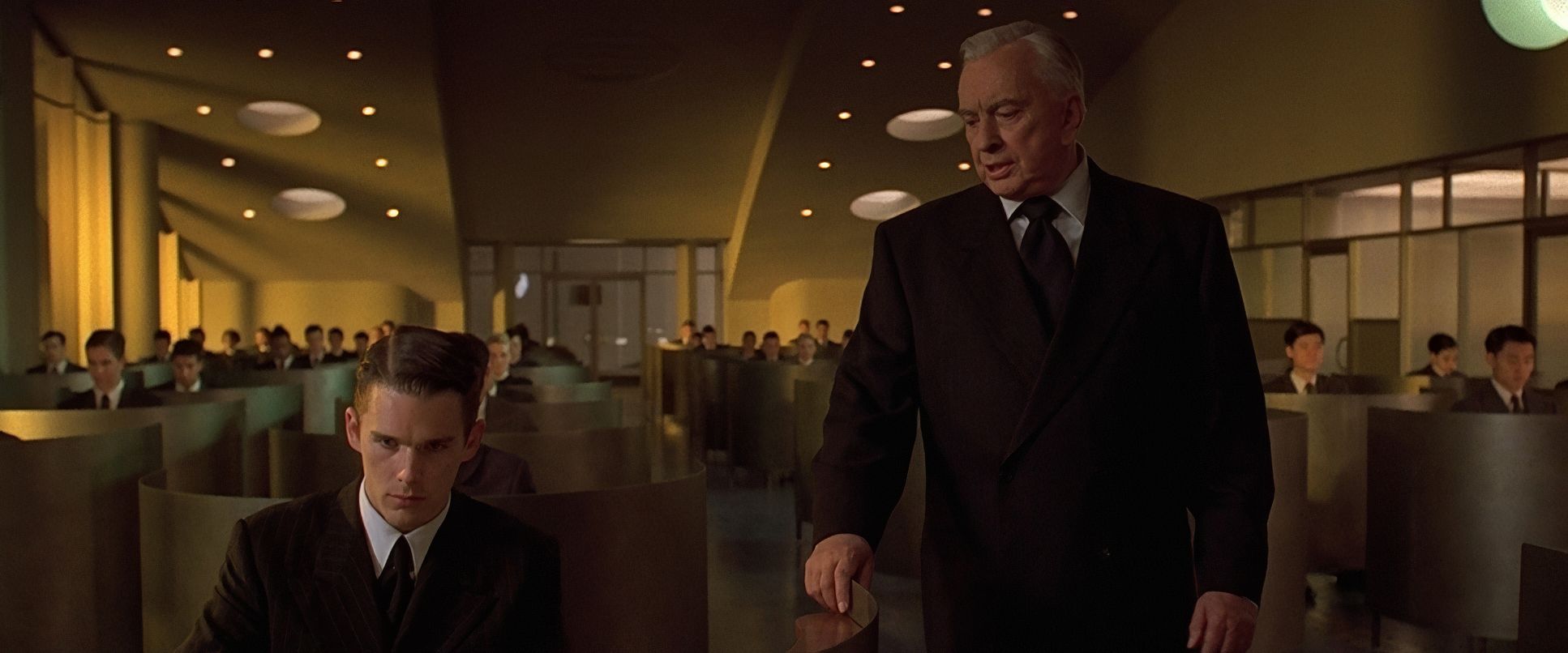
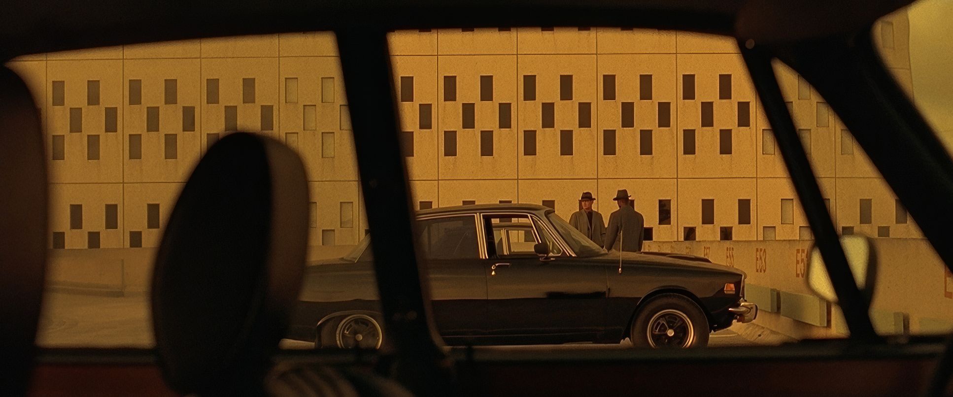
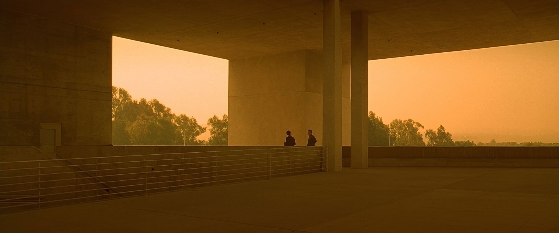
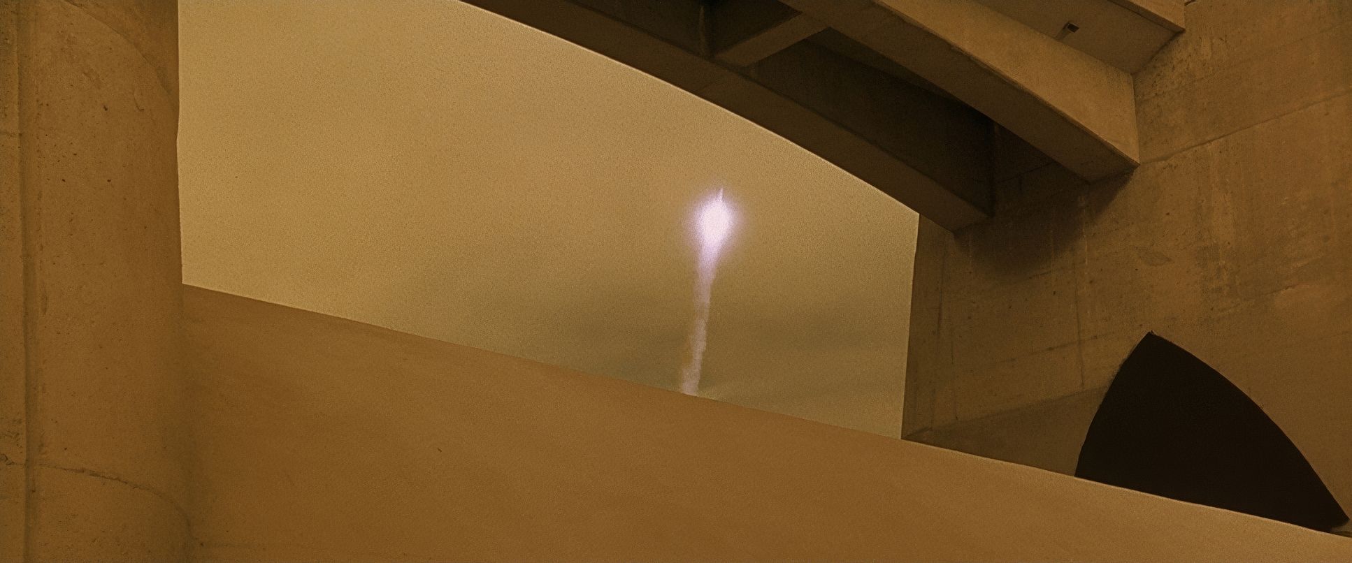
The DNA of Gattaca is a weird, beautiful mix of 1950s retro-futurism and classic film noir. This wasn’t just a stylistic whim; it was a thematic anchor. The mid-century modern architecture (famously shot at the Marin County Civic Center) and those severe uniforms reflect a society obsessed with order and genetic perfection.
The noir influence is what makes Vincent’s journey work. Noir is the language of shadows and predetermined fate, which is exactly what Vincent is fighting against. His existence is one long act of subterfuge, and the lighting constantly plays with that tension gleaming, perfect exteriors versus the grimy, high-contrast reality of a man living a borrowed life. By avoiding the CGI-heavy “neon” look of other sci-fi, they created a world that feels lived-in and dangerously cold.
Lensing and Blocking

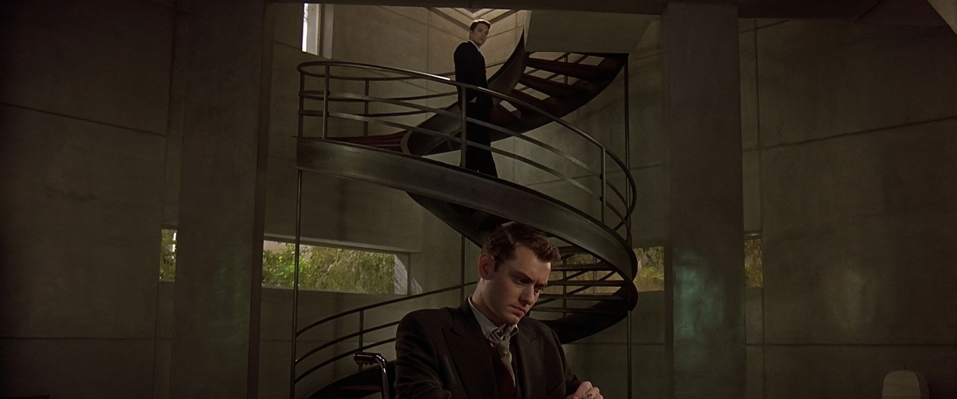
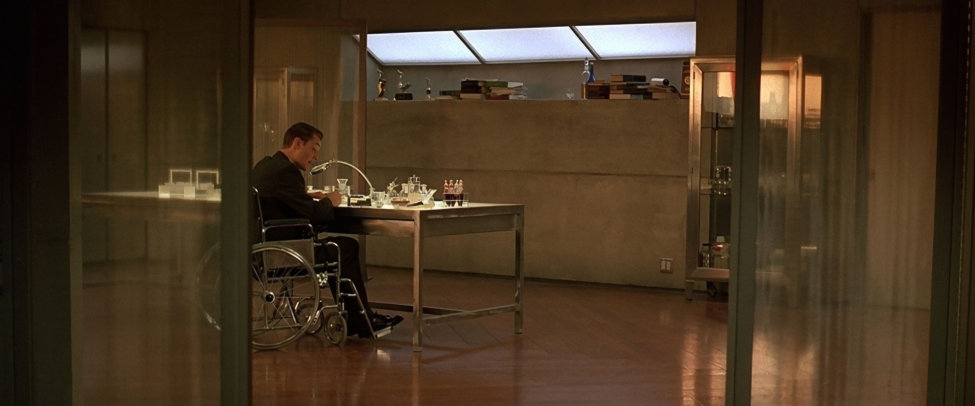
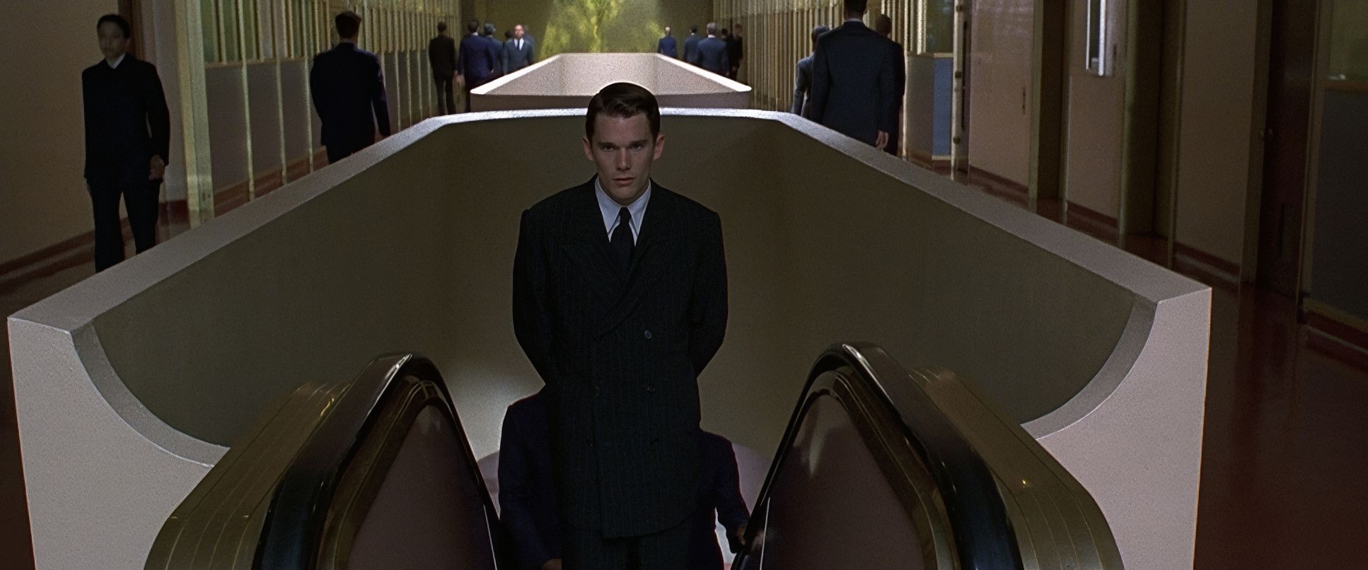
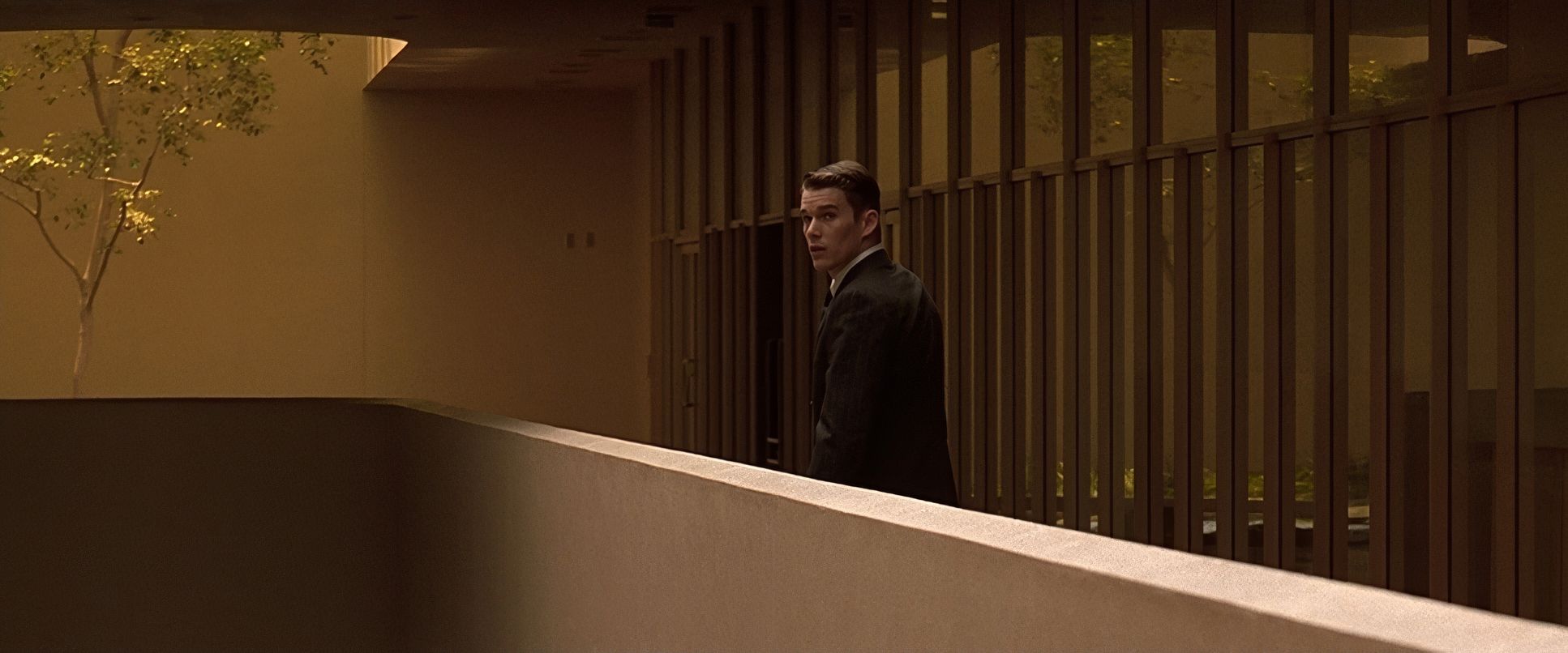
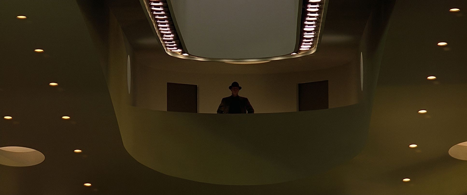
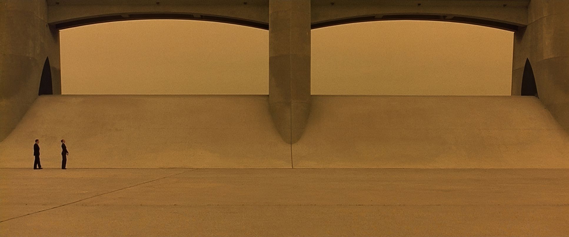
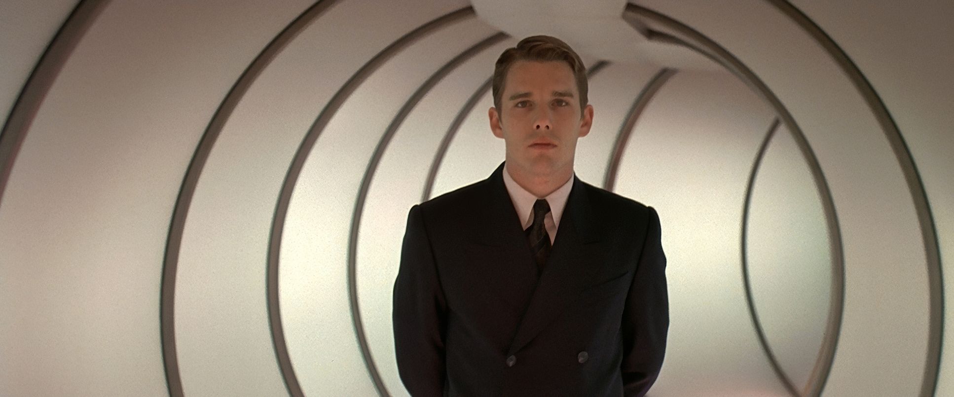
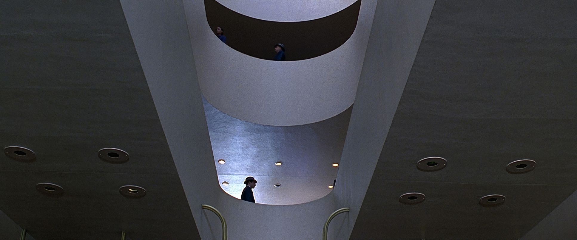
Idziak’s choice of glass is a big part of why the film feels so intimate yet imposing. He leaned on Cooke Speed Panchros and long lenses to create a sense of compression. By pulling the subjects away from their backgrounds, he emphasizes their isolation. When he does go wide, it’s usually to show how small Vincent is compared to the monolithic architecture of the corporation.
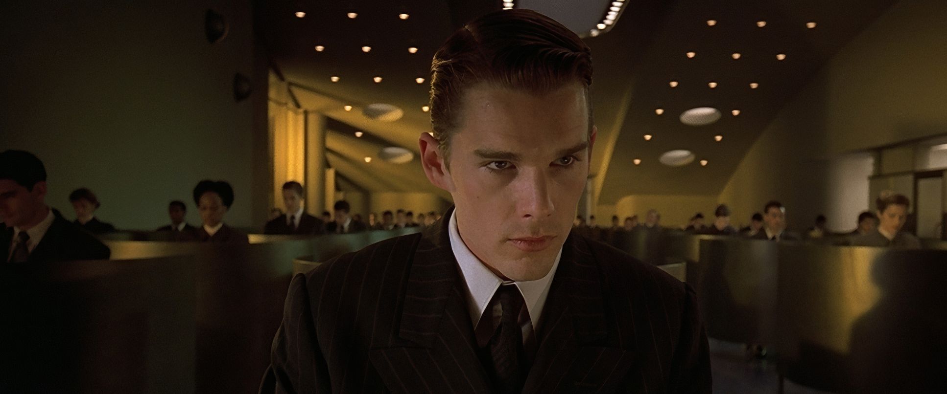
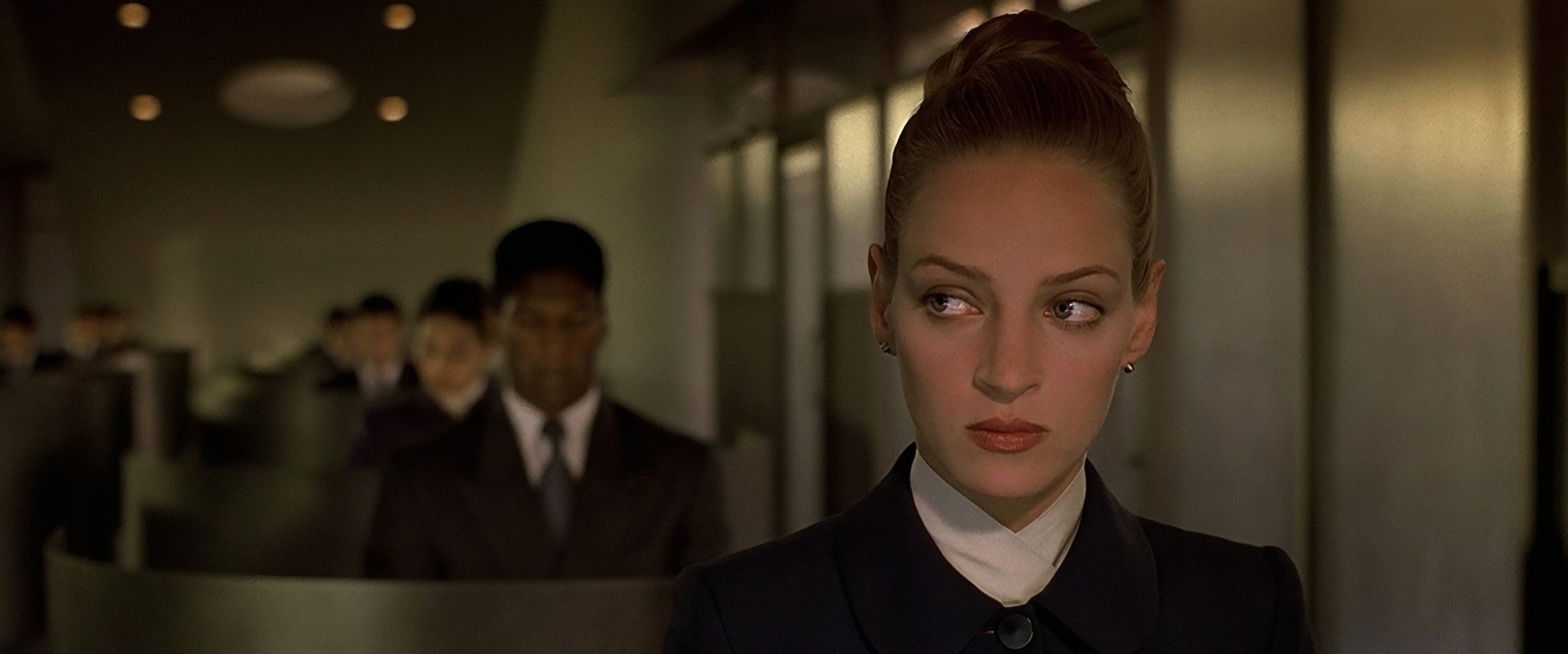
The blocking how the actors are staged is just as calculated. The “Valids” always seem to own the center of the frame, occupying positions of authority. In the beginning, Vincent is often pushed to the periphery or hidden in the background as a janitor.
I remember on one of my early shorts, we were struggling to show a character’s internal crossroads. We tried everything dialogue, extreme close-ups but nothing worked. Then my DP suggested a simple blocking change: place the character dead center, but use a wide lens to show two distinct, slightly soft-focus paths diverging behind them, then slowly dolly in. It was a revelation. Suddenly, the audience felt the dilemma without a single line of dialogue. Gattacadoes this in every single scene. It uses the geometry of the frame to tell you who has power and who is just a “borrowed ladder.”
Camera Movements
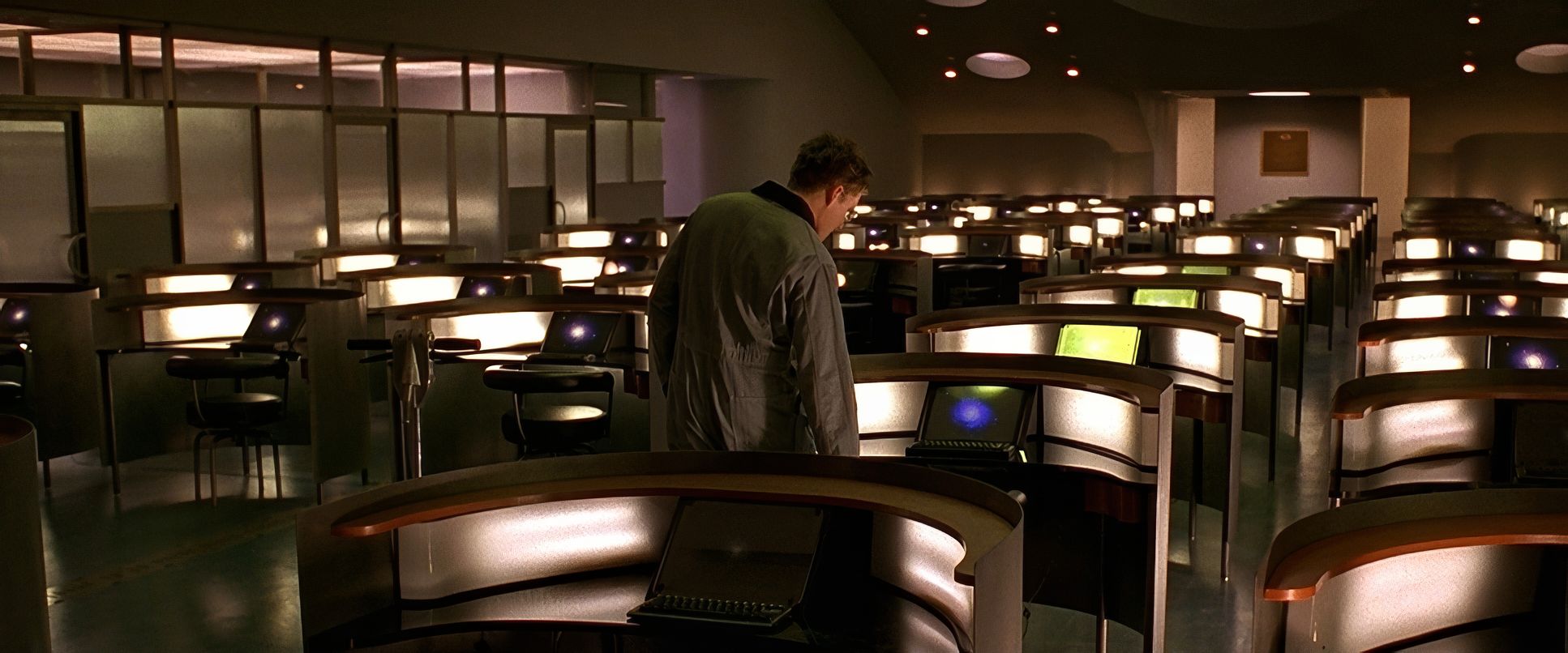
In this world, the camera doesn’t move unless it has a reason. It’s as controlled and deliberate as a genetic sequence. You won’t find shaky handheld work or flashy whip pans here. Instead, the movements are clinical and unhurried.
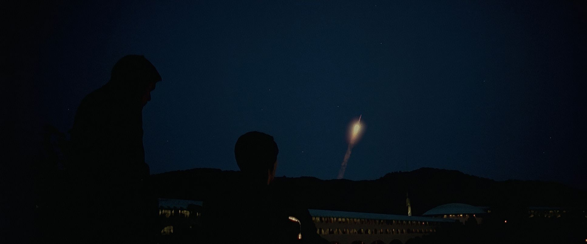
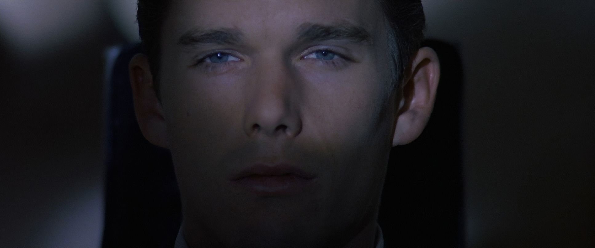
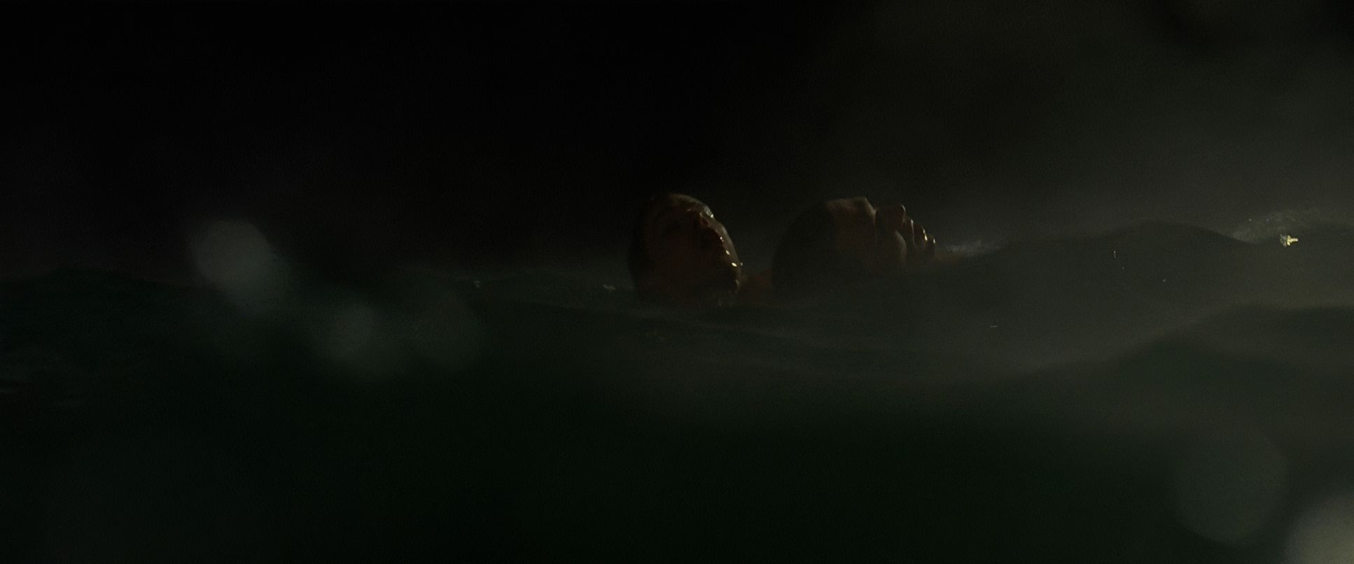
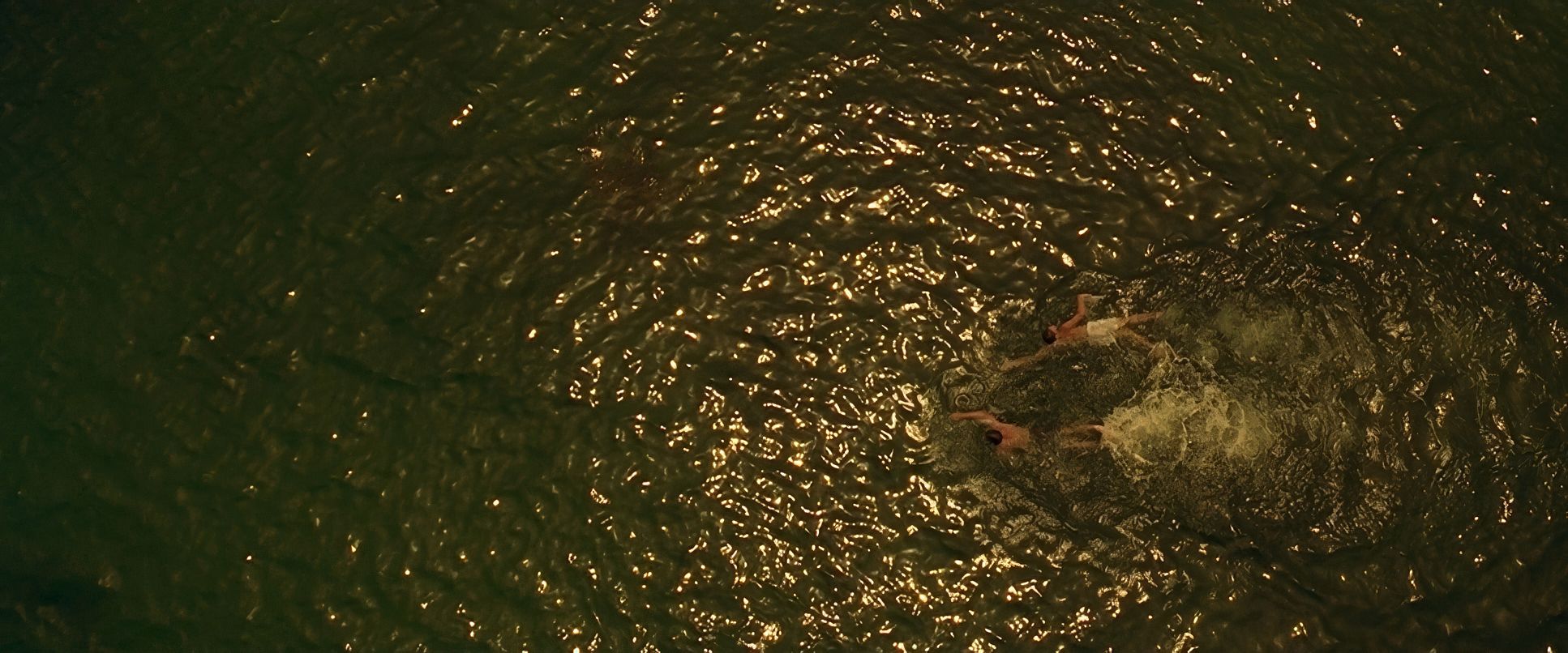
Often, the camera acts like a surveillance observer, gliding with Vincent through those sterile corridors. This invisible, steady motion underscores the idea that every skin cell or hair follicle he leaves behind is being watched. There’s a certain fluidity to the dolly work that makes the corporate environments feel dehumanizingly vast. But in the moments where Vincent’s human spirit breaks through like the swimming challenges the camera holds on his face, focusing on the sheer will and the “undying flame” of his defiance rather than the spectacle of the race.
Compositional Choices

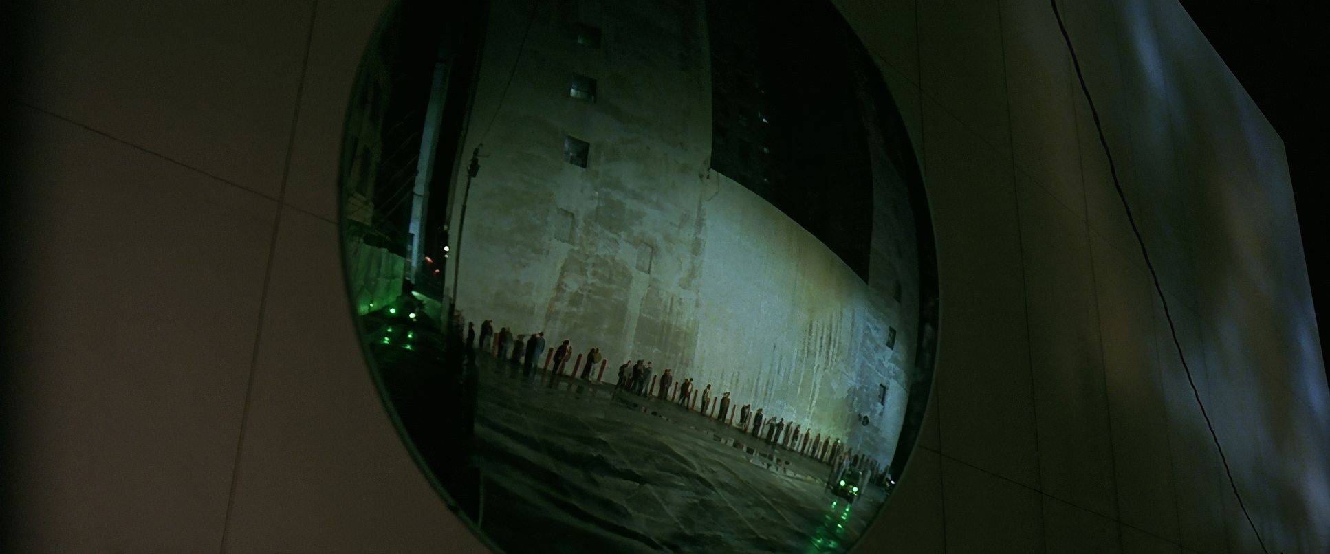
The compositions in Gattaca are all about symmetry and negative space. Idziak uses architectural lines to create a sense of manufactured perfection that feels incredibly isolating. Vincent is frequently framed alone in these massive, cavernous halls, which immediately communicates how vulnerable he is against the system.
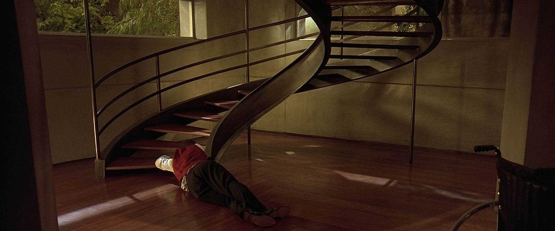
He also uses foreground elements glass partitions, railings, or concrete pillars to physically divide the frame. It’s a visual representation of the barriers Vincent has to navigate. Characters are often placed on different planes; the “children of God” stay in the background, while the Valids occupy the well-lit foreground. It’s only when Vincent and Irene connect that the symmetry starts to break, allowing a bit of “human” imperfection to leak into the frame.
Technical Aspects & Tools
| Genre | Mystery, Romance, Science Fiction, Thriller, Satire, Technology, Hard Sci-Fi, Political, Dystopian, Neo-Noir, Crime, Science-Fiction |
| Director | Andrew Niccol |
| Cinematographer | Slawomir Idziak |
| Production Designer | Jan Roelfs |
| Costume Designer | Colleen Atwood |
| Editor | Lisa Zeno Churgin |
| Colorist | Sheri Eisenberg |
| Time Period | Future |
| Color | Warm |
| Aspect Ratio | 2.39 – Spherical |
| Format | Film – 35mm |
| Lighting | Hard light, Side light |
| Lighting Type | Artificial light |
| Story Location | North America > United States of America |
| Filming Location | San Rafael > Marin County Civic Center |
| Camera | Arriflex, Moviecam SL |
| Lens | Cooke Speed Panchro |
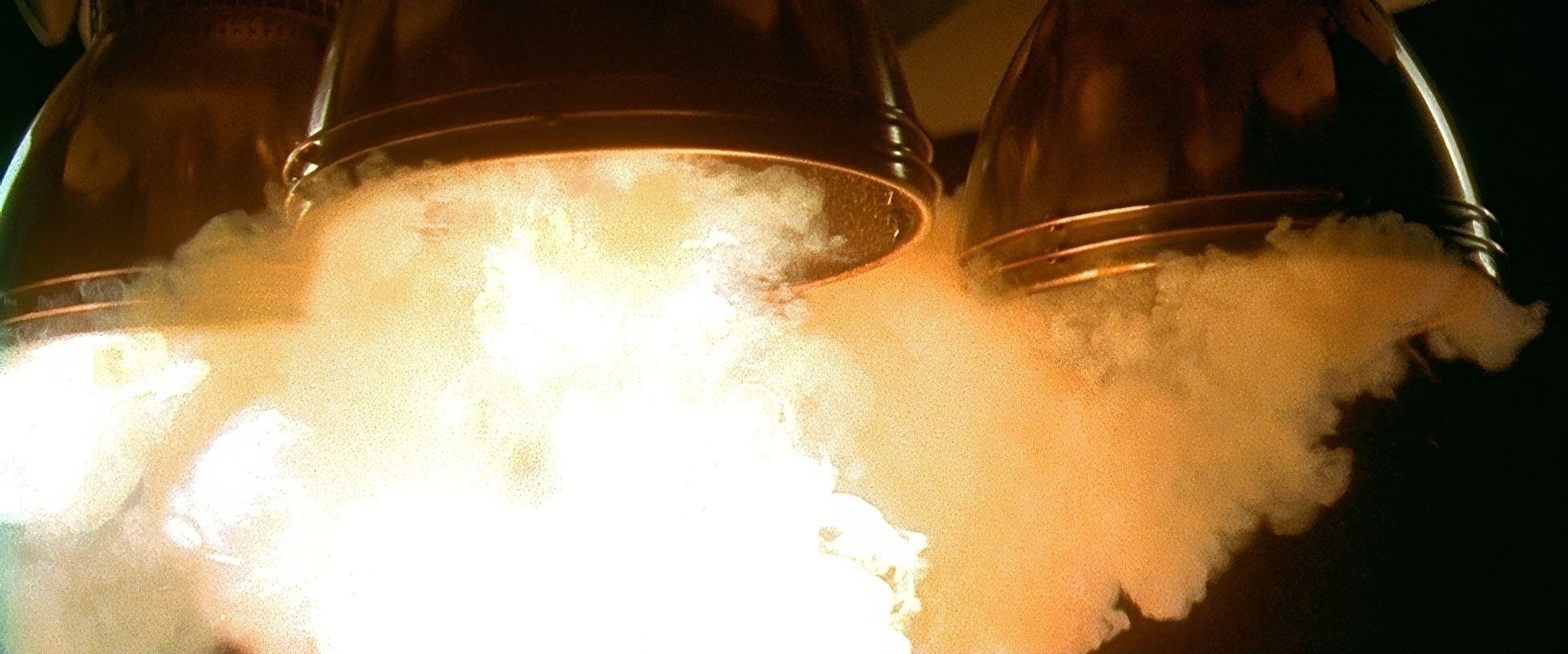
What’s wild is that Gattaca was made on a relatively modest budget around $36 million, which was “bargain basement” for a 90s studio film. Because they couldn’t afford a “visual effects spananza,” they had to be resourceful. Shooting on 35mm (Arriflex and Moviecam SL) gave them a dynamic range and grain structure that digital still struggles to match.
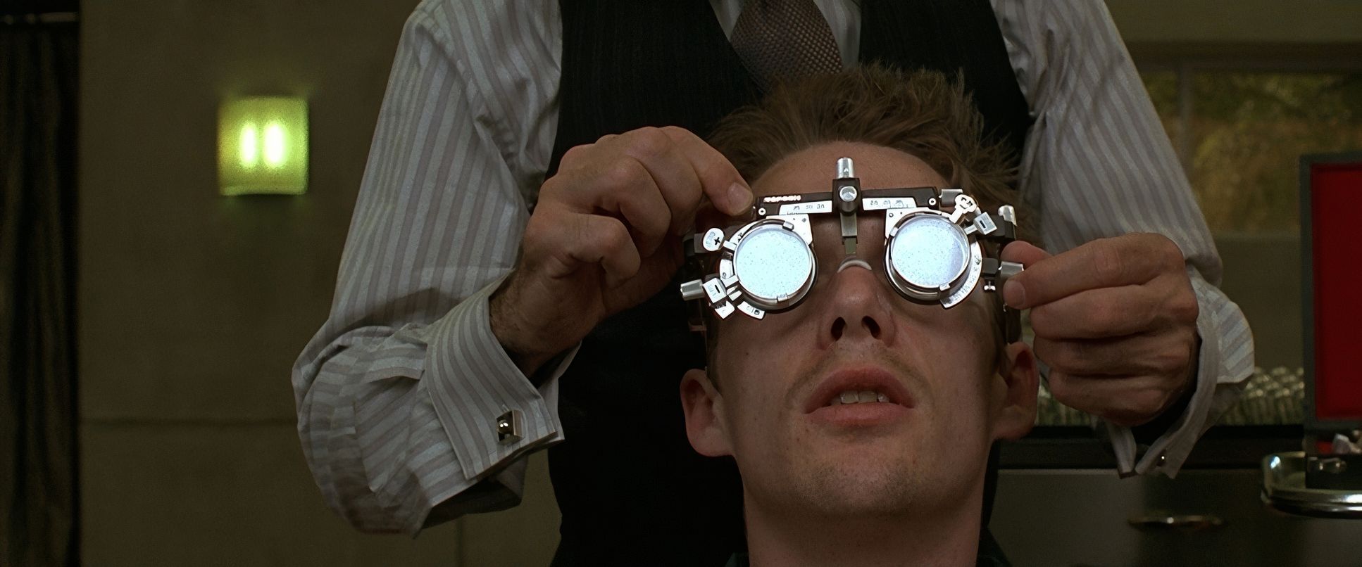
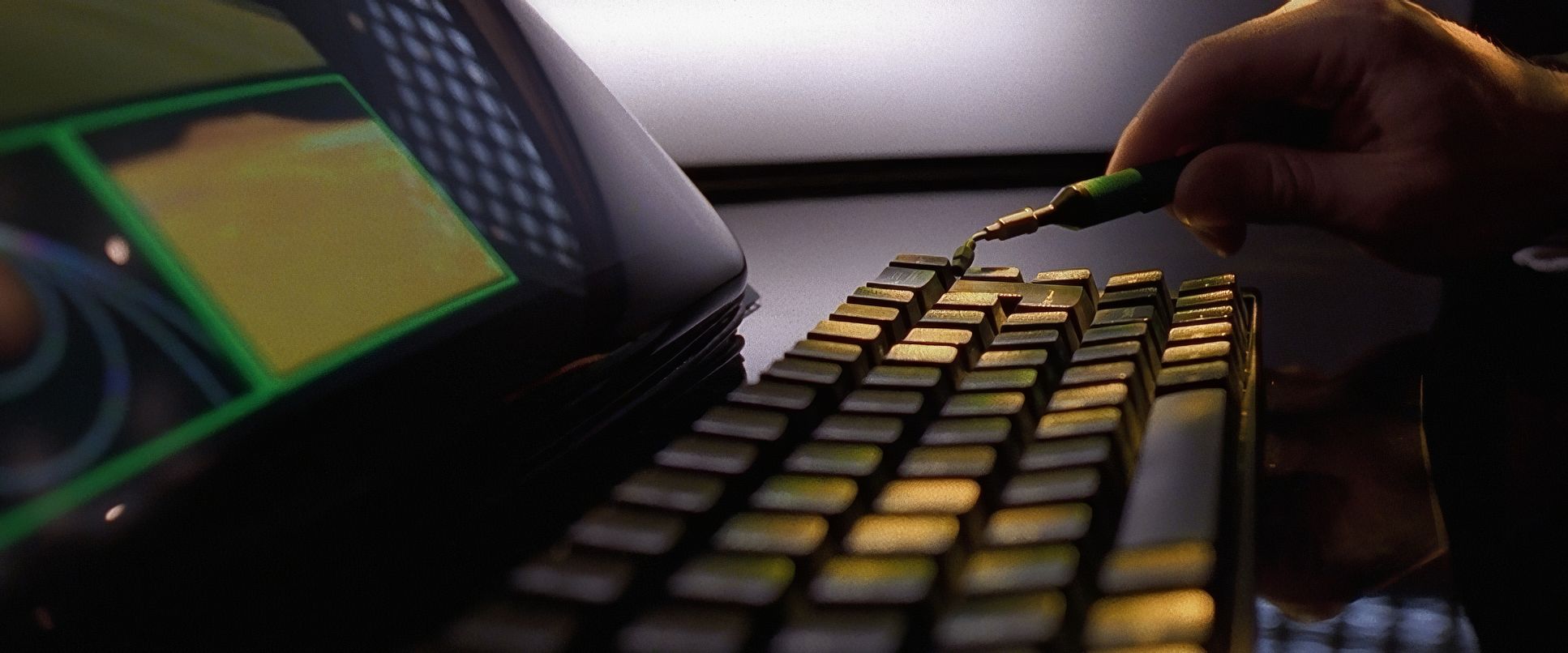
The lack of heavy CGI forced the team to rely on smart production design and in-camera tricks. Instead of glowing holographic screens, they used mechanical, analog-looking interfaces that fit the 1950s aesthetic. It’s proof that a clear vision and a keen eye will always beat out sheer technological horsepower.
Gattaca (1997) Film Stills
A curated reference archive of cinematography stills from GATTACA (1997). Study the lighting, color grading, and composition.


- Also read: O BROTHER, WHERE ART THOU? (2000) – CINEMATOGRAPHY ANALYSIS
- Also read: DONNIE BRASCO (1997) – CINEMATOGRAPHY ANALYSIS
Browse Our Cinematography Analysis Glossary
Explore directors, cinematographers, cameras, lenses, lighting styles, genres, and the visual techniques that shape iconic films.
Explore Glossary →