I first picked up To Be or Not to Be because of its reputation for being “too soon” for 1942 audiences. But as I sat with it, I stopped thinking about the controversy and started obsessing over how Rudolf Maté managed to make 1940s Warsaw look simultaneously like a Broadway stage and a war zone. For those of us at Color Culture who spend our days staring at scopes and skin tones, Ernst Lubitsch’s film is a reminder that you don’t need a wide color gamut to tell a complex story. You just need a perfect handle on your grey scale.
It’s a bizarre, risky movie. A troupe of Polish actors, led by Jack Benny and the incredible Carole Lombard, essentially “perform” their way through the Nazi occupation. It’s a farce, but one that’s draped in the coldest wartime reality. It was called “callous” back in the day, but watching it now, Lubitsch a refugee himself was clearly using satire as a survival mechanic.
Color Grading Approach

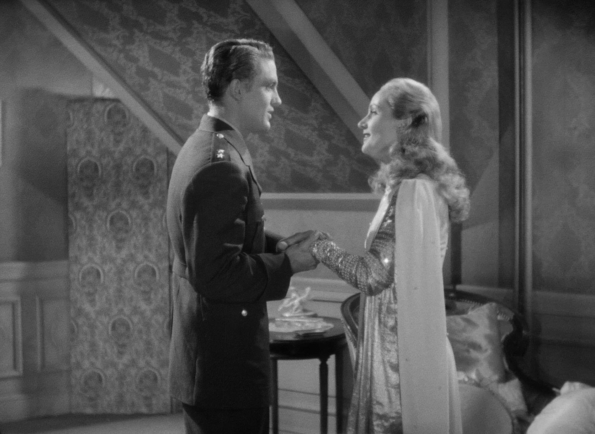
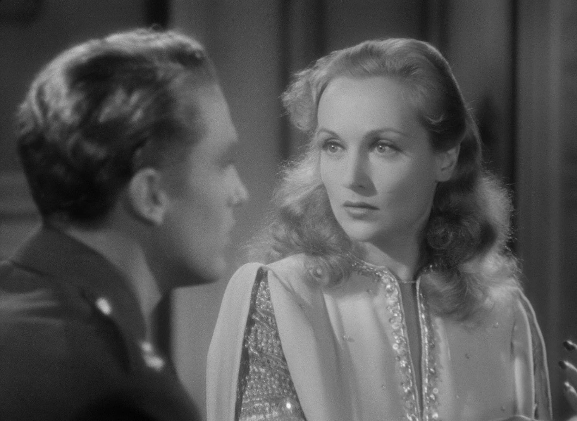
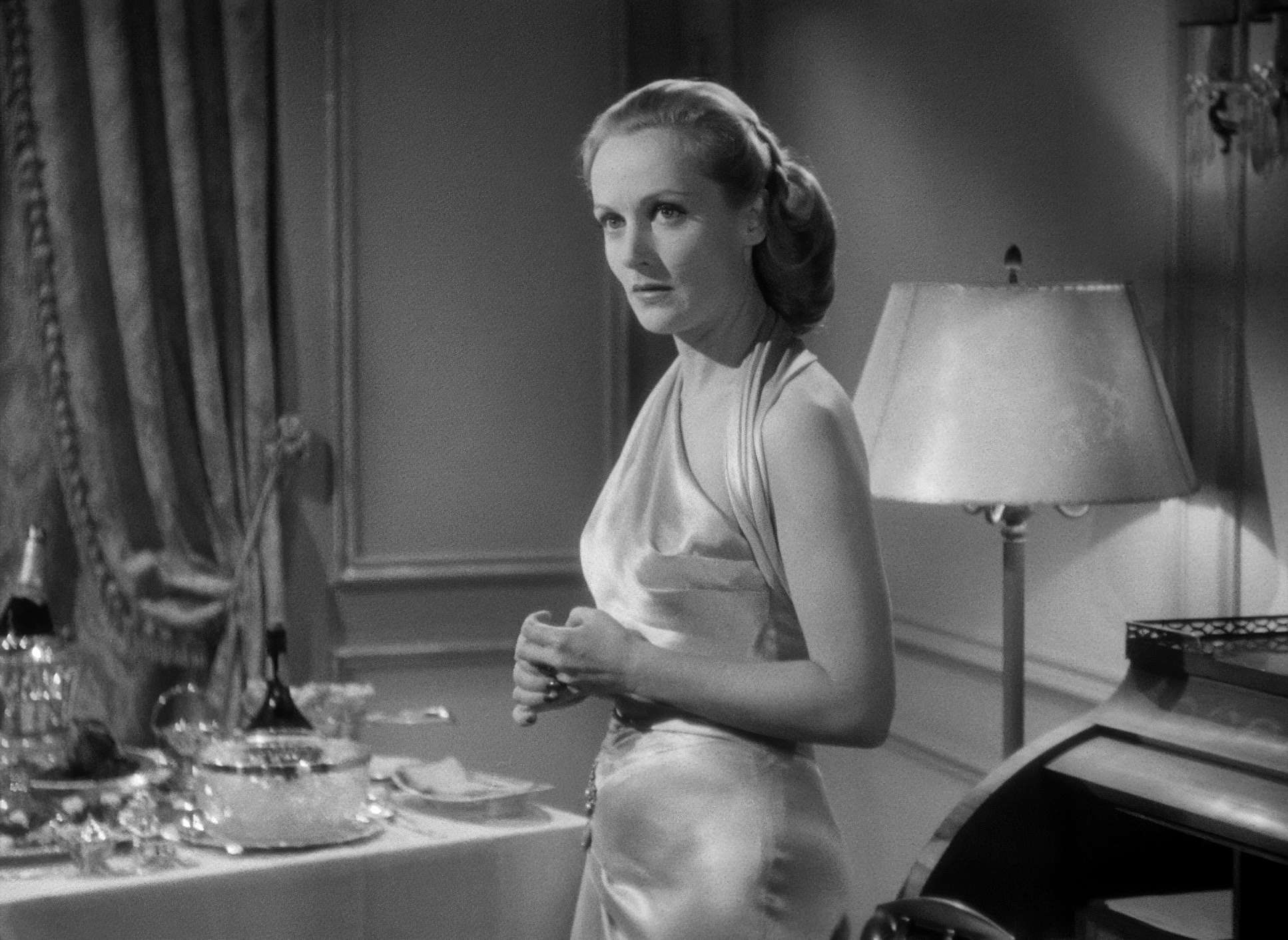
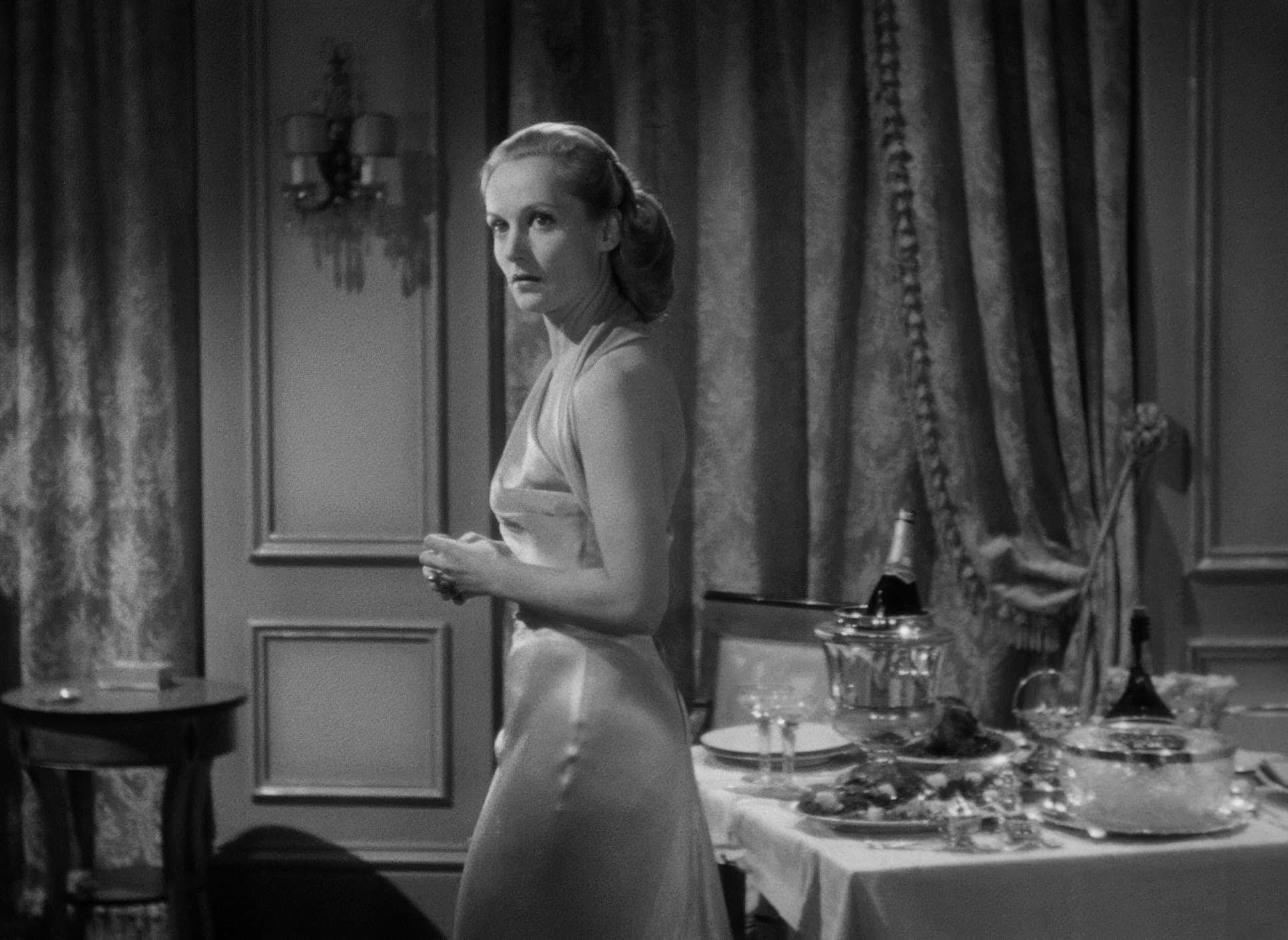
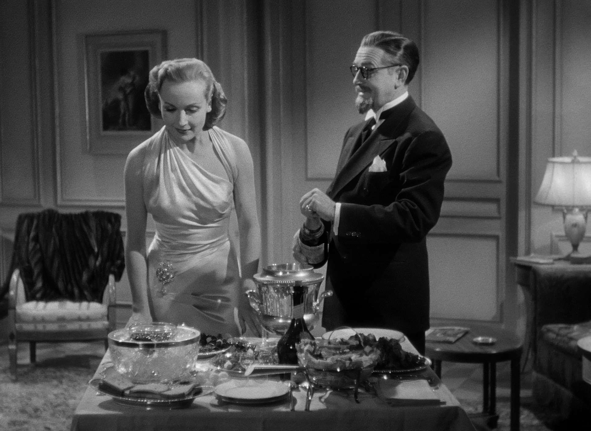
Since I spend my life in a grading suite, I can’t help but look at this film through the lens of tonal sculpting. Even though it’s black and white, the “grade” here is all about managing density and protecting the “toe” of the film’s characteristic curve. If I were sitting at my panel working on a remaster of this, my primary goal would be to preserve that luminous highlight roll-off on Carole Lombard’s skin without letting it blow out into a digital mess.
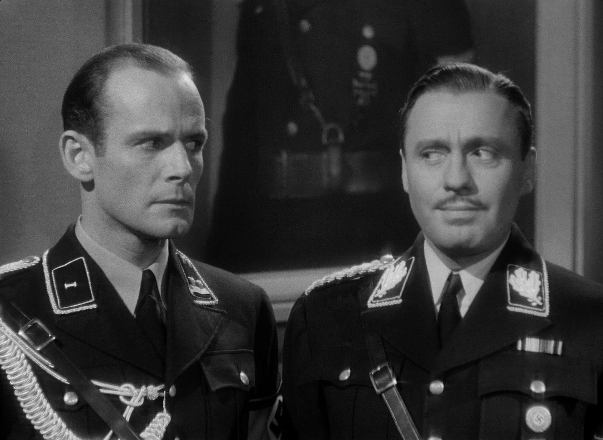
Maté used a massive range of tones, from deep, inky blacks to these piercing, theatrical whites. In modern terms, we’d talk about “separation,” but Maté did it through lighting ratios. He made sure the Nazi uniforms had enough sheen and texture to separate them from the flatter, more “theatrical” backgrounds of the Polish theatre. It’s tonal sculpting at its most fundamental. Every decision about exposure was a commitment one you couldn’t just “fix in post” with a power window.
About the Cinematographer

Rudolf Maté wasn’t just some Hollywood journeyman; he brought a heavy European edge to the studio system. He’d already shot The Passion of Joan of Arc and Vampyr, so he knew exactly how to make a frame feel claustrophobic or ethereal. He understood that light wasn’t just for visibility it was for carving out an emotional state.
In my own work, I try to stay invisible; the grade should serve the story, not distract from it. Maté operated on that same frequency. He wasn’t trying to show off with every shot. He was more interested in how a shadow could make a gag land or how a specific highlight could make a character feel more vulnerable. It’s an understated philosophy that a lot of modern cinematographers could learn from.
Technical Aspects & Tools
To Be or Not to Be (1942) – Technical Specifications
| Genre | Comedy, War |
| Director | Ernst Lubitsch |
| Cinematographer | Rudolph Maté |
| Production Designer | Vincent Korda |
| Costume Designer | Irene |
| Editor | Dorothy Spencer |
| Time Period | 1940s |
| Color | Desaturated, Black and White |
| Aspect Ratio | 1.37 – Spherical |
| Format | Film – 35mm |
| Lighting | Hard light, Top light |
| Lighting Type | Daylight |
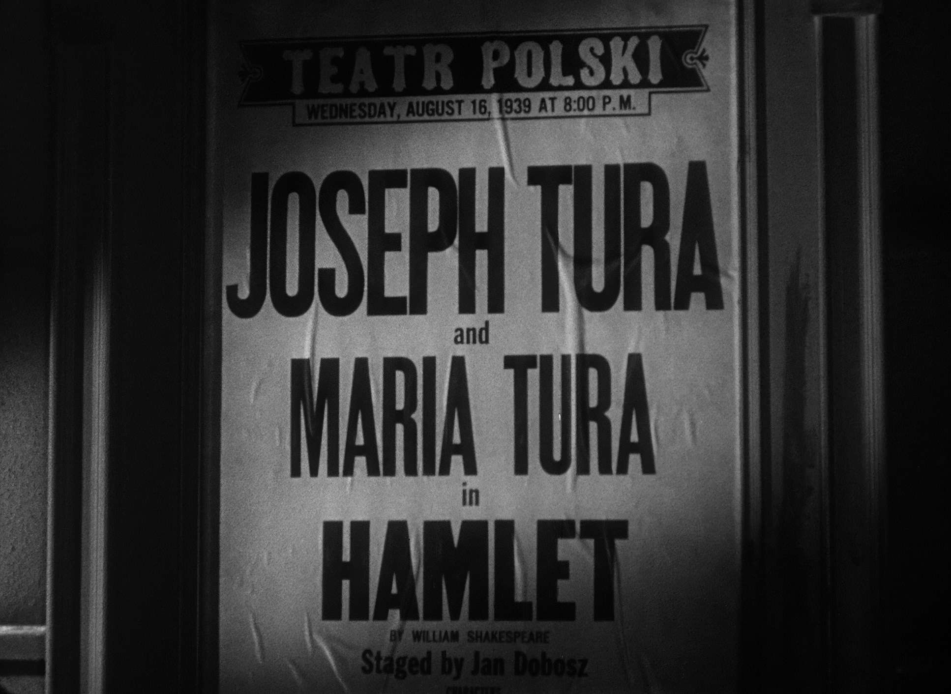
| Story Location | Poland > Warsaw |
| Filming Location | Burbank > Warner Bros Studios |
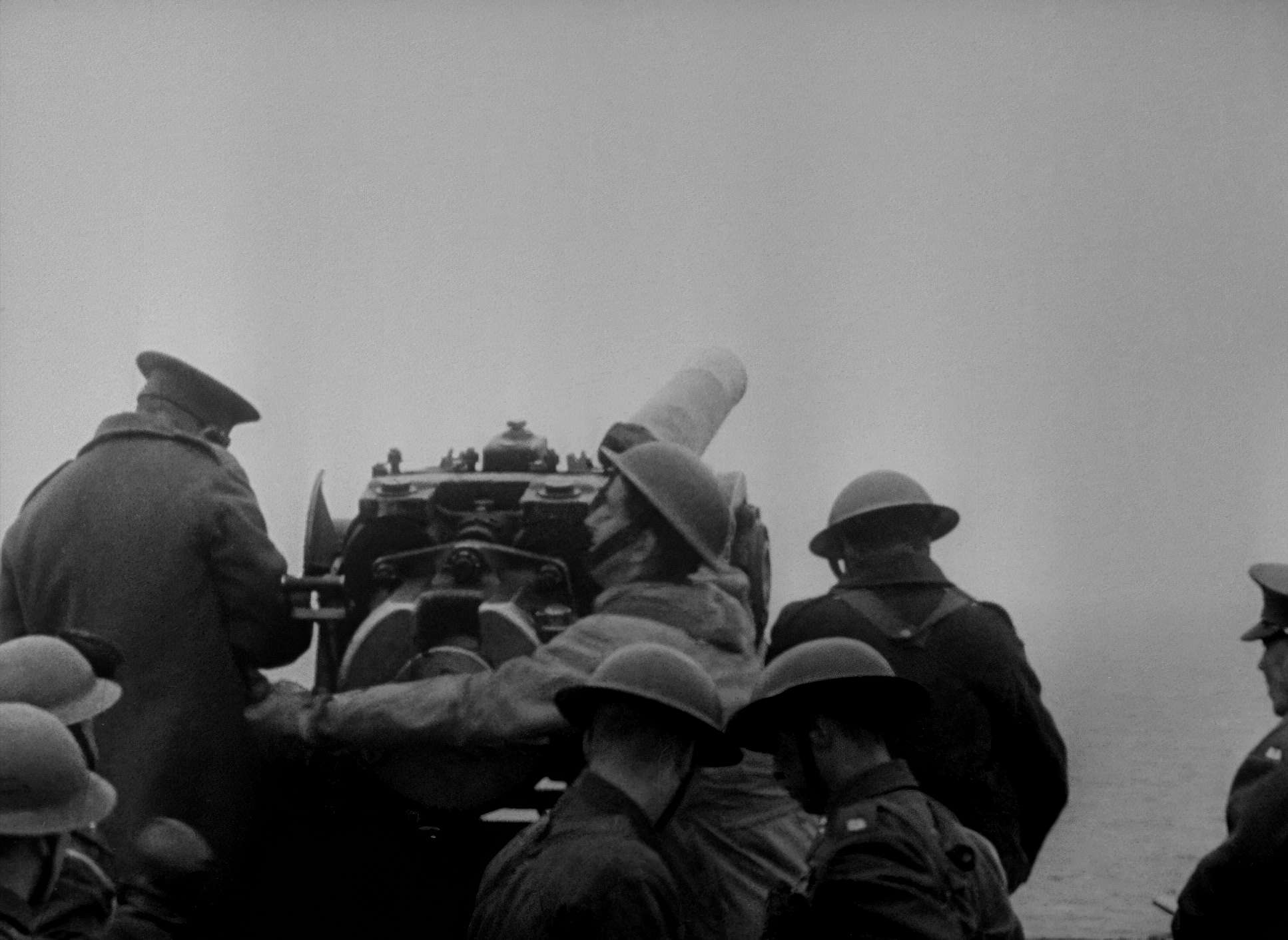
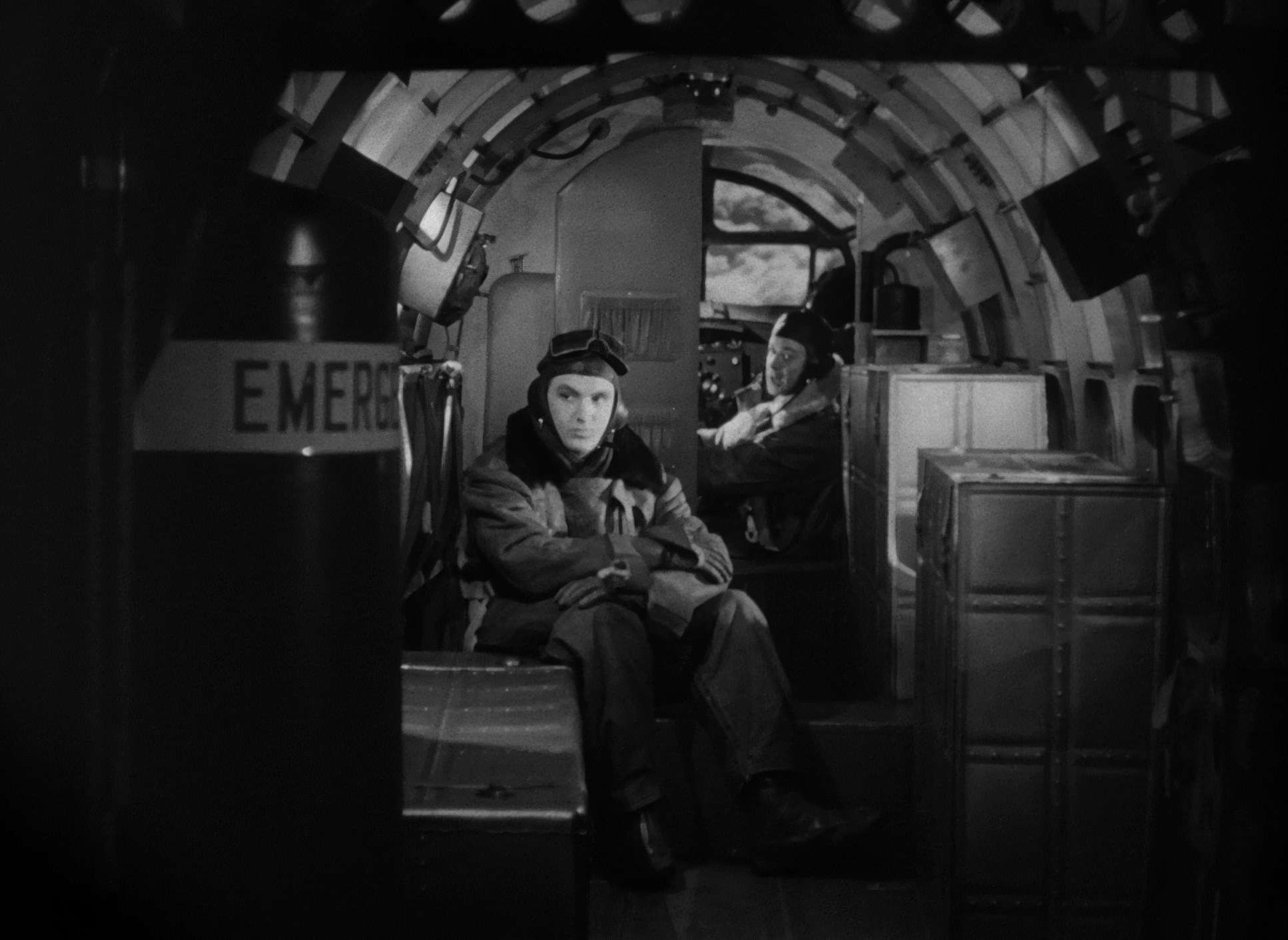
You have to respect the sheer physical labor that went into a film like this in 1942. They were shooting 35mm nitrate stock on heavy Mitchell BNC cameras. These things weren’t exactly “run-and-gun” tools. Every move had to be calculated. If the camera moved, it was because someone spent an hour laying track and timing a dolly pull.
The lighting was just as intense massive arc lamps and incandescent fixtures that probably made the sets feel like ovens. Because the film stocks back then had a much narrower dynamic range than a modern sensor, Maté had to be surgical with his flags and scrims. He was creating a look “in-camera” that most people today struggle to replicate with a million-dollar digital workflow. It’s a testament to the fact that gear doesn’t make the movie; the intention does.
Lighting Style

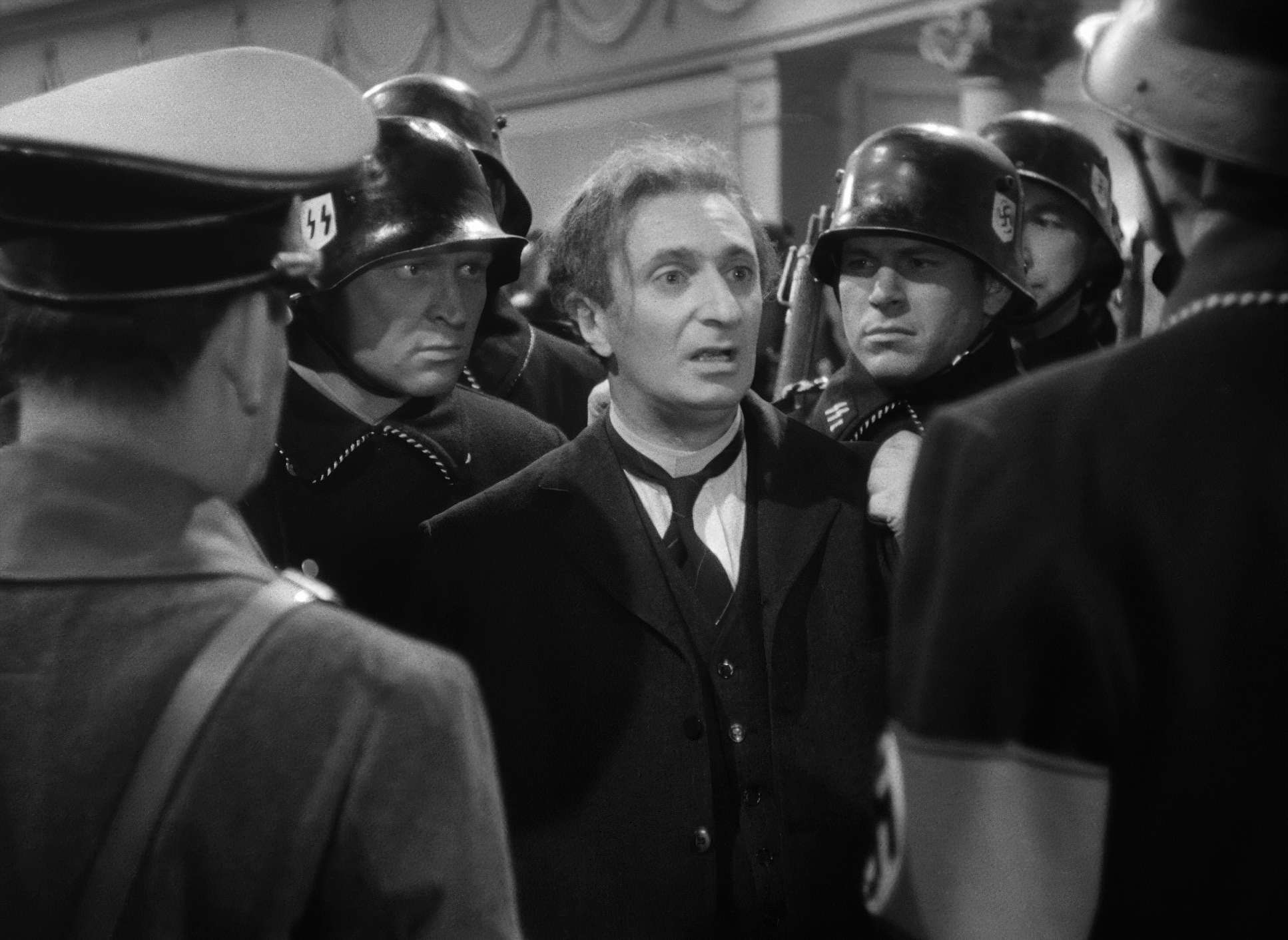
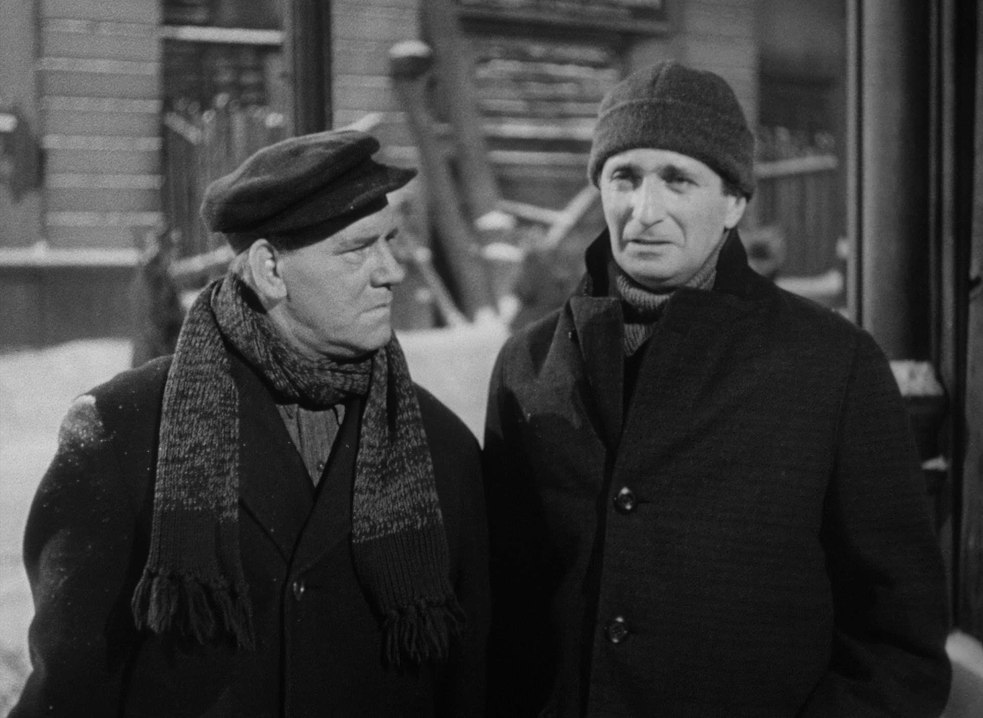
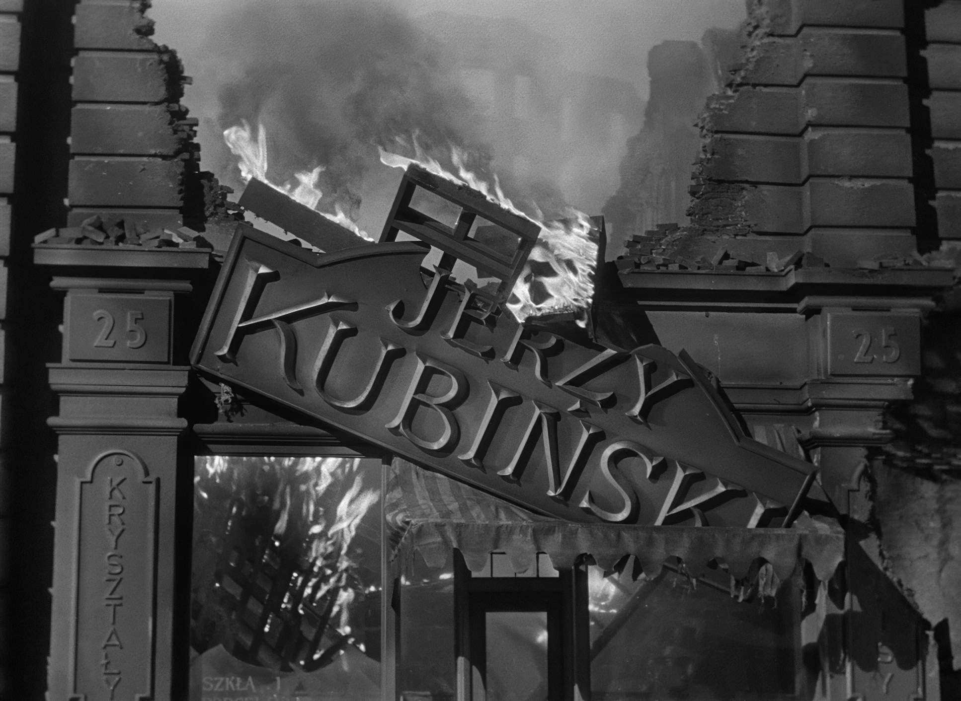
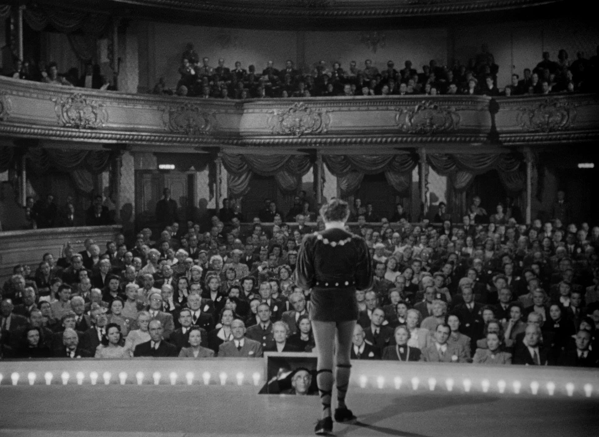
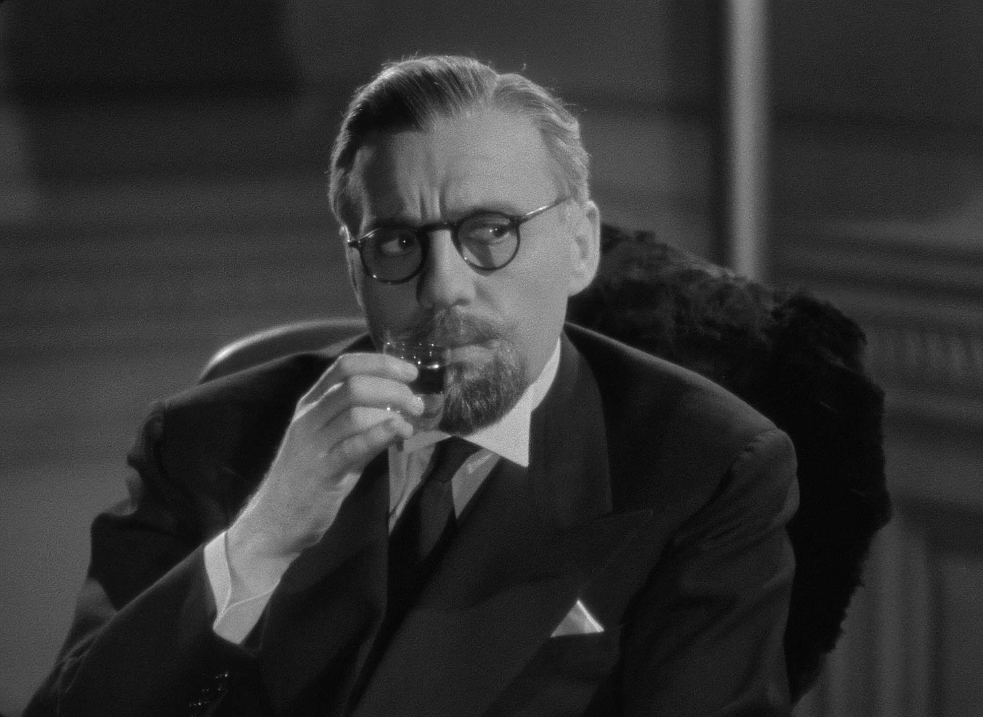
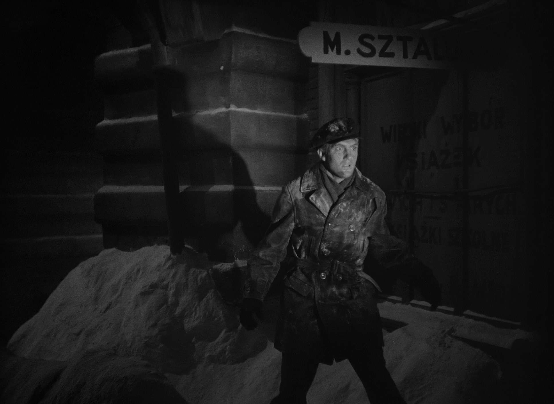
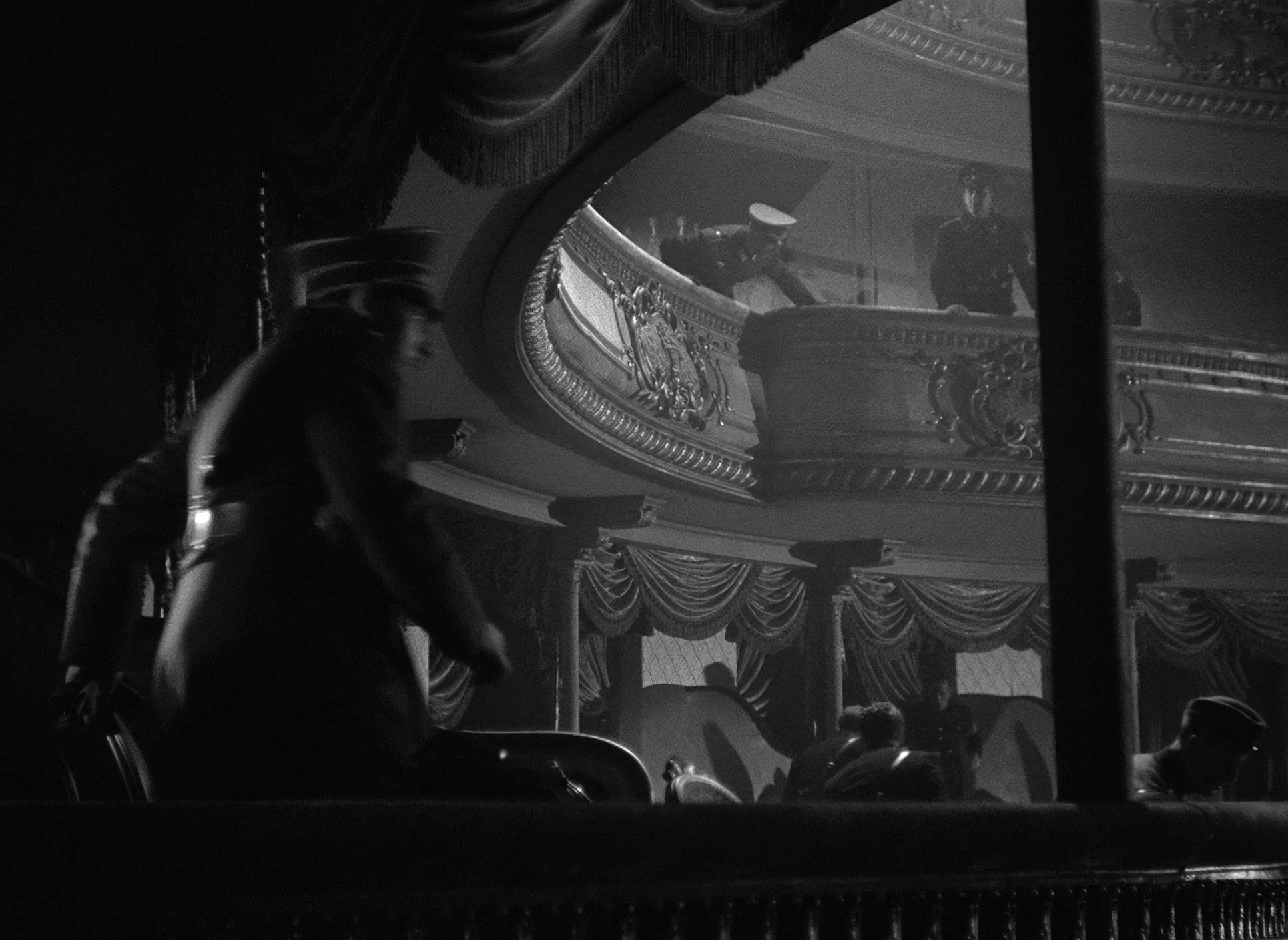
The lighting in To Be or Not to Be is where the “black comedy” really gets its bite. Maté uses a lot of hard, top-down lighting and sharp chiaroscuro. It’s a very low-key approach that feels more like a noir than a screwball comedy.
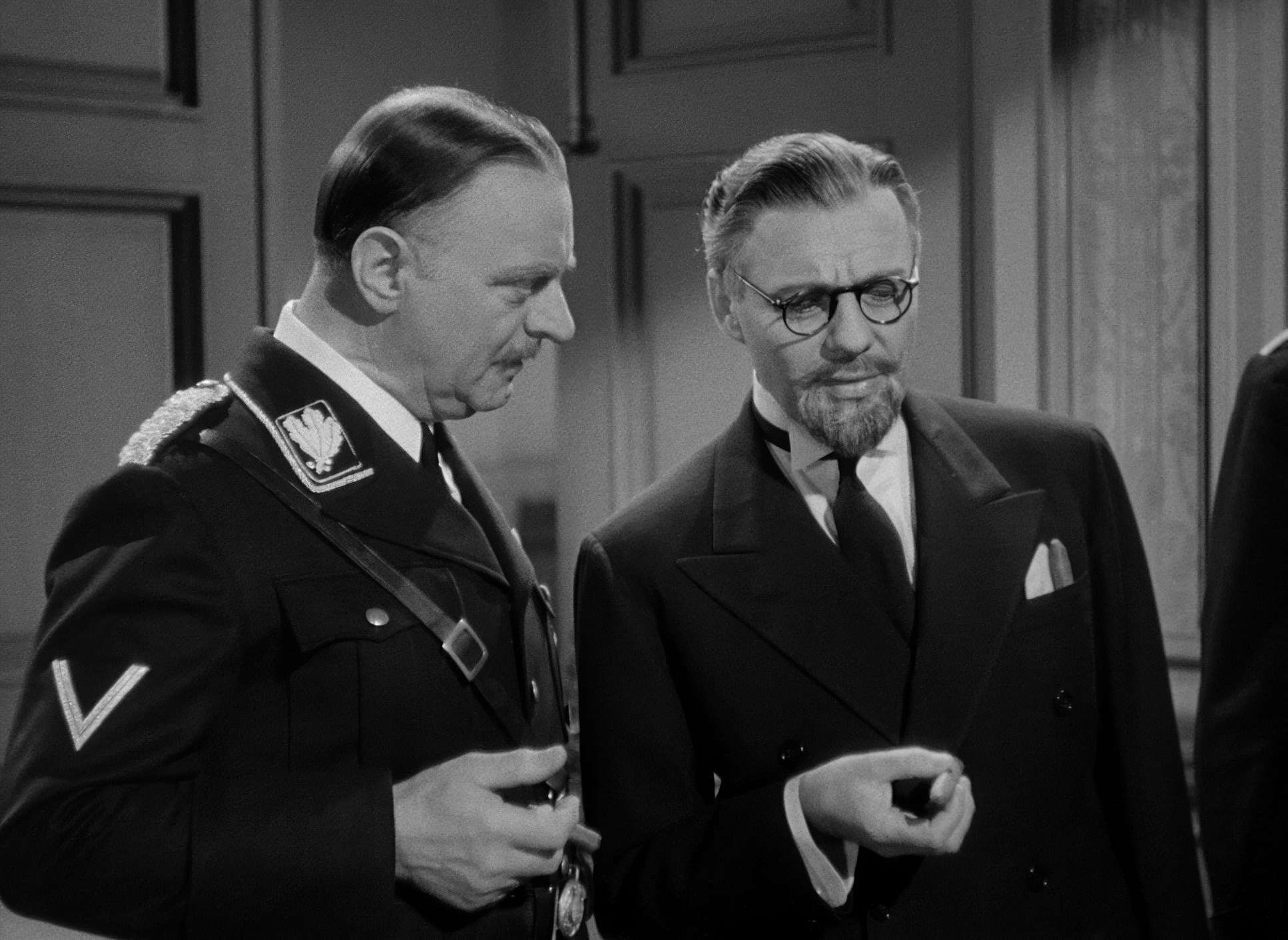
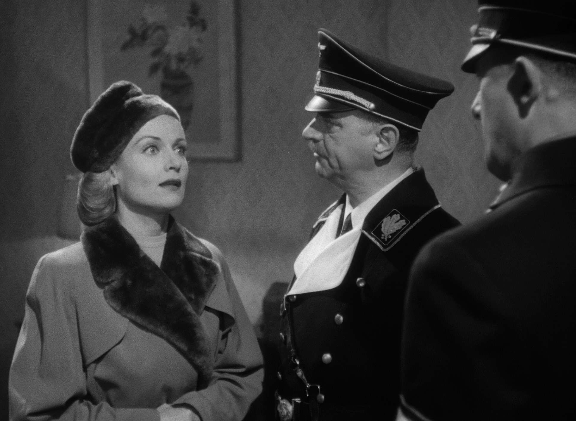
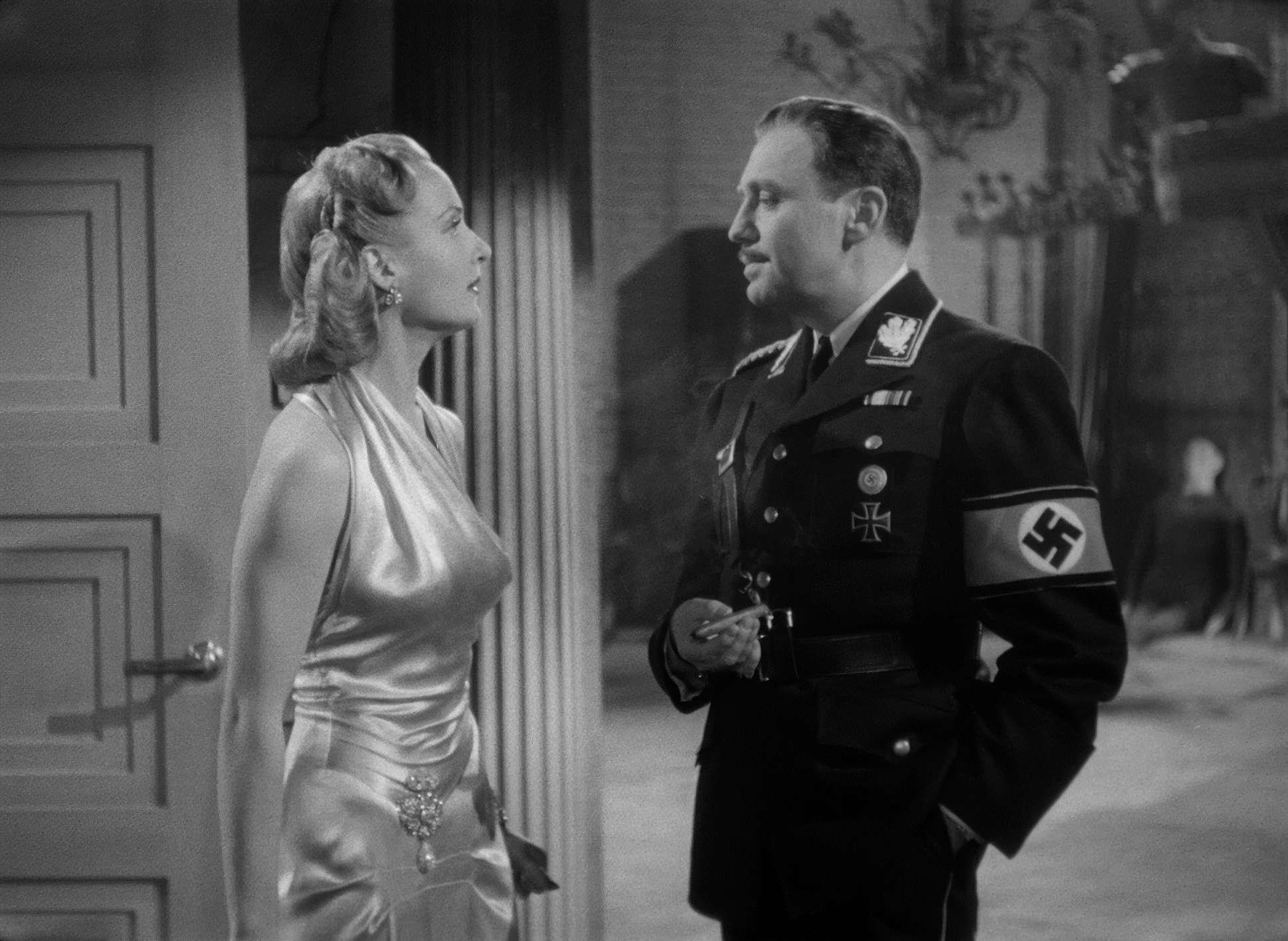
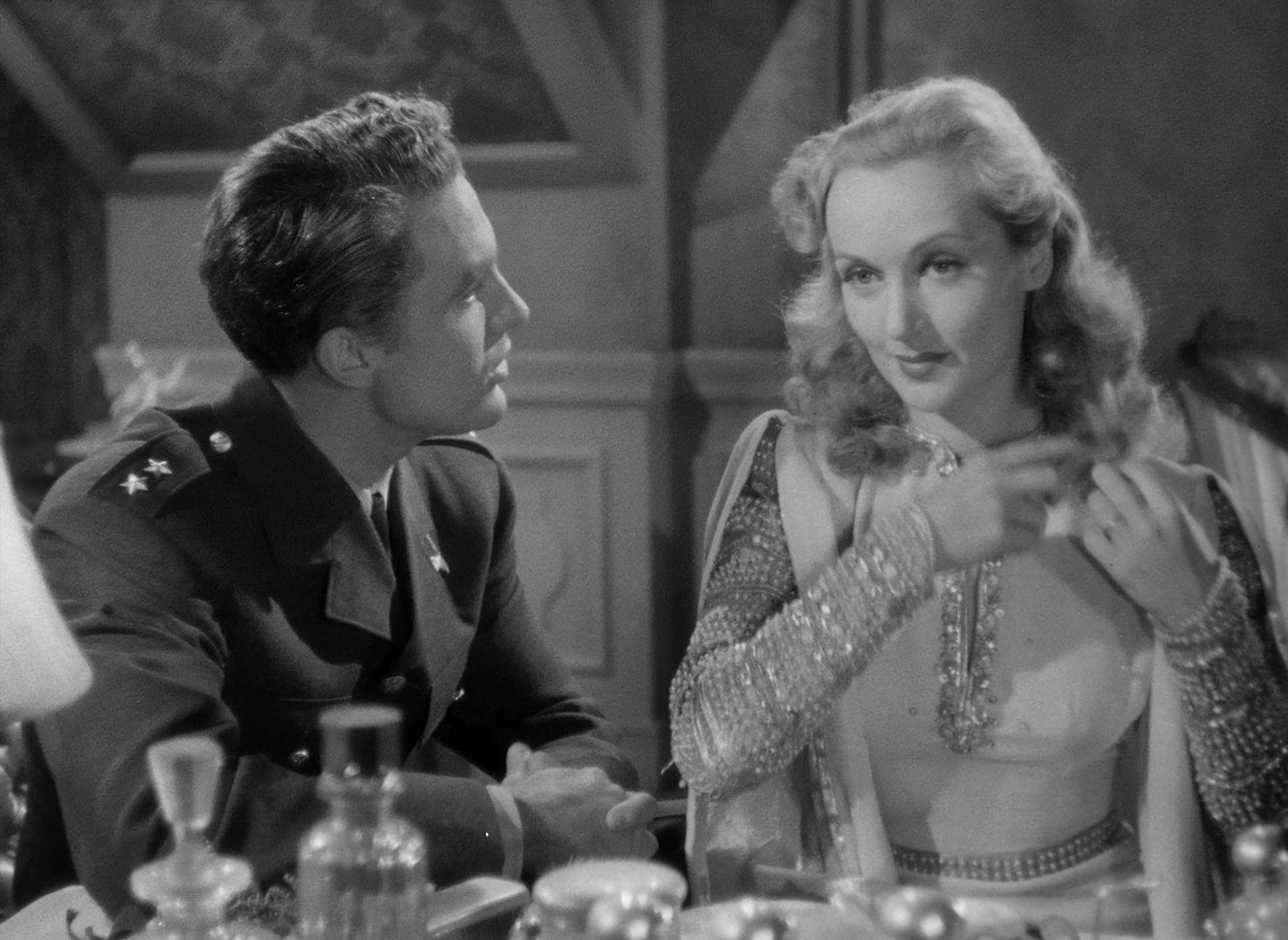
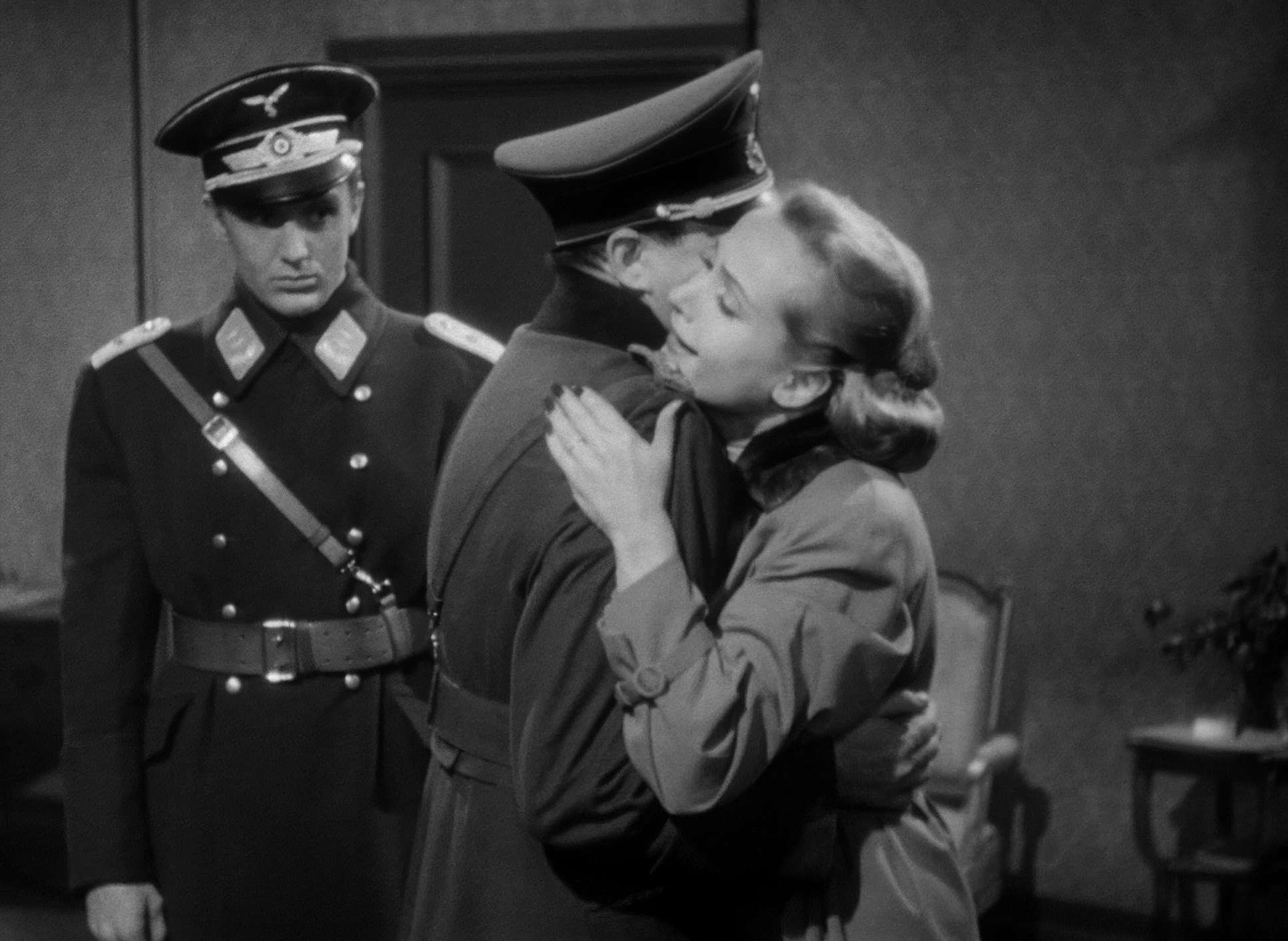
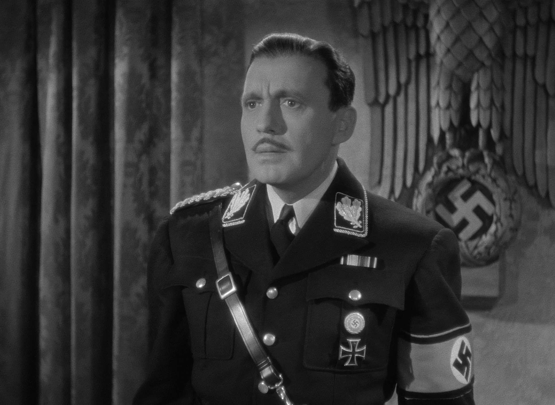
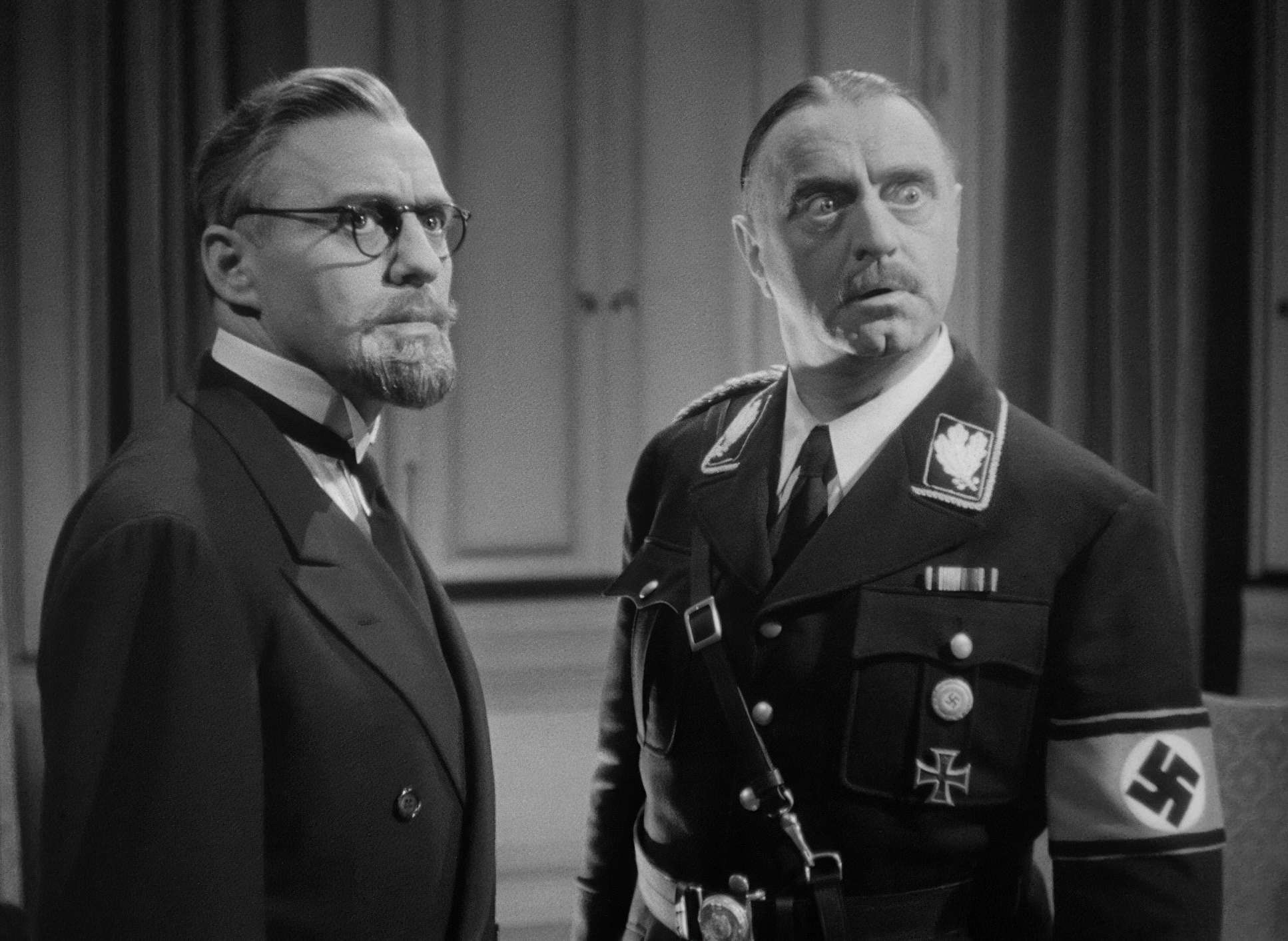
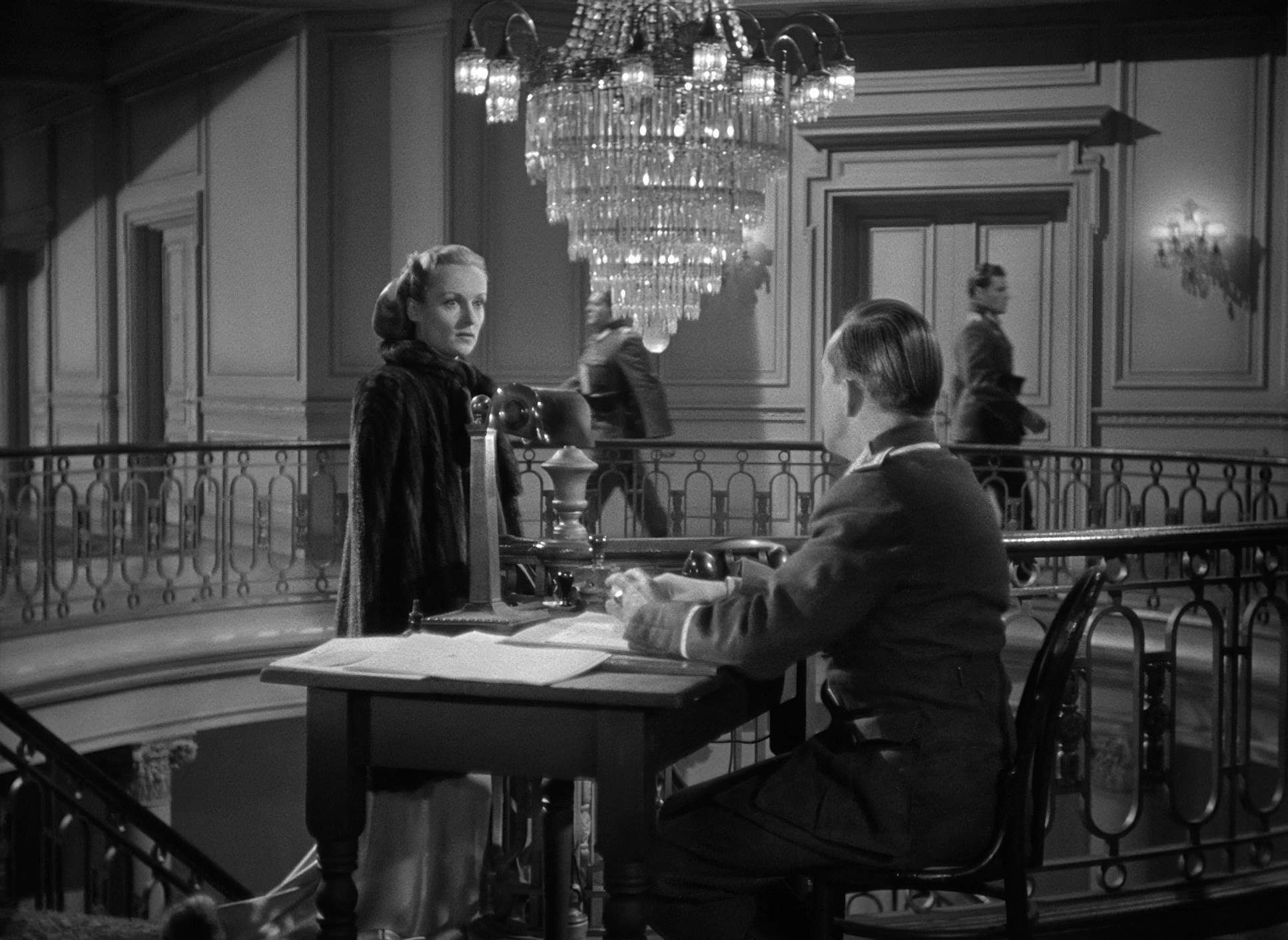
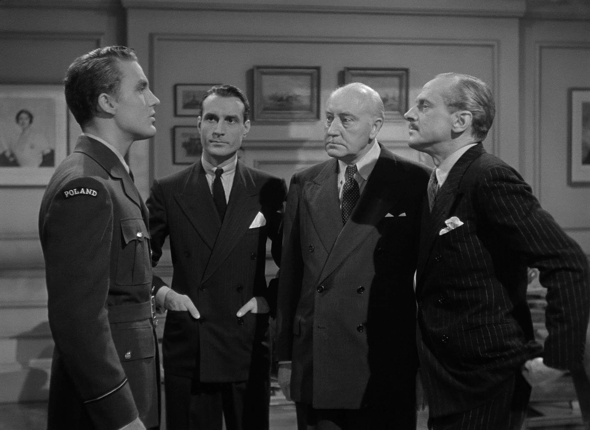
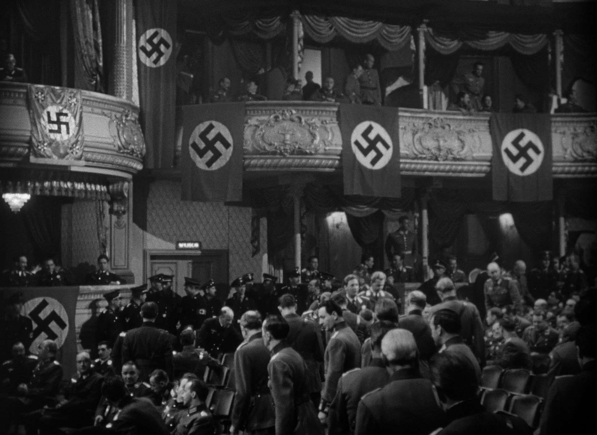
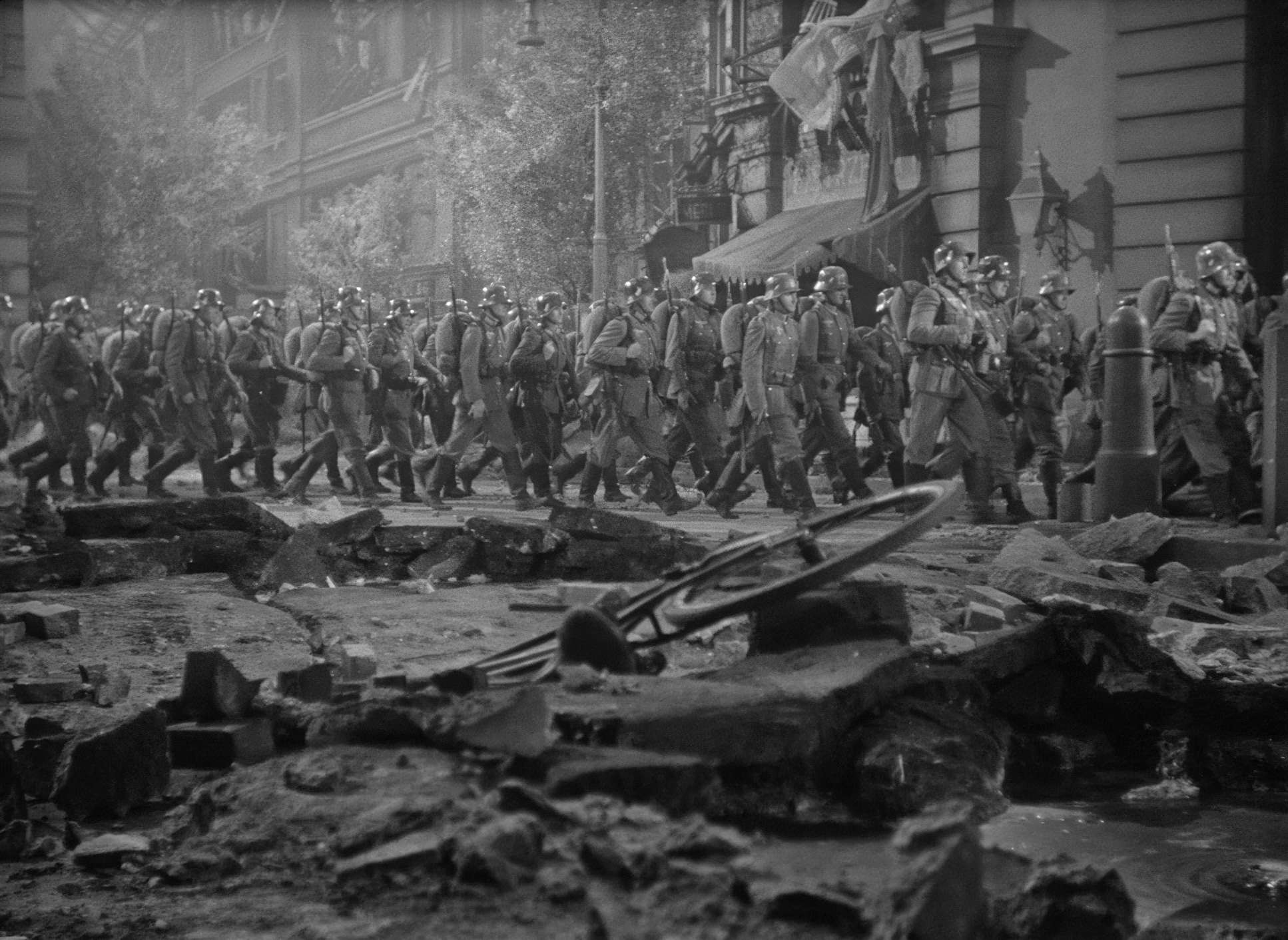
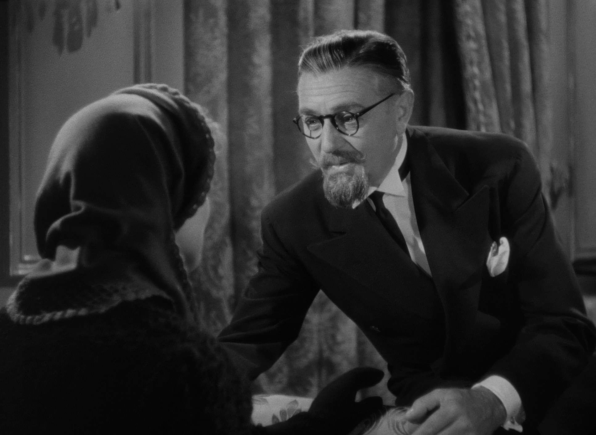
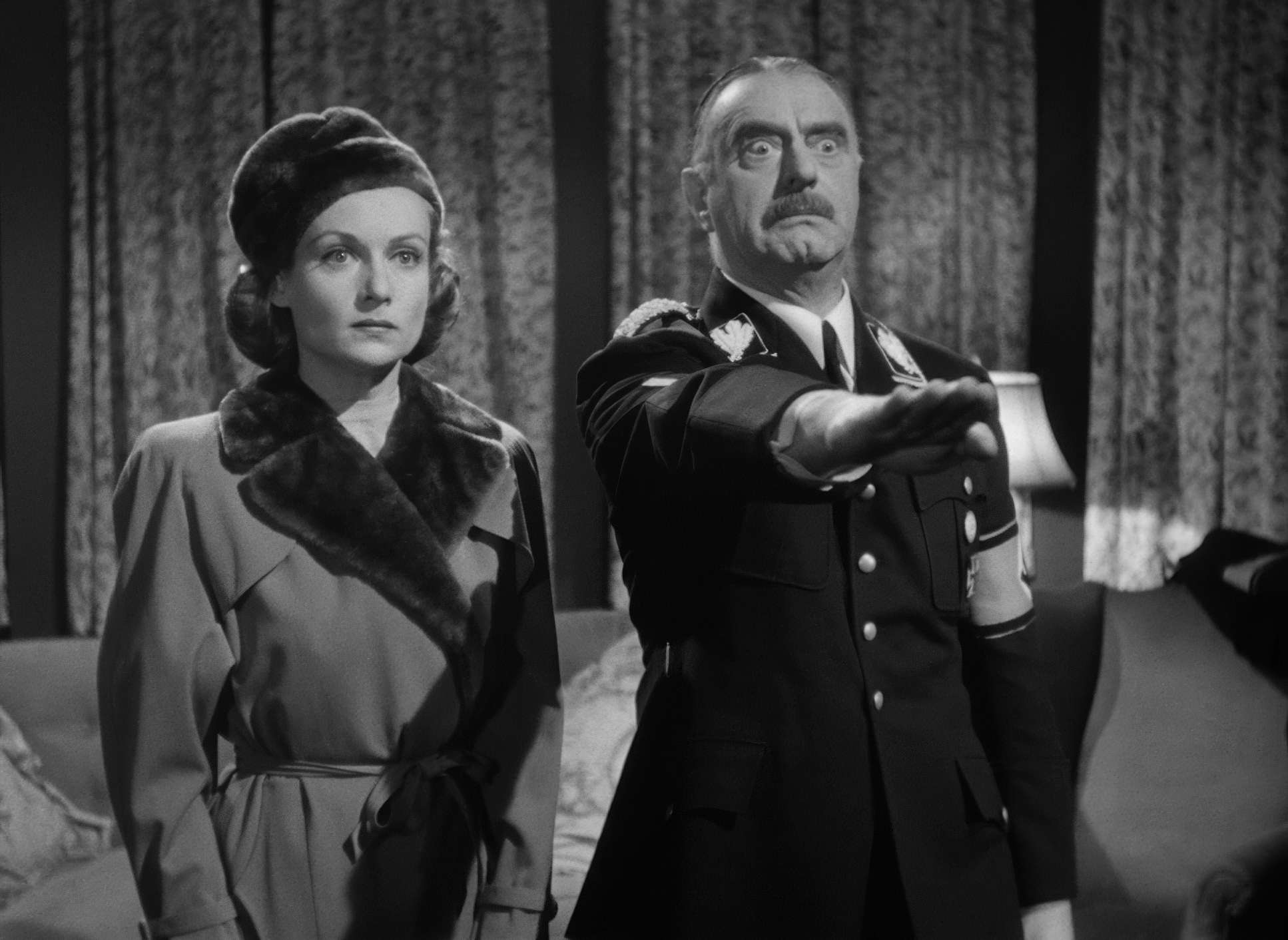
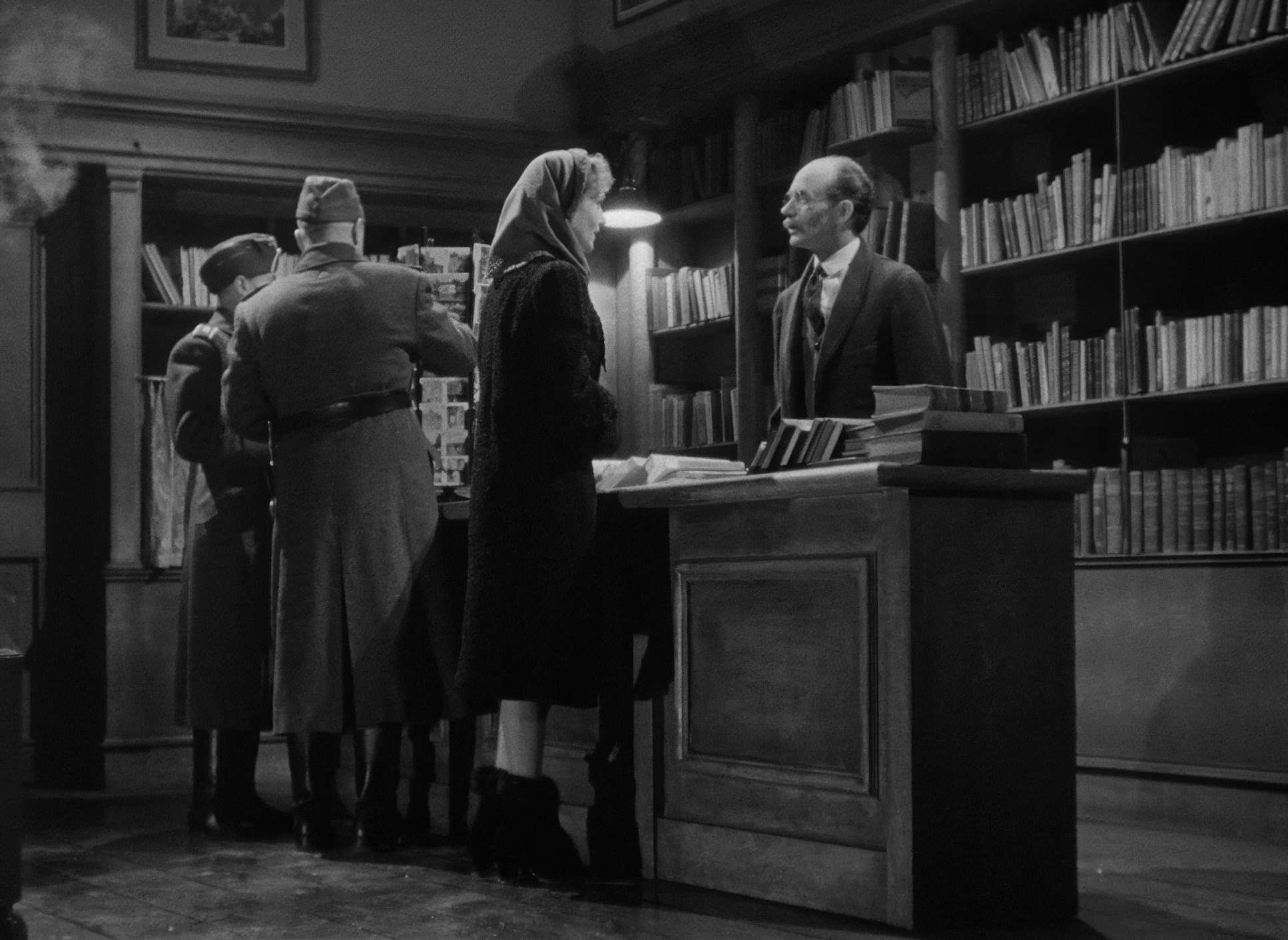
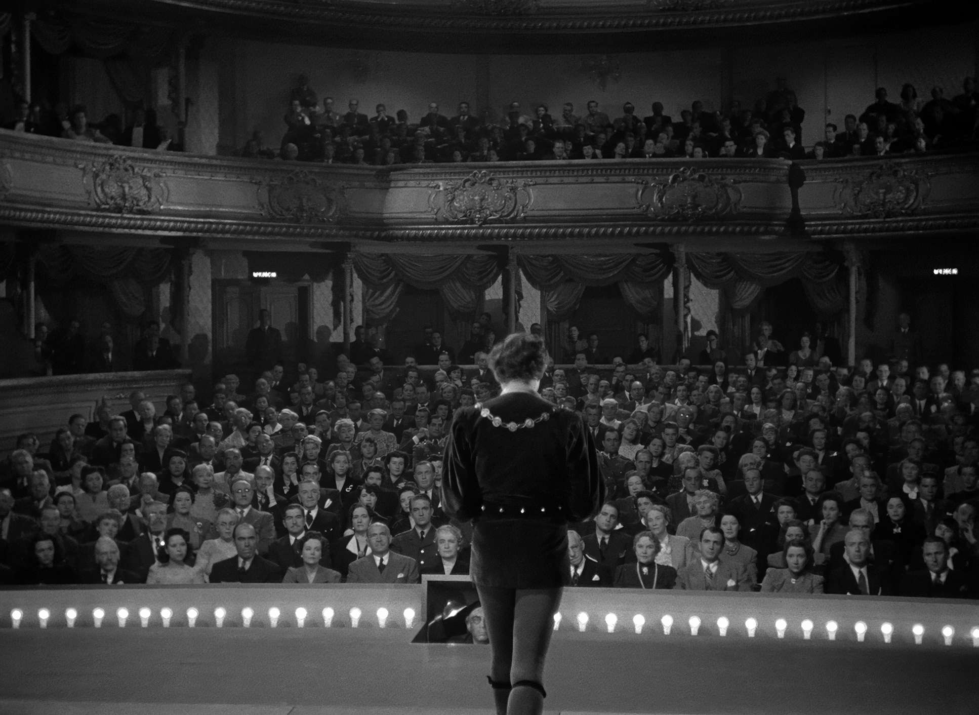
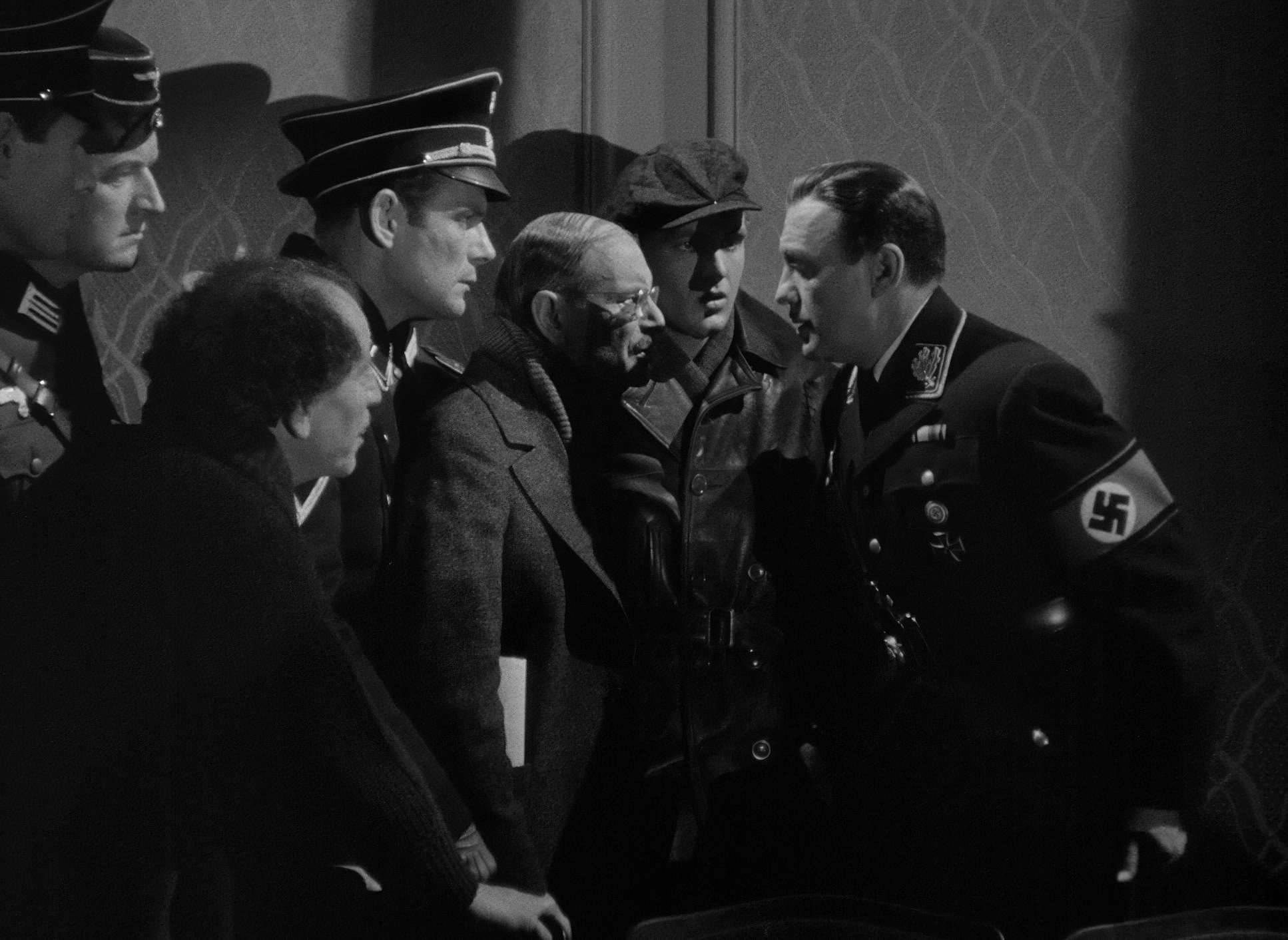
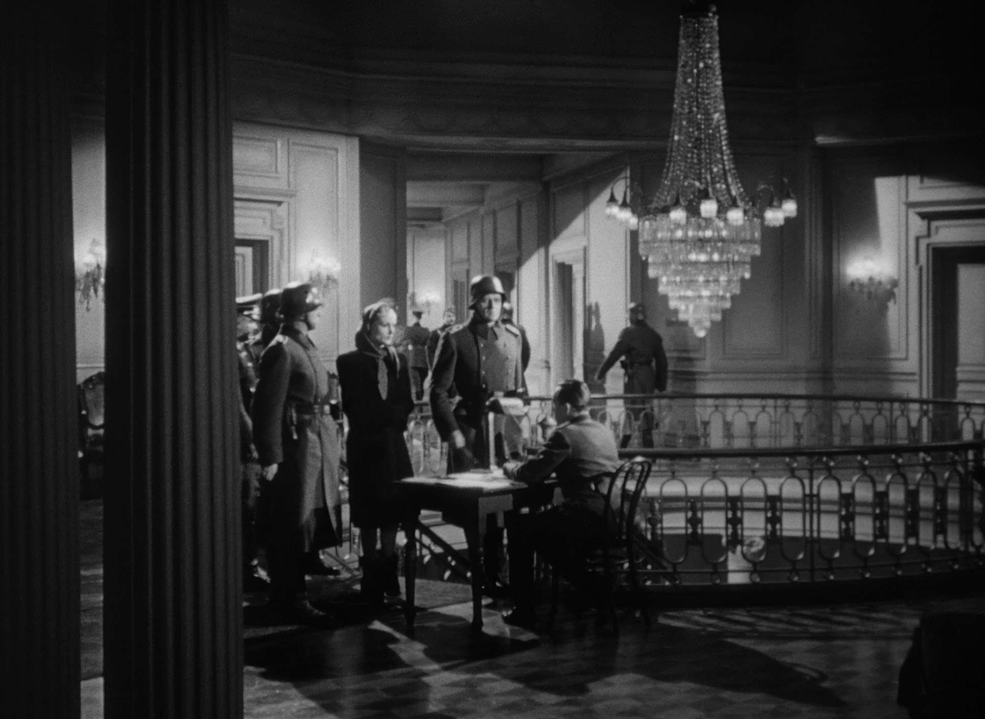
When we’re in the theatre, the light is artificial footlights and harsh backlighting that create these elongated, stagey shadows. But when the Nazi threat becomes real, the light gets colder and more unforgiving. Take a look at how Professor Siletsky is lit: heavy shadows around the eyes, making him look untrustworthy from the jump. It’s not subtle, but it’s effective. Maté used light as a moral compass for the audience.
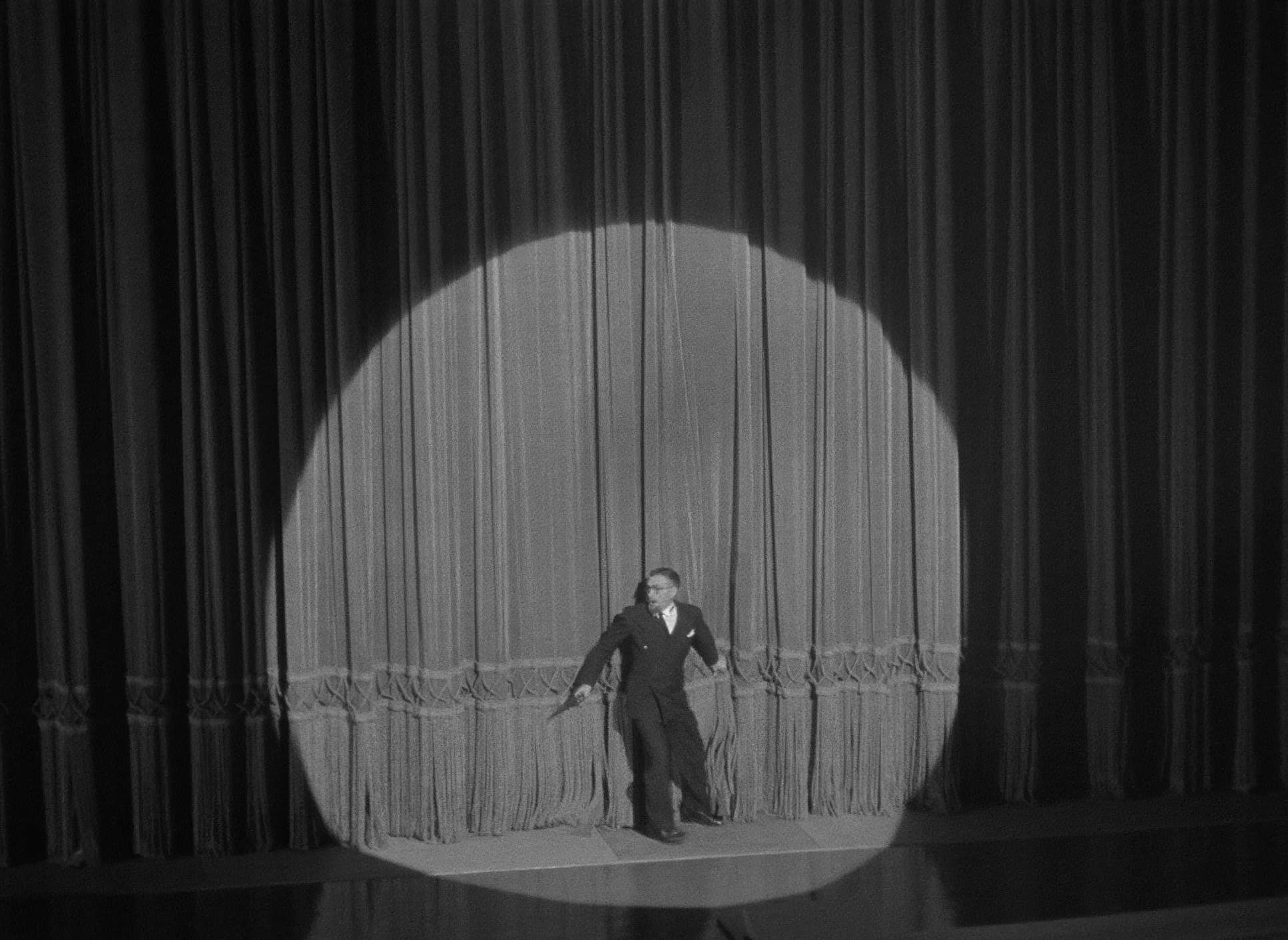
Compositional Choices

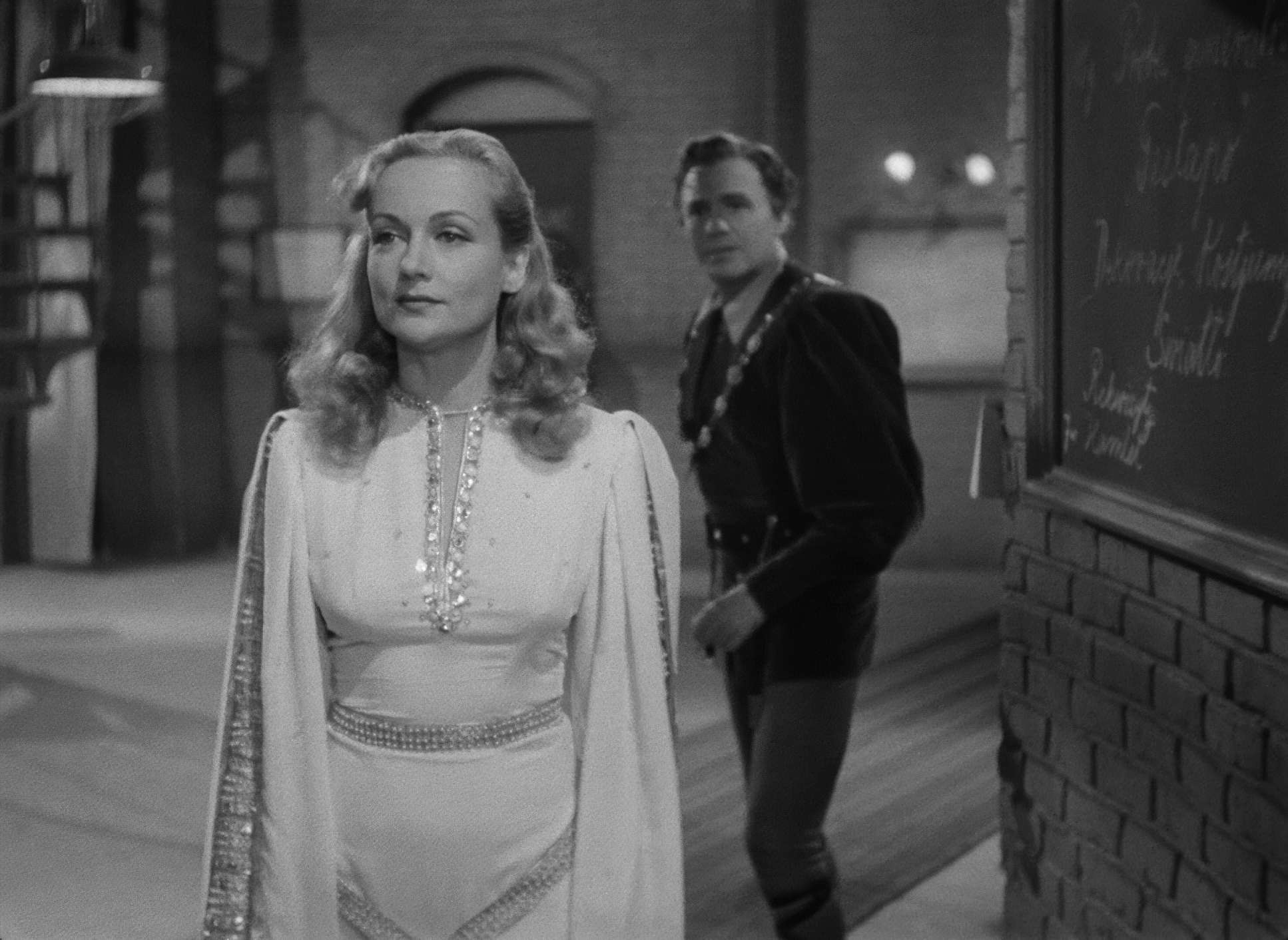
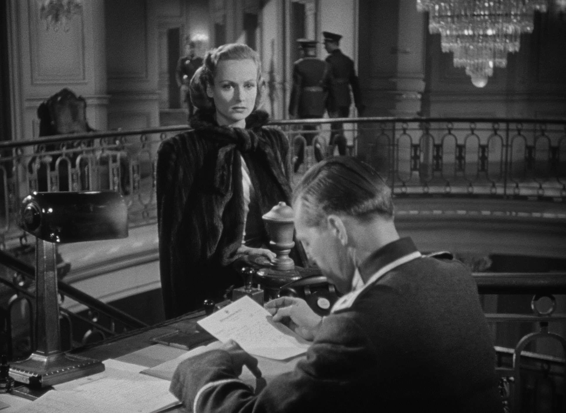
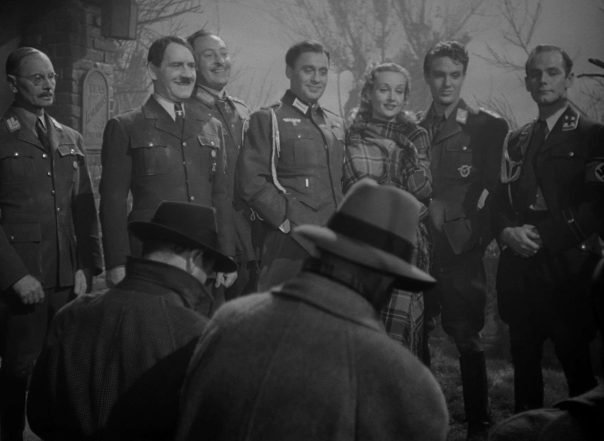
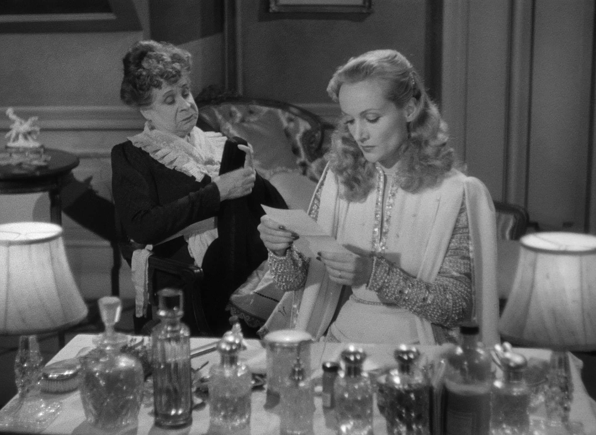
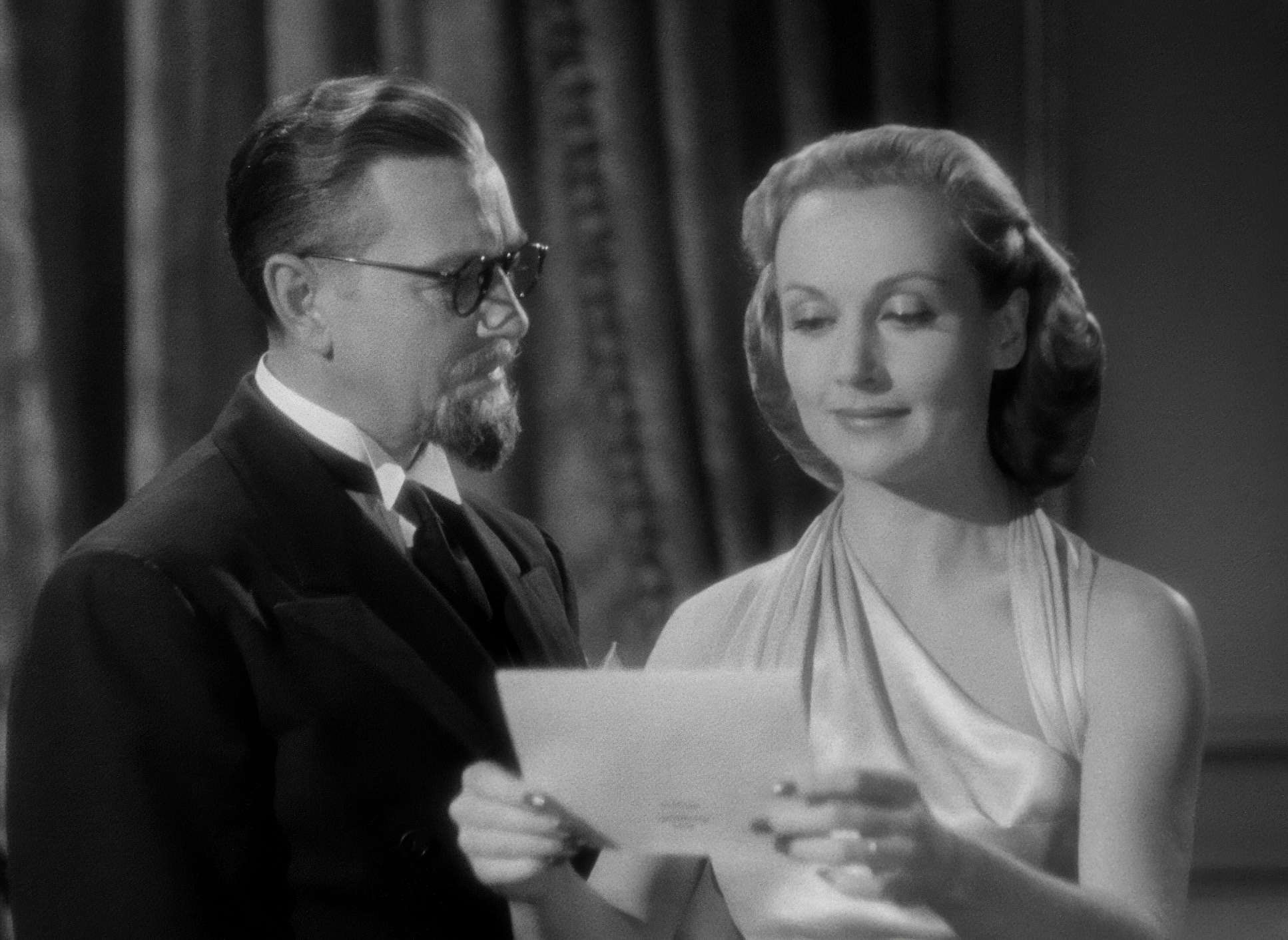
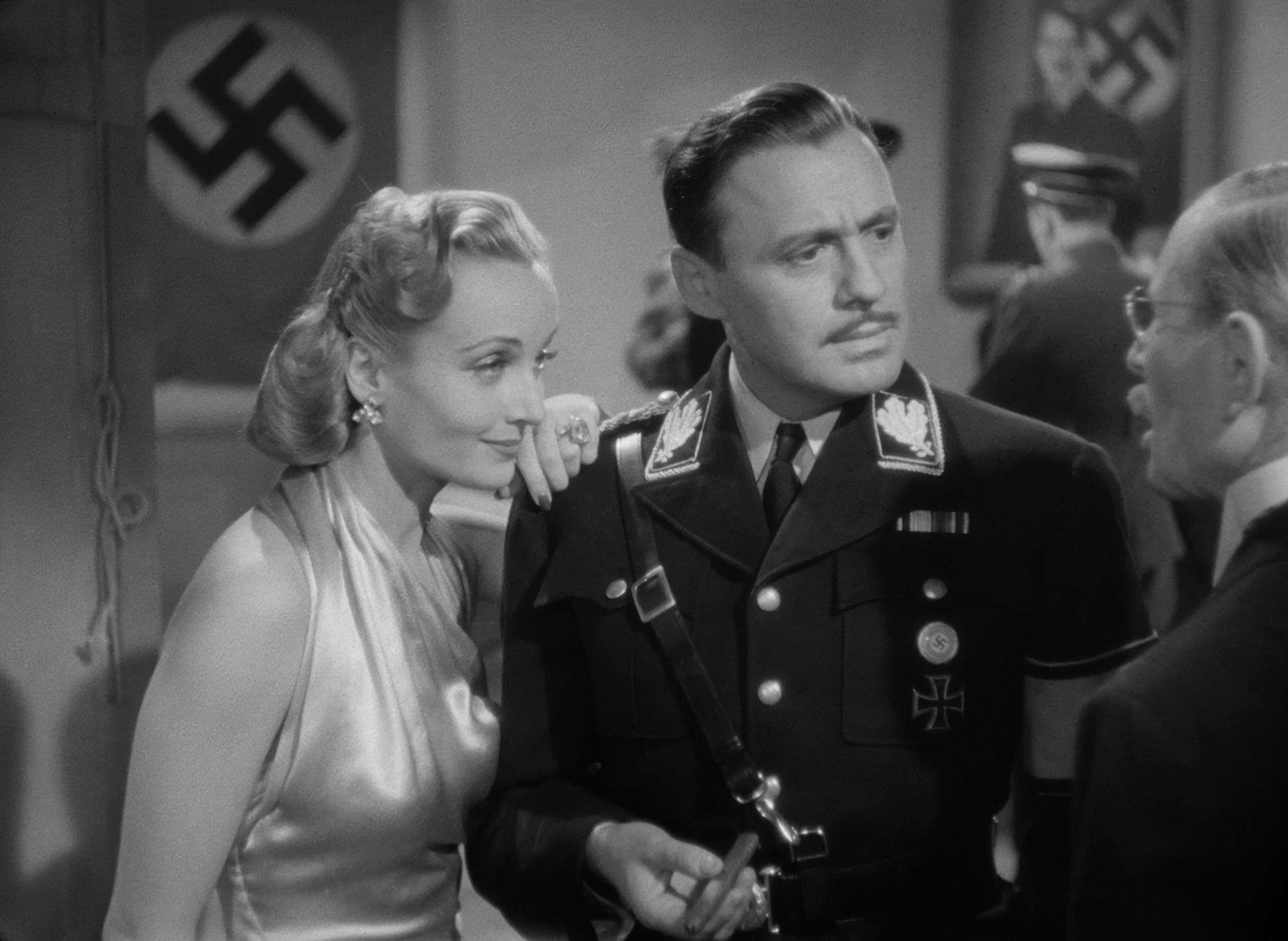
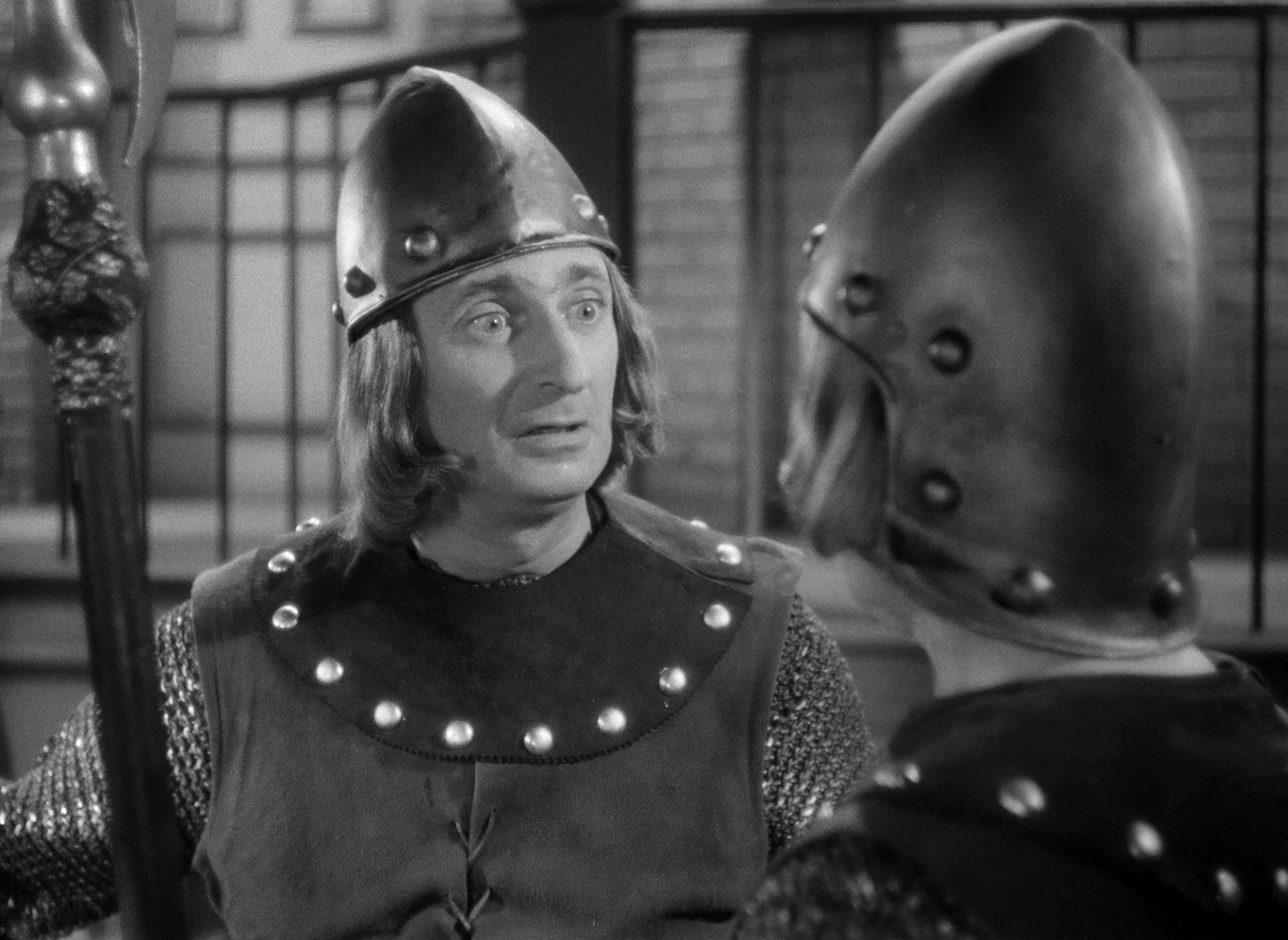
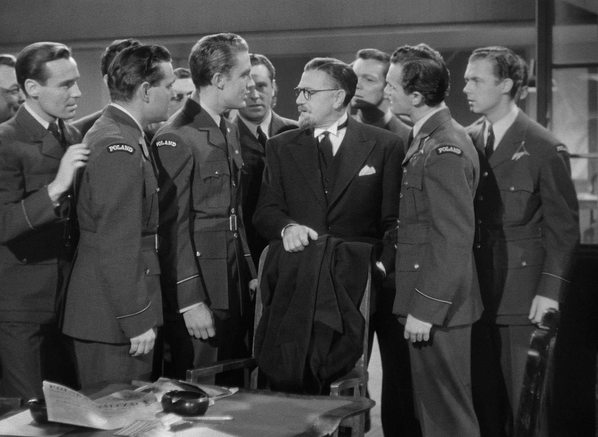
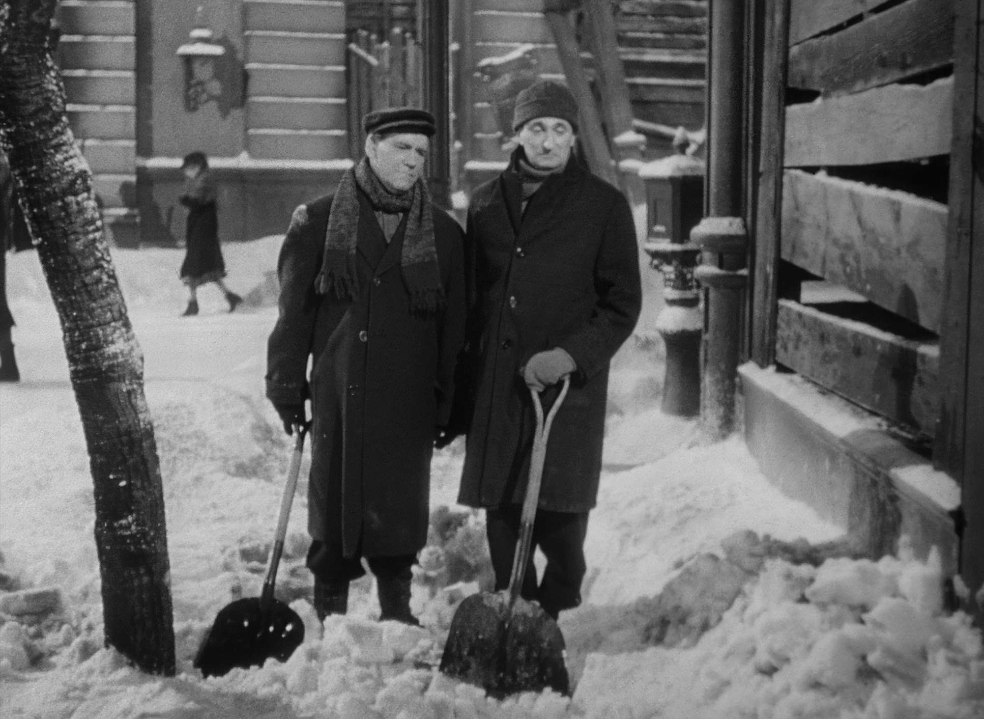
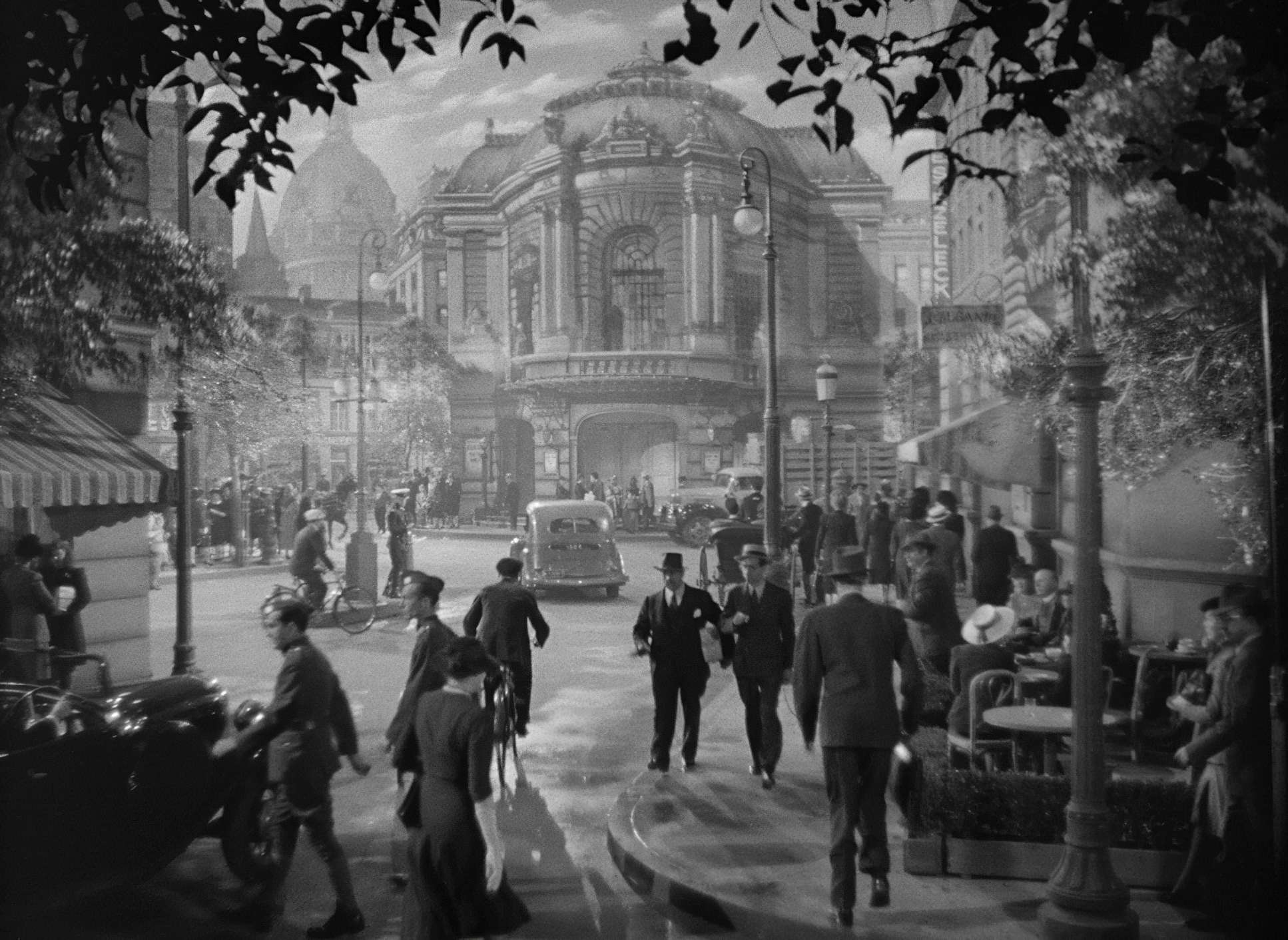
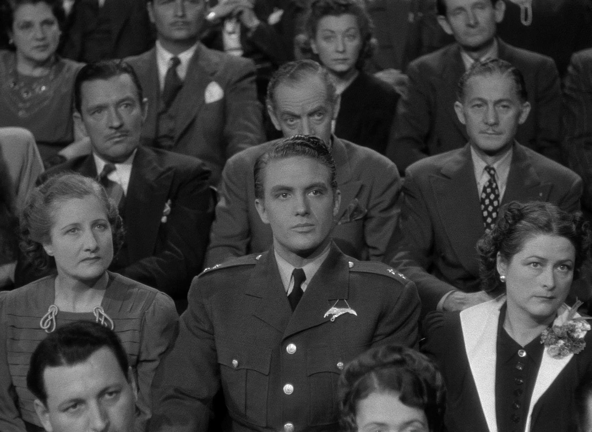
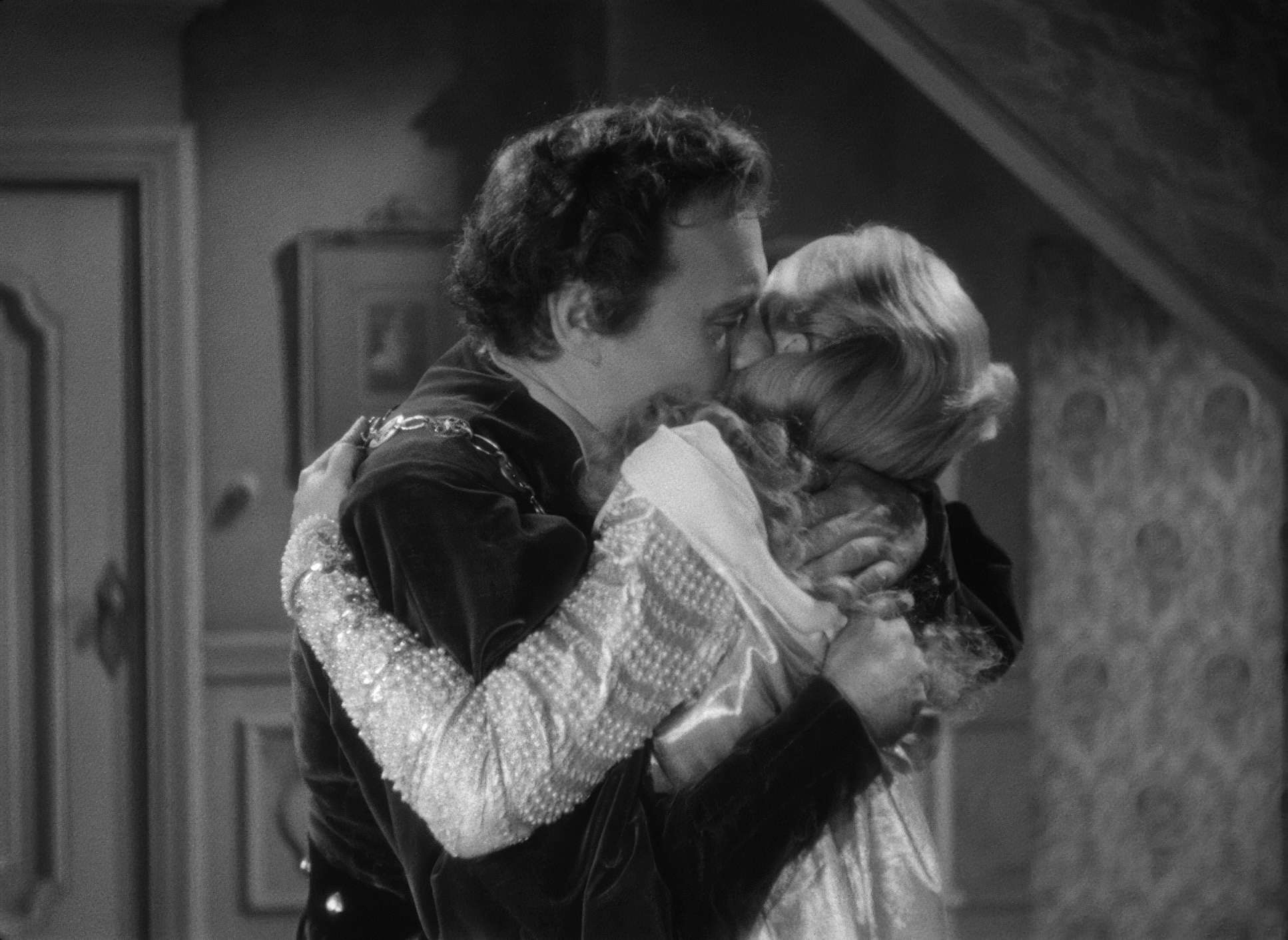
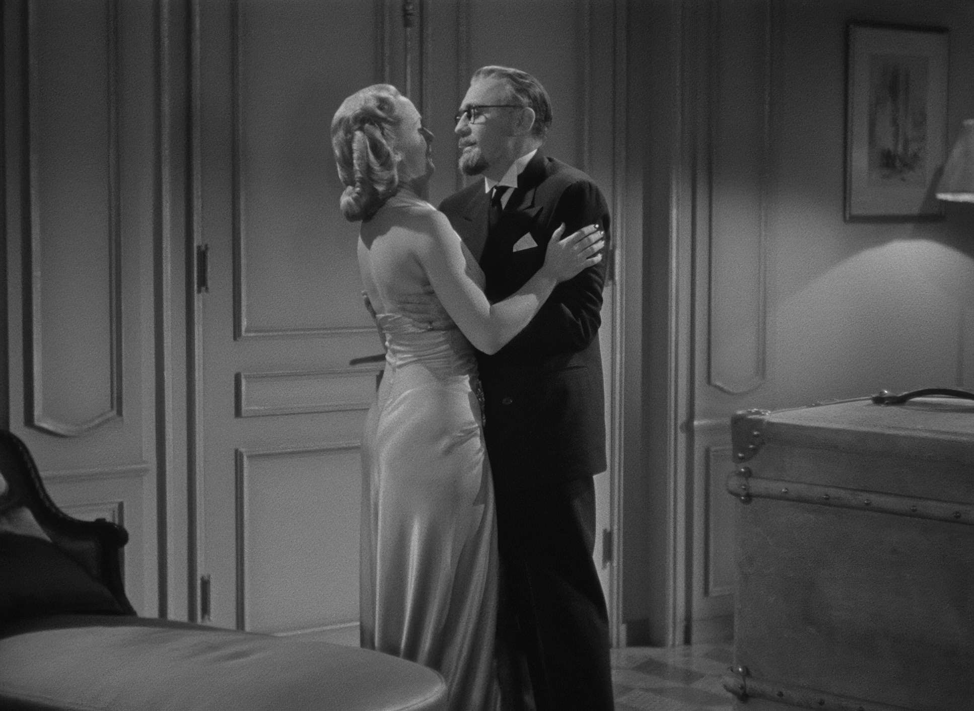
Maté’s frames are crowded and busy, which fits the chaotic energy of a farce. He loved deep staging. You’ll often see a character in the foreground reacting to something in the mid-ground, while a third person is doing something crucial in the background. It keeps the energy high without needing a lot of fast cuts.
He also used the architecture of the sets doorways and proscenium arches to constantly remind us that these characters are always on a stage, even when they’re in their own apartments. It’s a “balanced” composition for the most part, but there’s a tension there. You always feel like someone is watching, which is exactly how life under occupation feels.
Camera Movements

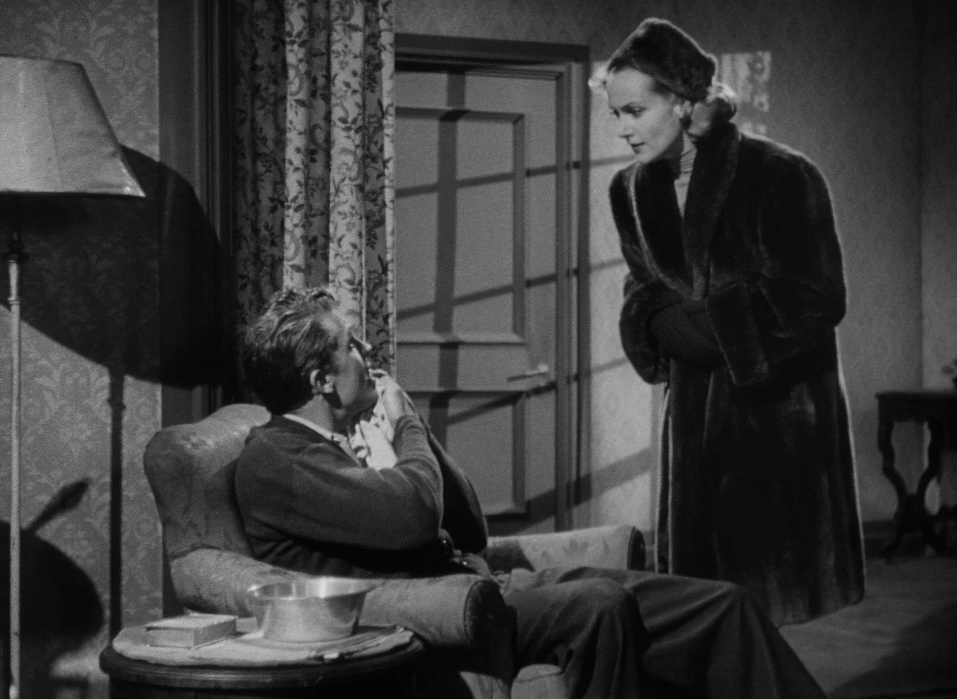
The camera moves in this film are precise, almost like choreography. There’s no Steadicam or handheld jitters here; just smooth, purposeful dollies and pans.
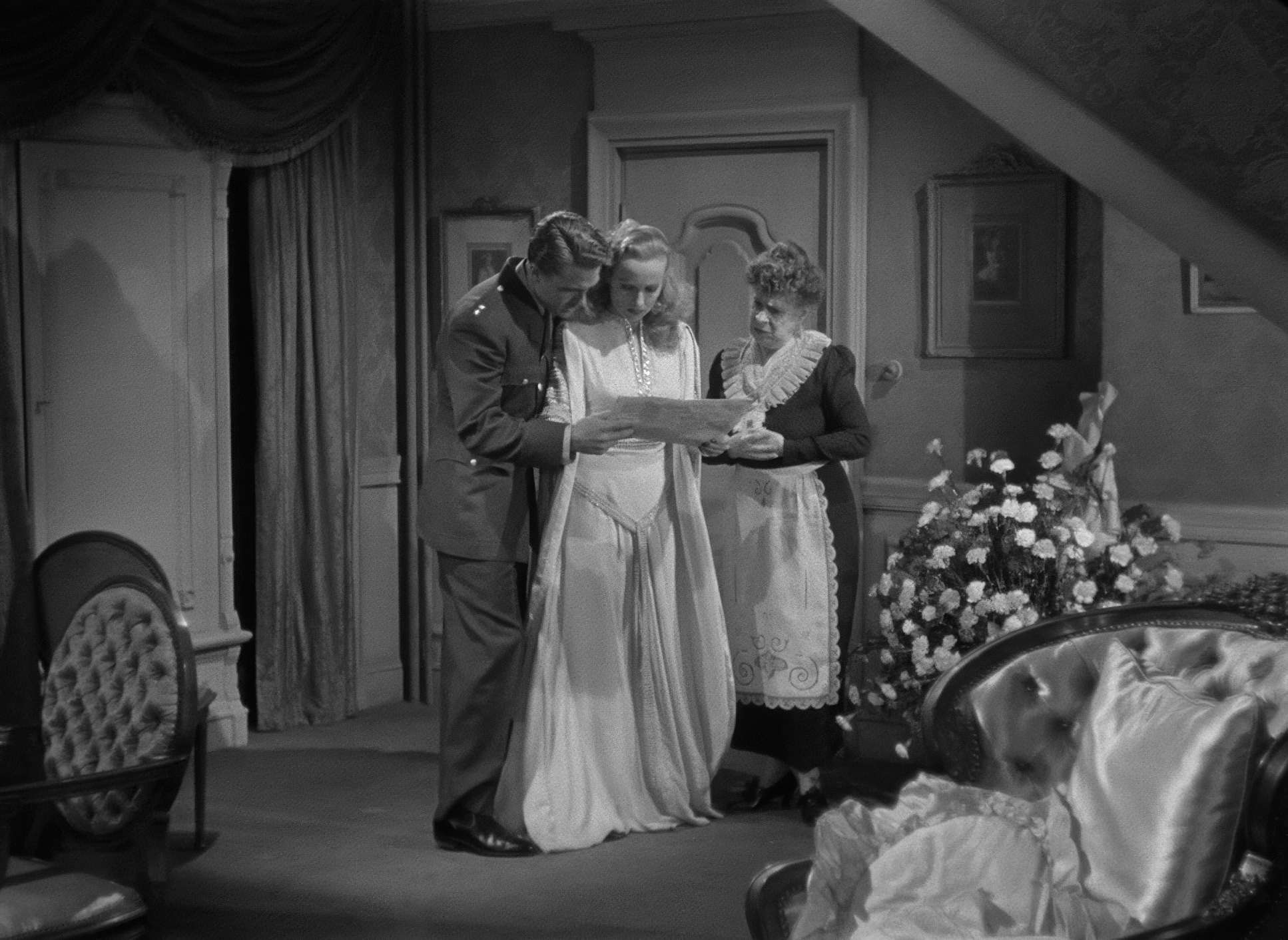
One of the best examples is the sequence where Maria Tura leaves her husband on stage mid-soliloquy. The camera follows her through the backstage labyrinth to her dressing room. It’s a long, fluid movement that connects the public performance to her private life. It makes us feel like we’re part of the secret. The camera isn’t just a witness; it’s a participant in the deception.
Lensing and Blocking

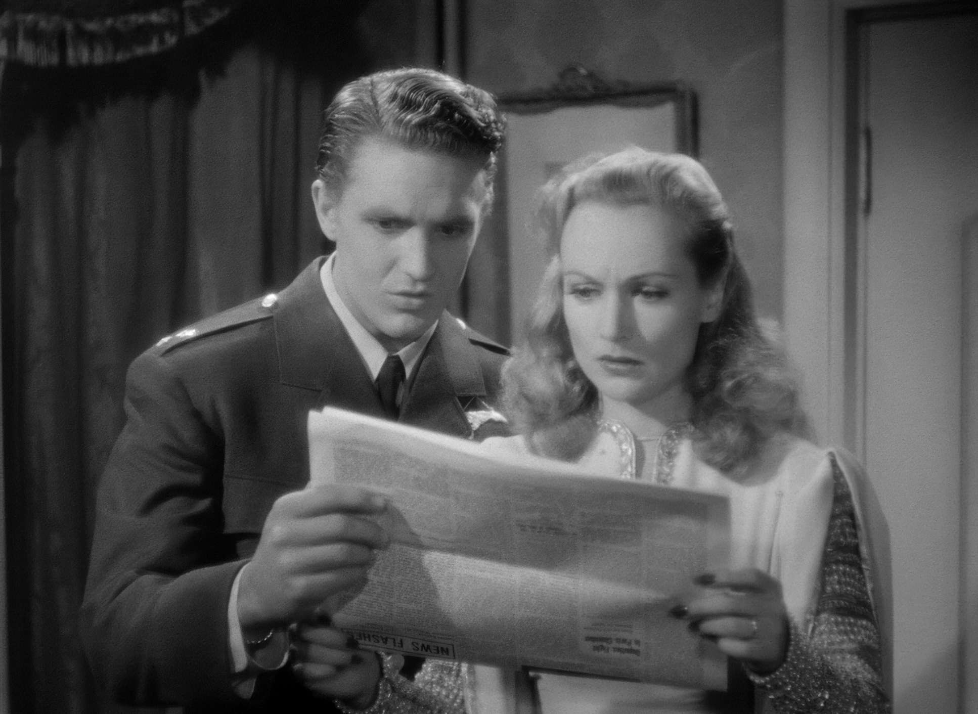
They mostly stuck to prime lenses nothing too wide or too long which keeps the perspective feeling natural. But the real magic is in the blocking. Farce depends on timing, and the visual timing here is airtight.
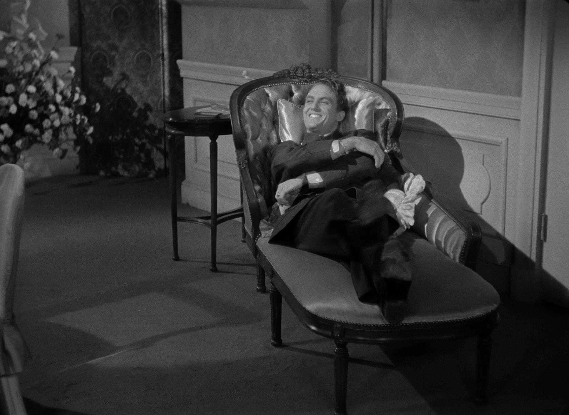
Characters are constantly positioned in a way that allows one person to set up a joke while another “reacts” in the same frame. For instance, the recurring “To be or not to be” gag works because of how the camera holds on Jack Benny, allowing us to see his ego inflate just before someone in the background punctures it. It’s simple, effective, and honestly, a bit of a flex in terms of staging.
Inspiration Behind the Cinematography

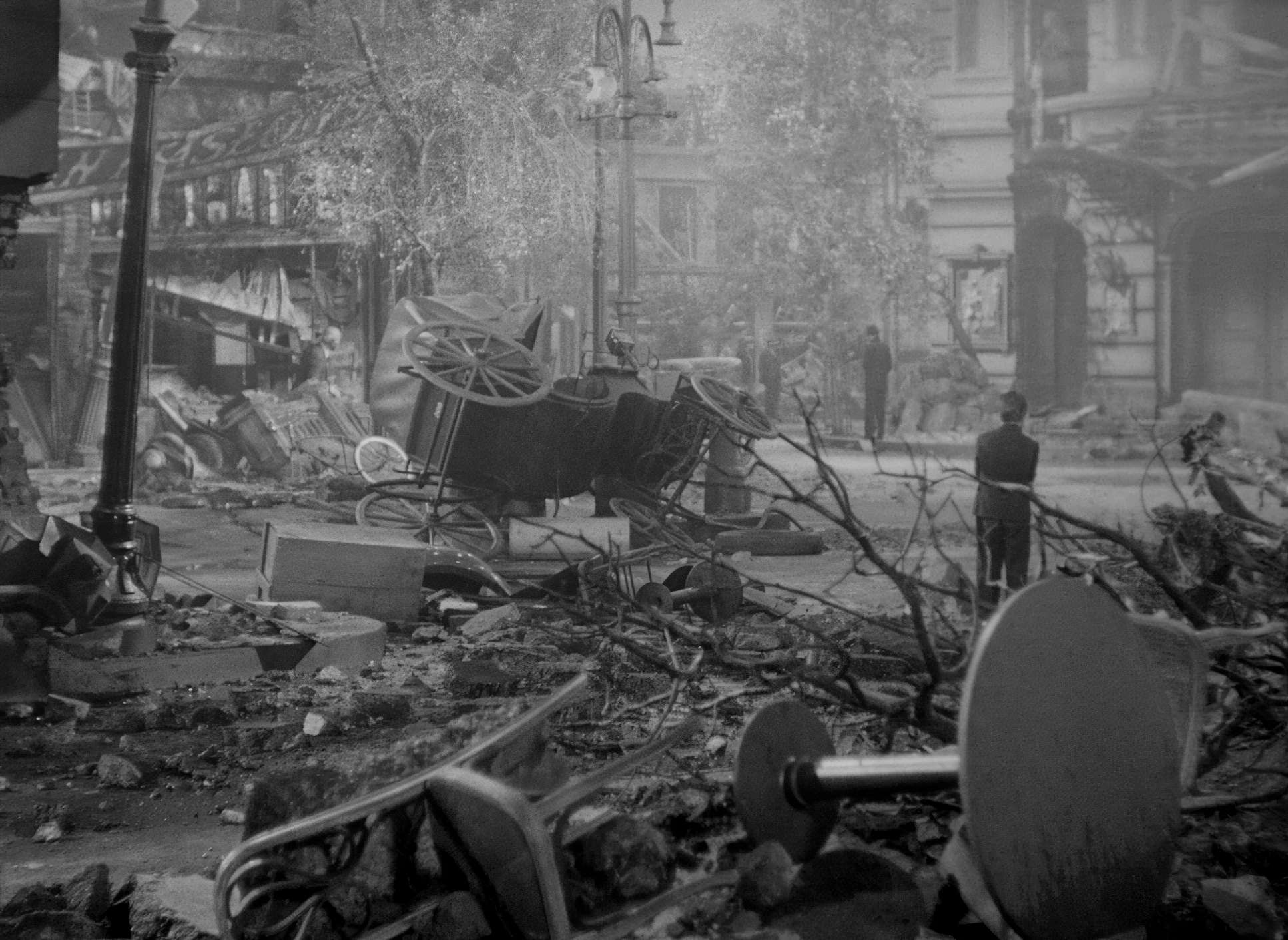
The whole visual identity of this film is built on the idea that the line between “theatre” and “reality” is paper-thin. The film starts with what looks like a Nazi invasion, only to pull back and show us it’s just a rehearsal. That visual rug-pull sets the tone for everything that follows.
Maté had to make the “fake” Nazis look just as convincing (or as ridiculous) as the “real” ones. The idea that acting is a skill that can win a war isn’t just a plot point it’s a visual directive. The camera frames the actors with a precision that makes their lies believable. It’s a dark mirror, showing that the absurdity of fascism is just another form of bad theatre.
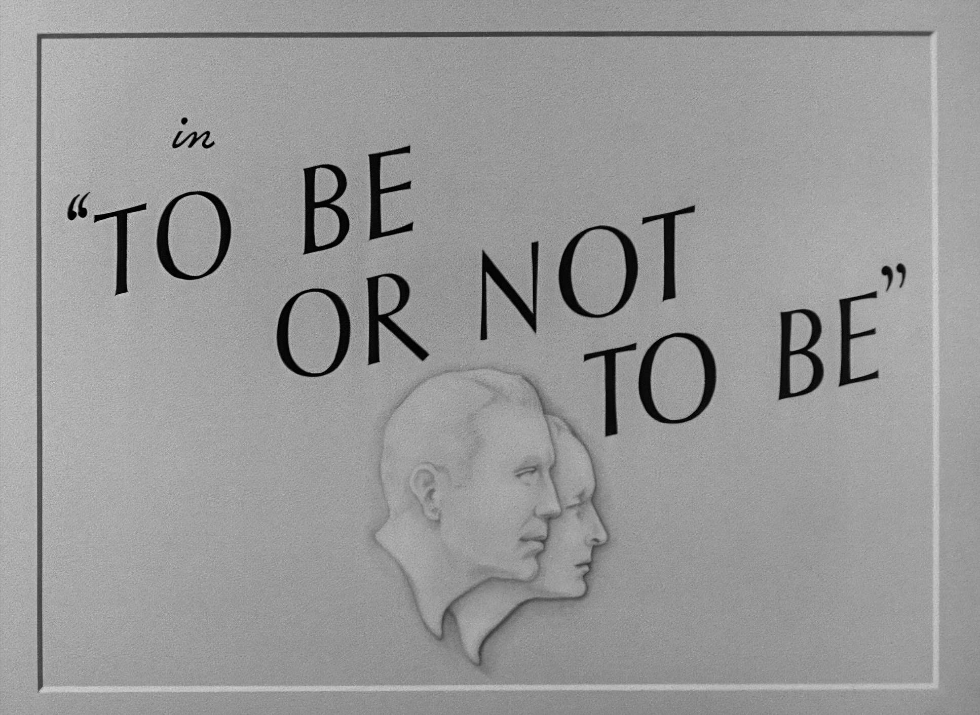
To Be or Not to Be (1942) Film Stills
A curated reference archive of cinematography stills from To Be or Not to Be (1942). Study the lighting, color grading, and composition.


- Also read: THE MESSAGE (1976) – CINEMATOGRAPHY ANALYSIS
- Also read: WOLF CHILDREN (2012) – CINEMATOGRAPHY ANALYSIS
Browse Our Cinematography Analysis Glossary
Explore directors, cinematographers, cameras, lenses, lighting styles, genres, and the visual techniques that shape iconic films.
Explore Glossary →