John Huston’s The Treasure of the Sierra Madre (1948) classic isn’t just a great story about greed; it’s a masterclass in visual storytelling. Every frame, every hard shadow, and every composition works to twist the knife of paranoia. It’s one of those rare films that is an undisputed classic, but after digging into it again through the lens of a colorist, I realized why: the cinematography isn’t just capturing the action it is the narrator.
About the Cinematographer
The visual architect behind The Treasure of the Sierra Madre was Ted McCord. McCord might not have the instant name recognition of a Gregg Toland, but his work here is nothing short of brilliant. He had a long career at Warner Bros. and understood the studio system’s demand for efficiency, but under Huston’s direction, he did something different. He stopped trying to make it look “pretty.”
Huston, known for films like The Maltese Falcon, was obsessed with moral ambiguity. He needed a visual language that matched that grittiness. What strikes me about McCord’s work here is the raw, almost documentary-like authenticity. This wasn’t about the glamour lighting typical of the 1940s. It was about stripping away the theatricality much like Huston told his father, Walter Huston, to lose his “actor’s voice” and applying that same ethos to the lens. The result is a naturalistic, yet deeply expressive black-and-white aesthetic that feels timeless.
Inspiration Behind the Cinematography
The core inspiration for the visual design truly comes from the setting itself. Huston wasn’t just making an adventure film; he was crafting a “grim meditation on paranoia,” based on B. Traven’s elusive novel. To get that right, you can’t shoot on a soundstage in Burbank.
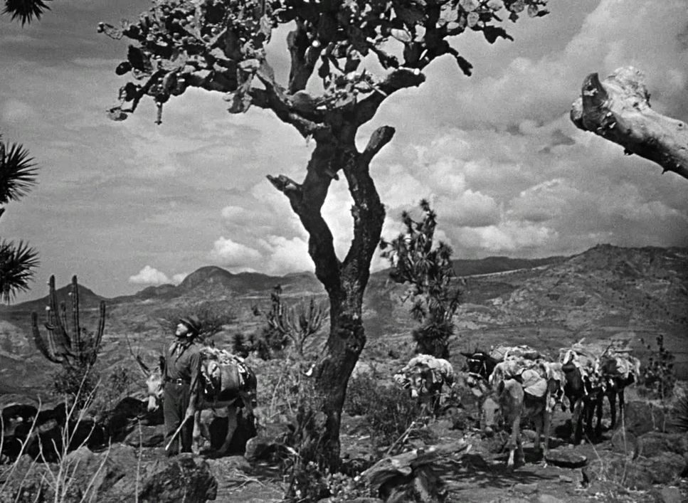
A huge part of the The Treasure of the Sierra Madre visual power comes from its commitment to shooting on location in the Sierra Madre Mountains of Mexico. You simply cannot fake that texture. The sheer scale and unforgiving nature of the landscape become a character in the film. The photography captures the brutality of the environment the dust, the relentless sun, the jagged rocks. It creates a “cynical noir look” under the blazing sun, setting the stage for the moral decay that follows.
The decision to shoot in black and white was pivotal. While a modern studio might push for color to show off the “gorgeous scenery,” the monochrome palette here acts as an abstraction layer. It turns sunlight into a stark, relentless glare and shadows into deep voids. It focuses the eye on textures and contrast rather than hues, amplifying the film’s core ideas of isolation and the twisting of the human spirit.
Camera Movements
When I watchThe Treasure of the Sierra Madre, I notice that the camera movements or often the lack thereof are incredibly deliberate. This isn’t a movie that relies on showy crane shots. The movement is psychological.
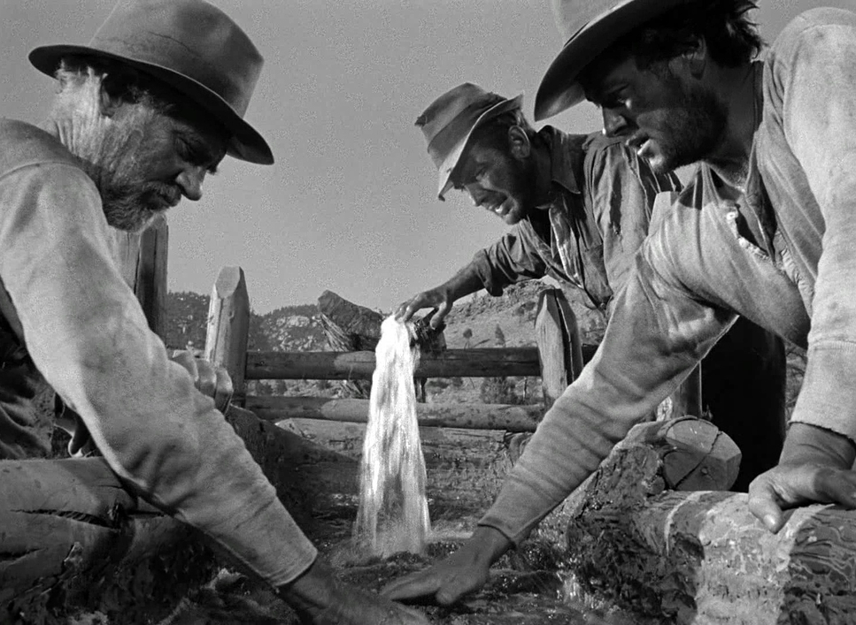
Take the establishment of the mining camp. We see static wide shots, or perhaps a slow, deliberate pan that emphasizes the emptiness surrounding these men. It reinforces their isolation. When they are breaking rock, the camera is often locked down, patiently observing the labor. It forces us to feel the weight of the work.
But then, watch closely as Dobbs (Humphrey Bogart) starts losing his mind. The camera begins to shift. It’s subtle a very slow push-in on his face during a tense silence, or a slight creep that isolates him in the frame. It’s not an overt “dolly zoom” effect; it’s a quiet visual cue that his sanity is slipping.
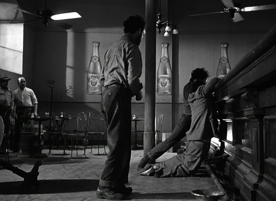
The bar fight scene is where the camera suddenly wakes up. Huston and McCord drop the camera to a low angle, giving us a visceral, ground-level perspective. The background windows are blown out, and the camera stays close to the punches. It’s chaotic and immediate, a sharp contrast to the slow, observational style of the mountain scenes. This shift in kinetic energy is pure visual storytelling.
Compositional Choices
The compositional genius here lies in how the frame is used as a psychological pressure cooker. McCord masterfully frames these prospectors against the immense, indifferent landscape.
In the beginning, the “gorgeous” mountain shots are almost always extreme long shots. The men are tiny specks against the horizon. It’s a powerful metaphor: their ambition is massive, but they are insignificant against nature. It makes the quest for gold feel almost absurdly small.
As the paranoia sets in, the focal lengths seem to tighten. We move from wide, open spaces to claustrophobic two-shots and close-ups. When they are sitting around the fire, the framing becomes intense. The composition forces us to look at the suspicion in their eyes.
I also love the high-contrast composition in the interiors. In the bar fight, those “blown out windows” aren’t a mistake they are a classic noir technique. By overexposing the background, McCord creates a silhouette effect that isolates the characters and focuses our attention purely on the violence. It strips away the world outside, trapping us in the room with them.
Lighting Style
As a colorist, even when I’m working with black and white, I’m always thinking about the “grade” which starts with lighting. Lighting dictates the contrast ratio, and McCord’s lighting here is a masterclass in motivated realism.
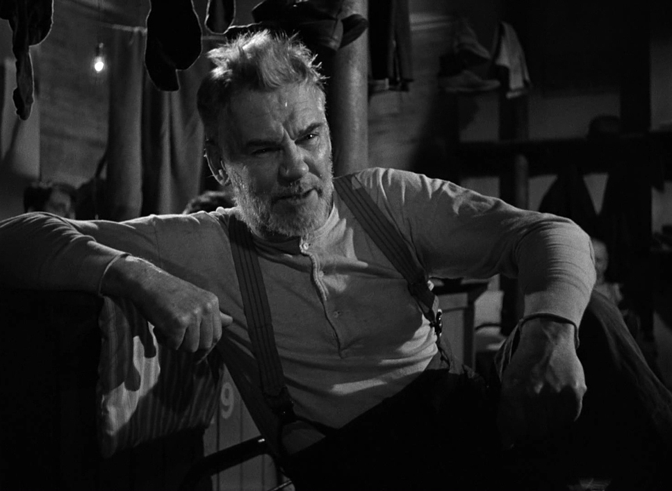
In the Mexican exteriors, the lighting is hard. It relies on the blistering sun, creating strong highlights and deep, hard shadows. It portrays the heat perfectly. You can practically feel the sweat and grit on the men’s faces because the light isn’t being softened or diffused; it’s hitting them straight on. It’s unromantic and honest.
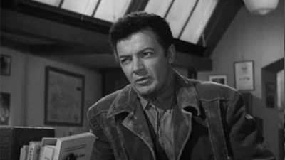
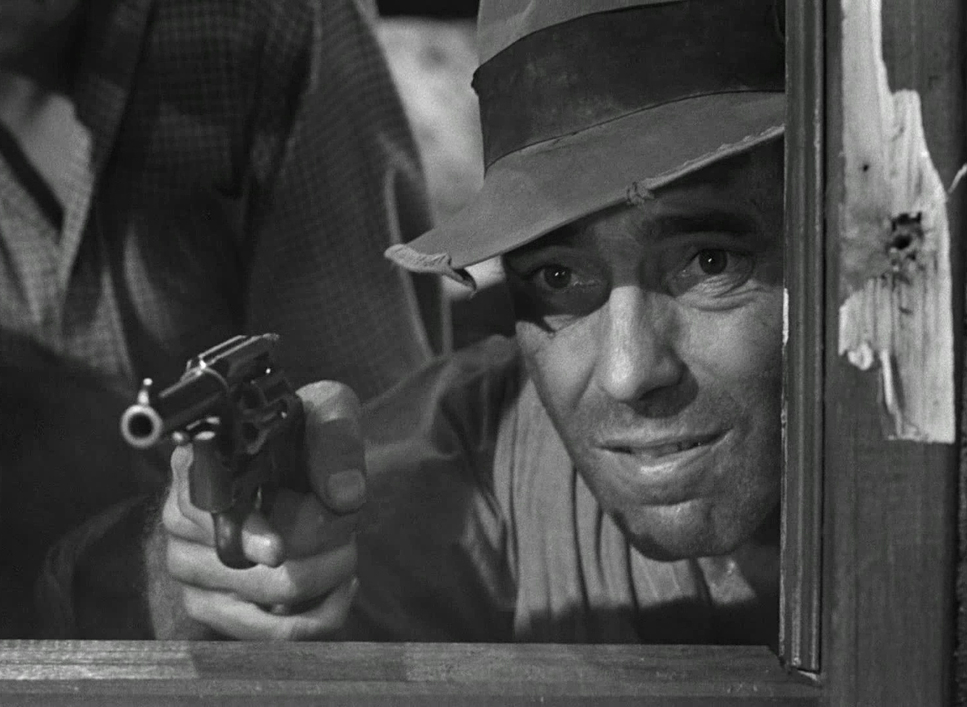
However, as the narrative descends into darkness, so does the lighting. We move into chiaroscuro territory. When Dobbs starts spiraling, the shadows literally begin to creep over his face. This is a deliberate choice to obscure his eyes or half his face in darkness, symbolizing his split psyche.
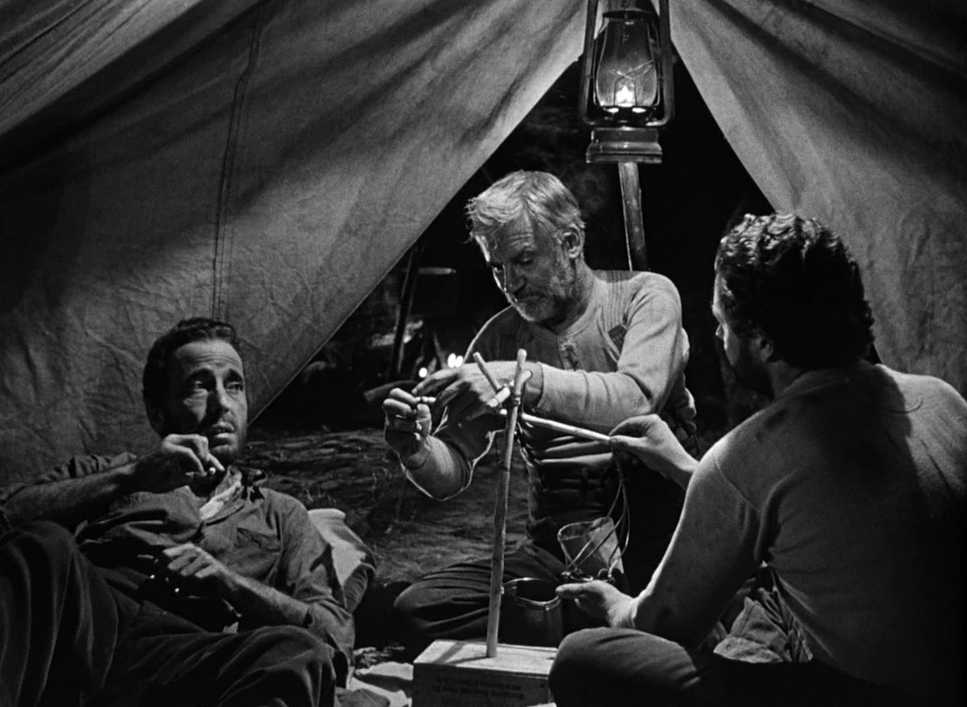
The campfire scenes are my favorite examples of this. The fire is the motivated source, casting flickering, grotesque shadows that dance across Bogart’s face. The catchlights in his eyes remain stark almost manic while the rest of his face falls into shadow. It creates a demonic look that tells you everything you need to know about his state of mind without him saying a word.
Lensing and Blocking
Blocking where the actors stand in relation to the camera is huge in The Treasure of the Sierra Madre. In a story about trust breaking down, physical distance equals emotional distance.
Initially, Dobbs, Curtin, and Howard are blocked together. They share the frame, often in medium shots, emphasizing their partnership. They occupy the same plane of focus. But as the gold piles up, the blocking shifts. Characters start standing further apart. Dobbs is often framed alone, or separated from the others by foreground elements.
The wardrobe and props play into this, too. Dobbs’ hat becomes a lighting tool. As he gets more paranoid, he tilts the brim lower. McCord uses this to cast a shadow over his eyes, literally darkening his character. It’s a brilliant integration of costume and cinematography.
Lens choices reinforce this isolation. While much of the film feels like it’s shot on standard primes (35mm or 50mm equivalents), you get the sense of subtle shifts. A slightly longer lens might be used to observe Dobbs from a distance, creating a voyeuristic feeling, while wider lenses in the tent scenes make the space feel smaller and more oppressive.
Color Grading Approach (in B&W)
You might ask, “Salik, how do you color grade a black-and-white movie?” But B&W is the ultimate grading challenge. It’s all about tonal sculpting. Since you don’t have color contrast to separate elements, you have to use luminance contrast.
When I look at this film, I see a specific curve. The “silvery glow” people talk about comes from careful control of the mid-tones. McCord likely used specific filters on the lens maybe a yellow or red filter to darken the blue sky and make the clouds pop, creating that dramatic separation.
If I were grading this in Resolve today, I’d be looking at the waveform and seeing a massive dynamic range. In the desert, they let the highlights clip. Those “blown out” whites aren’t technical errors; they are creative choices to emphasize the harshness of the sun. Conversely, in the night scenes, the blacks are crushed. They let the shadows fall into zero IRE (pure black) to increase the mystery.
Huston and McCord were “pre-grading” on set. By choosing specific fabrics for costumes and specific makeup that would register as different shades of gray on the film stock, they were controlling the final image before the film even hit the bath.
Technical Aspects & Tools
The Treasure of the Sierra Madre
Technical Specifications| Genre | Adventure, Drama, Western, Outlaw, Crime, Gangster |
| Director | John Huston |
| Cinematographer | Ted D. McCord |
| Production Designer | John Hughes |
| Costume Designer | Robert O’Dell, Ted Schultz |
| Editor | Owen Marks |
| Time Period | 1920s |
| Color | Desaturated, Black and White |
| Aspect Ratio | 1.37 – Spherical |
| Format | Film – 35mm |
| Lighting | Hard light, Top light, Side light |
| Lighting Type | Moonlight, Practical light |
| Story Location | North America > Mexico |
| Filming Location | Tamaulipas > Tampico |
The technical reality of this film is what grounds it. Shooting in 1948 Mexico was a logistical nightmare. This wasn’t a controlled soundstage where you could just move a wall if the light wasn’t right.
They were likely using 35mm Mitchell cameras, which were heavy workhorses. The fact that they hauled these up mountains is a testament to the crew’s dedication. The film stock would have been much slower (less sensitive to light) than what we have today, meaning they needed a lot of light. The fact that the night scenes look so deep and rich means they were blasting light into those scenes, yet controlling it so artfully that it looks like moonlight or firelight.
There is a misconception sometimes that parts of this were filmed in a studio to make it “look” authentic, but the opposite is true. The strength of the film is that it wasn’t a studio job. The sweat you see is real. The dust sticking to their faces is real. McCord had to expose his film stock for intense, high-contrast daylight, managing exposure without the safety net of a digital histogram. He had to trust his light meter and his eye.
- Also read: REBECCA (1940) – CINEMATOGRAPHY ANALYSIS
- Also read: NETWORK (1976) – CINEMATOGRAPHY ANALYSIS
Browse Our Cinematography Analysis Glossary
Explore directors, cinematographers, cameras, lenses, lighting styles, genres, and the visual techniques that shape iconic films.
Explore Glossary →