The story a piano prodigy named 1900, born and raised on the ocean liner Virginian, who refuses to ever set foot on land is inherently poetic. But Lajos Koltai, the brilliant Hungarian cinematographer, is the one who translated that poetry into light and shadow. The Legend of 1900 lives in my mind not just for the Ennio Morricone score or Tim Roth’s haunting performance, but for the imagery. The ship isn’t just a set; it’s a character. Every frame feels deliberate, soaked in a specific kind of nostalgia for a world that only existed for its protagonist.
The Man Behind the Lens: Lajos Koltai

To talk about the look of The Legend of 1900 is to talk about Lajos Koltai. He is a master of “atmospheric” cinematography, someone who knows exactly how to make a frame feel like a memory. His collaboration with Tornatore is legendary, and in 1900, you can see why. Koltai has this incredible ability to make light feel thick almost like you could reach out and touch the air in the room.
In “The Legend of 1900,” you see his classical sensibilities refined to a T. There’s an elegance to the framing that feels like it’s steeped in tradition, yet it never feels “old.” He wasn’t just lighting a set; he was sculpting emotions. It’s a testament to his skill that he could take a story that borders on a fairy tale and give it such a vibrant, believable soul.
The Visual Soul of the Virginian
The core of the visual language here comes from one constraint: a life lived entirely at sea. The Virginian had to feel like two things at once a vast, luxurious palace and a confining, wooden prison. The film exists in that weird, liminal space between Europe and America, reality and myth. The cinematography has to live there, too.
I’d bet the discussions on set revolved around how to capture that constant, gentle sway of the ocean. It becomes the protagonist’s natural state. Every visual decision reinforces the idea that the ship is the entire universe. The camera treats the Virginian with total reverence, exploring the grand ballrooms and the oily engine rooms with the same level of care.
Because it’s set in the early 20th century, there’s a romanticism to the past a golden-age glow that hits you in every scene. And then there’s the music. 1900’s piano playing is said to “enter your veins,” and the visuals follow suit. The camera dances with the score, mirroring the rhythm and the quiet, intimate moments of the performance.
A Camera That Dances
The camera movement in this film is incredibly fluid. It has a lyrical quality that feels like the ebb and flow of the tide. It’s rarely static; it’s always subtly guiding your eye, almost like it’s improvising alongside 1900.
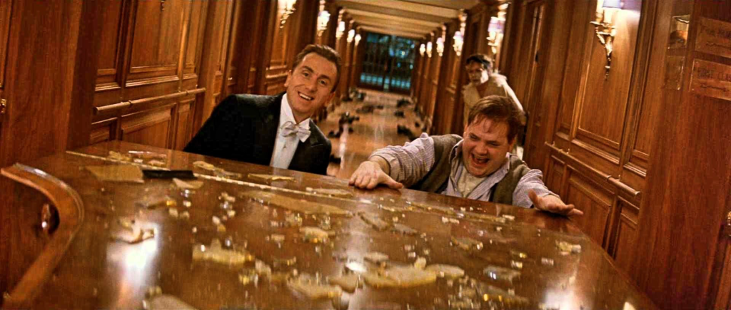
When he sits at the piano, the camera becomes an extension of the music. It glides in sweeping arcs or pulls you in close to catch the intensity of his focus. Think of the famous “dancing piano” scene during the storm the way the camera brushes past lamps and furniture. It captures that dynamic, almost drunken joy of the moment. It isn’t just a shot; it’s a visceral connection to the character’s freedom. That kind of motivated movement where the environment dictates the “dance” is exactly why I love this craft.
Composition and the Geometry of the Ship

Koltai’s compositions are a perfect balance of classical beauty and smart storytelling. He uses deep staging constantly, layering the foreground and background to give the Virginian a sense of massive scale. You aren’t just looking at a room; you’re looking through the world of the ship.
He also loves “frames within frames.” He’ll use doorways, archways, or portholes to box 1900 in. It’s a subtle way to remind us of his confinement. Even when he’s at the piano in a grand hall, he’s often centered and dwarfed by the architecture, or isolated in a single spotlight. That use of negative space tells you everything you need to know about his genius and his loneliness. He uses the ship’s own geometry long corridors and spiral stairs to pull your gaze exactly where he wants it.
Sculpting with Light

For a colorist, the lighting in this film is a dream. Koltai blends practical sources with cinematic techniques to create an atmosphere that feels period-accurate but heightened.
The interiors are warm they have that glow of gas lamps and early incandescent bulbs. It’s a “golden hour” look that stays consistent throughout the ship’s cabins. But he isn’t afraid of the dark. He uses heavy contrast to sculpt the frame, letting shadows hide what we don’t need to see.
When we’re out at sea, the natural light is the star. Sunlight streams through portholes, creating these beautiful shafts of light. As a colorist, I look at how he handles those highlights they roll off so gracefully, which is the hallmark of 35mm film. You don’t get that harsh, clipped digital look here. The light shifts from the vibrant energy of the day to the melancholic blue of the evening, always following the emotional beat of the story.
Lensing and the Anamorphic Look
To capture the scale of the ocean, you need a wide canvas. The film was shot in 2.39:1, which almost certainly means anamorphic lenses. This was the perfect choice for the long, elegant lines of the ship’s decks. Anamorphic glass has a character you just can’t fake: that unique bokeh, the subtle distortion, and a texture that feels “cinematic” in the truest sense.
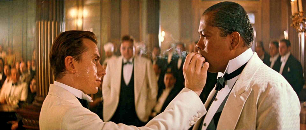
The blocking within that wide frame is brilliant. In the crowded ballroom scenes, the actors are orchestrated in layers, guiding your eye through the chaos. During the piano duels, the tension is built through proximity faces fill the edges of the frame, making the rivalry feel claustrophobic and intense. They used wider glass to show the ship’s vastness, then switched to longer lenses for the intimate moments to compress the background and isolate 1900. It’s a masterclass in using lens choice to dictate emotion.
The Colorist’s Perspective
This is where the film really hits home for me. Shooting on film provided a gorgeous foundation, but the grade is what makes it timeless. The palette is rich, warm, and soaked in that nostalgic gold.
From a technical side, the contrast shaping is incredible. Even in the dimmest engine room scenes, there’s detail in the shadows. They’re never “crushed” or muddy. The highlights bloom gently from the lamps, preserving that organic film latitude.
The hue separation is also handled with a lot of care. Skin tones stay warm and natural against the deep mahoganies and golds of the ship. There’s a slight desaturation across the board that keeps it from looking “neon” or garish, giving it an elegant, muted quality.
If I were grading this today at Color Culture, I’d be careful to honor that original intent. I’d use the mid-tone details to keep it feeling natural rather than forced. The temptation with modern tools is to “clean up” the grain or the imperfections, but you’d lose the soul of the movie. This grade understands its medium it feels sweet, painful, and nostalgic, just like the story itself.
The Tools of the Trade
Looking back at a late-90s production, you’re looking at the peak of 35mm tech. Koltai likely used Arriflex or Panavision systems with high-end anamorphic glass. That glass is responsible for the oval bokeh and those beautiful flares you see when a practical light hits the lens.
For film stock, Kodak Vision was the likely candidate. The latitude was essential for those high-contrast shots moving from a dark interior to a bright window looking out at the sea. To pull off those sweeping camera moves, they would have used extensive dolly and crane rigs. The “dancing” scene probably required a specialized gimbal or a very clever dolly setup to mimic the ship’s unpredictable sway. It’s a reminder of an era where technical mastery was about manipulating physical objects and chemistry, not just pixels.
- Also read: ANATOMY OF A MURDER (1959) – CINEMATOGRAPHY ANALYSIS
- Also read: SICKO (2007) – CINEMATOGRAPHY ANALYSIS
Browse Our Cinematography Analysis Glossary
Explore directors, cinematographers, cameras, lenses, lighting styles, genres, and the visual techniques that shape iconic films.
Explore Glossary →