My name is Salik Waquas, and I own a post-production color grading suite where I specialize in color grading for films and projects. As a working film colorist, I have a keen interest in cinematography and the intricate details that bring visual stories to life. In this analysis, I explore the remarkable cinematography of The Grand Budapest Hotel, a film that exemplifies the collaborative brilliance of director Wes Anderson and cinematographer Robert Yeoman.
About the Cinematographer
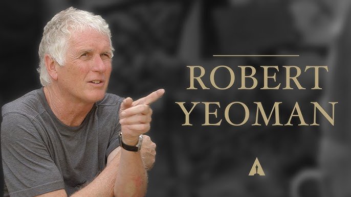
Robert Yeoman, a long-time collaborator of Wes Anderson, is the cinematographer behind The Grand Budapest Hotel. Yeoman has a distinct style that aligns perfectly with Anderson’s quirky, idiosyncratic vision. His filmography is largely intertwined with Anderson’s, showcasing an understanding of the director’s unique demands, from his obsession with symmetry to the need for a whimsical color palette.
In this particular film, Yeoman’s use of different aspect ratios is one of the defining elements that adds depth to the story. The film shifts between aspect ratios—1.37:1 for the 1930s segments and 2.35:1 for the 1960s sequences—transporting viewers through time and immersing them in the visual language of each era. Yeoman employs the ArriCam ST and Cooke S4 lenses, utilizing a combination of 35mm and 16mm film stocks to create texture and depth. The choice of Kodak Vision3 200T film stock provides a specific color texture and grain that enhances the film’s nostalgic feel. His commitment to embracing imperfections, such as light flares and grain, contributes significantly to the overall aesthetic and visual storytelling of The Grand Budapest Hotel.
Inspiration for the Cinematography of The Grand Budapest

The inspiration behind the cinematography of The Grand Budapest Hotel is deeply rooted in the nostalgic representation of a bygone era. Wes Anderson drew on a mix of European classic cinema and art, specifically looking to filmmakers like Ernst Lubitsch, who had a similar flair for ornate settings and farcical plots. The film is also heavily inspired by the works of Stefan Zweig, whose writings frequently lamented the end of the Belle Époque in Europe. This influence permeates the visuals, creating a reverence for the romanticized notion of old Europe that both Anderson and Zweig share.
Yeoman and Anderson’s collaboration creates a visually dynamic universe that almost feels like stepping into a storybook. This is evident through the carefully chosen aspect ratios, color schemes, and lighting styles, all of which reflect the moods of different timelines and add depth to Zero’s retelling of his life at the Grand Budapest. These visual elements effectively draw us into Anderson’s multi-layered story—a story within a story—allowing us to experience Zero’s nostalgia, romanticism, and deep connection to the past.
Camera Movements Used in The Grand Budapest
Camera movement in The Grand Budapest Hotel is characterized by precision and intention. Unlike in many modern films, where the camera may drift or follow a naturalistic, handheld approach, Anderson and Yeoman opt for deliberate movements that reflect the structured and almost theatrical nature of the story. The camera’s movement is often meticulously coordinated with the actors and the blocking, resulting in the signature Wes Anderson style—where tracking shots, whip pans, and dolly-ins serve as rhythmic beats within the film’s overall composition.
I believe Anderson’s camera moves like an observer in a diorama, establishing a sense of distance but also emphasizing the symmetry and balance that define his style. For instance, whip pans are often used to transition between scenes or follow characters as they dash around the hotel, giving the film an almost playful quality. Tracking shots follow the characters down perfectly framed corridors, imbuing the film with a feeling of seamless, clockwork efficiency—almost mirroring Gustave’s meticulous nature.
The movement is cleverly used to differentiate the different time periods in the story. The more staccato, almost frantic movements seen in the older 1932 timeline have an energy that contrasts with the more reserved, stately camera work of the modern segments, which amplifies the difference in how Zero views his past compared to the present day.
Moreover, Yeoman employs techniques such as dolly zooms and precise dolly shots to create a sense of depth and dimension. The dolly zoom, a classic cinematic technique that creates a feeling of disorientation, is effectively used to accentuate moments of emotional tension, adding layers to the visual storytelling. This meticulous attention to camera movement, combined with Anderson’s precise blocking, results in a visually stunning narrative that captivates viewers.
Compositions in The Grand Budapest
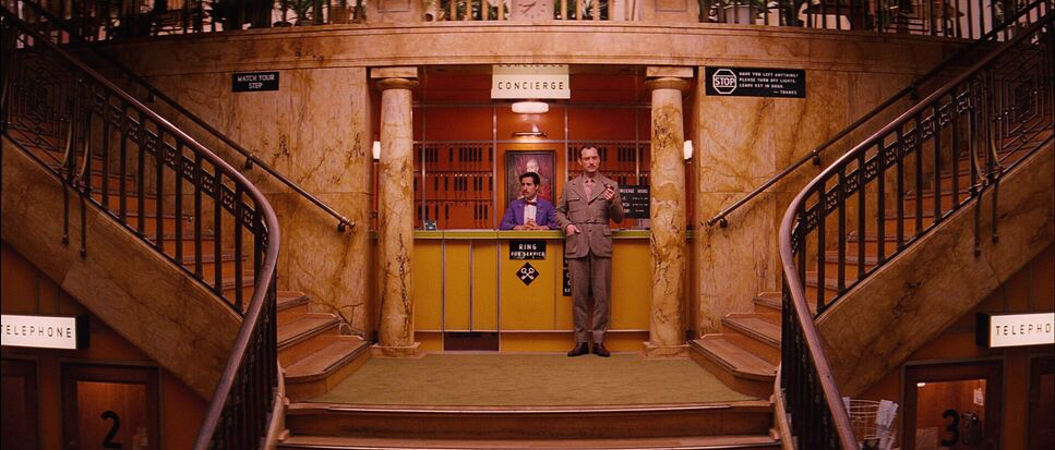
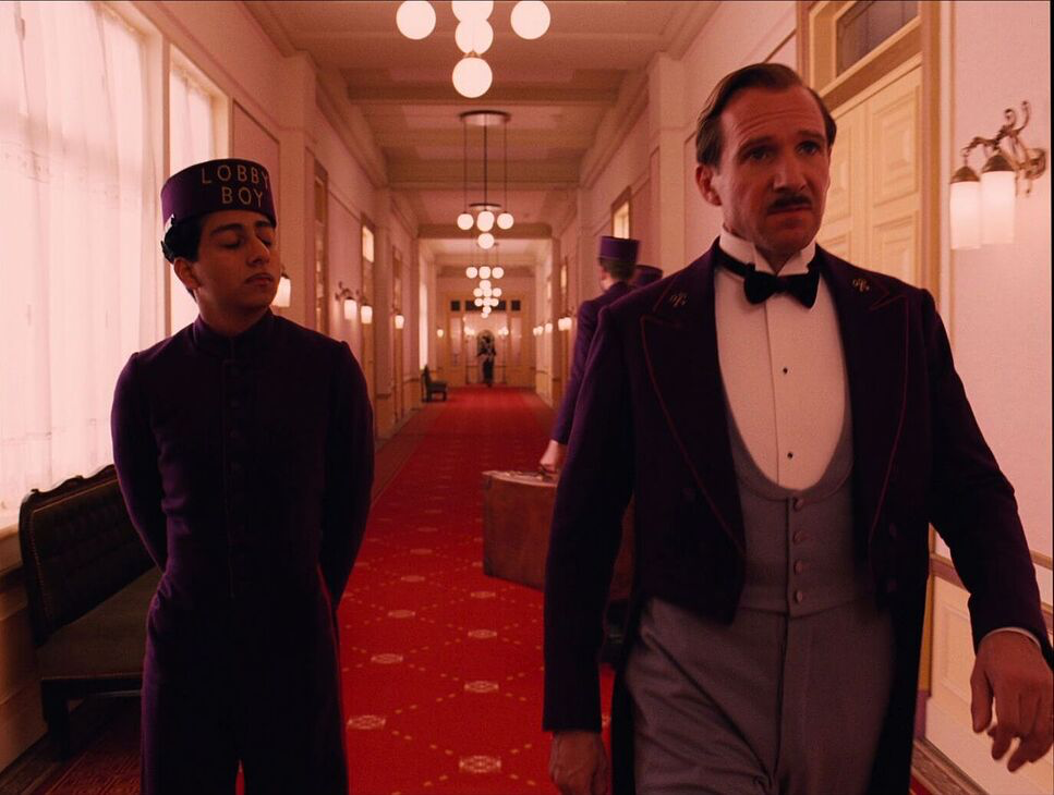
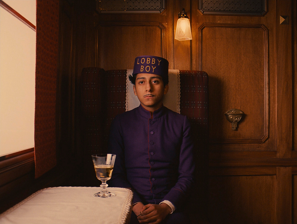
Wes Anderson’s compositions are often the first thing audiences notice about his films. In The Grand Budapest Hotel, symmetry plays a vital role, but there’s much more beneath the surface. Every frame in the film is constructed like a painting, and Yeoman takes full advantage of Anderson’s obsession with perfectly centered shots and carefully balanced visual elements to reflect the relationships between characters.
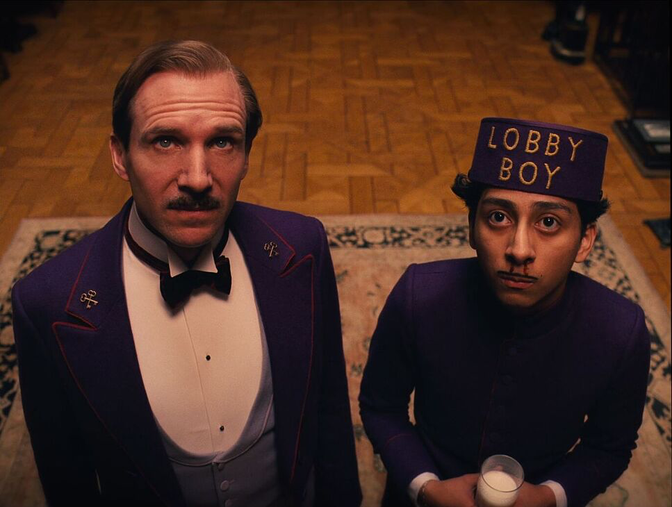
One of the most telling examples of this is the relationship between Gustave and Zero. Early in the film, Zero is often placed on the edge of the frame, while Gustave dominates the center. This framing reinforces the dynamic between them, with Gustave as the central figure, full of grandeur and confidence, while Zero is initially a subordinate, taking up less visual space. As the story progresses and Zero becomes more integral to Gustave’s life, they begin to share the frame equally, signifying the growth of their bond and mutual respect.
Yeoman’s attention to aspect ratios also enhances the compositions. The use of the Academy ratio (1.37:1) for the 1930s sequences creates a more intimate and claustrophobic feel, inviting viewers into the Grand Budapest’s ornate interiors. In contrast, the wider aspect ratio (2.35:1) used for the 1960s scenes evokes a sense of grandiosity, emphasizing the hotel’s fading glory.
Another compositional tool Anderson uses is depth of field, often flattening the image to create an almost diorama-like effect. This flatness gives each frame a storybook quality, suggesting that what we are seeing is a memory—something curated and perhaps embellished. Yeoman employs these compositional choices to emphasize the constructed nature of the story, making it clear that we are viewing events through Zero’s nostalgic lens.
Lighting Style of The Grand Budapest
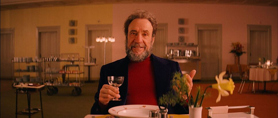
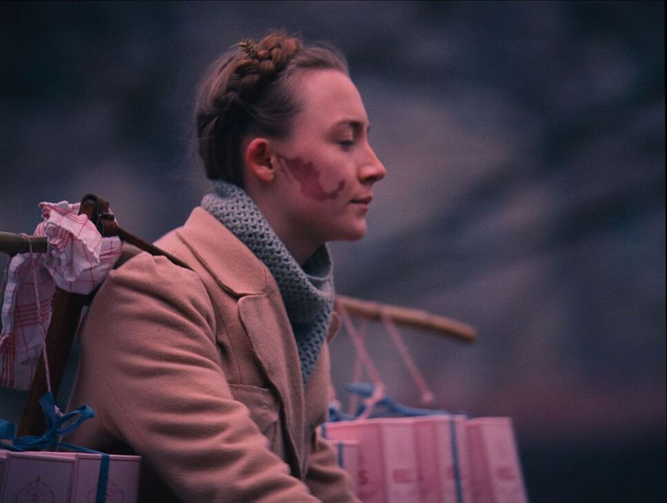
Lighting in The Grand Budapest Hotel accentuates the whimsical and romanticized world that the characters inhabit. The lighting shifts throughout the film to reflect changes in the characters’ relationships and to mark significant emotional beats. For instance, in scenes where Zero recounts his memories of Gustave, the lighting becomes warm, soft, and almost dreamlike, reflecting Zero’s fondness and nostalgia. This is especially evident in the scene where Zero recalls his time with Agatha—the lighting envelops her in a soft halo, underlining how she is at the center of Zero’s emotional world.
The contrast between warm and cool lighting effectively creates emotional contrasts. In happier moments, the lighting is saturated with warmth—yellows, oranges, and reds—while in the film’s darker moments, the lighting is stark and desaturated. A notable example is the scene in which Gustave is killed—the only black-and-white scene in the film. The drained color represents the loss of warmth and life, perfectly mirroring the emotional devastation Zero feels at losing his mentor.

Yeoman employs various lighting techniques to achieve these effects, including practical lights that enhance the vibrant colors of the set design and controlled diffusion to create soft shadows that lend a dreamlike quality to the imagery. The interplay of shadows and highlights is carefully orchestrated to emphasize the ornate details of the set and characters, enhancing the film’s visual storytelling.
What I find fascinating about Yeoman’s lighting choices is how he uses light to guide our emotional responses and draw attention to the theatricality of the world Anderson has created. It’s a heightened reality, almost magical, as if the entire film takes place within an elaborate, carefully lit stage play.
Lensing and Blocking of The Grand Budapest
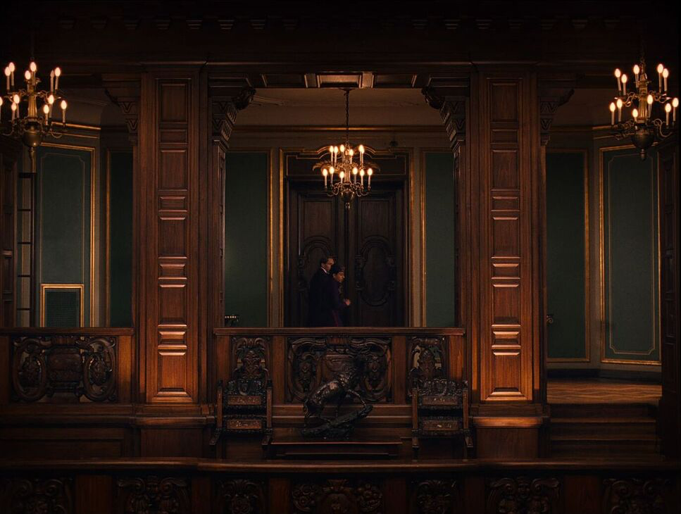
The lensing of The Grand Budapest Hotel is integral to its aesthetic. Anderson and Yeoman chose Cooke S4 lenses for the majority of the film, but also used anamorphic lenses for scenes set in the 1960s. These anamorphic lenses create a slight distortion, particularly at the edges of the frame, which adds a dreamlike quality to the images and a sense of nostalgia for an era long past. Anderson embraces these imperfections—the softness, the slight warping—because they contribute to the old-world feel of the film.
Blocking is also critical in conveying the story of The Grand Budapest Hotel. Characters are often staged so that their relationships are instantly communicated visually. Gustave’s commanding presence is clear through his placement at the forefront of group shots, framed in such a way that he appears larger than life, embodying the sophisticated persona he has built for himself. Conversely, Zero is initially placed in positions that minimize his presence—behind counters, in doorways, or at the edge of the frame—showing his deferential position in the story.
As Zero’s confidence grows, so does his spatial relationship to Gustave in the frame. By the film’s midpoint, Zero and Gustave are blocked as equals, side by side, signifying the evolution of their friendship. The meticulous blocking of characters in relation to the set and to each other is essential to Anderson’s visual storytelling, and one that Yeoman captures flawlessly.
Yeoman’s use of wide shots and close-ups, combined with careful blocking, creates a visual rhythm that enhances the comedic timing and emotional weight of each scene. The careful orchestration of movement and positioning adds layers to the narrative, immersing viewers in the intricate dynamics of the characters’ relationships.
Color Grading of The Grand Budapest
THE GRAND BUDAPEST HOTEL (2014)
Technical Specifications: 35mm · 1.85:1 · Arricam ST
| Genre | Comedy, Drama, Anthology, Crime, Heist |
| Director | Wes Anderson |
| Cinematographer | Robert D. Yeoman |
| Production Designer | Adam Stockhausen |
| Costume Designer | Milena Canonero |
| Editor | Barney Pilling |
| Colorist | Jill Bogdanowicz |
| Aspect Ratio | 1.85 – Spherical |
| Format | Film – 35mm |
| Lighting | Soft light |
| Lighting Type | Daylight, Overcast |
| Story Location | Hungary > Budapest |
| Filming Location | Europe > Germany |
| Camera | Arricam ST |
| Lens | Angenieux Optimo Zooms, Cooke S4/ i, Cooke Varotal Lenses, Cooke Varotel Zoom lenses |
| Film Stock / Resolution | 5213/7213 Vision 3 200T |
Color grading plays a vital role in establishing the mood and tone of The Grand Budapest Hotel. The colors are intentionally heightened, almost to the point of being surreal. The pinks of the hotel facade, the deep reds of the interior, and the bright pastels used throughout evoke a feeling of nostalgia and whimsy. This color palette helps set the tone for the story—a story that, while set against the backdrop of political upheaval and personal loss, is viewed through a lens of romanticism and fond memory.
The colors also change significantly depending on the time period represented. The modern sequences are relatively muted, with a more naturalistic color grade reflecting the present day as a kind of bleak and dull period. In contrast, the scenes set in the 1930s are highly saturated, with vivid reds, pinks, and purples contributing to the fairy-tale quality of the film. This saturation reinforces Zero’s romanticized memory of his time at the Grand Budapest, making the past appear more colorful and vibrant than the present.

I find that the color grading in this film isn’t just about creating a visually striking image—it’s a storytelling device in itself. By using such exaggerated colors, Anderson and his colorists convey the notion that this is not an objective retelling of events but rather an embellished, idealized version of the past. The color helps us understand that we are not seeing the world as it was, but as Zero wishes to remember it.
Conclusion
In The Grand Budapest Hotel, Wes Anderson and Robert Yeoman craft a visually stunning narrative that transcends traditional storytelling. Through meticulous camera movements, striking compositions, intentional lighting, and thoughtful color grading, they create a world that feels both whimsical and deeply nostalgic. The technical aspects of the cinematography enhance the film’s emotional core, allowing viewers to connect with Zero’s memories and experiences on a profound level.
As a film colorist, I admire the way Yeoman and Anderson utilize technical choices to elevate the narrative.
- Also Read: WHIPLASH CINEMATOGRAPHY ANALYSIS (IN DEPTH)
- Also Read: JOKER CINEMATOGRAPHY ANALYSIS (IN-DEPTH)
Browse Our Cinematography Analysis Glossary
Explore directors, cinematographers, cameras, lenses, lighting styles, genres, and the visual techniques that shape iconic films.
Explore Glossary →