I’m Salik Waquas, a working film colorist and owner of a color grading company called Color Culture. Over the years, I’ve had the opportunity to work on projects of various formats, always aiming to bring out the story that the visuals are trying to tell. Writing this analysis of Joker’s cinematography allows me to express my fascination with its visual storytelling, from a technical and an emotional perspective. I’ve always felt that cinematography is the lens through which we truly understand a character’s internal state, and Lawrence Sher’s work on Joker a 2019 film directed by Todd Phillips, exemplifies this perfectly, so let’s get started on various aspects of the film.
About the Cinematographer

The visual identity of Joker comes largely from Lawrence Sher, an accomplished cinematographer whose work I’ve admired for years. Known for his collaboration with Todd Phillips in the Hangover series, Sher took on the challenge of crafting a visual style that aligns with the gritty, raw, and often disturbing nature of Arthur Fleck’s journey. His manipulation of color, contrast, and texture resonated with me, as it reflects Arthur’s transformation into the Joker while evoking a sense of Gotham in the late 1970s and early 1980s.
Sher’s attention to detail is impressive. He made sure every frame contributed to telling Arthur’s story, employing a sense of intimacy that starkly contrasts the spectacle-driven imagery typical of comic book films. For me, this is what sets Joker apart; it strips away the glossiness, focusing instead on a visceral, ground-level portrayal of a man slowly unraveling.
Inspiration for the Cinematography of Joker
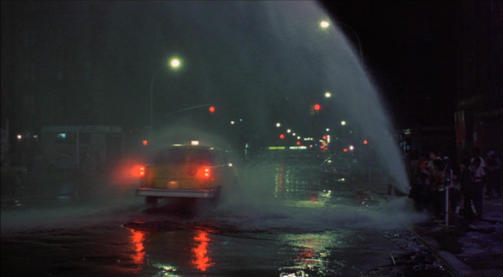
Sher has cited the influence of Martin Scorsese’s films, particularly Taxi Driver and The King of Comedy, in shaping the visual style of Joker. The aim was to create an intimate character study in the comic book realm, and I found this approach refreshing. Sher and Phillips wanted to explore what it would be like to strip everything down and focus intensely on Arthur Fleck’s transformation—an almost “handmade movie” that dives deep into the intricacies of a man consumed by his own demons.
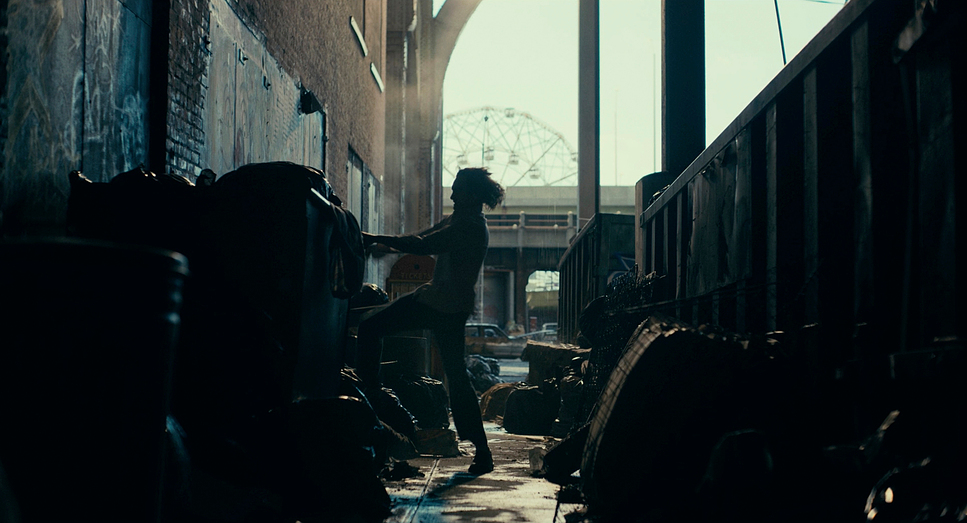
This exploration of character is evident in the film’s tone and its depiction of Gotham as a decaying city. Sher’s work, filled with contrasts, plays with light versus shadow and warm versus cool tones, brilliantly mirroring Arthur’s internal duality. As a colorist, I appreciate how these visual choices enhance the storytelling.
Camera Movements Used in Joker
The camera movements in Joker play a critical role in conveying Arthur’s emotional state, and I found this aspect particularly engaging. Sher’s use of handheld shots adds a raw, documentary-like quality to Arthur’s journey, immersing the audience in the unfolding chaos. It’s as if we’re right there with him, witnessing his unraveling in real time.
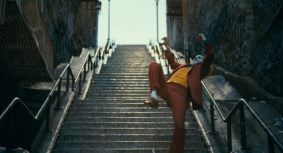
One of the standout sequences for me is the infamous staircase dance. Here, the camera moves fluidly with Arthur, almost like a dance partner. It’s celebratory and liberating—perfectly capturing Arthur’s newfound identity as the Joker. The decision to shoot the scene in a wide frame allows us to see his entire body and surroundings, emphasizing that he’s not hiding anymore; he’s embracing his new self.
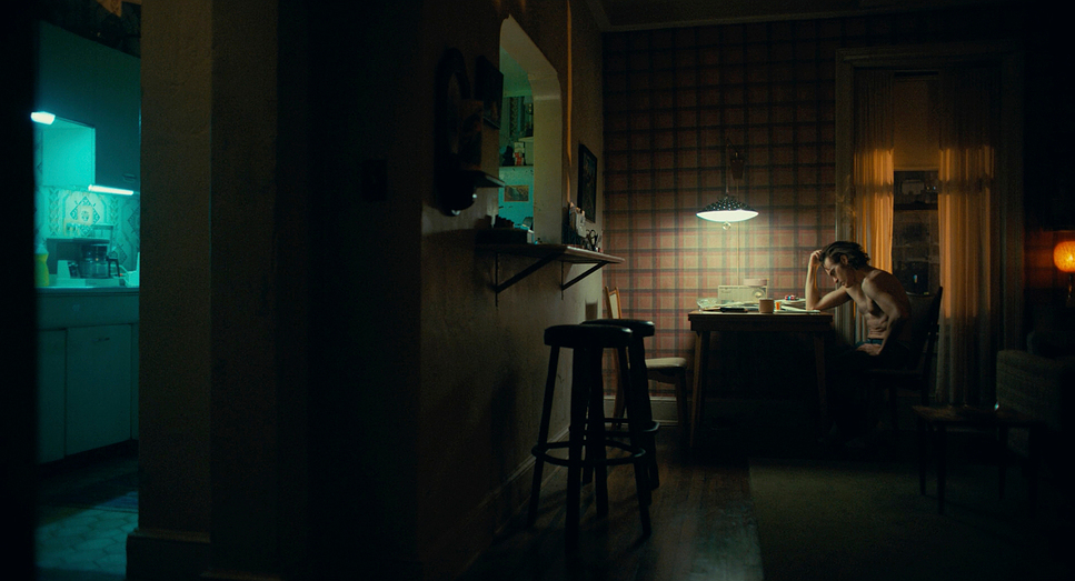
In contrast, as we can see, Sher employs more static, steady shots to evoke Arthur’s sense of entrapment, particularly in his apartment. These choices are subtle yet essential in illustrating Arthur’s evolving mental state, oscillating between fragile, chaotic, and ultimately unrestrained.
Compositions in Joker
Compositionally, Joker is masterful in using framing to communicate Arthur’s alienation and transformation. Sher often positions Arthur off-center in the frame, surrounded by empty space. This choice speaks volumes, emphasizing his loneliness and disconnection from the world around him.
The recurring motif of reflections adds complexity to Arthur’s character. In several scenes, we see him facing his reflection, reinforcing the duality of Arthur versus Joker. It’s a poignant look at how he perceives himself as his Joker persona begins to take shape.
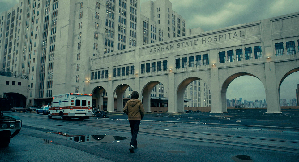
Sher’s compositions also cleverly play with Gotham’s geography, creating a visual language that depicts the city as a character itself. Wide shots of towering buildings and grimy streets contrast with tightly framed shots of Arthur, who appears small and insignificant. This visual strategy builds a sense of an overwhelming and indifferent city, further contributing to Arthur’s psychological decline.
Lighting Style of Joker
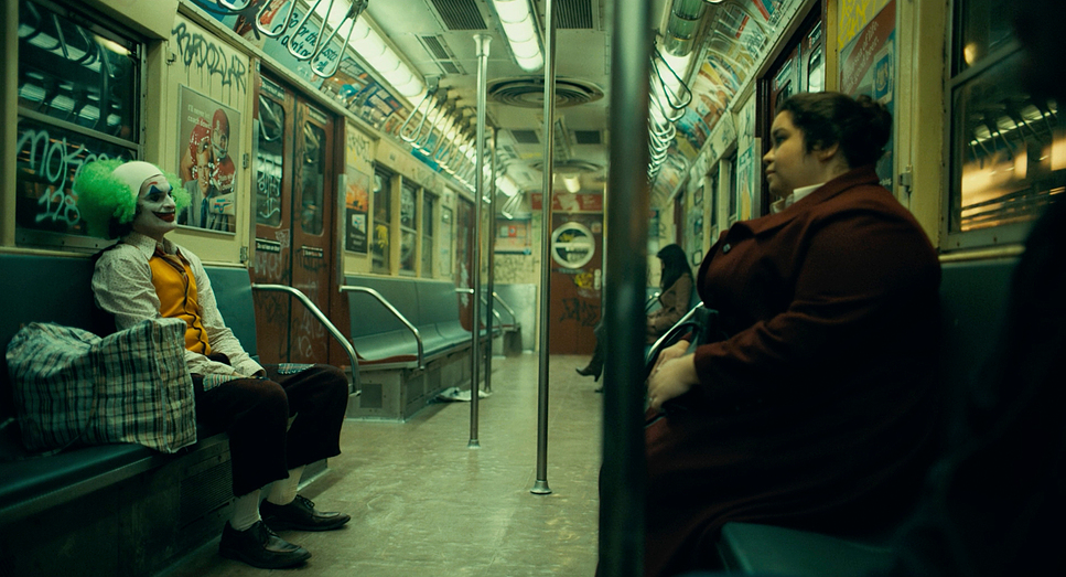
The lighting in Joker is crucial to the storytelling, and I can’t emphasize this enough. Sher blends naturalistic lighting with dramatic choices to shape the film’s atmosphere. The interplay of warm tungsten and cold blue tones represents Arthur’s internal battle and the chaos surrounding him.
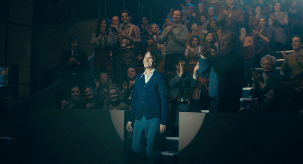
I particularly admire the use of sodium vapor streetlights, which bathe Gotham in a dirty, orange glow, creating a nostalgic yet sickly quality that reflects the city’s decay. Do notice, that one of the most striking lighting choices occurs during Arthur’s performance on the Murray Franklin Show, where the harsh spotlight almost blinds him. This moment is symbolic of the scrutiny Arthur faces and his inability to hide from the world any longer—his transformation into the Joker is now complete.
Lensing and Blocking of Joker
JOKER (2019) — 1.85:1 | Arri Alexa 65
| Genre | Comic Adaptation, Crime, DC Extended Universe, Drama, Psychological, Thriller, Action, Superhero, Psychological Horror, Mental Health, Horror |
| Director | Todd Phillips |
| Cinematographer | Lawrence Sher |
| Production Designer | Mark Friedberg |
| Costume Designer | Mark Bridges |
| Editor | Jeff Groth |
| Colorist | Jill Bogdanowicz |
| Time Period | 1980s |
| Color | Mixed, Saturated, Cyan, Blue |
| Aspect Ratio | 1.85 – Spherical |
| Format | Digital, Digital – Large Format |
| Lighting | Soft light |
| Lighting Type | Daylight, Artificial light, Practical light, Mixed light, Fluorescent |
| Story Location | United States > Gotham City |
| Filming Location | Harlem > 2335 12th Ave NY NY 10027 |
| Camera | ARRI ALEXA 65 |
| Lens | Arri DNA Large Format Lenses |
| Film Stock / Resolution | Arriraw 5.5K |
The choice of lenses in Joker is another critical element that enhances its visual storytelling. I appreciate how Sher used a mix of vintage lenses, particularly the Hasselblad Prime DNA lenses, which helped to achieve a unique visual texture reminiscent of 1970s cinema. These lenses impart subtle imperfections and flares, adding to the film’s nostalgic feel.
Blocking in Joker often reflects Joaquin Phoenix’s performance, allowing him the freedom to explore the space. This improvisational feel works wonders, especially in emotionally charged scenes, such as the bathroom dance after Arthur’s first killing. The camera follows Phoenix, capturing Arthur’s emotions in a hauntingly beautiful way, isn’t it so impressive?
Conversely, scenes where Arthur feels confined use tighter blocking, reinforcing his sense of entrapment—whether by his circumstances, mental state, or society. This contrast is essential in illustrating the duality of Arthur’s existence.
Color Grading of Joker
The color grading of Joker is one of its most defining features, and as a colorist, I find it particularly fascinating. Sher and colorist Jill Bogdanowicz collaborated extensively to create a color palette that reflects Arthur’s journey. The film begins with a desaturated look, embodying a grim and colorless Gotham that mirrors Arthur’s life. As he begins to embrace his Joker persona, the colors become more vibrant yet chaotic.

The use of complementary colors, especially cyan and orange, creates visual contrast that symbolizes Arthur’s duality. As we can see, the orange hues represent the warmth and comfort he craves, while the cyan embodies the cold, indifferent world he faces. This clash reflects Arthur’s inner turmoil, making every color choice deliberate and impactful.
In Arthur’s apartment, the sickly green tones emphasize the oppressive environment in which he lives. The final act, awash in vivid reds and yellows, evokes chaos, rage, and transformation—moments that truly highlight the emotional stakes of the film.
Final Thoughts
Joker is a film that transcends its compelling performances and storyline; it’s a masterclass in cinematography. Every frame is meticulously crafted, showcasing how visual elements can shape narrative and guide our emotions. For me, Lawrence Sher’s work on Joker serves as a prime example of how cinematography is about more than just beautiful images—it’s about creating meaning and evoking empathy.
- Also Read: PARASITE CINEMATOGRAPHY ANALYSIS (IN-DEPTH)
- Also Read: THE CINEMATOGRAPHY OF “SEVEN SAMURAI” EXPLAINED
Browse Our Cinematography Analysis Glossary
Explore directors, cinematographers, cameras, lenses, lighting styles, genres, and the visual techniques that shape iconic films.
Explore Glossary →