It’s rare that a film makes me want to put down the control surface and just… breathe. Flow is one of those films. It’s an audacious commitment to craft that, frankly, makes me want to be a better filmmaker.
It’s been rightfully snagging awards and even landed an Oscar nomination a massive feat for an indie when you’re up against a juggernaut like The Wild Robot. But Flow operates on a different frequency. It’s a wordless journey following a cat and a ragtag band of animal survivors through a catastrophic flood. No dialogue. No hand-holding. Just the raw, visceral language of animal sounds and the even more powerful language of images. It hits those mythological, spiritual notes without ever feeling the need to spell them out.
About the Cinematographer

When I first saw the trailer, my immediate thought was: “Who is the DP on this?” Then you dig into the story of Gints Zilbalodis and you realize how insane this project actually is. He isn’t just the director; he’s essentially the cinematographer, the animator, the editor, and the composer. He’s the whole damn crew.
There’s a rumor that it was made by just five animators. While the credits show more people handled the legal and production heavy lifting, the creative soul of the film especially the visual storytelling rests entirely on Gints’ shoulders. In a world of massive studio pipelines, this is almost unheard of. He isn’t just directing; he’s painting with light and movement as if he were holding a physical camera. It’s a singularly coherent, deeply personal visual language that makes “massive” studio productions look sterile by comparison.
Inspiration Behind the Cinematography

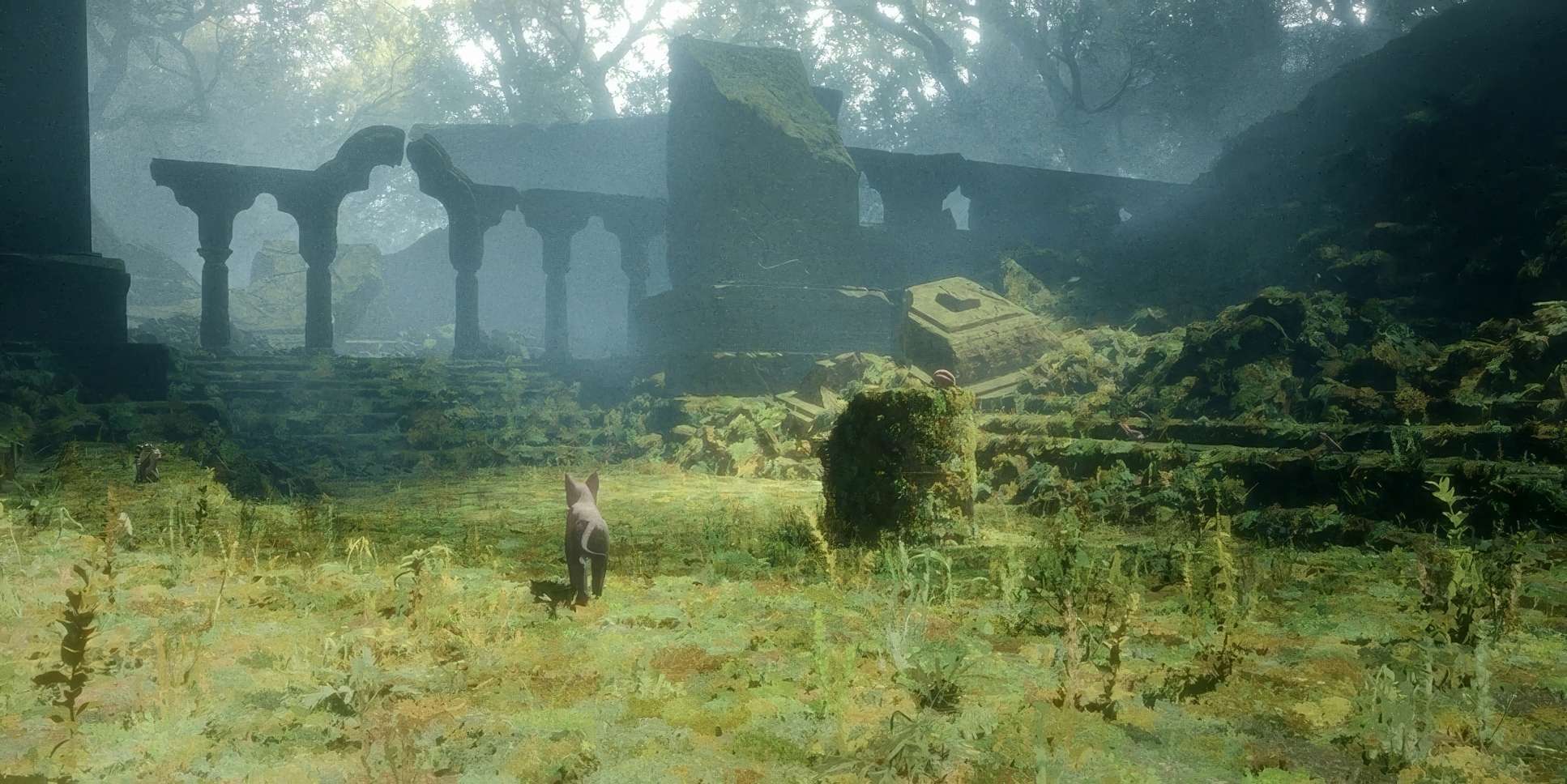
The primary engine behind Flow’s look is its central theme: a great flood. An apocalyptic cleansing. This isn’t just a disaster movie; it’s a retelling of the Noah’s Ark myth, or perhaps something even older and more polytheistic.
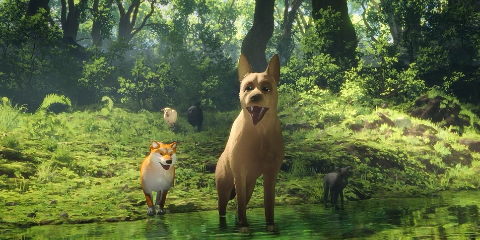
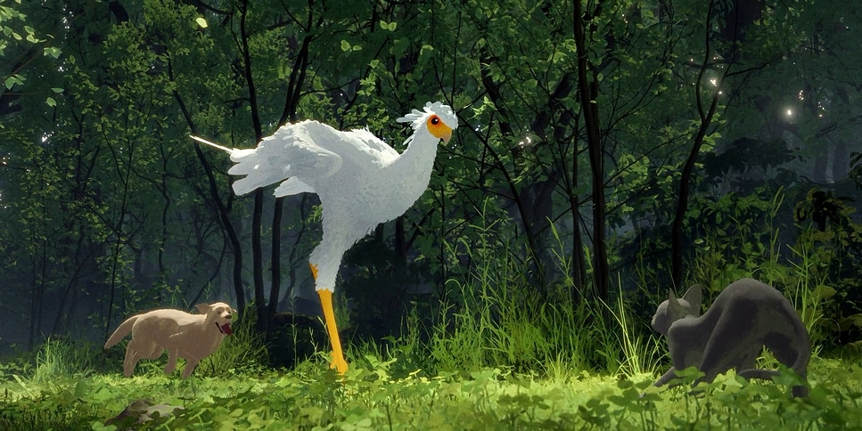
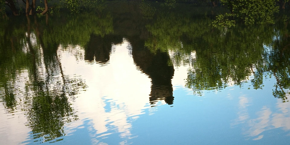
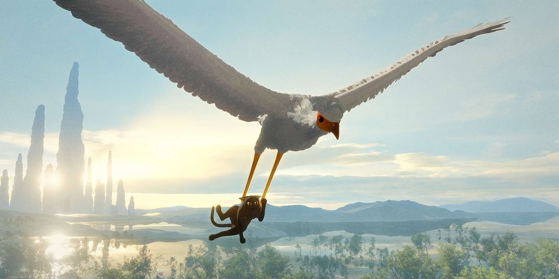
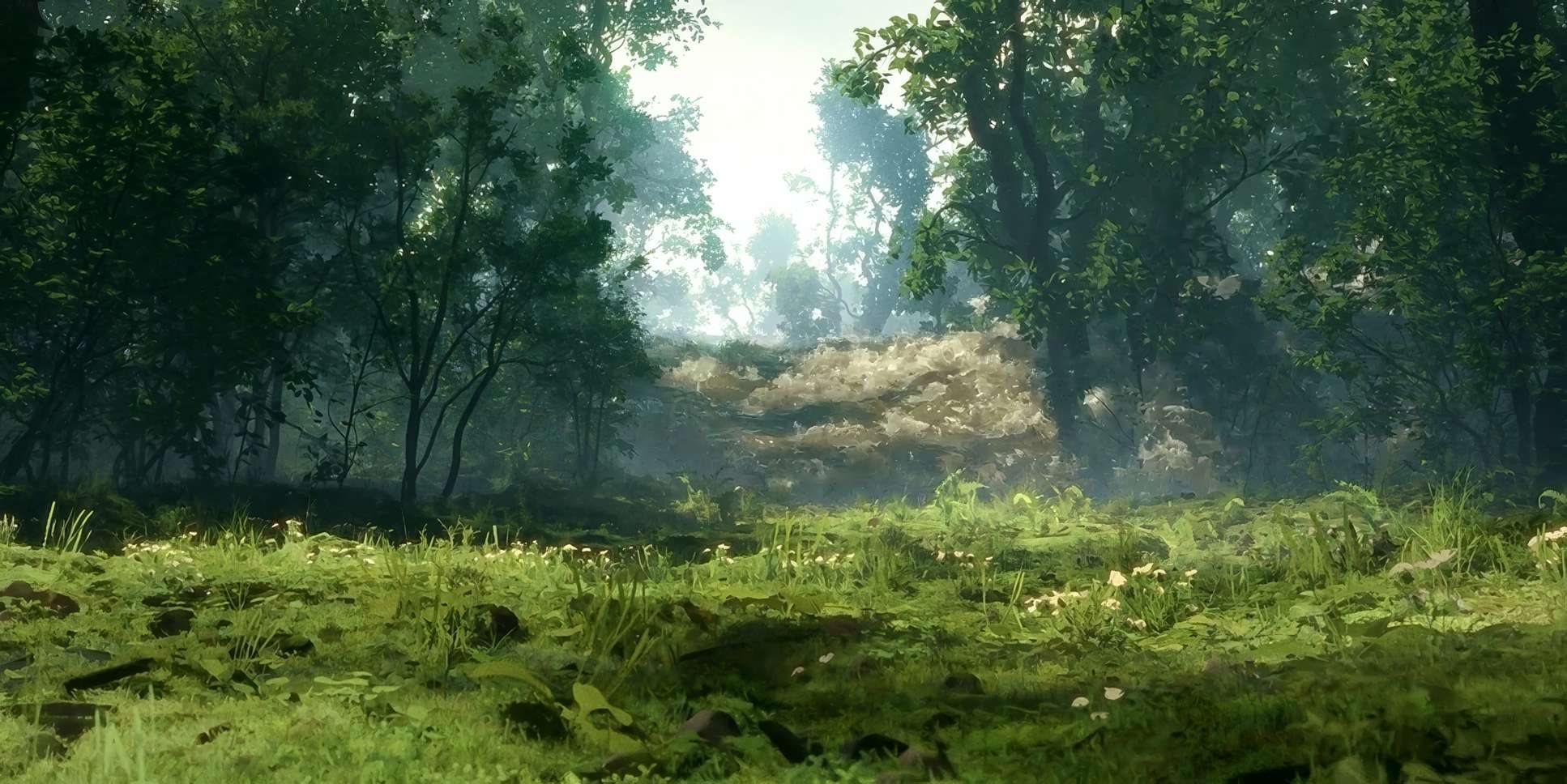
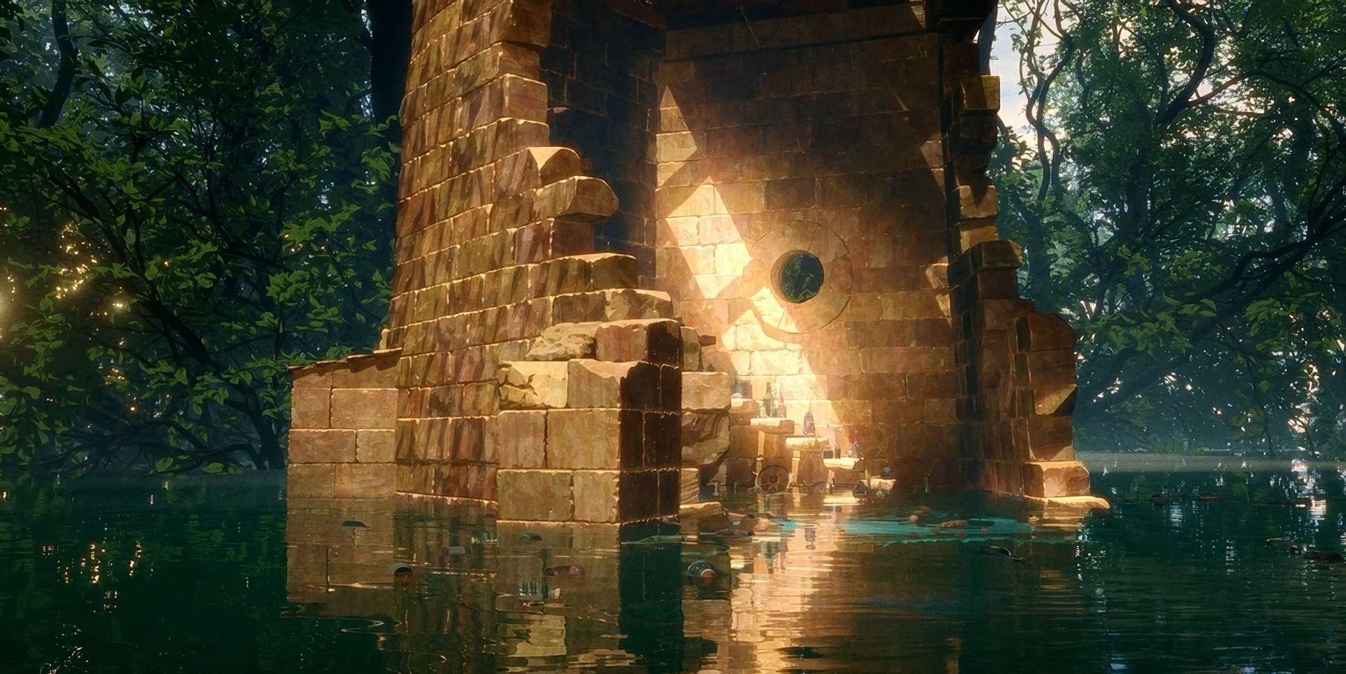
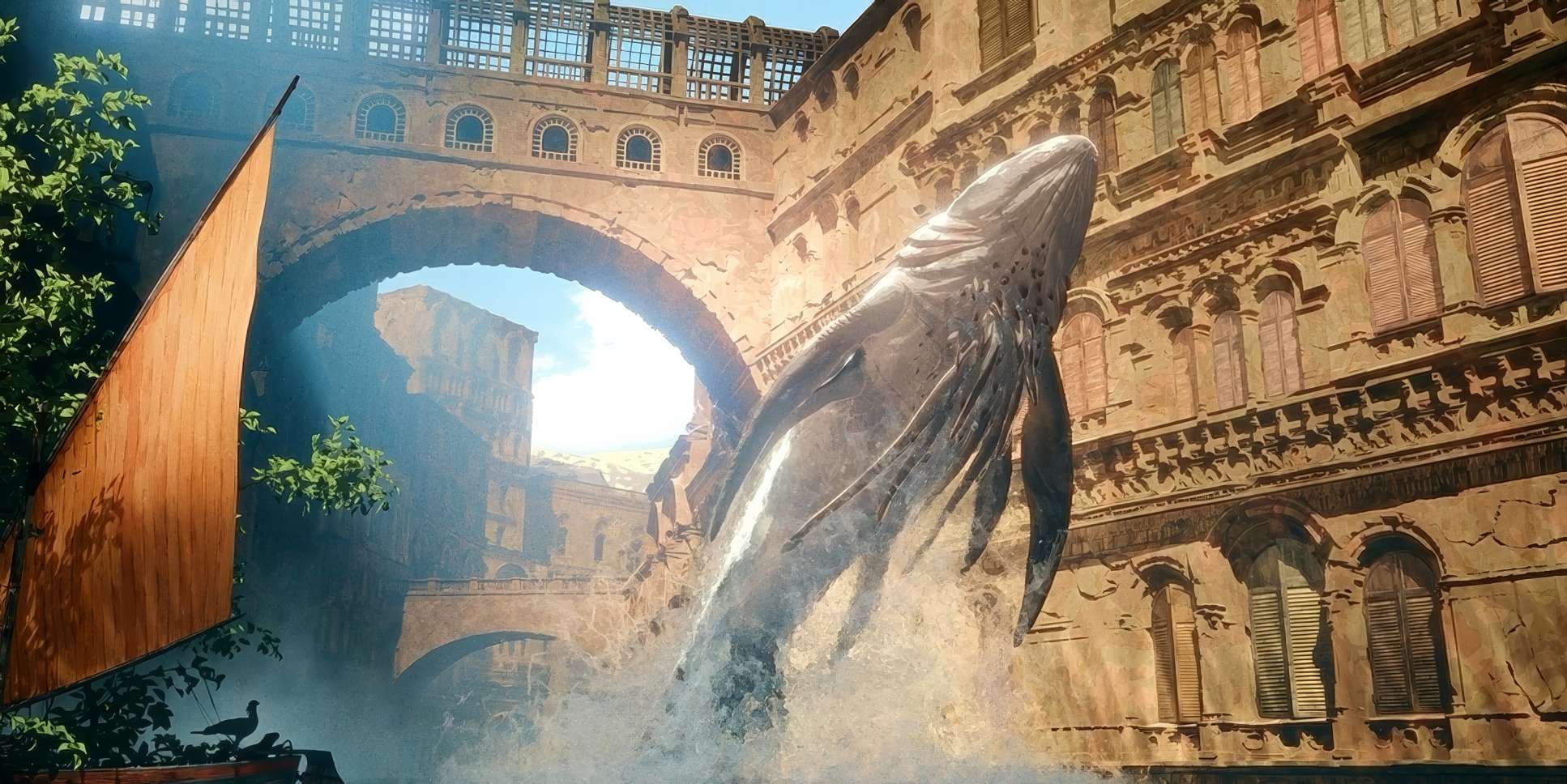
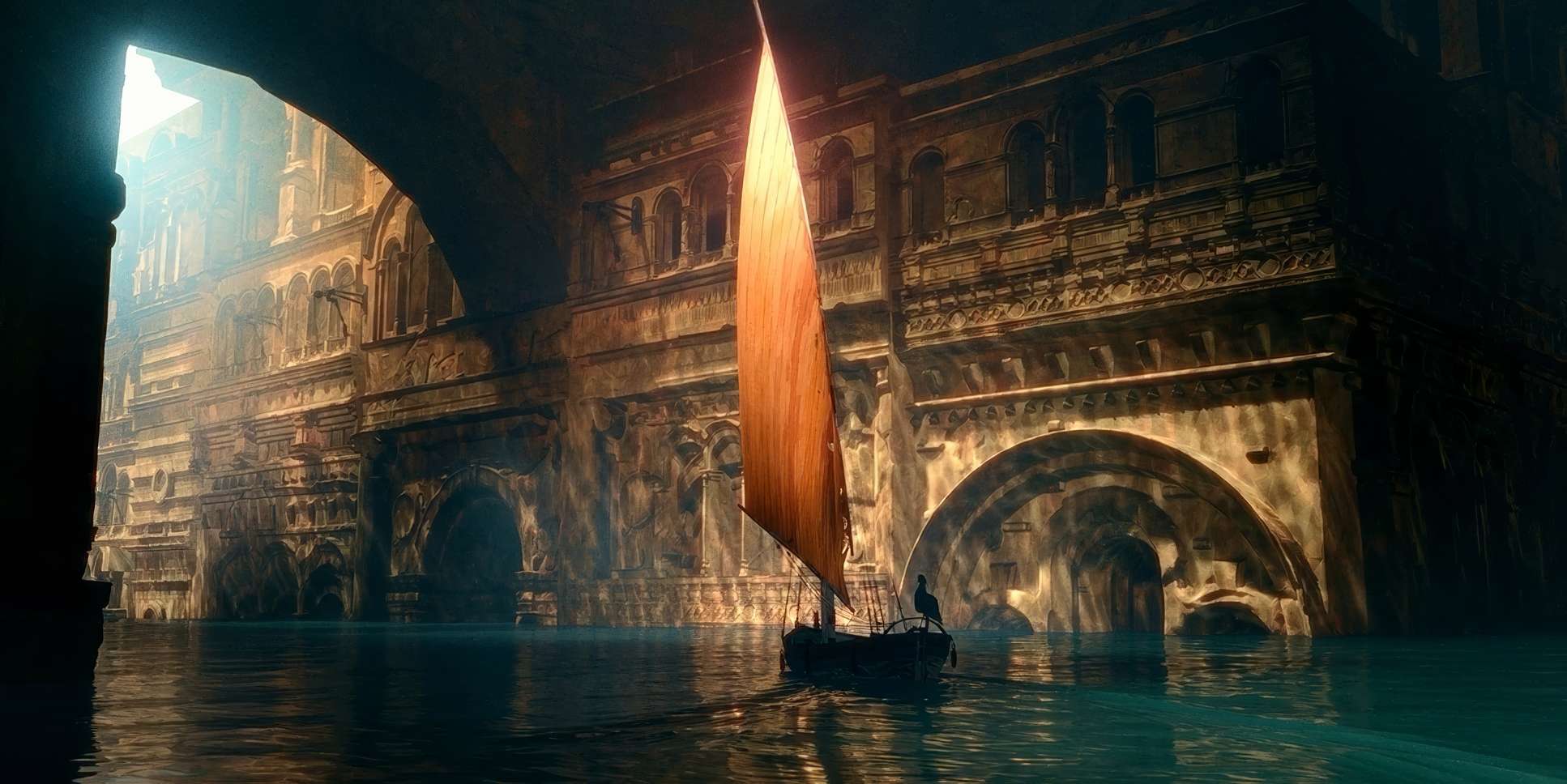
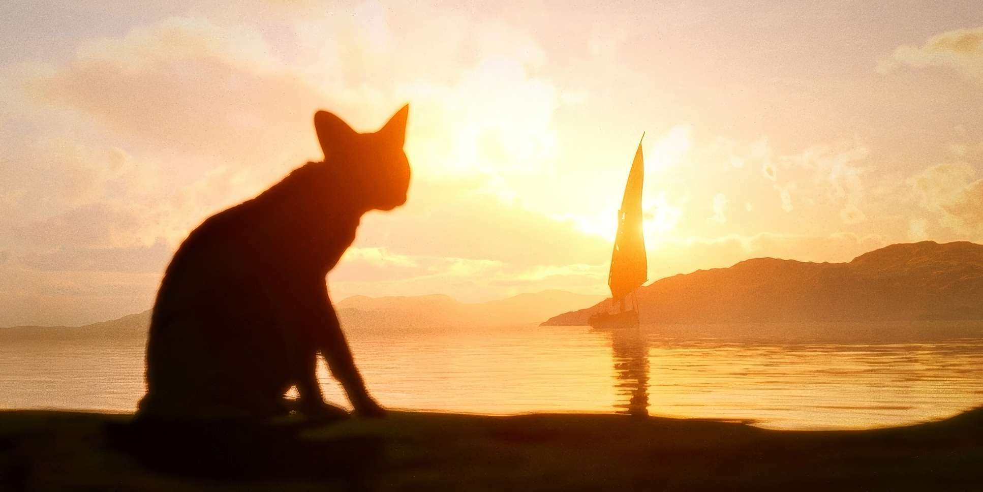
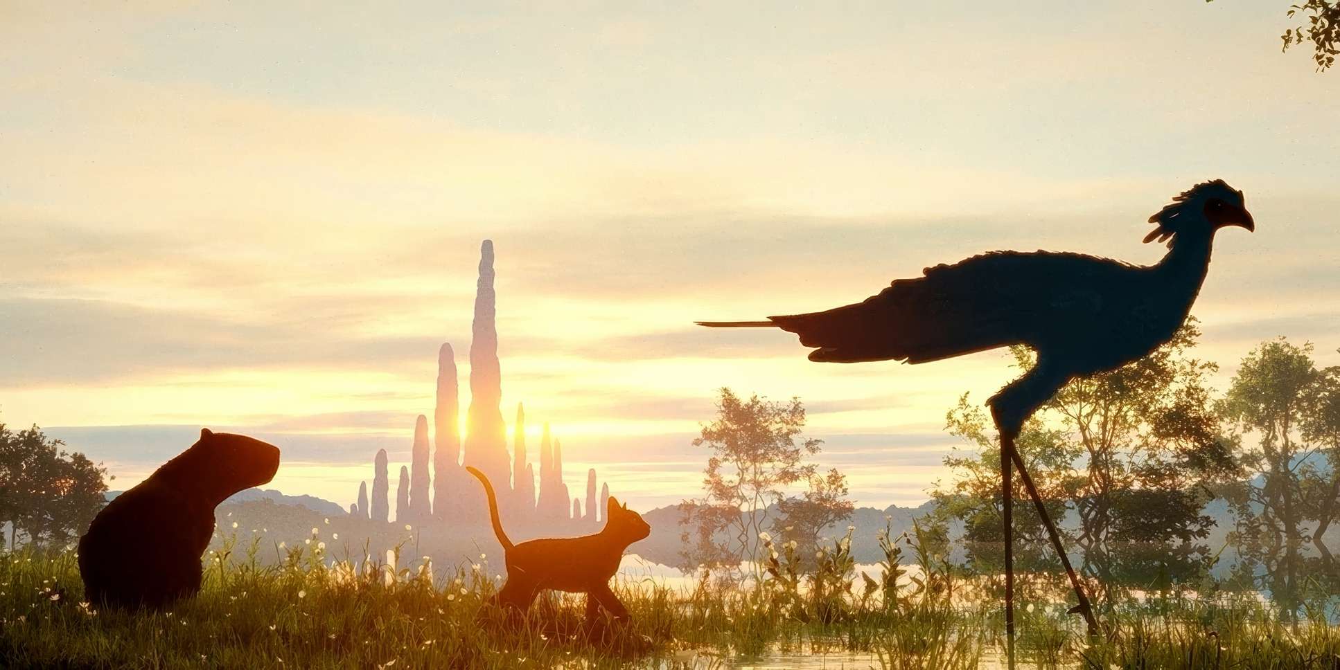
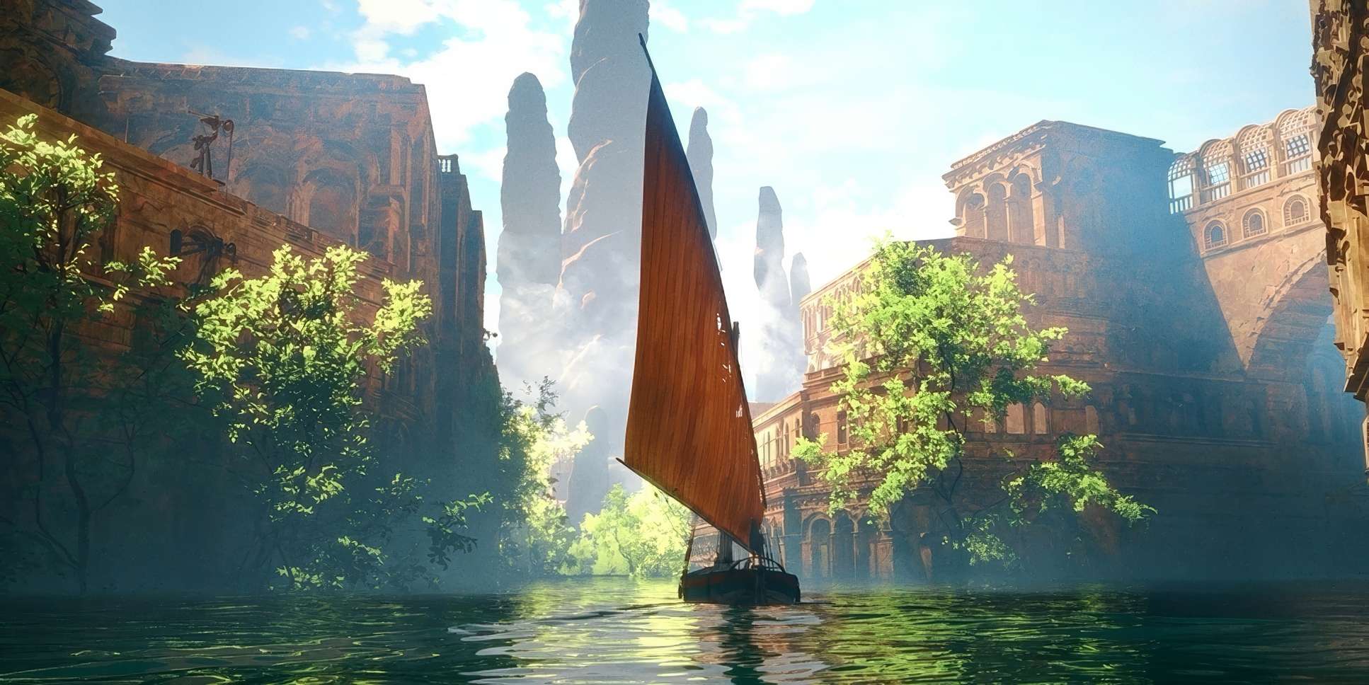
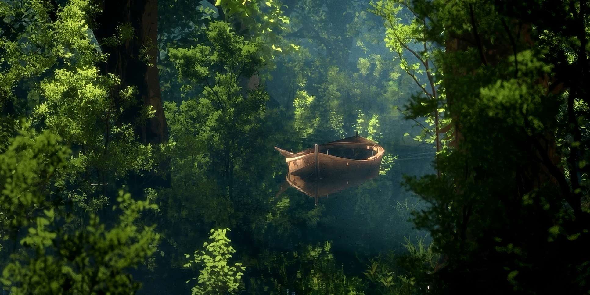
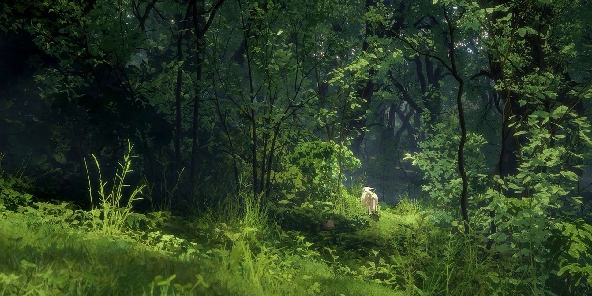
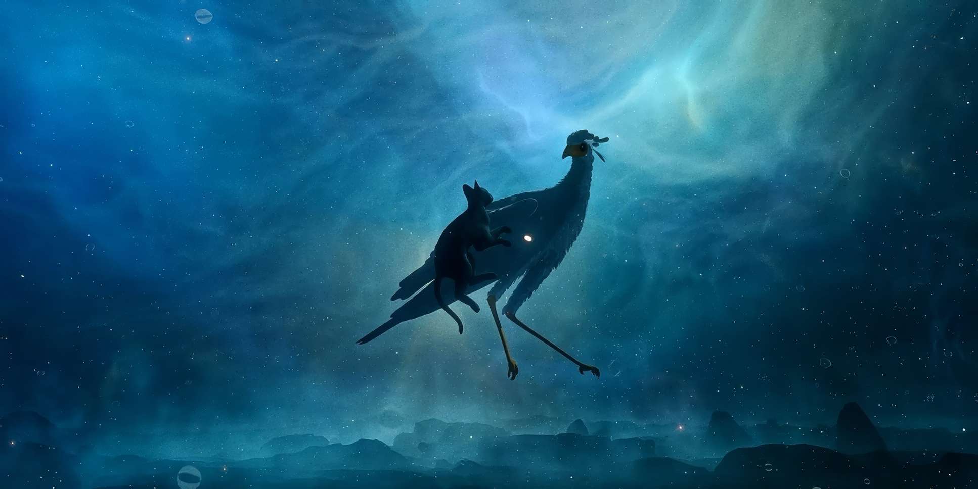
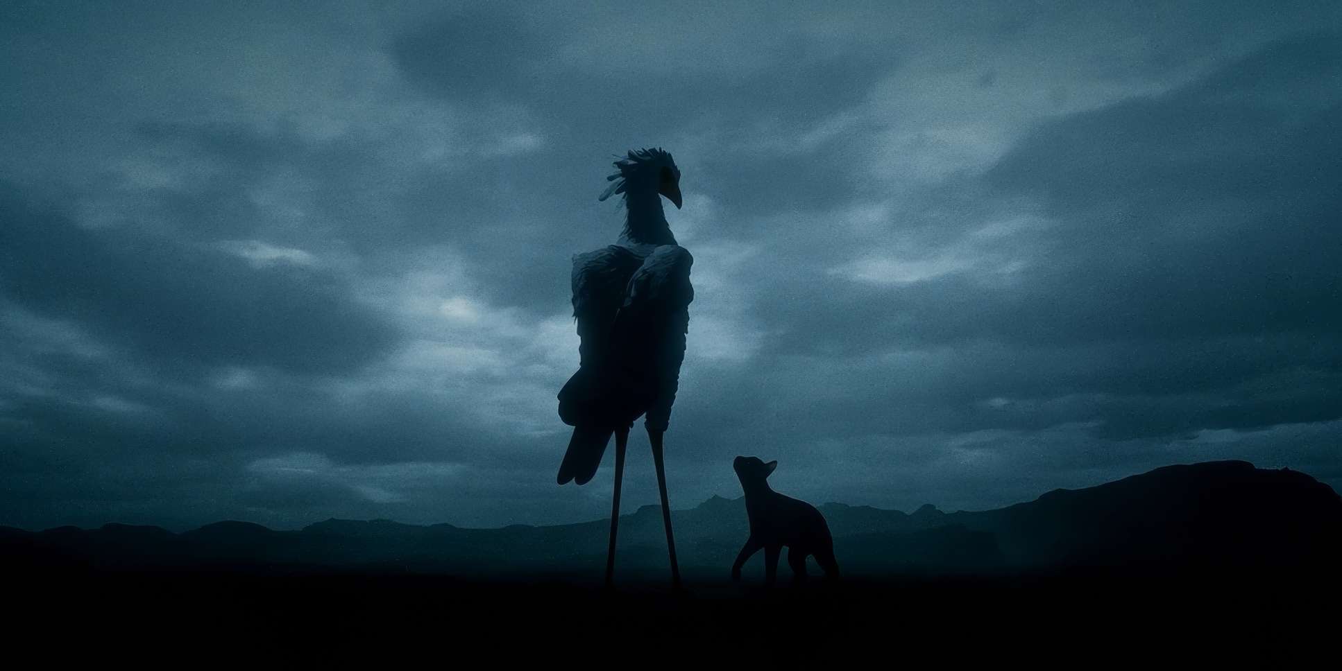
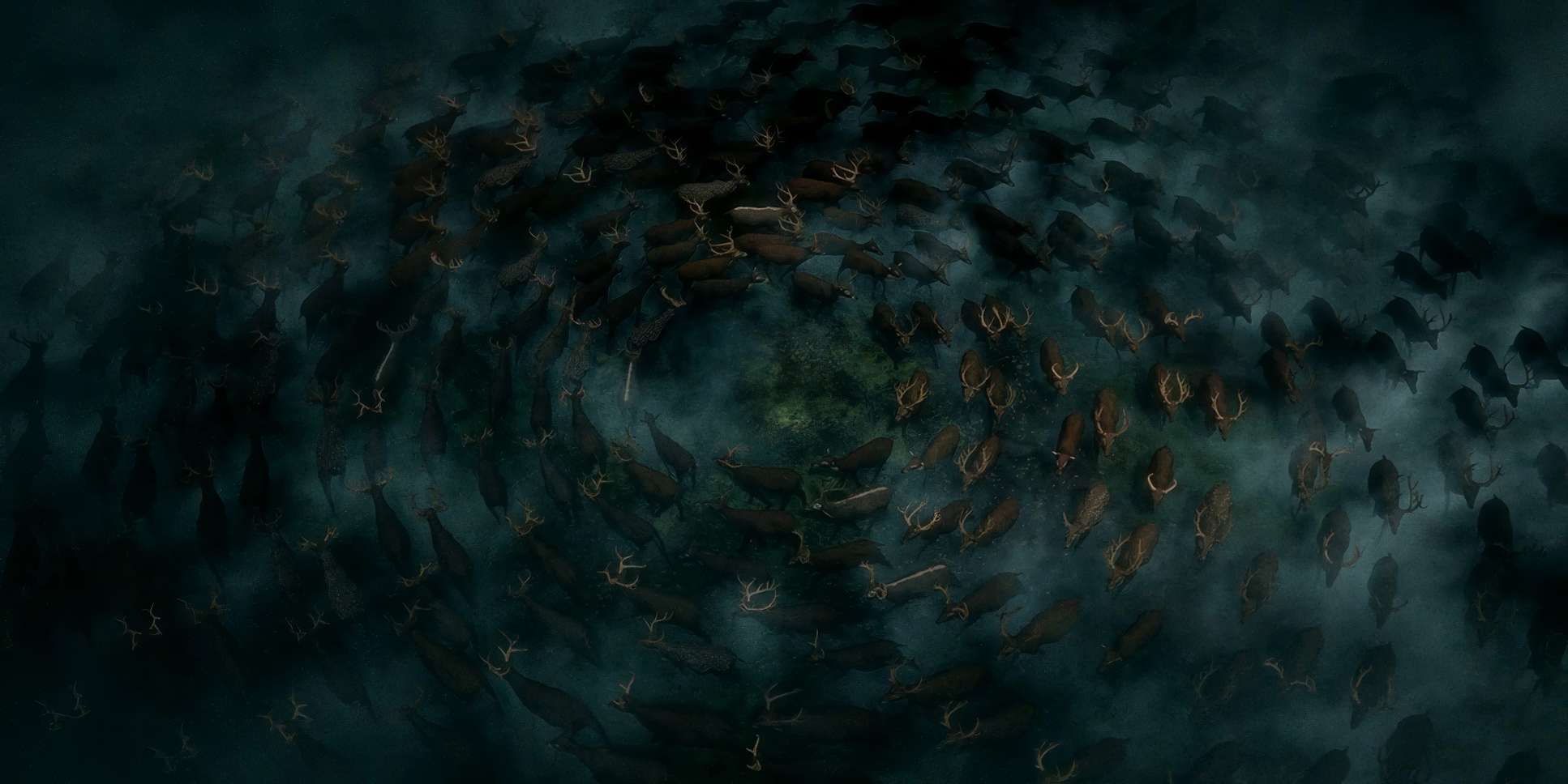
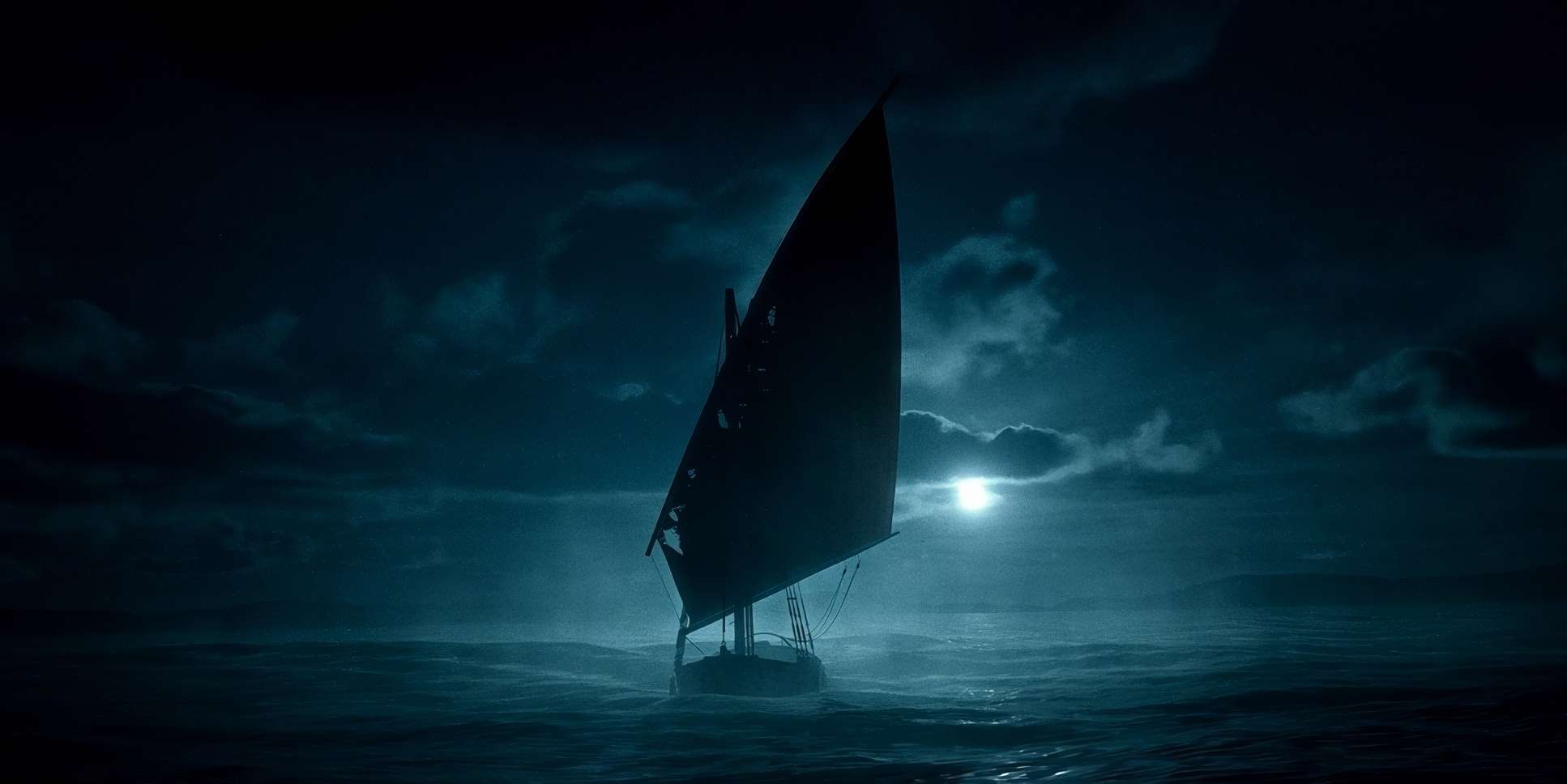
Visually, this means a world transformed. We see remnants of human life glass bottles, a house, monumental cat statues slowly disappearing beneath the rising tides. It tells us an era is being “washed away” without a single line of exposition. The style is what Mark Kermode called “magical realist,” grounding fantastical elements (like those ascending secretary birds) in a world that feels uncannily real. It reminds me of The Red Turtle it’s about letting the visuals do the heavy lifting. It doesn’t just show you a flood; it evokes the feeling of an era ending.
Camera Movements
For a film without dialogue, the camera is your narrator. Gints understands this perfectly. The camera work isn’t flashy for the sake of being “cool”; it’s purposeful.
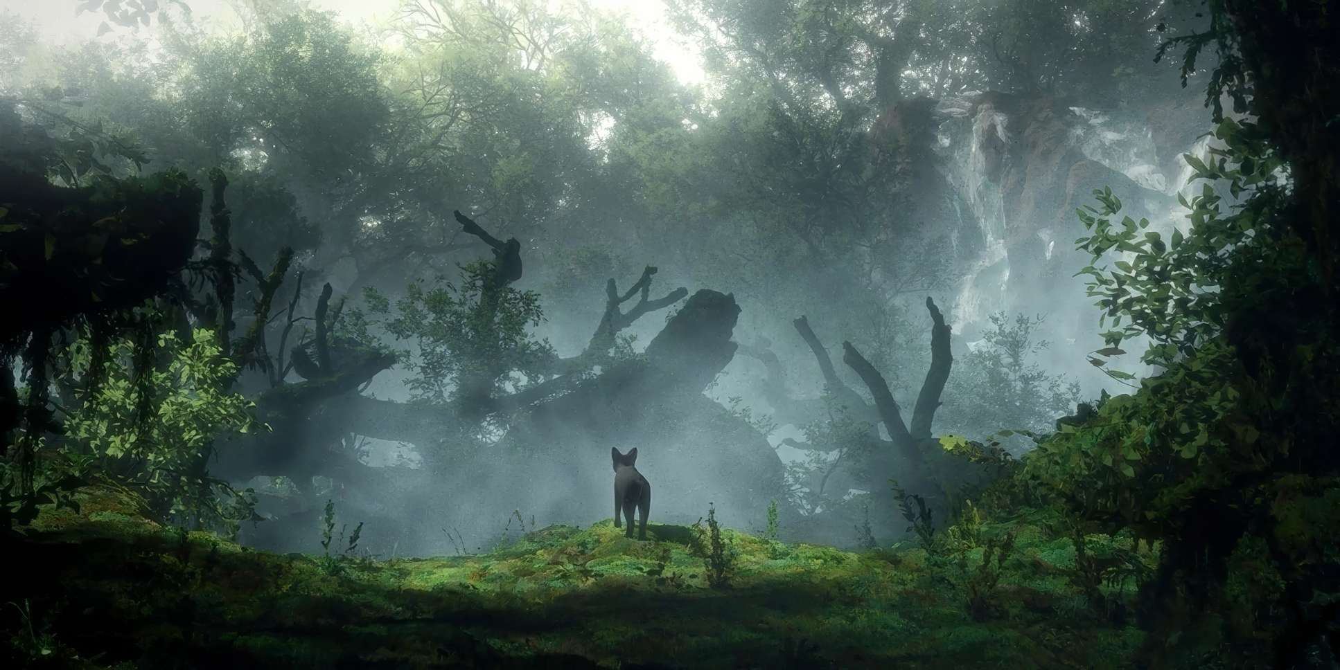
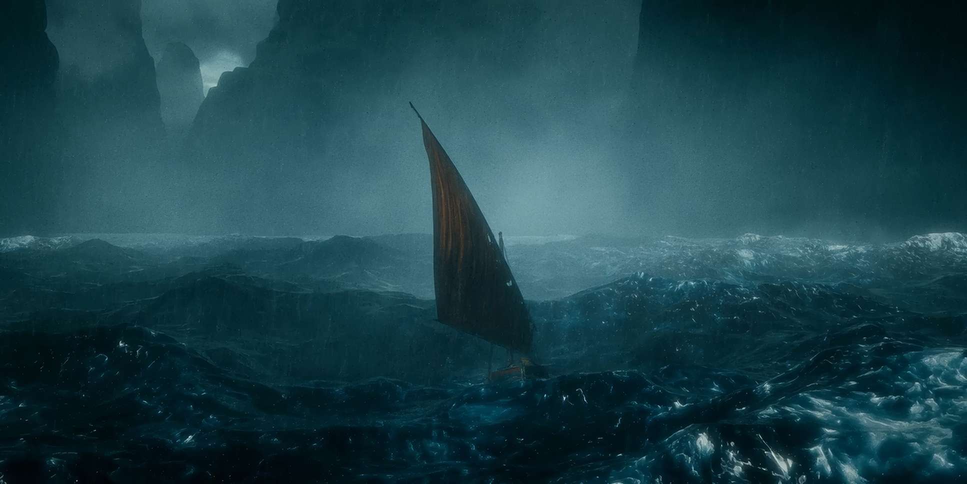
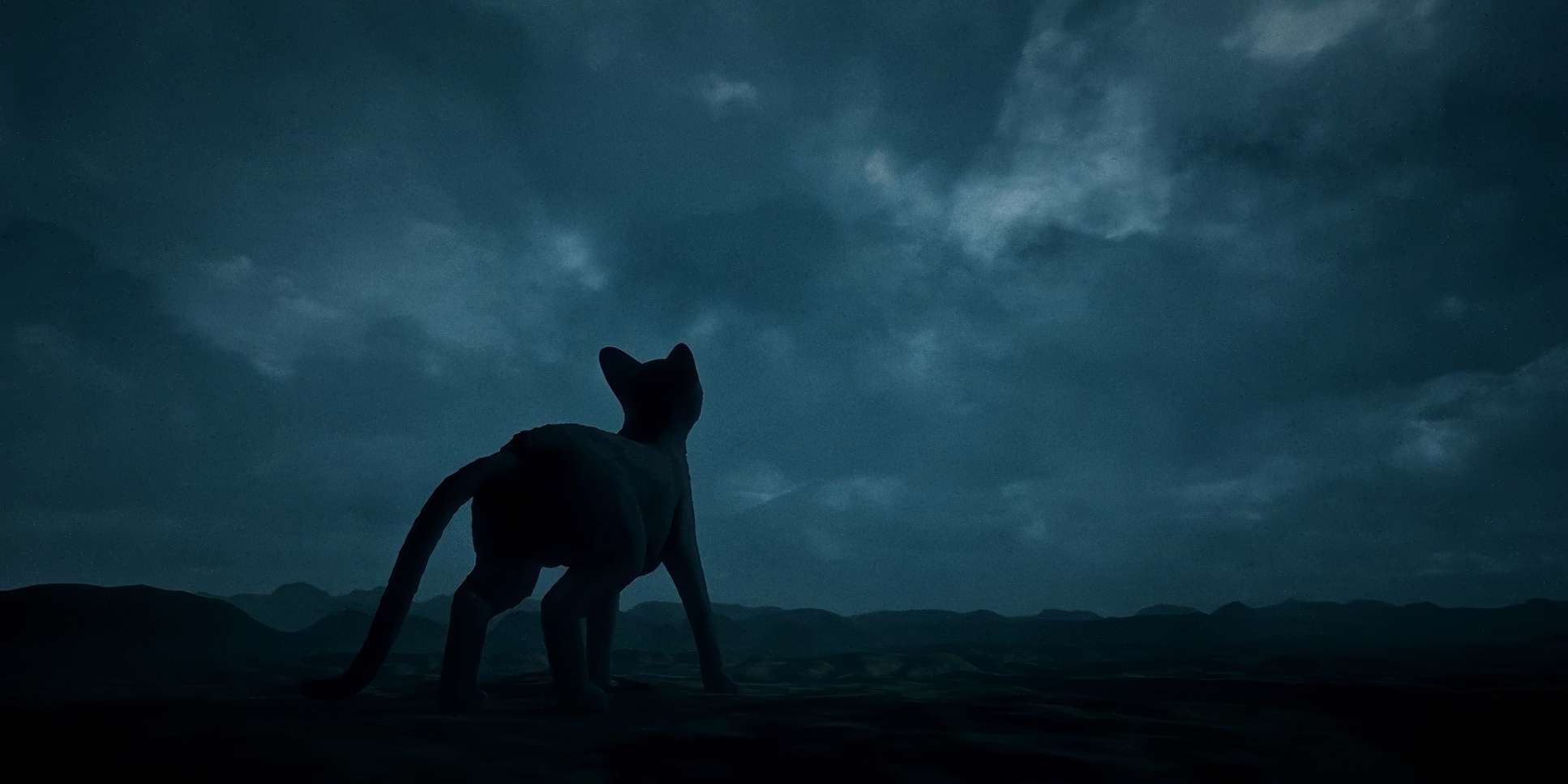
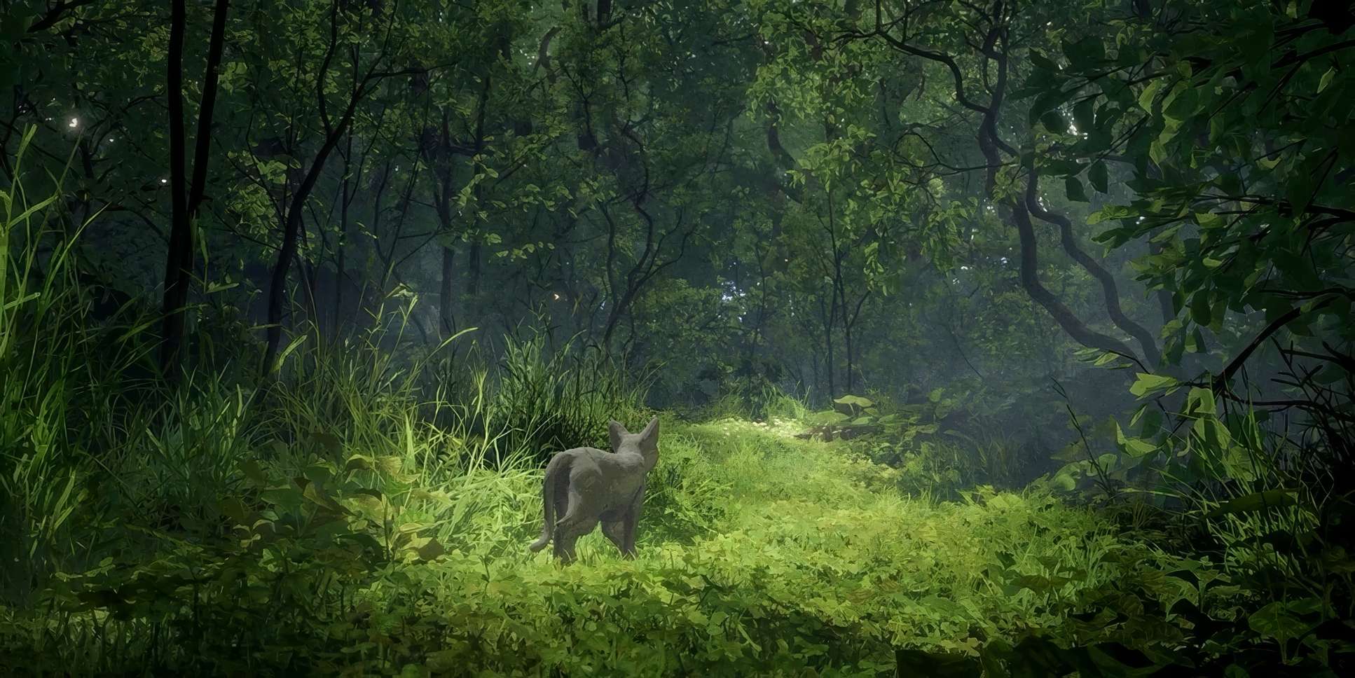
The movements are split into two vibes: observational and immersive. Early on, when the cat is still a loner, the camera keeps its distance. We see slow pushes and gentle tracks that emphasize the cat’s isolation. But the second the flood hits? Everything shifts. The camera dives into the chaos. We get handheld-esque jitters and rapid pans that make the peril feel immediate.
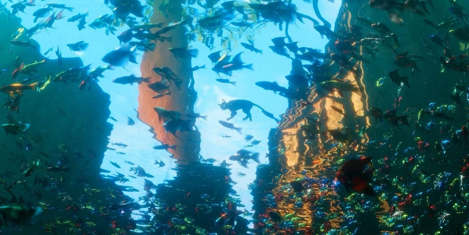
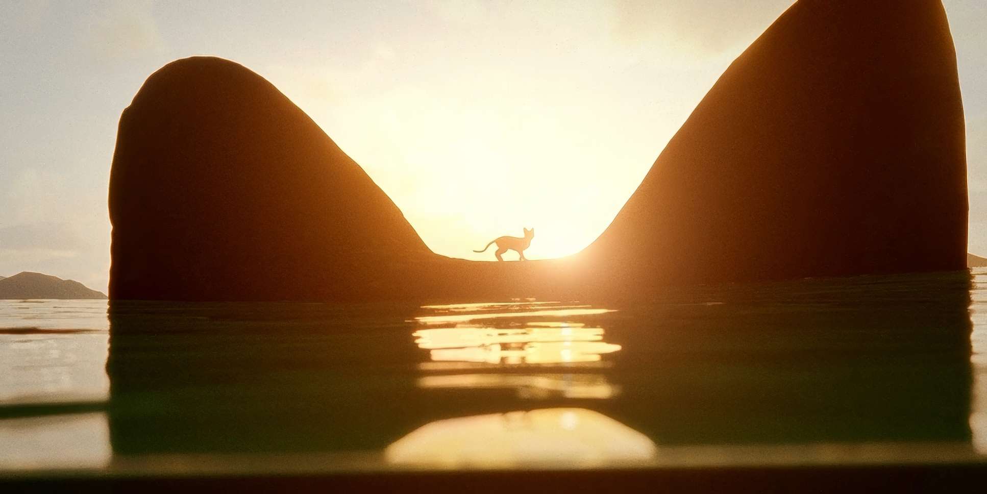
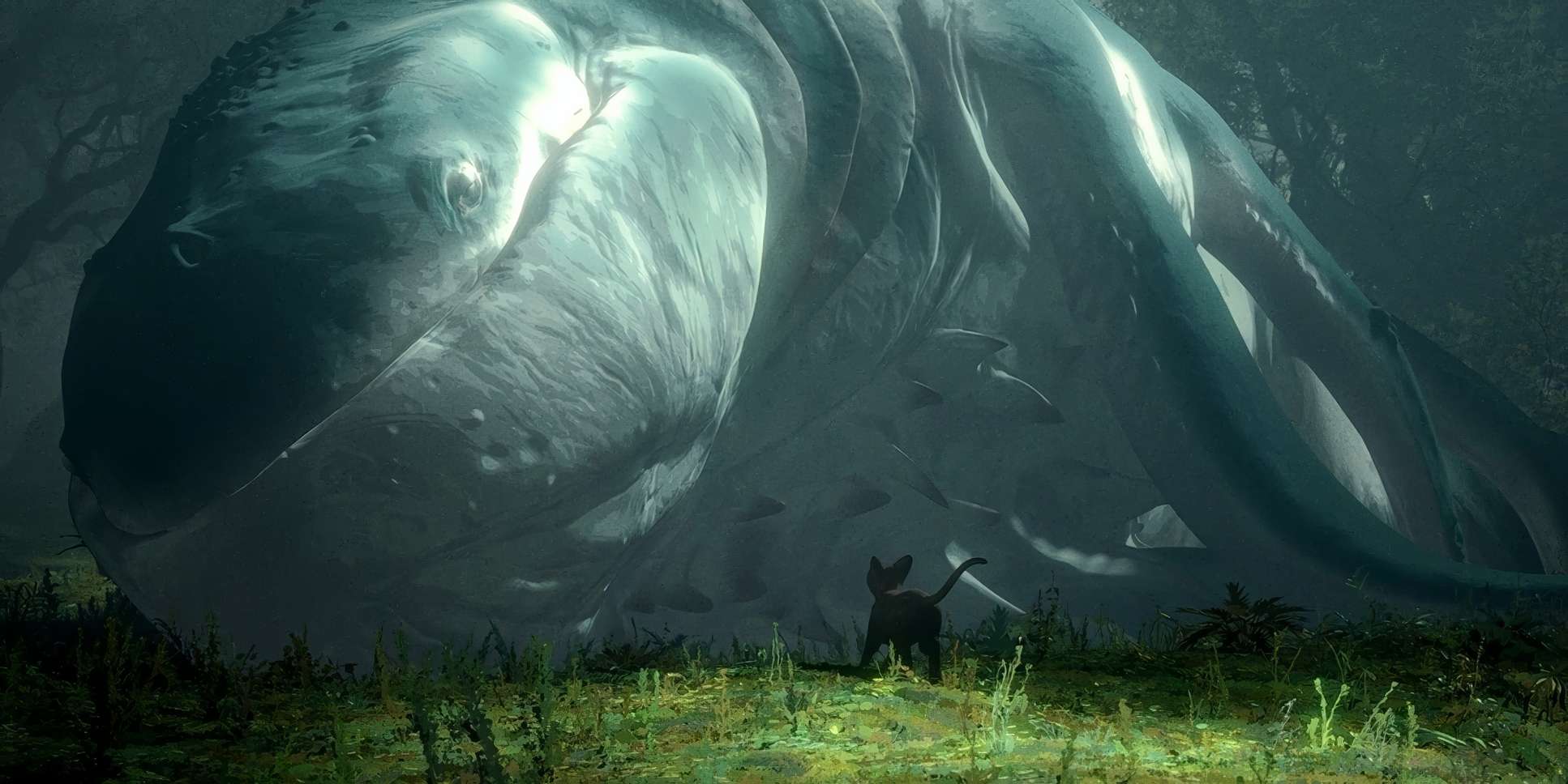
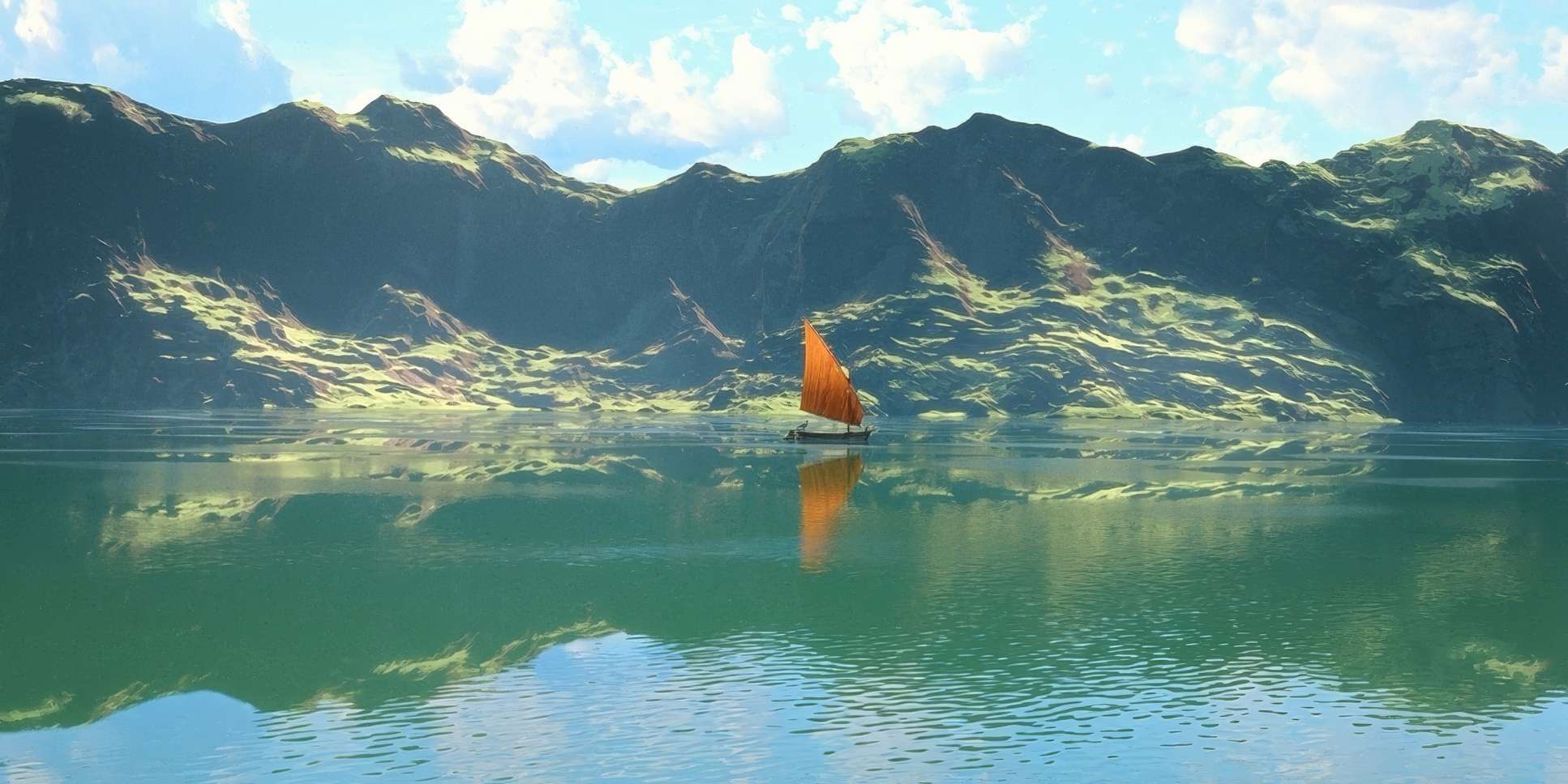
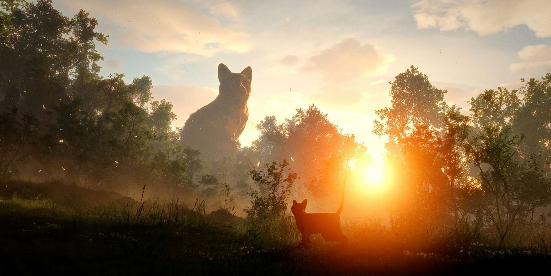
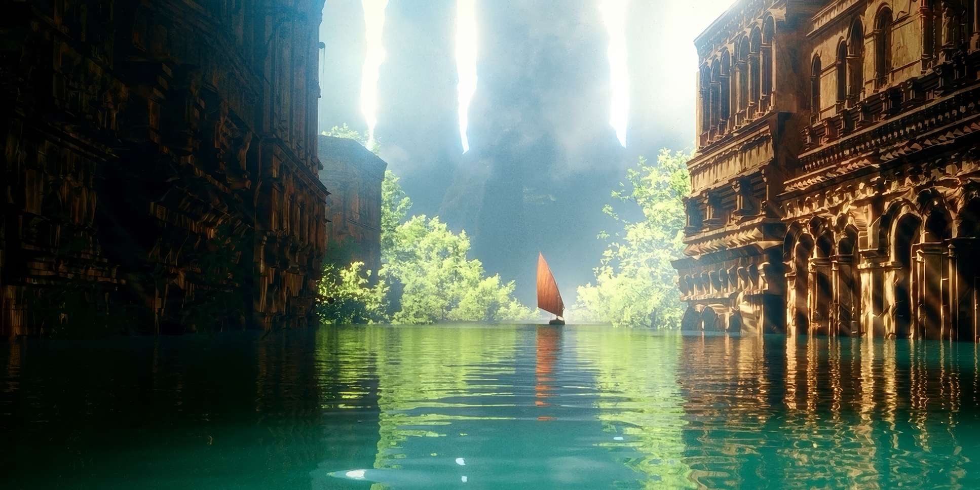
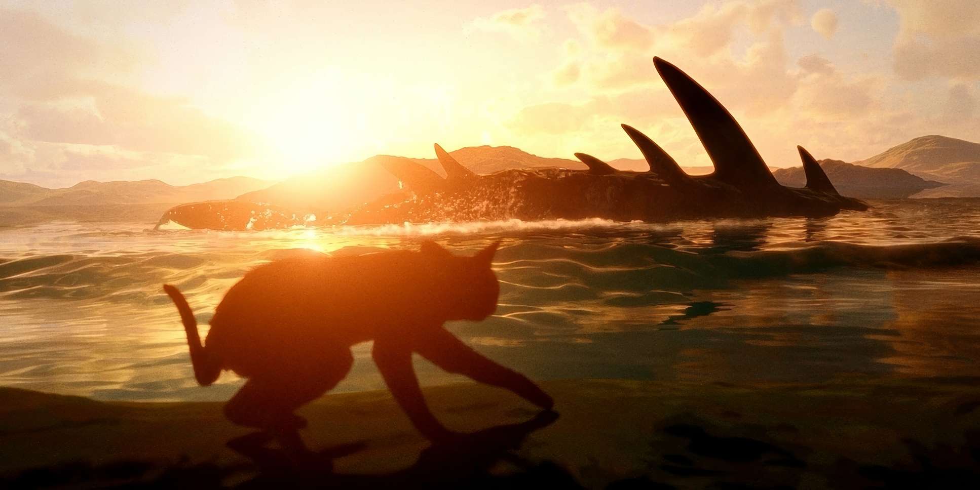
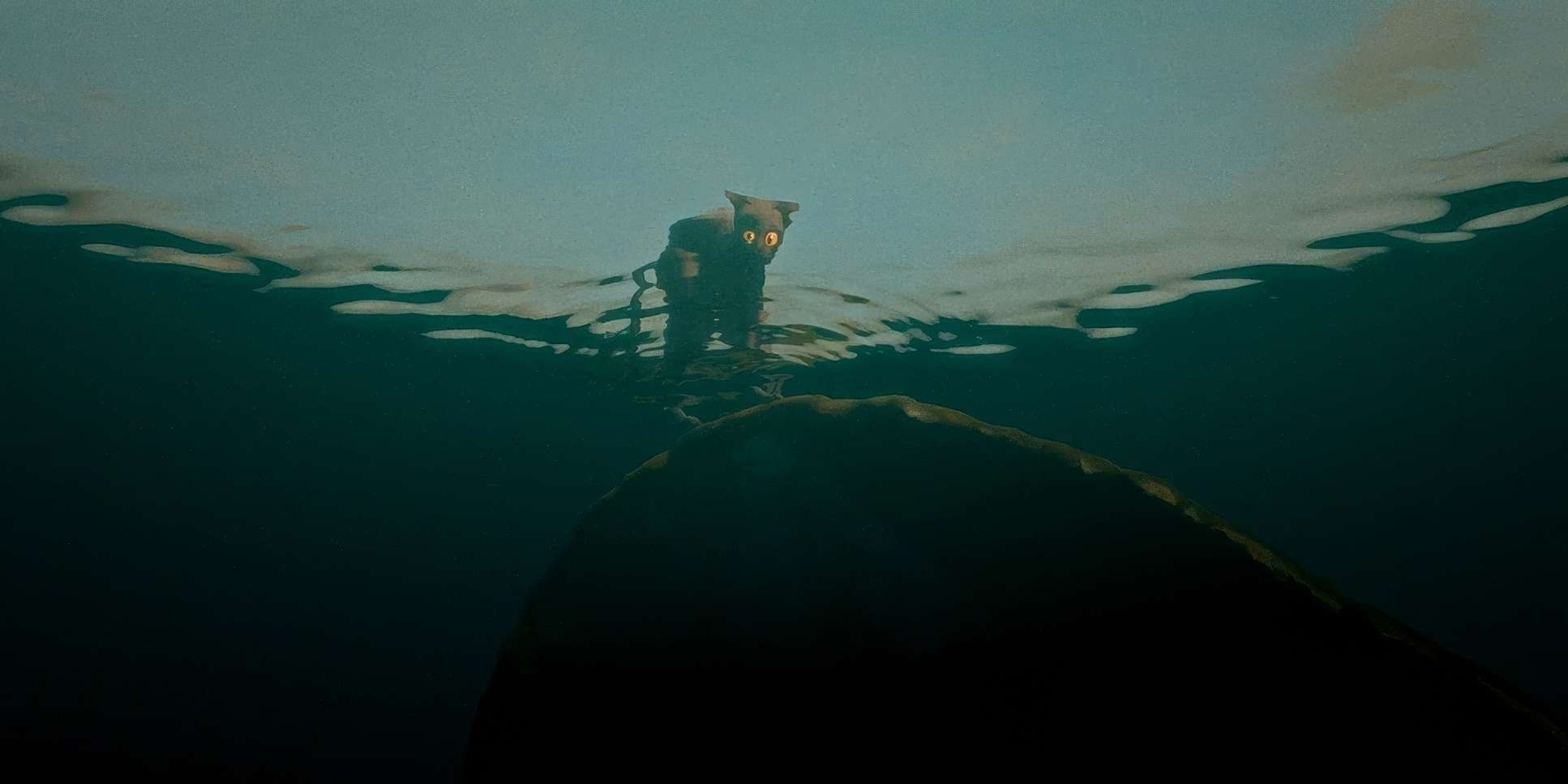
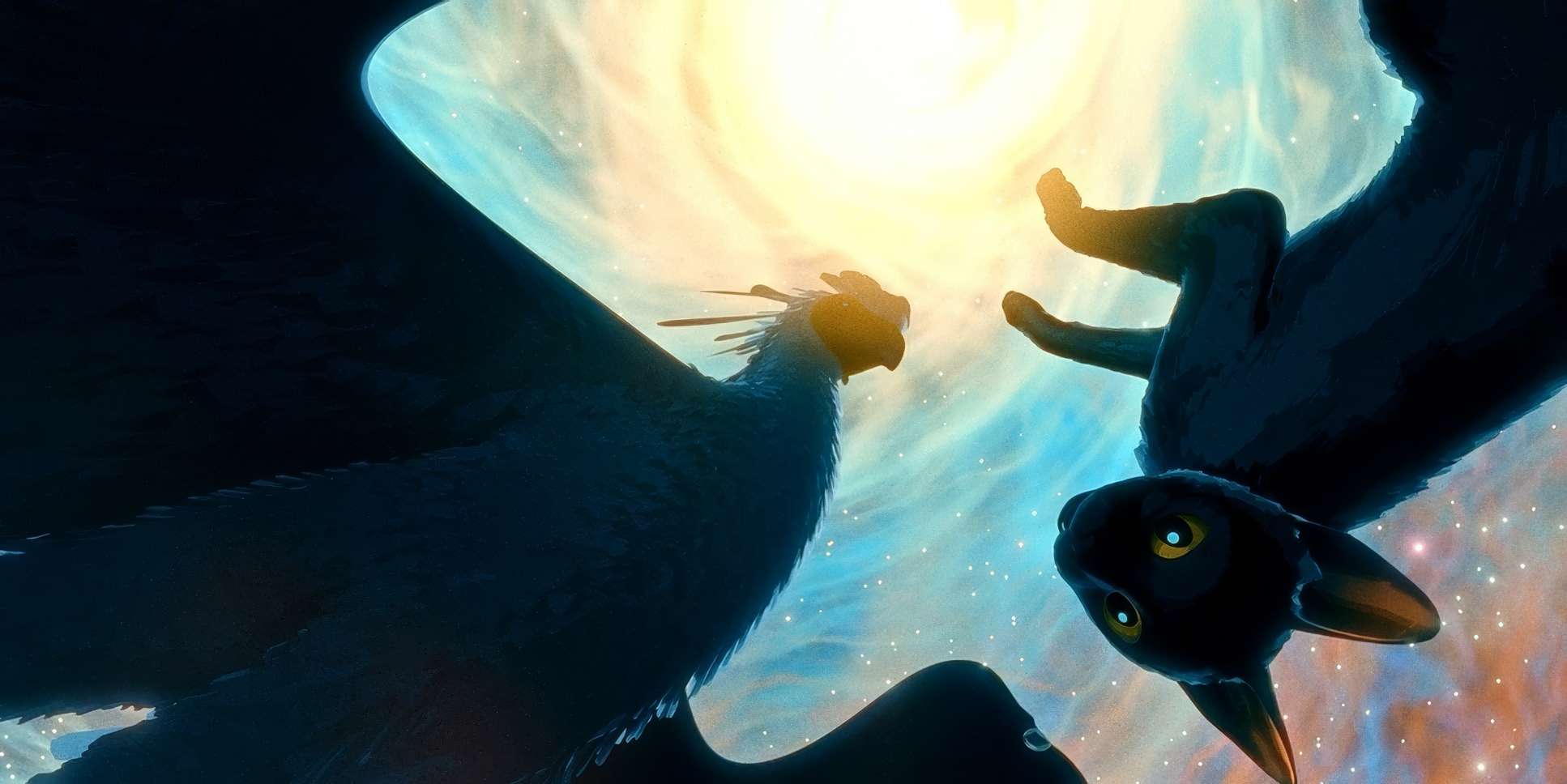
Once the animals are on the boat, there’s a beautiful fluidity to the movement. The camera tracks alongside them, sometimes pulling back to show their tiny vessel against a vast, drowned world, and sometimes getting close enough to feel the rocking of the water. It’s not just a visual effect; it’s an extension of the cat’s fear. When that legendary whale-type creature blasts out of the water, the camera pulls back, letting the scale fill the frame. It’s a classic move: use movement to build the connection, then use stillness to convey the awe.
Compositional Choices
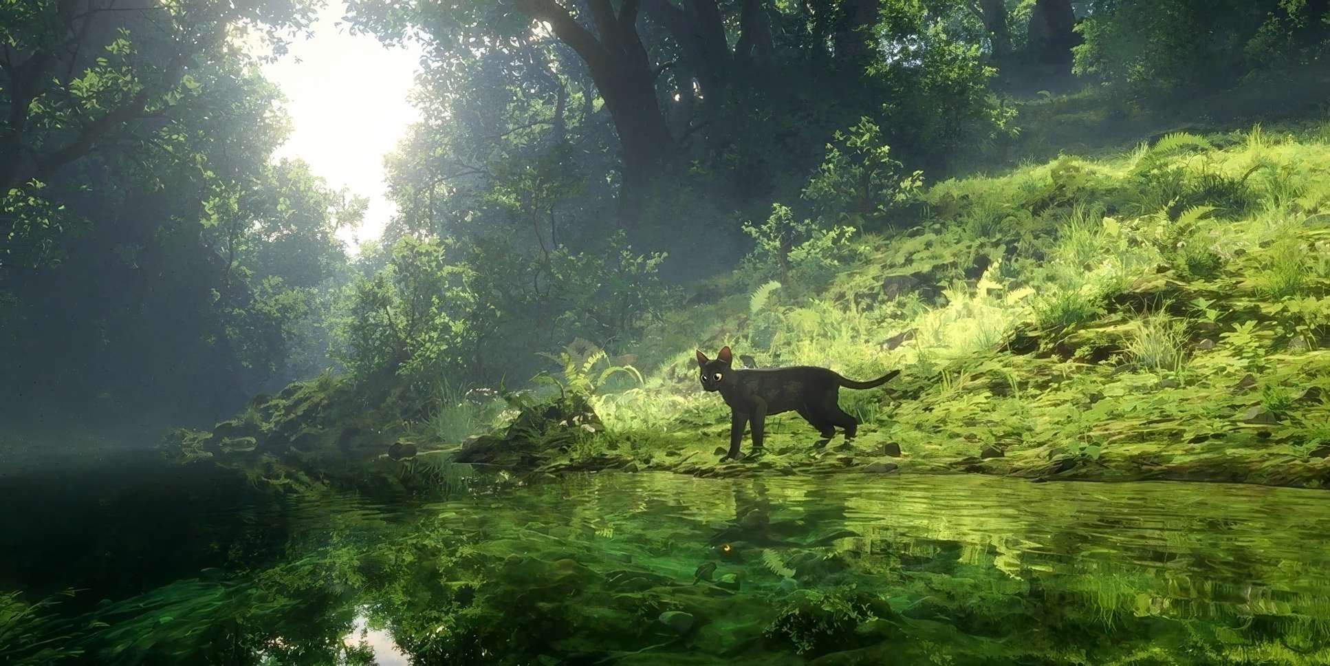
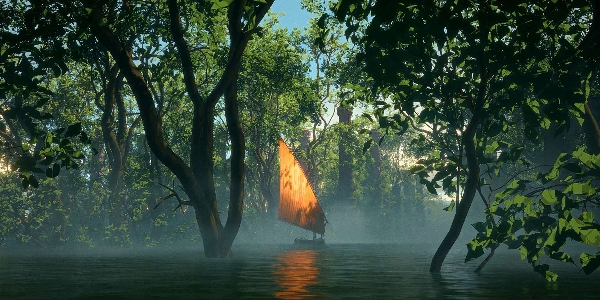
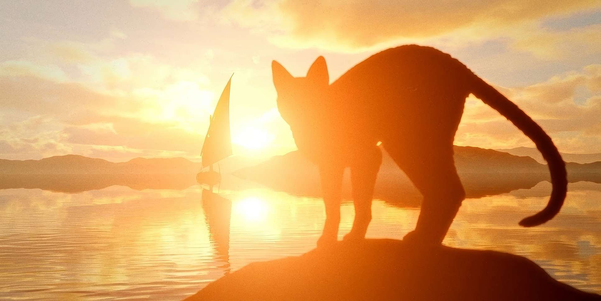
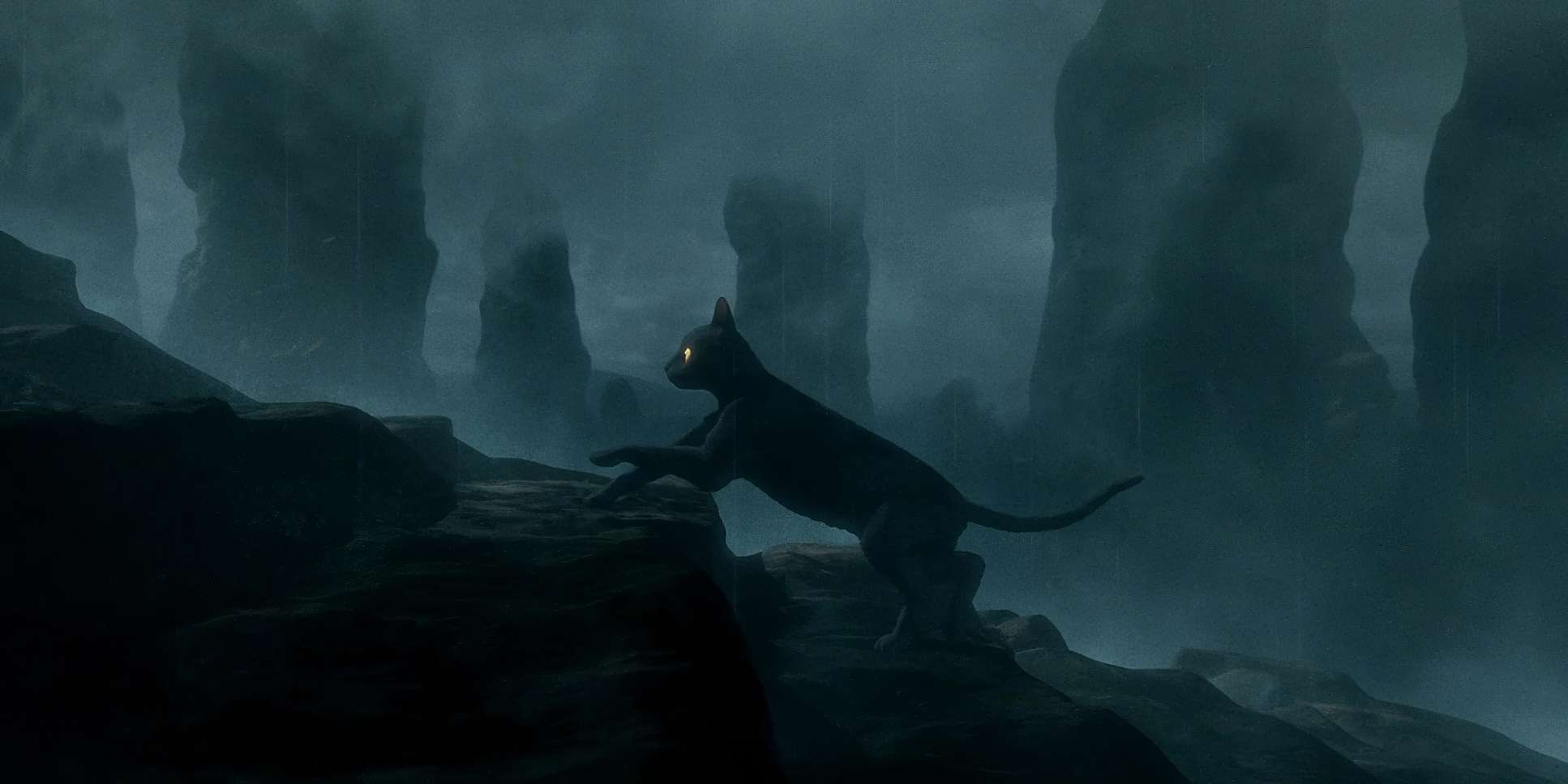
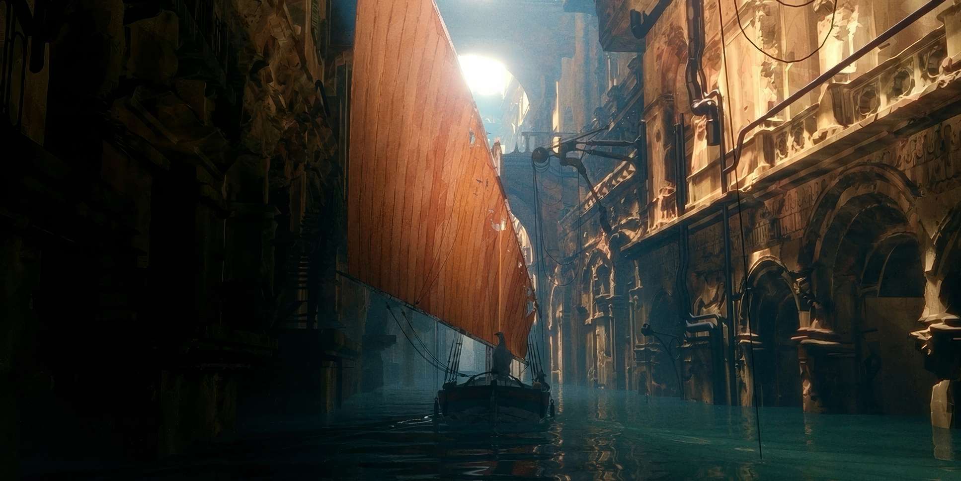
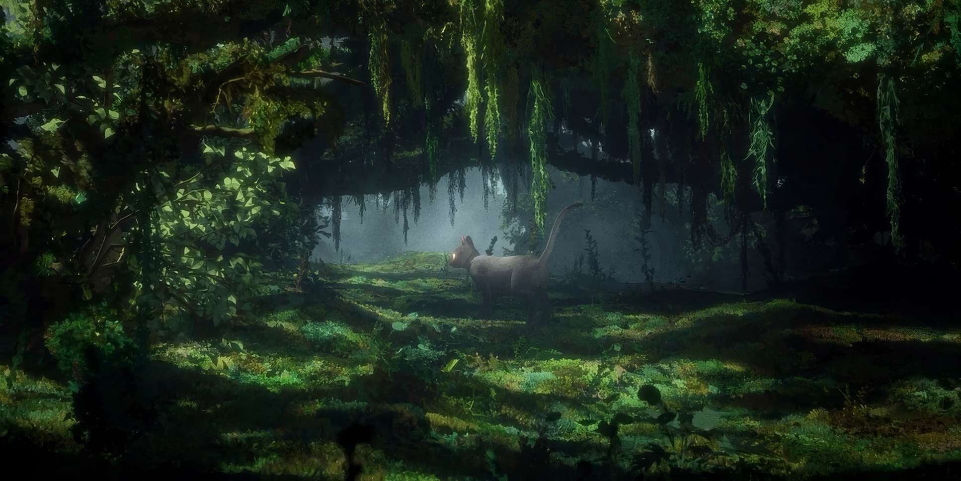
The compositions here are a masterclass in visual storytelling. Gints frequently uses wide shots to establish just how vulnerable these animals are. Seeing that tiny boat against endless water and submerged ruins communicates the stakes instantly. It builds this tension between awe and existential dread.
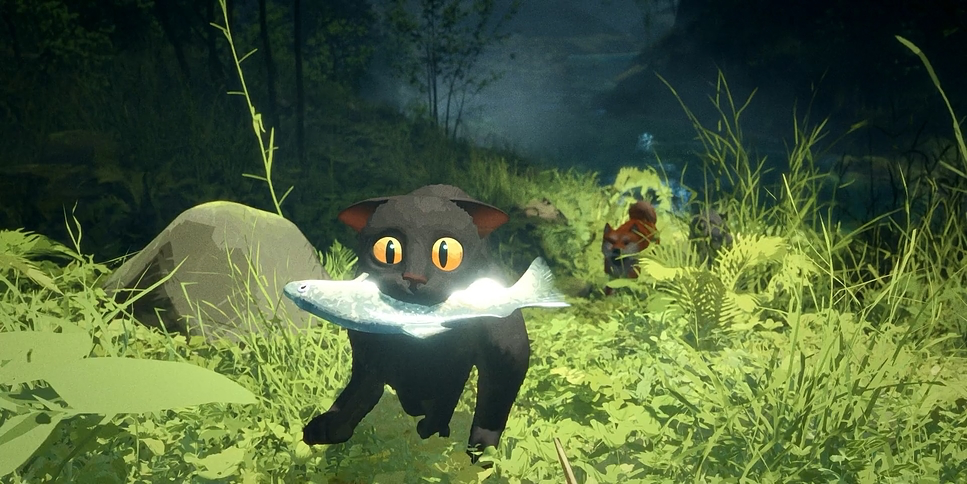
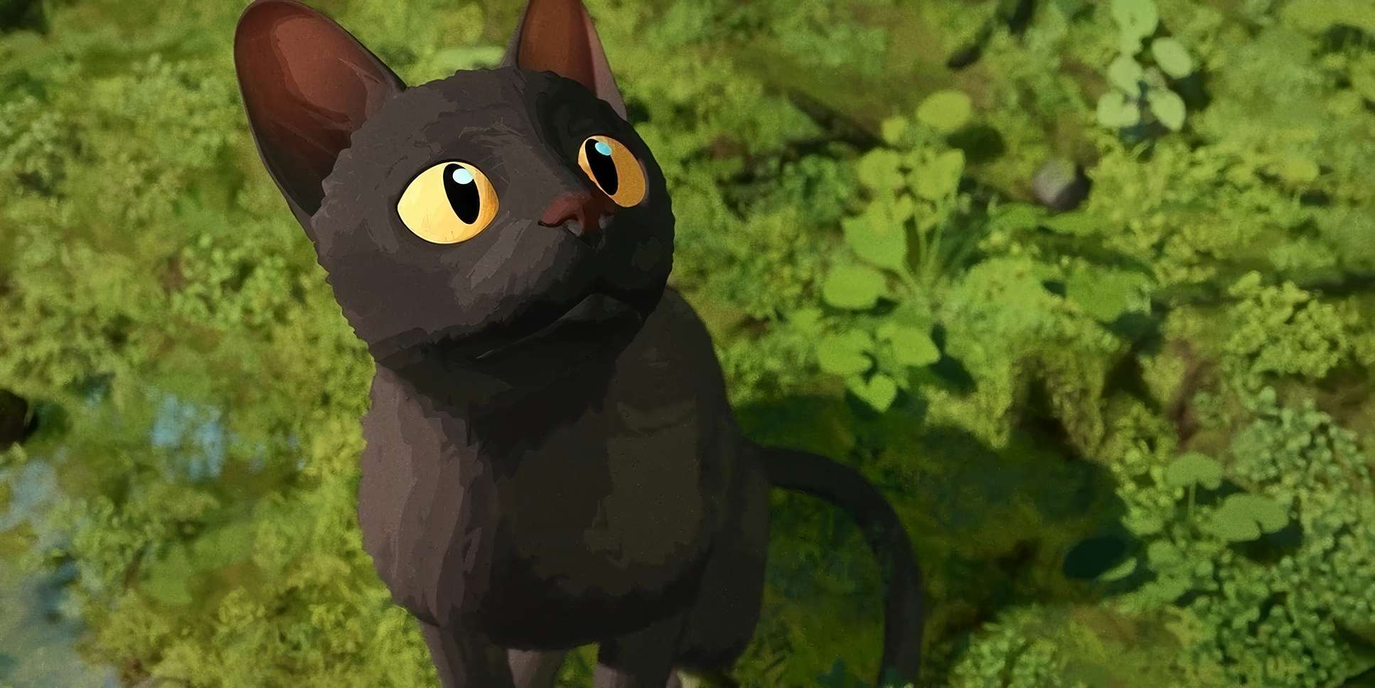
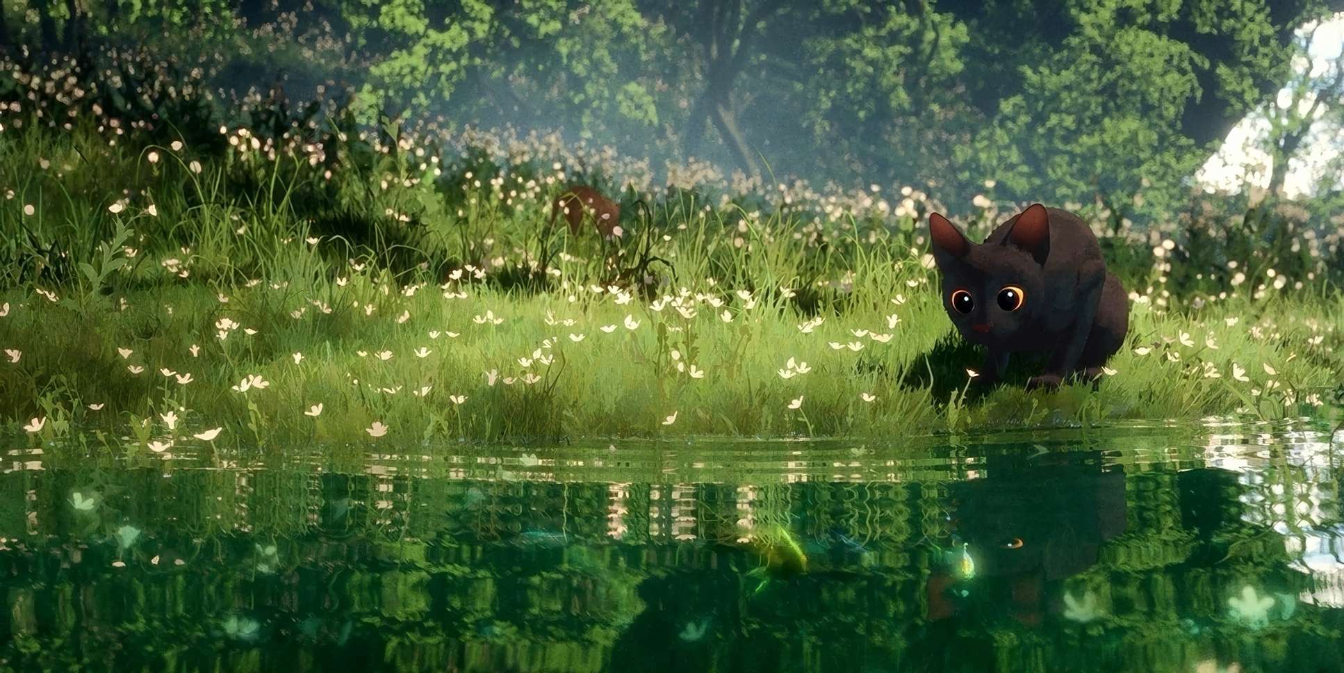
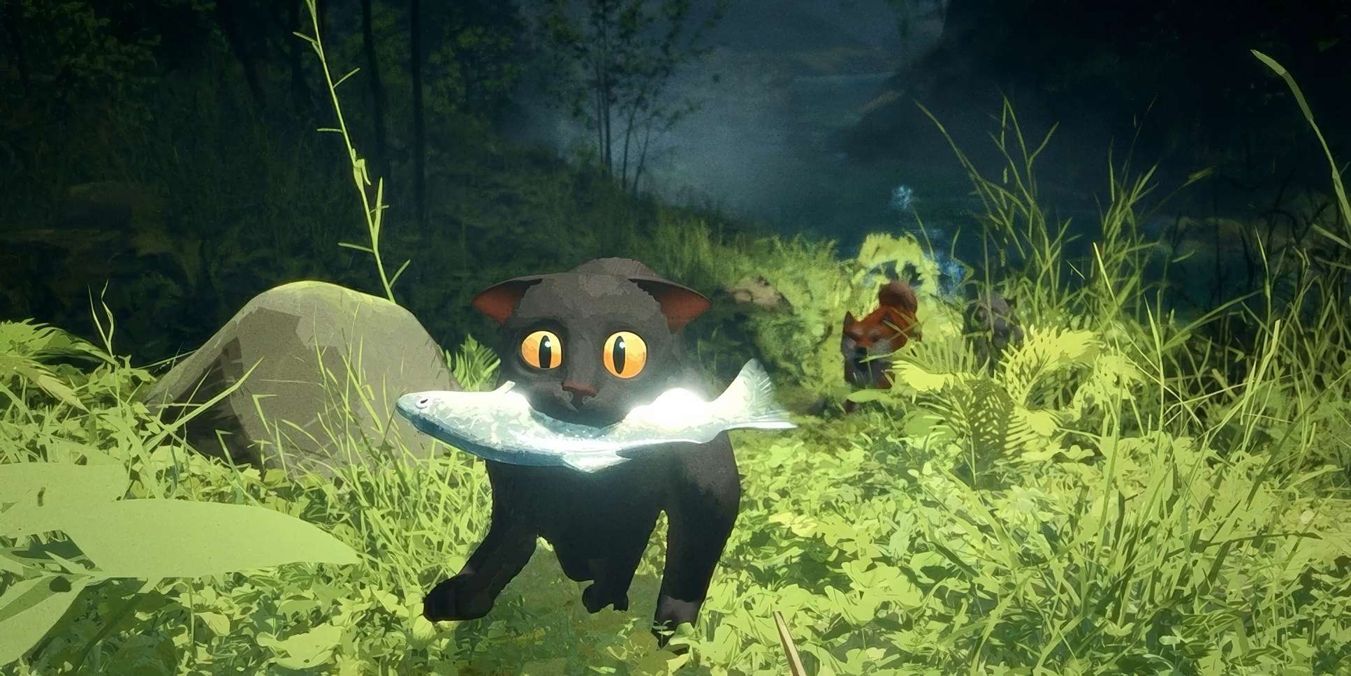
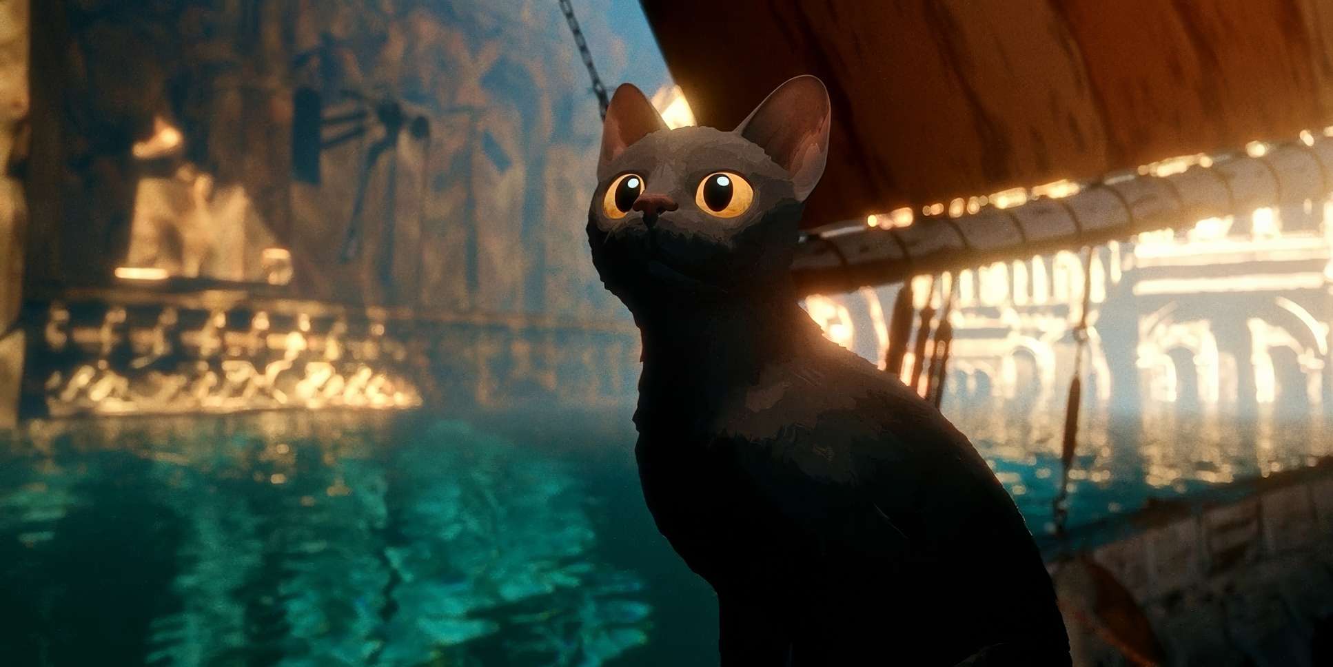
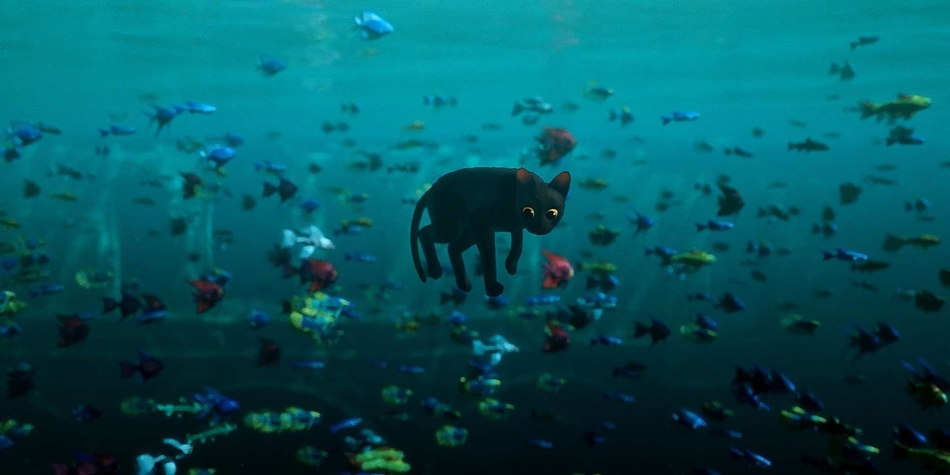
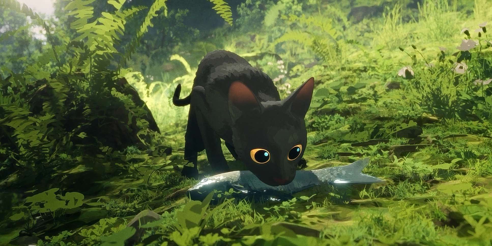
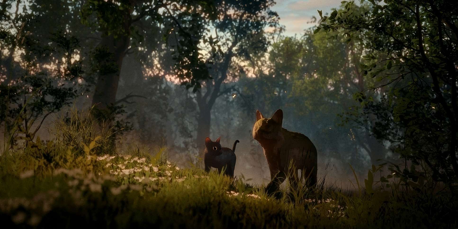
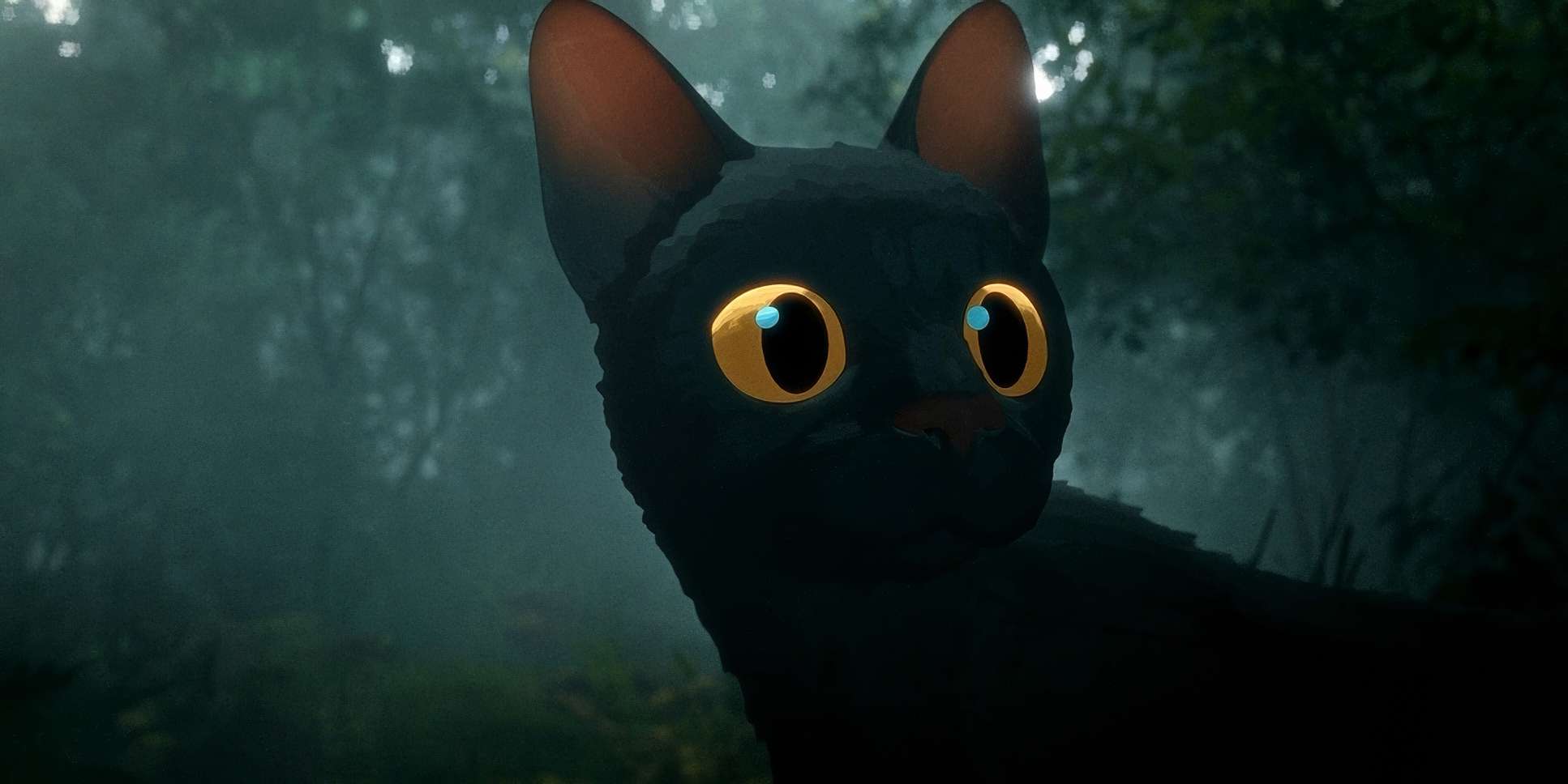
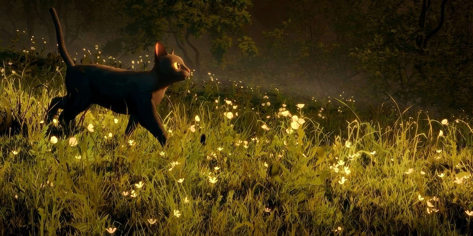
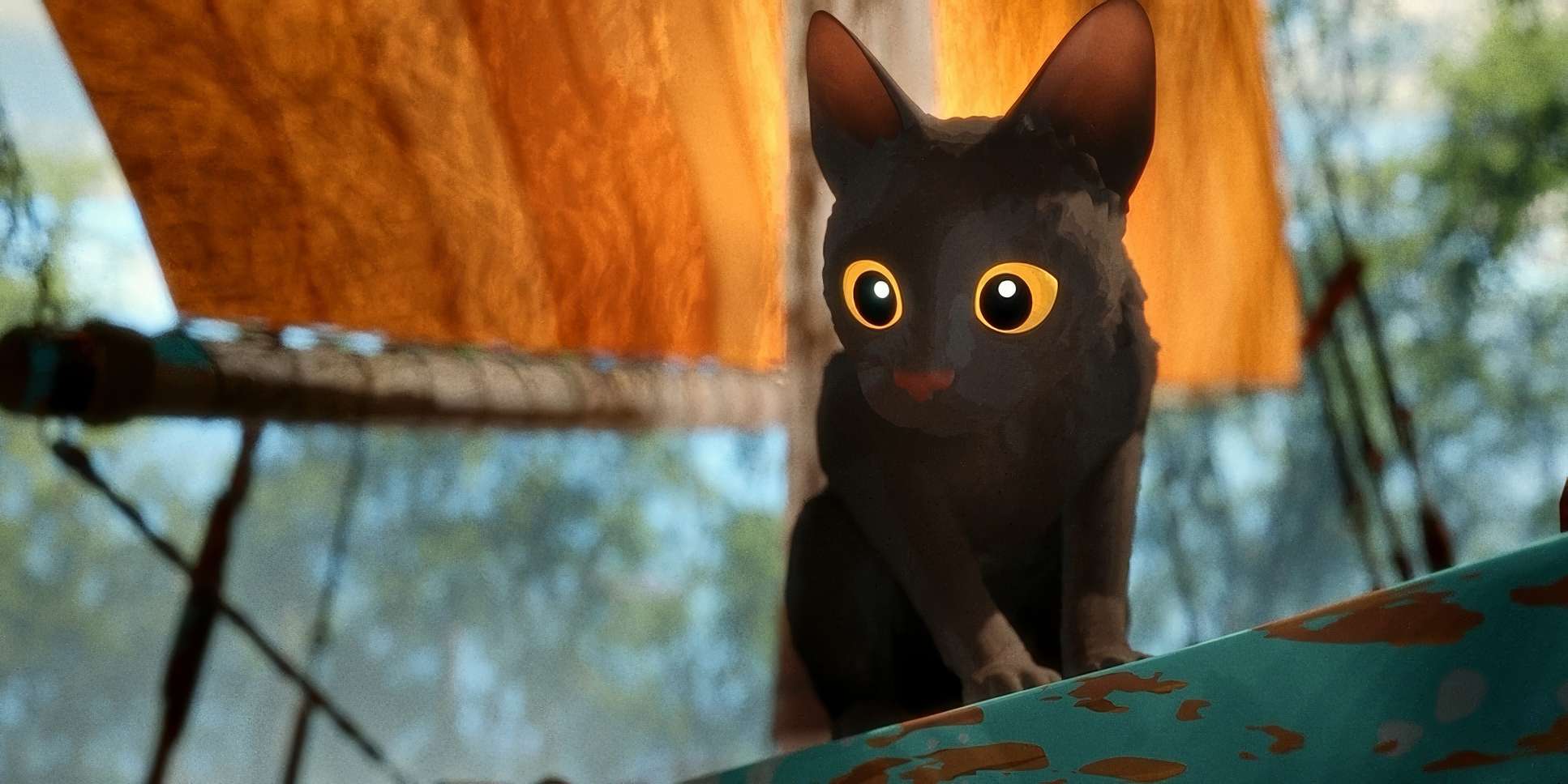
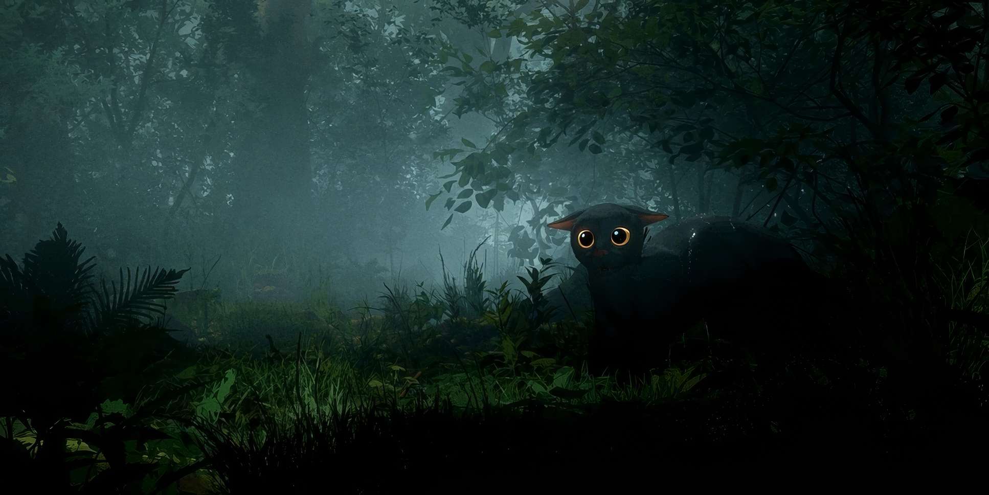
Then, he hits you with the close-ups. In animation, people often over-animate expressions to get a point across. Here, the subtlety is what works. The shift in the cat’s eyes or the capybara’s drowsy contentment lands because the composition isolates them. It forces you to read their intent.
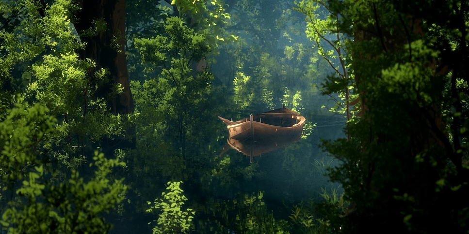
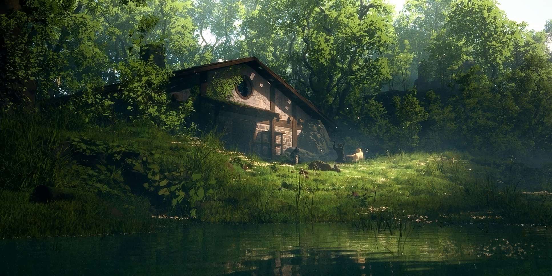
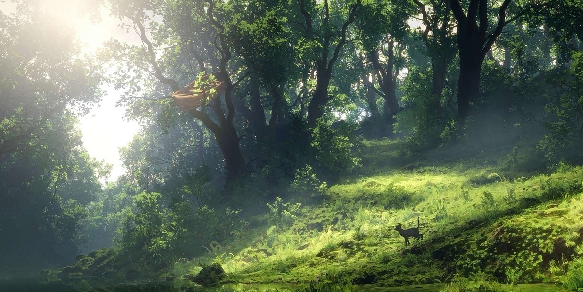
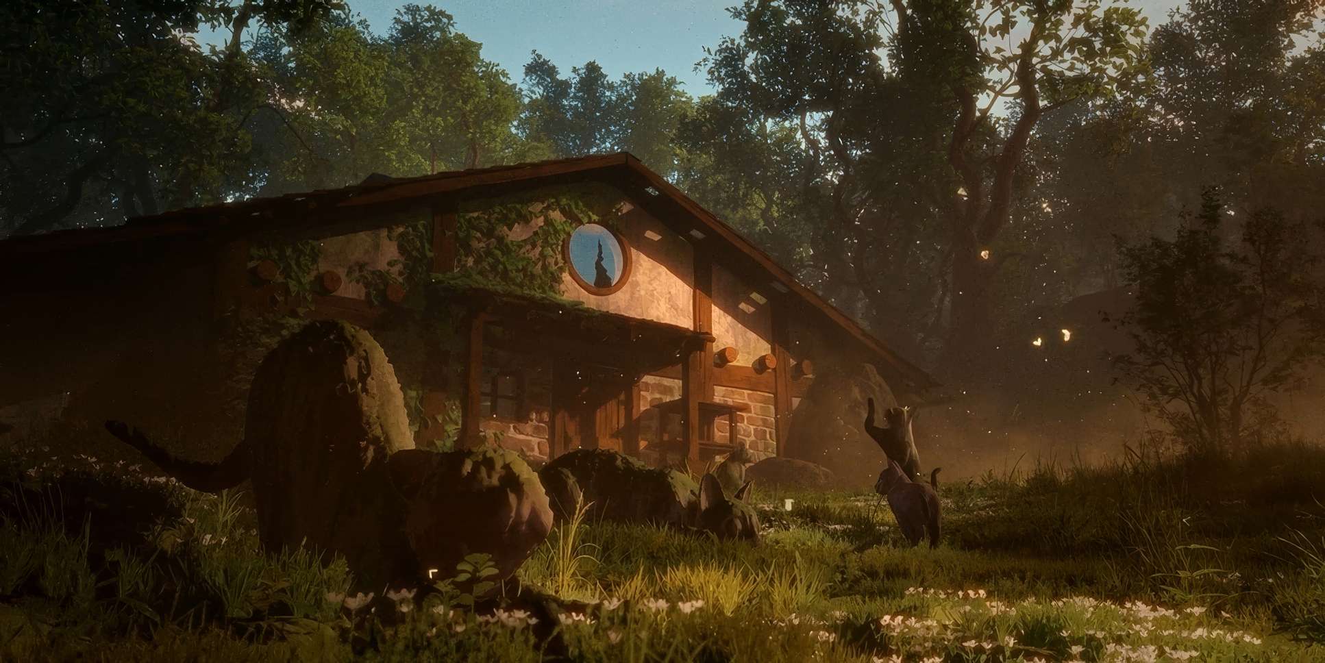
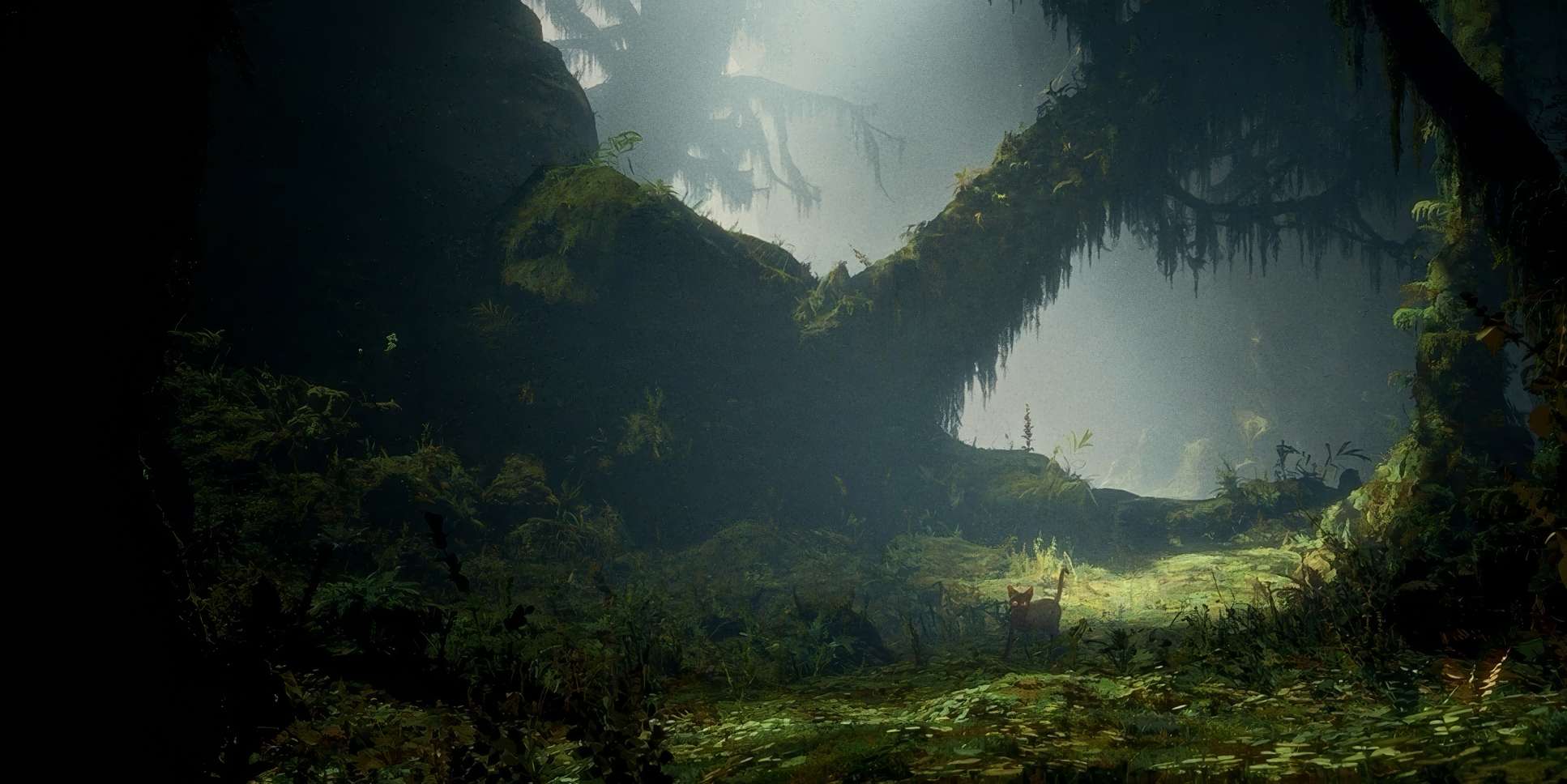
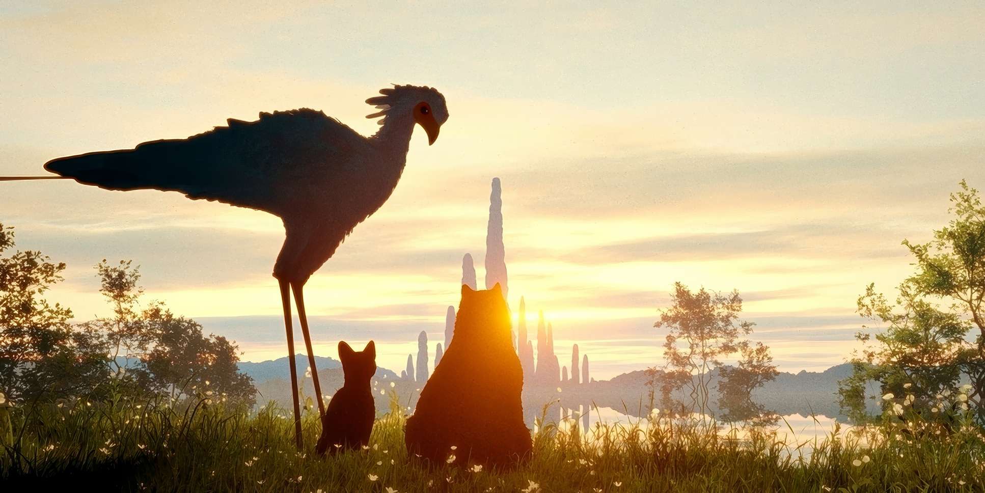
I also loved the use of negative space. With so much water, the sky and the sea often dominate the frame, which heightens that feeling of a journey into the unknown. Even the “eerie moving trees” and the boat stuck in a treetop serve as depth cues and narrative markers. The compositions use leading lines the horizon of the water or the line of a fallen tree to guide your eye even when nothing is moving. It’s a world where verticality is constantly being challenged by the horizontal plane of the water.
Lighting Style
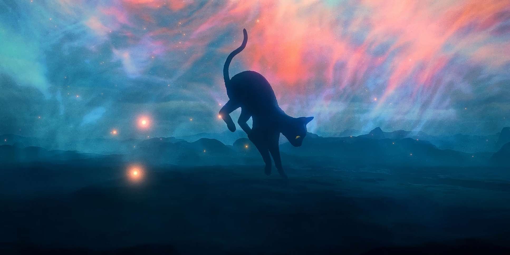
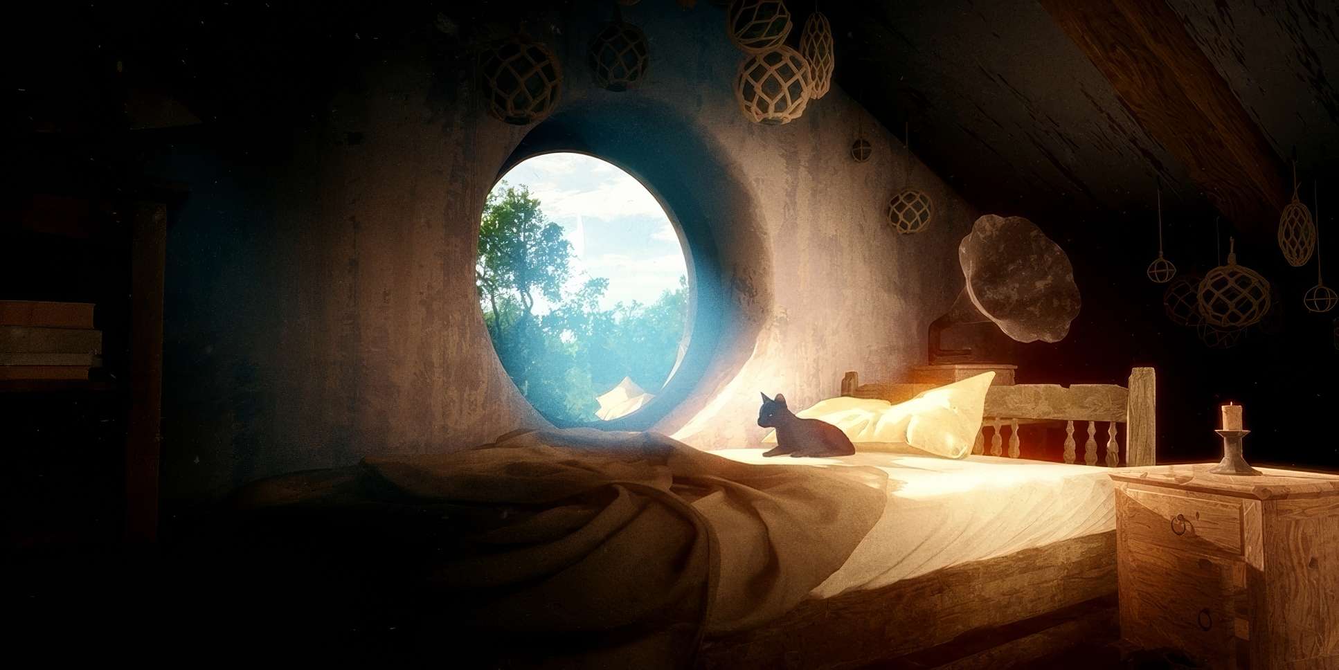
As a colorist, the lighting in Flow is what really got me. It’s motivated, but it has this dreamlike quality that balances the hyper-realism.
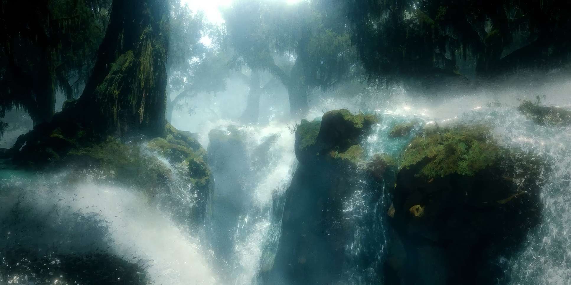
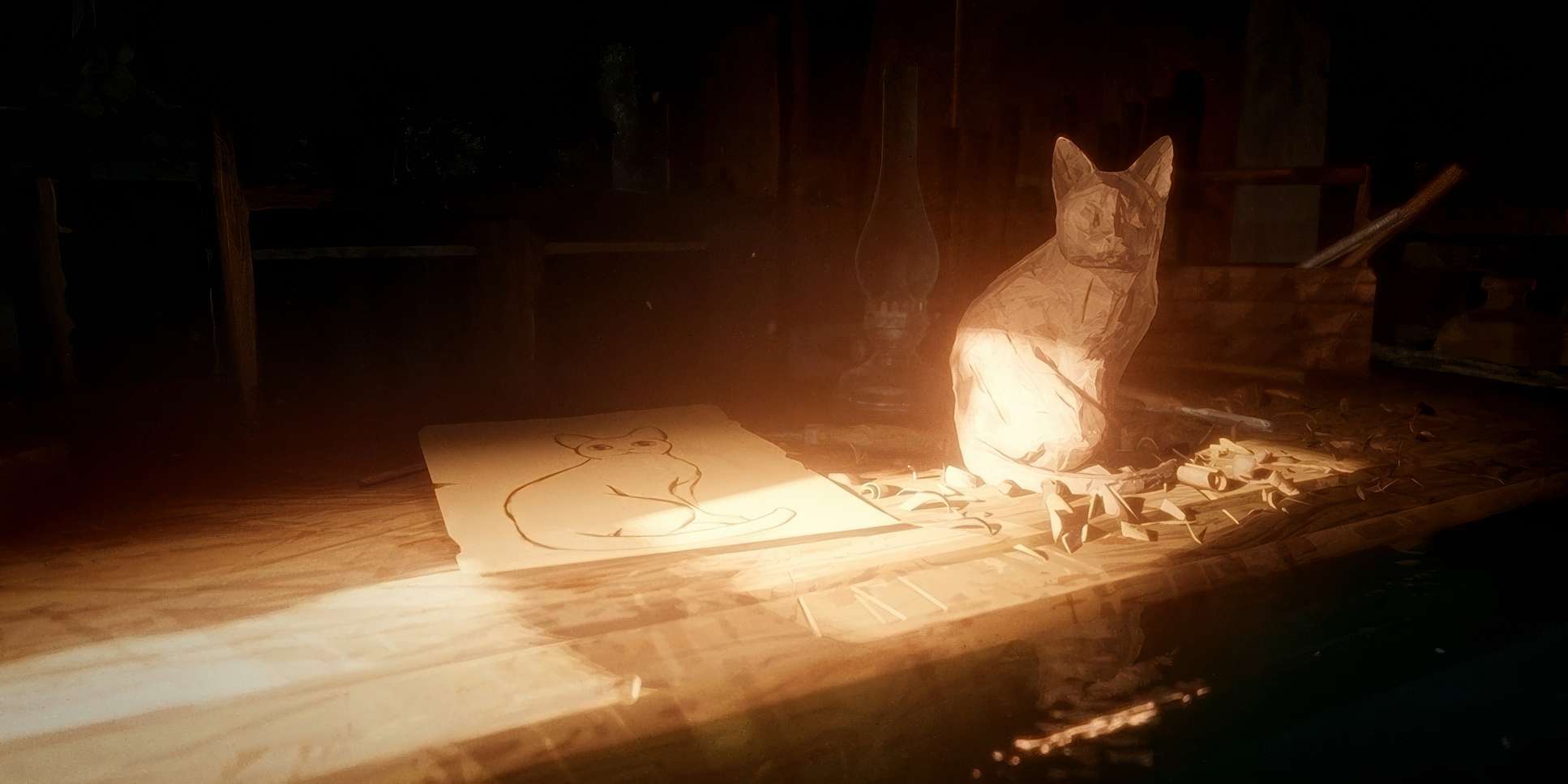
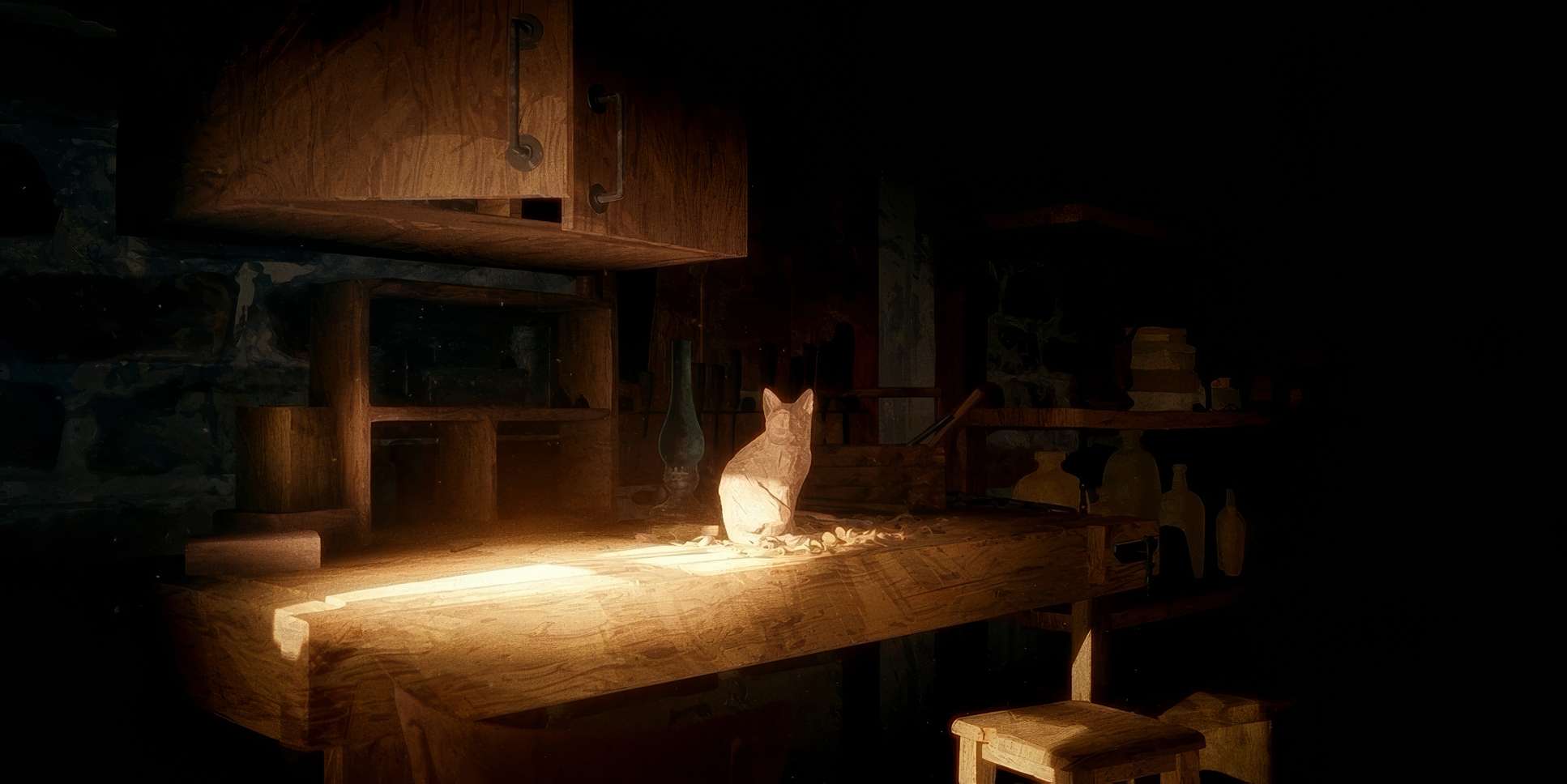
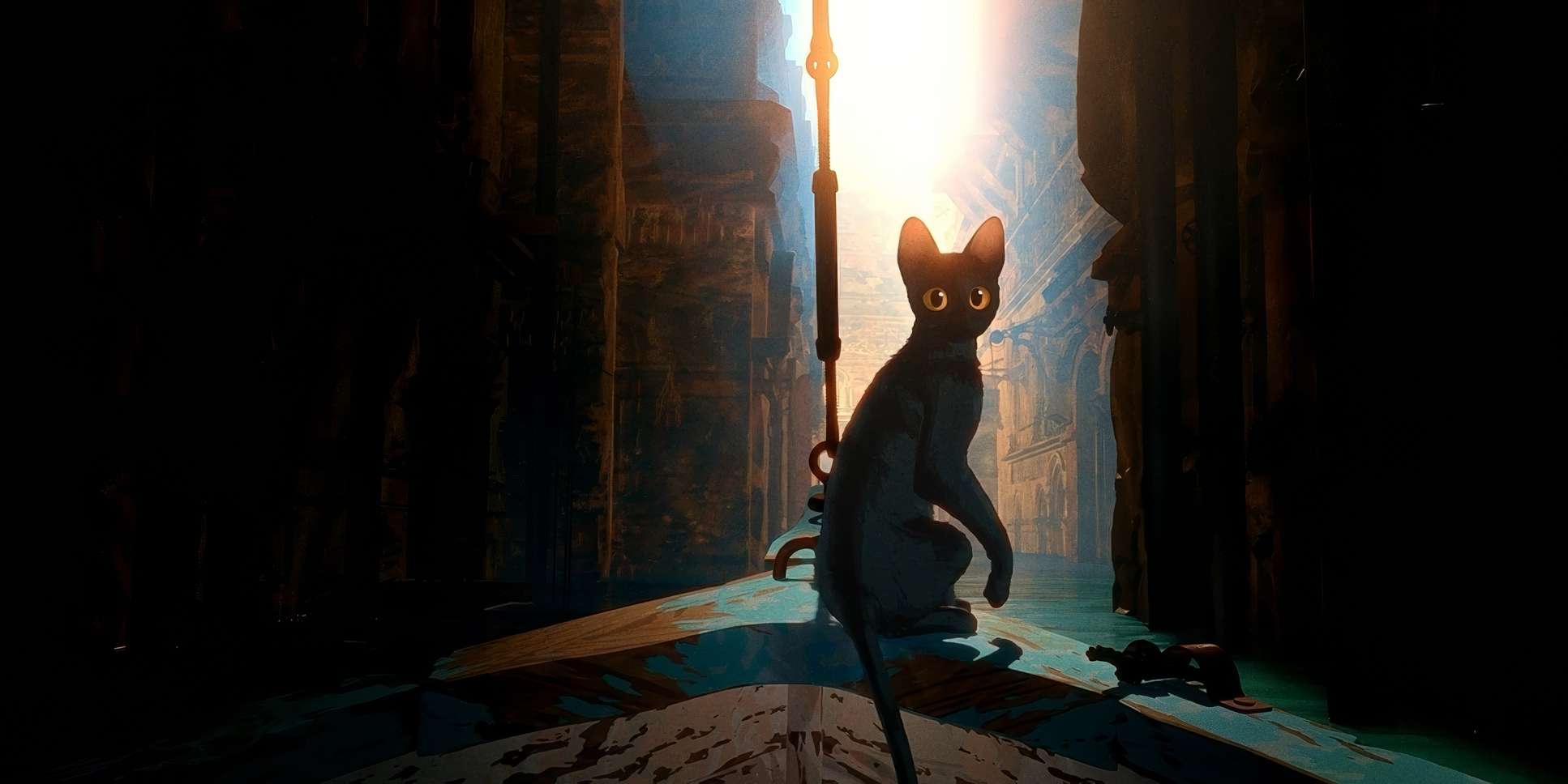
Most of the film lives in overcast days or twilight. This creates a soft, diffused look that feels melancholic and beautiful. But when the sun breaks through? It’s stunning. Sunbeams piercing the clouds are rendered with a painterly quality that feels divine.
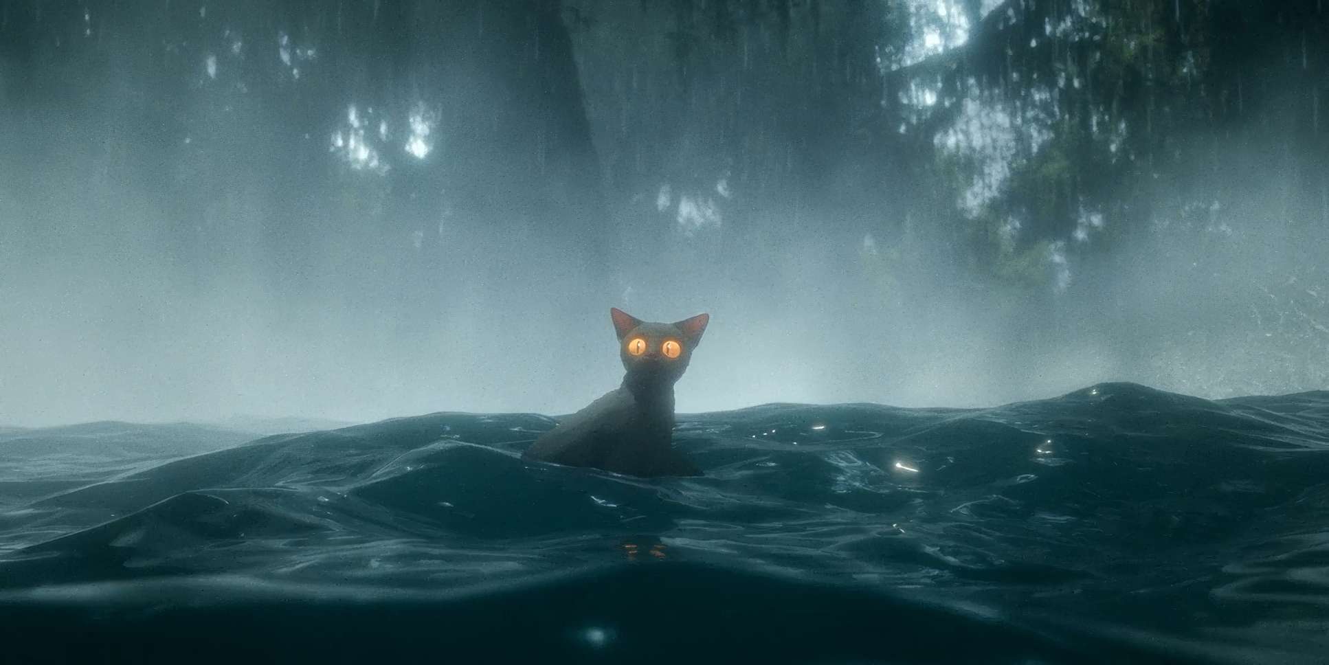
The dynamic range decisions here are fantastic. There’s a beautiful, soft highlight roll-off that avoids any harsh digital clipping. It gives the light a sense of grace. Shadows are rarely “crushed”; they hold detail, giving the environments a tactile texture even in the darkest moments. The lighting on the secretary birds is especially striking they’re backlit to look like “bright beautiful angels,” reinforcing their mythical status. It’s truly cinematic lighting, translated perfectly into a digital space.
Lensing and Blocking
Since Gints is operating a virtual camera, his lensing choices feel remarkably sophisticated.
Lensing: He stays mostly with wider to normal focal lengths. This is a smart choice it keeps the characters grounded in their environment. You don’t get that flat, telephoto look or gimmicky ultra-wide distortion. It feels like a human cinematographer is behind the lens. The depth of field is subtle; just enough to pull your focus, but not so shallow that you lose the scale of the world.
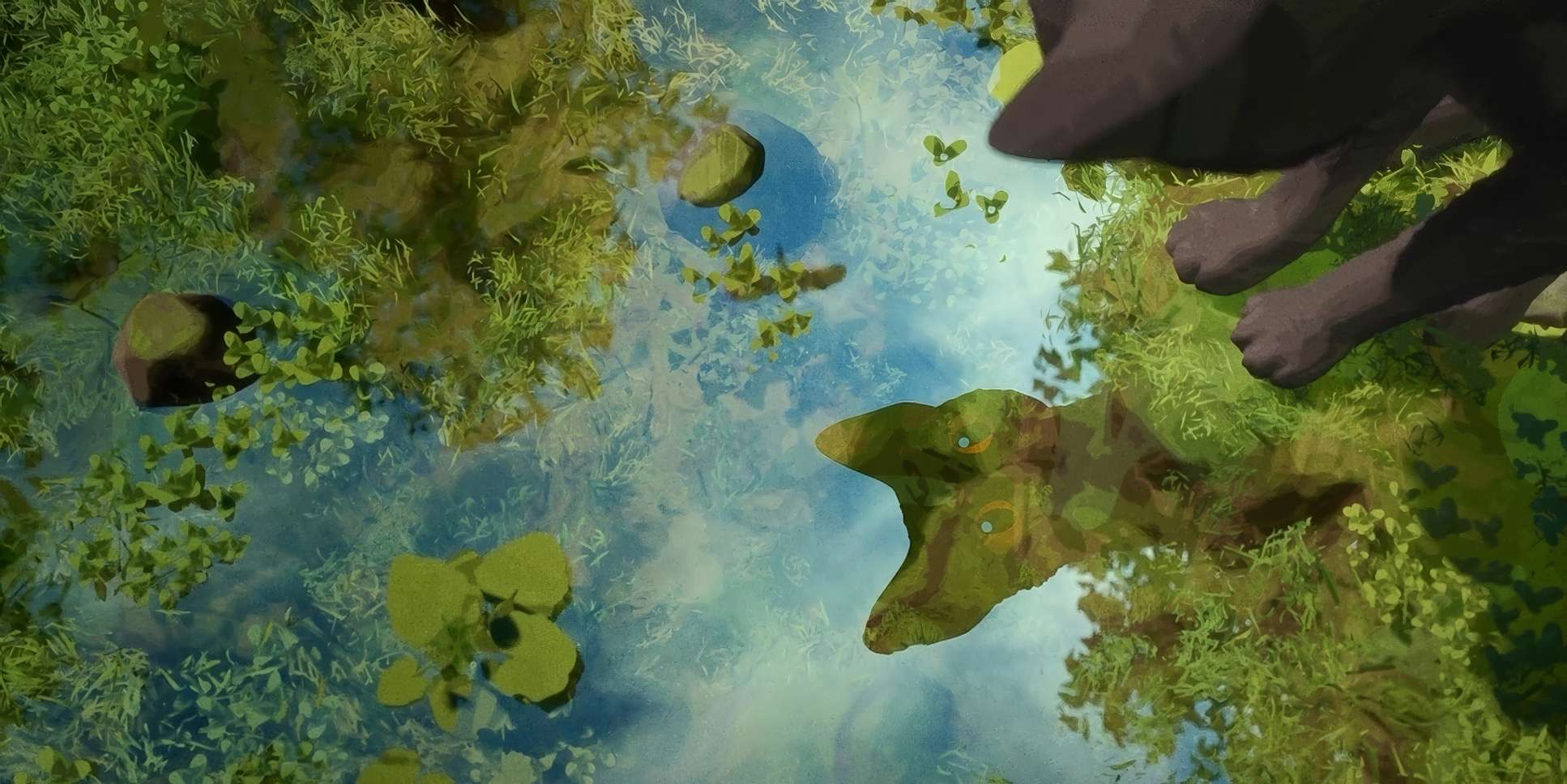
Blocking: This is where the story lives. Initially, the blocking emphasizes the cat’s isolation it’s always at the edge of the frame or moving away. As the group gathers on the boat, the blocking becomes about “reluctant camaraderie.” The small space forces them together, creating natural tension. The final shot where the group looks into a puddle and sees the “collective whole” instead of just themselves is a perfect example of symbolic blocking. Their physical proximity finally matches their emotional unity.
Color Grading Approach
This is where my brain really lights up. The grading in Flow is phenomenal. It’s “oozing with rich colors,” but it’s never “pretty” just for the sake of it.
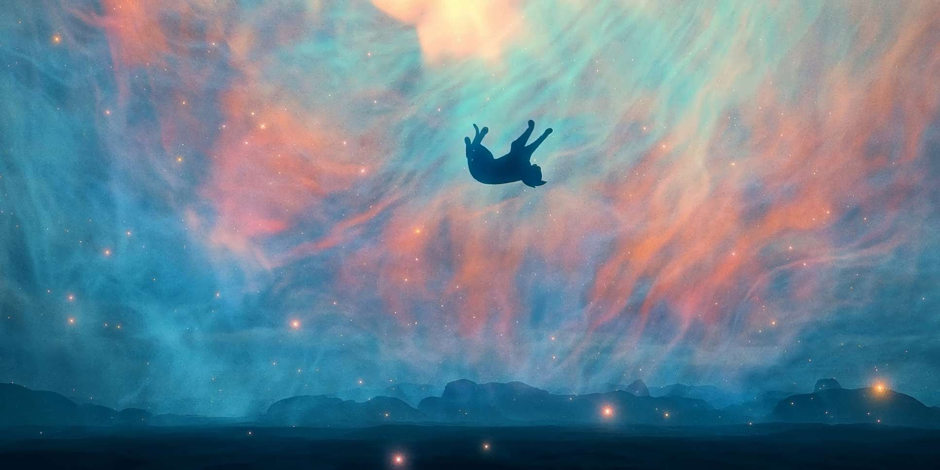
The palette is obviously heavy on blues and greens, but the blues are dynamic. They shift from foreboding indigos to hopeful aquamarines based on the emotional beat of the scene. What’s impressive is the hue separation. Even in a world that’s 90% blue, the subtle greens of submerged plants or the distinct coats of the animals pop without feeling artificial.
The contrast shaping is exquisite. During quiet, introspective moments, the contrast is lower, giving it a desaturated, melancholic feel. When the danger ramps up, the shadows deepen and the highlights become more pronounced. There’s a “print-film” sensibility to the whole look a richness and a subtle warmth in the mid-tones that keeps it from feeling sterile or overly digital. It feels organic. It feels tangible.
Technical Aspects & Tools
Flow (2024) — 2.00 Aspect Ratio | Soft Daylight
| Genre | Post-Apocalyptic, Adventure, Animation, Fantasy |
| Director | Gints Zilbalodis |
| Cinematographer | Gints Zilbalodis |
| Production Designer | Gints Zilbalodis |
| Editor | Gints Zilbalodis |
| Time Period | Future |
| Color Palette | Cool, Desaturated, Yellow, Cyan, Blue |
| Aspect Ratio | 2.00 |
| Lighting Style | Soft Light |
| Lighting Type | Daylight, Overcast |
| Story Location | … Earth |
Even though Gints was a “one-man band,” the technical execution is top-tier. The “hyper-real” quality of the fur and feathers and especially the fluid dynamics of the water points to a massive amount of technical skill. It’s not just about making it look good; it’s about making it feel real.
The sound design is a critical partner here, too. In a dialogue-free film, the lapping waves and animal sounds are your script. It creates depth cues for your ears that match what Gints is doing for your eyes. And the fact that this was done by a small crew scattered across Latvia and France is a testament to modern collaboration tools. It proves that you don’t need a thousand-person studio to create something that rivals the biggest films in the world. You just need a singular vision.
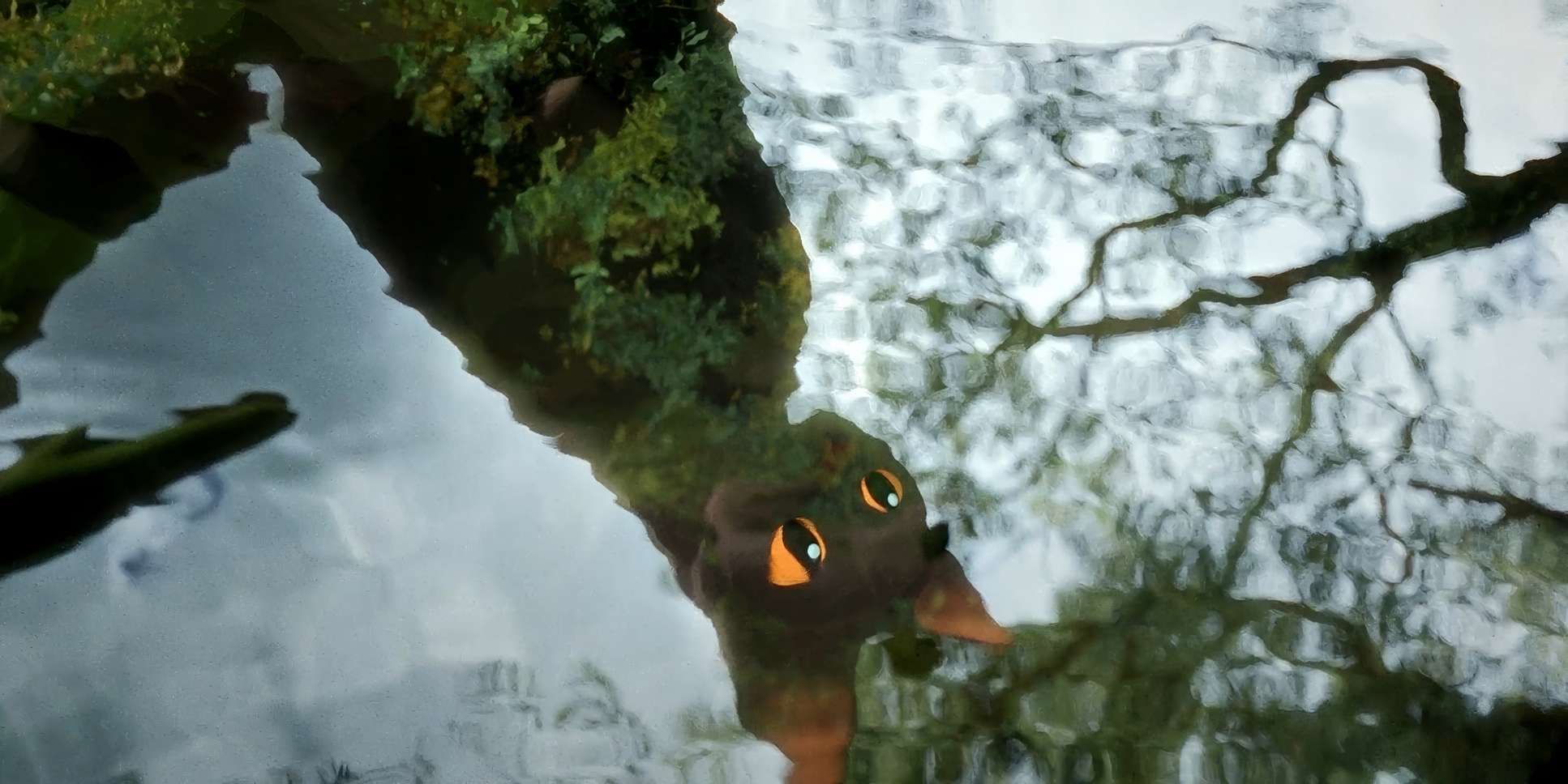
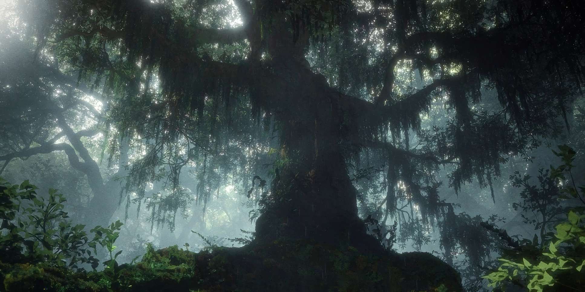
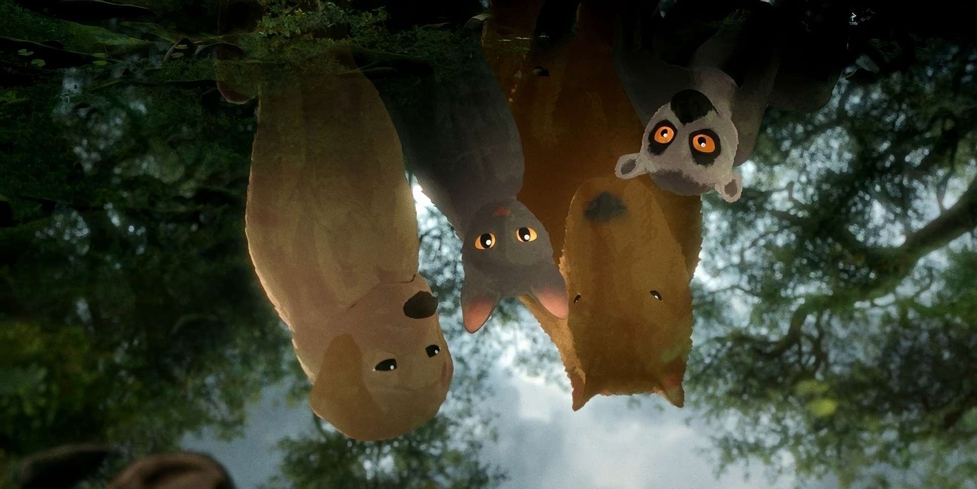
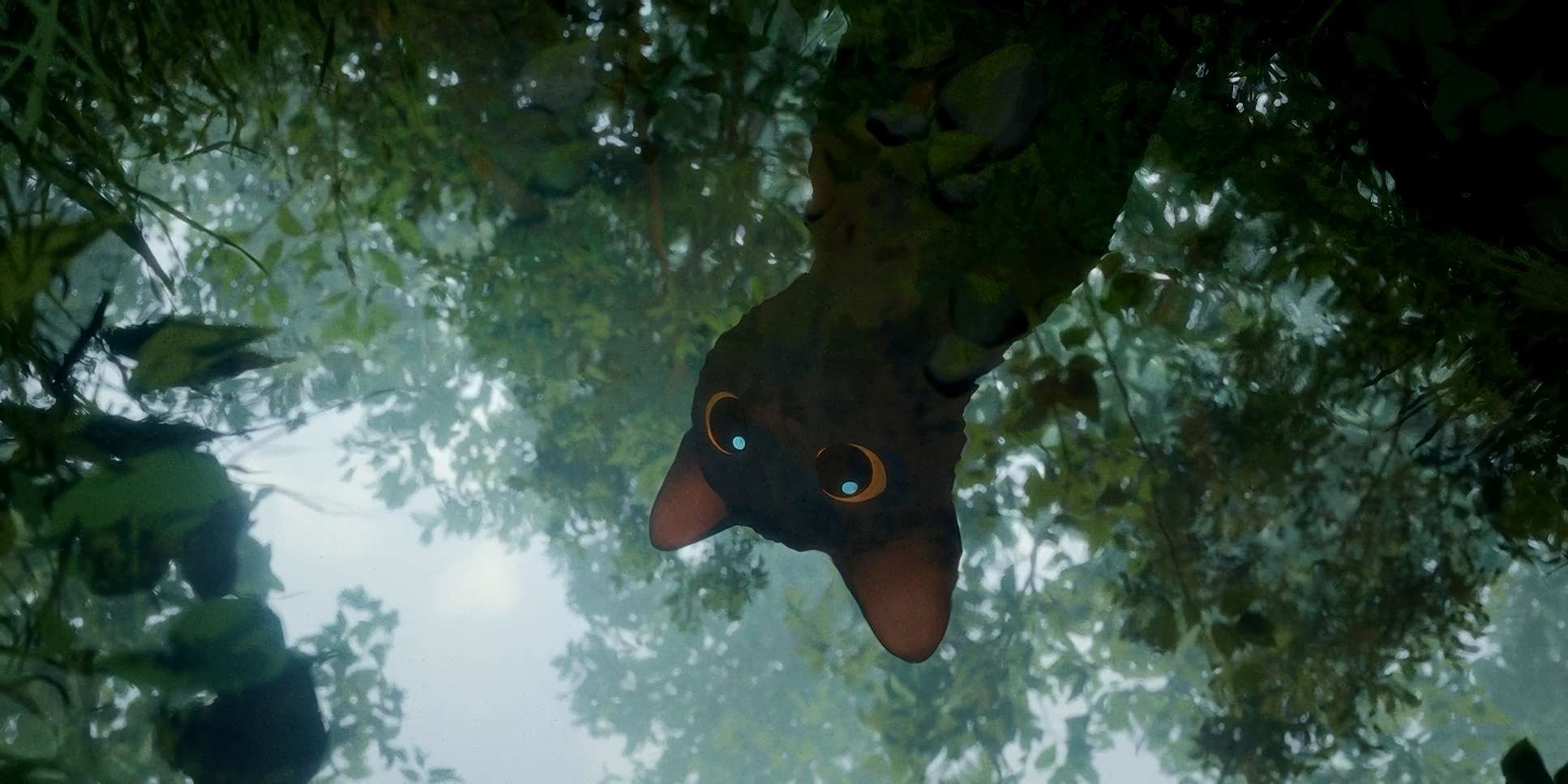
Flow (2024) Film Stills
A curated reference archive of cinematography stills from Flow (2024). Study the lighting, color grading, and composition.


Also read: SOLARIS (1972) – CINEMATOGRAPHY ANALYSIS
Also read: PERSEPOLIS (2007) – CINEMATOGRAPHY ANALYSIS
Browse Our Cinematography Analysis Glossary
Explore directors, cinematographers, cameras, lenses, lighting styles, genres, and the visual techniques that shape iconic films.
Explore Glossary →