Few films hold my attention quite like Tim Burton’s Edward Scissorhands. Looking at this 1990 masterpiece today isn’t just a nostalgia trip; it’s a masterclass in how visual language can do the heavy lifting for a story. It’s a collaboration where Danny Elfman’s score and Stefan Czapsky’s cinematography don’t just “support” the narrative they define it. For me, “seeing” this film means dissecting why the dualistic world Burton built feels so tangible, and it starts with the man behind the lens.
About the Cinematographer

Stefan Czapsky is a bit of a chameleon. Unlike some DPs who force a “signature look” onto every project, Czapsky’s genius on Edward Scissorhands was his ability to translate Burton’s internal psyche specifically his memories of feeling like an outsider in Burbank into a tactile reality. He had to bridge the gap between a fairy tale and a satire, which is no easy feat. Czapsky embraced the practical, on-set challenges of the early 90s, using light and composition to build two entirely separate universes that somehow exist in the same frame. It’s a testament to his versatility that he could jump from the brooding shadows of the castle to the flat, unyielding brightness of the suburbs without the film feeling disjointed.
Inspiration Behind the Cinematography
The DNA of this film is a weird, wonderful hybrid of German Expressionism and 1950s Americana. You can see the echoes of Mary Shelley’s Frankenstein and Beauty and the Beast everywhere, but it’s filtered through a very specific “comic strip” lens.
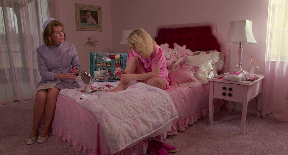
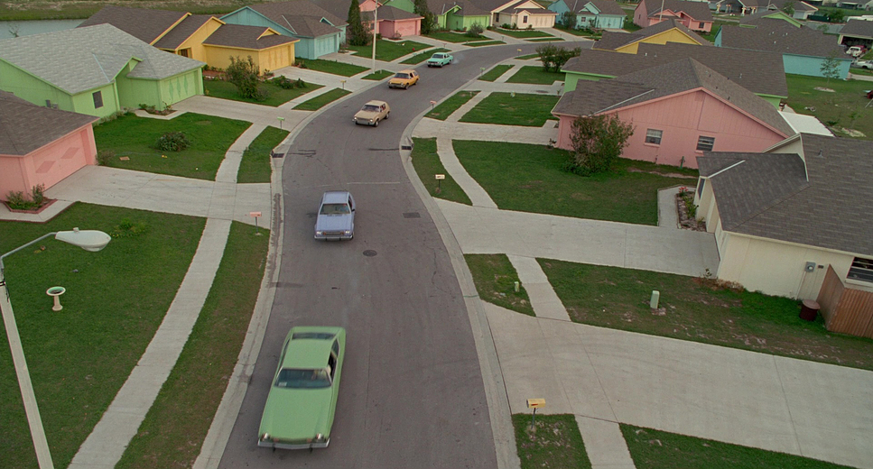
The suburb isn’t meant to look “real.” It’s a heightened, almost malicious take on perfection bright, plain pastel colors and uniform houses that feel like a satire of the American Dream. On the flip side, the castle draws from the Hammer Horror tradition: dark, isolated, and decaying. This duality is the bedrock of the film. Every choice Czapsky made was designed to reinforce this contrast. It’s not just a “look”; it’s a visual thesis on what happens when a “monster” with a childlike mind is dropped into a world that values conformity over everything else.
Lighting Style
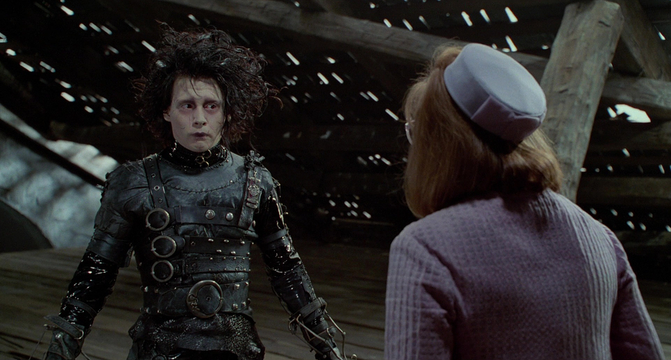
As a colorist, I find the lighting here fascinating because it’s so unapologetically extreme. In the castle, we have a quintessential Gothic aesthetic dramatic, high-contrast chiaroscuro. We’re talking about very few motivated light sources: moonlight through dusty glass or flickering candles. The shadows are deep and velvety, and while I’d love to see how much detail we could pull from those blacks in a modern HDR grade, there’s something beautiful about how the original film stock handles that gloom.
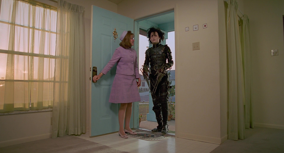
Then you hit the suburb, and the lighting philosophy flips 180 degrees. It’s bathed in a diffuse, flat, high-key light that screams artificial cheerfulness. It’s almost “oppressive” in its brightness. There are no places to hide in the suburb, which is exactly the point. The transition between these two moving from the cool, deep blues of the mountain to the warm, sickly yellows of the town is handled with incredible subtlety. It’s a deliberate shift in luminance that tells the audience exactly how to feel before a single line of dialogue is spoken.
Color Grading Approach
This is where the film really sings to me. We have to remember that in 1990, we didn’t have the luxury of a Digital Intermediate (DI) workflow. This was all about chemical “timing” and printer lights.
For the castle, the palette is beautifully desaturated. It’s dominated by melancholic blues and rich, organic blacks. My professional instinct tells me Czapsky was pushing for a print-film sensibility that retained shadow texture rather than just crushing it. The highlight roll-off is incredibly gentle, which gives the castle that ethereal, ghostly quality.
The suburb, however, is a different beast. We’re talking about “tonal compression” at its most effective. The pastels the mint greens, the pinks, the sunny yellows are pushed to a high saturation, but the overall contrast feels slightly “soft.” It gives the town a plastic, almost sickeningly sweet finish. As a colorist, I love the hue separation here; Edward’s dark, textured silhouette against those clean, distinct pastels creates a jarring visual disconnect. It’s a masterclass in using color to define “otherness.”
Camera Movements
The camera in Edward Scissorhands acts like an observer with a very specific emotional arc. In the castle, we see these sweeping, melancholic crane and dolly shots. They emphasize the scale of Edward’s loneliness the camera feels like it’s wandering through a graveyard of memories.
Once we descend into the town, the language becomes much more observational and steady. We get these tracking shots that highlight the eerie uniformity of the neighborhood. It’s “fish out of water” comedy captured from a distance. But as the town turns on Edward, the camera loses its cool. We start seeing more agitated movements and, eventually, a sense of panic. It’s a dynamic rhythm that shifts from sweeping grandeur to a frantic, claustrophobic urgency by the final act.
Compositional Choices
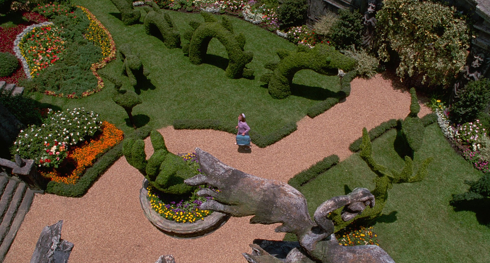
Czapsky uses the frame to trap Edward. In the castle, Edward is often framed small against massive, crumbling architecture, using negative space to scream “isolation.” The vertical lines of the Gothic sets pull the eye upward, making him look even more insignificant.
In the suburbs, the composition is all about symmetry and grids perfectly manicured lawns and identical windows. Edward, with his wild hair and blades, is a walking “disruption” to that symmetry. He’s almost always composed off-center or physically separated from the group. Even in a crowded backyard barbecue, he’s visually isolated. When he starts creating trimming hedges or cutting hair the camera finally celebrates him with more dynamic low-angles and Dutch tilts, before reverting to claustrophobic frames as the community’s judgment closes in.
Lensing and Blocking
Czapsky’s choice of glass is pivotal. Using wider lenses for the castle made the space feel even more remote and imposing. On the flip side, those same wide lenses in the suburbs exaggerate the sprawling, uniform nature of the town.
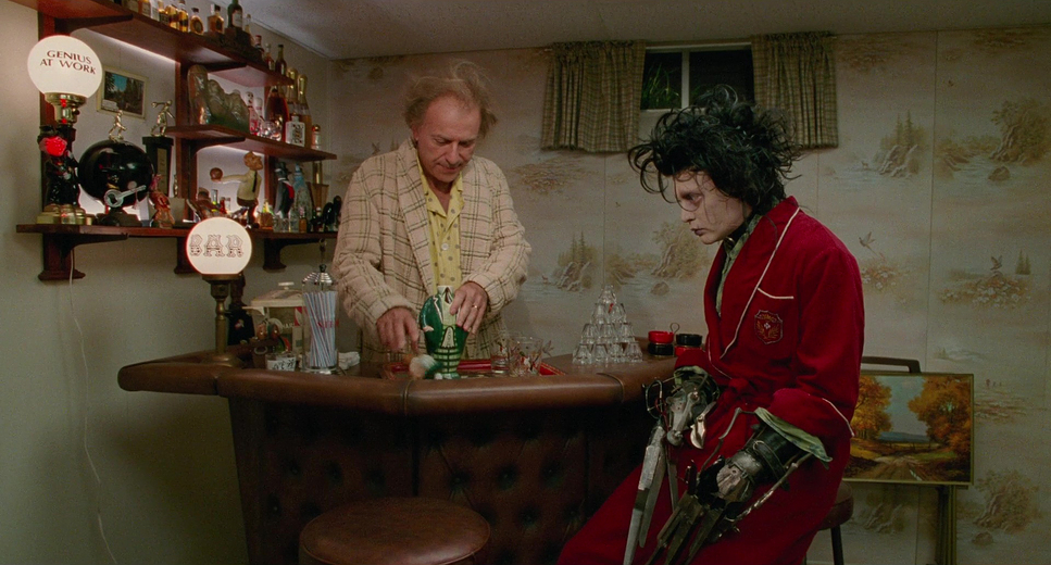
But it’s the tighter, telephoto work that really captures Johnny Depp’s performance. Those “wide-eyed and curious” expressions need that compression to make us feel his vulnerability. The blocking is equally heartbreaking. Edward is always “the edge” of the frame. Even as he gains acceptance, his hands remain a visual barrier. The scene where Kim tries to hold him is a perfect example of how blocking dictates emotion the physical gap between them is a chasm that his nature simply won’t let him bridge.
Technical Aspects & Tools
| Genre | Drama, Fantasy, Magical Realism, Romance, Suburbia, Satire, Low Fantasy, Fairytale |
| Director | Tim Burton |
| Cinematographer | Stefan Czapsky |
| Production Designer | Bo Welch |
| Costume Designer | Colleen Atwood |
| Editor | Colleen Halsey, Richard Halsey |
| Time Period | 1990s |
| Color | Saturated, Green |
| Aspect Ratio | 1.85 – Spherical |
| Format | Film – 35mm |
| Lighting | Soft light, Low contrast |
| Lighting Type | Daylight |
| Filming Location | 20th Century Fox Studios – 10201 Pico Blvd., Century City, Los Angeles, California, USA |
| Camera | Panavision Platinum, Panavision Gold / G2 |
| Film Stock / Resolution | 5245/7289 EXR 50D |
Looking at the spec sheet for this film is a trip down memory lane. Shot on 35mm film (specifically the Kodak EXR 50D 5245/7289 stock), the image has a grain structure and color rendition you just can’t perfectly replicate digitally. Czapsky used Panavision Platinum and Gold (G2) cameras with prime lenses to get that crisp, filmic look.
What’s most impressive is the reliance on practical effects. In an era where we’d just CGI those hedge sculptures, Burton physically put them on screen. That tangibility grounds the fantasy. The “grading” was a painstaking lab process, frame by frame, reel by reel. There’s a discipline in that analog workflow that I think we sometimes lose in the age of “we’ll fix it in post.” Every choice, from the film stock to the filters used to soften skin tones in the suburb, had to be intentional.
- Also read: HOT FUZZ (2007) – CINEMATOGRAPHY ANALYSIS
- Also read: THE BOURNE IDENTITY (2002) – CINEMATOGRAPHY ANALYSIS
Browse Our Cinematography Analysis Glossary
Explore directors, cinematographers, cameras, lenses, lighting styles, genres, and the visual techniques that shape iconic films.
Explore Glossary →