Let’s talk Donnie Darko. You know how some films just stick with you? They burrow into your subconscious and refuse to be fully parsed on a single viewing or even ten. Donnie Darko is absolutely one of those films for me. With Richard Kelly’s bizarre, confusing, and completely captivating tale, there is so much rich ground to cover. It’s the kind of film that made many of us, myself included, stop just watching movies and start asking deeper questions about the craft.
About the Cinematographer
When a film lands with such a distinct visual fingerprint, the cinematographer is the architect. For Donnie Darko, that visionary was Steven B. Poster ASC. Even at this early stage in Kelly’s career, Poster managed to translate a complex vision a narrative teetering between sci-fi, psychological drama, and teen angst into a cohesive visual language.
You can feel the trust between Poster and Kelly here. There is a shared intuition for creating images that are grounded in a mundane suburban reality but are constantly threatening to fracture into something surreal. It’s a testament to Poster’s skill that the film never looks “cheap” despite its indie constraints; instead, he leveraged those limitations to forge a specific, moody aesthetic that defines the film.
Inspiration Behind the Cinematography
The cinematic inspiration behind Donnie Darko isn’t about flash; it’s about a subtle, creeping psychological unease. Set in the late 80s, the film could have easily leaned into cheesy nostalgia, but it wisely avoids that trap. The period details remain a backdrop, making the surreal elements hit harder when they arrive.
What truly drives the look is the story’s inherent ambiguity. Is Donnie schizophrenic, or is he genuinely a “Living Receiver” in a collapsing tangent universe? The visual style supports both interpretations without tipping its hand. The mundane suburban shots feel slightly off-kilter, while the fantastical elements are presented with a matter-of-fact eeriness. The camera effectively becomes an unreliable narrator, mirroring Donnie’s precarious grip on his own reality.
Camera Movements
The camera work in Donnie Darko relies on a deliberate, hypnotic rhythm. We see a lot of slow, almost dreamlike tracking shots specifically when Donnie is cycling through his neighborhood or navigating the school hallways. These aren’t just for style; they create a sense of observational detachment, as if we are following Donnie through a maze he doesn’t quite understand.
Take the famous “Mad World” montage near the end. The camera pans slowly across the characters’ faces, acting as a visual echo of the trauma carried over from the tangent universe. It’s a mournful survey that suggests even erased memories leave a trace. Conversely, when the narrative demands panic, the camera snaps into urgency whip pans or subtle push-ins on Donnie’s face. The “liquid spears” (world lines) are another great example; while largely VFX, the camera’s interaction with them often a locked-off shot or a careful track feels organic, grounding the CGI in the physical space of the film.
Compositional Choices
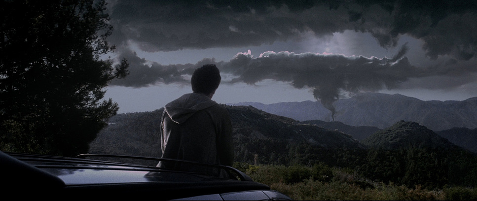
The framing consistently reinforces themes of isolation and the suffocating nature of suburbia. Shooting on Panavision anamorphic lenses (2.35:1 aspect ratio) allowed Poster to isolate Donnie in the frame, emphasizing his status as an outcast even when surrounded by people. Wide shots of the school or the streets of Middlesex, Virginia, are rendered with a depth that suggests hidden layers beneath the surface.
Close-ups are deployed surgically, usually on Donnie’s intense, searching eyes or objects of symbolic weight. The repeated close-up of Donnie’s pupil serves as our window into his awakening consciousness. At times, the framing feels almost voyeuristic, mirroring the sense that Donnie is being observed by something off-screen. The “arcade game shot” of the car crash is particularly clever; by mimicking a video game composition, it subtly foreshadows the simulation-like quality of the tangent universe, hinting that these events are part of a larger, predetermined loop.
Lighting Style

The lighting here is a study in contrast, balancing the flat reality of day against the nightmare of night. Much of the daytime lighting is naturalistic almost boring which gives the suburban setting a believability that makes its eventual breakdown more impactful.
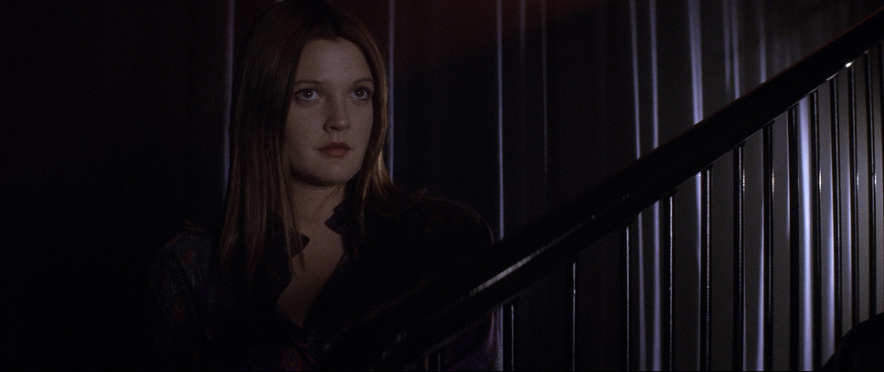
However, once Frank enters the picture, the lighting shifts gears. Night scenes feature stark, hard lighting that casts deep shadows. Frank himself, with that grotesque bunny mask, is frequently lit to emphasize his ominous presence sometimes silhouetted, other times hit with harsh, unmotivated light. This “unmotivated” sourcing isn’t a mistake; it’s a visual cue for the supernatural. The scenes in Roberta Sparrow’s cellar or house are bathed in low-key, practical-driven light that feels claustrophobic. Even the flickering light from the static TV uses an unearthly cadence to suggest a connection to a higher, perhaps divine, power.
Lensing and Blocking
Lens choices in Donnie Darko heavily influence how we perceive space. Poster often used wider focal lengths on the Panavision Primos to slightly distort perspective, particularly when the suburban facade feels most oppressive. This creates a subtle bending at the edges of the frame, contributing to the “unhinged” reality. Telephoto lenses, conversely, compress the space, drawing characters uncomfortably close together during moments of confrontation.
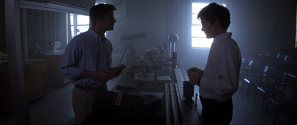
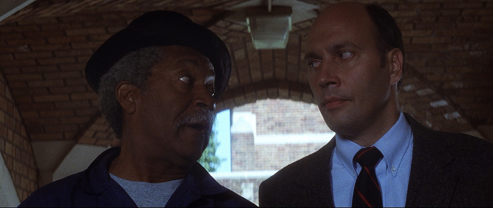
Blocking the staging of actors is equally crucial. In the “Fear versus Love” classroom scene, the blocking visually articulates the philosophical debate. Donnie is often positioned apart from the group or confronting authority head-on. His interactions with Jim Cunningham (the “antichrist,” as Donnie puts it) are staged to emphasize the power imbalance. The camera and lens choices work in tandem with this: a wide-angle might make Donnie seem small against the institutional backdrop, while a tighter shot focuses on his defiance.
Color Grading Approach
As a colorist, this is where the film really shines for me. Colorist Jim Passon didn’t go for a vibrant, pop-80s look. Instead, the grade is defined by a cool, blue-leaning palette that feels muted and almost bruised. It perfectly complements the tone of alienation and impending doom.
The contrast handling is distinctively analog. The blacks are deep and inky essential for those night scenes but the highlight roll-off is where you see the magic of the film stock. Unlike digital sensors that clip harshly, the highlights here bloom softly, often with a hint of warmth. This contributes to that “euphoric” yet creepy atmosphere. The hue separation is subtle, keeping the world cohesive, but when specific colors do appear like the deep red of Frank’s eyes or the eerie blues of the energy spears they cut through the desaturated palette dramatically. It’s a great example of using color to suggest rather than shout, letting the visual language support the story’s ambiguity.
Technical Aspects & Tools
| Donnie Darko — Technical Specifications | |
|---|---|
| Genre | Drama, Fantasy, Magical Realism, Mystery, Psychedelic, Suburbia, Time Travel |
| Director | Richard Kelly |
| Cinematographer | Steven Poster |
| Production Designer | Alec Hammond |
| Costume Designer | April Ferry |
| Editor | Sam Bauer, Eric Strand |
| Colorist | Jim Passon |
| Time Period | 1980s |
| Color | Cool, Blue |
| Aspect Ratio | 2.35 – Anamorphic |
| Format | Film – 35mm |
| Lighting | Hard light, Side light |
| Story Location | … Virginia > Middlesex |
| Filming Location | … California > Angeles National Forest |
| Camera | Panavision Platinum |
| Lens | Panavision Primo Anamorphics |
| Film Stock / Resolution | 5289/7289 Vision 800T |
Donnie Darko was shot on 35mm film (specifically Kodak Vision 800T for those grainy low-light sequences), giving it a texture that digital acquisition still struggles to replicate perfectly. The grain adds a raw realism to the 1988 setting. Poster used the Panavision Platinum camera with Primo Anamorphic lenses, and that combination of high-end glass with a gritty film stock created a unique look sharp, yet textured.
I have to mention one specific technical detail: the visible boom mic in one of Patrick Swayze’s instructional videos. Years ago, I wrote this off as a low-budget indie mistake. But looking at it now, within the context of the film’s meta-narrative, it feels like it does double duty. It reads as a deliberate touch a nod to the artificiality of the “manipulated living” and the staged nature of the tangent universe. Whether it was a happy accident or a choice, it adds another layer to the film’s self-awareness.
- Also read: SLUMDOG MILLIONAIRE (2008) – CINEMATOGRAPHY ANALYSIS
- Also read: THE MARTIAN (2015) – CINEMATOGRAPHY ANALYSIS
Browse Our Cinematography Analysis Glossary
Explore directors, cinematographers, cameras, lenses, lighting styles, genres, and the visual techniques that shape iconic films.
Explore Glossary →