My name is Salik Waquas, and I am a filmmaker and full-time colorist with a deep passion for cinematic storytelling. Through my journey in film and color grading, I’ve had the privilege to dissect visual masterpieces that resonate with emotional depth and technical brilliance. My color grading suite, Color Culture, is where I explore how visual storytelling can elevate a narrative, and writing analyses like this one lets me share those insights with others. Today, I’m thrilled to discuss the cinematography of Her (directed by Spike Jonze)—a film that I consider a visual poem, crafted with intention and artistry.
About the Cinematographer

Hoyte van Hoytema, the genius behind Her’s visuals, has always been one of my favorite cinematographers. His ability to combine naturalism with an emotive aesthetic is unparalleled. Films like Let the Right One In, Interstellar, and Tinker Tailor Soldier Spy exhibit his unique skill in crafting atmospheres that transcend the screen. In Her, Hoytema elevates this artistry to create a world where the visual language speaks as eloquently as the dialogue. His lens captures the fragility of human emotions, making each frame feel intimate and alive.
Inspiration for the Cinematography of Her

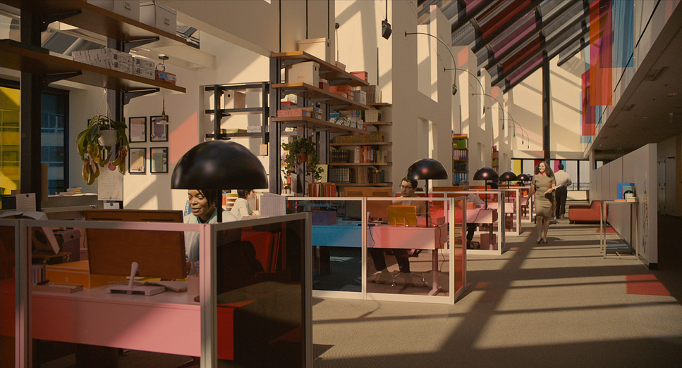
When I first watched Her, what struck me most was its world-building—futuristic yet deeply human. Spike Jonze and Hoytema’s vision avoids the traditional cold, metallic look of sci-fi, instead drawing from warm modernist aesthetics and Scandinavian design. This choice makes the world of Her feel organic and plausible, almost like a version of our reality we could step into tomorrow. The pastel palettes, soft lighting, and minimalistic architecture suggest a future built for comfort, not grandeur. This design philosophy pairs perfectly with the story’s emotional depth, making the visuals a seamless extension of Theodore’s inner life.
The color palette also reminds me of Impressionist art—dreamy and nostalgic. It feels like the filmmakers asked, “What would memories look like if they were alive?” and painted the screen with their answer. That balance between nostalgia and futurism is what sets Her apart visually, and it’s a lesson for any filmmaker: your world should reflect your story’s soul.
Camera Movements Used in Her

Hoytema’s approach to camera movement in Her is a masterclass in restraint. Instead of flashy movements or dramatic shifts, the camera glides gently, reflecting Theodore’s introspective and contemplative nature. Slow pans and delicate dollies bring a meditative rhythm to the film, creating a sense of intimacy. This restraint mirrors Theodore’s subdued emotions as he navigates the complexities of love and loneliness.
One of my favorite examples of this is the scene where Theodore and Samantha share their first “date.” The camera lingers, allowing their connection to unfold naturally. In moments of conflict or Theodore’s emotional turmoil, subtle handheld movements come into play. These shifts are never jarring but rather feel like the camera itself is breathing with Theodore, inviting the audience into his inner world.
Compositions in Her

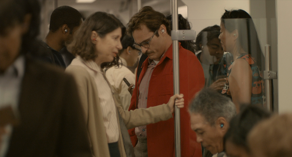
Composition is where Her truly shines. Hoytema’s use of framing and focus creates a visual representation of Theodore’s emotional journey. Shallow depth of field isolates Theodore, blurring the bustling Los Angeles skyline behind him. This technique underscores his loneliness, making the city feel like a backdrop rather than a place he inhabits. Hoytema’s compositions often place Theodore off-center, visually hinting at his sense of incompleteness.
As Theodore begins to find solace and connection, the compositions subtly evolve. More balanced framing and a deeper focus integrate him into his surroundings, reflecting his emotional growth. This shift is so subtle that it feels organic—a reminder of how visual storytelling can mirror character arcs without a single word of dialogue.
Lighting Style of Her

Lighting in Her is pure poetry. Warm, diffused light dominates the film, casting a soft glow over the characters and their environments. This warmth is comforting, almost like an embrace, and perfectly matches the film’s tone of quiet introspection. When Theodore is lost in his memories or feeling isolated, the lighting shifts to cooler, dimmer tones. These transitions subtly guide us through his emotional highs and lows.
One standout scene for me is when Theodore and Samantha share a moment at the beach. The natural light of the setting sun bathes Theodore in golden hues, symbolizing his fleeting joy. This use of natural light underscores the film’s emotional realism, even in its futuristic setting.
Lensing and Blocking in Her
Hoytema’s choice of lenses and blocking techniques in Her is a study in intimacy. The use of prime lenses with wide apertures creates a shallow depth of field, keeping the focus tightly on Theodore. This isolates him visually, reflecting his internal solitude. I love how the background melts into soft blurs, making Theodore’s world feel as emotionally distant as he perceives it.
Blocking is equally deliberate. Characters are often positioned in confined spaces or framed closely, emphasizing their emotional proximity—or lack thereof. One scene that stands out is Theodore lying in bed, talking to Samantha. The tight framing and lack of movement create an almost cocoon-like intimacy, enveloping us in their connection.
Color Grading of Her

As a colorist, I have to say that the color grading in Her is among the most emotionally resonant I’ve seen. The warm, pastel palette—dominated by reds, pinks, and yellows—evokes a sense of nostalgia and tenderness. These colors are not just aesthetic choices; they’re emotional signposts. The warmth of the palette draws us into Theodore’s longing and moments of joy, while cooler tones punctuate his isolation and regret.
For instance, the flashbacks to Theodore’s marriage use muted, cooler tones, contrasting sharply with the warmth of his present relationship with Samantha. This subtle interplay between warmth and melancholy is a lesson in how color grading can amplify a film’s emotional resonance.
Technical Aspects of Her
HER (2013) — Technical Specs
| Genre | Drama, Romance, Science Fiction, Lo-Fi Sci-Fi |
| Director | Spike Jonze |
| Cinematographer | Hoyte van Hoytema |
| Production Designer | K.K. Barrett |
| Costume Designer | Casey Storm |
| Editor | Jeff Buchanan, Eric Zumbrunnen |
| Colorist | Mats Holmgren |
| Color | Warm, Saturated |
| Aspect Ratio | 1.85 |
| Format | Digital |
| Lighting | Soft light, Low contrast, Side light |
| Lighting Type | Artificial light |
| Story Location | … California > Los Angeles |
| Camera | ARRI ALEXA XT / XTplus |
| Lens | Canon K35, Zeiss Super Speed |
Shot on an ARRI Alexa, Her makes full use of the camera’s dynamic range to capture intricate lighting and color nuances. Hoytema’s lens choices prioritize natural skin tones and a soft, filmic quality, enhancing the film’s dreamy aesthetic. What I find particularly impressive is the production design’s seamless integration with cinematography. The real-world environments are designed with such care that they feel both futuristic and familiar, grounding the story in reality.
The editing complements the cinematography beautifully. Close-ups of Theodore often precede montages, anchoring the story in his perspective. This interplay between visual and narrative techniques creates a cohesive experience that feels deeply personal.
Conclusion
The cinematography of Her isn’t just a visual component—it’s a storytelling device that breathes life into the narrative. Hoyte van Hoytema’s restrained camera movements, evocative compositions, warm lighting, and intimate lensing draw us into Theodore’s world, making his journey feel deeply personal and universally relatable. As a filmmaker and colorist, I’m inspired by how every visual choice in Her serves the story, proving that cinematography is at its best when it captures both the seen and the felt.
Writing this analysis reminds me why I fell in love with cinema in the first place: the power of visuals to tell stories that linger in our hearts long after the credits roll.
- Also Read: CINEMATOGRAPHY ANALYSIS OF GRAVITY (IN DEPTH)
- Also Read: CINEMATOGRAPHY ANALYSIS OF GOODFELLAS (IN DEPTH)
Browse Our Cinematography Analysis Glossary
Explore directors, cinematographers, cameras, lenses, lighting styles, genres, and the visual techniques that shape iconic films.
Explore Glossary →