My name is Salik Waquas, and I am a filmmaker and professional colorist passionate about the art of storytelling through visuals. I own Color Culture, a dedicated color grading suite where I bring cinematic visions to life through the magic of post-production. With years of experience in analyzing and crafting cinematic aesthetics, I aim to bridge the gap between creative expression and technical execution. As a colorist and storyteller, films like Get Out inspire me to dive deep into the interplay of light, shadow, and color to amplify narratives that resonate on both emotional and intellectual levels.
Jordan Peele’s Get Out is a groundbreaking fusion of horror and social commentary, elevated by its meticulous cinematography. As someone who views storytelling through the lens of visuals, I see Get Out as more than just a film—it’s a masterclass in using imagery to evoke tension, provoke thought, and unearth layers of meaning. In this article, I’ll share my personal analysis of Get Out’s cinematography, exploring how its visual language enhances its narrative themes.
About the Cinematographer

The visual genius behind Get Out is Australian cinematographer Toby Oliver. Known for his versatile approach to storytelling, Oliver has a knack for adapting his style to fit the needs of a film, whether it’s atmospheric horror or intimate drama. His work in Get Out is a perfect marriage of subtlety and intensity, seamlessly blending unsettling imagery with psychological depth. His experience in genre films shines here, as he crafts visuals that capture both the terror and the underlying social critique that define the narrative.
Inspirations Behind Get Out’s Cinematography

As a filmmaker, I appreciate how Get Out draws inspiration from horror classics like Rosemary’s Baby and The Stepford Wives. These films use their visual language to critique societal norms, and Toby Oliver’s cinematography does the same but with a sharp focus on racial dynamics. For example, the sprawling Armitage estate evokes imagery reminiscent of plantation-era power structures, merging past and present to create a haunting allegory. This interplay between homage and innovation ensures that Get Out is firmly rooted in the tradition of horror as social commentary while crafting a language uniquely its own.
Camera Movements: Subtlety and Suspense

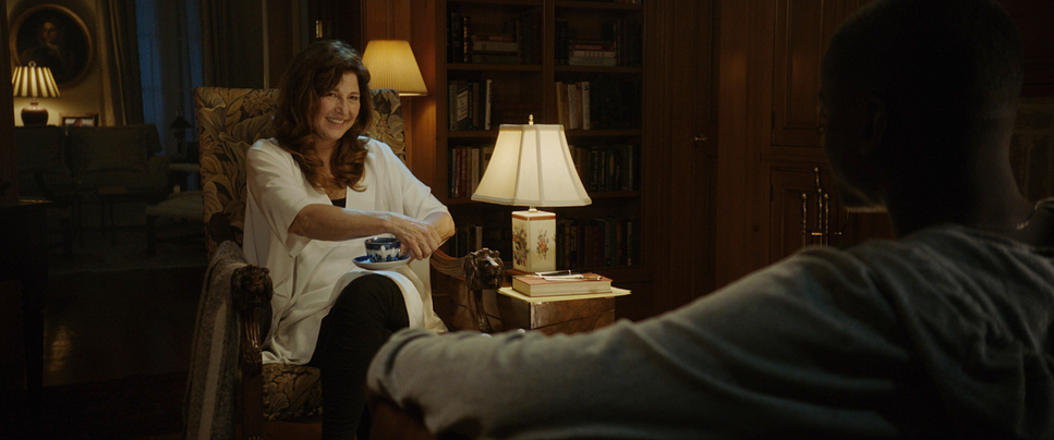
In Get Out, the camera movements are deliberate and almost hypnotic, mirroring the growing paranoia and helplessness of Chris, the protagonist. A scene that stands out for me is the hypnosis tea sequence, where slow zooms and creeping close-ups guide the viewer into the infamous “Sunken Place.” These movements trap the audience in the same way Chris is being psychologically cornered.
Equally impactful are the locked-off shots used during moments of eerie stillness, such as Chris’s interactions with Walter and Georgina. These static frames make the characters’ robotic demeanor even more unsettling, building dread through restraint rather than overt action. As a filmmaker, I find this subtle approach to be an artful way of heightening tension without overwhelming the viewer.
Masterful Compositions: Storytelling Through Framing

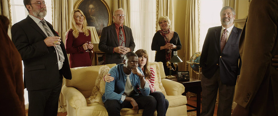
The compositions in Get Out are some of the most effective I’ve seen in modern cinema. Oliver employs symmetry and framing to visually isolate Chris, reinforcing his alienation throughout the film. For example, during the garden party scene, Chris is framed tightly, surrounded by the intrusive gazes of the white guests, highlighting his discomfort and dehumanization.
Another standout technique is the use of direct address, where characters like Missy look directly into the camera. This breaks the fourth wall in an unsettling way, making the viewer feel complicit in Chris’s entrapment. It’s as though Chris is silently pleading for help, creating a powerful emotional connection with the audience.
Lighting: From Comfort to Horror

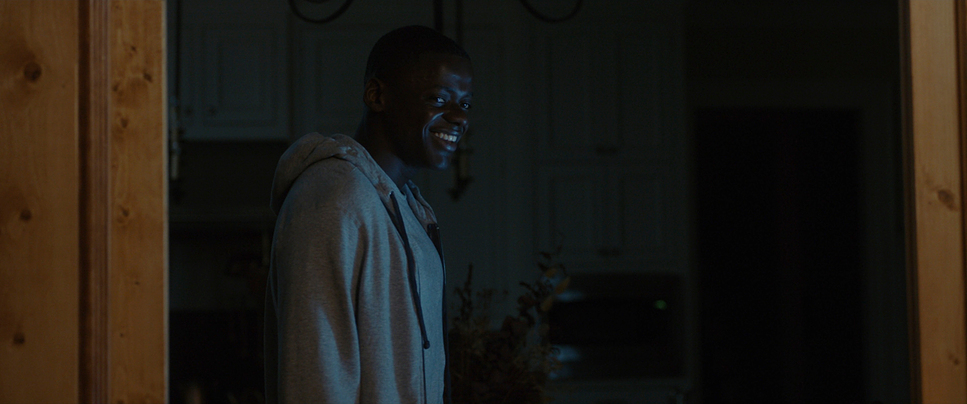
Lighting in Get Out is a dynamic tool used to mirror the shifting tone of the story. The daylight scenes at the Armitage estate are bathed in soft, idyllic light, creating a veneer of safety. However, this brightness feels artificial, almost too perfect—a visual clue that something is amiss.
Contrast this with the oppressive darkness of the interiors, where shadows dominate, and secrets lurk. The “Sunken Place” sequence is a masterstroke in lighting design, using stark contrasts to emphasize Chris’s dissociation. The single spotlight on his face as he falls into the void creates a harrowing sense of isolation and powerlessness, a moment that is both visually and emotionally unforgettable.
Lensing and Blocking: Power and Vulnerability

The choice of lenses in Get Out adds another layer of storytelling. Wide-angle lenses are used sparingly to exaggerate Chris’s isolation in vast spaces, such as when he arrives at the Armitage estate. This makes him appear small and out of place, underscoring his vulnerability.
Blocking, too, plays a critical role. Characters are positioned in ways that reflect power dynamics—for instance, during Chris’s interactions with Rose’s parents, the Armitages are often centrally framed or positioned above him. This reinforces their dominance and Chris’s lack of control. These choices might seem subtle, but they add up to create a subconscious sense of imbalance that keeps the audience on edge.
Color Grading: Subtle Yet Profound

As a colorist, I find the color grading in Get Out to be a study in restraint and intention. The film’s muted palette, dominated by earthy tones, grounds it in realism, allowing the more stylized moments to stand out. The party scene, for example, juxtaposes Chris’s dark skin with the pale complexions of the guests, a deliberate visual contrast that underscores the racial tension.
The “Sunken Place” shifts to an eerie blue tint, visually separating it from reality. This cold, desaturated palette amplifies the surreal and chilling nature of the sequence. For me, these choices demonstrate how color grading can subtly yet powerfully shape a film’s emotional impact.
Technical Aspects: A Perfect Union of Tools and Vision
| Genre | Horror, Mystery, Suburbia, Thriller |
| Director | Jordan Peele |
| Cinematographer | Toby Oliver |
| Production Designer | Rusty Smith |
| Costume Designer | Nadine Haders |
| Editor | Gregory Plotkin |
| Colorist | Aidan Stanford |
| Time Period | 2010s |
| Color | Warm, Desaturated, Yellow |
| Aspect Ratio | 2.39 – Spherical |
| Format | Digital |
| Lighting | Hard light, Backlight, Edge light |
| Lighting Type | Artificial light, Practical light |
| Story Location | United States of America > New York |
| Filming Location | United States of America > Alabama |
| Camera | ARRI ALEXA Mini |
| Lens | Angenieux Optimo |
| Film Stock / Resolution | 3.2K / 3.2K ArriRaw |
From a technical standpoint, Get Out is a marvel. Shot on the Arri Alexa Mini, the film benefits from the camera’s dynamic range, which captures both naturalistic exteriors and highly stylized interiors with precision. The pairing of Panavision Primo lenses enhances the sharpness and clarity of the visuals, ensuring that every detail contributes to the story.
Sound design also plays an integral role in tandem with the visuals. The rhythmic tapping of the tea spoon during the hypnosis scene, for instance, combines with the disorienting camera movements to create a sense of unease that lingers long after the scene ends.
Final Thoughts
Jordan Peele and Toby Oliver’s collaboration in Get Out exemplifies the transformative power of cinematography. Every visual element—whether it’s the deliberate camera movement, evocative lighting, or nuanced color grading—serves to enhance the film’s exploration of race, identity, and societal complicity.
As a filmmaker and colorist, Get Out is a reminder of the importance of intentional visual storytelling. It’s not just a film you watch—it’s a film you feel, reflect upon, and remember. This level of craftsmanship inspires me to continue pushing the boundaries of what can be achieved through cinematography, lighting, and color. For anyone passionate about film, Get Out is a masterclass that demands to be studied, celebrated, and emulated.
- Also Read: CINEMATOGRAPHY ANALYSIS OF FORREST GUMP (IN DEPTH)
- Also Read: CINEMATOGRAPHY ANALYSIS OF FIGHT CLUB (IN DEPTH)
Browse Our Cinematography Analysis Glossary
Explore directors, cinematographers, cameras, lenses, lighting styles, genres, and the visual techniques that shape iconic films.
Explore Glossary →