I’m Salik Waquas, a filmmaker and colorist, and throughout my career, I’ve developed a deep admiration for the power of cinematography in storytelling. Having worked on many visual projects, I’ve always been fascinated by how camera work, lighting, and color grading can elevate a narrative.
When I watched 12 Years a Slave, I was struck by the visual mastery Sean Bobbitt brought to the film. The way he captured the raw, harrowing journey of Solomon Northup was nothing short of remarkable. As I write this analysis, I’m diving into the cinematic choices that stood out to me as a filmmaker and colorist. It’s a film that challenges you not only to watch but to feel every moment.
Cinematography Analysis of 12 Years A Slave
About the Cinematographer
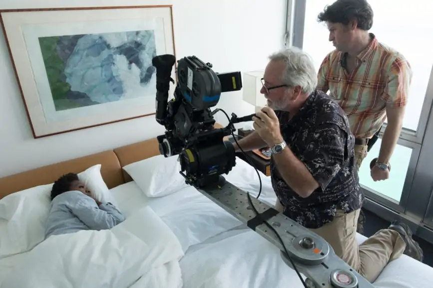
Sean Bobbitt’s work in 12 Years a Slave felt very personal to me, given my own passion for visual storytelling. I knew that Bobbitt had a background in documentaries, and that experience shines through in this film. His ability to bring authenticity to the screen while avoiding overly stylized shots really resonated with me. It reminded me of my own philosophy in color grading, where subtlety often conveys the most emotion.
What struck me most about Bobbitt’s style is his journalistic eye. He doesn’t force the audience to feel a specific way; instead, he presents the moments as they are, allowing the weight of the scene to speak for itself. That level of restraint is something I strive for in my own work, particularly when handling emotionally charged scenes. For me, 12 Years a Slave represents a perfect example of how cinematography can be both brutally honest and artistically beautiful.
Inspiration for the Cinematography of 12 Years a Slave

When I look at the visual inspiration behind 12 Years a Slave, it’s clear that both Bobbitt and Steve McQueen wanted to stay true to historical authenticity. They took a lot of cues from Civil War-era photography, especially the works of Mathew Brady, who captured the grim realities of 19th-century America. As someone who spends a lot of time thinking about how visuals can shape a narrative, I could see how those stark, unflinching images translated into the film’s style.
For me, this idea of “letting the horror speak for itself” really resonates. As a filmmaker, I’ve always believed that the visuals should support the story, not overshadow it. That’s exactly what Bobbitt achieves here. The extended shots that force the audience to stay with a scene—no matter how uncomfortable—make the experience more immersive. I aim to bring that same level of emotional depth to my own work, using visuals that challenge viewers rather than offer them an escape.
Camera Movements in 12 Years a Slave
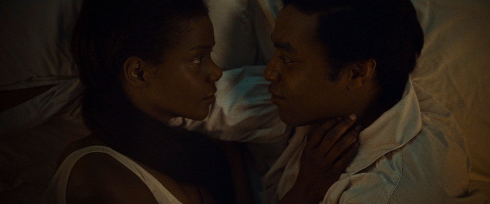
One of the first things I noticed about the cinematography in 12 Years a Slave is how restrained the camera movement is. As a filmmaker, I’ve come to appreciate the power of stillness in visual storytelling. Bobbitt’s camera often remains stationary or moves very slowly, which allows the audience to feel more present in the scene. This minimalist approach reminded me of why I sometimes choose to let the camera linger in my own projects—sometimes less movement creates more tension.
The near-lynching scene in 12 Years a Slave is a perfect example of how slow, deliberate camera movement can enhance a moment. The camera pans so slowly across the plantation as Solomon struggles to keep his feet on the ground. I found myself holding my breath during this scene. That slow pan prolongs the agony, and as someone who works with visual storytelling, I deeply respect how Bobbitt makes time feel almost unbearable in that moment. It’s something I’ve taken away for my own projects, where tension can be created by the pace of the camera rather than the action itself.
Compositions in 12 Years a Slave
I’m always drawn to how a cinematographer frames a shot, and Bobbitt’s compositions in 12 Years a Slave were simply stunning. One of the things I’ve tried to implement in my own work is how to use wide shots to show isolation, and Bobbitt does this so effectively. The way Solomon is often framed as a small figure in a vast landscape really struck me. It visually captures the emotional isolation Solomon must have felt, and as someone who works with color and framing, I admired how much was conveyed with these compositions.
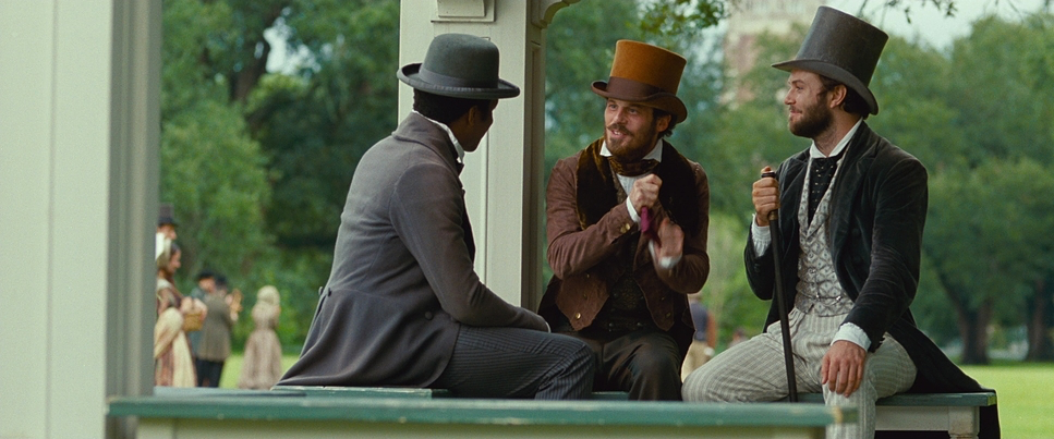
There’s a certain beauty in the wide shots of the plantation, but it’s a beauty that feels oppressive. The vastness of the environment dwarfs Solomon, making him seem powerless. I often find myself thinking about how to visually represent emotional states in my work, and Bobbitt’s approach here really inspired me. On the other hand, the close-ups are so intimate that they feel almost invasive. I think of the prolonged close-up during Solomon’s near-lynching, where the camera just holds on his face. It’s a visual decision that refuses to let the audience look away, and as a filmmaker, it reminded me of the power of not cutting too soon—letting a moment breathe can sometimes be the most emotionally intense choice.
Lighting Style of 12 Years a Slave
Lighting is something I’m always thinking about in my work, especially as a colorist. Bobbitt’s use of natural light in 12 Years a Slave immediately grabbed my attention. The sunlight in the outdoor scenes feels almost oppressive, as if the heat and harshness of the environment are weighing down on the characters. As someone who often works to balance natural and artificial lighting in color grading, I appreciated how Bobbitt leaned into natural light to reflect the brutal conditions of the Deep South.
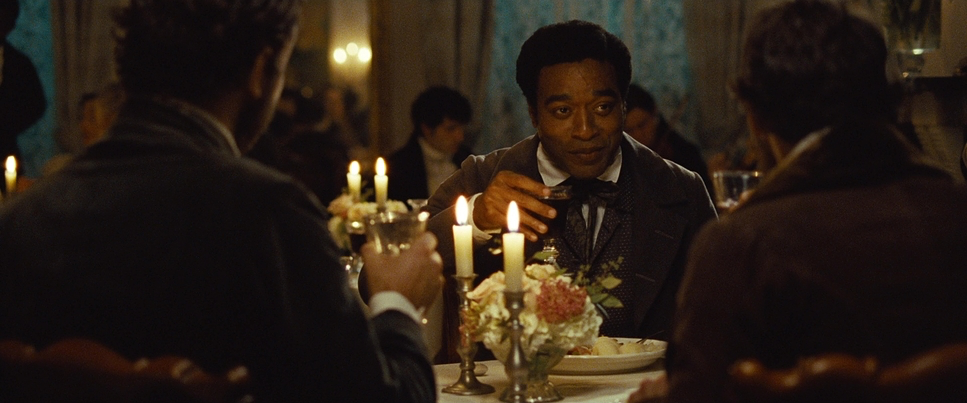
In the interior scenes, Bobbitt uses soft, natural sources like candlelight to create a sense of intimacy and claustrophobia. I found this to be incredibly effective. The lack of artificial lighting made these moments feel more personal and raw. In my own projects, I’m always thinking about how to use light to convey mood, and the way Bobbitt uses dim lighting to reflect Solomon’s despair really spoke to me. There’s an emotional honesty in how the lighting changes based on Solomon’s internal state, something I aim to bring into my own color work.
Lensing and Blocking in 12 Years a Slave
As a filmmaker, lensing and blocking are two aspects I constantly pay attention to, and Bobbitt’s choices in 12 Years a Slave fascinated me. I noticed that he often used wide-angle lenses to capture the sprawling plantation landscapes. This choice creates a sense of scale and isolation that’s essential to the film. I’ve always believed that the type of lens you choose can profoundly impact how the audience feels about a scene, and Bobbitt’s use of wide lenses gave the story an oppressive, larger-than-life feeling.
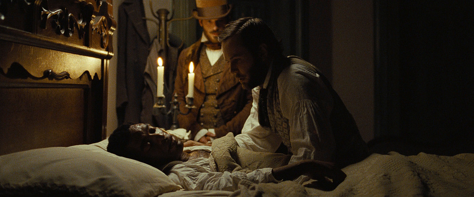
Blocking, too, is something I think about a lot when shooting, and Bobbitt’s restrained approach really worked in this film. The characters aren’t over-directed in their movements; they’re allowed to inhabit the space naturally. For me, this added to the realism of the film. I often try to adopt a similar approach, giving my actors room to breathe within the frame, which can add to the authenticity of a scene. Solomon is frequently positioned at the margins of the frame, visually reinforcing his marginalized status. It’s a subtle yet powerful choice that aligns with how I like to position characters in my own work.
“12 Years a Slave” was shot using the ArriCam LT camera, known for its versatility and high-quality image capture. Bobbitt used a range of lenses, including Cook S4 lenses, to achieve the desired visual effects. The film’s technical setup was designed to capture the raw, unfiltered reality of the story, with a focus on visual honesty and authenticity. The use of deep focus and natural light helped to create a sense of realism and immersion, making the film’s depiction of slavery all the more impactful.
Color Grading in 12 Years a Slave
12 Years a Slave
Technical Specifications
| Genre | Adventure, Book Adaptation, Civil Rights, Civil War, Crime, Drama, History, Marriage, Political, Survival, Documentary, Docudrama |
| Director | Steve McQueen |
| Cinematographer | Sean Bobbitt |
| Production Designer | Adam Stockhausen |
| Costume Designer | Patricia Norris |
| Editor | Joe Walker |
| Colorist | Tom Poole |
| Time Period | 1800s |
| Aspect Ratio | 2.39 – Spherical |
| Format | Film – 35mm |
| Lighting | Soft light, Top light |
| Lighting Type | Daylight, Overcast |
| Story Location | United States > Louisiana |
| Filming Location | United States of America > Louisiana |
| Camera | Arricam LT, Arricam ST |
| Lens | Angenieux Optimo, Cooke S4/ i |
| Film Stock / Resolution | 5203/7203 Vision 3 50D, 5207/7207 Vision 3 250D, 5219/7219 Vision 3 500T |
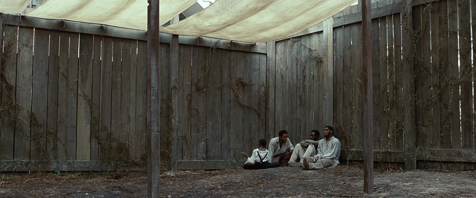
As a colorist, I was particularly excited to analyze the color grading of 12 Years a Slave. Bobbitt and the color team chose a muted, earthy color palette, which I thought was a brilliant choice. The desaturated tones reflected the somber, harsh reality of the story. What stood out to me was the way the color grading shifted throughout the film. In the beginning, when Solomon is still a free man, there are warmer tones. But as he descends into the brutality of slavery, the colors become cooler and more muted. This subtle shift really resonated with me as a colorist because it mirrored Solomon’s emotional journey.
In my own work, I’m always trying to find ways to let the color grading serve the story. 12 Years a Slave does this beautifully by maintaining a subdued, almost timeless palette. The desaturated colors make the film feel universal, not tied to a specific period or trend. It’s something I’ve come to appreciate more and more in my own grading work—using color to deepen the emotional impact without distracting from the narrative.
Conclusion
The cinematography of 12 Years a Slave left a lasting impression on me as both a filmmaker and a colorist. Sean Bobbitt’s minimal camera movement, deliberate compositions, natural lighting, and subtle color grading create a deeply immersive experience. I found myself reflecting on how these visual techniques contribute to the emotional power of the film. As someone who works in this space, 12 Years a Slave serves as a reminder of the importance of restraint and intentionality in visual storytelling. It’s a film that continues to inspire me in my own work, pushing me to think more deeply about how I can use cinematography and color grading to evoke the most honest emotions in my projects.
- Also Read: CINEMATOGRAPHY ANALYSIS OF CASABLANCA (IN- DEPTH)
- Also Read: CINEMATOGRAPHY ANALYSIS OF TOKYO STORY (IN-DEPTH)
Browse Our Cinematography Analysis Glossary
Explore directors, cinematographers, cameras, lenses, lighting styles, genres, and the visual techniques that shape iconic films.
Explore Glossary →