A Silent Voice: The Movie (2016) directed by Naoko Yamada and produced by Kyoto Animation, isn’t your typical anime romance, nor is it a straightforward drama. It’s a raw look at youth, anxiety, and the arduous journey of self-acceptance. Looking at it through a cinematographer’s lens, what strikes me is how masterfully the visual design translates these intricate emotional states. The film doesn’t shy away from the ugliness of human behavior, but frames it within a world that Naoko Yamada designed to “accept everything.” That gentle yet profound visual philosophy is what I want to break down.
About the Cinematographer
Naoko Yamada is synonymous with a specific kind of thoughtful elegance in animation. If you look at her body of work, including K-On! and Tamako Market, it’s clear she possesses an illustrator’s heart but a cinematographer’s brain. What sets her apart is her meticulous attention to “lighting and framing” she doesn’t just draw scenes; she lights them. She treats the virtual camera as an empathic observer, specifically using it to feel with the characters when they are at their most vulnerable. This isn’t abstract; it’s tangible in the way she isolates a solitary figure with a wide lens, or how she lingers on a hand gesture with the shallow depth of field usually reserved for macro photography.
Inspiration Behind the Cinematography
Yamada’s core philosophy for A Silent Voice: The Movie was to build a visual world that is “profound and gentle,” a stark contrast to the internal chaos of the protagonist, Shoya. This translates into cinematography that feels grounded and realistic mimicking live-action characteristics rather than fantastical.
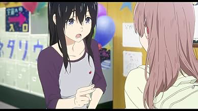
The visual choices are directly informed by the characters’ internal struggles. Shoya’s social anxiety isn’t just told through dialogue; it is the film’s central visual motif. The literal “blue X over their faces” regarding everyone he perceives as distant is an ingenious use of subjective reality. What fascinates me is the commitment to this device: the animators actually fully animated the faces first, and then the compositing team placed the X’s on top to obscure them. It’s a deliberate destruction of the image that underscores Shoya’s psychological state he is physically blocking out the world.
Camera Movements
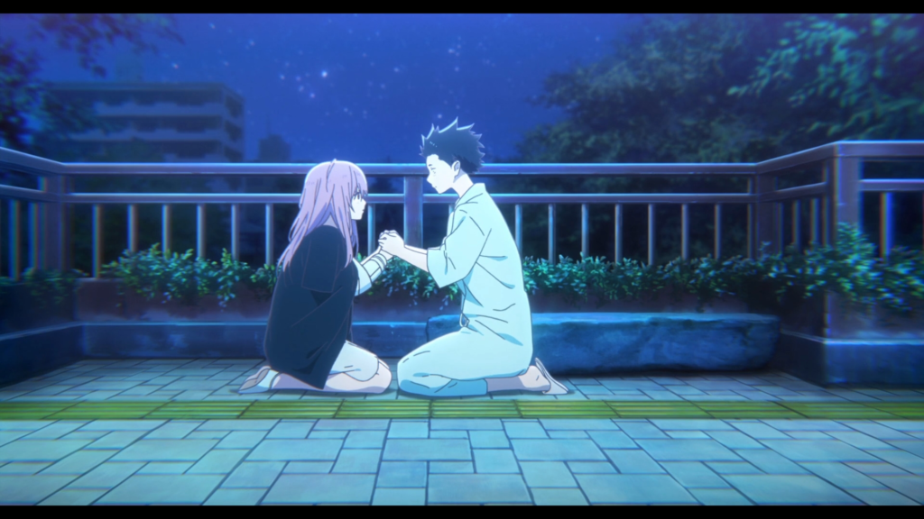
In animation, “camera movement” is a virtual construct, but in A Silent Voice: The Movie, it carries the weight of a physical camera. The film often employs subtle, almost observational movements. We see slow, deliberate “dolly” pushes into characters’ faces during moments of high emotion to heighten intimacy. Conversely, we get elegant pull-backs to emphasize isolation, leaving Shoya small within a negative space.
What I find particularly effective is the implied “handheld” feel in certain sequences. It’s not aggressive shaky-cam, but a slight, organic drift likely achieved by applying noise modifiers to the camera position in the compositing software. This lends a documentary-like authenticity to the characters’ struggles. The camera frequently aligns with Shoya’s perspective, mirroring his tendency to look down. We are often denied direct eye contact with other characters, forcing the audience to share his visual impairment of social anxiety.
Compositional Choices
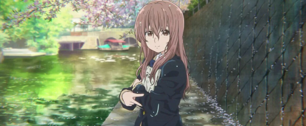
Composition here is a conduit for thematic resonance. The “blue X’s” are the most obvious device, but the framing choices go deeper. Yamada frequently emphasizes isolation through asymmetric framing. Characters are often pushed to the far third of the frame, leaving the rest empty. It creates a visual tension an imbalance that subconsciously reinforces the feeling that something is missing in their lives.
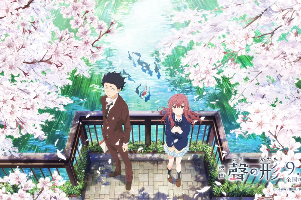
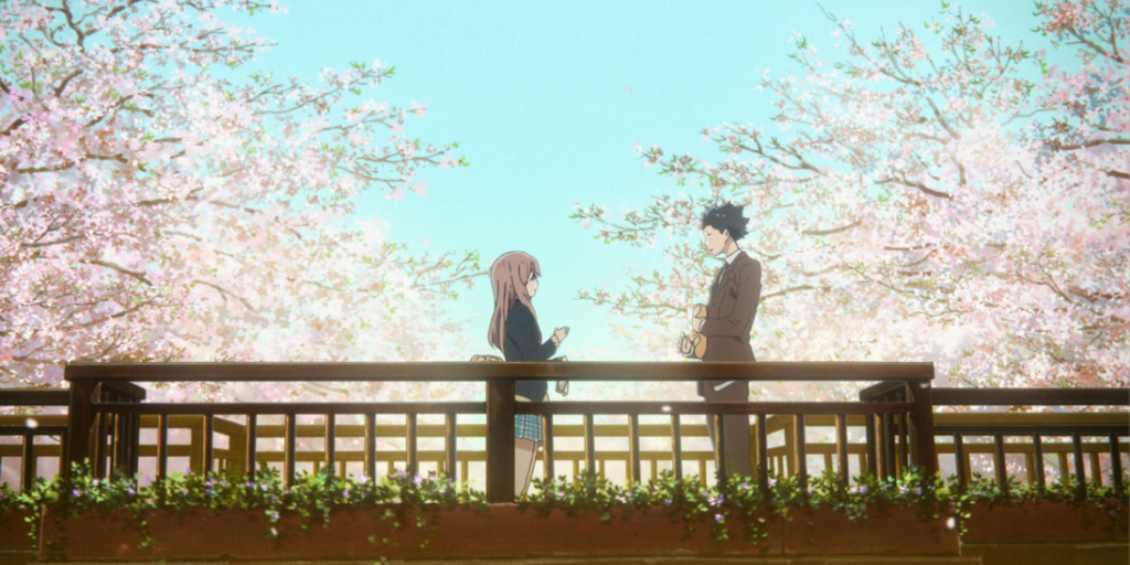
There’s also a recurring use of depth cues to define relationships. When Shoya and Shoko are distant, they are placed on different focal planes, separated by foreground elements or distinct background layers. As they grow closer, the compositions flatten, bringing them into the same plane of focus. Furthermore, the frequent “short-sighting” of Shoya framing him so he looks out of the frame rather than into it denies the viewer the emotional connection usually conveyed by open framing, making his eventual ability to “look up” at the end of the film significantly more cathartic.
Lighting Style
Lighting is where this film truly bridges the gap between 2D animation and live-action cinematography. The film leans heavily on motivated lighting, mimicking natural sources to ground the story. Sunlight streaming through windows, the practical glow of interior lamps, or the dappled light filtering through trees these establish a tangible sense of time and place.
However, the lighting is also highly expressive. During moments of despair, the lighting becomes softer and more diffused, lowering the local contrast to create a sense of melancholy. Conversely, moments of breakthrough are often bathed in warmer, brighter light, often utilizing lens flares and volumetric lighting effects.
The dynamic range handling is key. While animation can have perfect blacks and whites, A Silent Voice: The Movie manipulates light and shadow to guide the eye. Faces are meticulously “lit” with a soft key light that emphasizes the eyes crucial for a film involving sign language, where facial nuance is half the conversation.
Lensing and Blocking
When discussing “lensing” in animation, we’re talking about the implied focal length choices. A Silent Voice: The Movie often utilizes what feels like a 24mm or 35mm equivalent for establishing shots, giving a sense of environment and placing characters within a larger, isolating world. For intimate moments, the implied focal length tightens to an 85mm or 100mm, compressing the background and drawing us into the character’s headspace.
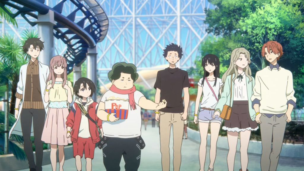
Blocking the arrangement of characters within the frame is equally deliberate. Shoya is frequently blocked to be physically separate, even when in a group. He might be positioned at the edge of the frame or turned away. But blocking also defines power dynamics. In the early bullying scenes, Shoya occupies the center of the frame, towering over others. Later, as the dynamic shifts, he is pushed to the periphery, crowded by the frame’s edge. This careful use of space articulates the shifting social hierarchy without a single word being spoken.
Color Grading Approach
As a colorist, this is where I really connect with the film’s engineering. The grading is sophisticated because it avoids the hyper-saturated “anime look” in favor of something more filmic and nostalgic.
- Contrast Shaping: The film employs a gentle contrast curve. The “toe” of the curve (the shadow roll-off) is lifted, creating those milky, matte blacks often seen in Japanese cinema or Fujifilm emulations. This prevents the visuals from becoming too oppressive, even in dark scenes, maintaining that “gentle place” philosophy.
- Highlight Roll-off: The highlights don’t clip harshly into digital white. They have a soft roll-off, retaining detail in the brightest parts of the image, similar to the response of motion picture film. This contributes to the soft, memory-like texture of the movie.
- Hue Separation: While the palette is cohesive, there is excellent color separation. Shoko’s hair acts as a specific color anchor a soft brown that separates her from the cooler, busier backgrounds.
- Tonal Sculpting: The grade uses what we call “tonal sculpting” subtle vignettes or power windows that brighten faces while slightly desaturating backgrounds. This ensures the viewer’s eye is always locked onto the emotional reaction, which is vital when the dialogue is silent.
Technical Aspects & Tools
Kyoto Animation is known for technical mastery, and the compositing work here is exceptional. The integration of 2D character art with detailed, often photorealistic backgrounds requires precise color matching and light wrap techniques to prevent the characters from looking like “stickers” on a background.
The execution of the “blue X’s” is a standout technical decision. By animating the faces fully before covering them, the studio ensured that if the X’s peeled away for even a frame, the underlying emotion was there. It implies a layered post-production workflow where thematic devices were prioritized over the labor-saving shortcuts usually found in TV animation. The synergy between this visual approach and the sound design specifically the selective muting during sign language creates a truly immersive, sensory experience.
Also read: PARIS, TEXAS (1984) – CINEMATOGRAPHY ANALYSIS
Also read: THE TREASURE OF THE SIERRA MADRE (1948) – CINEMATOGRAPHY ANALYSIS
Browse Our Cinematography Analysis Glossary
Explore directors, cinematographers, cameras, lenses, lighting styles, genres, and the visual techniques that shape iconic films.
Explore Glossary →