Today, I’m looking back at The Imitation Game (2014). When this film dropped, the conversation was dominated by Benedict Cumberbatch’s performance and the controversy surrounding the script’s historical accuracy. Critics labeled it “Oscar bait” a safe, formulaic biopic designed to check boxes rather than challenge the audience.
But looking at the “Oscar bait” argument through a visual lens offers a different perspective. Does “safe” storytelling equate to lazy filmmaking? Or does it require a specific, highly polished visual language to work? Let’s strip away the narrative debates for a moment and look at the craft specifically how the cinematography and color grading handle the weight of Alan Turing’s story.
About the Cinematographer
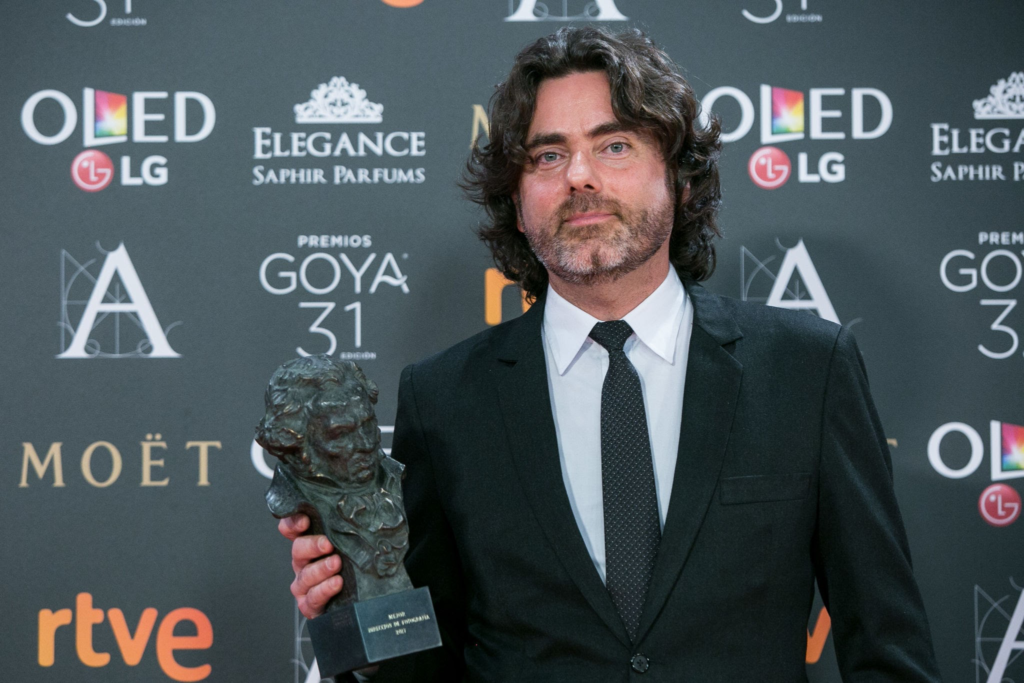
The Director of Photography was Óscar Faura, best known for his work on The Orphanage and The Impossible. Pairing a Spanish cinematographer known for atmospheric, naturalistic horror with a Norwegian director (Morten Tyldum) to shoot a quintessential British period piece was an inspired choice. It prevented the film from looking like a stuffy BBC drama.
Faura is not a flashy shooter. You don’t hire him for lens flares and shaky cam; you hire him for texture. His work here is disciplined. He understands that in a film about code-breaking, the visual tension comes from what is hidden in the shadows, not what is exploding in the foreground.
Inspiration Behind the Cinematography
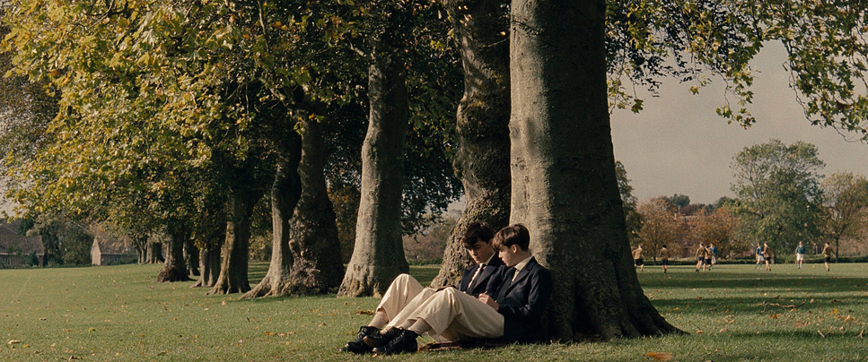
The visual challenge of The Imitation Game is simple but difficult: How do you film thinking? The central conflict isn’t physical; it’s internal. The war is happening hundreds of miles away, while Turing is fighting a war of intellect in a small hut.
Faura and Tyldum leaned into the concept of “claustrophobic secrecy.” The inspiration seems to be the contrast between the vastness of the global stakes and the cramped, suffocating reality of Hut 8. They bifurcated the visual approach based on the timeline: the urgency of the WWII Bletchley Park scenes versus the tragic, hollowed-out feeling of the 1950s investigation. The goal wasn’t just to show the period, but to show the pressure cooker Turing was living in.
Camera Movements
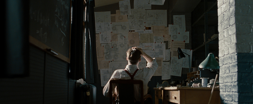
Unlike modern biopics that often rely on handheld camera work to create “fake” energy, The Imitation Game is refreshingly steady. The movement is methodical much like the Enigma machine itself.
The camera work relies heavily on controlled dolly moves. We see slow push-ins on Turing during moments of revelation, isolating him from the group even when they are standing right next to him. It’s a visual representation of his neurodivergence and social isolation. The camera doesn’t drift aimlessly; it observes. This steadiness grounds the intellectual drama. When the camera does move, it’s often tracking characters through the corridors of Bletchley, but the motion feels heavy and deliberate, mirroring the burden of the secrets they are carrying.
Compositional Choices
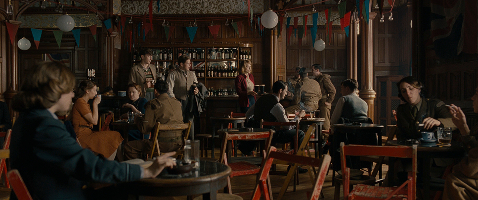
The composition is where the film’s “isolation” theme really lands. Faura frequently frames Turing (Cumberbatch) with significant negative space or pushes him to the edge of the frame making him look “right heavy” or “left heavy” in the composition to signify his imbalance with the world around him.
We see a lot of “frame-within-a-frame” techniques shooting through doorways, windows, or the complex wiring of the Bombe machine. This adds depth, but more importantly, it makes the characters feel trapped. In the group shots within Hut 8, the composition is often cluttered, filled with papers, wires, and other codebreakers. This visual noise contrasts sharply with the shots of Turing alone, which are stark and empty.
Lighting Style

The lighting is a highlight for me because it embraces the “muddy” reality of the era without looking ugly. Faura utilizes hard, directional lighting, mimicking the tungsten sources of the time.
In the Bletchley scenes, we get these pools of hard light from desk lamps, carving out the actors’ faces while letting the rest of the room fall into deep shadow. It’s high-contrast but sourced practically.
Interestingly, the 1950s timeline specifically the interrogation scenes and Turing’s apartment often leans into a grimier, artificial look. We see hard side-lighting that isn’t flattering; it casts long shadows across Cumberbatch’s face, emphasizing his exhaustion and the dual life he is forced to lead. The light doesn’t wrap around him softly; it hits him aggressively, just like the police investigation.
Lensing and Blocking
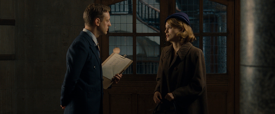
For a period piece, the choice of lenses was surprisingly modern. Faura used Zeiss Master Primes. These are clinically sharp lenses with high contrast and almost no distortion.
Why use modern, sharp glass on a 1940s period piece? Because they didn’t want it to feel like a “memory.” They wanted the image to feel immediate and present. The sharpness of the Master Primes means we see every pore, every bead of sweat, and the grease on the machine parts.
The blocking reinforces the power dynamics. In the scenes with Commander Denniston (Charles Dance), Turing is often seated while Denniston stands, or they are placed on opposite ends of a long axis. In the 1950s interview room, the blocking is static, trapping Turing in the chair, with the detective looming or sitting in opposition. The lens choice (often medium focal lengths, around 35mm to 50mm) keeps us at a conversational distance, making us an observer to the interrogation.
Color Grading Approach
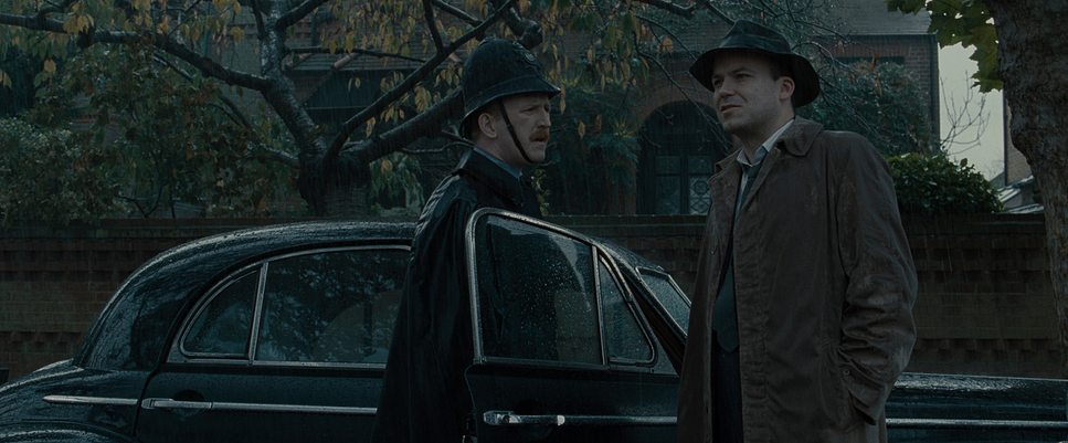
As a colorist, this is where I start geeking out. The color grade on The Imitation Game (handled by Stefan Sonnenfeld at Company 3) is a masterclass in period separation without falling into the sepia-tone cliché.
The film has a distinct density to it. The blacks are crushed but retain texture a hallmark of high-quality film stock. The Bletchley Park scenes lean into a cooler, desaturated palette lots of greys, teals, and muted greens. It feels damp and cold, which matches the English weather and the sterile military environment.
However, the 1950s interiors, like Turing’s Manchester apartment, often surprise you. There are scenes bathed in “warm, saturated orange” tungsten light. But it’s not a “happy” warm; it’s a sickly, suffocating warmth (often sodium vapor or tungsten balanced specifically to feel heavy). The contrast here is key: the cyan/blue of the shadows against the orange practicals creates a color separation that guides the eye. The skin tones are kept relatively natural but sit slightly under the film’s overall cool cast, making the characters look a bit pale and stressed.
Technical Aspects & Tools
The Imitation Game — Technical Specs
| Genre | Drama, History, Thriller, War |
| Director | Morten Tyldum |
| Cinematographer | Oscar Faura |
| Production Designer | Maria Djurkovic |
| Costume Designer | Sammy Sheldon |
| Editor | William Goldenberg |
| Colorist | Stefan Sonnenfeld |
| Time Period | 1950s |
| Color Palette | Warm, Saturated, Orange |
| Aspect Ratio | 2.39 – Spherical |
| Format | Film – 35mm |
| Lighting Style | Hard light, Side light |
| Lighting Type | Artificial light, Tungsten |
| Story Location | England > Manchester |
| Filming Location | United Kingdom > England |
| Camera | Arricam LT |
| Lens | Zeiss Master Primes |
Here is where the original article draft got it wrong. The Imitation Game wasn’t shot on digital; it was shot on 35mm film.
Faura used the Arricam LT (Lite) and Arricam ST (Studio) bodies. Shooting on film was a critical decision. Digital cameras in 2014 (even the Alexa) were great, but they didn’t have the chaotic, organic texture of celluloid. The film stocks used (likely Kodak Vision3 500T 5219 for the interiors) handle mixed lighting beautifully.
When you shoot Tungsten film stock in mixed daylight, you get those rich, natural blue tones in the shadows without them clipping into an electronic “video blue.” The grain structure of the 35mm film adds a layer of “noise” that lives between the audience and the actor, which subconsciously makes the period setting feel more authentic. It softens the sharpness of the Master Primes just enough. The dynamic range here isn’t a sensor spec; it’s the physical capability of the film emulsion to hold detail in the bright windows of the manor house while still seeing into the dark corners of the hut.
- Also read: DONNIE DARKO (2001) – CINEMATOGRAPHY ANALYSIS
- Also read: SLUMDOG MILLIONAIRE (2008) – CINEMATOGRAPHY ANALYSIS
Browse Our Cinematography Analysis Glossary
Explore directors, cinematographers, cameras, lenses, lighting styles, genres, and the visual techniques that shape iconic films.
Explore Glossary →