Hi, I’m Salik Waquas, a film colorist with a passion for cinematography and visual storytelling. I’ve spent years working on various projects, exploring how the visual components of film can be manipulated to tell deeper, more emotional stories. When I watch a film like “Whiplash,” I find myself not just absorbed in the narrative, but also in the intricacies of how the cinematography supports and elevates the story. This article is my take on how Sharone Meir’s exceptional work as a cinematographer shapes the intensity of “Whiplash” and adds layers to the journey of its protagonist.
About the Cinematographer

“Whiplash,” directed by Damien Chazelle, features cinematography by Sharone Meir. Meir’s work on the film is a masterclass in visual storytelling, helping to elevate the intense emotional journey of the protagonist, Andrew. The cinematographer uses light, camera movement, and color to immerse the audience in the rigorous world of jazz music and Andrew’s relentless pursuit of greatness. His approach is characterized by its attention to detail, and the film’s dynamic, energetic visuals enhance the story’s psychological depth. I found it interesting to see how Meir balances the emotional highs and lows of Andrew’s journey, often using subtle techniques to communicate significant emotional shifts.
If yo have seen Sharone Meir’s previous work on films like “Coach Carter” and “Mean Creek” you can see showcases his versatility in handling both high-energy and intimate moments. His experience clearly comes through in “Whiplash,” where every shot seems calculated to evoke a specific emotional response, and his collaboration with Chazelle is clearly one of perfect synergy.
Inspiration for the Cinematography of “Whiplash”

The cinematography in “Whiplash” draws significant inspiration from classic jazz imagery and thrillers. The film’s visual style seems to evoke the aesthetics of jazz album covers from the ’50s and ’60s—dynamic, moody, and bold. When you see the film’s use of warm yellows and oranges, it almost feels like you’re flipping through a jazz record collection. The compositions are often intimate, even claustrophobic, echoing the pressure-cooker environment Andrew finds himself in.
Interestingly, Damien Chazelle wanted to structure the movie like a thriller, and Meir’s cinematography reflects that approach. There’s a psychological tension reminiscent of suspense films like “Black Swan” or even the blood-test scene in John Carpenter’s “The Thing.” You feel the camera stalk its subjects; it’s relentless and unflinching, much like Fletcher’s character. The visual style brings out the mental strain of Andrew’s pursuit—every frame seems to carry the weight of his desire and desperation. I could see the inspiration is clearly rooted in visual intensity, where every shot reflects either the passion or the turmoil within the protagonist.
Camera Movements Used in Whiplash
One of the striking elements in “Whiplash” is its camera movement, which almost mirrors the rhythm of jazz music itself. Fast, frenetic, and unyielding, the camera becomes a part of Andrew’s world, isn’t that just amazing? The way it glides across the room during rehearsal sequences evokes the feeling of being caught in a musical whirlwind, much like how Andrew gets carried away by the music and Fletcher’s demanding demeanor, absolutely marvelous.
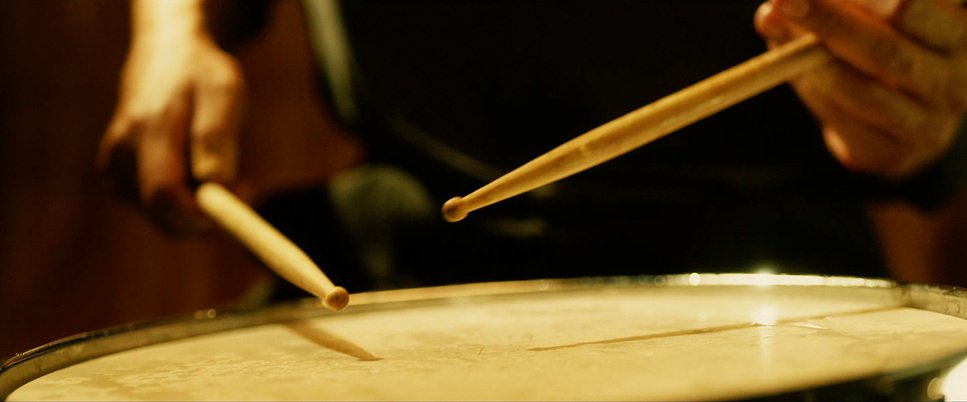
There’s a lot of handheld camera work, which gives the movie a visceral feel. The handheld shots make the audience feel Andrew’s anxieties and pressures—the unsteadiness reflecting his mental and physical exhaustion. When Fletcher yells, the camera often snaps to him, echoing the aggression in his voice. During performances, the camera dances, following the drumsticks with intense close-ups, sometimes capturing the sweat and blood on Andrew’s hands. These movements effectively put us as an audience in Andrew’s shoes, capturing his chaotic world.
I also found the subtlety of camera work during quieter moments to be very effective. For example, the camera becomes more static when Andrew is with his family or during moments of reflection, symbolizing his departure from the stressful, relentless environment of the band. This dichotomy between movement and stillness enhances the narrative and gives the audience a break from the otherwise high-intensity scenes.
Compositions in Whiplash

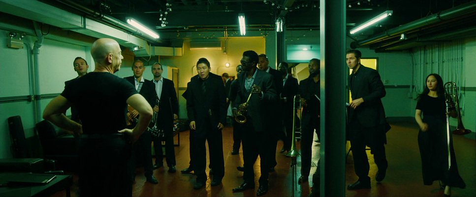
Compositionally, “Whiplash” is all about creating a sense of tension. The tight framing, particularly during practice sessions, emphasizes the claustrophobic environment that Andrew is stuck in. He’s constantly boxed in by the frame, and there’s this sense that he can’t escape from Fletcher’s overbearing presence or from his own ambitions. The compositions are so carefully constructed that they make you feel the struggle Andrew is going through. He’s often placed in the lower part of the frame or positioned against heavy, imposing elements like dark walls or black backgrounds.
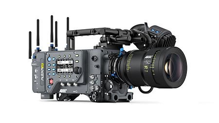
The technical aspects of “Whiplash” play a huge role in creating its visual intensity. The film was primarily shot on the ARRI ALEXA, which is known for its excellent dynamic range and color rendition.
There’s also a significant use of symmetry when Fletcher is on screen, symbolizing his control and authority. He’s always dead center, commanding the frame, and this visual consistency aligns perfectly with his dominating personality. What we ca see on the other hand, Andrew’s framing is often unbalanced, chaotic, and dynamic, highlighting his uncertainty and constant struggle.
One of my favorite aspects of the composition is how the drum kit itself is framed. The drum becomes almost a character in its own right, shot with reverence and intensity. Extreme close-ups of the cymbals, the rapid movements of drumsticks, and the beads of sweat create a sense of intimacy with the instrument, as if it’s an extension of Andrew. This dynamic framing adds to the visceral experience of the film and makes the act of drumming itself a powerful visual spectacle.
Lighting Style of Whiplash
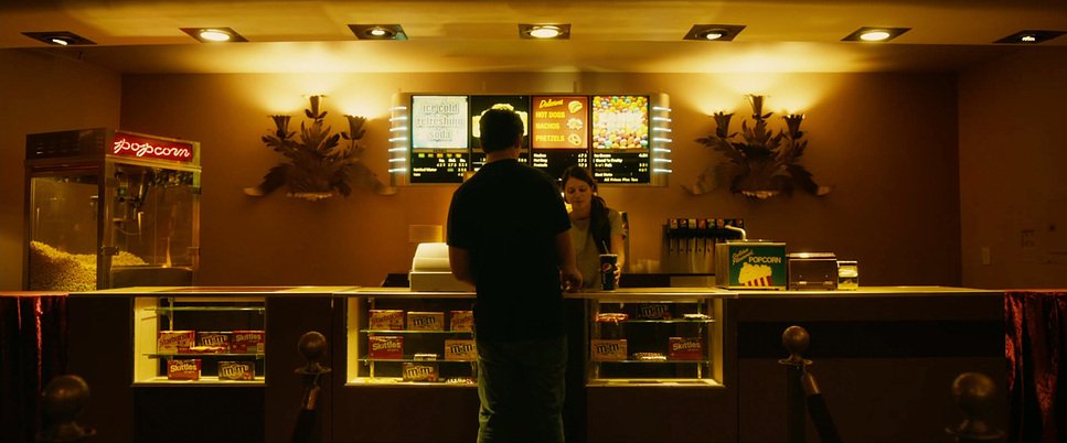
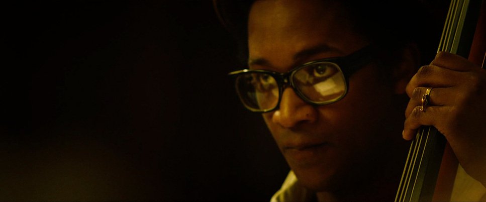
The lighting in “Whiplash” is both expressive and intentional. The predominant use of warm yellows and oranges gives the film a unique visual tone that both comforts and unsettles. The soft, warm light during scenes between Fletcher and Andrew, for example, creates a false sense of safety. At first glance, the lighting could be perceived as cozy or inviting—perhaps even fatherly. However, as the film progresses, it becomes apparent that these warm hues mask something more sinister, much like Fletcher’s personality.
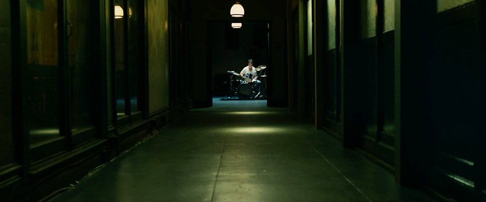
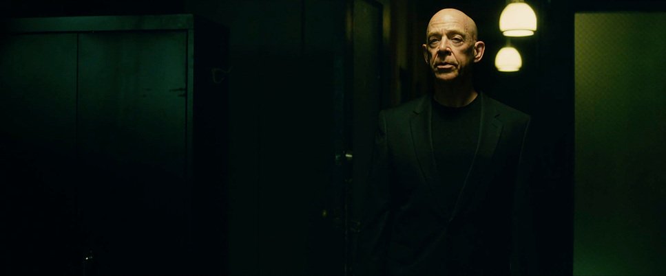
The use of shadows is another remarkable aspect of the lighting in “Whiplash.” In the opening scene, Andrew is practicing in a dark room, almost entirely swallowed by blackness, which signifies the power dynamics at play. He is dwarfed by the darkness of the music school, suggesting that, at this stage, the institution and Fletcher have full control over him. Fletcher, in his all-black attire, steps into this darkened environment as an ominous figure, foreshadowing the control he will exert over Andrew.
Contrasting with the warmth, the cooler greens and blues in the film mark Andrew’s moments of struggle and failure. The green hues during Andrew’s car crash or when he’s alone and spiraling into doubt symbolize his faltering confidence. These cooler tones are used sparingly but effectively to denote Andrew’s slipping grasp and the creeping sense of failure, which becomes a visual motif throughout the film.
Lensing and Blocking of Whiplash
The lens choices in “Whiplash” play a significant role in building the emotional intensity of the film. The cinematographer uses longer lenses during performances, which compresses the background and makes the scenes feel more confined, emphasizing the pressure Andrew is under. The shallow depth of field isolates Andrew, making everything outside of his goal irrelevant. It visually communicates his tunnel vision—his obsession with being the best drummer.

Blocking, on the other hand, is used to show the power dynamics between characters. Fletcher is often placed above Andrew, looming over him, which physically demonstrates his dominance. The rehearsal scenes are meticulously blocked to ensure Fletcher is always in a position of control—either standing over Andrew or pacing around the band, exerting his authority. Meanwhile, Andrew is often stationary, sitting at his drum kit, physically bound to his passion and the torment that comes with it.
The lensing and blocking work together seamlessly to build the film’s tension. During the final performance, the camera lenses become wider, and the blocking becomes more fluid, showing Andrew finally coming into his own. For the first time, he meets Fletcher on an equal plane, and the visual language shifts to signify this moment of triumph.
Color Grading of Whiplash
| Genre | Drama |
| Director | Damien Chazelle |
| Cinematographer | Sharone Meir |
| Production Designer | Melanie Jones |
| Costume Designer | Lisa Norcia |
| Editor | Tom Cross |
| Colorist | Natasha Leonnet |
| Time Period | 2010s |
| Aspect Ratio | 2.39 – Spherical |
| Format | Digital |
| Lighting | High contrast, Top light |
| Lighting Type | Artificial light, Practical light, Mixed light |
| Story Location | New York City > Shaffer Conservatory |
| Filming Location | California > Los Angeles |
| Camera | ARRI ALEXA Classic / plus, Canon 7D |
| Lens | Angenieux Optimo Zooms, Cooke Panchro Classic, Leica Summilux-C |
| Film Stock / Resolution | HD / 1080p |
Color grading is an integral part of “Whiplash’s” visual identity. The film predominantly employs a palette of yellows, greens, and blacks to convey the psychological states of its characters. The yellow and orange tones, in particular, give the film its characteristic jazz feel. They symbolize Andrew’s passion for drumming but also the suffocating heat of Fletcher’s expectations. There’s a duality in the use of these colors—they represent both Andrew’s burning desire to succeed and the destructive fire that consumes him.
The use of black is notable in its representation of power. Fletcher, dressed in black, exudes dominance, and the dark environments serve to remind the audience of his control. Andrew’s transformation is reflected in his wardrobe as he transitions from light-colored clothing to black, mirroring his descent into obsession and the influence Fletcher holds over him. The grading accentuates these wardrobe choices, making the contrast more vivid.
Green tones are used sparingly but effectively. They appear during Andrew’s moments of doubt or failure, such as when he’s expelled or after the car crash. These greens symbolize his uncertainty and fear, providing a stark visual contrast to the fiery yellows of his ambition. The transitions between these colors are seamless, and the color grading gives “Whiplash” an emotional undertone that supports the narrative, making every shift in color feel intentional and loaded with meaning.
Conclusion
“Whiplash” is a film that perfectly marries content with form. Its visual storytelling aligns seamlessly with its narrative themes of ambition, control, and the quest for greatness. Sharone Meir’s cinematography captures the chaotic energy of Andrew’s world, whether through intense handheld shots, carefully framed compositions, or evocative lighting and color grading. The film’s technical prowess—be it through its camera movements, lens choices, or grading—shows how cinematography can amplify a story’s emotional impact, and for that reason, it remains a visual masterpiece in my book.
- Also Read: JOKER CINEMATOGRAPHY ANALYSIS (IN-DEPTH)
- Also Read: PARASITE CINEMATOGRAPHY ANALYSIS (IN-DEPTH)
Browse Our Cinematography Analysis Glossary
Explore directors, cinematographers, cameras, lenses, lighting styles, genres, and the visual techniques that shape iconic films.
Explore Glossary →