Let’s get into G.O.R.A. from a purely visual standpoint. As a colorist, I spend my life obsessing over the nuances of an image, so when a film like this a Turkish sci-fi comedy from 2004 crosses my desk, I don’t just see the jokes. I see how it was built, brick by visual brick.
It’s one thing to make a comedy; it’s another thing entirely to build a sci-fi parody that takes aim at heavyweights like Star Wars, The Fifth Element, and The Matrix. That is a massive undertaking. To pull it off, you can’t just have a funny script you need a visual language that can hold its own alongside the Hollywood blockbusters it’s mocking.
The High-Stakes Ambition of Veli Kuzlu’s Cinematography

The visual ambition of G.O.R.A. is loud and clear, and that’s largely thanks to the eye of cinematographer Veli Kuzlu.This wasn’t a low-budget “indie” attempt at sci-fi; Kuzlu brought a very deliberate, concerted effort to push the production value toward international standards.
The sets are shiny, the futuristic elements feel tactile, and the VFX are surprisingly robust for the era. To me, this suggests a camera team that wasn’t just looking for “coverage.” Kuzlu was pushing for a polished, cinematic look because he knew the audience would be subconsciously comparing the film to the very blockbusters it was spoofing. It takes a certain level of confidence to build setups this meticulous just to house “crude” humor. The cinematography here is doing double duty: it serves the story, but it’s also making a statement that Turkish cinema has the technical chops to play on the global stage.
Stealing from the Best: The Visual Parody

The heart of G.O.R.A. is its blatant love-letter (and occasional middle finger) to sci-fi giants. For a cinematographer, a parody isn’t just about what the actors say it’s about dissecting the visual DNA of the original and recreating it just enough to make the punchline land.
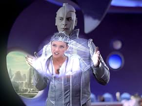
Take The Matrix. Everyone remembers the green tint and the bullet-time. When Arif tries to reenact Neo’s dodge, the visual team has to nail that sleek, digital-dystopia look. If the lighting or the color isn’t right, the joke dies. The same goes for The Fifth Element. That film is defined by vibrant, almost operatic production design. When Arif unlocks the “sacred stones,” the camera recreates that ancient-meets-futuristic grandeur perfectly, which only makes his confusion funnier.
The challenge for Kuzlu was the tightrope walk: how do you mimic three different iconic visual styles without losing the identity of your own film? G.O.R.A. leans into the “too blatant” side of things, but in a parody, that’s often the point.
When Bullet-Time Hits a Speed Bump
In big-budget sci-fi, the camera usually acts as a grand witness sweeping cranes, epic vistas, and fluid Steadicam work. G.O.R.A. plays with these expectations by knowing exactly when to pull back.
You expect the fight scenes to be these “Matrix-level” revolutionary sequences, but then the film gives you a short,unspectacular scrap. That’s a deliberate choice. The humor isn’t in a perfectly executed action sequence; it’s in the failure of the characters to live up to the cinematic tropes.
For the most part, Kuzlu keeps the camera controlled and smooth, letting the “shiny” sets breathe. But when the “lovable goofballs” start their adventure, the rhythm shifts to follow their antics. The cinematography isn’t trying to show off; it’s supporting the comedic timing.
Framing the Farce: Compositional Choices

Composition in G.O.R.A. is a balancing act between sci-fi scale and character comedy. To sell the spaceship environments, Kuzlu utilizes wide lenses and strong leading lines classic sci-fi language that adds depth and makes the world feel expensive.
But then, you have the “Cem Yılmaz factor.” Since he’s playing both Arif and Logar, the blocking and framing have to be surgical. You need clean singles, strategic over-the-shoulder shots, and precise depth separation to make sure both characters register as distinct people in the same world.
The humor often benefits from a “front and center” approach. When the joke is physical or “risqué,” the framing stays tight and unfiltered, making sure the audience doesn’t miss the gag.
The Tug-of-War: Moody Sci-Fi vs. Clear Comedy
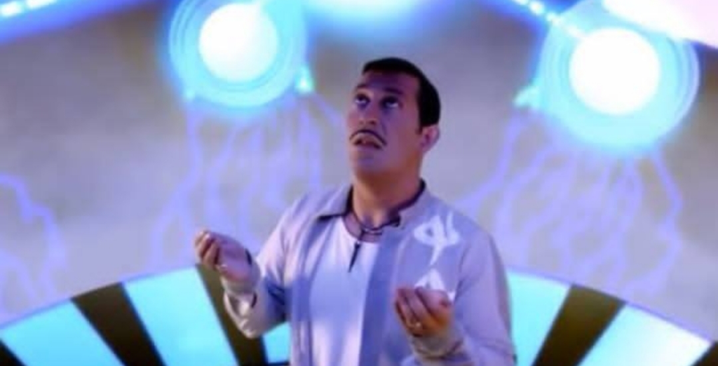
Lighting a sci-fi comedy is a nightmare for most DPs. Sci-fi usually wants high contrast, motivated light from glowing panels, and moody, cool temperatures (purples, cyans, deep blues). But comedy? Comedy needs to be seen. It usually thrives in high-key, even lighting where every facial expression is crystal clear.
Veli Kuzlu navigated this duality by shifting gears depending on the scene. The grand exterior shots and the serious “sci-fi” moments lean into that stylized, dramatic contrast. But the moment the “penis jokes” or the dialogue scenes start, the lighting becomes more functional. It’s not always flattering, but it’s always clear. It’s about finding that sweet spot where the serious ambition and the silly intent can live in the same frame.
The Magic of Glass and Body Doubles
When we talk about lensing and blocking, we’re talking about how you sculpt space. To get that “Hollywood” feel in 2004, you’d typically reach for anamorphic glass to get those distinctive flares and the widescreen scope of Star Wars.
However, my gut says they likely leaned into spherical lenses for the bulk of the comedy. Spherical glass gives you a cleaner image and more flexibility for VFX integration and the motion-control work needed for Cem Yılmaz’s dual roles. The blocking is often intentionally clumsy especially the Matrix references playing on the audience’s expectation of “perfect” action choreography and giving them something wonderfully awkward instead.
Grading the Galaxy: My Take as a Colorist
This is where it gets interesting for me. Being a 2004 release, G.O.R.A. likely went through a Digital Intermediate (DI) process. This gave the filmmakers the power to really sculpt the look in post.
I’d expect a base grade that’s clean and cool, but with “look-shifts” for specific parodies. For the Matrix bits, you’ve got to push that green bias into the midtones and crush the blacks. For The Fifth Element references, you’d dial up the saturation in the primaries rich reds and oranges.
The trick is consistency. You want the “shiny and futuristic” world to feel cohesive, but you also want the grade to help the audience realize, “Oh, we’re doing a Star Wars bit now.” As a colorist, I’d be looking for those subtle color washes that separate the actors from the VFX backgrounds, ensuring the image has depth without feeling “muddy.”
The 35mm Backbone: Technical Tools
In 2004, if you wanted to stand next to Western blockbusters, you shot on 35mm film. There’s a texture and a dynamic range there that early digital just couldn’t touch. Using Kodak or Fuji stocks would have given Veli Kuzlu the flexibility to handle the “shiny” highlights of the spaceship sets without blowing them out.
The “pretty good effects” the film is known for were likely a result of a robust pipeline: meticulous greenscreen work and motion-control rigs. The DI was the glue that held it all together, allowing the team to color-match live action with CGI so the audience stays immersed in the world, even when the characters are being “a little dumb.”
- Also read: RIO BRAVO (1959) – CINEMATOGRAPHY ANALYSIS
- Also read: THE LEGEND OF 1900 (1998) – CINEMATOGRAPHY ANALYSIS
Browse Our Cinematography Analysis Glossary
Explore directors, cinematographers, cameras, lenses, lighting styles, genres, and the visual techniques that shape iconic films.
Explore Glossary →