Directed by Doug Liman and shot by the late Oliver Wood The Bourne Identity (2002), it wasn’t just another spy flick. It was a visual manifesto. It dared to be ugly where other films wanted to be pretty, offering a gritty, unvarnished look at a man scrambling to find his own soul. For a colorist, understanding the “why” behind this film’s look is vital. It’s the definitive blueprint for the grittier, grounded aesthetic that eventually took over the entire genre.
About the Cinematographer
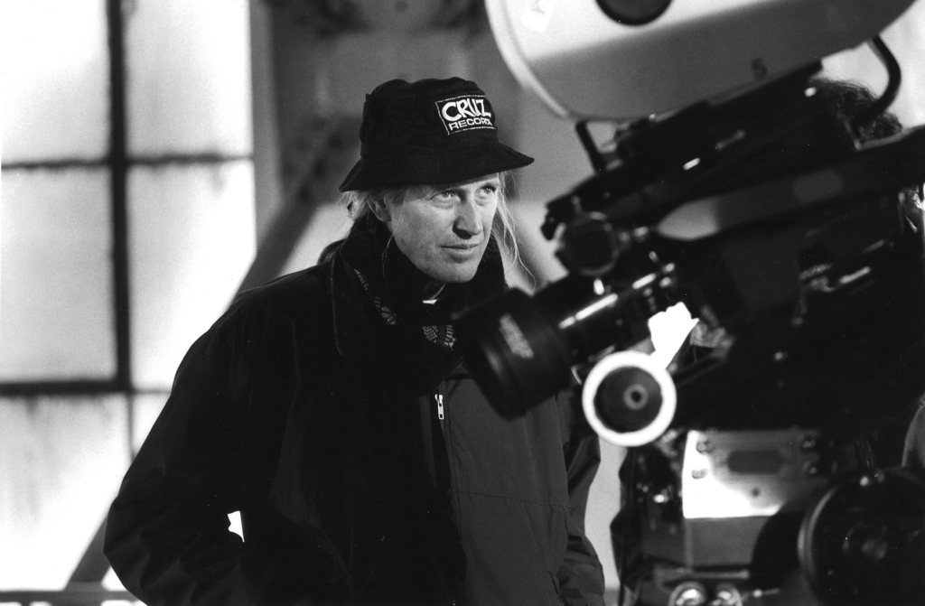
The man behind the lens was Oliver Wood. We lost him in 2023, but the legacy he left with the Bourne franchise is massive. His partnership with Doug Liman on this film was foundational. Liman came from the indie world and he brought that “break the rules” energy with him. He wanted something that felt like it was happening right now, in the moment, without the typical Hollywood gloss.
Wood was the perfect guy for this. He had this incredible ability to take chaotic energy and turn it into controlled visual storytelling. A lot of people blame Bourne for the “shaky cam” craze, but if you actually look at Wood’s work in the first film, it’s different. It’s handheld, sure, but it isn’t just flailing. It’s a meticulously orchestrated movement designed to make you feel every punch and every frantic escape. He wasn’t just shaking a camera; he was injecting kinetic energy directly into the audience’s pulse.
Color Grading Approach
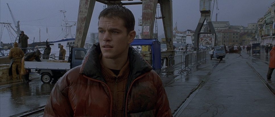
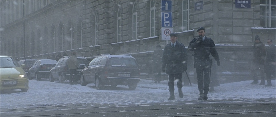
Let’s talk about the grade, because this is where the film’s soul really lives. When I’m sitting in front of my panels and a client asks for a “Bourne look,” they usually just mean “make it blue and desaturated.” But it’s so much more than that. The look of this film defined an era. It’s a cool-toned, “Paris in Winter” palette that feels bone-chillingly real.
In the suite, this isn’t just a global desaturation. It’s about tonal sculpting. We’re looking at significant desaturation in the mid-tones while keeping the blacks dense and “inky.” The highlight roll-off is the secret sauce here; because it was shot on 35mm, the highlights don’t just clip they bleed softly, maintaining that organic, filmic texture.
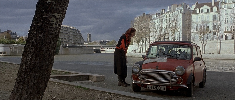
I love the hue separation in this film. Even in a world of muted cyans and greys, specific elements like a red backpack or a tail light still have a subtle, purposeful pop. It’s visual restraint. It tells the viewer: this isn’t a fantasy; this is messy, it’s cold, and it’s happening on a street you might actually walk down. For me, translating that kind of narrative intentionality is the most rewarding part of the job. It’s not about making things “look pretty.” It’s about making them feel true.
Inspiration Behind the Cinematography
The inspiration here was twofold: Bourne’s broken brain and a total rejection of the “gadget-spy” tropes of the 90s. Bourne has amnesia. He’s discovering lethal skills he didn’t know he had, and the camera reflects that confusion. Everything is moving at a frenetic pace because that’s exactly how he feels.
Liman and Wood stripped away the veneer. They wanted a documentary feel, almost like we were trespassing on a real CIA operation. This was 2002 audiences were tired of the “superhero” spy. They wanted a hero who bled. That demand for realism is what eventually gave us Casino Royale and Batman Begins, but Bourne got there first. It embraced imperfections and organic light because that was the only way to make the stakes feel dangerous.
Camera Movements
I have to reiterate: handheld is not the same as “shaky cam.” Wood nailed the distinction. In later films, directors used shaky cameras to hide bad stunt work. In The Bourne Identity, the handheld work is a character in itself. It tracks, pushes, and pulls with Jason Bourne.
Look at the embassy escape. As he’s moving through those hallways, the camera is right there, breathing with him. It’s immersive. It’s claustrophobic. The median shot length is incredibly short, which keeps the pace frantic. It’s effective because it’s motivated. The camera is an extension of Bourne’s own drive to survive. It’s not a random wobble; it’s a heartbeat.
Lighting Style
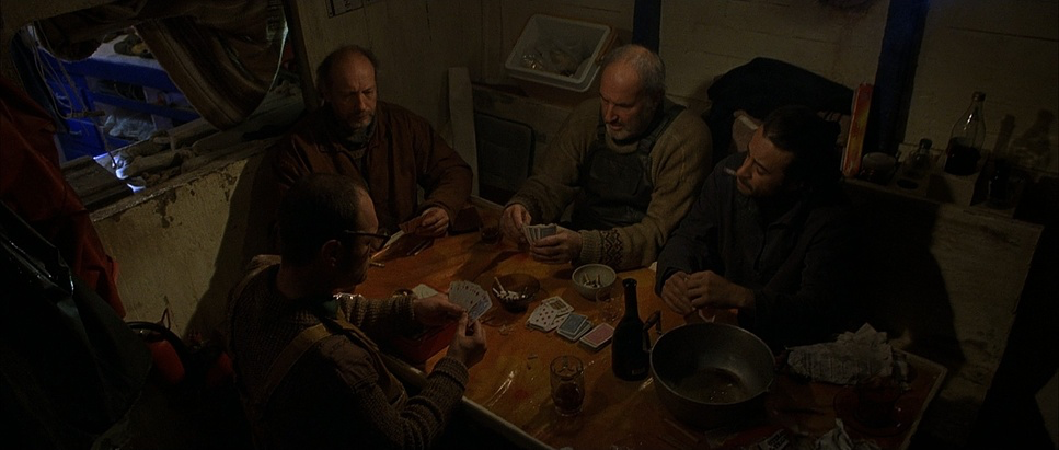
This is a masterclass in motivated realism, a term I probably say ten times a day in my own work. Oliver Wood leaned heavily into what looks like available light. It’s dark. It’s moody. By traditional Hollywood standards, a lot of this film is “underexposed,” but that’s the point.
Interiors feel like they’re lit by a single desk lamp or a window. It feels like we’re observing real life, not a set. The “Paris in Winter” setting provides this gorgeous, flat, overcast light that stretches shadows and mutes the colors. Even the CIA control rooms feel sterile and unglamorous. It’s not about “beautiful lighting” it’s about atmosphere. Every decision, from the location to the time of year, was made to support that feeling of being on the run.
Compositional Choices

The framing in this film isn’t about “postcard shots.” Even in a city as beautiful as Paris, Liman keeps the compositions functional and tight. He famously “broke the 180-rule” (the rule of spatial continuity), which is a bold move. It keeps the audience slightly off-balance, mirroring Bourne’s own disorientation.
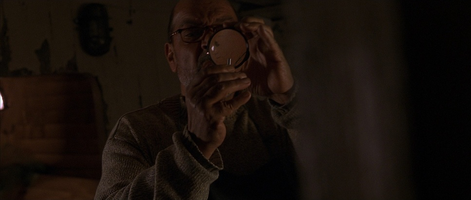
Instead of wide, sweeping vistas, we get tight, intimate frames. We’re in the apartment during the fight; we’re scaling the embassy wall with a sense of “matter-of-fact” danger. The camera doesn’t over-dramatize the action because the action is already intense enough. It’s observational. It’s raw. It’s “in the moment.”
Lensing and Blocking
Wood’s choice of glass further cements this grounded look. There’s a clear preference for wider focal lengths, even in close-quarters combat. Why? Because it keeps more of the environment in focus. It lets us see the spatial relationships and the immediate threats.
When Bourne uses a pen as a weapon, the lens is uncomfortably close. It makes the violence feel visceral and immediate. Blocking-wise, characters move with a natural, unchoreographed fluidity. It doesn’t look like a dance; it looks like a struggle. Liman often filmed with just him, a camera, and Matt Damon—no massive crew, no big lights. That intimacy shows up on screen. It allows for raw performances and a kinetic energy that you just can’t fake.
Technical Aspects & Tools
| Genre | Action, Drama, Mystery, Thriller, CIA, Political, Spy, CIA / FBI, FBI / CIA |
| Director | Doug Liman |
| Cinematographer | Oliver Wood |
| Production Designer | Dan Weil |
| Costume Designer | Pierre-Yves Gayraud |
| Editor | Saar Klein |
| Colorist | Mark Sachen, Michael Healey |
| Time Period | 2000s |
| Aspect Ratio | 2.35 – Super 35 |
| Format | Film – 35mm |
| Lighting | Soft light, Backlight |
| Lighting Type | Daylight, Overcast |
| Story Location | Marseilles > Ocean |
| Filming Location | France > Paris |
| Camera | Aaton 35-III, Panavision Millennium / Millenium XL / XL2 |
| Lens | Panavision Lenses |
| Film Stock / Resolution | 5245/7245 EXR 50D, 5279/7279 Vision 500T |
Since it was shot on 35mm, The Bourne Identity has that organic grit that digital still struggles to replicate. Wood likely used agile cameras like the Arriflex 435 or Aaton 35-III to handle the constant handheld movement.
You have to remember, this was 2002. Post-production was in a transition phase. The color grade likely involved a lot of photochemical timing, which added to that “print-film” sensibility. The film’s ending was even changed due to the real-world sensitivities of 9/11, shifting from a massive explosion to something more intimate. That kind of adaptability, combined with a mastery of film stock like the Kodak Vision 500T, is what allowed them to create something that still feels modern over twenty years later.
- Also read: BACK TO THE FUTURE PART II (1989) – CINEMATOGRAPHY ANALYSIS
- Also read: SHAUN OF THE DEAD (2004) – CINEMATOGRAPHY ANALYSIS
Browse Our Cinematography Analysis Glossary
Explore directors, cinematographers, cameras, lenses, lighting styles, genres, and the visual techniques that shape iconic films.
Explore Glossary →