Let’s talk Zootopia (2016), Zootopia is different. It’s one of those rare animated features that doesn’t just entertain; it schools you on visual storytelling. It achieves a level of sophistication that rivals high-end live-action productions. It’s the kind of work that feels like a reference print you keep on your desktop a benchmark for how vibrant yet grounded a digital image can be.
For an industry that often struggles to make animated films resonate beyond the “kid demographic,” Zootopia hits differently. It blends infectious energy with complex noir tropes, and it does so with such visual grace that it leaves a mark. This isn’t just a fun adventure; it’s a meticulously engineered optical experience, and that’s exactly why I want to break down its cinematography.
About the Cinematographer
In animation, “cinematographer” can be a tricky title because you don’t have one person holding a physical camera. However, on Zootopia, the credit largely belongs to Nathan Warner (Director of Cinematography – Layout). He and his team didn’t just “place” cameras; they simulated the physics of real-world photography. They worked intimately with directors Byron Howard and Rich Moore to translate the script’s emotional beats into a cohesive visual language.
They made deliberate choices about where the virtual camera went, how it moved, and crucially, what “lenses” were used. It’s a fascinating mix of technical code and artistic gut instinct. Their job wasn’t just to make the fur look pretty, but to use the camera to serve the story. They treated the virtual set like a live-action location, creating a world that feels tactile or as one review noted, an “amazing world” that feels lived-in. When you see the sheer detail, you realize this wasn’t just rendered; it was photographed.
Inspiration Behind the Cinematography
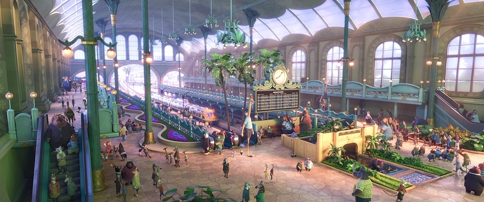
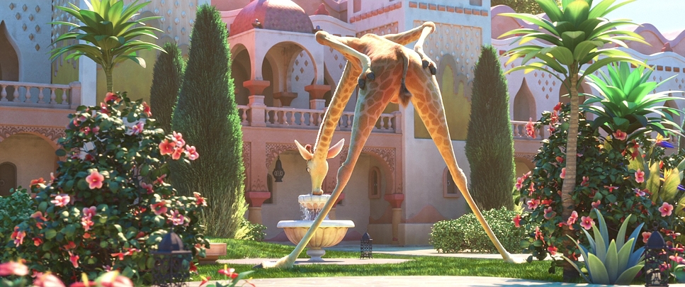
The primary inspiration here feels like a collision between a nature documentary and a 1970s neo-noir. The team had to build a hyper-realistic, modern metropolis that could house creatures ranging from shrews to giraffes. The world-building is massive, but the cinematography grounds it.
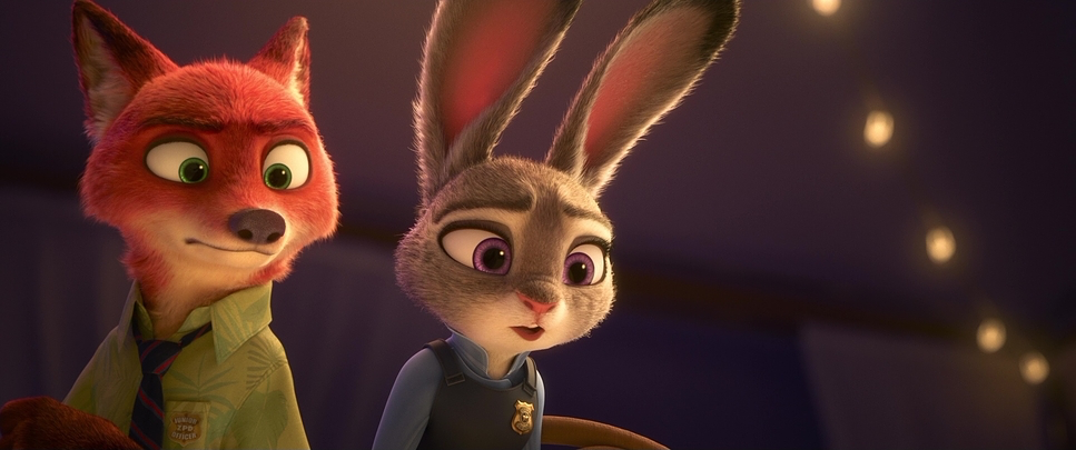
I see clear nods to classic detective noirs and buddy-cop thrillers, particularly in how Judy Hopps and Nick Wilde navigate the city’s underbelly. The film uses the high-contrast lighting and low angles typical of those genres to imbue moments with tension. It’s a smart way to layer narrative meaning: by using the visual grammar of an urban thriller, they allow the film to explore heavy themes prejudice, corruption without it feeling preachy. The visuals do the heavy lifting, letting the adults catch the noir references while the kids enjoy the chase.
Camera Movements
The camera work in Zootopia avoids the “floating camera” syndrome that plagues a lot of bad CGI. The movement feels weighted and physical. When we are with Judy, the camera often employs intimate, handheld-style drift that subtle “keep alive” motion that makes it feel like a human operator is holding the lens.
Contrast that with the establishing shots: sweeping crane moves that showcase the scale of the districts. When Judy arrives in Zootopia, we get those grand, tilting-up shots emphasizing her small stature against the massive architecture. It’s aspirational. But during the action sequences, the camera shifts to rapid dolly or tracking shots that inject urgency. The filmmakers even simulate focus-pulling errors slightly, or camera shake during impact, which tricks your brain into thinking this was shot on a physical set. It’s a masterful control over cinematic language, ensuring the viewer never feels lost in the pixels.
Compositional Choices
Compositionally, Zootopia is a study in scale. The film constantly plays with depth cues to emphasize the hierarchy of this society. Think of Judy, a small rabbit, frequently framed in wide shots against massive animals or imposing buildings. These choices visually underscore her “underdog” status better than dialogue ever could.
The use of negative space is also clever, often isolating characters in the frame during moments of doubt. They stick to the Rule of Thirds for the balanced, “safe” moments, but aren’t afraid to break it to create tension. There are frequent deep-focus shots in the wide exteriors to show the ecosystem, but they switch to shallow depth of field for character beats. As a viewer, you subconsciously understand the power dynamics just by looking at how much headroom a character is given or how compressed the background feels.
Lighting Style
The lighting in Zootopia is where the tech really shines. Disney used their Hyperion renderer here, which allows for massive amounts of complex light calculation. It’s a masterclass in motivated lighting. Every light source feels like it’s coming from a logical place streetlamps, neon signs, or the sun.
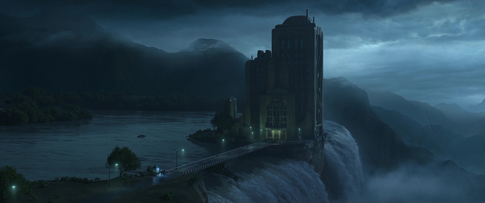
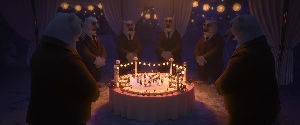
From the golden hour glow washing over the plaza (evoking optimism) to the gritty, high-contrast sodium vapor look of the Rainforest District, the light sculpts the emotional tone. As a colorist, I love how they handled the “toe” of the curve the shadows. In the mystery scenes, they let the shadows go deep and dark, creating genuine tension without resorting to cheap jump scares. There is also a beautiful implementation of volumetric light (god rays) and sub-surface scattering on the characters’ fur, which prevents them from looking like plastic toys. It creates a “vibrant, complete” image that feels organic.
Lensing and Blocking
This is where the animation team really flexed their muscles, emulating live-action glass with uncanny precision. Zootopia employs a diverse range of virtual focal lengths. We see wide-angle distortions (probably equivalent to a 18mm or 24mm) to emphasize the grandeur of the city. But during emotional close-ups with Nick and Judy, they lean into longer focal lengths (likely 85mm or higher), which compresses the background and isolates the faces.
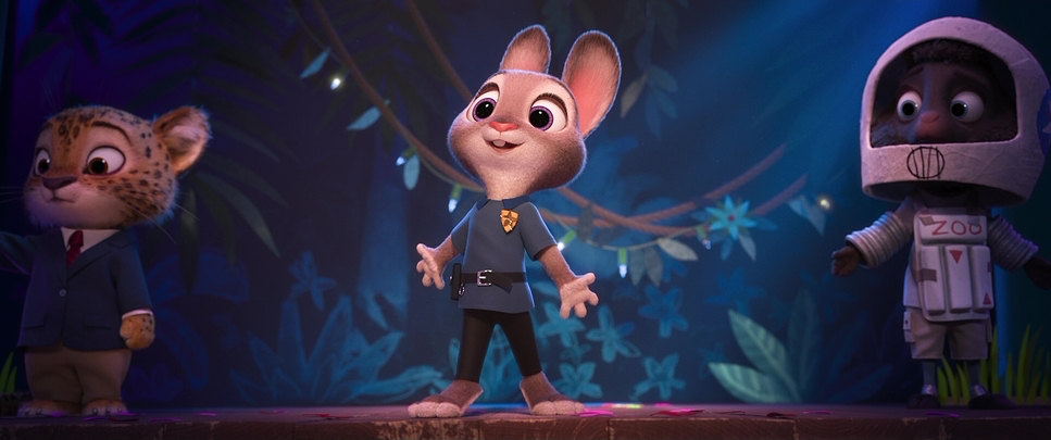
The bokeh (background blur) is artfully rendered, mimicking the characteristics of high-end cinema lenses. It helps separate the characters from the incredibly busy backgrounds. Blocking-wise, the spatial relationship between Nick and Judy tells its own story. They start visually separated, often on opposite sides of the frame, and gradually move closer as their partnership solidifies. It’s textbook blocking, but executed with rabbits and foxes.
Color Grading Approach
From my perspective at the grading desk, the work done here credited to colorist Eliot Milbourn is superb. It’s a masterclass in density and separation. The overall palette is vibrant, yes, but it’s not “default digital” saturation. It feels curated.
They use distinct color contrasting for different districts: Sahara Square uses scorching warm yellows and oranges, while Tundratown is locked into cool teals and cyans. This isn’t just decoration; it instantly communicates the environment. What I appreciate most is the film emulation feel. They seem to be aiming for a print-film look, perhaps nodding to Kodak 2383 stock characteristics. The highlights have a soft roll-off (no harsh digital clipping), and the shadows are rich and heavy. They sculpted the contrast to match the mood—softer for the emotional beats, punchier and grittier for the chase scenes. It’s a balanced grade that supports the film’s dual nature: a bright family film on the surface, with a moody noir film underneath.
Technical Aspects & Tools
Zootopia – Technical Specs
| Genre | Adventure, Animation, Comedy, Family, CGI Animation, Murder Mystery, Satire, Mystery, Crime, Police |
| Director | Byron Howard, Rich Moore |
| Cinematographer | Nathan Warner |
| Production Designer | David Goetz |
| Editor | Fabienne Rawley, Jeremy Milton |
| Colorist | Eliot Milbourn |
| Time Period | 2010s |
| Color | Mixed, Saturated, Blue |
| Aspect Ratio | 2.39 |
| Lighting Type | Daylight, Sunny |
| Story Location | … Earth > Zootopia |
While we don’t have a camera package list, the technical prowess is undeniable. Disney’s proprietary software had to handle millions of individual hairs interacting with light a nightmare for rendering engines. The fact that they achieved this level of fidelity speaks to the power of the Hyperion renderer.
The simulation of cloth, fur, and atmospheric effects (fog, rain) provided a robust foundation for the lighting team. From a colorist’s point of view, having this high-quality render data (likely 32-bit float EXR or similar) is gold. It means you have immense latitude to push and pull the image in the grade without it breaking apart. It allows for that nuanced sculpting of light and shadow that makes the final image look so expensive.
- Also read: THE PURSUIT OF HAPPYNESS (2006) – CINEMATOGRAPHY ANALYSIS
- Also read: BLOOD DIAMOND (2006) – CINEMATOGRAPHY ANALYSIS
Browse Our Cinematography Analysis Glossary
Explore directors, cinematographers, cameras, lenses, lighting styles, genres, and the visual techniques that shape iconic films.
Explore Glossary →