As the founder of Color Culture, I spend most of my waking hours staring at reference monitors, tweaking curves, and obsessing over signal flows. Usually, I’m dissecting live-action footage, trying to make digital sensors look like organic memory. But when I first watched Makoto Shinkai’s Your Name. (2016), it stopped me cold. It wasn’t just a good animated movie; it was a masterclass in visual engineering. The film weaves a fantastical narrative with visceral, grounded visuals that I still study today. It challenges how we perceive reality and memory, and it does so through a cinematography style that rivals the best live-action DPs working today.
About the Director’s Visual Approach
In live-action, the cinematographer interprets the director’s vision. In animation—specifically with an auteur like Shinkai—the director is the primary visual architect. Shinkai has built a career on stories about distance and longing, from The Garden of Words to Voices of a Distant Star, and his visual signature is inseparable from those themes.
For Your Name., Shinkai elevates a body-swapping trope into an epic. His aesthetic relies on a hyper-realistic treatment of backgrounds that often feel more detailed than the characters inhabiting them. This creates a fascinating tension: simplified, expressive characters set against backgrounds that look like high-resolution photography on steroids. While critics often compare him to Miyazaki, I find Shinkai’s handling of light and atmosphere to be distinct. He leans into the “digital” nature of his medium, embracing lens flares and volumetrics to bridge the gap between mundane high school life and the cosmic events that drive the plot.
Inspiration Behind the Cinematography
The film’s visual language is built entirely on the narrative’s core conflict: Tokyo vs. Itomori. Urban vs. Rural. Taki vs. Mitsuha. This dichotomy anchors the visual strategy. We have the cold, vertical density of Tokyo juxtaposed against the horizontal, verdant serenity of the countryside.
Shinkai’s team achieved this through a specific blend of rotoscoping and abstraction. There’s a popular observation in video essays about this film that notes how the animation “uses reality without being limited by it.” I agree. By tracing over real-life footage (rotoscoping), they ground the physics of the world. Trains move with the correct weight; doors slide with familiar friction. This grounding makes the fantastical elements—the comet, the body swaps—hit harder. It creates a believable canvas. For me, the inspiration feels like a technical appreciation for the transient beauty of light, pushing the boundaries of what we usually accept in animation.
Camera Movements
In animation, a “camera move” is a math problem. It has to be calculated, not captured. In Your Name., these calculations are incredibly deliberate.
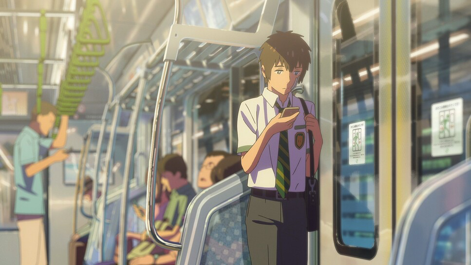
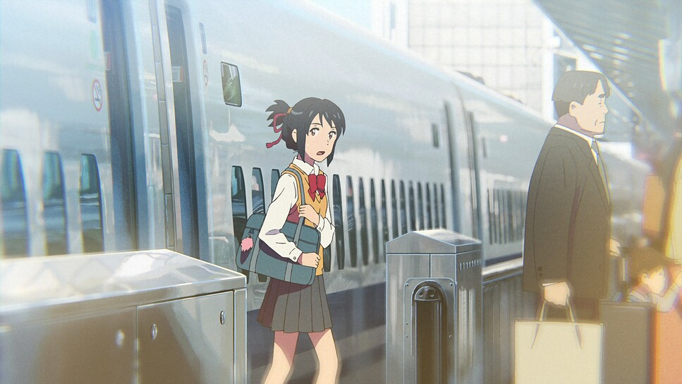
We see a lot of lateral tracking shots—Taki navigating the Shibuya crossing or Mitsuha cycling. These aren’t random; they establish the geography and rhythm of their daily lives. But when the scale shifts, so does the virtual camera. The sweeping crane shots over Itomori utilize parallax scrolling (where foreground and background layers move at different speeds) to sell the scale of the crater lake. It dwarfs the characters, emphasizing the indifference of nature.
What impresses me most are the imperfections. The animators introduce handheld-esque jitters during high-stress moments. When Taki is frantically searching his memory, the frame isn’t locked off; it floats with a subtle, unstable noise that mirrors his anxiety. Conversely, the moments of connection use slow, mechanical push-ins. The pacing of these moves acts as visual punctuation. It’s a testament to the team’s skill that these digital keyframes feel as intuitive as an operator responding to an actor on set.
Compositional Choices
Shinkai’s framing is dense. While he uses standard rule-of-thirds for dialogue, his establishing shots are where the magic happens. He loves deep-focus compositions where every pixel is fighting for attention.
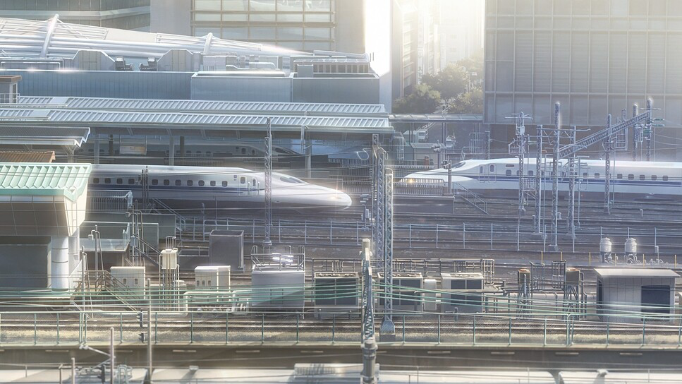
The backgrounds are characters. Whether it’s the tangle of power lines in Tokyo (a classic anime trope that Shinkai has perfected) or the mossy stones of the shrine, the frame is packed with data. As a colorist, I often tell clients that a frame is “too busy” and we need to window/vignette the subject to guide the eye. Shinkai somehow ignores this rule. He uses leading lines—train tracks, cables, pathways—to cut through the noise and point us exactly where we need to look.
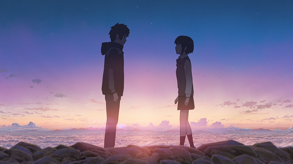
He also understands the power of the void. During the comet sequences, the vastness of the sky dominates the frame, using negative space to evoke isolation. This balance between the clutter of human life and the emptiness of the cosmos drives the emotional arc. It’s a visual rhythm that moves from the intimate to the infinite.
Lighting Style
This is where I get jealous. The lighting in Your Name. is “motivated,” meaning sources feel physical and directional, but they are stylized for maximum emotional impact.
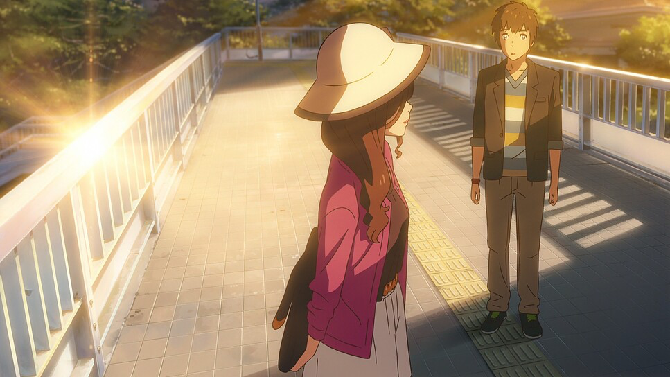
Shinkai is famous for his “magic hour” lighting, but it’s the specific quality of that light that matters. He pushes the bloom and diffusion to create a soft, almost humid atmosphere. The sunsets aren’t just orange; they are gradients of violet, magenta, and deep gold that bleed into the shadows. In Tokyo, the light is harder, sharper, often cool and cyan-tinted from the city’s LEDs. In Itomori, it’s soft, warm, and wraps around the characters.
Technically, the “God rays” (volumetric lighting) piercing through clouds add a texture that 2D animation usually lacks. The highlight roll-off is also worth noting. In digital video, highlights often clip harshly. Here, the animators have simulated a filmic shoulder, where the whites roll off gently rather than hitting a hard ceiling. It mimics the response of high-quality film stock, preventing the image from feeling like a vector graphic.
Lensing and Blocking
Even without physical glass, the film simulates the physics of optics. The “lensing” choices tell the story. Wide-angle perspectives (likely simulating a 24mm or wider) emphasize the distance between characters or the scale of the city. These shots often use exaggerated perspective distortion to draw you in.
On the flip side, we see “telephoto” compression effects. When looking at the comet or distant characters, the background appears closer to the foreground subject, compressing the space. The bokeh (background blur) is rendered with circular, chromatic aberrations that mimic real lenses.
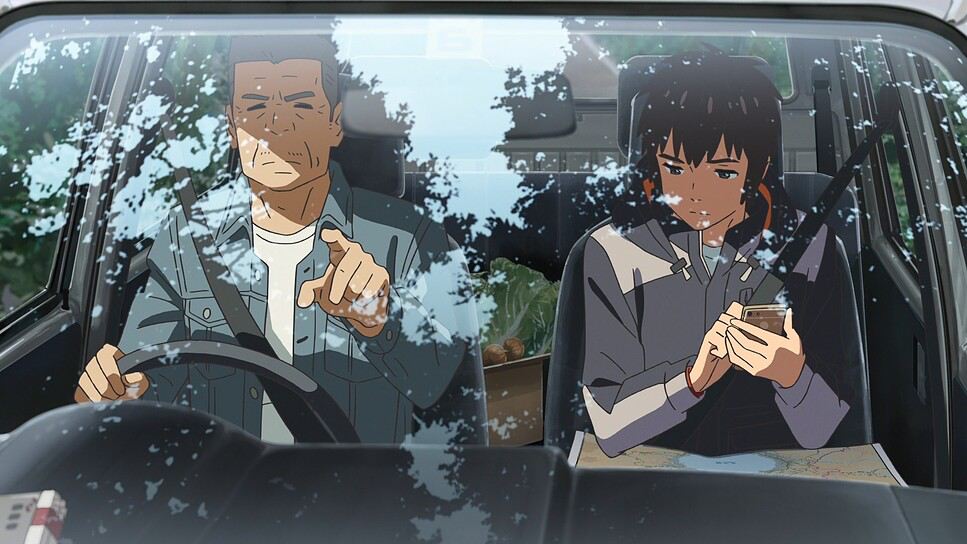
Blocking—where characters stand and how they move—is equally precise. The body-swap physical comedy relies entirely on blocking. Taki-in-Mitsuha moves with a masculine, unrefined gait that clashes with the feminine setting. Mitsuha-in-Taki is reserved and polite in a chaotic male environment. The climax at Kataware-doki (twilight) is a masterclass in spatial relationships, navigating the barrier between timelines through simple, effective character placement.
Color Grading Approach
This is my home turf. If I were grading this in DaVinci Resolve, I’d say the look relies on high color density and a very specific subtractive color model. The palette is vibrant, yes, but it’s not just “saturated.” It’s “dense.”
The contrast curve is S-shaped but lifted. Shadows are rich but open (never fully crushed to black), and the highlights retain detail. It feels like a print film emulation—think Kodak 2383 but with the saturation cranked up in the mid-tones.
The hue separation is textbook perfection. Tokyo is defined by cold tones—steely blues, concrete greys, and the artificial glow of screens. Itomori is organic—lush greens, earthy browns, and the warm spectrum of sunlight. The most striking element is the Red String of Fate. In a world of complex palettes, that red is pure, primary, and cuts through everything. It’s a visual anchor.
During the comet scenes, the palette shifts into ethereal purples and cyans. These shifts aren’t jarring because they follow the established logic of the film’s lighting. It’s an expert demonstration of how color grading isn’t just about making things look “nice”—it’s about emotional signaling.
Technical Aspects & Tools
Your Name. (2016) — Technical Specs
| Genre | Animation, Drama, Fantasy, Melodrama, Romance, Time Travel, Traditional Animation |
| Director | Makoto Shinkai |
| Cinematographer | Makoto Shinkai, Hitomi Fukuzawa |
| Editor | Makoto Shinkai |
| Time Period | 2010s |
| Aspect Ratio | 1.78 |
| Format | Animation |
| Lighting | Hard light, Side light |
| Lighting Type | Artificial light |
| Story Location | Japan > Tokyo |
| Filming Location | Asia > Japan |
While the marketing plays up the “hand-drawn” angle, Your Name. is a hybrid beast. The character animation preserves the expressive, imperfect line quality of traditional cell animation. However, the environments are a triumph of digital compositing.
The production almost certainly relied on a heavy post-processing pipeline—likely using After Effects for compositing and Cinema 4D for the complex camera moves and particle effects (like the comet tail). The integration of rotoscoping provides the skeleton for the movement, but the digital polish gives it the skin.
The team also simulated motion blur and depth of field with surprising accuracy. In many anime, these effects look like cheap filters slapped on top. Here, they track with the movement and focal plane, mimicking the shutter angle and aperture of a physical camera. It’s this marriage of traditional artistry and high-end digital compositing that creates the signature “Comix Wave” look.
- Also Read: THE LIVES OF OTHERS (2006) – CINEMATOGRAPHY ANALYSIS
- Also Read: AMADEUS (1984) – CINEMATOGRAPHY ANALYSIS
Browse Our Cinematography Analysis Glossary
Explore directors, cinematographers, cameras, lenses, lighting styles, genres, and the visual techniques that shape iconic films.
Explore Glossary →