When I watch Young Frankenstein (1974), I’m not just watching one of the greatest comedies ever made; I’m looking at a masterclass in visual subversion. It’s a film that dared to look “old” at a time when Hollywood was obsessed with the new, and as a result, it hasn’t aged a day.
Mel Brooks didn’t just want a parody; he wanted a living, breathing anachronism. This wasn’t some shallow stylistic choice. It was a foundational decision that touched every single department. To me, Young Frankenstein is like a vintage Rolex every gear and spring serves a mechanical purpose, creating a piece of art that still tells a perfect story fifty years later.
About the Cinematographer
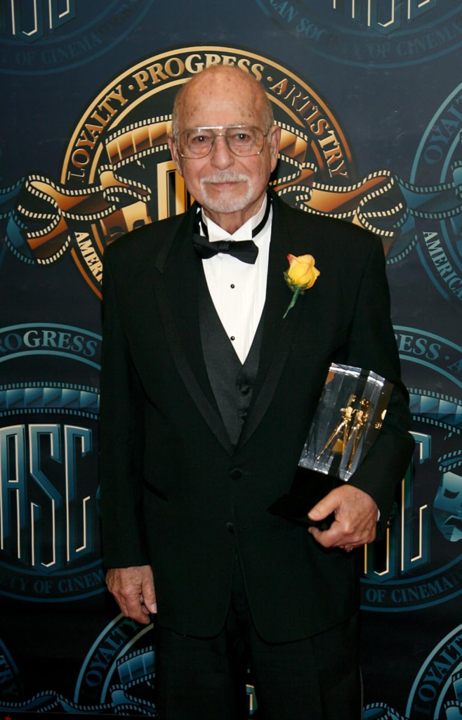
The visual architect here was Gerald Hirschfeld, ASC. His work on this film is the ultimate “what if” scenario: what happens when technical mastery meets a director with zero fear of the studio brass?
A DP of Hirschfeld’s caliber doesn’t just “light” a room. He’s sculpting. For Young Frankenstein, he wasn’t just shooting a movie; he was reverse-engineering a dead language. He spent hours studying the “Universal Grammar” of the 1930s the specific way shadows fell and how the lenses reacted to light. He realized you couldn’t just mimic the surface-level stuff. You had to embrace the technical limitations of the past using the tools of the 70s. The result? A film that feels deeply respectful of its source material while being completely original.
Inspiration Behind the Cinematography
The core mission was simple: make it look like an authentic Universal Monster film, not a spoof of one. This wasn’t “retro” for the sake of being cool. It was a hill Mel Brooks was willing to die on. In 1974, the studio panicked at the thought of a black-and-white comedy. They actually offered Brooks more money to shoot in color. He told them he’d walk. That kind of creative conviction is rare today, and frankly, it’s inspiring.
In my world, black and white isn’t just a “filter” you slap on in post-production. It’s a different canvas entirely. When you strip away color, you lose the “easy” way to create separation. You’re forced to focus on form, texture, and light. In Young Frankenstein, this choice does something the jokes couldn’t do alone it immerses you. It signals that the filmmakers are taking the world seriously, even if the characters are being absurd.
Camera Movements
You won’t find the frantic, handheld energy of modern comedy here. Instead, Hirschfeld kept things stately. The camera moves with a careful, almost theatrical deliberation that echoes the early sound era.
The tracking shots are smooth and gliding, making the Transylvanian castle feel cavernous and oppressive. The pans and tilts are precise, often used to “reveal” a gag rather than just following the action. Take Frederick’s arrival at the castle: the camera doesn’t just show the set; it introduces it with a reverential sweep.
The genius, though, is the tension. The camera stays formal and “serious” while Gene Wilder is losing his mind. That contrast the stoic camera versus the chaotic performance is exactly why the comedy lands so well.
Compositional Choices
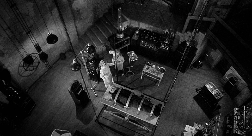
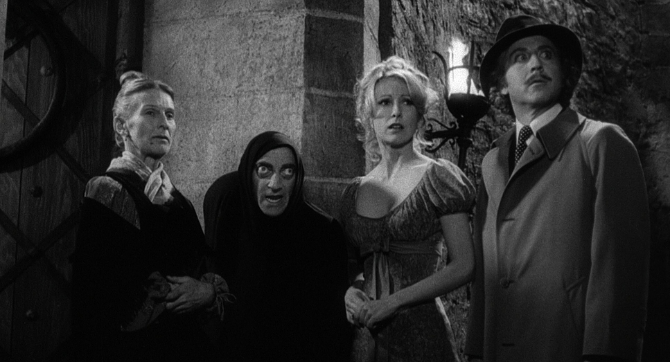
Compositionally, Hirschfeld was a master of the “Z-axis.” He used deep depth of field to keep everything in the lab sharp, from the foreground props to the actors in the back. It creates this sense of claustrophobia that is perfect for gothic horror.
He used strong diagonals and leading lines staircases, archways, stone corridors to drag your eye exactly where he wanted it. There’s also a lot of “negative space.” He wasn’t afraid to let the darkness swallow parts of the frame. It makes the characters look small and vulnerable. And then you have the visual gags, like Igor’s shifting hump. Because the framing is so formal, Marty Feldman’s subtle physical adjustments become hilarious precisely because they’re happening inside such a “serious” composition.
Lighting Style
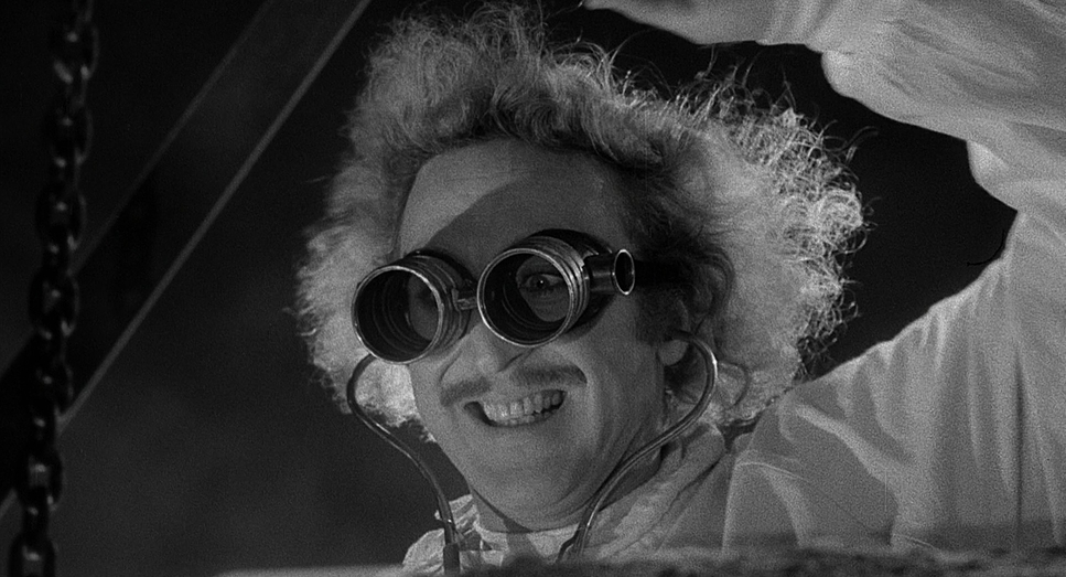
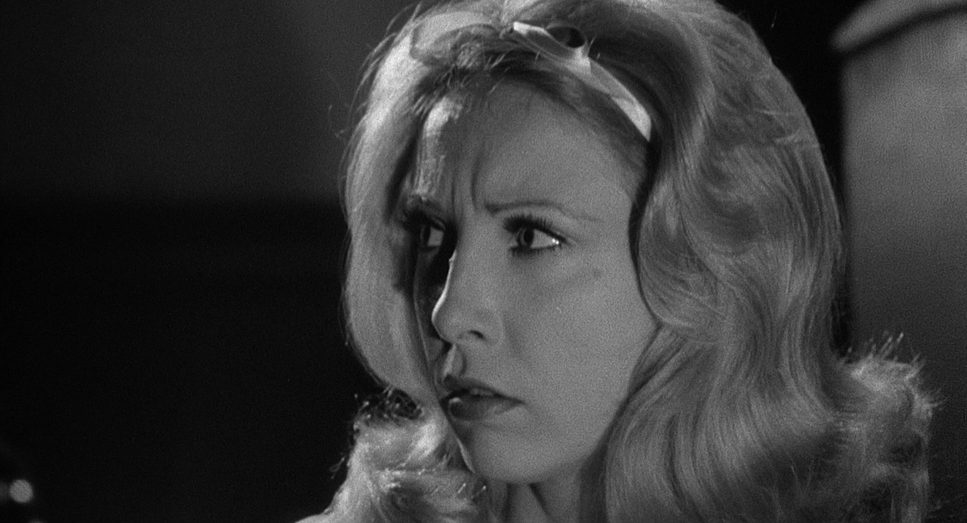
This is where the movie really sings. This isn’t just “black and white”; it’s high-contrast chiaroscuro. Hirschfeld used hard key lights to cast sharp, brutal shadows. In modern digital cinematography, we’re often obsessed with “soft, flattering” light, but Hirschfeld went the other way.
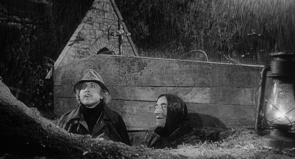
He used heavy rim lighting to pop the actors off the dark backgrounds, giving them a sculptural, almost 3D look. He kept the fill light to a minimum, letting the blacks go “inky” and deep. And the lightning? Those weren’t just flashes; they were theatrical bursts that changed the entire geometry of the scene for a split second. The fact that the rain machines flooded the set tells you everything you need to know about their commitment to practical, in-camera lighting.
Lensing and Blocking
Hirschfeld and Brooks went with wider lenses to show off those massive practical sets. This allowed for more complex “blocking” actors moving toward or away from the camera rather than just side-to-side.
Think about the “Walk This Way” gag. It isn’t just a funny line; it’s a brilliant piece of blocking. The camera stays wide, holding on both characters as they hobble away in perfect sync. It’s a theatrical approach that lets the physicality of the actors do the heavy lifting. The camera doesn’t have to “chase” the funny; it just sets the stage and lets the actors play.
Color Grading Approach
As a colorist, I look at Young Frankenstein and see a film that was “graded” entirely on the set. Today, I’d use DaVinci Resolve to sculpt these tones, but Hirschfeld did it with his gaffer and his film stock.
If I were grading a horror-parody today, I’d probably push for cool, desaturated tones and maybe some subtle warmth in the skin. But in monochrome, your only tools are tonal separation and contrast. You have to make sure a dark wood door doesn’t disappear into a dark stone wall. That’s the “grading” here using light to create depth where color usually would.
When I’m working on a digital project, I spend hours trying to replicate the “Double-X” Kodak grain and the organic highlight roll-off seen in this film. There’s a “weight” to the blacks in Young Frankenstein that feels physical. It’s a reminder that great cinematography is about total control over light, regardless of the medium.
Technical Aspects & Tools
Young Frankenstein: Technical Specifications
| Genre | Comedy, Parody, Satire, Horror, Monster, Music, Musical, Holidays |
| Director | Mel Brooks |
| Cinematographer | Gerald Hirschfeld |
| Production Designer | Dale Hennesy |
| Costume Designer | Dorothy Jeakins, Ed Wynigear |
| Editor | John C. Howard |
| Time Period | 1800s |
| Color | Desaturated, Black and White |
| Aspect Ratio | 1.85 – Spherical |
| Format | Film – 35mm |
| Lighting | Hard light, Top light |
| Lighting Type | Artificial light |
| Story Location | Romania > Transylvania |
| Filming Location | USA > California |
| Camera | Panavision R-200 |
| Lens | Panavision | Standard Primes |
| Film Stock / Resolution | 5222/7222 Kodak Double X |
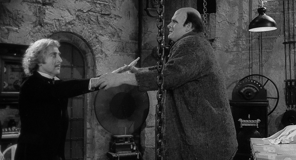
The technical backbone of this movie is legendary. They didn’t build replicas for the lab; they hunted down Kenneth Strickfaden’s original equipment from the 1931 Frankenstein. Those Tesla coils and switchboards were the real deal, sparking and humming on set.
There were no digital safety nets here. No sound libraries or CGI rain. If you see a flash of lightning or a downpour, it was happening right there in front of the lens. Shooting on 35mm 5222 Kodak Double-X gave the film a specific grain and texture that you just can’t “fake” perfectly in post. It’s a tactile movie. You can almost feel the cold stone and the static electricity.
- Also read: JFK (1991) – CINEMATOGRAPHY ANALYSIS
- Also read: ONE BATTLE AFTER ANOTHER (2025) – CINEMATOGRAPHY ANALYSIS
Browse Our Cinematography Analysis Glossary
Explore directors, cinematographers, cameras, lenses, lighting styles, genres, and the visual techniques that shape iconic films.
Explore Glossary →