Most superhero movies age like milk, but X-Men: Days of Future Past (2014) is different. Watching it again recently for Color Culture, I realized why. It isn’t just a great superhero flick; it is a masterclass in using cinematography to solve a narrative problem. Bryan Singer and his team didn’t just have to film a sequel; they had to visually glue together two completely contradictory time periods without giving the audience whiplash.
The result is a film that feels grounded and epic simultaneously. It pulled in massive box office numbers not just because of the cast, but because it looks expensive and deliberate. It respects the audience’s eye.
About the Cinematographer
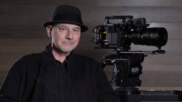
When you look at DOFP, you are seeing the work of Newton Thomas Sigel at his peak. Sigel isn’t just a hired gun; he’s a long-time collaborator with Singer (they did The Usual Suspects and X2 together). That shorthand is crucial here.
Sigel is known for being a chameleon. He doesn’t force a “Sigel look” onto a movie; he adapts the image to serve the story. For Days of Future Past, he had the impossible task of selling a grim, terminator-esque future and a vibrant, grainy 1973 simultaneously. A lesser DP might have made the visual jump too jarring or, worse, too subtle. Sigel found the sweet spot: grounding the fantasy elements in a tactile realism so that when we see a Sentinel ripping through a wall, the physics of the light make it feel terrifyingly real.
Inspiration Behind the Cinematography
The visual grammar here is entirely dictated by the time-travel premise. You have two distinct worlds, and they needed to feel like different genres of film.
The future segments draw heavily on a war-torn, monochromatic aesthetic. It’s bleak. It had to communicate absolute despair immediately no exposition needed. The visual design here screams “game over.” It’s cold, metallic, and sharp.
Conversely, the 1973 segments had to feel like a completely different stock. It’s the era of the Vietnam War, cultural upheaval, and analog technology. The inspiration here was 1970s political thrillers think All the President’s Men or The Parallax View. It’s a world that is “simple and primitive” compared to the future, but it has a pulse. The cinematography embraces the textures, the mixed lighting, and the warm color palettes of the era. The goal wasn’t just to show the past, but to make us feel the “print film” nostalgia of it.
Camera Movements
In a plot this dense, the camera has to act as a narrator. DOFP uses movement to subconsciously tell you which timeline you’re in.
For the future sequences, the camera is often fatalistic. It’s either locked off and wide, showing the hopelessness of the landscape, or it’s frantic and handheld during the Sentinel attacks, mirroring the desperation of the mutants. There is no safety net in the camera work here.
In the 1973 timeline, the movements settle down. We get smooth tracking shots that establish the geography of the Paris Peace Summit or the White House. But pay attention to the character moments: when the focus shifts to Xavier, Magneto, and Logan, the camera pushes in. The handheld work here is intimate, not chaotic.
And then, of course, there is the Quicksilver kitchen scene. This isn’t just “slow motion”; it’s high-speed cinematography shot on Phantom cameras at thousands of frames per second. It’s a manipulation of physics that turns a violent shootout into a ballet. It remains one of the best-executed sequences in comic book movie history because the camera movement is perfectly synchronized with the character’s perception of time.
Compositional Choices
With an ensemble cast this massive, composition is everything. Sigel uses the 2.39:1 aspect ratio to his advantage, often isolating characters in the negative space.
In the future, the compositions emphasize isolation. We see wide shots of desolate landscapes where the X-Men are tiny specs against the machine world. It establishes the overwhelming odds visually.
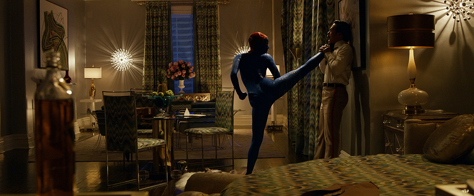
In 1973, the framing gets tighter and more cluttered. The frame is often filled with foreground elements furniture, glass, crowds which grounds the characters in a specific reality. When Xavier and Magneto share the screen, the composition often uses the environment to show their divide placing them on opposite sides of a chess board or separated by a plane aisle. The film knows when to give the characters breathing room and when to choke the frame to ramp up the tension.
Lighting Style
The lighting is where the duality of the film really shines. If you look at the metadata of the film, specifically around the Paris scenes (approx 00:38:48), you see a distinct shift in lighting philosophy.
The future is lit with hard, directional sources. It’s high contrast, low-key, and often motivated by “emergency” lighting cool cyans and harsh shadows. It’s unforgiving.
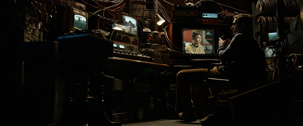
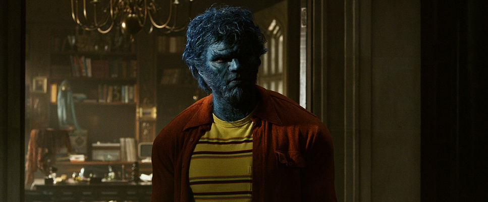
Transitioning to 1973, the light softens. Sigel embraces “mixed light” the messy combination of tungsten practicals (lamps), fluorescent tubes, and daylight coming through windows. It’s not perfectly color-balanced, and that’s the point. It feels organic. In the interior shots, like Xavier’s mansion, we get that soft, dusty daylight that wraps around the face. It allows for a wider range of expression, which is crucial for McAvoy’s performance as a broken man finding his way back.
Lensing and Blocking
Lensing is a subtle art, but it does heavy lifting here. For the future, Sigel leans on wider, sharper glass to emphasize the scale and the clarity of the threat. The depth of field is often deeper you see everything.
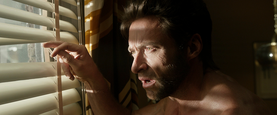
In the 1973 sequences, we switch to longer lenses for the close-ups. This compresses the background and isolates the actor, giving us that classic portrait look. It focuses on the raw emotion of the “broken trio” (Charles, Eric, Raven).
But the real stroke of genius is the “found footage” texture. There are moments, like the public reveal of Mystique in Paris, where the image quality intentionally degrades. This grounds the fantastical events in a gritty, documentary-like authenticity. It stops feeling like a movie and starts feeling like history.
Color Grading Approach
As a colorist, this is the part I geek out on. The grade in DOFP isn’t just “orange and teal”; it’s a specific emulation of film stocks.
The future segments are graded with a “Bleach Bypass” feel crushed blacks, desaturated mid-tones, and a cold, metallic cast. The highlight roll-off is steep, making the image feel harsh. The palette is restricted to cool blues, gunmetal greys, and the ominous purple/red of the Sentinel energy.
The 1973 timeline is where the image comes alive. We are talking about a warm, saturated palette rich reds, yellows, and greens. The skin tones have that thick, healthy density you get from print film. The highlights are creamy and soft, rolling off gently rather than clipping. There is likely a specific Print Emulation LUT used here to separate the warm channels and give the image that “analog” weight. Even within the 70s, the grade shifts Xavier’s depression is visualized through cooler, more muted tones in the mansion, which slowly warm up as he regains his hope. It’s visual storytelling at the pixel level.
Technical Aspects & Tools
X-Men: Days of Future Past — Technical Specifications
| Genre | Action, Adventure, Fantasy, Science Fiction |
| Director | Bryan Singer |
| Cinematographer | Newton Thomas Sigel |
| Production Designer | John Myhre |
| Costume Designer | Louise Mingenbach |
| Editor | John Ottman |
| Colorist | Stephen Nakamura |
| Time Period | 1970s |
| Color | Warm, Saturated, Red, Yellow, Green |
| Aspect Ratio | 2.39 – Spherical |
| Format | Digital |
| Lighting | Soft light, Low contrast |
| Lighting Type | Daylight, Artificial light, Mixed light, Tungsten |
| Filming Location | Canada > Quebec |
| Camera | Aaton XTR |
| Lens | Panavision Nova series |
We need to correct a common misconception: this film wasn’t just shot on one digital camera. While the ARRI Alexa was the workhorse for the main unit (providing that dynamic range needed for the VFX), Sigel got his hands dirty for the period textures.
For the 1973 “newsreel” and POV footage, they utilized the Aaton XTR (Super 16mm) and even 8mm cameras. That grain you see during the Paris summit isn’t a plugin; it’s actual film grain. That texture helps sell the time period better than any costume ever could.
The integration of these formats is seamless. The VFX team had to match their digital assets (the Sentinels) to these varying plate textures. They had to match the lighting of the 70s practicals and the harshness of the future environment. It’s a technical tightrope walk balancing specific aspect ratios, lens characteristics, and color sciences to make it all feel like one cohesive movie.
- Also read: EDGE OF TOMORROW (2014) – CINEMATOGRAPHY ANALYSIS
- Also read: SHREK (2001) – CINEMATOGRAPHY ANALYSIS
Browse Our Cinematography Analysis Glossary
Explore directors, cinematographers, cameras, lenses, lighting styles, genres, and the visual techniques that shape iconic films.
Explore Glossary →