I finally sat down with Billy Wilder’s 1957 classic, Witness for the Prosecution, and honestly, I’m a little embarrassed it took me this long. What a film. It isn’t just about pushing pixels or tweaking curves; it’s about understanding the intent behind every frame. It’s a lesson in tension, performance, and yes, visual storytelling, pulling you into its web of deception with every perfectly composed shot.
Wilder, as he often did, took Agatha Christie’s already brilliant plot and beefed up the characterization, creating a world that feels both intimate and grand. While much of the buzz rightly goes to the acting—Charles Laughton’s cantankerous Sir Wilfrid Robarts, Tyrone Power’s sly Leonard Vole, and Marlene Dietrich’s enigmatic Christine are unforgettable—the film’s cinematography is the quiet engine driving the machine. It grounds those stellar performances and orchestrates the audience’s emotional journey, guiding our eye, shaping our perceptions, and ultimately, making those famous twists hit with devastating precision. For a movie nominated for six Oscars, the craft was undeniably top-tier, and the visual language played no small part in that success.
About the Cinematographer
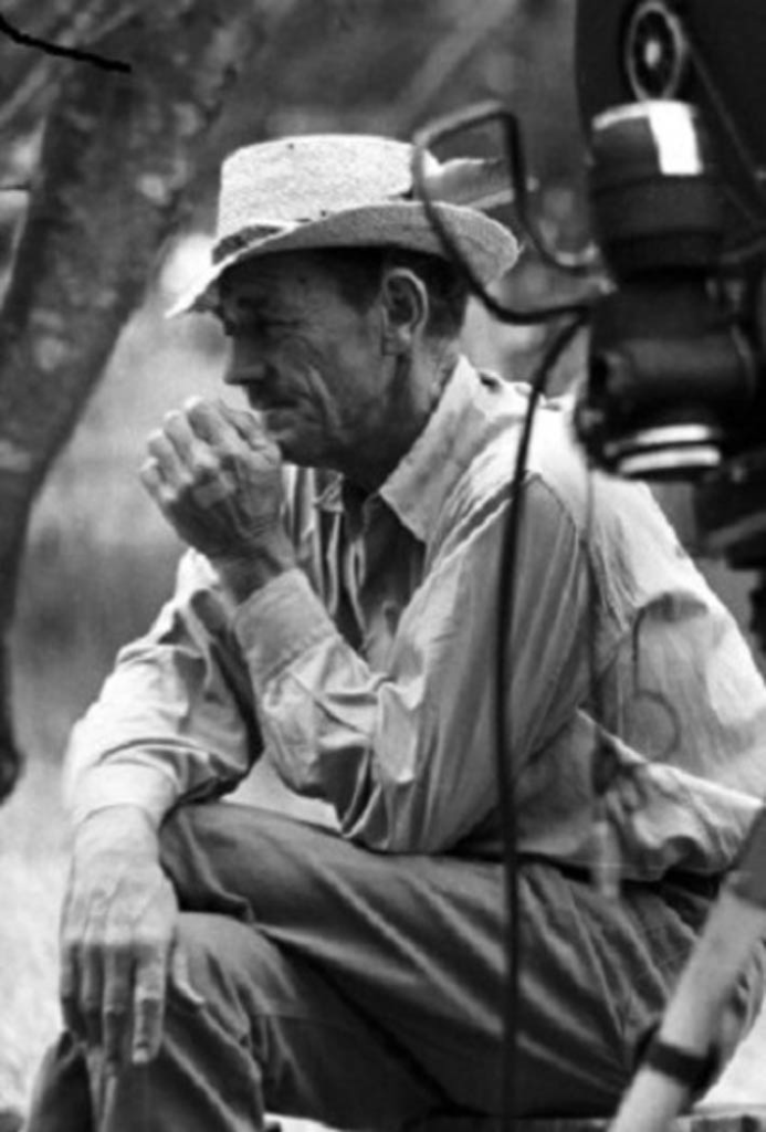
The man behind the lens for Witness for the Prosecution was Russell Harlan, a prolific cinematographer with a career that spanned decades. Harlan had a knack for bringing a sharp, often dramatic sensibility to his black-and-white work, having shot everything from Westerns like Red River to noir-adjacent thrillers. His partnership with Billy Wilder here is a testament to his versatility. You can see in his compositions and lighting choices that he’s not just documenting the action; he’s actively interpreting the story, using light and shadow to deepen character and suspense. He understands that in black and white, the absence of color demands an even more meticulous approach to contrast, texture, and form. For a colorist like me, analyzing a B&W film means stripping away the hue layer to focus solely on the tonal architecture, and Harlan’s work here is a fantastic blueprint for exactly that.
Inspiration Behind the Cinematography
The film’s visual inspiration clearly stems from its hybrid nature: a tight courtroom drama punctuated by expansive flashbacks. Unlike a stage play, which typically confines itself to one location, Wilder wisely chose to expand the world of the story, which was a gift to Harlan. This allowed for a fascinating contrast in visual styles.
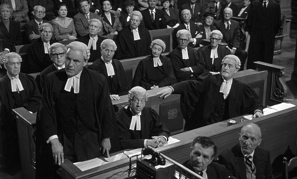
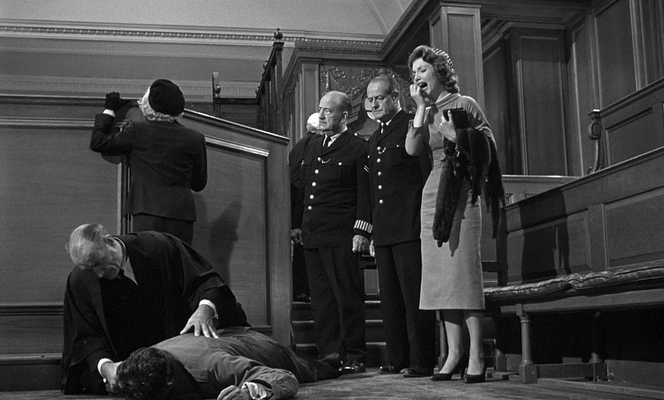
The courtroom itself feels vast, old, and filled with history. Harlan captured this grandeur with compositions that emphasize its imposing architecture, often framing characters against its weighty backdrop to subtly suggest the crushing weight of the law. It’s a space of formality and procedure, and the cinematography reflects that with a certain stately precision.
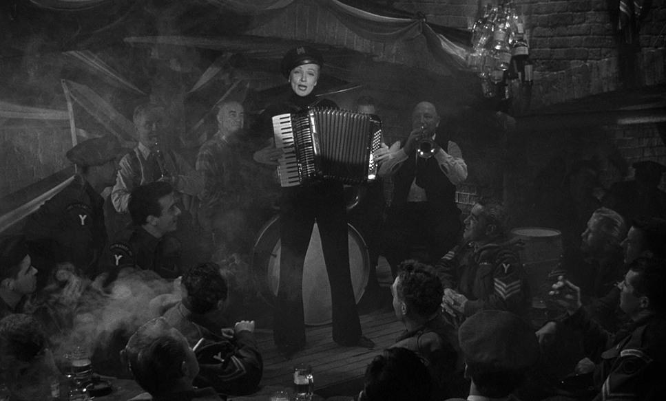
Then you get to the flashbacks—specifically the scenes back in 1945 Germany—which are easily a highlight from a visual standpoint. This is where the film leans heavily into a “wartime noir” aesthetic. The foggy, wet streets and grungy, lived-in tiny apartments instantly evoke a classic noir mood. This visual style for the past isn’t just aesthetic; it’s narrative. It imbues Leonard Vole’s origin story and his meeting with Christine with a sense of desperation, moral ambiguity, and a stark realism that contrasts sharply with the British legal system’s more polished facade. Harlan’s ability to pivot between these two distinct visual languages—the formal grandeur of the courtroom and the grimy intimacy of the past—is a key strength of the film’s look.
Camera Movements
In a dialogue-driven film like Witness for the Prosecution, camera movements are economical and purposeful, serving to underscore character dynamics rather than drawing attention to themselves. Wilder, a director renowned for his sharp wit and meticulous scripting, knew when to let the actors own the frame and when to use the camera to comment on the scene.
We see instances of purposeful movement, like Charles Laughton zipping down the stairs on his lift, escaping his nurse to dive back into his work. This shot is framed beautifully not just for comedy, but to visually convey Sir Wilfrid’s eagerness and his resistance to his health restrictions. The camera movement here captures a moment of fleeting rebellion, a burst of energy from an otherwise ailing character.
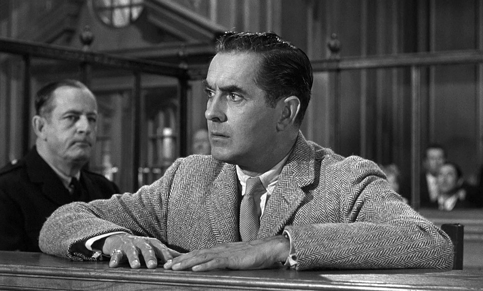
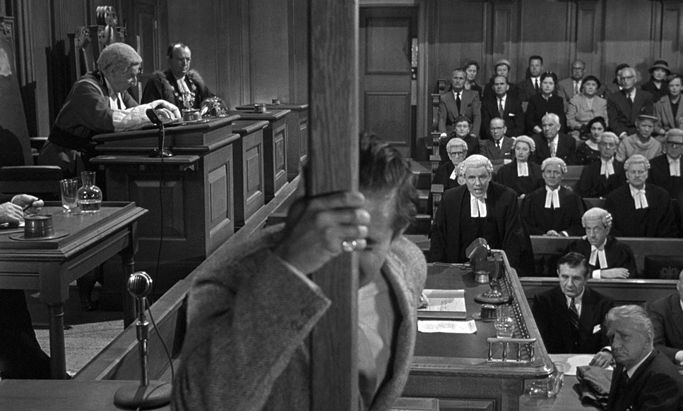
During the intense courtroom exchanges, Harlan relies on carefully chosen static shots or subtle dollies that follow the emotional pendulum swing between characters. Rapid-fire cuts or overly elaborate camera movements would only distract from the fast-paced dialogue. Instead, the camera settles, allowing the audience to truly absorb the crackling exchange and the nuanced facial expressions—particularly during moments like Christine Vole’s cold, business-like testimony or Tyrone Power sweating and spitting in the witness box. The lack of overt flashy camerawork ensures that the focus remains entirely on the characters’ intricate psychological battles.
Compositional Choices
Composition in Witness for the Prosecution functions like a chess match, framing characters to illuminate their inner states and relationships. Harlan’s framing is never arbitrary; it always serves a dramatic purpose.
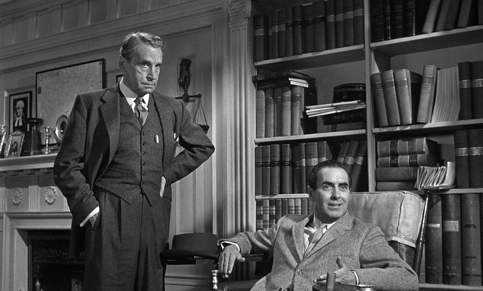
Consider Sir Wilfrid’s use of his monocle. The camera often frames him in a way that highlights this prop, making it a focal point. It’s not just a visual quirk; it’s a device that enhances his penetrating gaze, magnifying his intellect and suspicion. Similarly, the framing of Marlene Dietrich, particularly early on, emphasizes her enigmatic quality. As a colorist, I immediately notice how her face is sculpted with light and shadow, leaving parts of her expression ambiguous, mirroring Sir Wilfrid’s—and our—inability to figure out her angle. Her coldness and her transitions from devoted wife to vengeful woman are amplified by how Harlan isolates her or places her in the frame, often with a subtle visual barrier or an imposing backdrop that hints at her guarded nature.
In the vastness of the courtroom, wide shots establish the power dynamics and the oppressive nature of the legal system. Yet, during close-ups, we are drawn into the private anxieties of the characters. The blocking—how characters occupy and move through the space—is expertly captured. Think about Tyrone Power smoothly striding back in, a free man, and then his nose-to-nose clash with Charles Laughton. This compositional choice, bringing their faces into direct, confrontational proximity, visually underscores the shock and anger of that moment, making their clashing personalities resonate with even greater impact.
Lighting Style
In black and white cinematography, lighting isn’t just about illumination; it’s about sculpting reality. Witness for the Prosecution showcases a versatile lighting style, adapted to its different narrative environments.
For the courtroom scenes, the lighting feels traditional and formal, utilizing broader, more even light to ensure clarity and emphasize the architectural grandeur of the setting. However, specific areas like the witness box or the judge’s bench are lit with slightly more intensity or contrast to draw the eye and underscore the gravity of the testimony. Motivated lighting from practical fixtures within the set adds to the realism.
Where the lighting truly shines, however, is in the “wartime noir” flashbacks. Here, Harlan employs a dramatic, low-key lighting approach. We see sharp contrasts, deep shadows swallowing backgrounds, and harsh, directional light on faces. This classic noir technique creates a sense of unease and moral murkiness, perfectly suiting the damp streets and cramped apartments. Shadows serve as depth cues, separating elements and adding a sense of claustrophobia. This approach allows characters to emerge from or recede into darkness, reflecting their secrets. The contrast between these two lighting styles—the formal brightness of justice versus the chiaroscuro of memory and deception—is a subtle yet powerful narrative tool.
Lensing and Blocking
The choices of lensing and blocking in Witness for the Prosecution are integral to its rhythm. While we don’t have the original camera logs, we can infer the focal lengths from the perspective. For instance, the tight, intimate “fencing” scene between Dietrich and Laughton in his office likely utilized lenses that create a natural perspective—perhaps a 50mm or 75mm—to maintain a sense of direct engagement without distorting their faces. The blocking here is precise, ensuring that Dietrich’s unexpected demeanor completely undercuts what Laughton was expecting, playing out visually as a power shift in their spatial relationship.
Conversely, the expansive courtroom scenes employ wider lenses to capture the scale and the myriad reactions of the jury and gallery, establishing a broader context before cutting into tighter shots for dramatic impact. The camera’s perspective shifts effectively, looking down from the judge’s view or up from the defense table to manipulate the power dynamics.
The transformation of Tyrone Power’s character—from his initial grinning, carefree appearance to his eventual cocky confidence after the twist—is amplified by strategic blocking. Early on, he is shot with more headroom, appearing casual; later, we see tighter, more confrontational close-ups that emphasize his smugness. The final confrontation, where Power is practically nose-to-nose with Laughton, is a prime example of blocking used to create intense visual friction. Harlan positioned the camera to capture this extreme proximity, making the tension palpable for the audience.
Color Grading Approach
Now, this is my turf. In B&W, “color grading” translates to tonal sculpting. You don’t have hue and saturation to play with, but you have the entire spectrum of light to dark, and how those values interact is everything. For Witness for the Prosecution, the black and white photography isn’t just a format; it’s a deliberate artistic choice that demands a thoughtful grade.
Firstly, contrast shaping is paramount. In the courtroom, the grade aims for a balanced, robust contrast, ensuring clarity across the grand set. The goal is to maintain a healthy dynamic range, showing detail in both the brighter robes of the barristers and the darker wooden panels, allowing the audience to perceive depth and texture.
For the flashbacks, however, the grade shifts dramatically. I see higher contrast, with deeper blacks and starker whites, and a more aggressive fall-off in the mid-tones to create dramatic shadows. This is where tonal separation becomes crucial—ensuring the foggy streets still have discernible elements in the shadows while maintaining texture in the grime. The highlight roll-off is managed to avoid blowing out skies or practical lights, while allowing for a certain crispness in street lamps or reflections on wet surfaces.
The film stock of 1957 inherently contributed to its look, reflecting certain print-film sensibilities—specific grain structures and a natural, organic quality to how light rendered. As a colorist, if I were honoring this look today, I’d be thinking about how to emulate that grain, that specific density of black, and the smooth tonal progression in the skin tones. The make-up was vital for Dietrich’s disguise; a good tonal grade ensures that the subtle differences in texture for her “aged” hands and stained teeth are clearly visible, becoming crucial visual cues for the twist. It’s about translating emotional temperature into visual density—making the blacks feel heavy with despair or the whites sharp with revelation.
Technical Aspects & Tools
Witness for the Prosecution – Technical Specifications
| Genre | Crime, Drama, Mystery |
|---|---|
| Director | Billy Wilder |
| Cinematographer | Russell Harlan |
| Production Designer | Edith Head, Joe King, Adele Parmenter |
| Costume Designer | Joe King, Edith Head, Adele Parmenter |
| Editor | Daniel Mandell |
| Time Period | 1950s |
| Color | Desaturated, Black and White |
| Aspect Ratio | 1.66 – Spherical |
| Format | Film – 35mm |
| Story Location | England > London |
| Filming Location | Culver City > Metro-Goldwyn-Mayer Studios – 10202 W. Washington Blvd |
In 1957, filmmaking was a tangible, mechanical art form. The photography we see in Witness for the Prosecution was likely achieved with cameras like Arriflexes or Mitchells, loaded with Panchromatic film stock known for its sensitivity across the visible spectrum. These were robust tools, requiring skilled operators and gaffers who understood how to shape light with large, hot tungsten units, flags, and nets.
The production design speaks to the sheer craftsmanship of the era. The sets—from the courtroom to the Berlin streets—were meticulously built. These physical spaces, rich with detail, were essential for Harlan to light effectively. They provided the tactile realism that allowed the camera to capture authentic depth cues, whether it was the textures of old books or the damp sheen on cobblestones.
Crucially, the film also used practical technical elements like the newly installed lift in Sir Wilfrid’s office, a physical tool captured for both plot and character beats. And then there’s the masterful use of makeup and prosthetics, particularly for Marlene Dietrich’s dual role. The fact that Orson Welles reportedly helped Dietrich build the nose out of putty, combined with the details of her aged hands and stained teeth, underscores the practical effects prowess of the time. Harlan’s lighting ensures these visual cues are visible without giving the game away too early.
- Also Read: M (1931) – CINEMATOGRAPHY ANALYSIS
- Also Read: THE APARTMENT (1960) – CINEMATOGRAPHY ANALYSIS
Browse Our Cinematography Analysis Glossary
Explore directors, cinematographers, cameras, lenses, lighting styles, genres, and the visual techniques that shape iconic films.
Explore Glossary →