Ingmar Bergman’s Wild Strawberries (1957) is exactly that. Released in the same insane year as The Seventh Seal, it’s a masterclass in visual psychology. It’s the kind of film that gets under your skin not because of a flashy plot, but because of how it uses light and shadow to map the messy, labyrinthine mind of a 78-year-old man, Professor Isak Borg. It’s a “jumble of events,” sure, but every frame feels like it was etched by hand.
About the Cinematographer
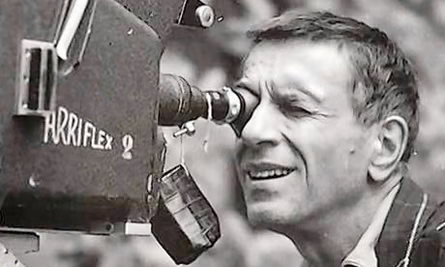
When people think of the “Bergman Look,” they usually jump straight to Sven Nykvist. But for me, the real unsung hero is Gunnar Fischer. He shot Bergman’s earlier, more expressionistic work, and his fingerprints are all over Wild Strawberries. While Nykvist eventually brought a certain “naturalism” to Bergman’s world, Fischer brought the drama. His style is all about stark contrasts and a psychological use of shadow that feels almost claustrophobic. As someone who works with images for a living, I find it fascinating to watch how a director’s voice shifts when they change collaborators. It’s like a composer switching from a cello to a violin; the notes are the same, but the resonance changes. Fischer was perfectly tuned to Bergman’s early existential dread, giving us images that feel raw, vulnerable, and deeply unsettling.
Inspiration Behind the Cinematography
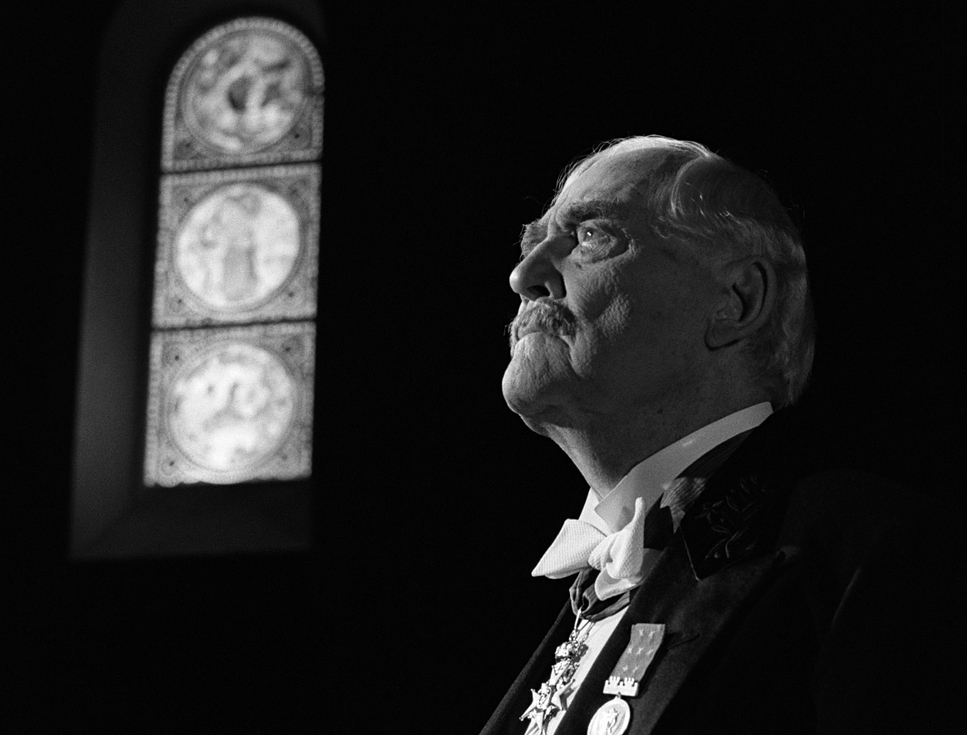
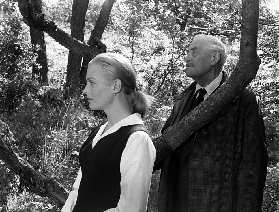
Bergman didn’t just pull his style out of thin air; he was obsessed with the “Swedish Scandinavian tradition.” He was constantly looking back at the silent era the days of Victor Sjöström (who, brilliantly, plays our protagonist here). It’s that classic theme of “man vs. landscape,” where the environment isn’t just a backdrop, but a reflection of fate. You can feel that weight in every exterior shot of this film.
The cinematography here isn’t trying to be “pretty.” It’s trying to be honest. There’s a sharp dichotomy at play: the “wild strawberries” represent these fleeting, organic nuggets of joy Borg once had, while the rest of his life is this “static civilization” rigid, cold, and structured. Fischer captures this by making the natural world feel transient and the “actual” world feel like a tomb. It’s a painterly approach that forces you to stop and consider the vastness of a human life within a single, 1.33:1 frame.
Camera Movements
What strikes me most is the camera’s restraint. For the most part, it just sits there. It’s observant, almost judgmental, letting Borg’s internal turmoil play out in real-time. This stillness creates a heavy psychological gravity; it forces us to inhabit Borg’s skin and sit with his regrets.
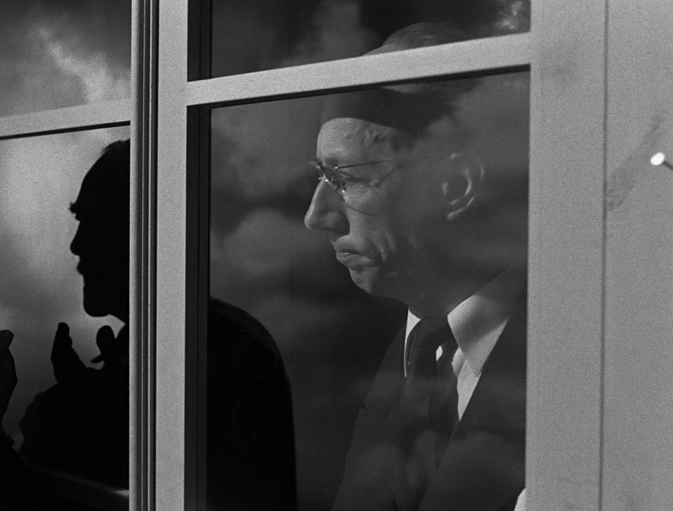
But then, the rules break. During the dream sequences, Fischer shifts gears into expressionism. He uses jump cuts to fracture time and slow, disquieting pushes or pans to make the “virtual world” of Borg’s subconscious feel unstable. When Isak walks down those eerily empty streets toward a handless clock, the camera movement isn’t a “cool shot” it’s a heartbeat. It’s the jolt of moving from reality into the fractured landscape of the mind.
Compositional Choices
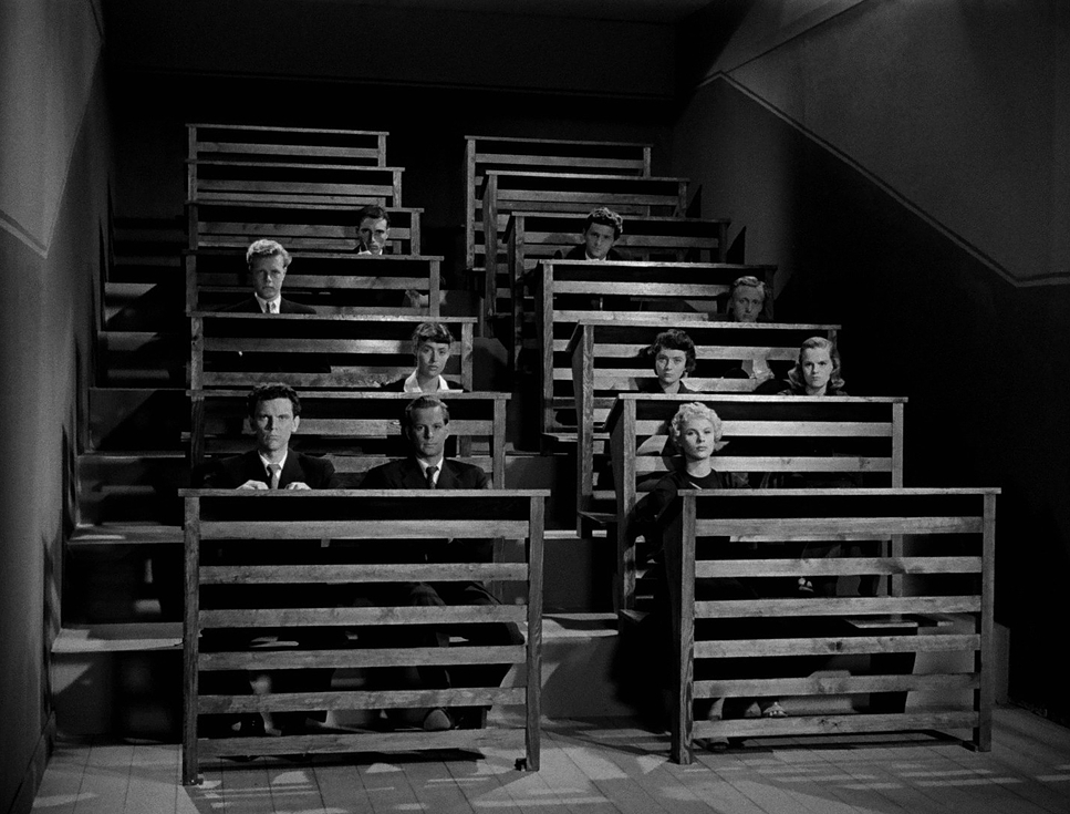
Fischer’s real genius is in his deep staging. He had this incredible ability to stack meaning from the foreground all the way to the back of the room. There’s one specific “recollection image” that I keep coming back to: you have Sara with her lovers in the background, a broken couple fighting in the mid-ground, and Isak’s daughter-in-law in the foreground. It’s a visual summation of an entire life past regrets, present misery, and future anxiety all packed into one shot.
These frames aren’t just decorative; they are metaphors. He uses wide shots to dwarf Borg, making him look small and insignificant against the world, and then slams into a tight close-up the moment Borg is emotionally vulnerable. The way characters are angled away from each other tells you more about their relationship than the dialogue ever could.
Lighting Style
In Wild Strawberries, light isn’t just illumination it’s a character. Fischer and Bergman used lighting to draw a hard line between reality and memory. Generally, the past is bathed in bright, soft highlights, while the present is a world of harsh, dramatic chiaroscuro.
When we’re in Borg’s youthful memories, the light has this nostalgic, ethereal glow. It’s high-key and tender, even when the memory itself is painful. It feels like looking at an old, overexposed photograph. But the “now” is different. It’s full of deep, ink-black shadows that swallow the characters whole. This low-key lighting reflects the “cruel suffering” of Borg’s old age. My favorite moments are when Bergman blurs these lines having a past trauma bleed into a present scene and the lighting schemes intermingle, creating a visual vertigo that perfectly mirrors Borg’s confusion.
Lensing and Blocking
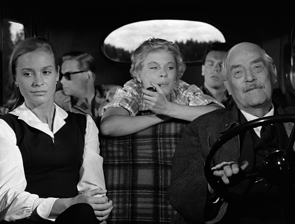
Technically, they were mostly sticking to the classics 35mm and 50mm lenses. This gives the film a naturalistic perspective that keeps the weirder, dreamlike elements grounded in reality. But then you get those “beautiful close-ups” of Sjöström. They likely went a bit longer on the focal length there to compress the space and really isolate the raw emotion on his face. Bergman famously noted that Sjöström was often in a “very bad mood” during these shots, and ironically, that irritability translates into a stunning, transparent honesty on screen.
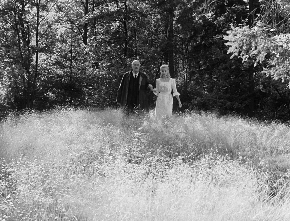
The blocking is equally deliberate. When Borg visits his mother, they are placed at opposite ends of a cold, empty room the physical distance is the emotional distance. Contrast that with the “wild strawberry patch” memories, where the characters are physically intertwined. It’s simple, effective visual storytelling that uses depth of field to ensure every piece of information, from a flower in the foreground to a house in the distance, serves the narrative.
Color Grading Approach
People think “color grading” doesn’t apply to black and white, but as a colorist, I’d argue it’s actually harder in monochrome. You aren’t playing with hues; you’re sculpting with luminance. Fischer’s work here is a masterclass in tonal range. He manages to get these rich, bottomless blacks without losing the texture in the mid-tones.
Look at the highlights in the dream sequences. They have a delicate roll-off they never quite “blow out” to a digital-looking white. They retain a silver-halide grain that feels alive. And here’s a nerdy point I have to mention: even though there’s no “color,” the way different colors in the scene (a red dress vs. a blue sky) translate into different shades of grey is a form of grading in itself. It’s “chromatic separation into luminance,” and it’s why the film feels so “thick” and textured. You can practically feel the silver crystals on the film stock.
Technical Aspects & Tools
Wild Strawberries (1957) | 1.33:1 • 35mm B&W
| Genre | Road Trip, Drama |
| Director | Ingmar Bergman |
| Cinematographer | Gunnar Fischer |
| Production Designer | Gittan Gustafsson |
| Costume Designer | Millie Str |
| Editor | Oscar Rosander |
| Time Period | 1950s |
| Color | Desaturated, Black and White |
| Aspect Ratio | 1.33 – Spherical |
| Format | Film – 35mm |
| Lighting | Hard light |
| Lighting Type | Daylight, Artificial light |
| Story Location | Europe > Sweden |
| Filming Location | Europe > Sweden |
Shooting this in 1957 was a physical battle. Fischer was likely wrestling with an Arriflex 35 II a heavy, mechanical beast and film stocks that weren’t nearly as forgiving as what we have today. The lighting rigs were massive, hot, and required a small army to move.
Bergman once told a story about Sjöström being denied his 5:00 PM whiskey because they were chasing the light, which led to a massive grumpiness that actually helped the performance. It’s a great reminder that even a masterpiece is subject to the “wildness and randomness” of a film set. The technical constraints of the era—the limited dynamic range and the physical weight of the gear actually forced a level of intentionality that we sometimes lose in the digital age.
- Also read: 8½ (1963) – CINEMATOGRAPHY ANALYSIS
- Also read: INFERNAL AFFAIRS (2002) – CINEMATOGRAPHY ANALYSIS
Browse Our Cinematography Analysis Glossary
Explore directors, cinematographers, cameras, lenses, lighting styles, genres, and the visual techniques that shape iconic films.
Explore Glossary →