I’m usually not one for rom-coms; most of them feel like they were assembled in a lab for mass consumption. But When Harry Met Sally… is different. It’s often called an “iconic autumn comfort movie,” but as a filmmaker, I’m interested in the “how.” It’s not just the script; it’s the way Barry Sonnenfeld and Rob Reiner used a 35mm canvas to create that “big warm blanket” feeling. It’s a masterclass in restraint, and it deserves a look through a professional lens.
About the Cinematographer

Before he was a household name for Men in Black, Barry Sonnenfeld was the guy giving the Coen Brothers their signature “quirk.” If you look at Blood Simple or Raising Arizona, you see a DP who loves precise, almost theatrical framing and weirdly aggressive perspectives.
Coming into When Harry Met Sally…, Sonnenfeld did something impressive: he toned it down. He didn’t lose his precision, but he traded the “look at me” cinematography for an observational intimacy. He made these characters look like real people you’d actually bump into on a New York sidewalk, not movie stars on a soundstage. It’s a great example of a DP adapting their ego to serve the story.
Technical Aspects & Tools
When Harry Met Sally… (1989) • 1.85:1 • 35mm
| Genre | Comedy, Drama, Romance, Rom-Com |
| Director | Rob Reiner |
| Cinematographer | Barry Sonnenfeld |
| Production Designer | Jane Musky |
| Costume Designer | Gloria Gresham |
| Editor | Robert Leighton |
| Colorist | Dale E. Grahn |
| Time Period | 1980s |
| Color | Green |
| Aspect Ratio | 1.85 – Spherical |
| Format | Film – 35mm |
| Lighting | Soft light, High contrast, Side light |
| Lighting Type | Daylight, Overcast |
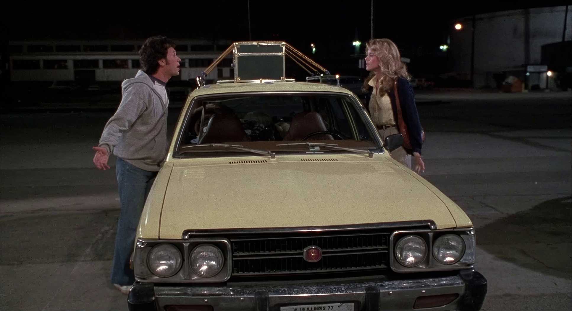
| Story Location | Chicago > Parking Lot |
| Filming Location | New York City > Parking Lot |
| Camera | Panavision Cameras |
| Lens | Panavision Lenses |
To understand the look, you have to look at the “bones.” This was shot on 35mm film, likely using the Kodak workhorses of the late 80s (5294 or 5247). We’re talking about an era where the “grade” happened in a lab with chemical baths and timing lights, not on a DaVinci Resolve panel. The legendary Dale E. Grahn was the colorist on this, and you can feel that analog soul in every frame.
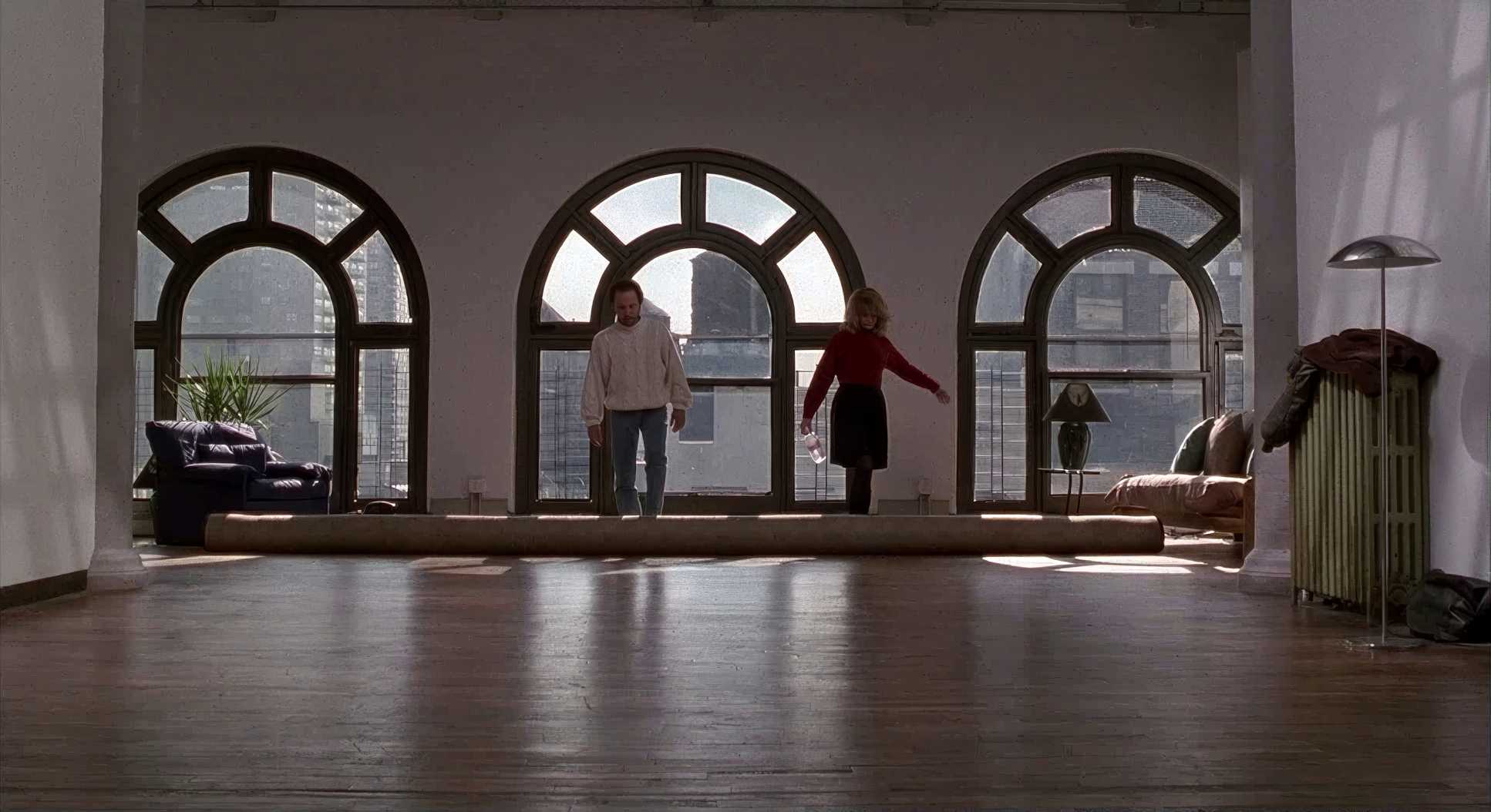
They shot with Panavision cameras and lenses in a 1.85:1 spherical aspect ratio. That’s a very “human” frame it’s not the epic wide-screen sweep of an anamorphic 2.39:1, but it gives the characters room to breathe without feeling tiny. The organic film grain gives the image a texture that we spend hours trying to emulate digitally today.
Inspiration Behind the Cinematography

Nora Ephron’s script is unapologetically intelligent, and the visuals had to match that. There’s no flashy camera work here because flashy work would have stepped on the dialogue. The goal was authenticity.
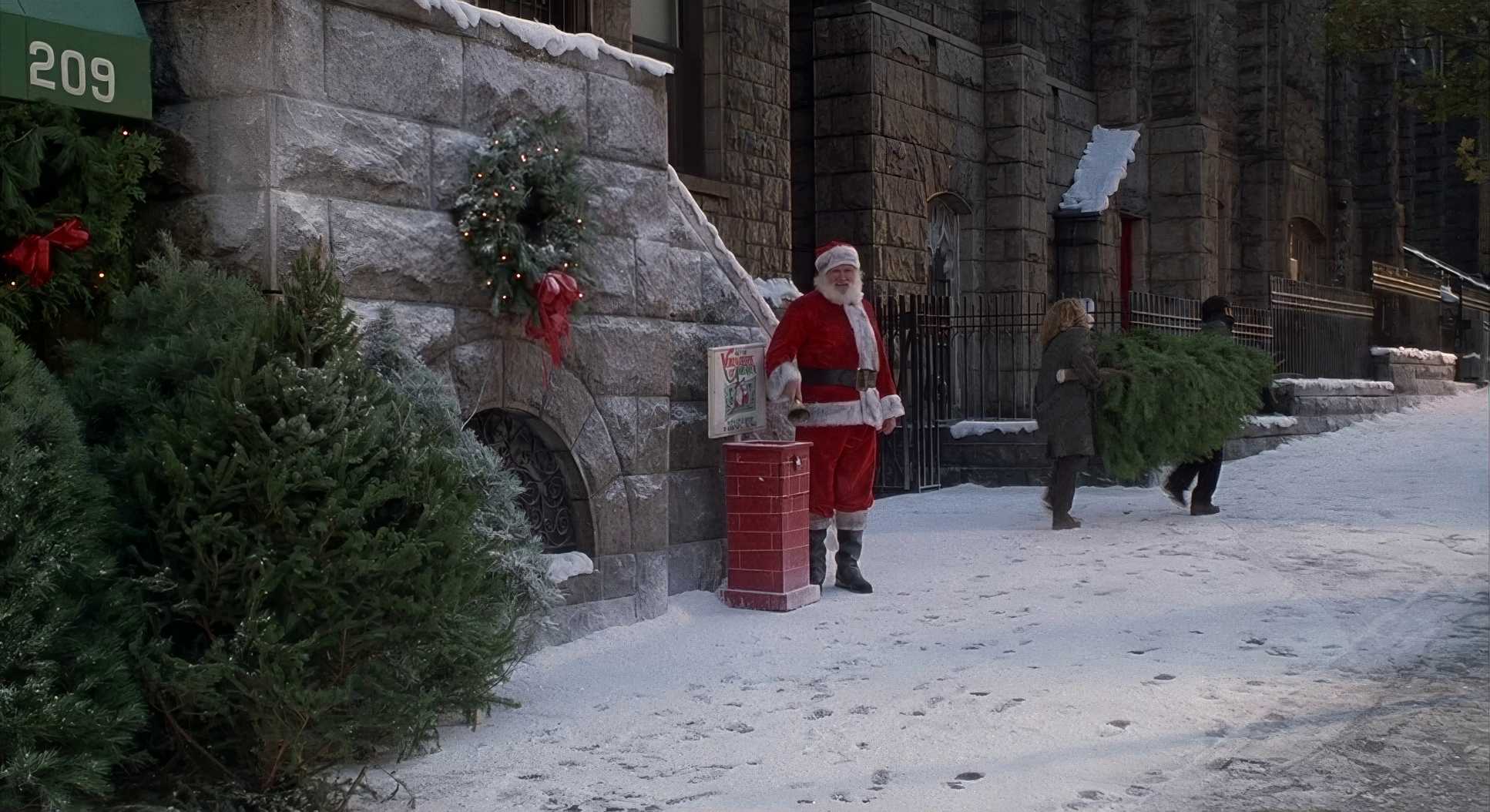
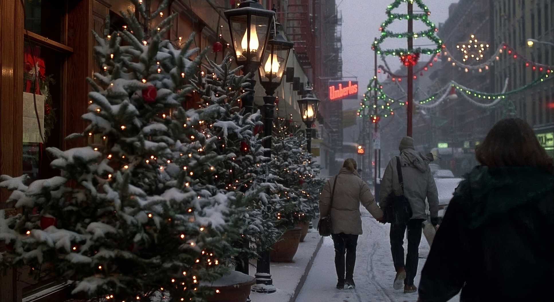
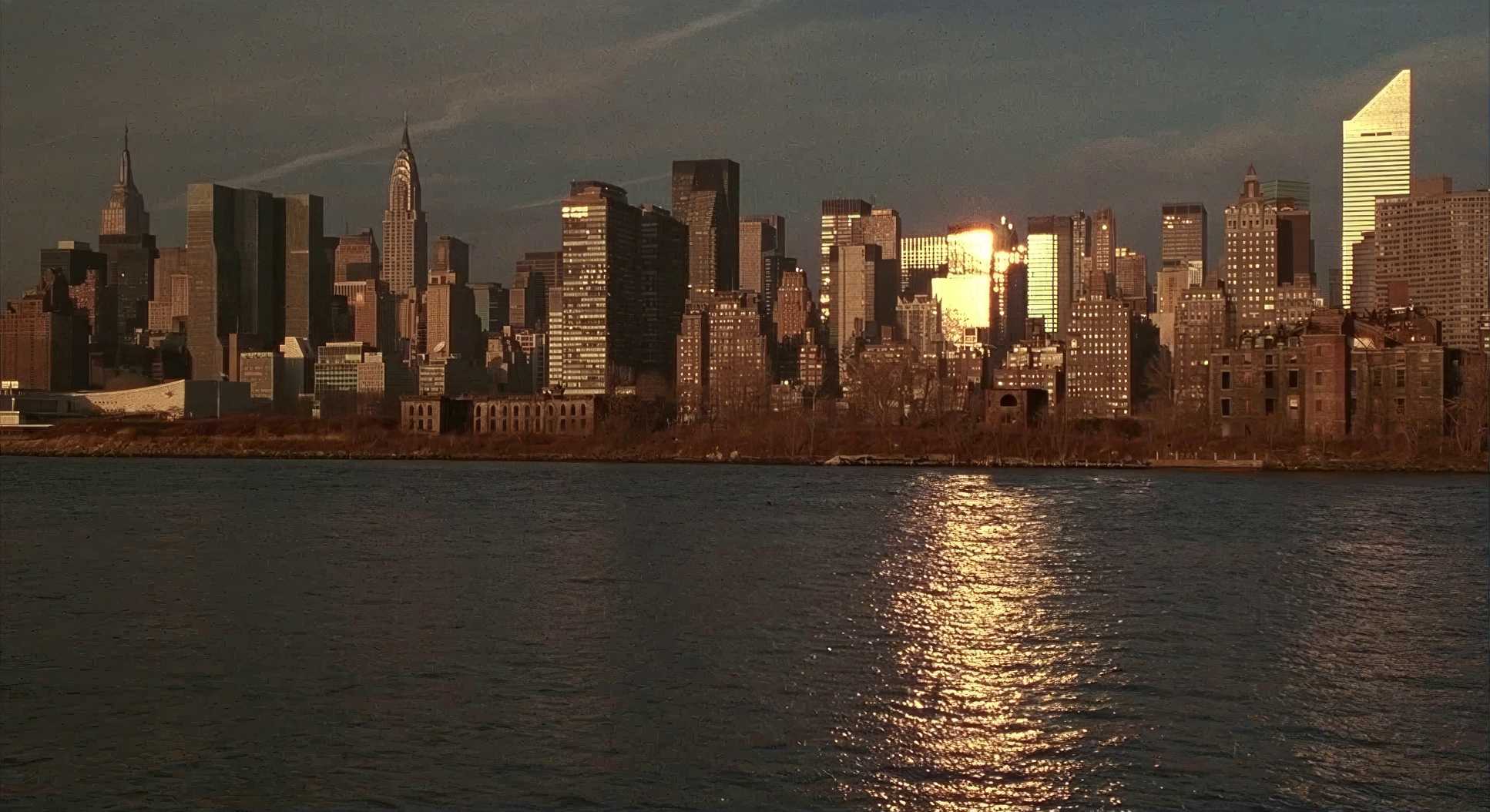
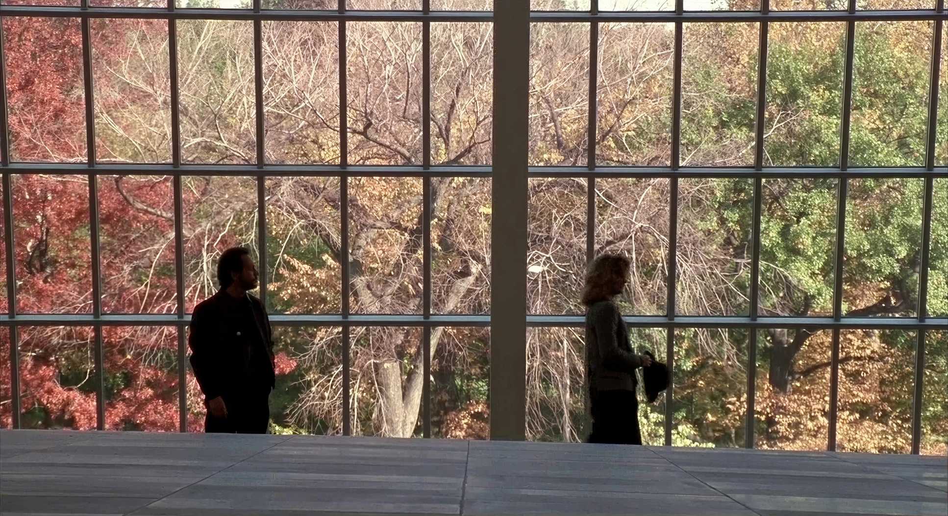
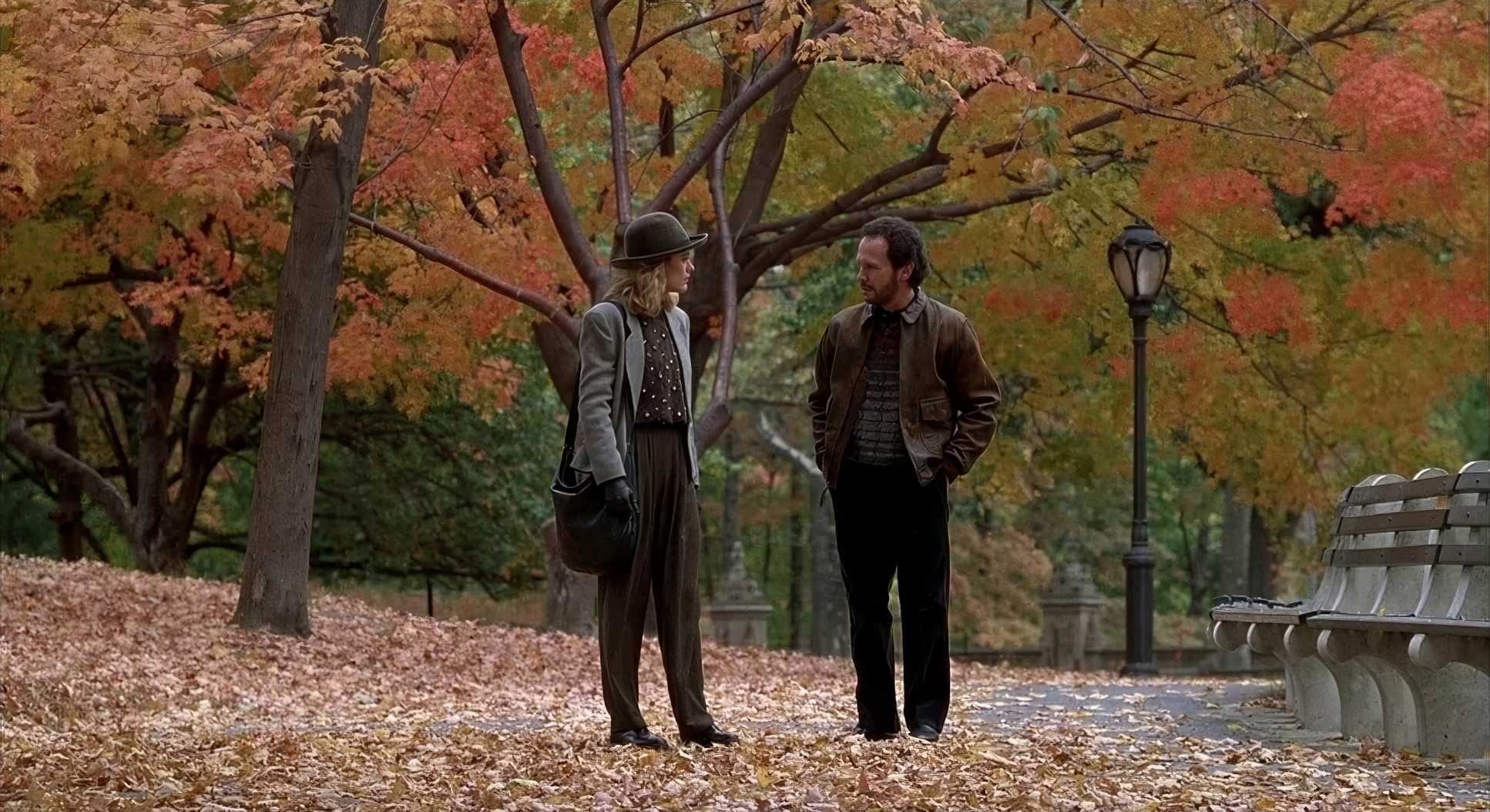
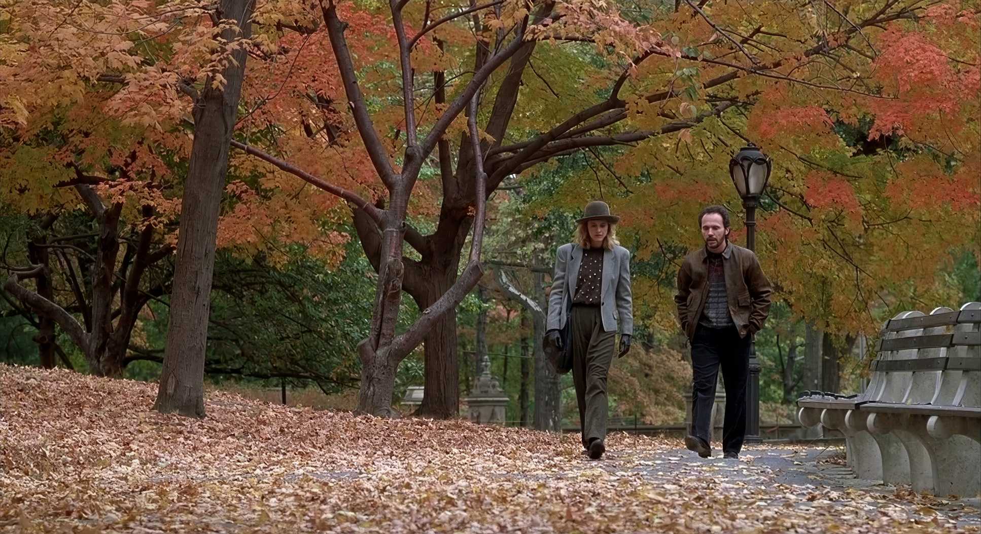
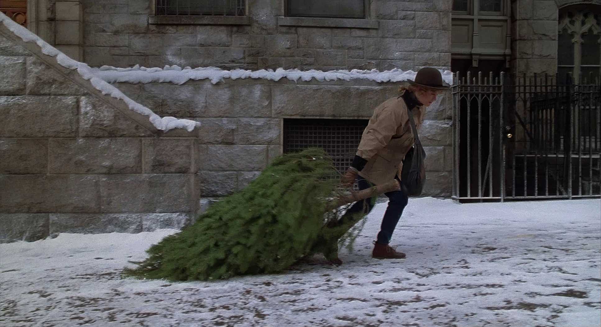
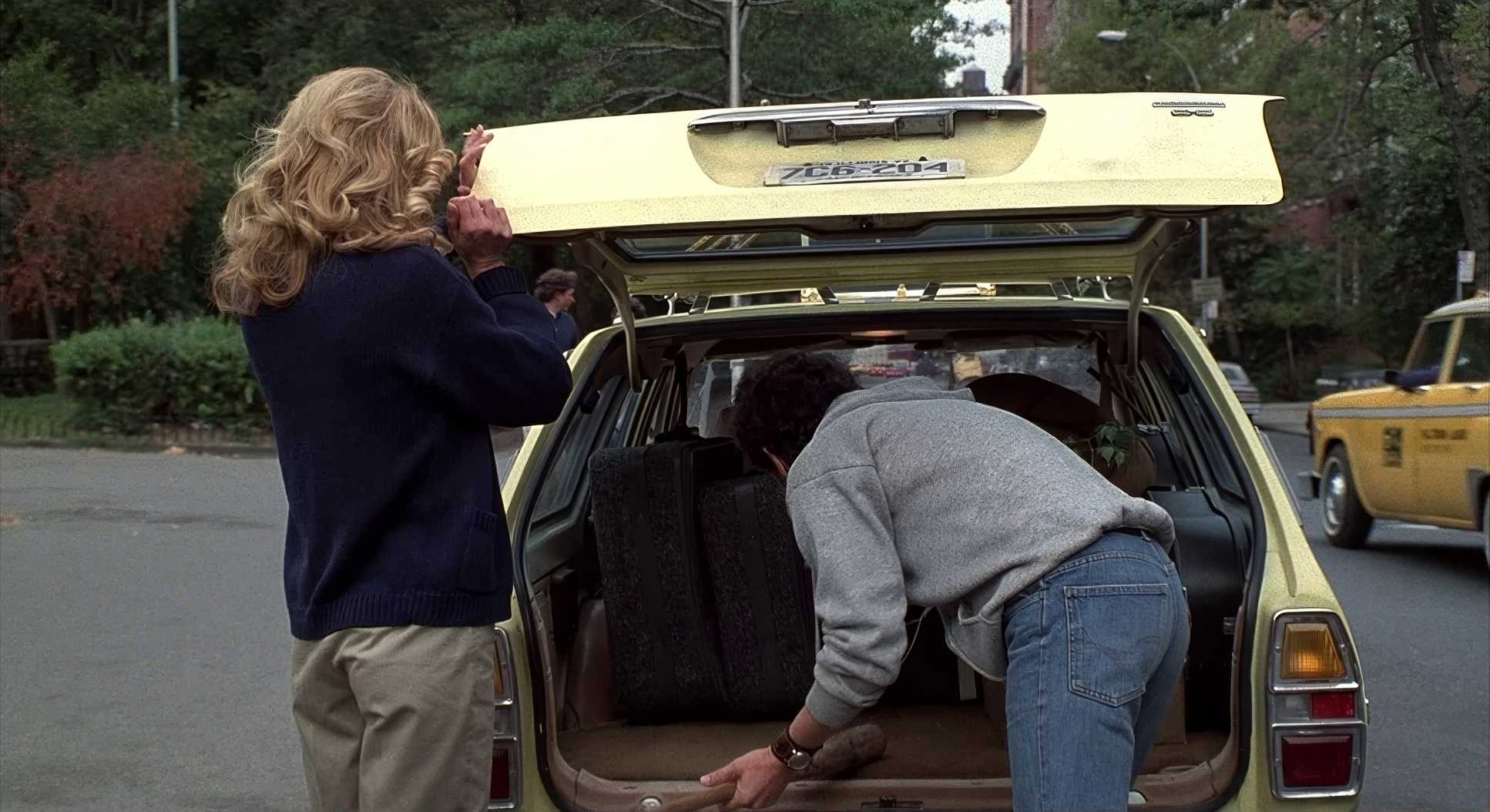
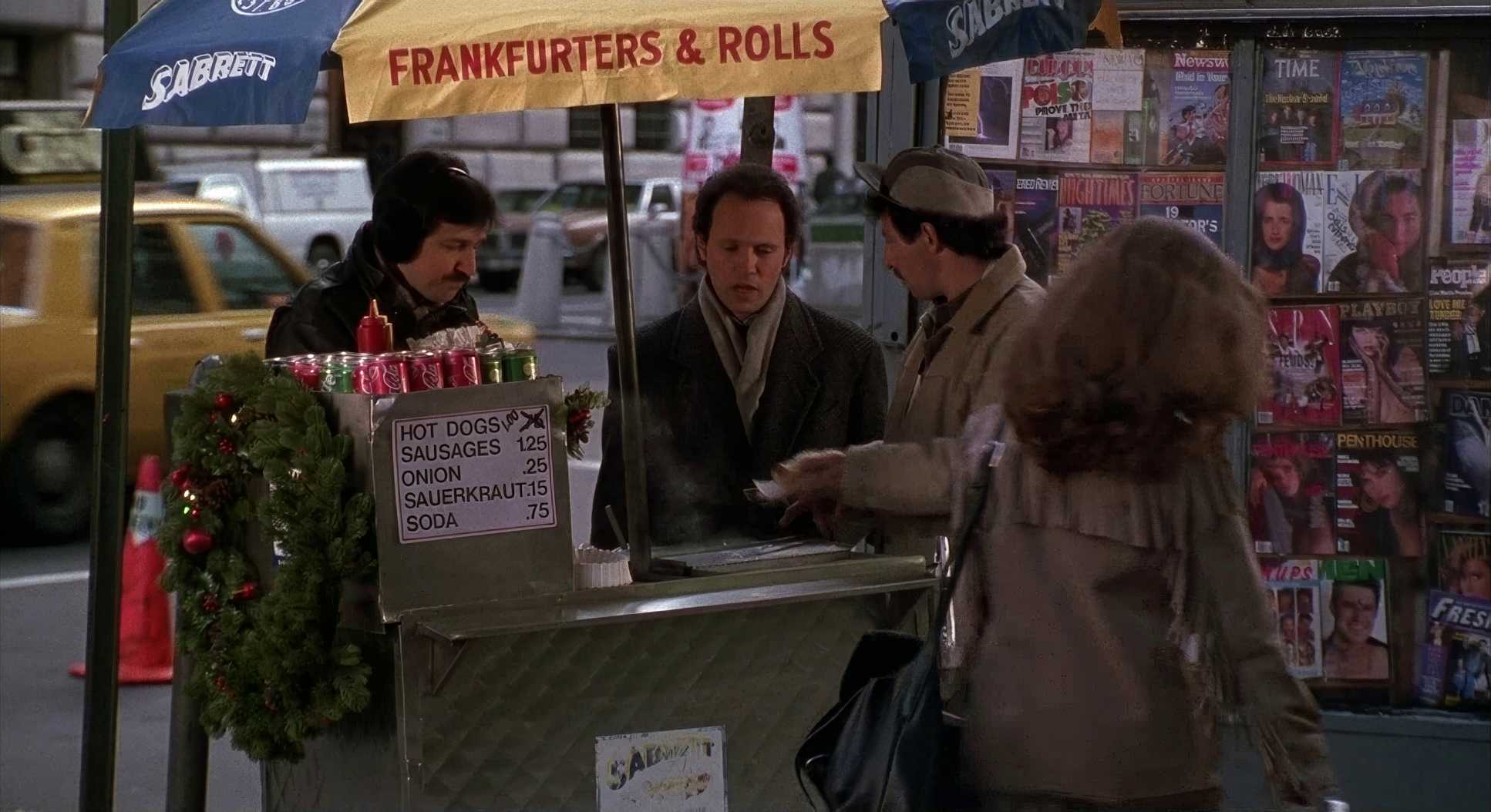
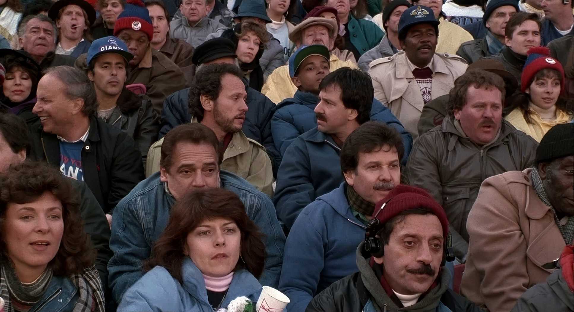
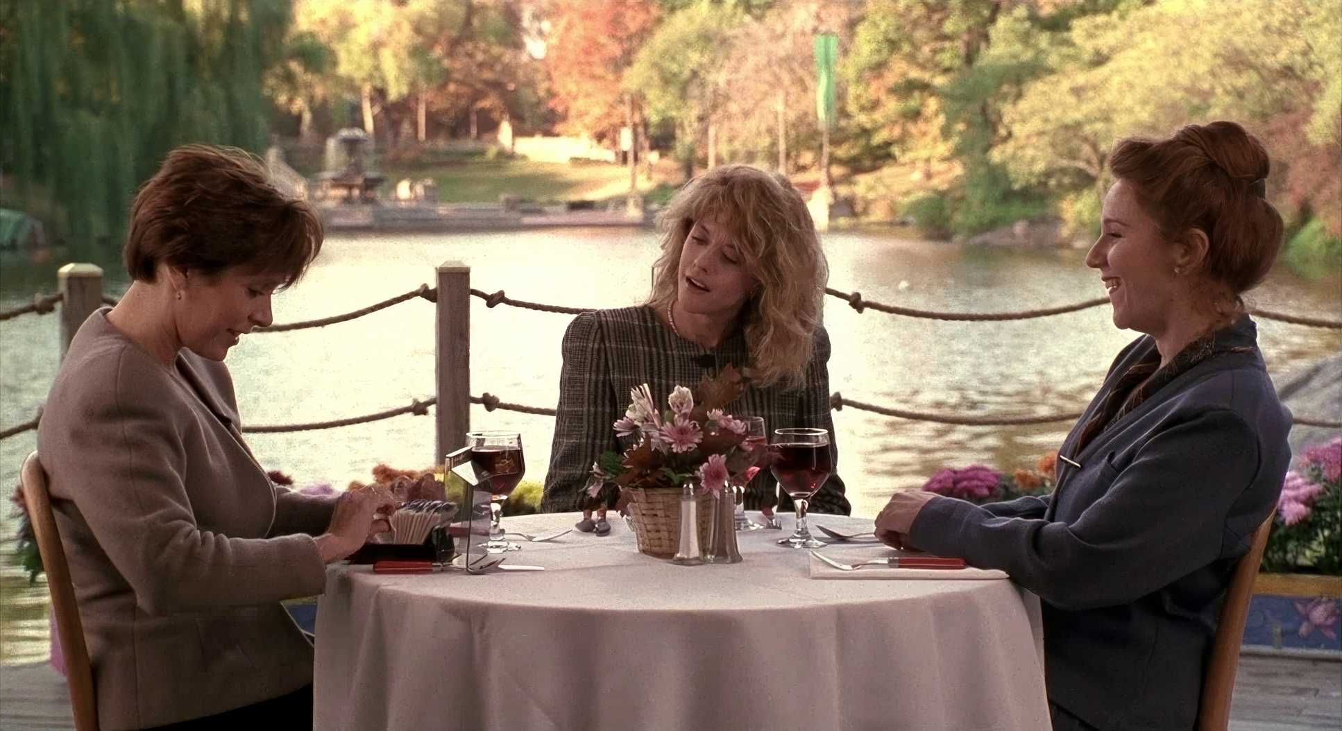
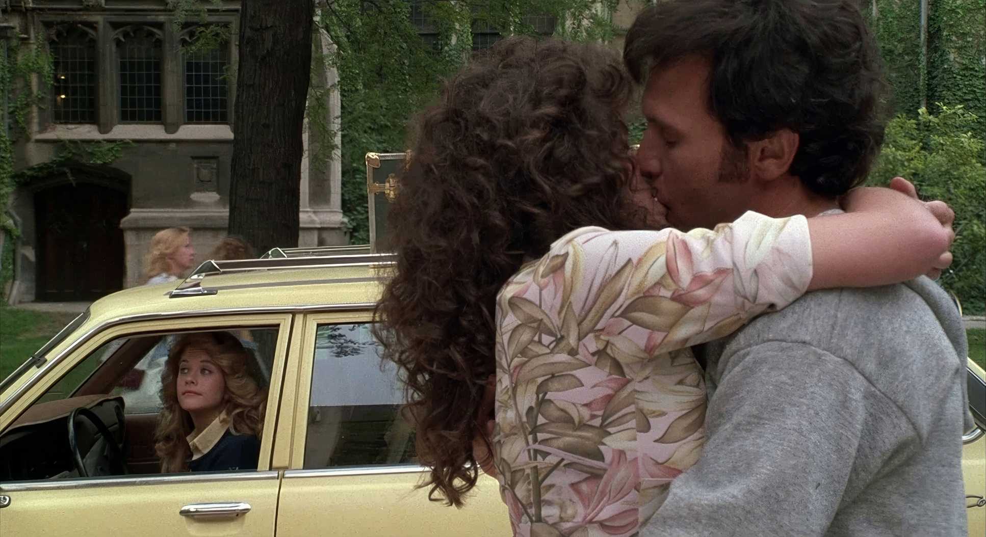
The 12-year timeline gave Sonnenfeld a massive canvas. New York isn’t just a background; it’s a character that changes with the seasons to reflect Harry and Sally’s messiness. People always say, “No movie has made fall look this fall,” and they’re right. It was a deliberate choice to ground the romance in a tangible, physical reality. There’s definitely some Annie Hall DNA in here, especially with the documentary-style cutaways to the older couples, which keeps the whole thing feeling grounded rather than “Hollywood.”
Camera Movements

Movement in this film is all about purpose. You won’t find aggressive dolly zooms or unmotivated crane shots here. Sonnenfeld and Reiner let the camera act as an empathetic observer.
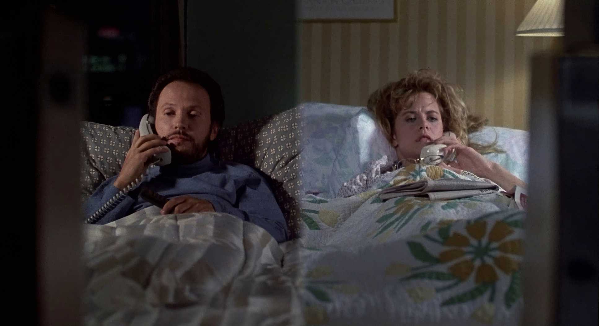
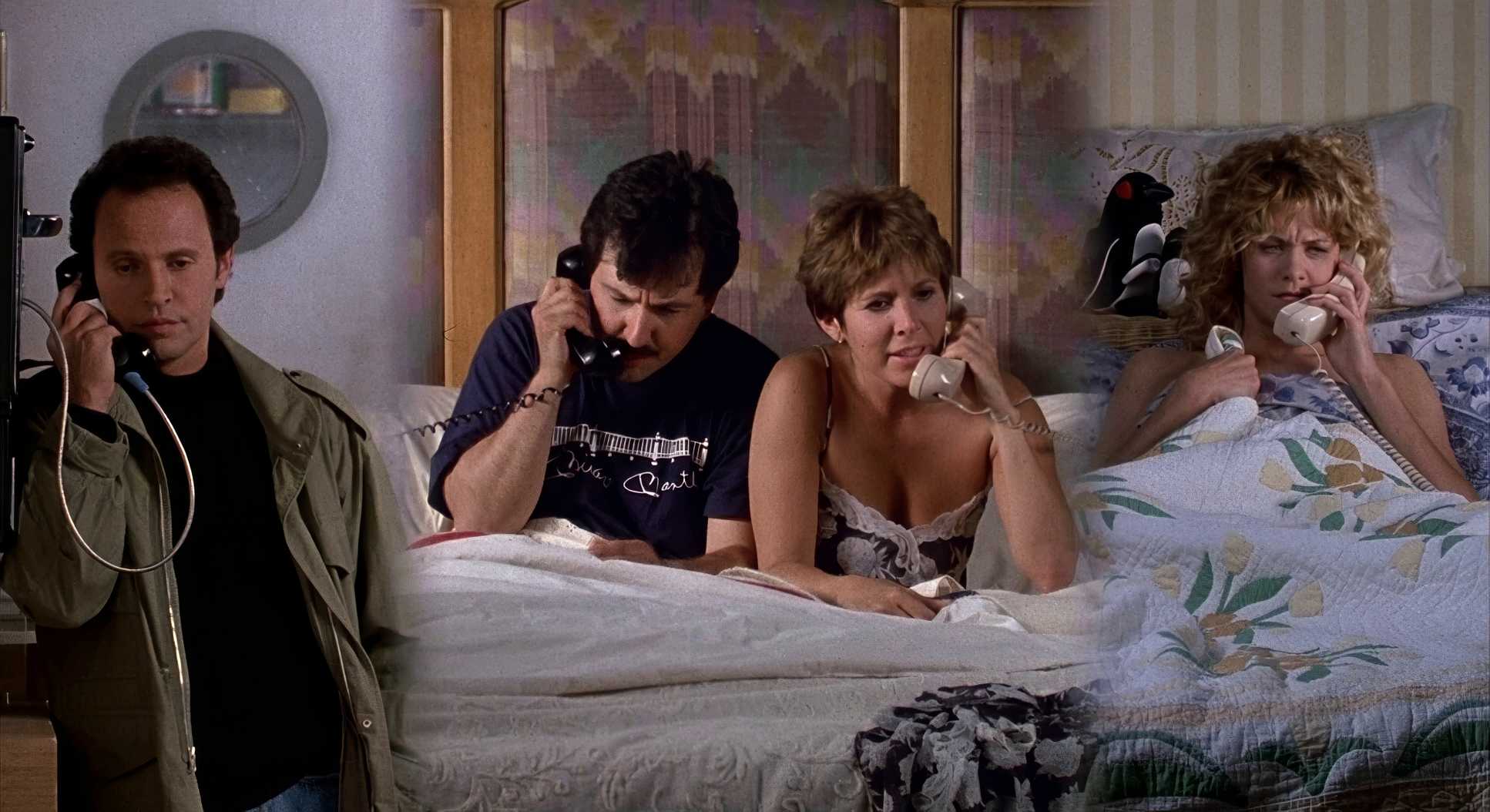
When the camera does move, it’s subtle. A gentle push-in during a key bit of dialogue or a graceful tracking shot while they walk through the park. It’s about keeping the audience in the conversation. Even the split-screen phone calls are perfectly choreographed; the camera stays still and lets the actors “share” the space despite being miles apart. It’s a lesson in restraint the best camera work is often the kind you don’t even notice.
Lensing and Blocking

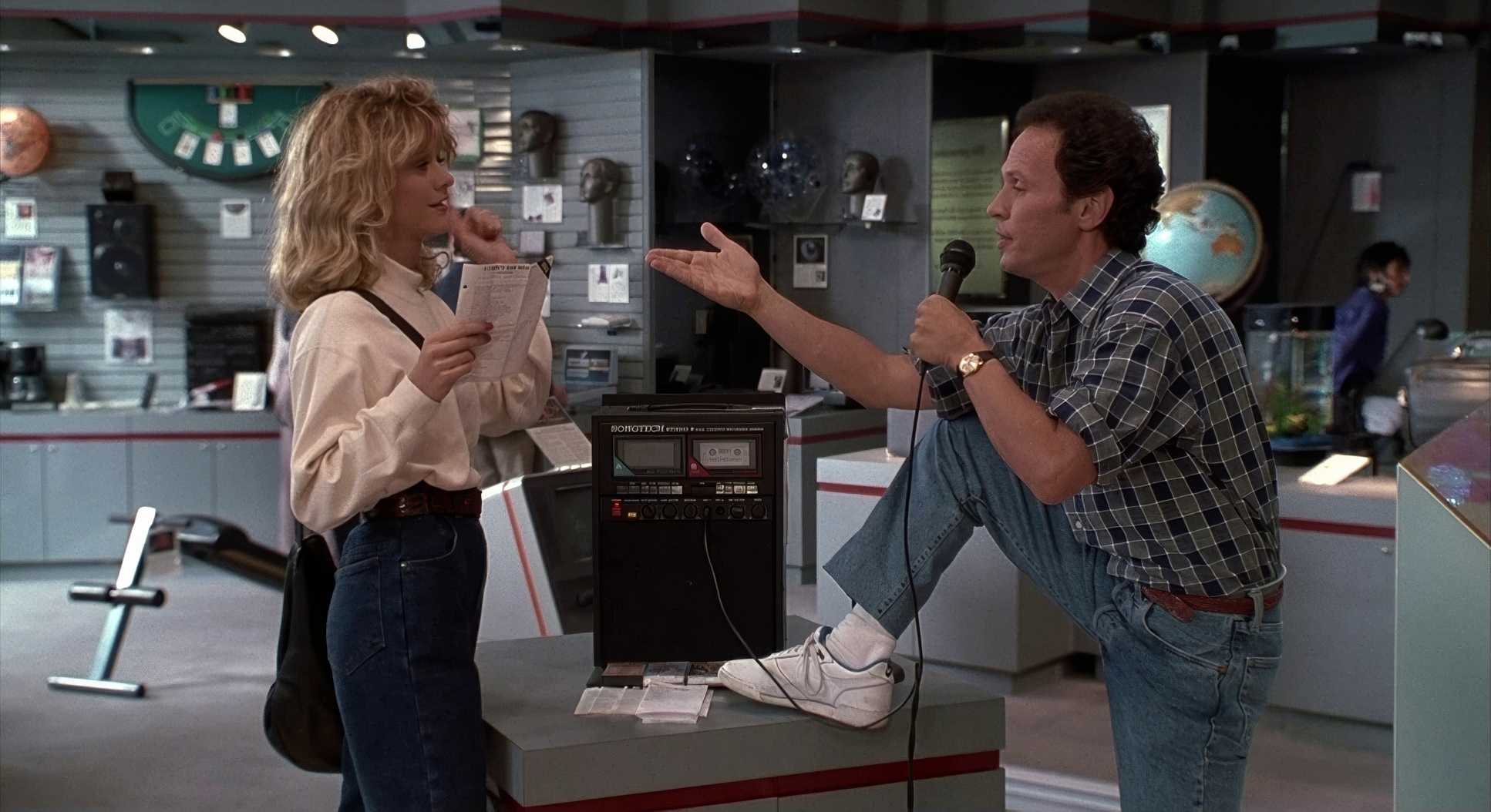
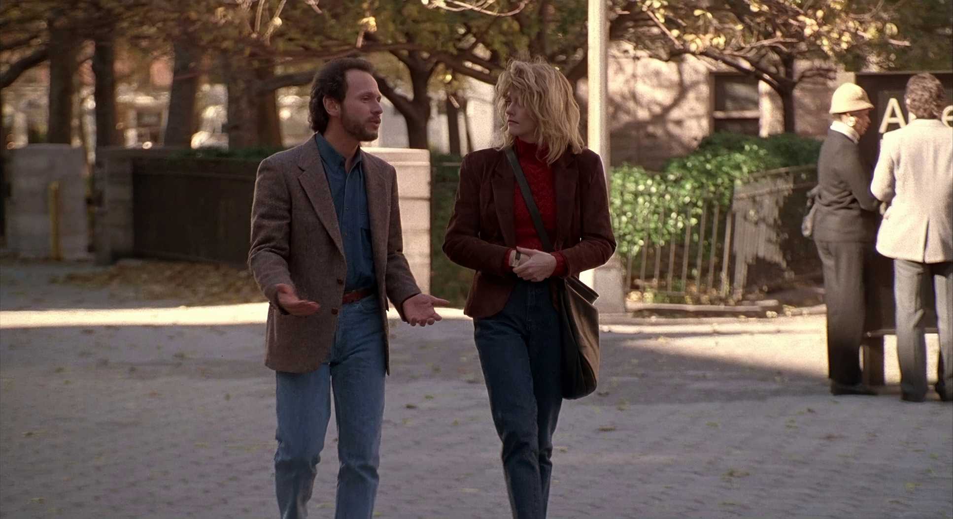
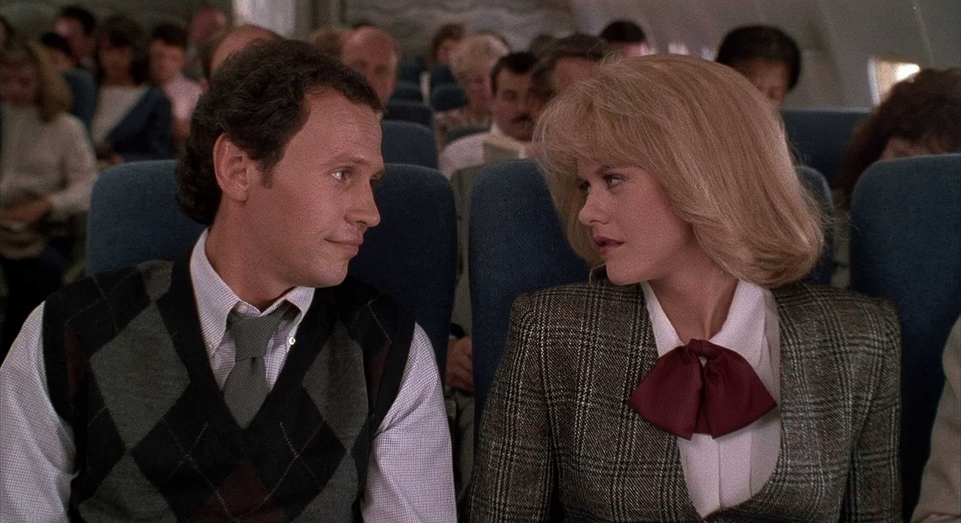
Sonnenfeld stuck to standard focal lengths mostly 35mm, 50mm, and 85mm. These lenses approximate how we actually see the world. No ultra-wide distortion, no extreme telephoto compression. It makes the characters feel reachable.
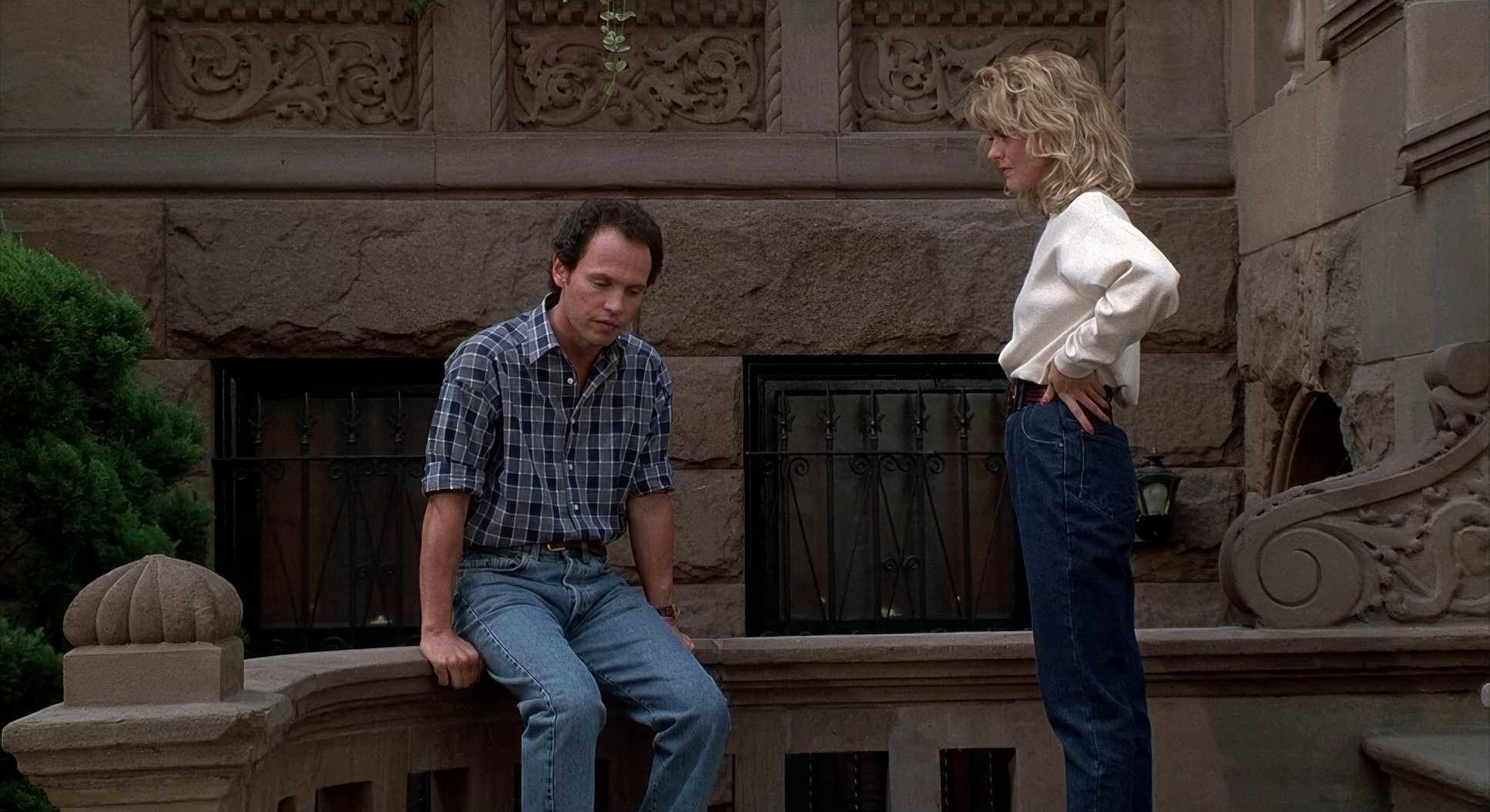
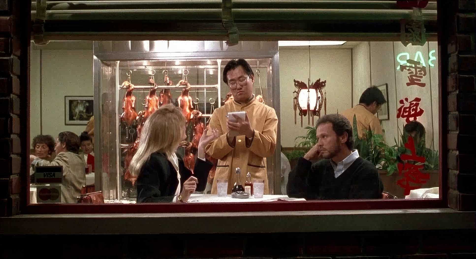
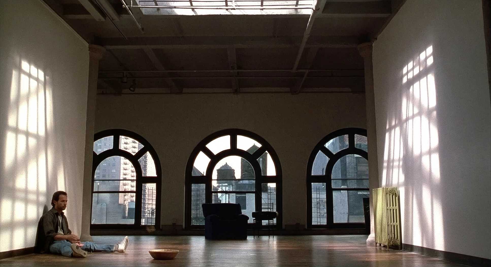
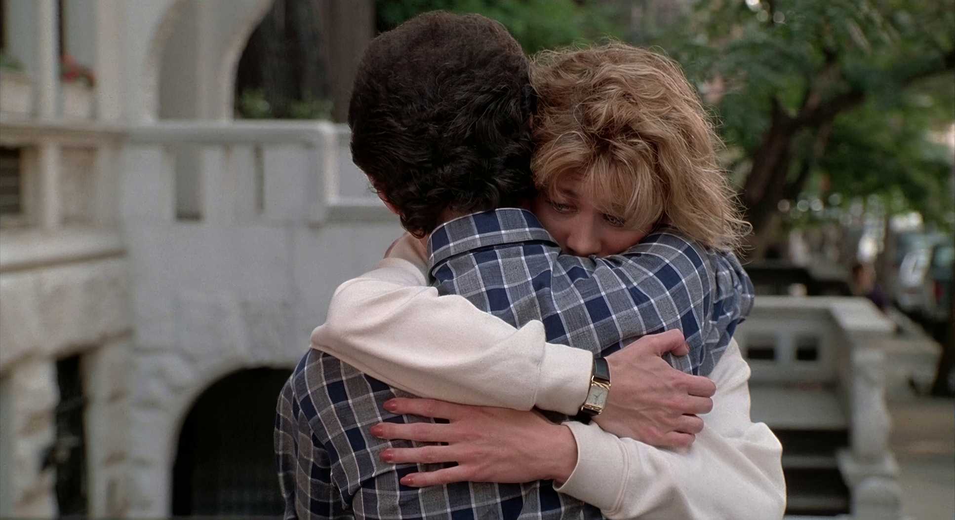
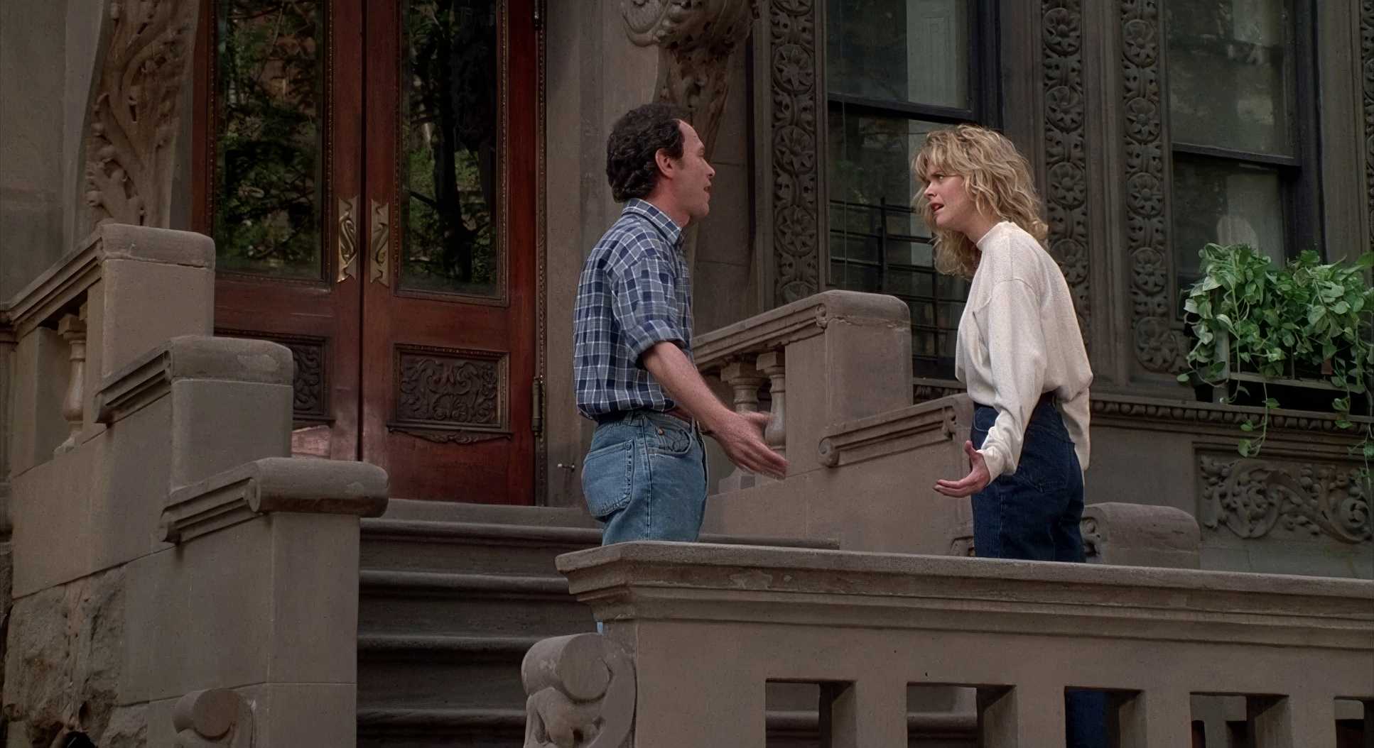
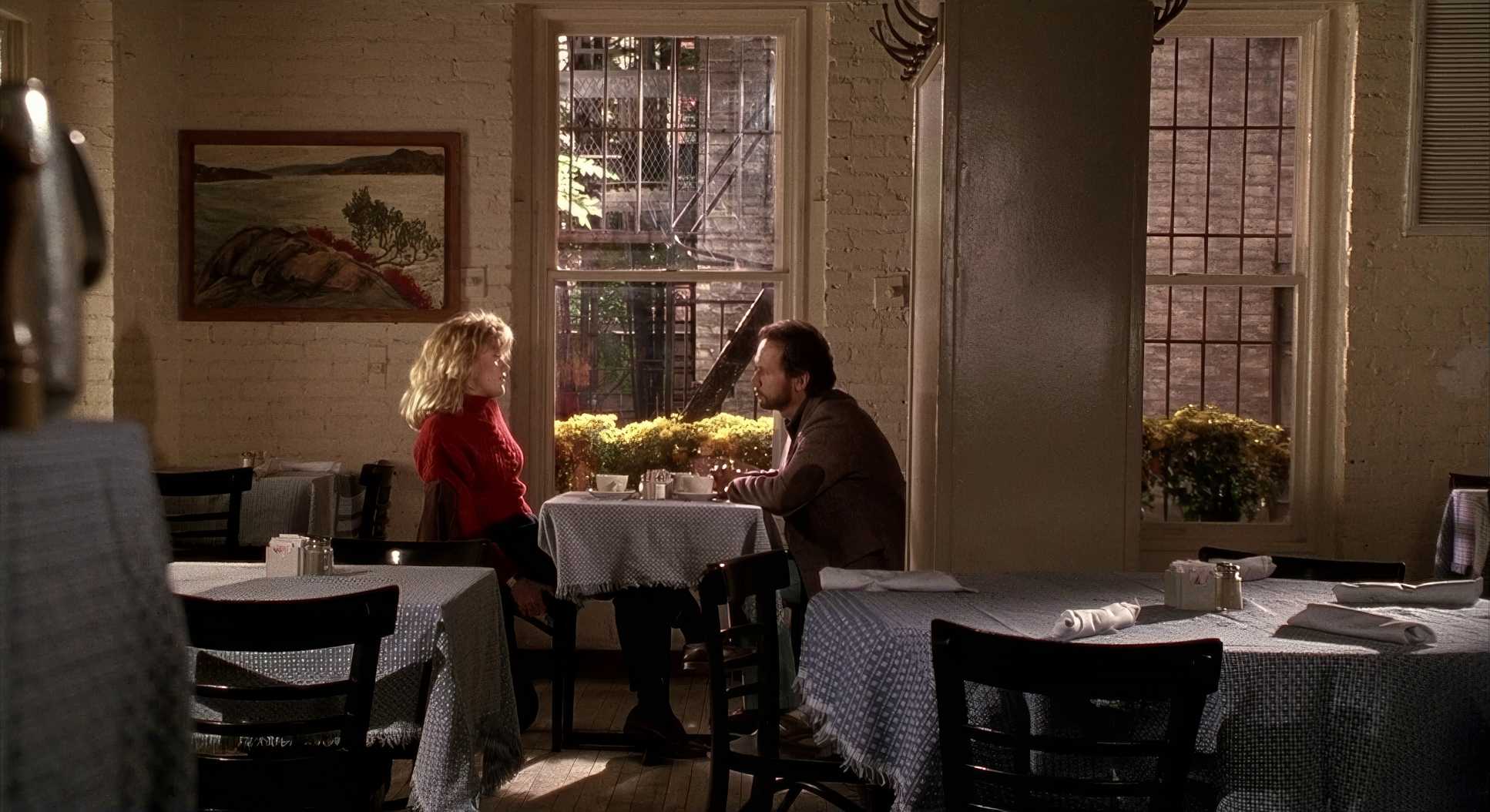
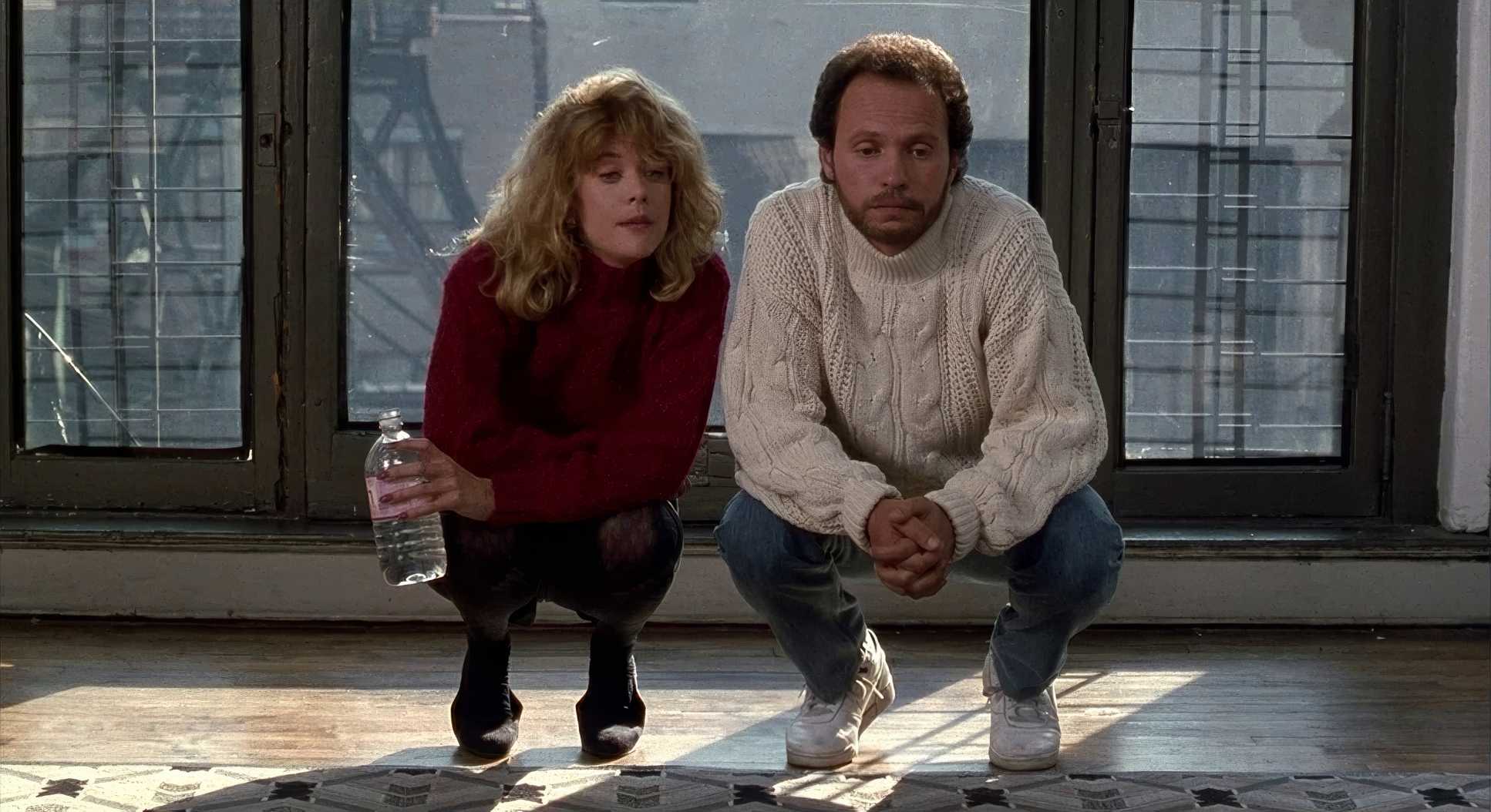
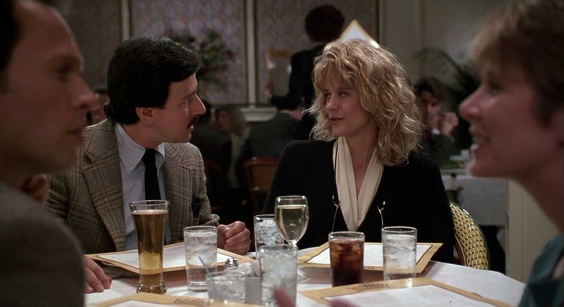
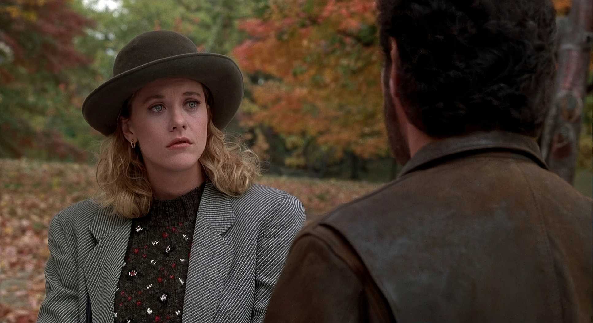
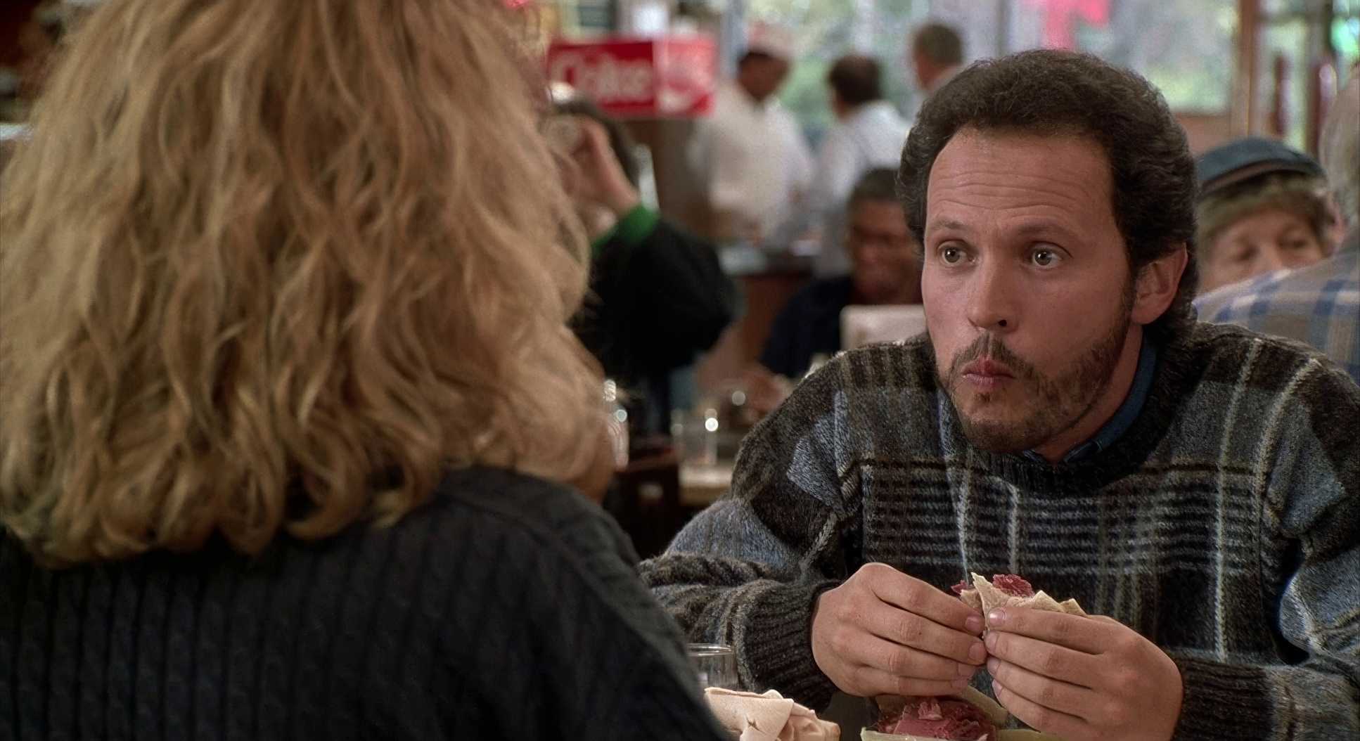
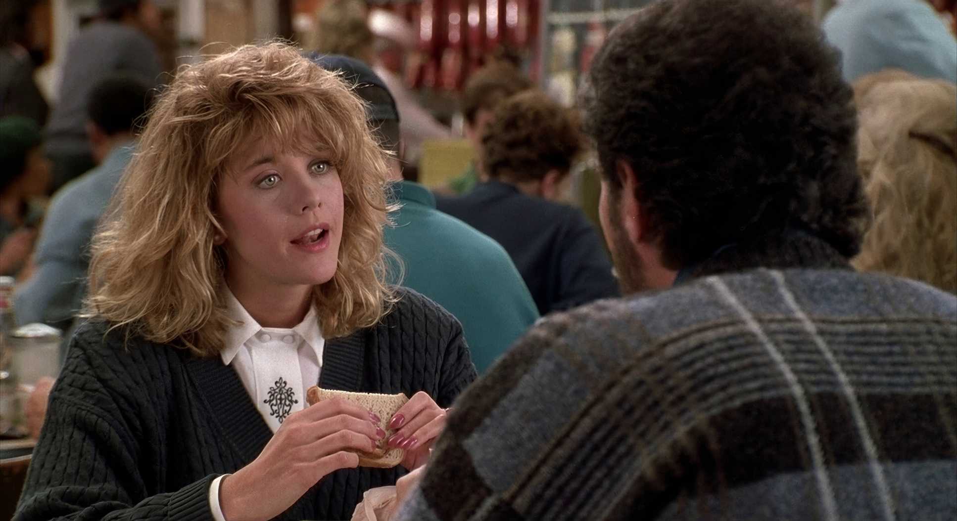
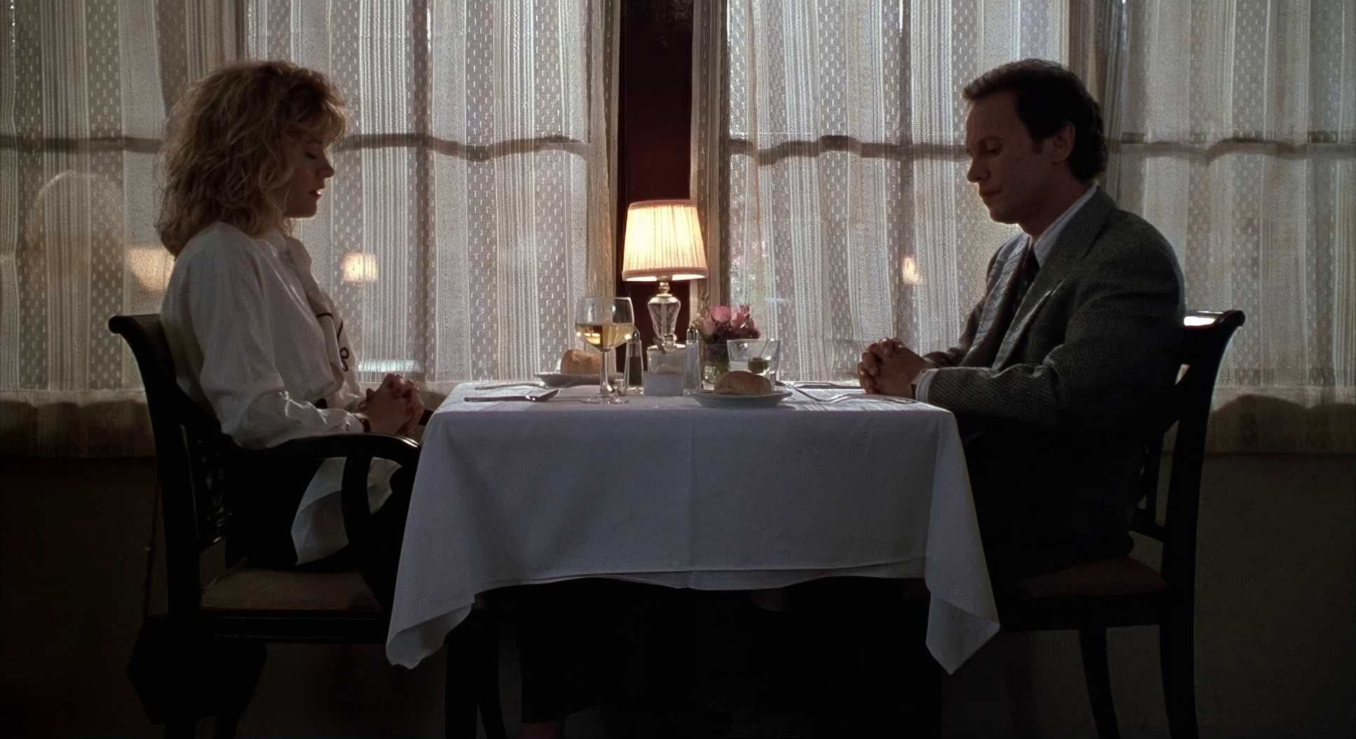
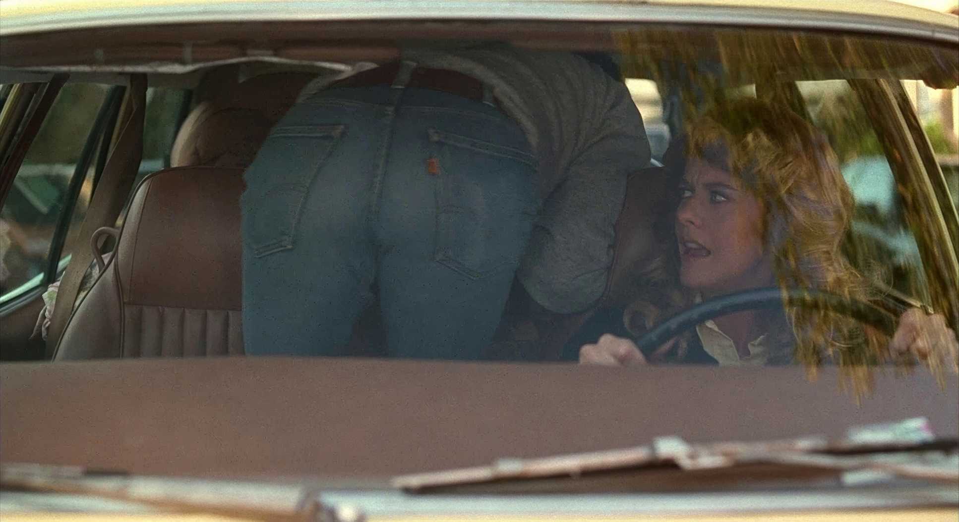
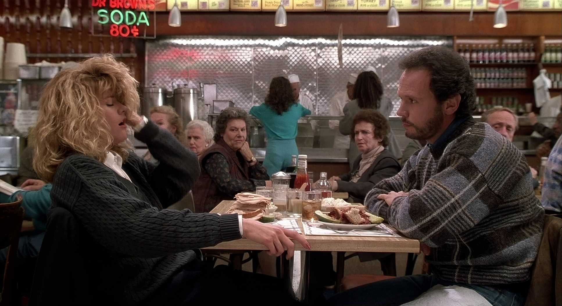
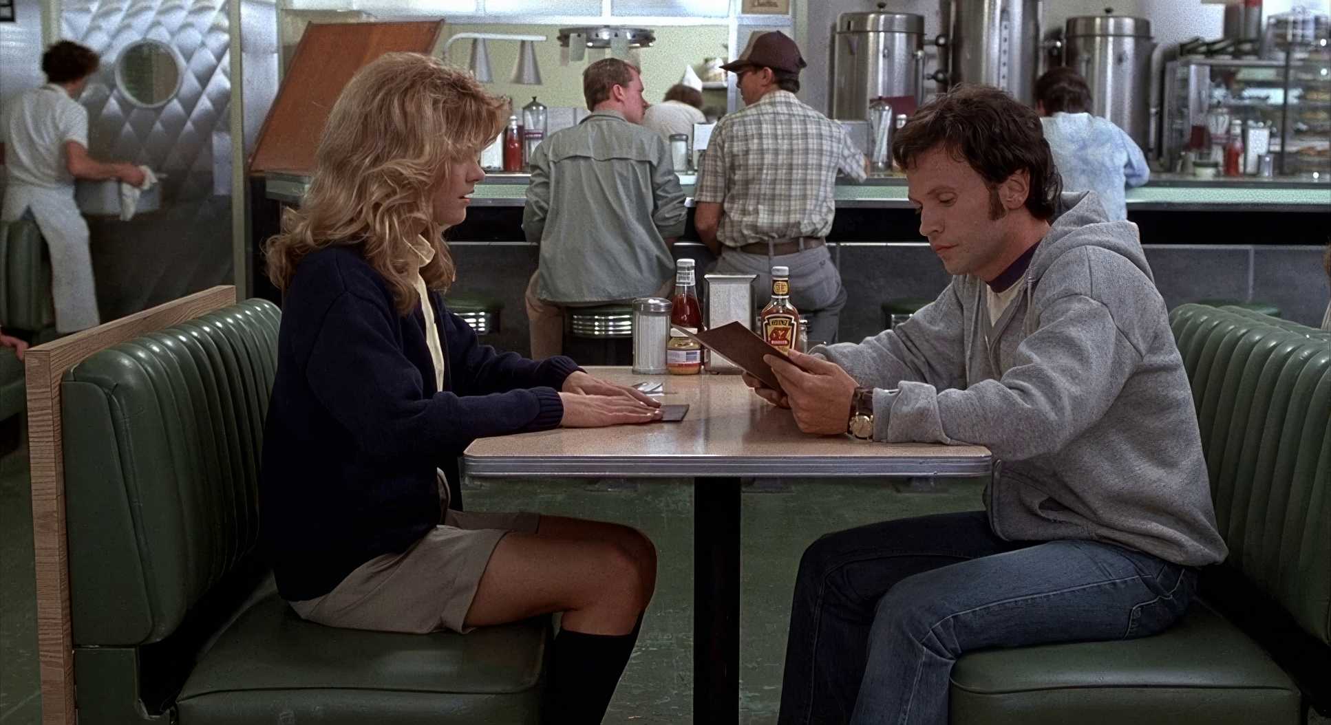
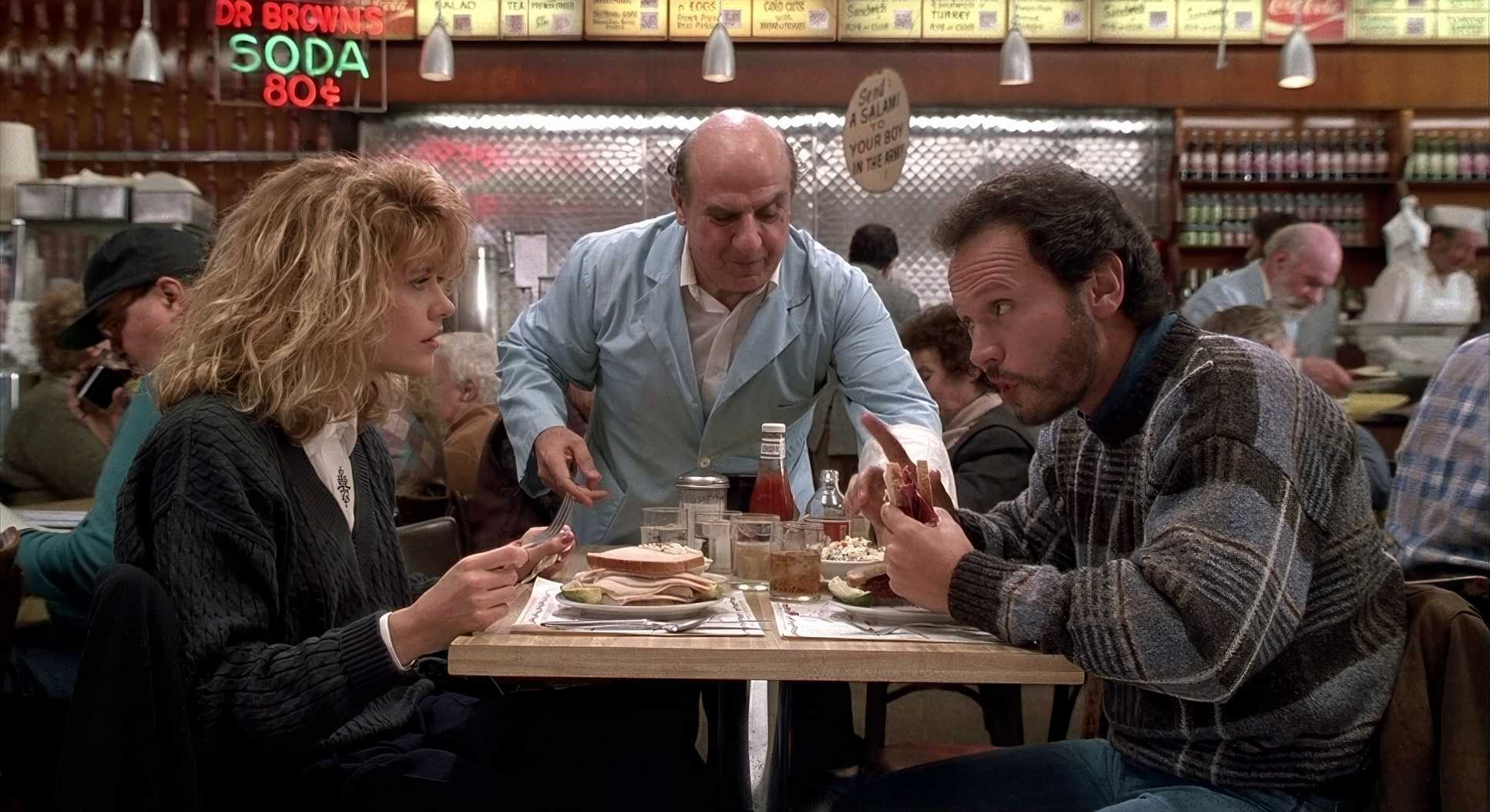
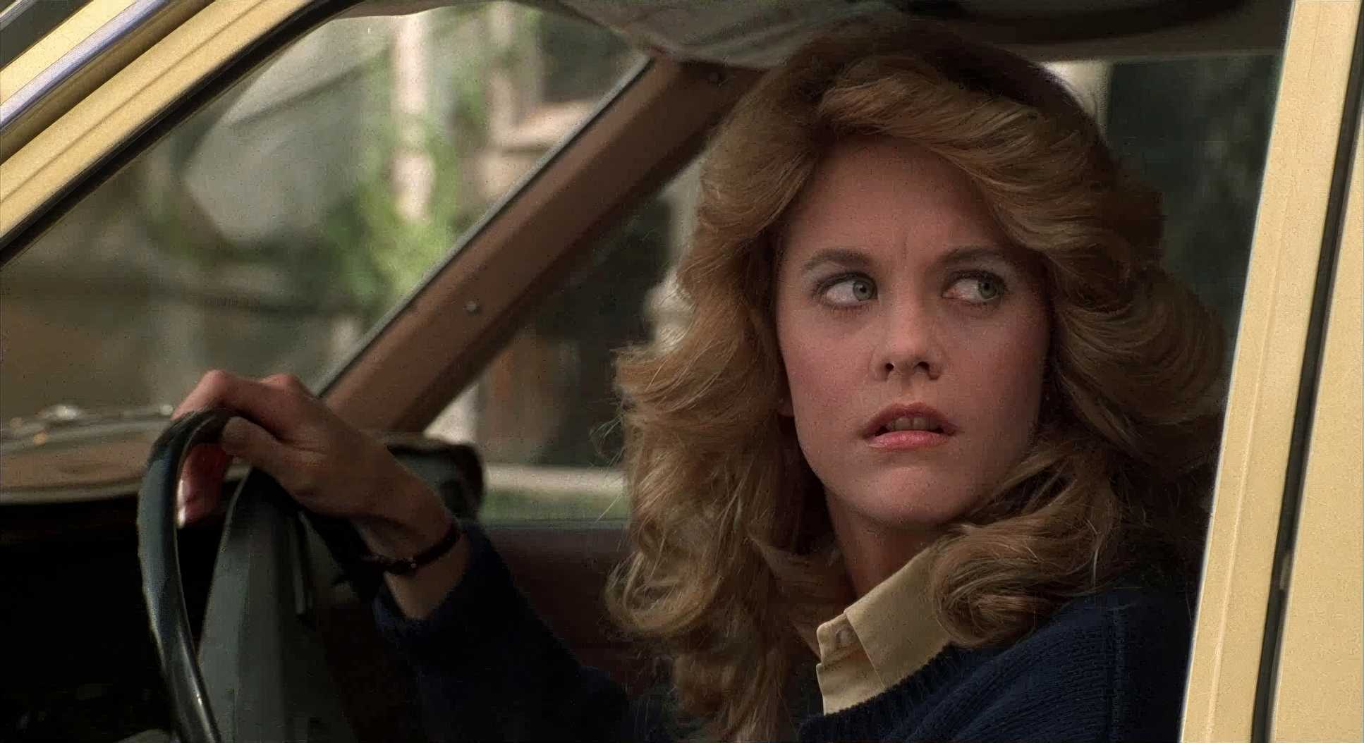
The blocking is where the real storytelling happens. In the early scenes, like the drive from Chicago, there’s an uncomfortable amount of negative space between them. They’re stuck in a car but couldn’t be further apart. As the film progresses, that space shrinks. By the time they’re in the deli, the blocking is tight, holding them together in the frame even when they’re arguing. As a filmmaker, I love this it’s not about a “cool shot,” it’s about using the lens to track the emotional distance between two people.
Lighting Style

This is where the “warm blanket” aesthetic really lives. Sonnenfeld used a naturalistic, motivated style. He wasn’t trying to be moody; he was trying to be inviting.
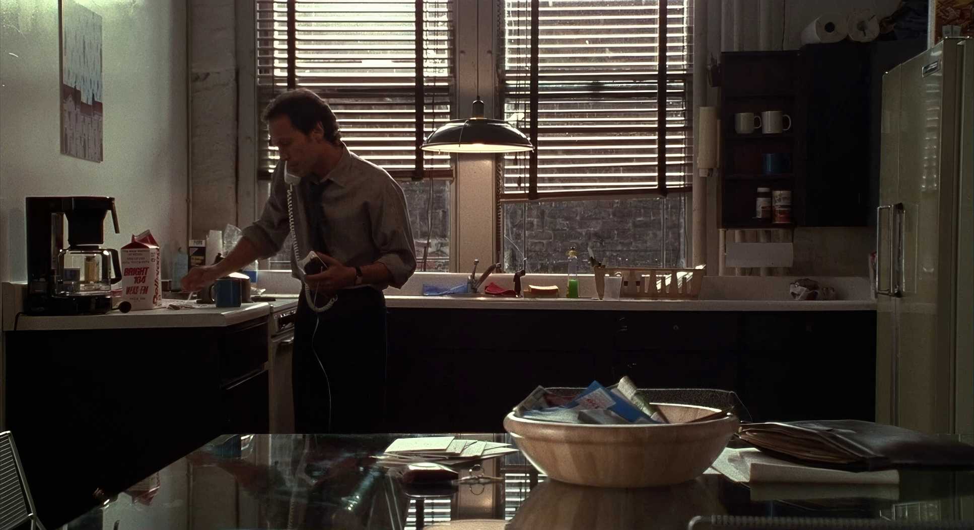
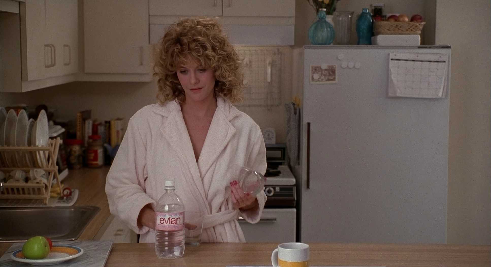
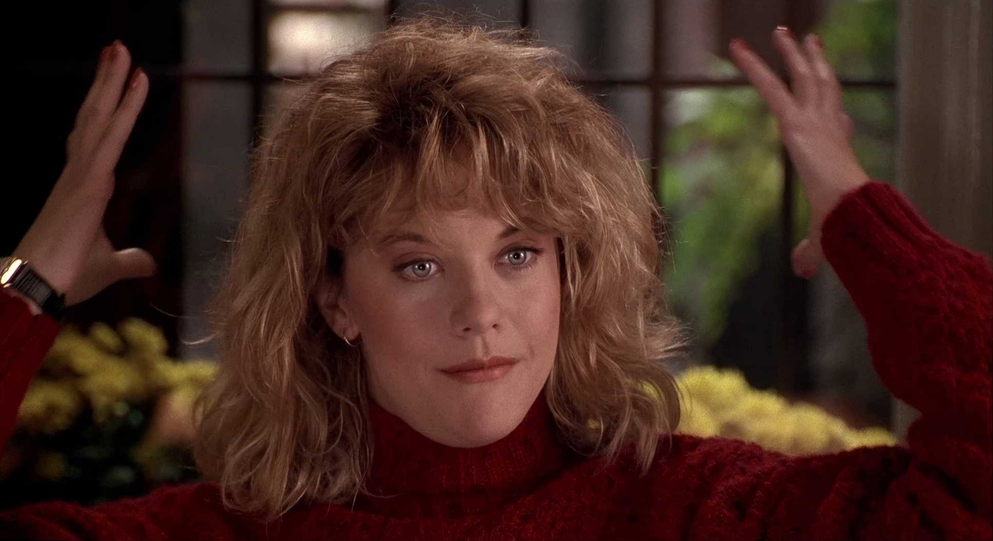
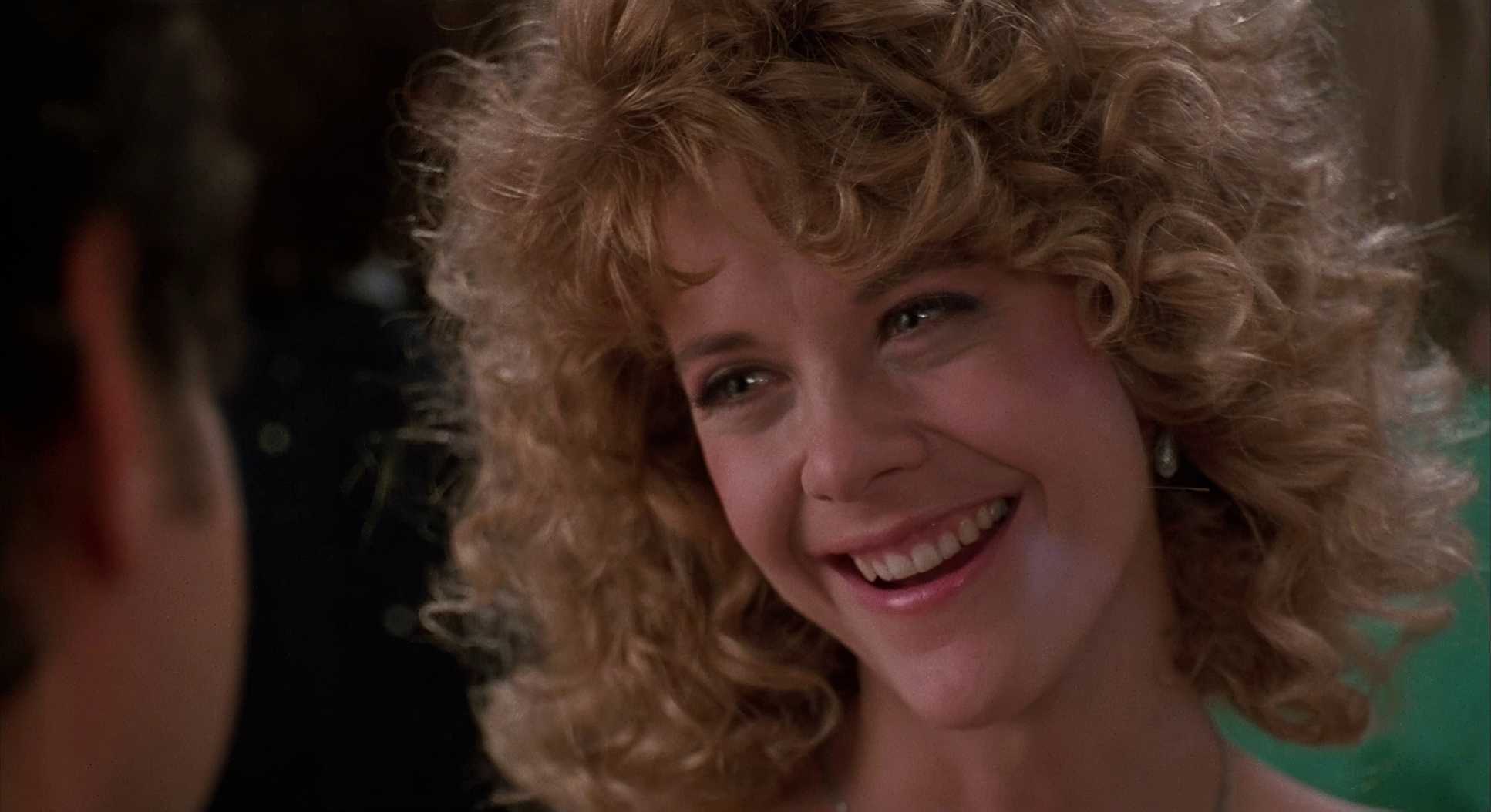
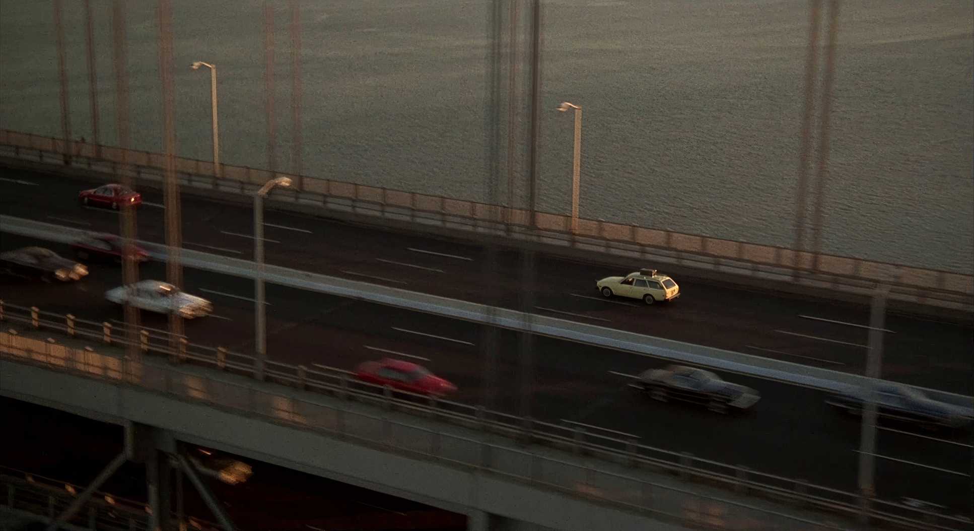
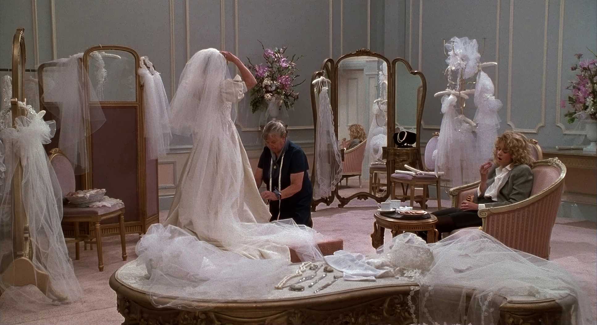
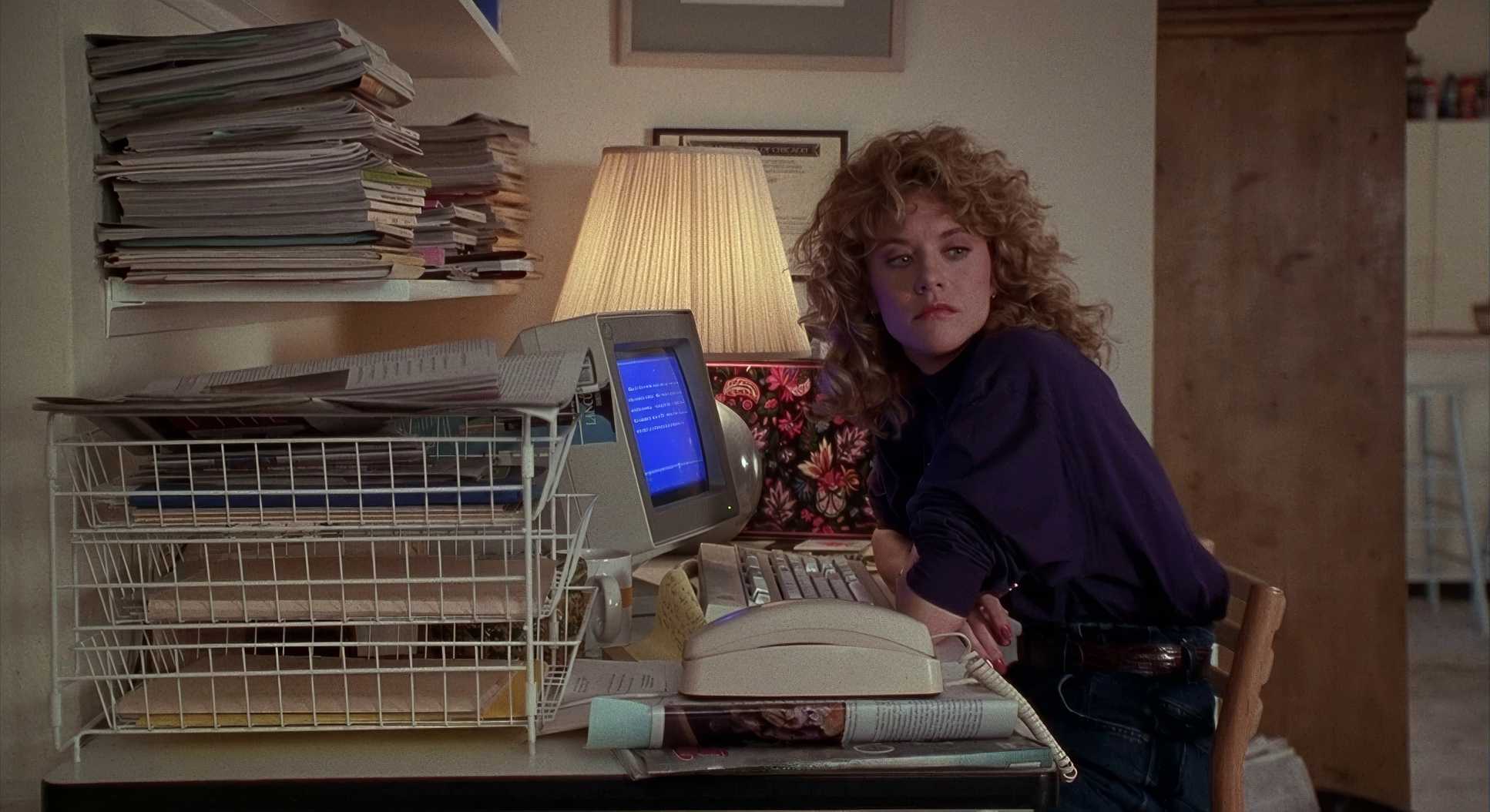
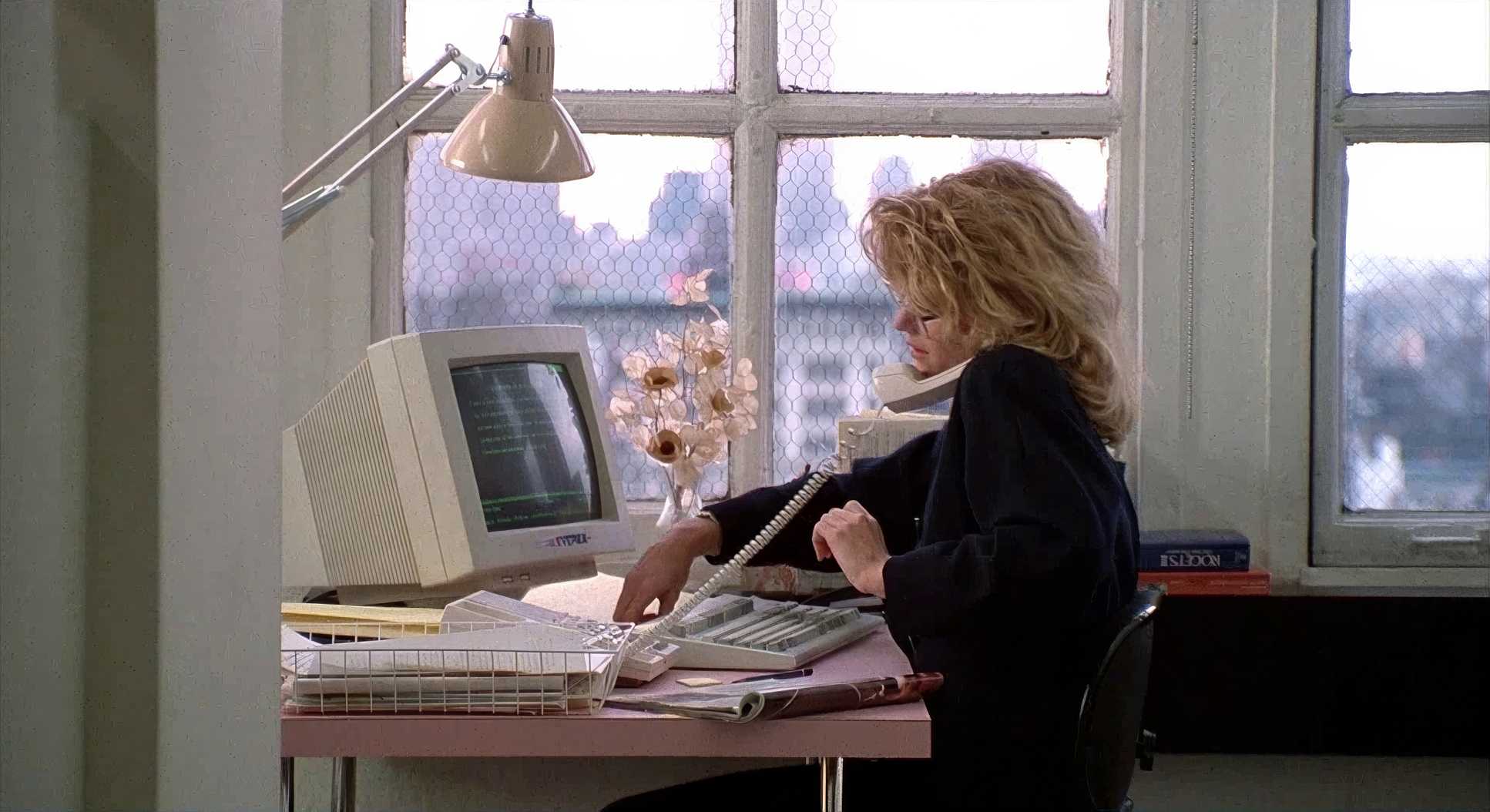
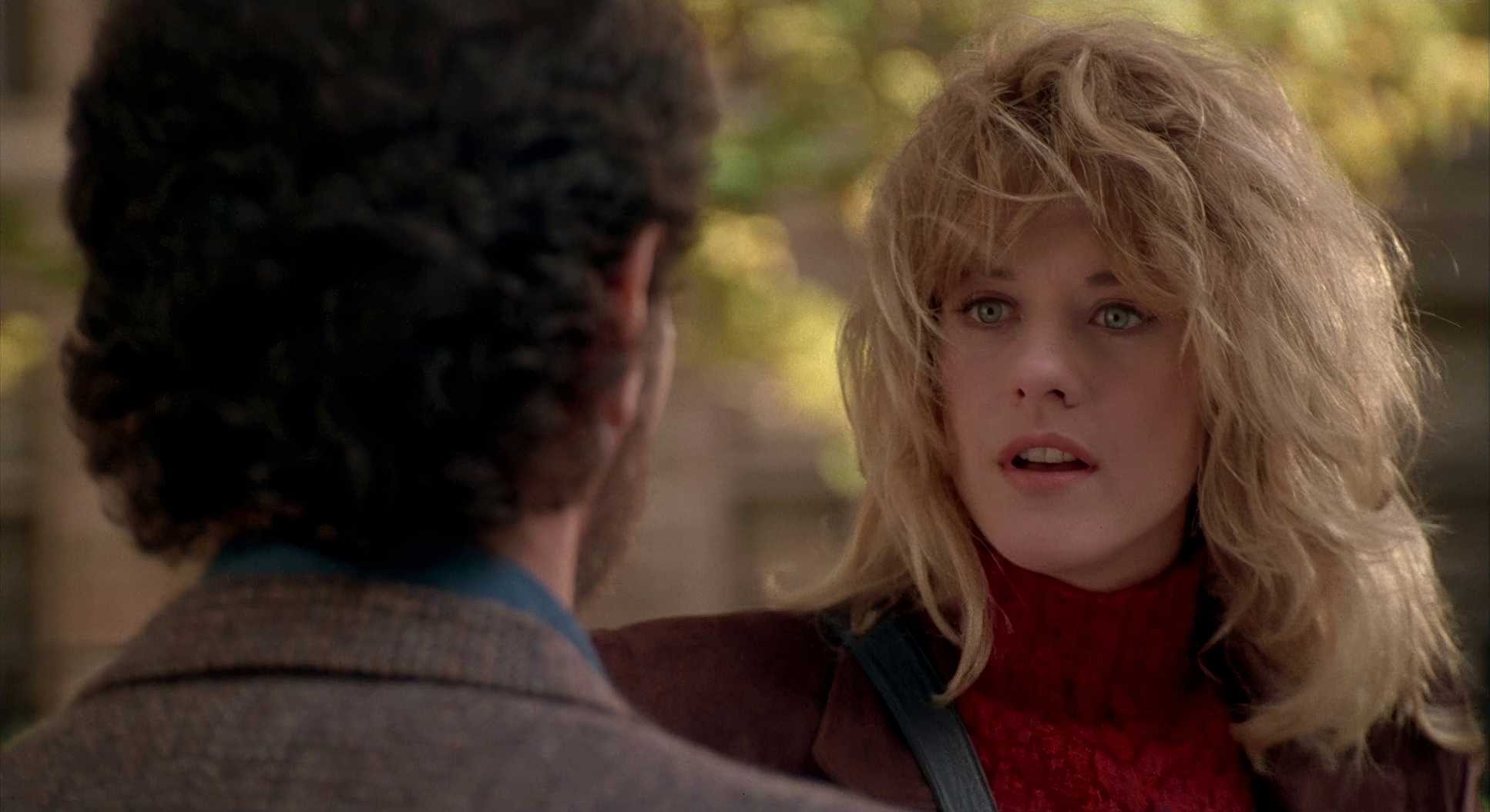
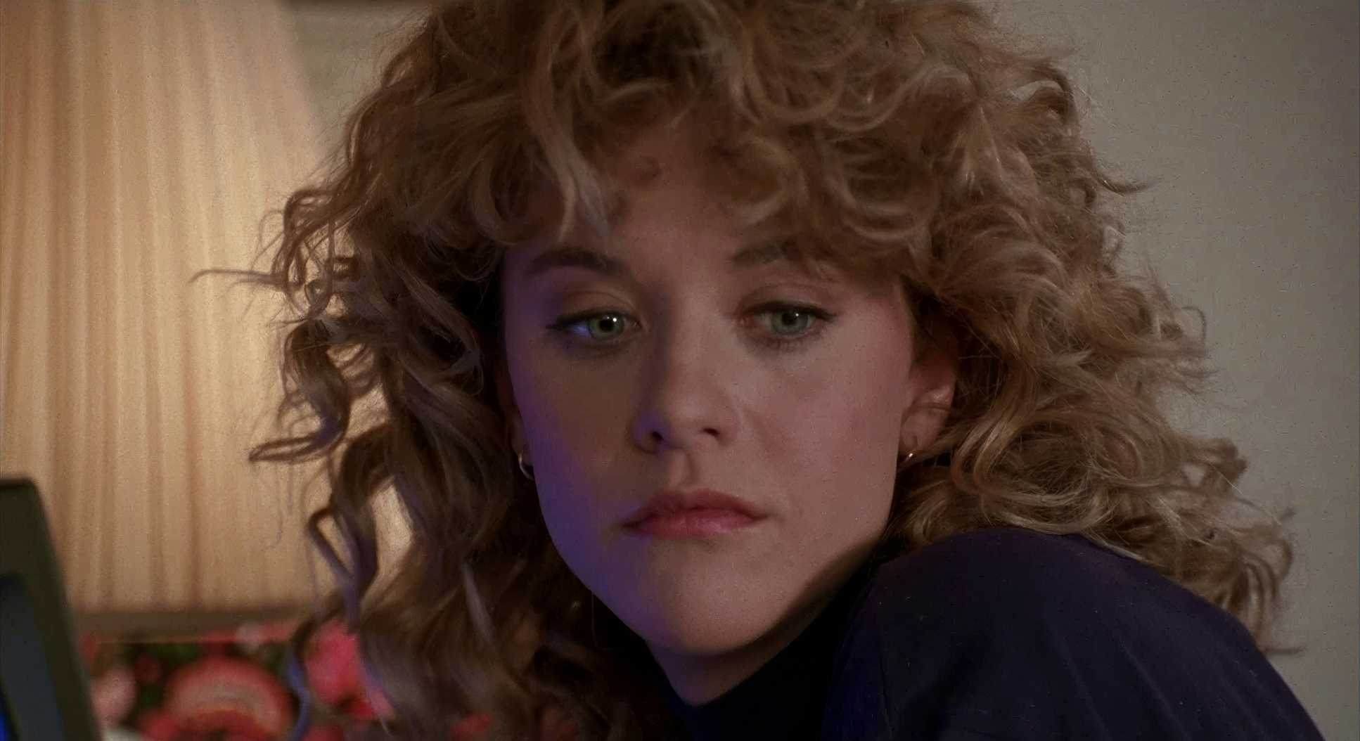
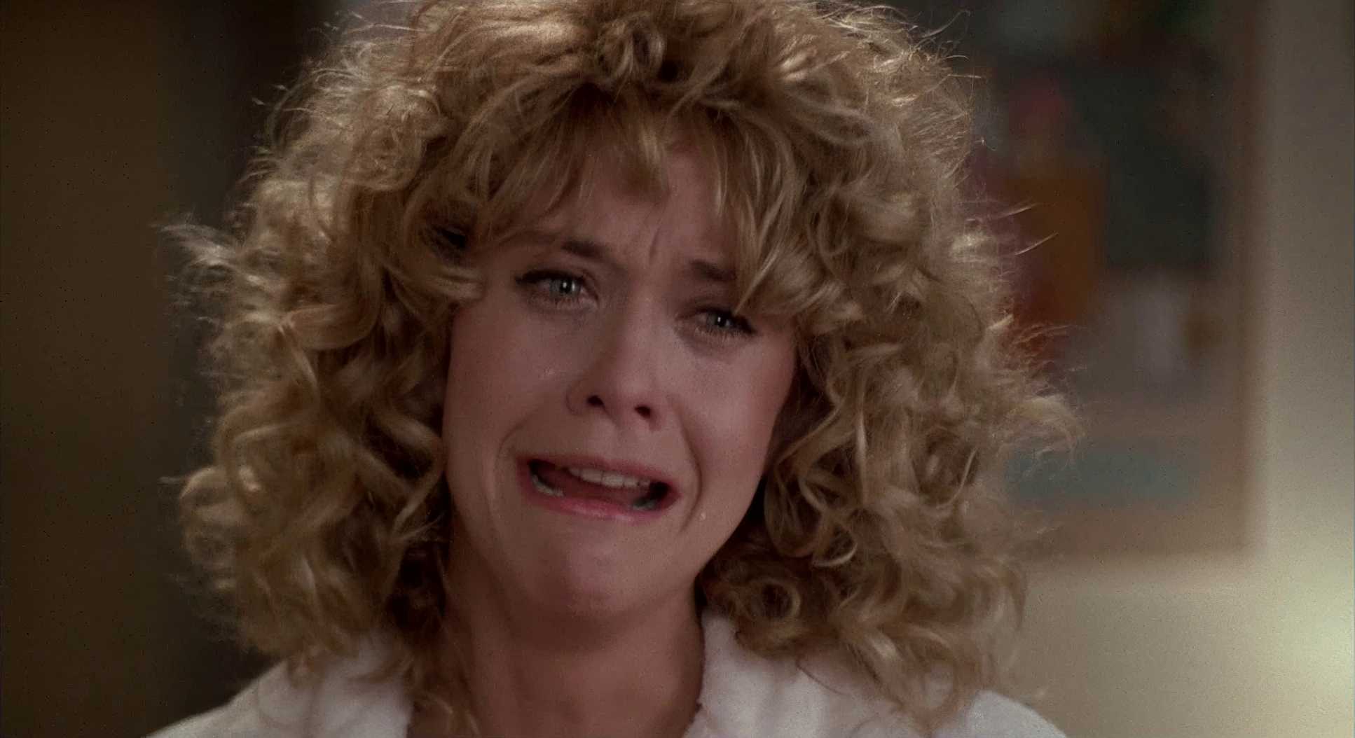
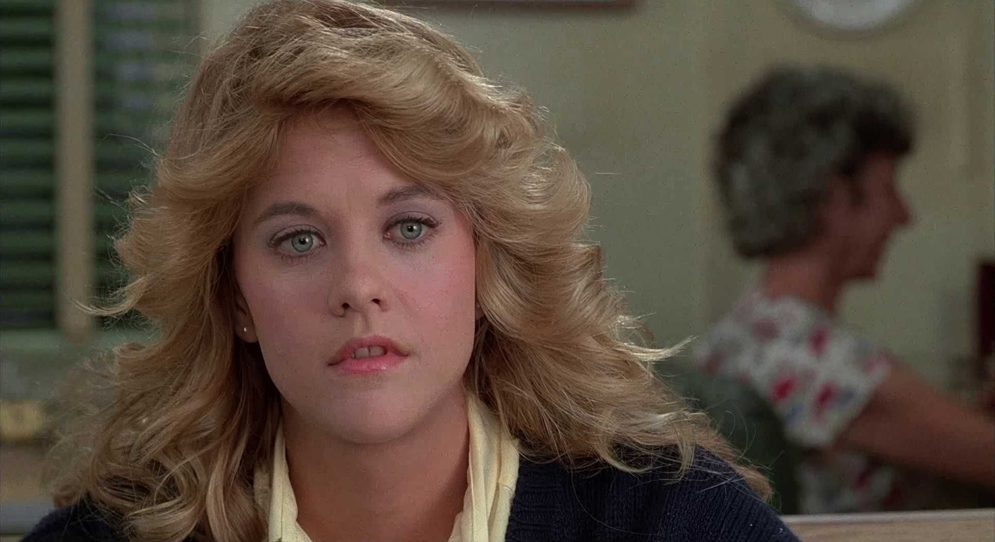
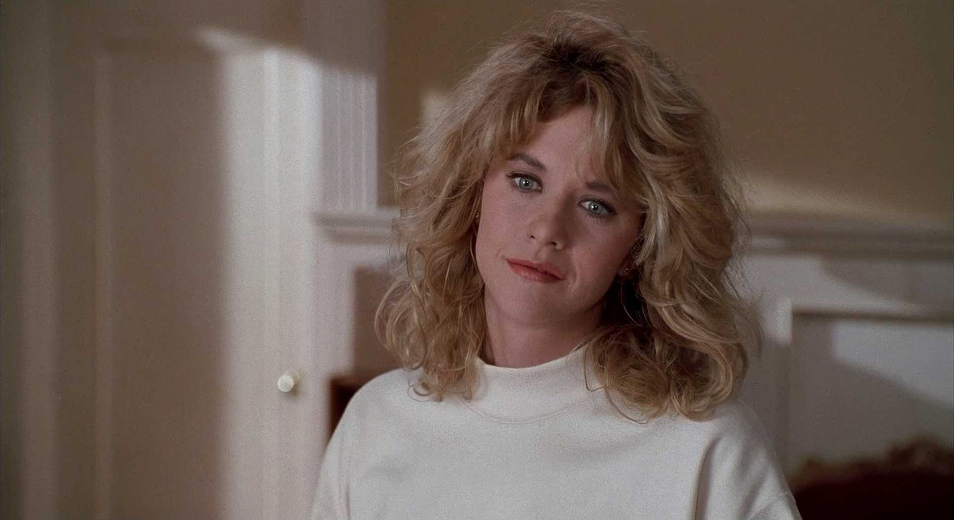
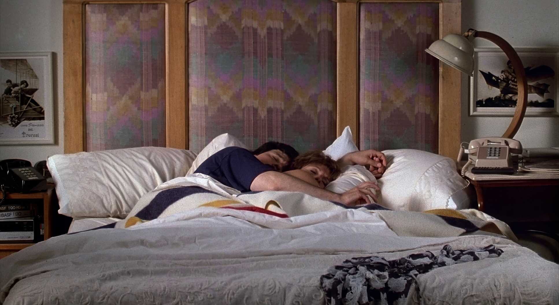
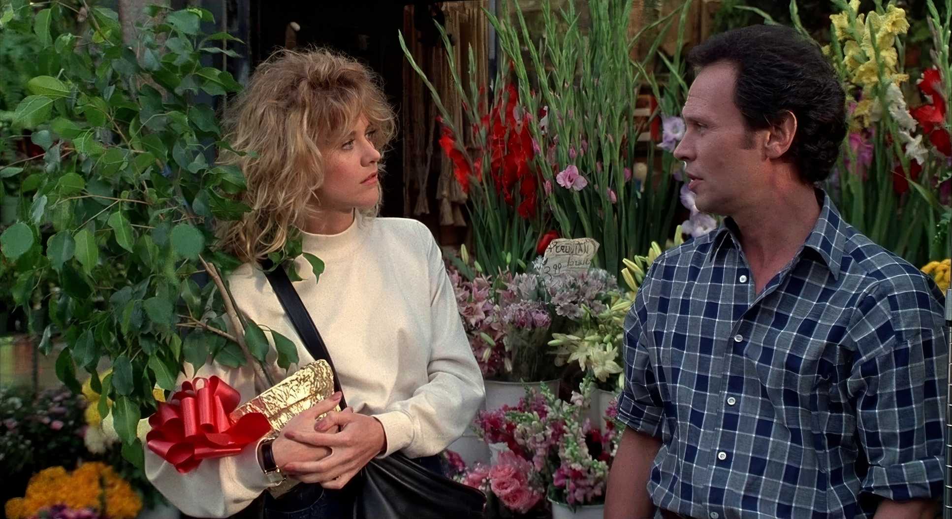
Interiors are filled with soft, diffused light from practical lamps. The key lights are broad, ensuring we can see every micro-expression on Meg Ryan or Billy Crystal’s faces. Then you have the exteriors—that legendary golden hour light. He likely used big diffusion frames and HMIs to mimic the sun filtering through the trees. It’s not just “pretty”; it’s functional. The lighting shifts from the crisp, high-contrast side light of a Chicago parking lot to the soft, overcast daylight of a New York winter, always maintaining a moderate contrast that avoids crushed blacks.
Compositional Choices

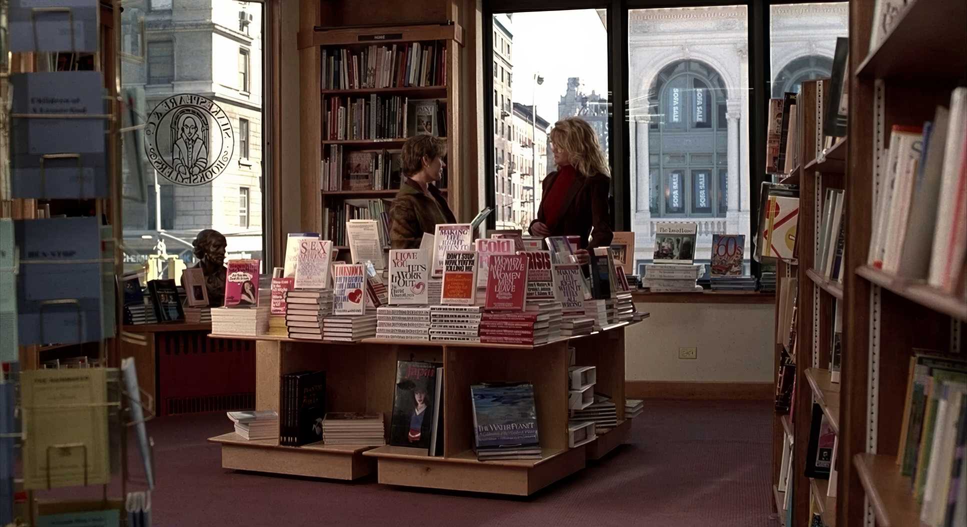
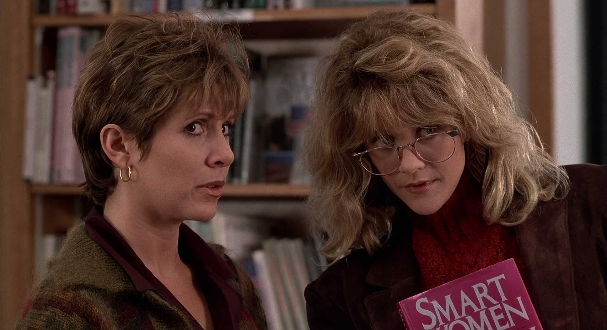
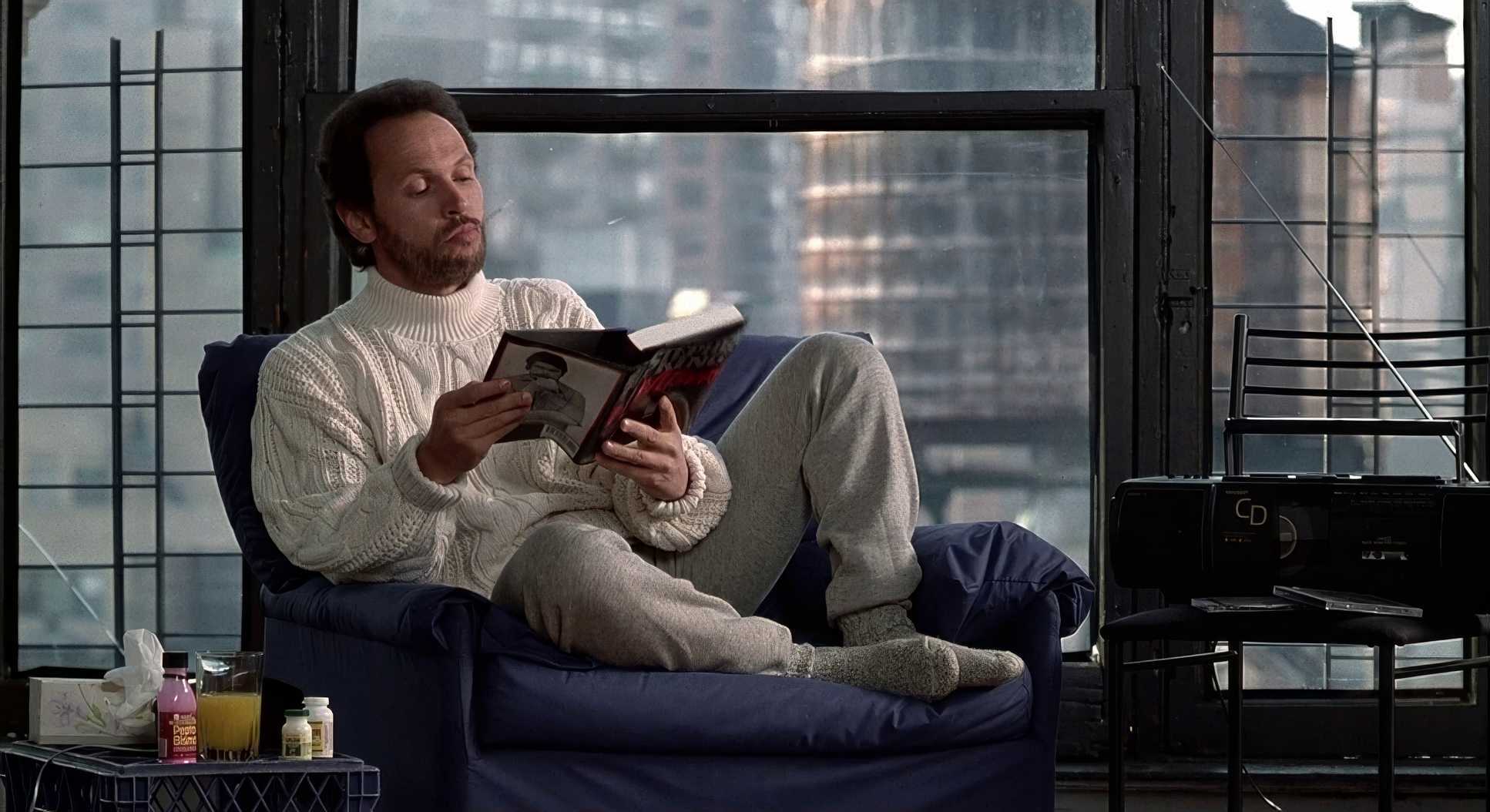
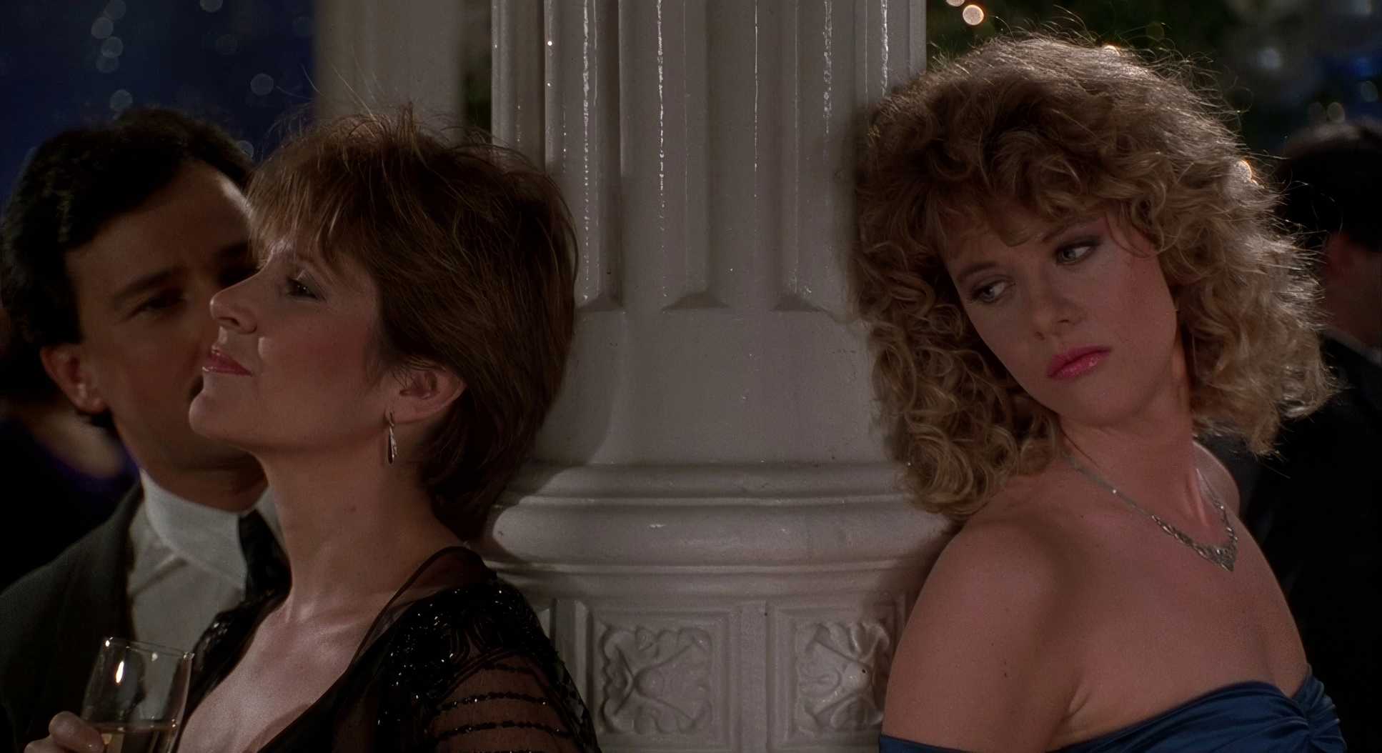
“Simplicity is the most effective method” is the mantra here. Look at the shot of Harry by the window while his friends are blurred in the background. It’s a masterclass in selective focus. Harry is physically in the room, but he’s “stuck in his head” about his ex-wife. The shallow depth of field tells you exactly where he is mentally without a single line of dialogue.
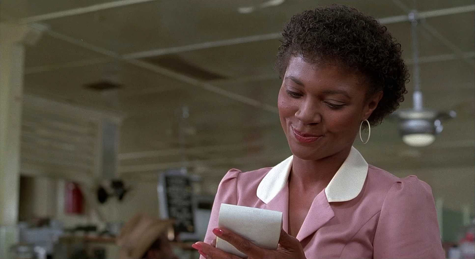
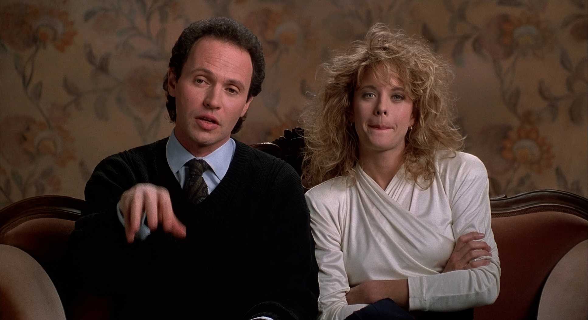
The interview segments are another brilliant choice. Centered, simple frames of “real” couples. It breaks the fourth wall just enough to make the audience feel like they’re part of a documentary on love, rather than just watching a movie.
Color Grading Approach

From my perspective in the grading suite, this is the good stuff. The film leans into a warm, saturated palette of ambers and golden yellows. The greens are pulled back just enough to let the autumn colors pop.
What’s interesting is the “tonal sculpting.” Since this was timed for film print, the blacks aren’t “crushed” they’re soft and lifted. This is a huge part of why the movie feels “cozy.” Harsh, deep blacks create tension and drama; soft, milky blacks feel safe and nostalgic. The highlights have that beautiful film roll-off that gives everything a slight glow. Skin tones are kept natural and healthy. Even when the “story” gets cold, the underlying density of the image stays warm. It’s like a perfectly brewed cup of tea enveloping and consistent.
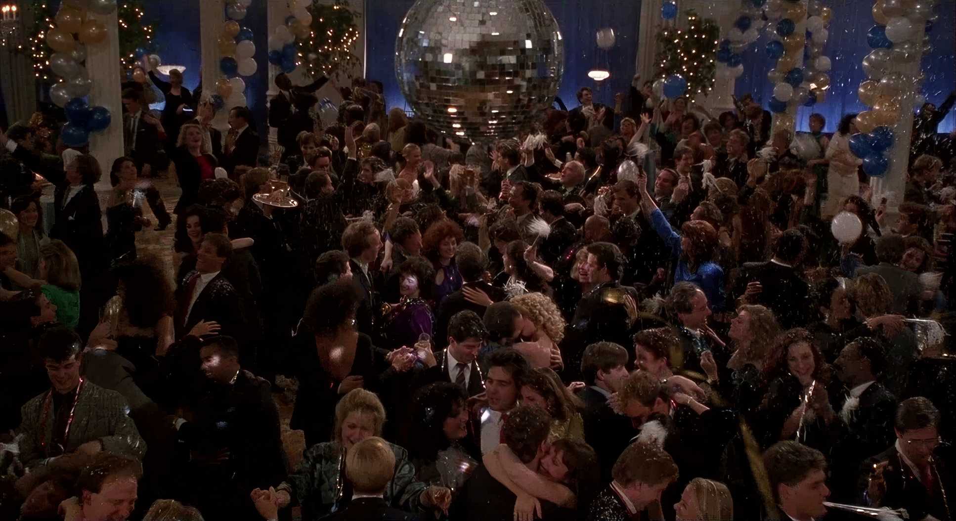
When Harry Met Sally… (1989) Film Stills
A curated reference archive of cinematography stills from When Harry Met Sally… (1989). Study the lighting, color grading, and composition.


- Also read: PHILADELPHIA (1993) – CINEMATOGRAPHY ANALYSIS
- Also read: CHANGELING (2008) – CINEMATOGRAPHY ANALYSIS
Browse Our Cinematography Analysis Glossary
Explore directors, cinematographers, cameras, lenses, lighting styles, genres, and the visual techniques that shape iconic films.
Explore Glossary →