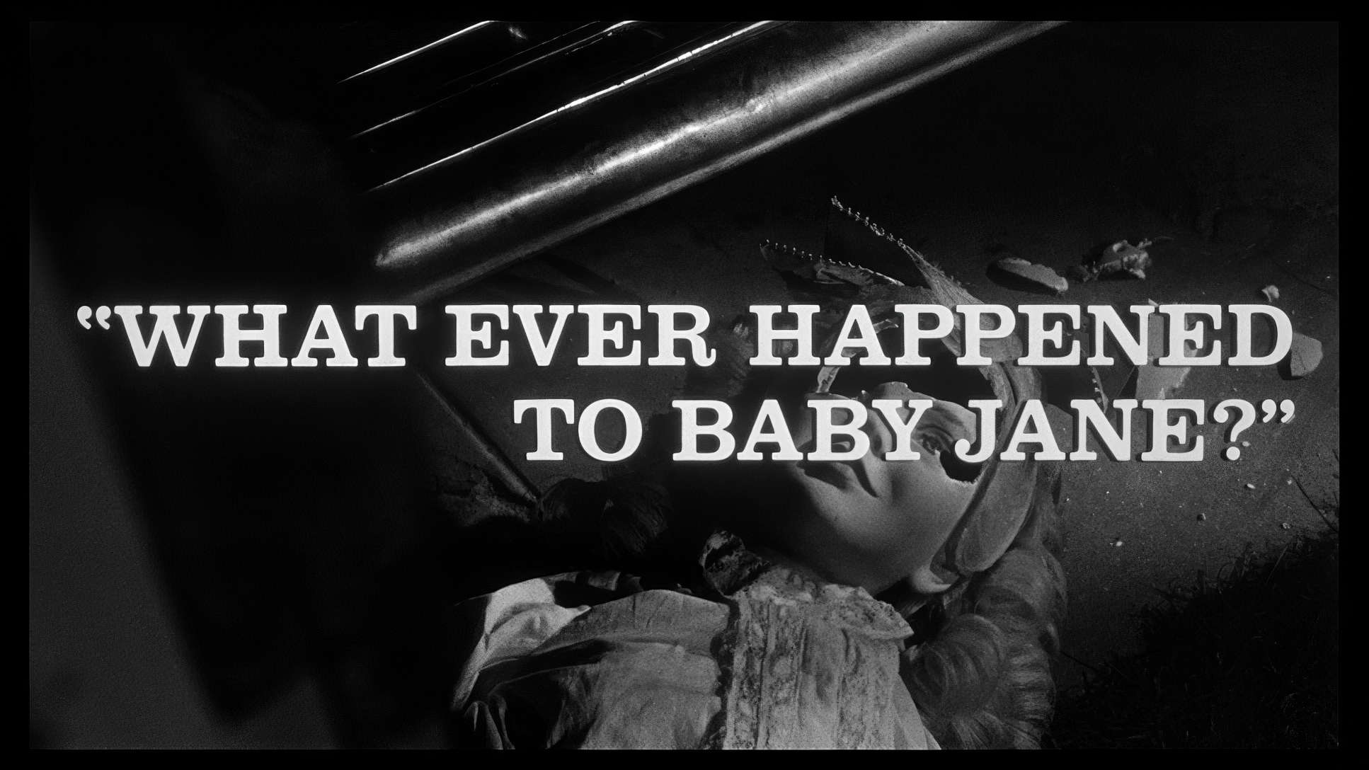
One thing I’ve learned is that the most iconic visual statements usually come from filmmakers who are backed into a corner. Limitations breed grit. That’s exactly why Robert Aldrich’s 1962 masterpiece, What Ever Happened to Baby Jane?, still hits so hard sixty years later.
This isn’t some polished psychological thriller. It’s a raw, unpretentious clinic in how a legendary rivalry can be amplified by shrewd cinematography. Released just two years after Psycho, it arrived right as audiences were developing a taste for a darker, more unsettling breed of horror. It birthed the “Hagsploitation” genre, sure, but if you look past the camp and the headlines, there is a serious level of craft here that we need to talk about.
About the Cinematographer
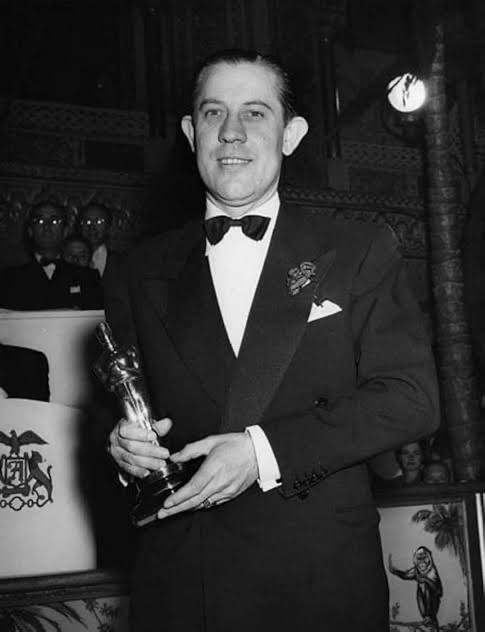
Behind the camera was Ernest Haller. He might not have the “household name” status of some Golden Age legends, but in our industry, the man is a giant. One detail from the production history that I love: Haller was Bette Davis’s go-to guy. That kind of trust is a game-changer on set. It’s a shorthand a shared understanding of how to light and frame an actress to capture her at her most vulnerable, or in this case, her most monstrous.
Haller was a studio system veteran, the guy responsible for the crisp looks of Jezebel and Mildred Pierce. But Baby Jane was a different beast entirely. It was greenlit on a shoestring budget. For those of us working in production today, we know what that means: no massive sets, no safety nets. You lean on faces, you lean on shadows, and you find the truth in the decay of a real location.
Technical Aspects & Tools
What Ever Happened to Baby Jane?
Technical Specifications • 35mm • 1.78 SphericalWhen you look at the 1962 production through a modern lens, the resourcefulness is staggering. They shot on 35mm, likely using a stock like Kodak Double-X 5222. As a colorist, I love that stock it has this beautiful, fine grain and a tonal range that allows you to really push the shadows.
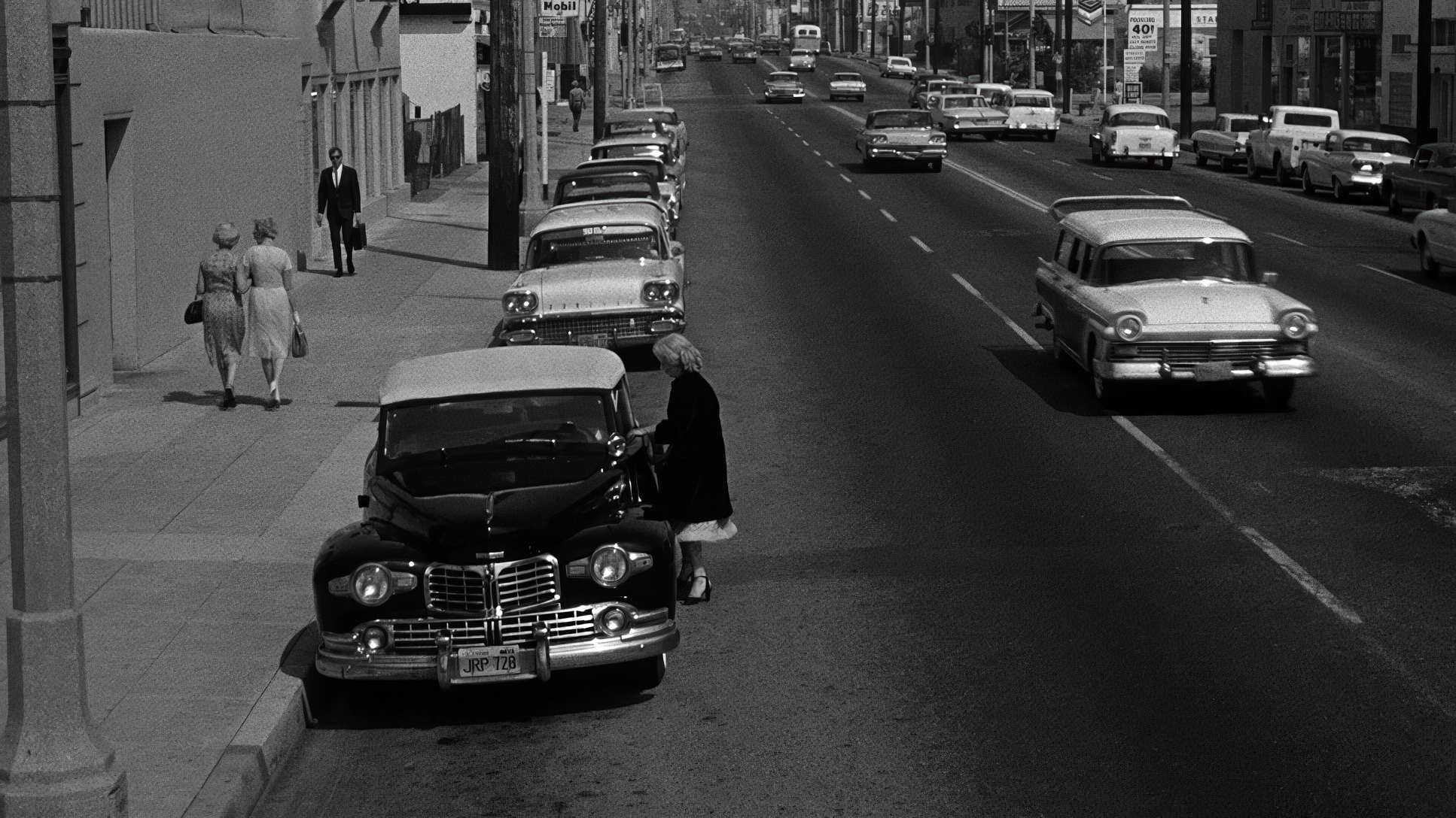
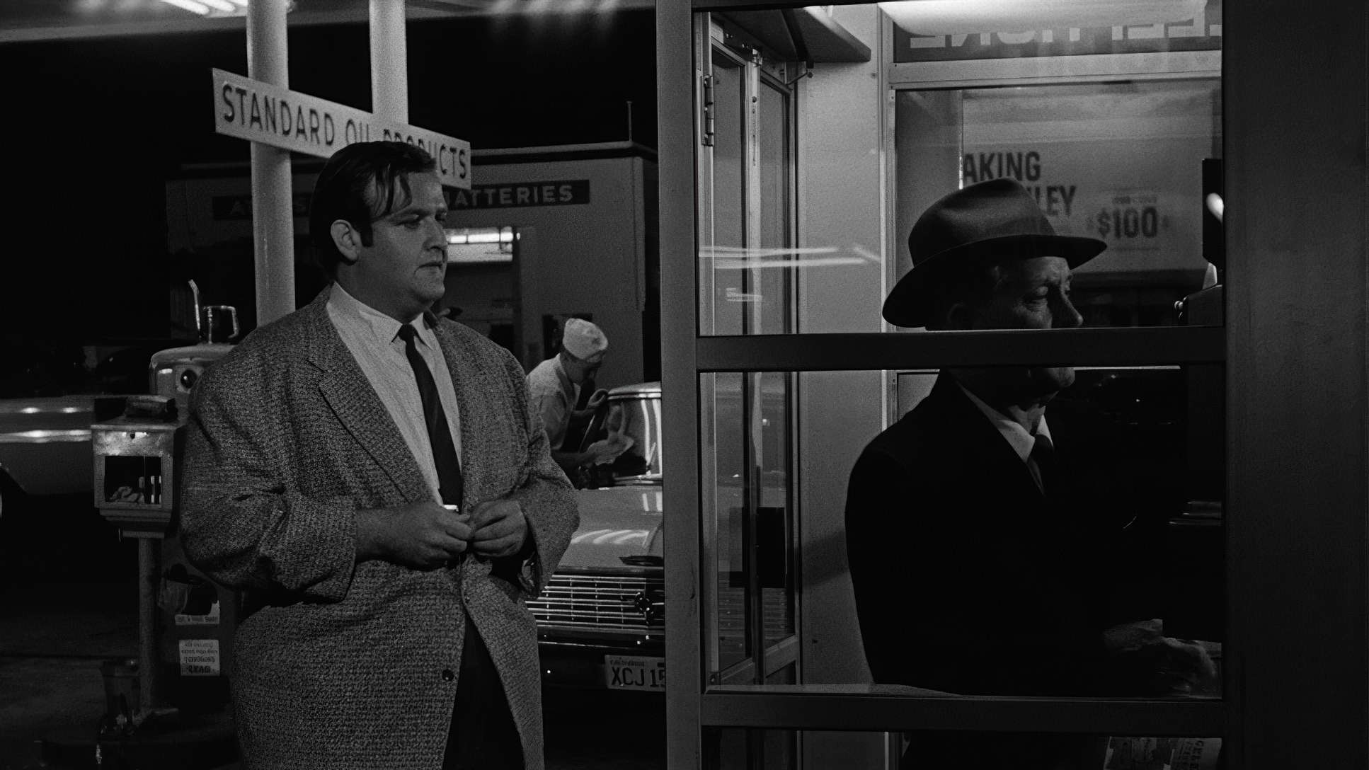
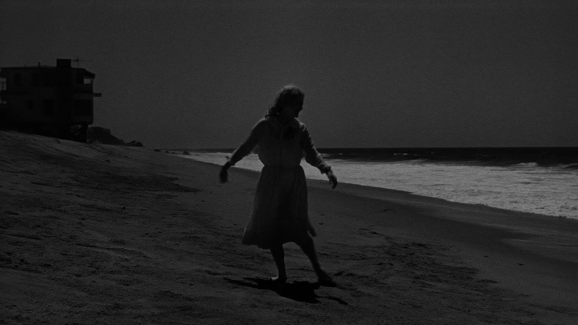
The budget meant they couldn’t afford “process shots” (rear projection) for the scenes where Jane is driving. So, what did they do? They strapped Ernie Haller to the front of the car and had Bette Davis actually drive him around West Hollywood. You can’t fake that look. The way the real streetlights hit her face creates a gritty, documentary-style realism that no green screen could ever replicate. It grounds Jane’s madness in a world that feels tangible and dangerous.
Inspiration Behind the Cinematography
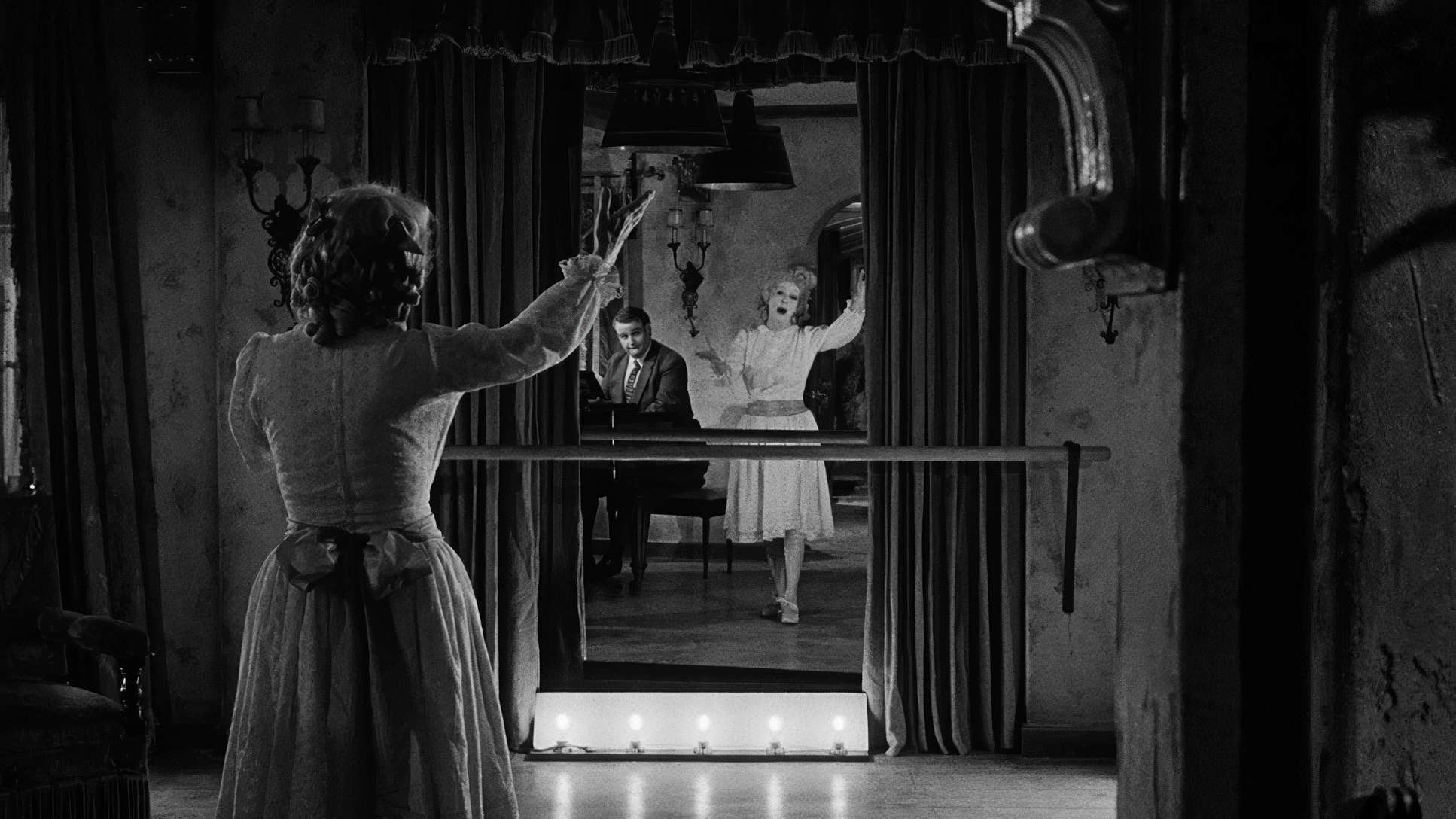
Visually, the film is a love letter to Gothic psychological horror. If Bette Davis was “the storm” and Joan Crawford was “the eye of the storm,” the camera had to be the thing that captured the wreckage.
The crumbling Hollywood mansion isn’t just a location; it’s a character. It’s a mausoleum for forgotten dreams. The cinematography embraces this by leaning into confinement. The shadows aren’t just decorative; they are manifestations of Jane’s deteriorating mind, slowly creeping in to swallow Blanche whole. Every visual choice was dictated by that sense of psychological unraveling.
Lighting Style

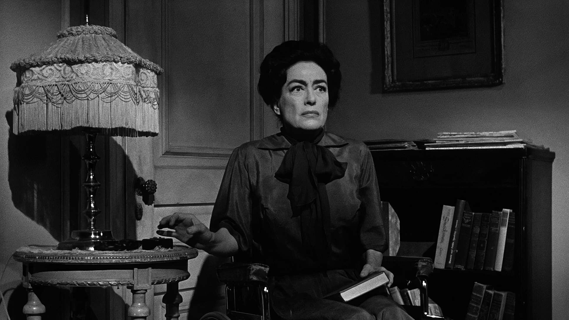
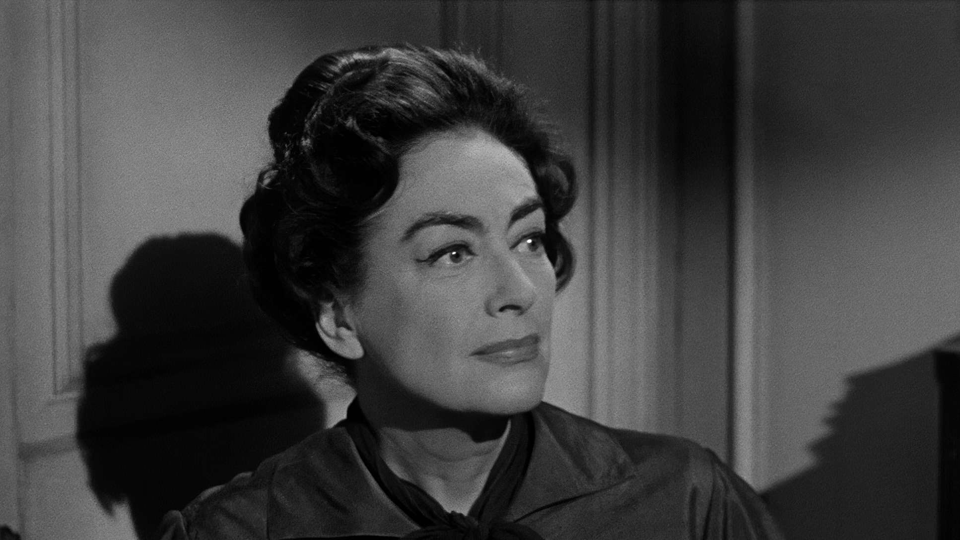
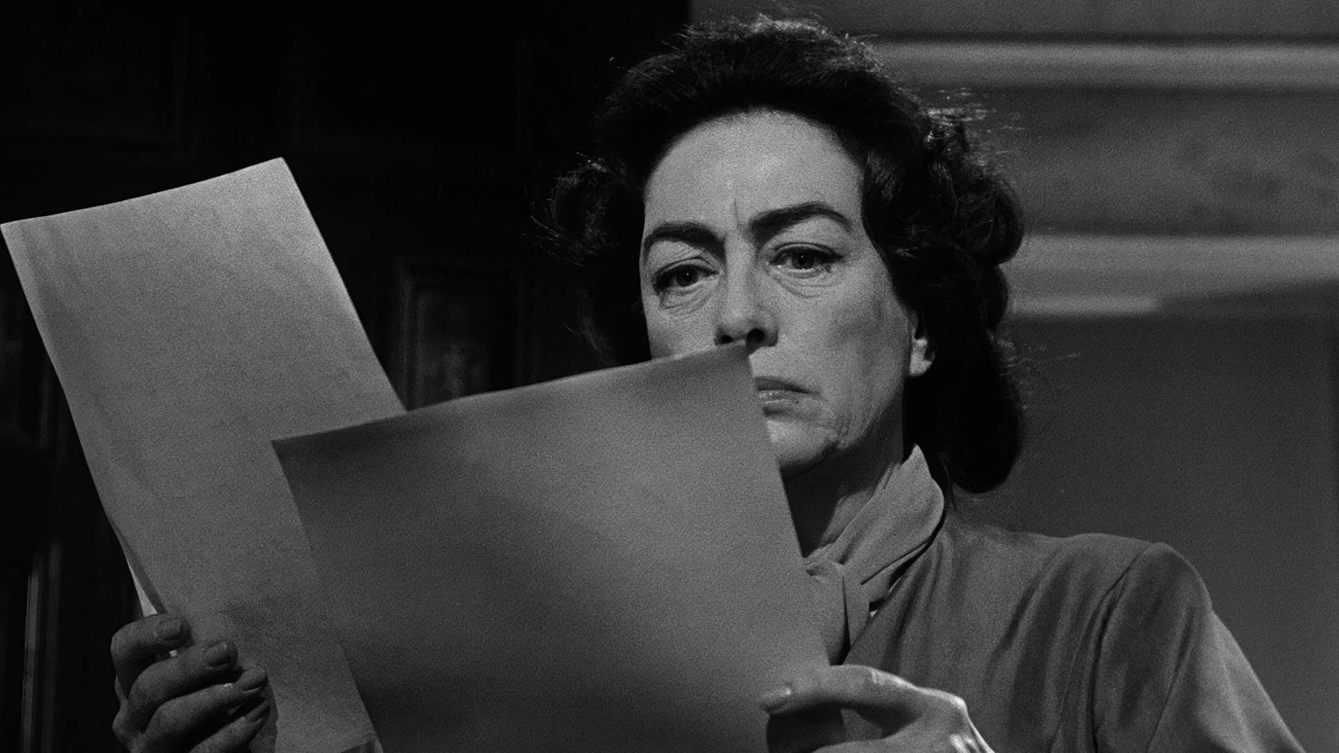
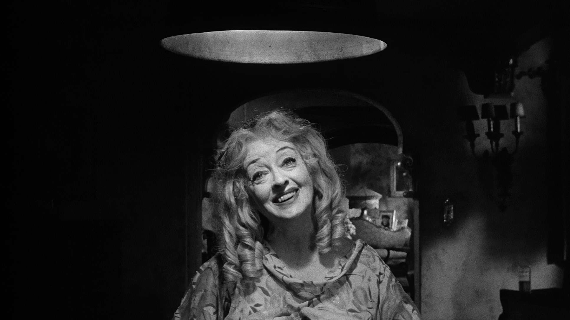
In a black-and-white film, lighting is your entire world. Haller’s use of chiaroscuro here is masterly. He isn’t trying to make anyone look “good” in the traditional sense; he’s sculpting drama.
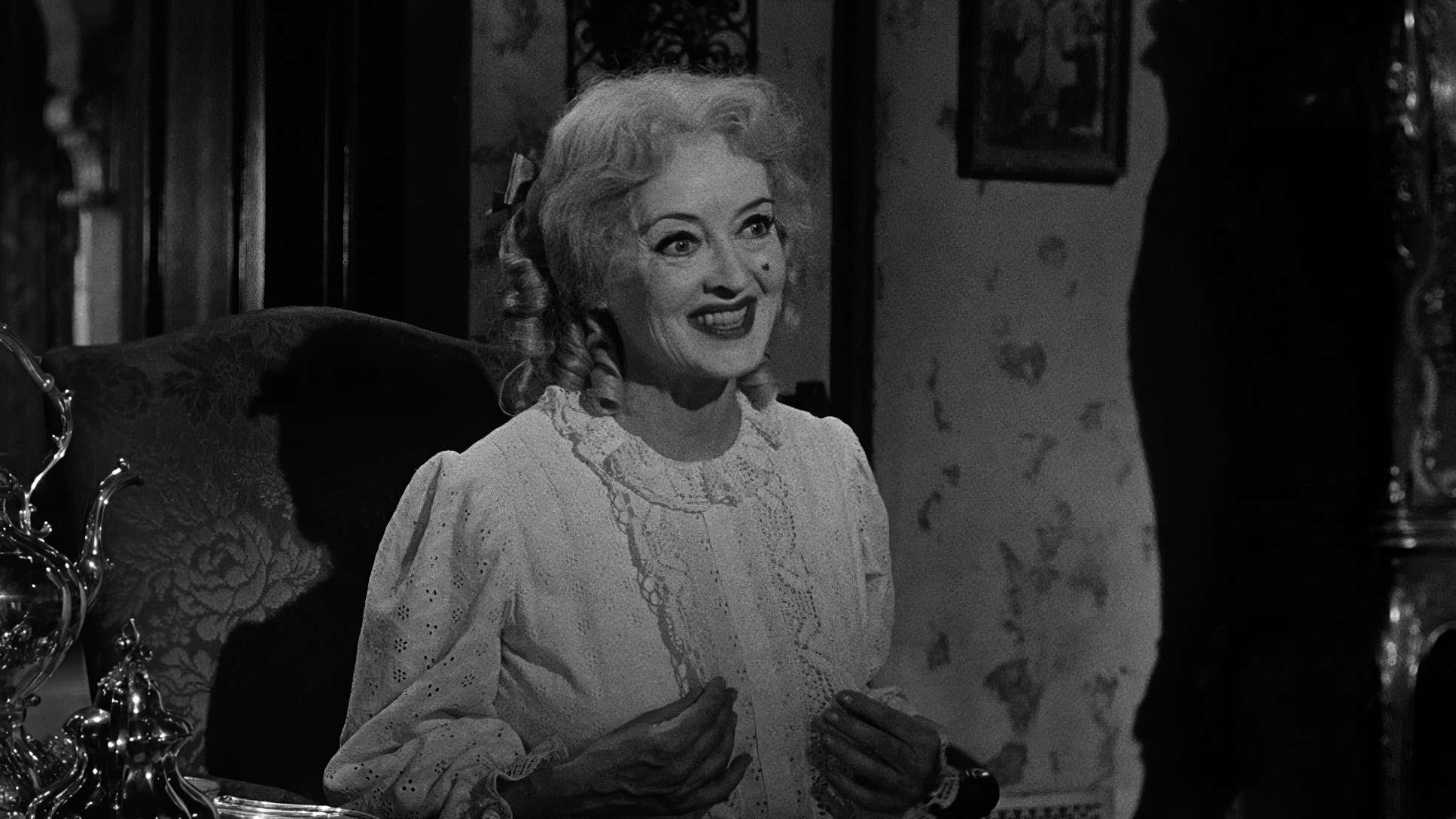
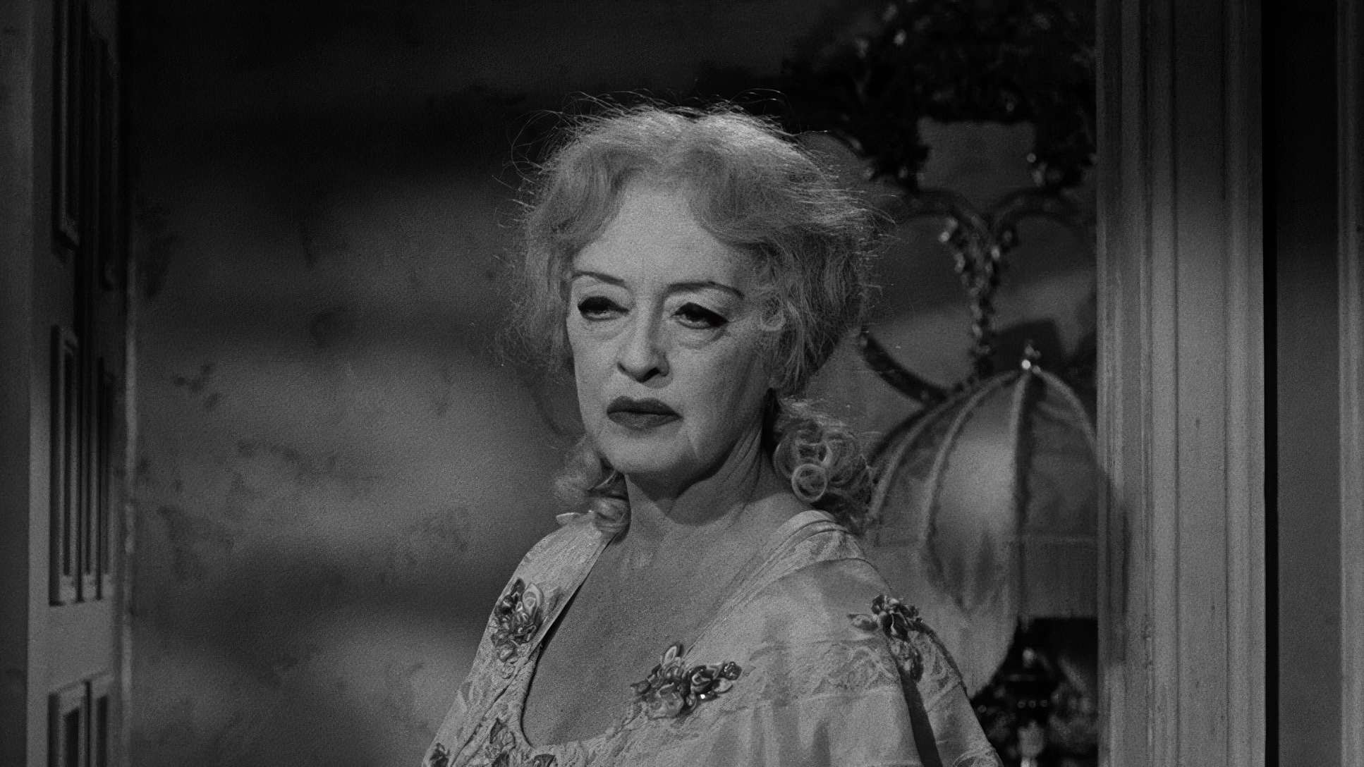
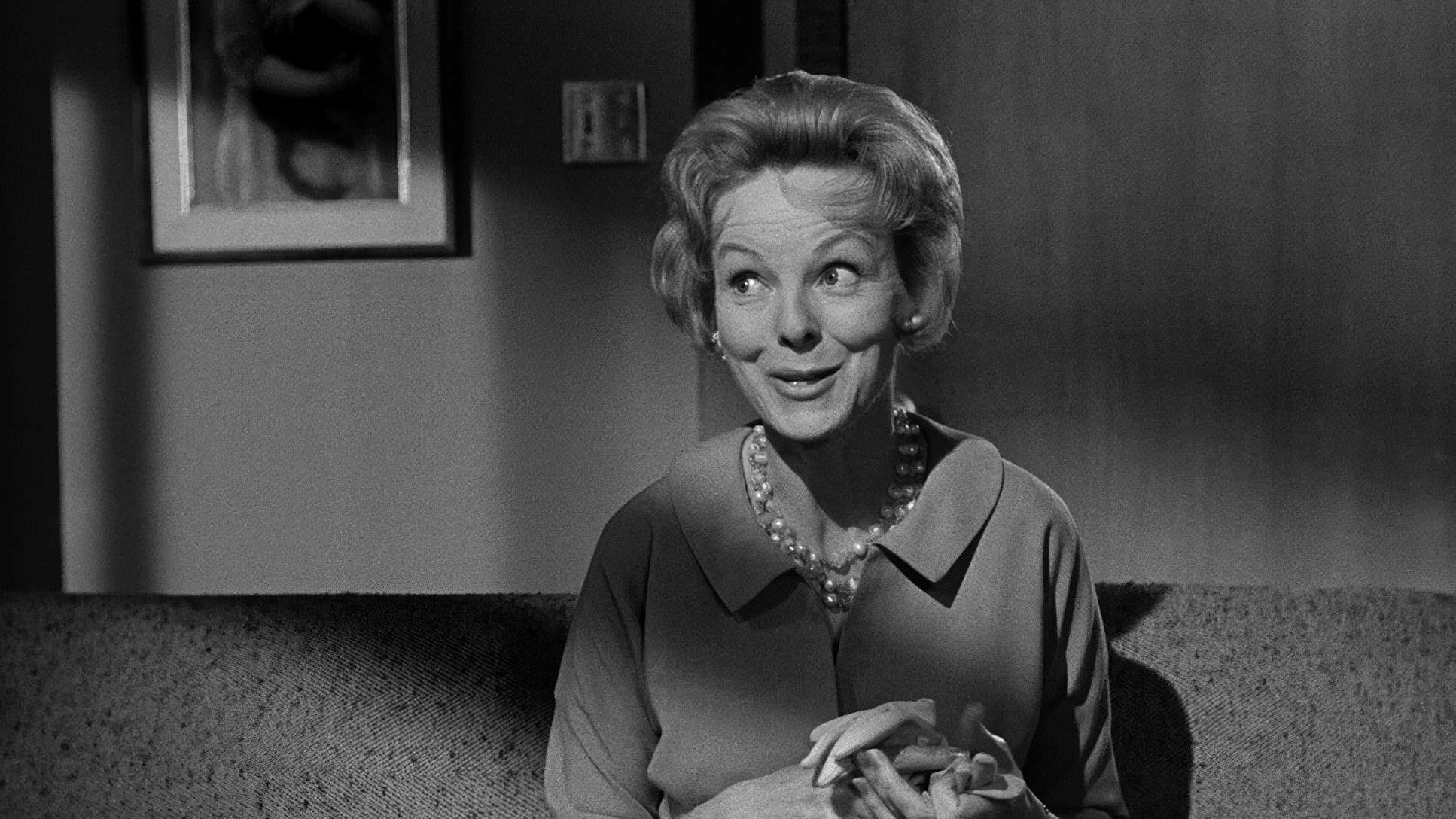
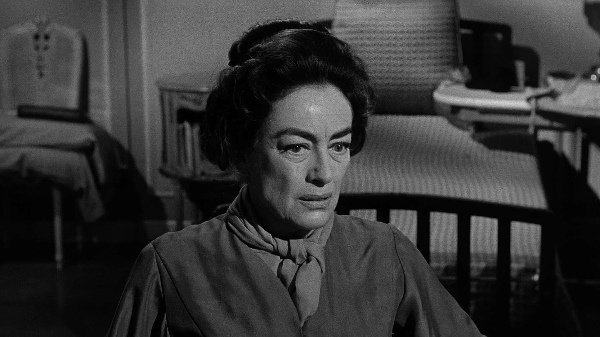
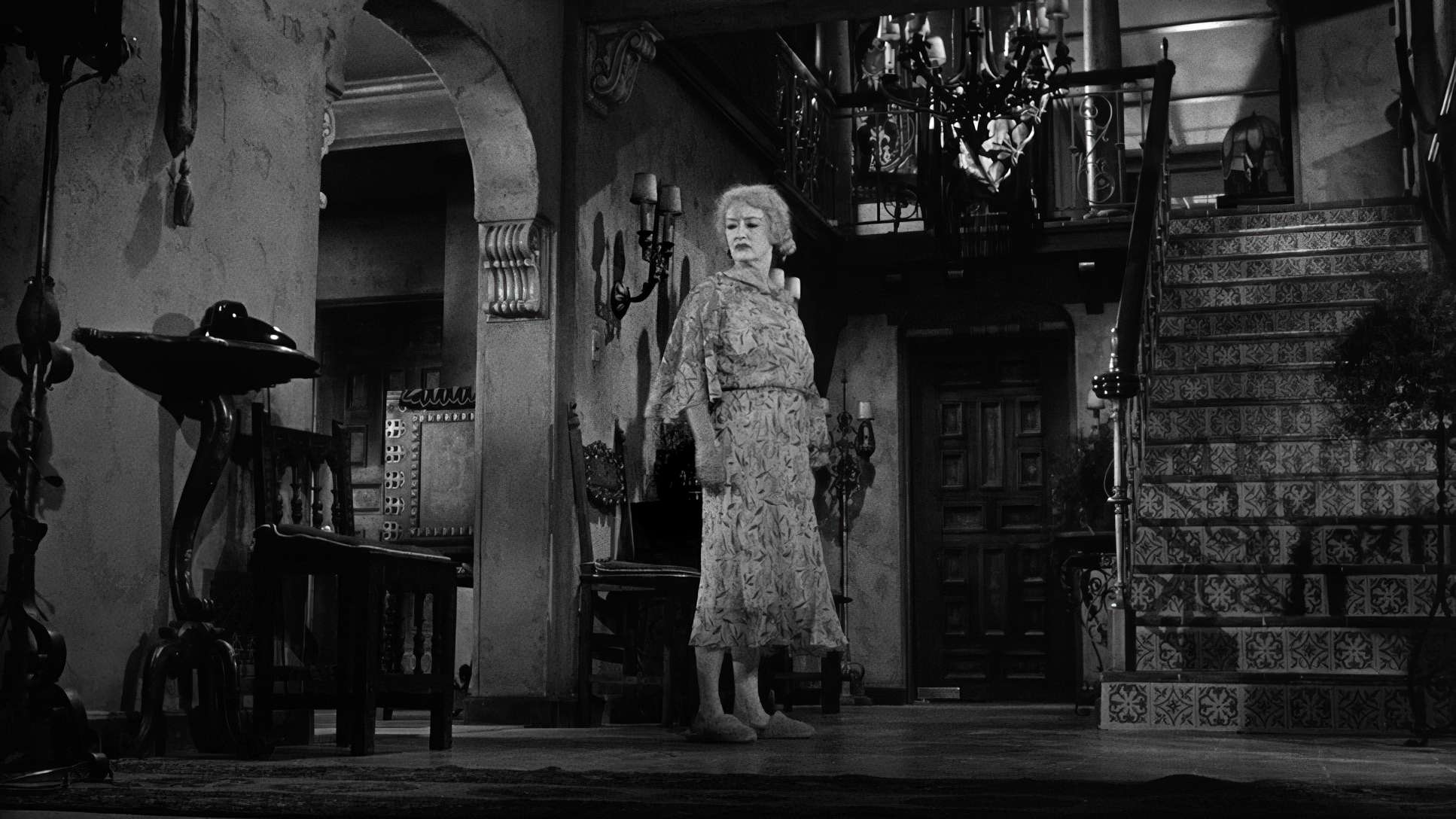
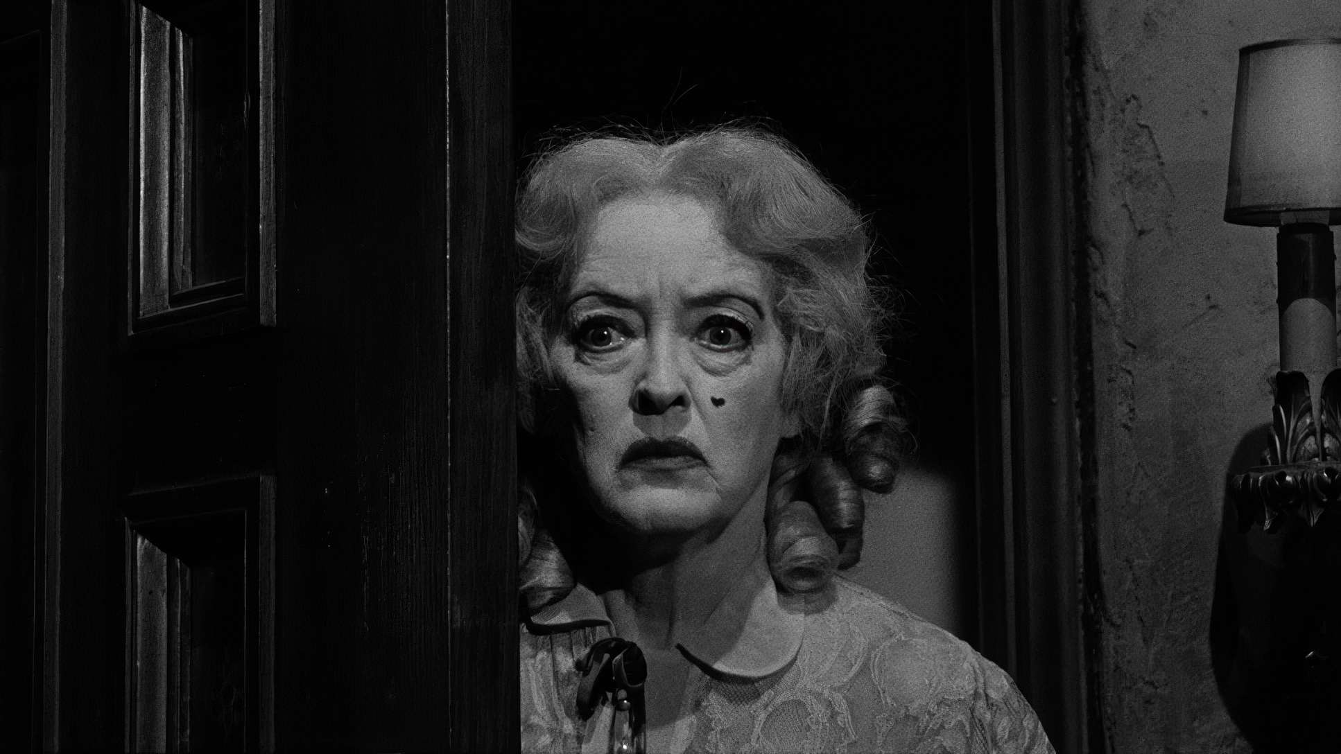
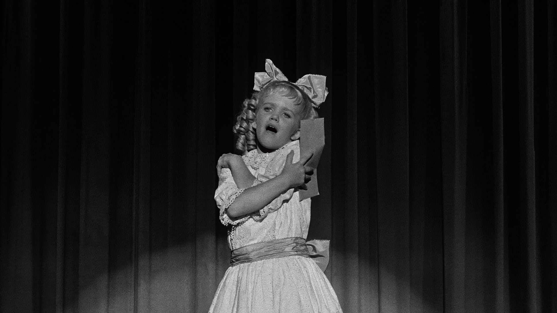
Take Jane’s “white chalky makeup.” Bette Davis designed that herself to look like a woman who never washes her face. From a colorist’s perspective, that makeup is a gift. Haller used hard, directional light to catch every crack and pore. He’s using high contrast to turn her face into a landscape of derangement inky blacks meeting harsh, blown-out highlights.
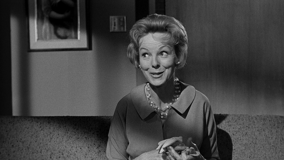
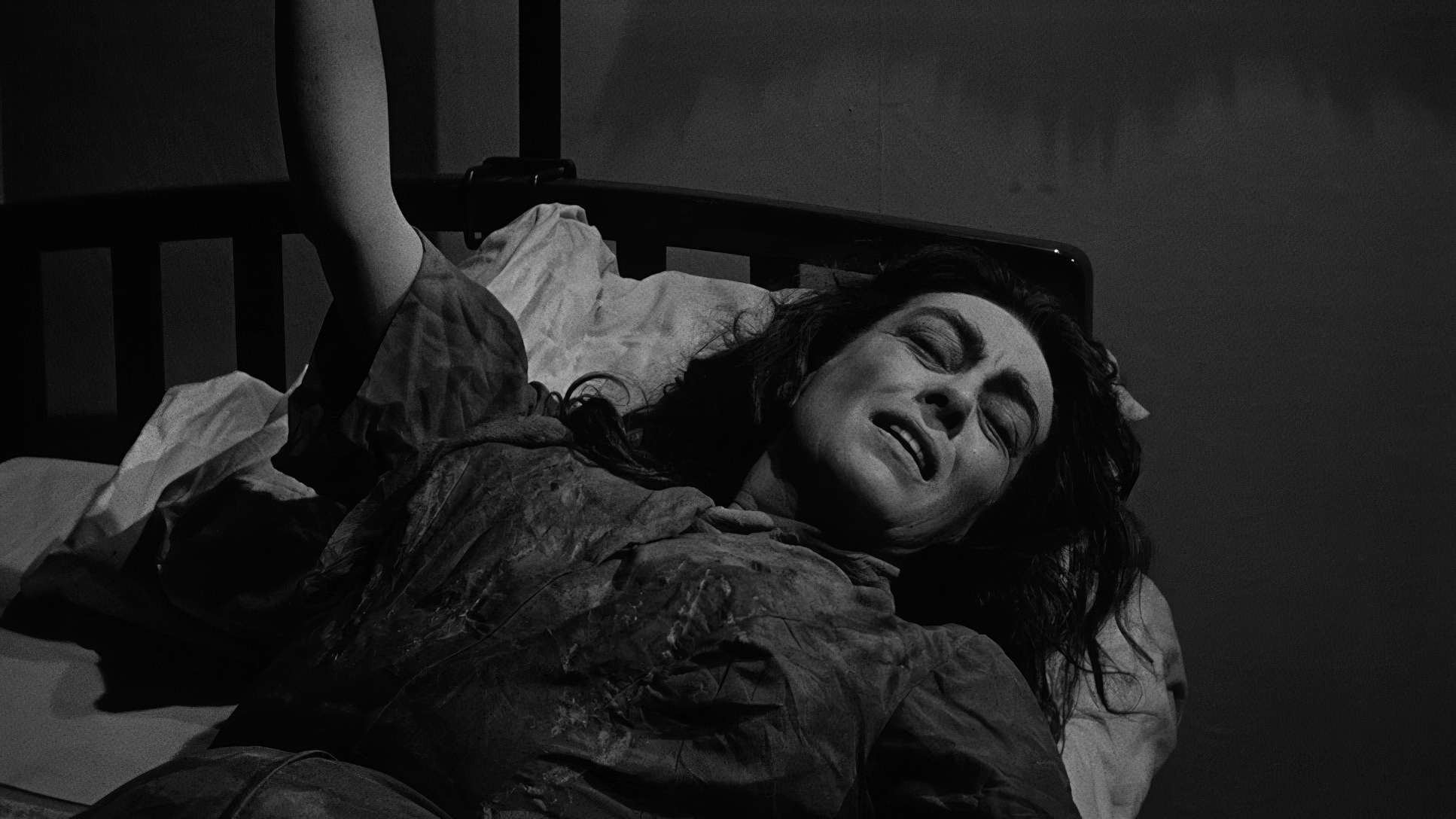
For Blanche, the light is softer, usually motivated by a window or a bedside lamp. It feels natural, but the shadows are always encroaching. The “dynamic range” decisions here are subtle but brilliant. While Jane’s scenes are pushed into aggressive, crushed blacks, Blanche’s world exists in a more nuanced grayscale, reflecting her emotional paralysis.
Camera Movements

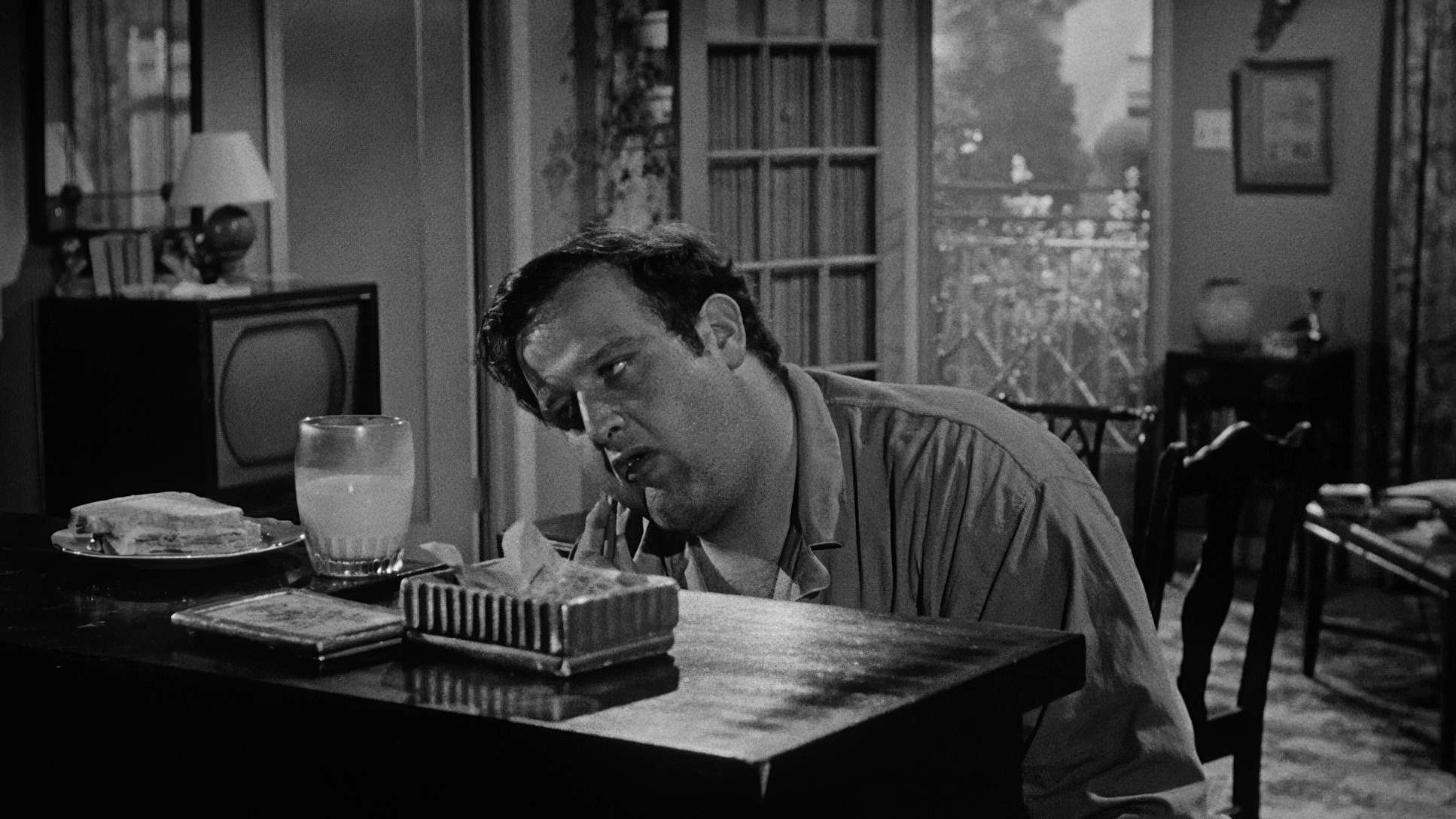
In Baby Jane, what the camera doesn’t do is just as important as what it does. Blanche is paralyzed. Her world has shrunk to the size of a bedroom. To mirror that, the camera often stays static, observing her with a suffocating intensity. When it does move around her, it’s usually a slow, predatory push-in that underscores her helplessness.
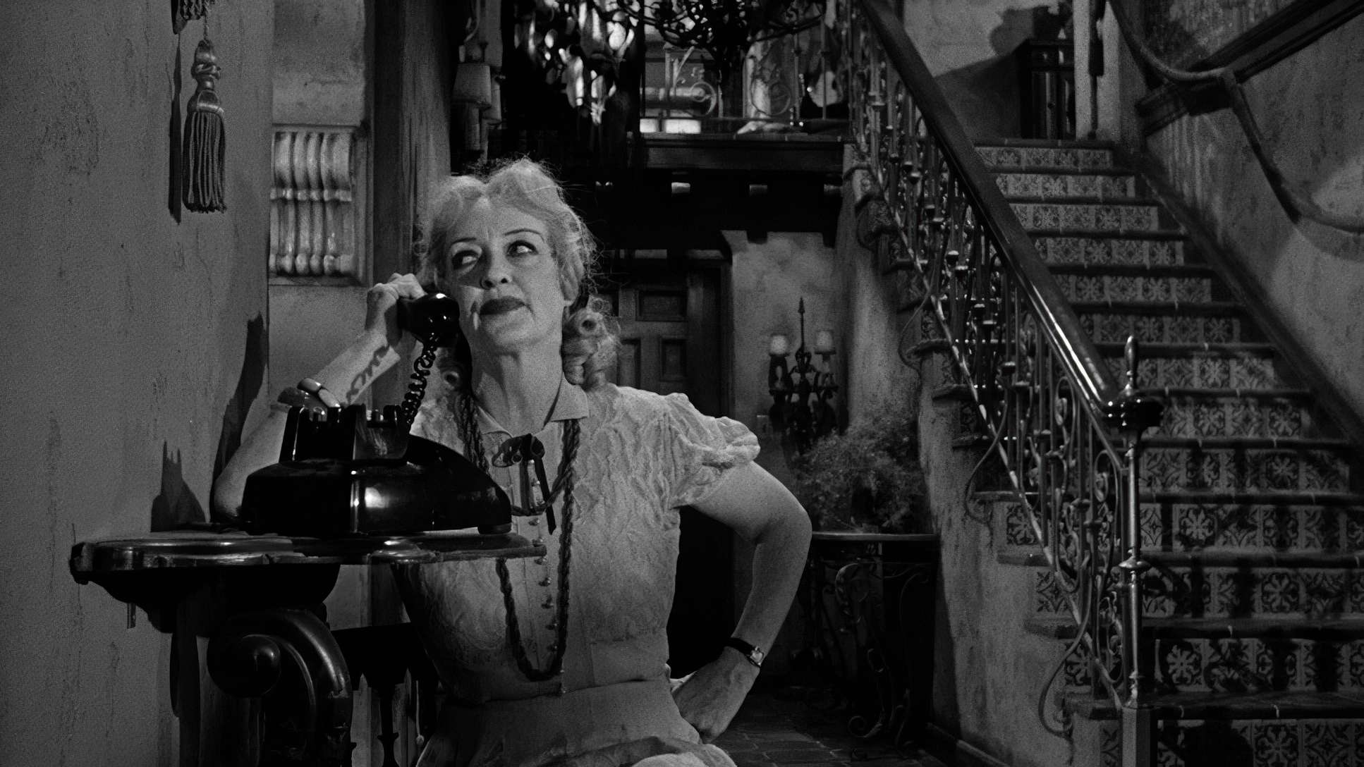
Jane’s coverage is the opposite. It’s more dynamic, sometimes even feeling unhinged. While true handheld wasn’t common then, there’s an agitation to her scenes. The cuts are sharper. The camera feels like it’s struggling to keep up with her erratic energy, mirroring her slide into total madness.
Compositional Choices

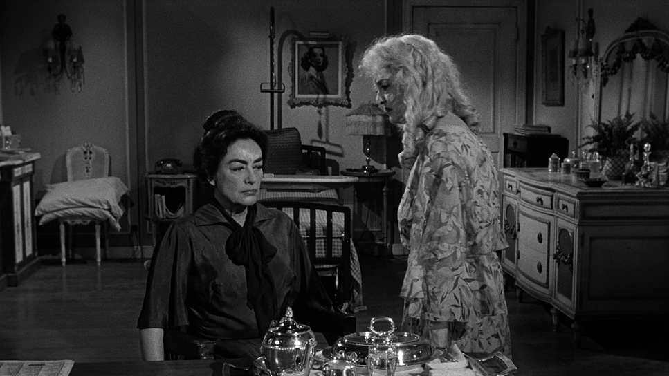
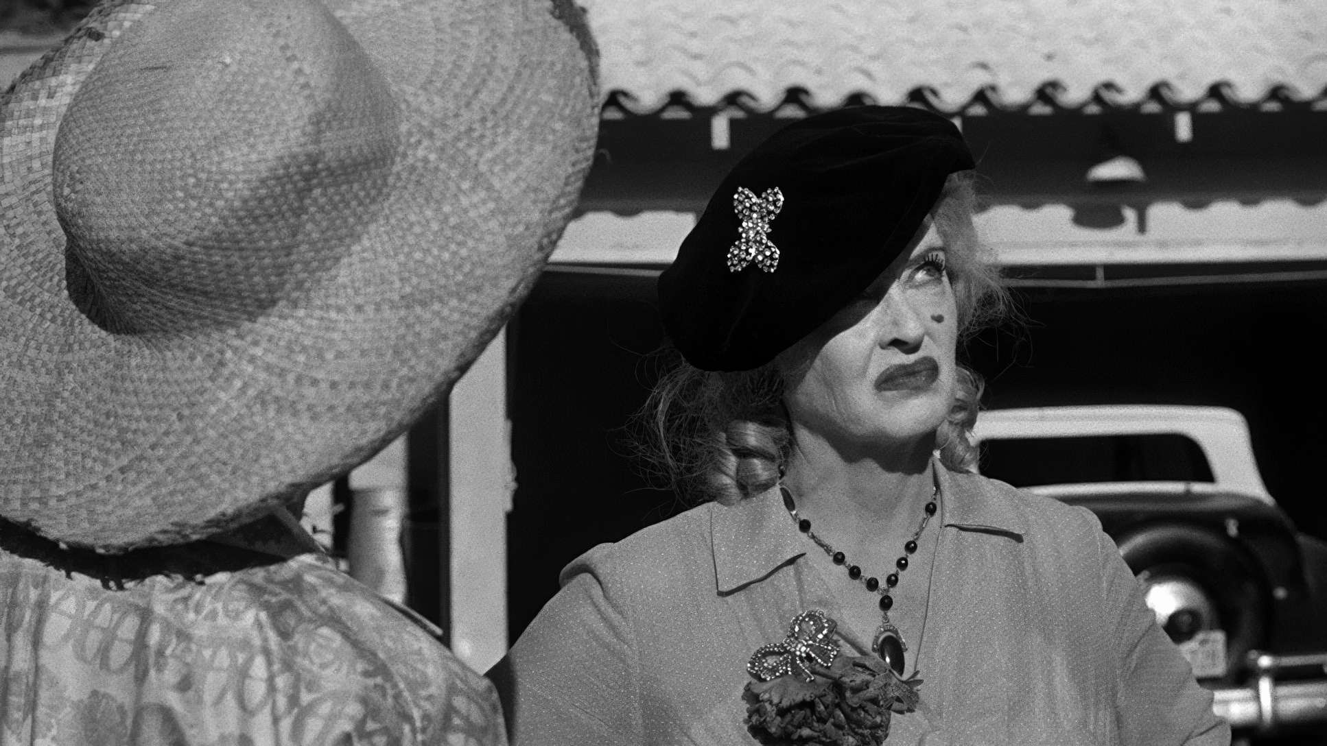
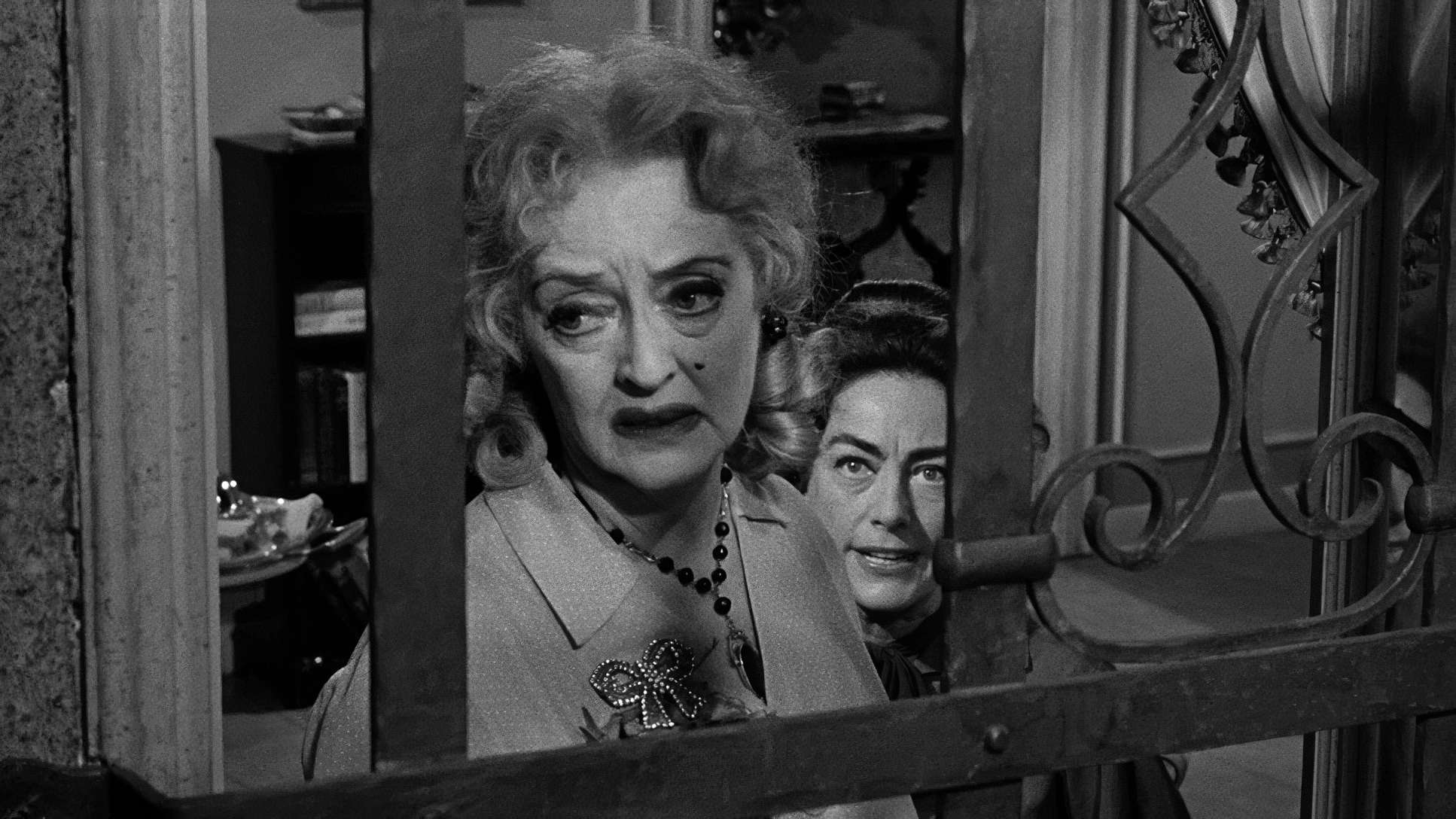
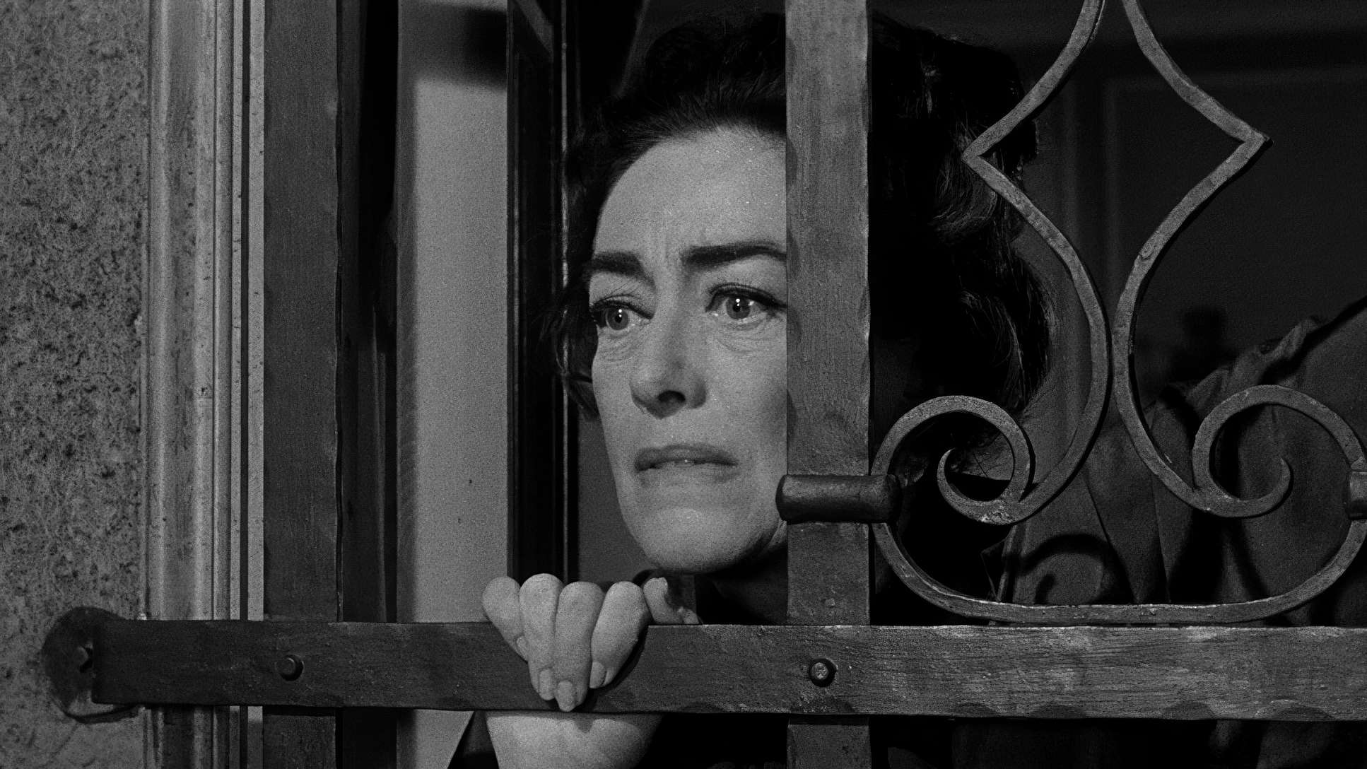
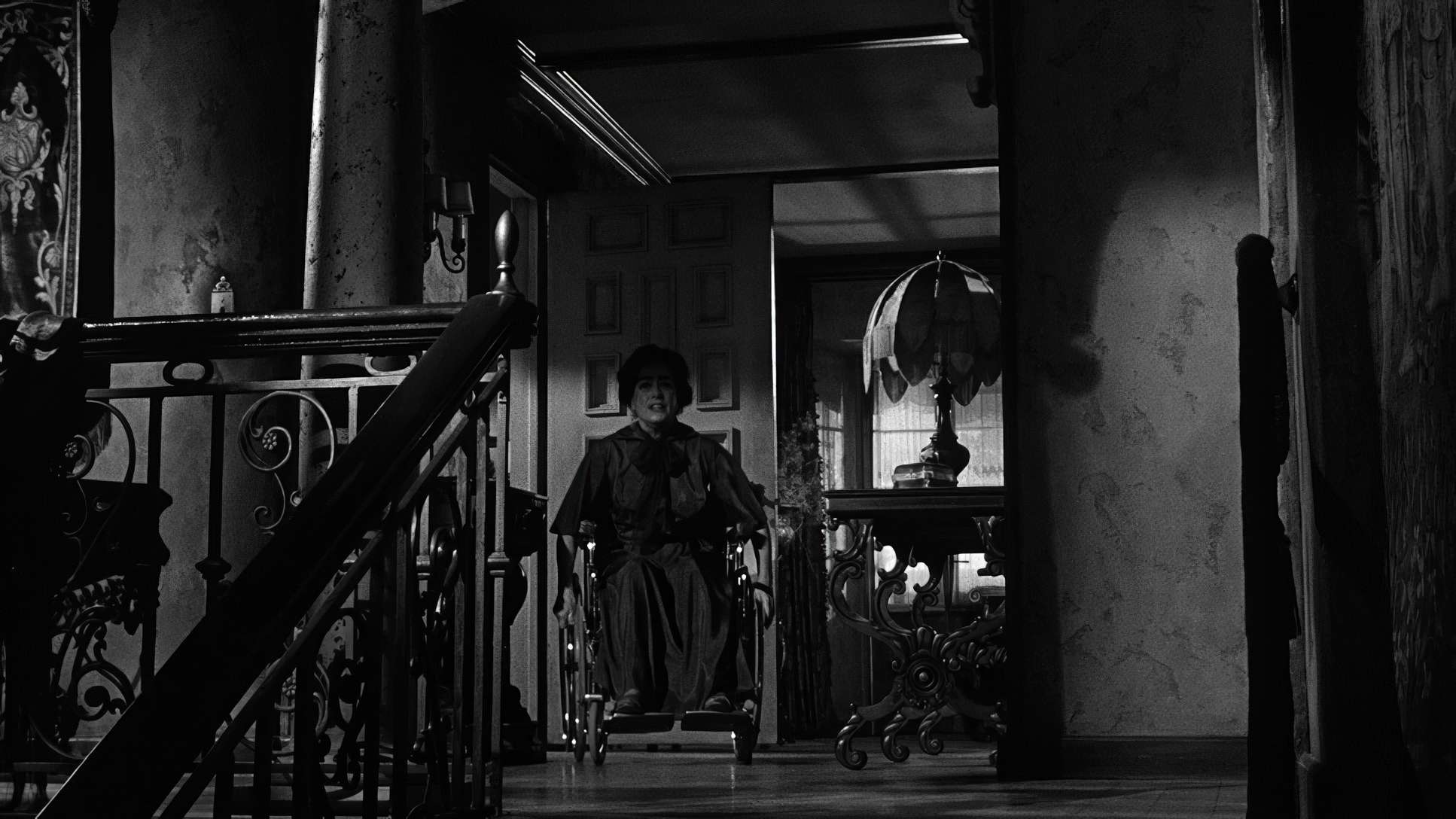
The framing here is all about power dynamics and isolation. We constantly see Blanche “caged” by vertical lines doorframes, windows, or the heavy bars of her antique bed. She’s often placed small in the frame, swallowed by the decaying opulence of the room.
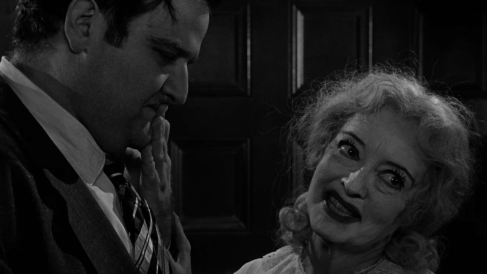
Jane, meanwhile, is composed to dominate. Haller uses grotesque close-ups to force the audience to confront her derangement head-on. There’s no emotional distance. When the two are in the same frame, Jane is usually looming, centrally positioned to show she holds all the cards. The house itself is framed to feel like a labyrinth of long, shadowy hallways and cluttered corners a visual metaphor for their stagnant lives.
Lensing and Blocking

We don’t have the exact lens metadata, but the visual output suggests a heavy reliance on standard and slightly telephoto lenses. These lenses compress the space, making those mansion rooms feel even more claustrophobic than they already were.
The blocking is where the “dance” happens. Aldrich and Haller used the physical space to heighten the torture. Jane is constantly invading Blanche’s personal space leaning over her, standing at the foot of the bed, looming. By using tighter lenses for these confrontational moments, they force an uncomfortable intimacy on the viewer. You feel trapped in that room with them.
Color Grading Approach (The Monochromatic Palette)
Even though this is a B&W film, as a colorist, I still see a “palette.” It’s just a palette of tonality. If I were sitting at my desk grading a remaster of this today, my main goal would be preserving that “print-film sensibility.”
I’d be looking at “tonal sculpting” using qualifiers and power windows to accentuate Davis’s pallor against the dark backgrounds. You want to ensure that her dark, ill-fitting clothes don’t just disappear into the shadows. You need that separation. The highlight roll-off would be critical, too. In 1962, the whites from windows had a distinct softness. You’d want to avoid a “digital” clip at all costs, keeping the transitions from highlight to mid-tone feeling organic and heavy with dread.
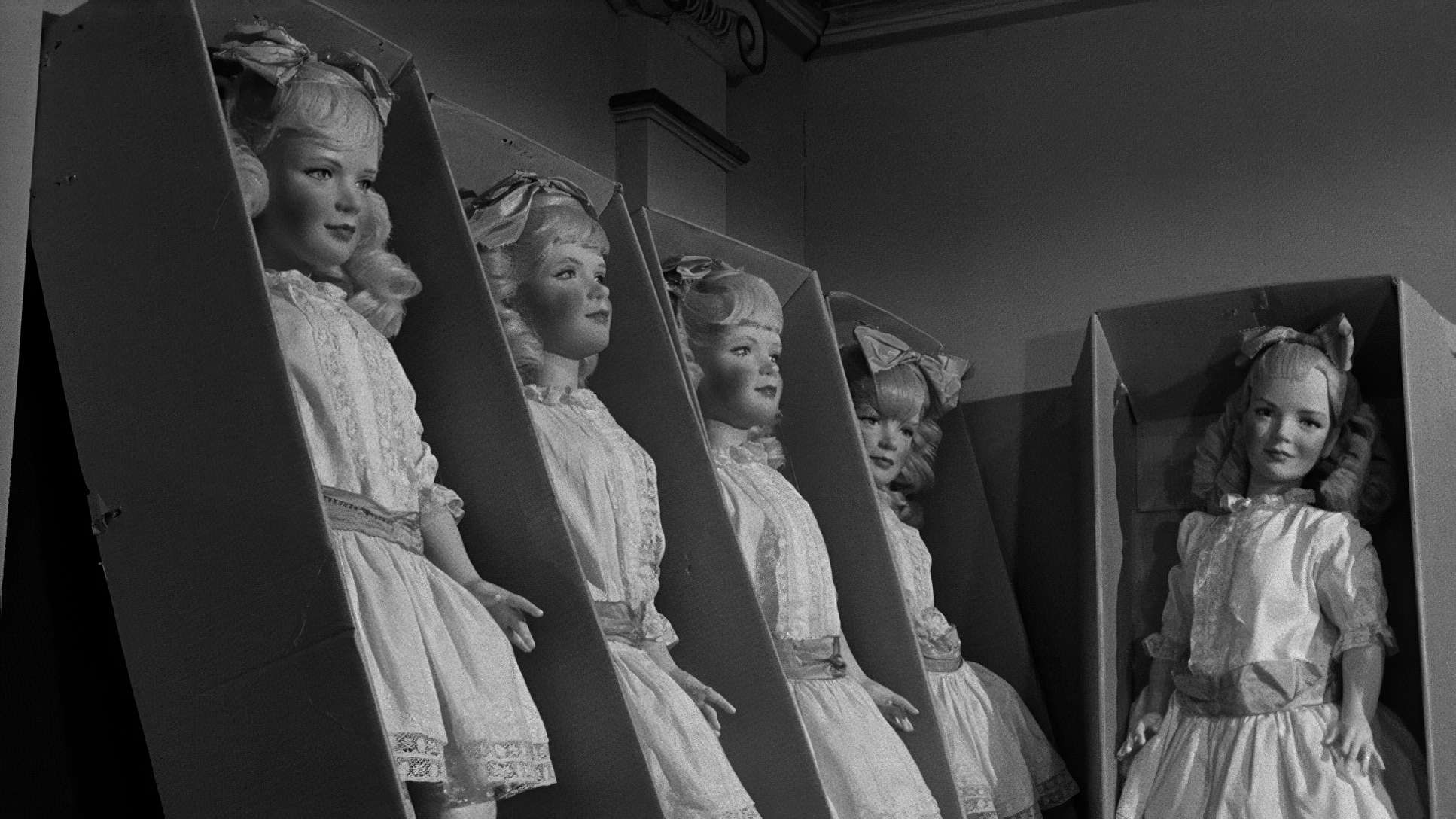
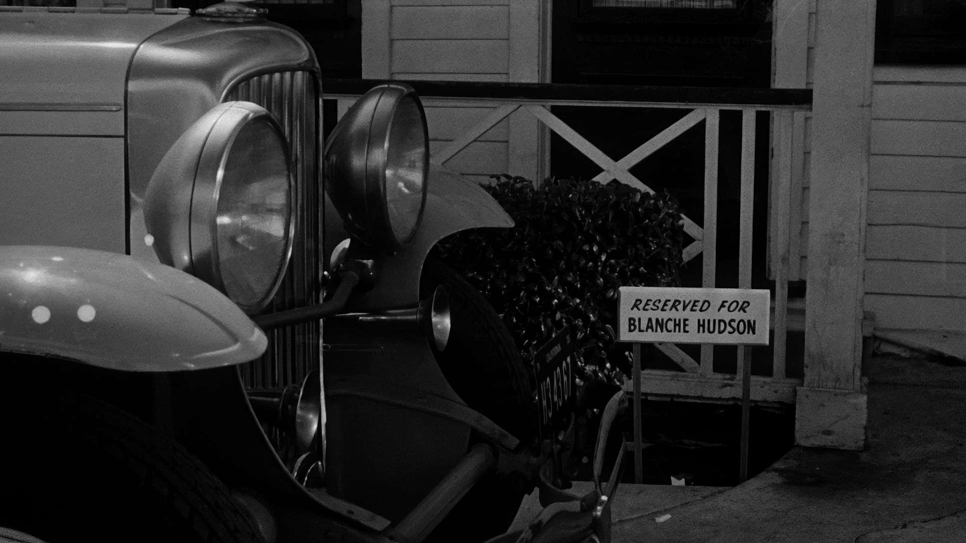
What Ever Happened to Baby Jane? (1962) Film Stills
A curated reference archive of cinematography stills from WHAT EVER HAPPENED TO BABY JANE? (1962). Study the lighting, color grading, and composition

- Also read: SONG OF THE SEA (2014) – CINEMATOGRAPHY ANALYSIS
- Also read: LA STRADA (1954) – CINEMATOGRAPHY ANALYSIS
Browse Our Cinematography Analysis Glossary
Explore directors, cinematographers, cameras, lenses, lighting styles, genres, and the visual techniques that shape iconic films.
Explore Glossary →