Most films just flicker by. Then there are the rare ones that leave a permanent mark on your DNA as a creator. Emir Kusturica’s Underground (1995) is, for me, the absolute gold standard of that second category.
It’s a masterclass in how cinematography stops being a “service” to the script and starts breathing as its own character. It’s chaotic, farcical, and loud, but underneath the madness is a level of visual intentionality that every filmmaker should study.
About the Cinematographer
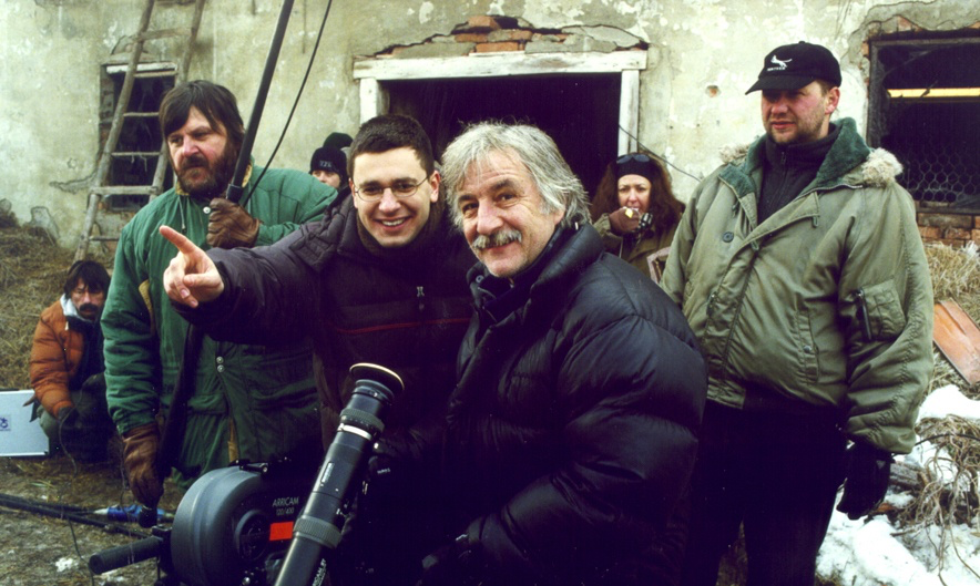
The man responsible for this controlled chaos was Vilko Filač. He was Kusturica’s long-time visual partner, the guy who lensed Arizona Dream and When Father Was Away on Business. You can see the shorthand they developed over the years; Filač didn’t just “capture” Kusturica’s maximalist energy he sculpted it.
He had this fearless way of embracing a cluttered frame without letting it feel messy. His style feels less like an observer standing behind a tripod and more like a participant in the middle of a riot. It’s a perfect example of what happens when a director and DP have total, unspoken trust: you get bold, visceral imagery that isn’t afraid to get its hands dirty.
Inspiration Behind the Cinematography
Kusturica famously prioritized “energy” over rigid narrative logic, and that’s the bedrock of this film’s look. Underground isn’t a movie you just watch; it’s a world you inhabit. Translating the messy, tragic history of Yugoslavia full of satire, magical realism, and raw patriotism into a single visual style is a tall order.
Filač leaned into the “farcical” nature of the story. He didn’t shy away from the horrific or the absurd. Instead, he framed the tragedy with a heightened, almost cartoonish levity. Think of the opening: Blackie and Marco, drunk, firing guns into the air, while a brass band chases them down the street. It’s ridiculous, but Filač shoots it with such raw, immediate energy that you buy into the fantasy instantly. He’s essentially using the camera to write a visual elegy for a nation that was slowly disappearing.
Lensing and Blocking
This is where the technical genius really shows. Underground is a movie with a massive ensemble, and managing that many moving parts requires surgical precision. Filač heavily favored wider lenses. In the tight, sweaty confines of the bunker, these lenses do something brilliant they distort the perspective just enough to make the world feel slightly hallucinatory. It pulls you into the frame, making you feel the claustrophobia of the celebrations and the desperation of the arguments.
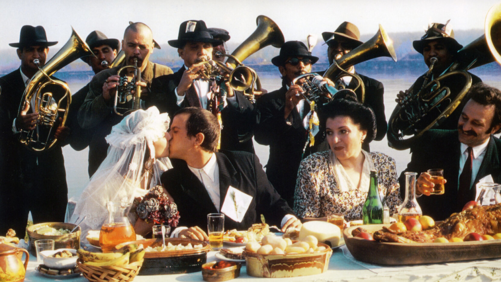
The blocking is equally insane. Filač and Kusturica utilized “ensemble staging” where characters, animals, and props are layered across multiple planes of depth. As a viewer, your eye is constantly being led through the frame. Take the wedding scene where the bride appears to float. That’s not just a trick; it’s a meticulously blocked moment where lens choice and character positioning hide the “how” and leave you with the “wow.” I’ve always debated whether Marco’s “alpha male” physicality was amplified by wide-angle distortion or just grounded by a normal lens I lean toward the latter, but the fact that we can even have that debate shows how much thought went into the glass they chose.
Camera Movements
If the lenses provide the perspective, the camera movement provides the pulse. This isn’t a film of static, polite frames. The camera in Underground is a ballet dancer that’s had way too much coffee. Filač uses handheld and Steadicam shots to plunge us into the thick of it the parties, the fights, the cramped bunker life.
Then you have these sweeping wide crane shots that reveal the sheer scale of the sets. These aren’t just “cool shots”; they are depth cues that show you the layers of this makeshift world. The camera weaves through crowds, lingers on a face for a split second, then pulls back to show the chaos of the brass band. It feels like the camera is being swept along by the current of history itself. It’s relentless and exhausting in the best way possible.
Compositional Choices

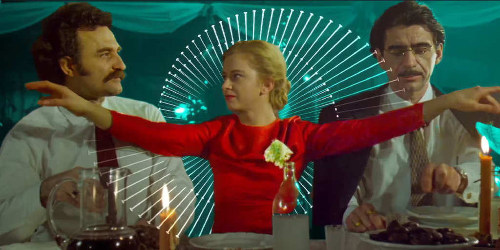
Filač’s compositions are the skeleton that keeps this sprawling epic from falling apart. Every frame is “bursting at the seams,” mirroring the messy lives of the characters. He mastered the art of deep staging—using the foreground, midground, and background simultaneously to tell three different parts of the story at once. It makes the world feel lived-in and overflowing.
I also love his use of “frame-within-a-frame.” He’ll use a doorway or a piece of bunker machinery to isolate a character, highlighting their literal and metaphorical confinement. And those wide-angle shots? They give the “monkey in a tank” moments a surreal, dreamlike quality that hits that perfect sweet spot between “this is happening” and “this is a fever dream.” The art direction in that bunker is legendary, and Filač gives it the room it needs to breathe.
Lighting Style
For me, the lighting in Underground is a beautiful study in duality. The exterior scenes the war, the invasion of Belgrade are often stark and unforgiving. Filač uses naturalistic, sometimes harsh directional light to emphasize the grit and the texture of a city under siege. The shadows are deep and the stakes feel real.
But once we drop into the bunker, the lighting logic completely shifts. It becomes a world of practicals: bare bulbs, flickering generators, and the warm glow of “man-powered” machinery. It’s a masterclass in low-key lighting. Filač creates this perpetual twilight that feels both cozy and terrifying. The highlight roll-off from those flickering bulbs is incredibly nuanced, keeping the textures of the bunker walls visible without ever looking “lit.” It’s a visual metaphor for the characters’ “dream world” a theatrical, internal glow that hides the fact that their reality is a lie.
Color Grading Approach
This is my favorite part. Underground was released in 1995, an era of pure film-print sensibility, and the grade has a richness that we’re constantly trying to “plugin” our way into today. It feels thick, organic, and analog.
The palette is earthy ochres, deep reds, and browns reflecting the “soul” of the Balkans. But it’s the contrast shaping that really gets me. In the war scenes, the blacks are inky and the mid-tones are punchy, giving everything a sense of urgency. In the bunker, the contrast softens just a bit, becoming more diffuse and nostalgic.
As a colorist, I’m obsessed with the highlight roll-off here. It’s so smooth; the light from those practical lamps never feels clinical or “digital.” It just glows. The hue separation is handled with such a light touch, too. The vibrant costumes pop against the muted bunker walls without feeling like they’ve been “masked” or over-saturated. It’s a grade that supports the satire and the tragedy simultaneously, grounding the absurdity in a world that feels 100% real.
Technical Aspects & Tools
To pull this off in ’95, the crew had to be at the absolute top of their game. We’re talking 35mm film likely Arriflex or Panavision and probably Kodak Vision or Fuji stock. You can see the latitude of the film in those low-light bunker scenes; the way it holds detail in the shadows while protecting the highlights is something you just can’t fake.
The lighting rig would have been a beast HMIs for those daylight exteriors and a massive array of tungsten fixtures for the interiors. And the support! To get those “dancing” shots, they would have been using everything from heavy-duty dollies to elaborate crane systems and, of course, the Steadicam. The technical proficiency required to coordinate a brass band, a monkey, a tank, and a dozen actors in a single take is staggering. It’s a reminder that great cinematography isn’t just about settings; it’s about logistics and passion.
- Also read: LE SAMOURAÏ (1967) – CINEMATOGRAPHY ANALYSIS
- Also read: MOMMY (2014) – CINEMATOGRAPHY ANALYSIS
Browse Our Cinematography Analysis Glossary
Explore directors, cinematographers, cameras, lenses, lighting styles, genres, and the visual techniques that shape iconic films.
Explore Glossary →