For me, diving into True Romance (1993) isn’t just about admiring the craft; it’s about dissecting the “why.” Why does it leave such an indelible mark? It’s this weird, beautiful, violent, candy-coated fever dream. It manages to balance a dozen spinning plates gritty reality, hyper-stylized romance, and pulp ultraviolence—without dropping a single one. It’s a concoction that demands a very specific, very aggressive visual language.
About the Cinematographer
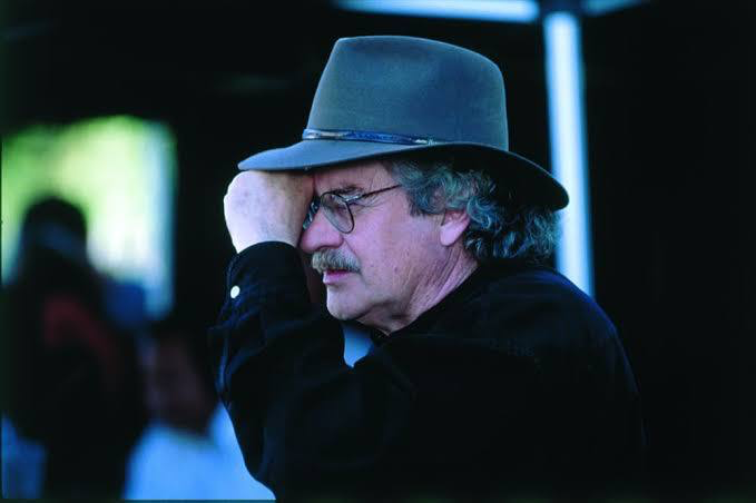
The man behind the lens was Jeffrey L. Kimball, ASC. If you know Tony Scott’s filmography, Kimball is the backbone. They had this formidable creative shorthand, forged on Top Gun, Beverly Hills Cop II, and Revenge. This wasn’t a director hiring a “technician”; it was a collaboration between two guys who inherently spoke the same visual language of rhythm and aesthetic ambition.
Kimball has this uncanny knack for creating images that feel both slick and visceral at the same time. He’s a master of dynamic lighting, often playing with heavy backlights and atmospheric haze to create depth where most would see flat space. In True Romance, Kimball isn’t just capturing the story he’s serving as an extension of Scott’s eye, translating Tarantino’s sharp, witty dialogue into something tangible and high-octane.
Lensing and Blocking
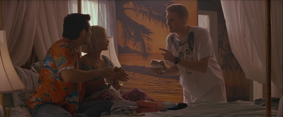
Let’s get the technicals right: this is a Panavision Anamorphic masterclass. They shot on the Platinum and Lightweight bodies using those legendary E-Series Anamorphic primes. You can see it in every frame the subtle lens flares, the beautiful vertical bokeh, and that specific 2.39:1 scope that makes even a dirty Detroit bar feel epic.
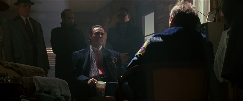
For the intimate moments, Kimball leans into long lenses to compress the space, isolating Clarence and Alabama from the predators circling them. But it’s the blocking that really slays me. Take the legendary Walken and Hopper exchange the “Sicilian” scene. The blocking is a meticulously choreographed power struggle. It’s not just actors hitting marks; it’s about how they occupy or retreat from each other’s personal space. The camera sits back on a long lens, invading their privacy, making the tension nearly unbearable.
Lighting Style
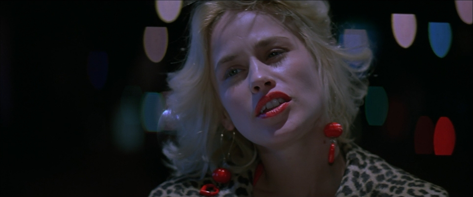
The lighting in True Romance is undeniably aggressive. Scott and Kimball didn’t do “subtle.” They went for a bold, theatrical look with high-contrast, motivated light sources that feel dialed up to eleven. We’re talking hard directional sources, neon-drenched night exteriors, and a persistent use of side-lighting that sculpts the actors’ faces with a pulp-fiction intensity.
Kimball’s use of backlight is his secret weapon here. He’s constantly cutting through smoke or atmospheric haze to create a rim of light around the characters. This does two things: it separates them from the grit of the background and gives Alabama this almost angelic, “cotton candy” glow. It’s a brilliant juxtaposition lighting a scene like a high-fashion shoot while the characters are covered in blood. It reinforces that “sweet but savage” dissonance that defines the whole movie.
Color Grading Approach
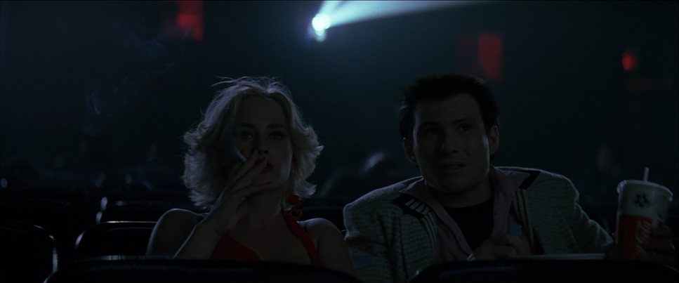
As a colorist, this is where I start losing my mind. The look of this film largely credited to the work of colorist Mark Nakamine is the North Star for expressive palettes. We’re not looking at naturalism; we’re looking at a world pushed to its absolute limit. It’s got that classic 90s high-contrast “print-film” feel that digital sensors still struggle to perfectly emulate.
The palette is punchy and deliberate. You’ve got these incredibly saturated reds and cyans fighting for dominance. Skin tones are rendered with a warm, romantic blush especially for Alabama which serves as a visual anchor for their connection amidst the chaos. I love the way they handled the shadows; they’re deep and rich, but they hold onto those cool blue and green tones that stop the image from feeling muddy. It’s not just about making the frame “look pretty.” It’s narrative warfare through color.
Camera Movements
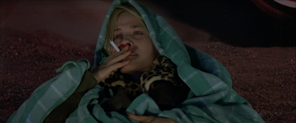
The camera in True Romance is a character in itself. It rarely sits still. It embodies the lovers’ headlong rush into a world that wants to kill them. Scott and Kimball used a very active, kinetic approach fluid tracking shots that pull us through the Detroit snow, contrasted with aggressive handheld work when the violence erupts.
This shifts the audience from observer to participant. During the motel climax, the use of dollies and cranes gives the carnage an operatic, grand scale. The camera doesn’t just show us the action; it dictates the heart rate of the scene. A slow push-in builds the dread; a rapid, vibrating track emphasizes the urgency. It’s a masterclass in using movement to sculpt narrative beats.
Compositional Choices
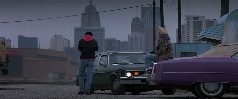
The compositions are consistently striking and purposeful. Using the 2.39:1 aspect ratio, Kimball creates grand, sweeping frames even in claustrophobic interiors. You’ll see strong leading lines and symmetrical framing when the tension is building, but the second things go south, the composition breaks.
They aren’t afraid of “ugly” framing when it serves the story off-kilter angles and tight, uncomfortable close-ups that force you to confront the raw emotion on screen. Kimball also uses negative space brilliantly to isolate Clarence or Alabama, emphasizing their solitude in a world of “ricocheted bowling balls.” Every frame is designed to maximize visual tension.
Inspiration Behind the Cinematography
The core inspiration clearly stems from the audacity of the script itself. Tarantino wrote this while working in a video store, and you can feel that “everything-all-at-once” energy. The challenge for the visual team was to bridge the gap between Tarantino’s brutal, witty world and Scott’s flamboyant, fast-paced direction.
They needed a look that could embody the sweetness of the romance while selling the brutality of the drug world. This led to that “cotton candy” visual style vibrant, romantic hues for the intimacy, then a hard pivot to stark, high-contrast chaos for the bursts of violence. It’s a visual tightrope walk. The movie feels like it’s constantly moving, and the visual style is designed to keep pace with that unrelenting narrative speed.
Technical Aspects & Tools
True Romance (1993) — Technical Specifications
| Genre | Action, Crime, Romance, Thriller, Road Trip |
| Director | Tony Scott |
| Cinematographer | Jeffrey L. Kimball |
| Production Designer | Benjamín Fernández |
| Costume Designer | Susan Becker |
| Editor | Michael Tronick, Christian Wagner |
| Colorist | Mark Nakamine |
| Time Period | 1990s |
| Color | Mixed, Saturated, Red, Cyan, Blue |
| Aspect Ratio | 2.39 – Anamorphic |
| Format | Film – 35mm |
| Lighting | Soft light, Side light, Edge light |
| Lighting Type | Mixed light |
| Story Location | Michigan > Detroit |
| Filming Location | Michigan > Detroit |
| Camera | Panavision Platinum, Panavision Lightweight |
| Lens | Panavision Primo Primes, Panavision E series |
Shooting on 35mm film gave True Romance its organic soul. The texture of the grain and the way the highlights roll off into the shadows is something digital just can’t quite touch. They used Panavision Platinum and Lightweight cameras workhorses of the era paired with those E-Series Anamorphics to get that signature wide-screen look.
The post-production was a different beast back then. We’re talking analog timing and printing processes. Mark Nakamine and the team had to make definitive choices about contrast and color balance that would be baked into the film’s identity. It wasn’t about “fixing it in post”; it was about a clear, artistic vision executed with precision at every stage.
- Also read: WALK THE LINE (2005) – CINEMATOGRAPHY ANALYSIS
- Also read: HIDDEN FIGURES (2016) – CINEMATOGRAPHY ANALYSIS
Browse Our Cinematography Analysis Glossary
Explore directors, cinematographers, cameras, lenses, lighting styles, genres, and the visual techniques that shape iconic films.
Explore Glossary →