Released in 1996, Danny Boyle’s Trainspotting is adaptation of Irvine Welsh’s novel isn’t just a film about heroin addiction; it’s a raw, uncomfortably exhilarating journey through the veins of Edinburgh. More than two decades on, its visual style still feels dangerous. For me, it wasn’t just about depicting that world it was about immersing you in it. It makes you feel the chaotic energy, the fleeting highs, and the crushing lows. It’s sensory overload, and that’s precisely what I want to dissect here.
About the Cinematographer
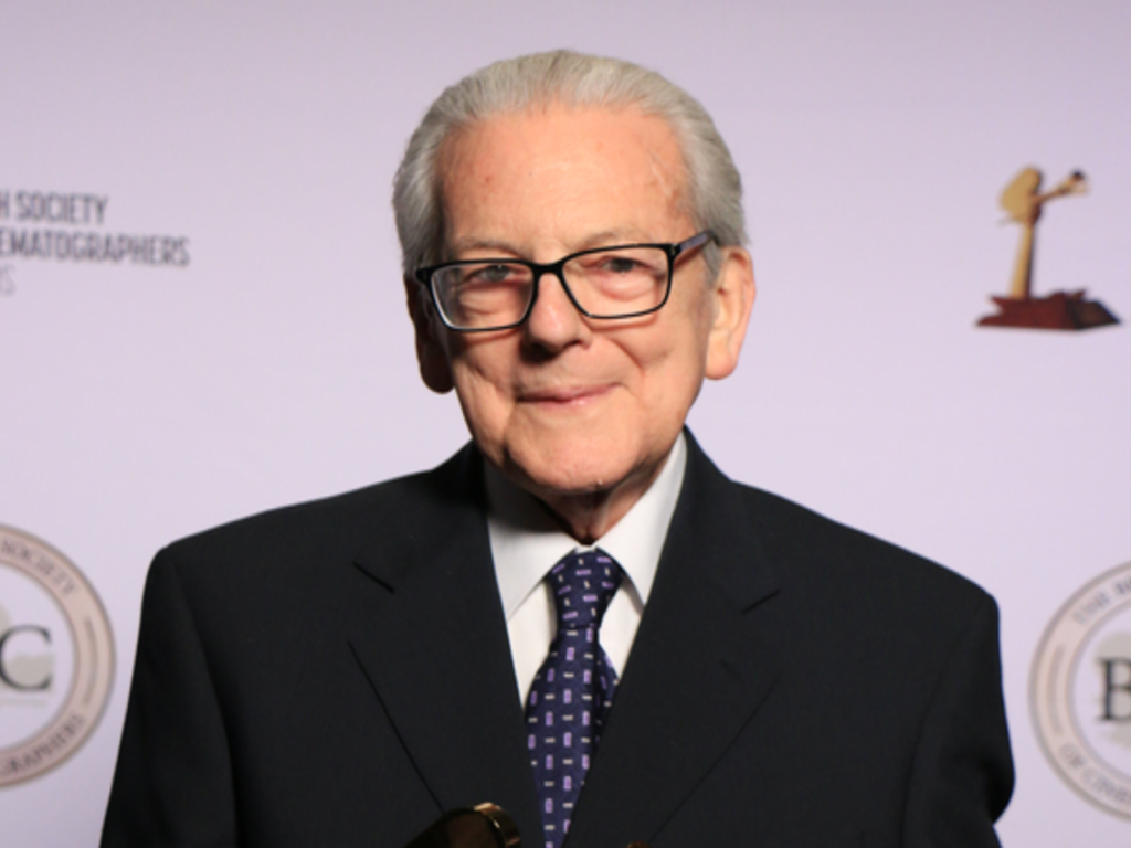
Behind the lens was Brian Tufano, a name synonymous with a gritty, energetic British aesthetic. Tufano had already worked with Boyle on his debut, Shallow Grave (1995), establishing a shorthand that was crucial here. Tufano wasn’t interested in “pretty” pictures. He came from a BBC documentary background, which meant he knew how to light fast and work with available energy. His approach was naturalistic but heightened perfect for a story that swings between grime and hallucination. His job was to translate Boyle’s vision of making “the most energetic movie you’ve ever seen” into a tangible reality, and he delivered.
Inspiration Behind the Cinematography
Danny Boyle was clear: he wanted to “disrupt the spectacle.” He didn’t want the typical grey, depressing social realism often associated with British cinema. He wanted a ride. To get the cast and crew on the same wavelength, Boyle didn’t just give direction; he gave homework. He had them watch rebellious youth films like The Hustler and A Clockwork Orange. You can see that influence immediately it’s unhinged, dynamic, and a touch surreal.
The visual strategy was to convey the experience of addiction, not just the observation of it. Boyle wanted the perspective of the user, or sometimes even “the perspective of the heroin itself.” This meant the camera couldn’t be a passive observer. It had to be a character, constantly shifting. It embraces discomfort. It dares you to look away, yet compels you to stay. It’s a genius move to lean into the inherent chaos and internalize it through the lens, making us complicit in the characters’ bad decisions.
Camera Movements
If one thing defines Trainspotting, it’s speed. The film vibrates with nervous urgency. We are constantly pushing forward, reflecting the characters’ frantic pursuit of their next fix. This is achieved through aggressive handheld work, often operating at eye level or lower to plunge us into the squalor.
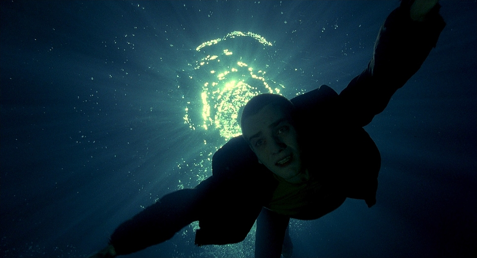
But it’s not just handheld; there’s a specific “run-and-gun” energy to the tracking shots. Think of the iconic opening sequence: Renton is sprinting, security is chasing, and the camera is right there, practically wheezing trying to keep up. This propulsive energy, paired with wide glass, creates an immersive urgency. When Renton sinks into the “worst toilet in Scotland,” the camera follows him a stomach-churning POV descent. Conversely, the film knows when to stop. During the overdose scene, the camera becomes a fixed, horrified observer. That sudden lack of motion amplifies the terror. The contrast between frenetic energy and absolute paralysis captures the pendulum swing of addiction perfectly.
Compositional Choices
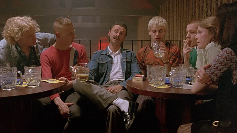
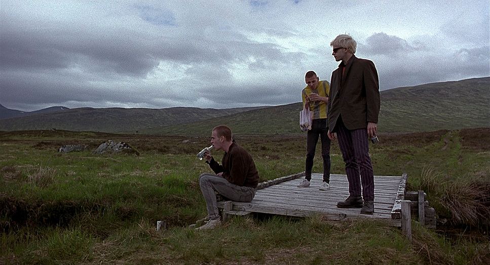
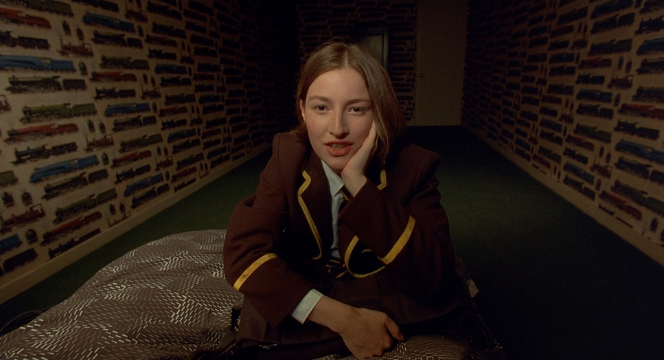
The composition in Trainspotting relies heavily on the 1.85:1 aspect ratio to pack characters into their dilapidated environments. Tufano used what I call “environmental framing” letting the walls close in. We see Renton, Spud, and Sick Boy crammed into tiny apartments, the ceiling pressing down on them. It creates a powerful sense of entrapment.
When the film goes in for close-ups, they are often extreme. Consider the famous “Choose Life” monologue. Renton is framed directly to camera, breaking the fourth wall. It’s a confrontational address to the audience. There’s also a recurring use of low-angle shots (typical of the “hero” shot, but subverted here) for characters like Begbie, making his volatility loom over us. I watched it again recently and was struck by the negative space. In some frames, the empty space feels oppressive, reflecting the lack of a future. It’s a brave choice to make your characters look small against the weight of their own lives.
Lighting Style
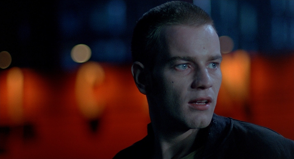
The lighting is entirely motivated. Tufano didn’t fight the locations; he leaned into the “grungy look” of the abandoned cigarette factory in Glasgow where they shot. Interiors are dim, bathed in the sickly green or amber tones of industrial fluorescents and practical bulbs. It feels rot-infested. There’s no Hollywood fill light here—just deep, stark shadows that underscore the decay.
But it’s not all gloom. The film uses contrast to sell the highs. When Renton hits the club, the lighting shifts to vibrant, pulsing neons and strobes. During the “Perfect Day” overdose sequence, the visual style descends into a dreamlike, ethereal glow—a soft, warm light that contrasts with the horrific reality of his body failing. This dynamic range is key. The film isn’t afraid to blow out highlights in the fantasy sequences or crush the blacks into oblivion during withdrawals.
Lensing and Blocking
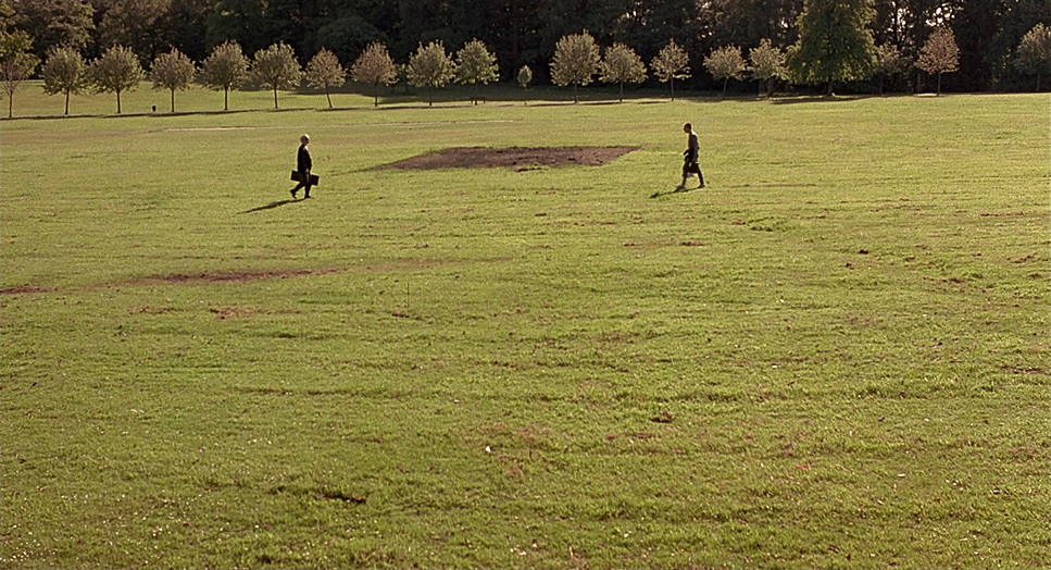
To achieve that specific distorted look, Tufano utilized Zeiss Standard Primes, leaning heavily on the wider focal lengths (24mm, 28mm). This wasn’t just to fit more into the frame; wide lenses exaggerate perspective. They pull the foreground uncomfortably close while pushing the background away. It makes the characters feel isolated even when they are in a room full of people. When Renton looks out a window, the wide glass warps the frame, making the mundane world outside feel inaccessible.
In terms of blocking, the film excels in choreographing chaos in tight spaces. With a schedule of under two months, many scenes were done in one take, requiring an organic, messy approach to blocking. Actors are piled on top of each other in the flat, creating palpable tension. Then, you have the isolation blocking Renton physically removed from the group, placed in the foreground while the chaos happens behind him. It’s efficient, intuitive filmmaking.
Color Grading Approach
Ah, the color. As a colorist, this is where I really geek out. In 1996, we didn’t have the luxury of modern Digital Intermediates (DI). This look was achieved photochemically through production design, lighting, and printer lights at the lab. The film employs a desaturated, bruised palette. Institutional greens, browns, and muted yellows dominate the interiors. These aren’t arbitrary; they evoke illness.
However, the film punches back with color to signify euphoria. The electrifying blues and reds of the club scenes, or the hyperreal greens of the Scottish countryside, serve as a counterpoint to the grey reality. The contrast is crunchy. You can see the deep, inky blacks that you only really get from print emulation. The highlights roll off with that specific organic softness of 35mm stock, preventing the brights from feeling digital or harsh. It’s a textured, gritty quality that perfectly complements the narrative. It’s raw, bold, and unapologetically expressive.
Technical Aspects & Tools
| Genre | Crime, Drama, Magical Realism, Psychedelic, Addiction, Coming-of-Age |
|---|---|
| Director | Danny Boyle |
| Cinematographer | Brian Tufano |
| Production Designer | Kave Quinn |
| Costume Designer | Rachael Fleming |
| Editor | Masahiro Hirakubo |
| Time Period | 1990s |
| Color | White |
| Aspect Ratio | 1.85 – Spherical |
| Format | Film – 35mm |
| Lighting | Soft light |
| Lighting Type | Daylight, Sunny |
| Story Location | … United Kingdom > Scotland |
| Filming Location | … Scotland > Edinburgh |
| Camera | Aaton 35-III |
| Lens | Zeiss Standard Primes |
While many indie films of the 90s were scrapping by on 16mm, Trainspotting committed to 35mm film, which gives it that cinematic weight despite the grime. Given the tight schedule and the need for agility, Tufano chose the Aaton 35-III. This camera is a workhorse compact, perfectly balanced for handheld, and quiet.
Pairing the Aaton with the Zeiss Standard Primes allowed Tufano to keep the rig small and nimble, essential for a shoot that prioritized immediacy over elaborate setups. The abandoned factory offered flexibility for sets, but the gear had to move fast. This combination of a lightweight 35mm camera and fast glass allowed for that dynamic, improvisational feel Boyle wanted. It’s a testament to the idea that the right tool isn’t always the biggest or most expensive one; it’s the one that lets you capture the energy in the room.
- Also read: GRAN TORINO (2008) – CINEMATOGRAPHY ANALYSIS
- Also read: BLADE RUNNER (1982) – CINEMATOGRAPHY ANALYSIS
Browse Our Cinematography Analysis Glossary
Explore directors, cinematographers, cameras, lenses, lighting styles, genres, and the visual techniques that shape iconic films.
Explore Glossary →