Today, I want to break down the visual language of a film that shouldn’t have been as good as it is: Pixar’s Toy Story 2. Released in 1999, this movie was originally slated as a cheap direct-to-video cash grab. Instead, through a production history that is now industry legend, it became a benchmark for animated filmmaking. I revisit this film often not just for nostalgia, but because it represents a massive leap forward in how CGI handles light, texture, and emotional weight. It isn’t just a cartoon; it is a serious piece of cinematography.
About the Cinematographer

There is a common misconception that animated films don’t have cinematographers. People assume the computer just “does the lighting.” That couldn’t be further from the truth. Toy Story 2 had a distinct visual author: Sharon Calahan.
While the first Toy Story was revolutionary, its look was somewhat plastic and rigid. Calahan came in with a painterly background and a deep understanding of live-action lighting principles. She didn’t just want to illuminate the characters; she wanted to create atmosphere. She served as the Director of Photography, leading a team of lighting supervisors and layout artists to treat the virtual environment like a physical set. Working alongside Director John Lasseter and the Pixar creative team, Calahan’s approach was about softening the digital edge. She pushed for lighting that wrapped around characters rather than just hitting them, effectively pioneering the “soft” look that defined Pixar for the next decade.
Inspiration Behind the Cinematography
The visual approach here is dictated entirely by the narrative conflict: preservation vs. play. We are watching Woody go through an existential crisis about his own obsolescence, and the camera work reflects that duality.
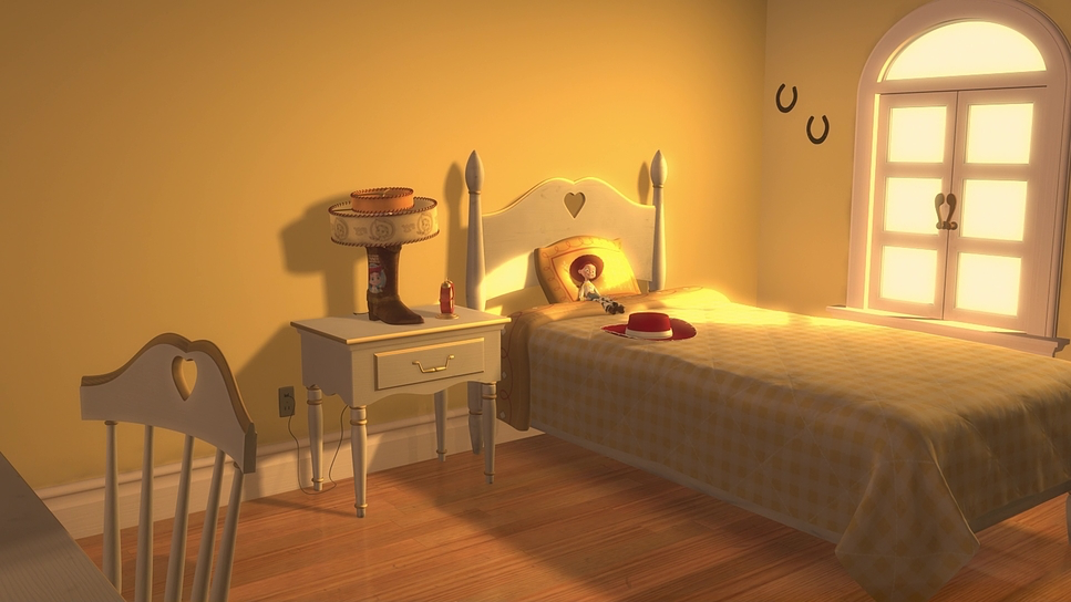
On one hand, you have the world of Andy’s room: chaotic, messy, warm, and shot with a loose, handheld feel that mimics the energy of a child. On the other hand, you have Al’s apartment and the “Woody’s Roundup” collection. This world is sterile, museum-like, and composed with rigid symmetry. The inspiration here comes from the stark contrast between a home and a display case. The “Woody’s Roundup” sequences specifically mimic the aesthetic of 1950s television high-key lighting, slightly sepia-toned palettes, and very specific framing that evokes the Golden Age of Westerns. It’s a brilliant visual shorthand that instantly tells us Woody is a relic of a different era.
Camera Movements
For a film made in the late 90s, the virtual camera work is surprisingly grounded in real-world physics. In animation, you can theoretically put the camera anywhere inside a keyhole, flying through a wall but Toy Story 2 shows restraint. The camera has “weight.”
When Buzz and the gang are crossing the street to Al’s Toy Barn, the camera angles are low, right down on the pavement. This isn’t just to show scale; it uses wide lenses to exaggerate the z-axis, making the traffic cones and oncoming cars feel like monuments. Later, in the baggage claim sequence, the camera tracks with the characters on the conveyor belts with the smoothness of a Steadicam. It helps ground the action. If the camera moved impossibly fast, we would lose the sense of danger. By keeping the pans and tilts motivated by character movement, the animators trick our brains into thinking this was shot by a human operator, which subconsciously raises the stakes.
Compositional Choices
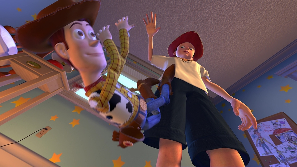
The composition in this film is all about scale and isolation. Since we are dealing with a 1.78 aspect ratio (filling the 16:9 screen), there is a lot of vertical space to play with. The layout artists frequently use “God’s eye” top-down views to emphasize how small the toys are in the human world, particularly in Al’s massive apartment.
I love the blocking during the interactions between Woody and the Prospector (Stinky Pete). Pete is often framed within his box, looking out a visual metaphor for his trapped worldview. Woody, conversely, is often framed with open space around him, highlighting his vulnerability but also his freedom. They also use foreground elements brilliantly chair legs, door frames, blades of grass to create depth (parallax) and remind us that we are viewing this world from six inches off the ground. It turns mundane domestic spaces into epic canyons and valleys.
Lighting Style
This is where Sharon Calahan’s influence is most visible. In 1999, we didn’t have the advanced global illumination or ray-tracing we have today. They had to “cheat” realism using specific light placements, and the result is stunning.
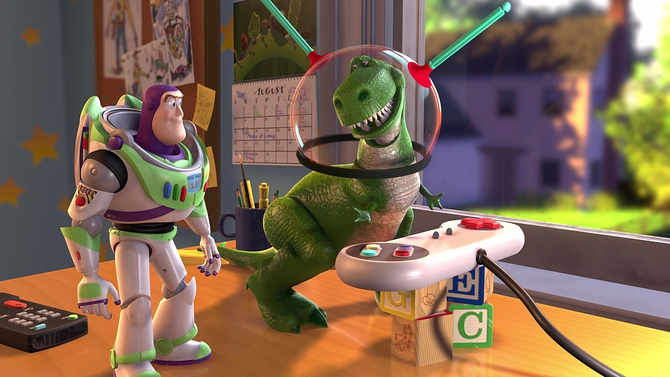
The lighting is strictly motivated. In the ventilation shafts, the light cuts through slats, creating shafts of volumetric atmosphere that guide the eye. In the cleaner scene where Woody gets restored the lighting shifts to a high-contrast, almost surgical look. But look closely at the materials. The team worked hard on the “subsurface scattering” effect on the plastic characters. When a bright light hits Woody’s ear or hand, it glows slightly red/warm, mimicking how light passes through skin (or in this case, soft vinyl). It differentiates the materials: Buzz looks hard and reflective, while Woody looks soft and tactile. That separation is pure lighting technique.
Lensing and Blocking

Even without physical glass, the team made very specific choices about virtual focal lengths. They generally stick to wider lenses (equivalent to 24mm or 35mm) for the action sequences. This enhances the speed of movement and makes the environments feel vast.
However, for the emotional beats like Jessie’s song “When She Loved Me” the “lens” zooms in, compressing the background. This shallow depth of field is crucial. It blurs out the distractions and forces us to look at the subtle facial animation. The blocking in that musical sequence is a masterclass in staging; the camera slowly revolves around Jessie, isolating her in the center of the frame as the seasons change in the background. It creates a sense of loneliness that feels incredibly intimate, proving you don’t need a real lens to create emotional depth.
Color Grading Approach

As a colorist, this is the part I find most fascinating. We have to remember the context: Toy Story 2 was finished on film. There was no Digital Intermediate (DI) workflow like we have now with DaVinci Resolve. The final color decisions were made by Dale E. Grahn, the color timer, working with printer lights.
Because of this, the film has a specific “print film” density. The shadows aren’t clinically black; they have a rich, organic weight to them. The color palette is strictly coded:
- Andy’s Room: Saturated primaries (Cyan walls, Red bedspread, Yellow stars). It feels safe and vibrant.
- Al’s World: There is a distinct shift toward sickly greens, magentas, and browns. It feels industrial and off-putting.
- The Nightmare: When Woody dreams of being thrown away, the contrast cranks up, crushing the blacks and desaturating the colors to create a “film noir” horror vibe.
Grahn and the art department ensured that even in the darkest scenes, the characters “pop” with specific hue separation. Woody’s yellow shirt always cuts through the murky backgrounds of the baggage handling system, ensuring the eye never gets lost.
Technical Aspects & Tools
Toy Story 2 (1999) — Technical Specifications
| Genre | Animation, Comedy, Family, CGI Animation, Buddy |
| Director | John Lasseter |
| Cinematographer | Sharon Calahan |
| Production Designer | William Cone, Jim Pearson |
| Editor | Lee Unkrich, David Ian Salter, Edie Ichioka |
| Colorist | Dale E. Grahn |
| Time Period | 1990s |
| Color | Mixed, Saturated, Magenta |
| Aspect Ratio | 1.78 |
| Format | Animation |
| Lighting Type | Daylight |
| Story Location | North America > United States of America |
| Filming Location | Emeryville > Pixar Animation Studios |
The production history of this film is famous for the “disaster that wasn’t.” The lore is true: someone accidentally ran a rm -rf command and deleted 90% of the film assets. It was only saved because the Supervising Technical Director, Gail Susman, had a backup on her home workstation because she had recently given birth and was working remotely.
But beyond the near-deletion, the real technical story is the crunch. The film was essentially restarted from scratch just nine months before release. The team had to innovate out of necessity. They reused assets the Geri character from the short Geri’s Game became the Toy Cleaner. They upgraded the skin shaders significantly from the first film, which allowed human characters like Al to look grotesque and sweaty rather than just like stiff mannequins. It was a crucible of pressure that forced Pixar to refine their pipeline, proving that they could deliver high-end, cinematic fidelity even under the most insane deadlines imaginable.
- Also read: LIFE OF PI (2012) – CINEMATOGRAPHY ANALYSIS
- Also read: DISTRICT 9 (2009) – CINEMATOGRAPHY ANALYSIS
Browse Our Cinematography Analysis Glossary
Explore directors, cinematographers, cameras, lenses, lighting styles, genres, and the visual techniques that shape iconic films.
Explore Glossary →