I don’t just watch Krzysztof Kieślowski’s Three Colors: Red; I study it. It’s one of those rare films that actually justifies the time we spend obsessing over a single frame. In my daily work, I’m constantly trying to find that sweet spot where an image stops being just a “picture” and starts feeling like an emotion. Red is the ultimate blueprint for that.
It’s the final chapter of the trilogy, and while it deals with the French ideal of fraternity, it’s really a meditation on the invisible threads fate, chance, or just plain luck that pull people together. Watching Valentine (Irène Jacob) and the reclusive judge navigate their strange, cynical bond feels like watching a slow-burn masterclass in visual subtext. For me, as Salik Waquas, this isn’t a “one and done” movie; it’s a film you have to revisit every few years just to see if you’ve finally caught up to its genius.
About the Cinematographer
The visual DNA of Red belongs to Piotr Sobociński. His partnership with Kieślowski is the kind of symbiotic relationship every director dreams of. Sobociński didn’t just “light scenes”; he interpreted the script through the lens. His work isn’t about being flashy or showing off a high-budget rig; it’s deeply empathetic.
He had this incredible knack for naturalism, even when he was pushing stylized color choices that should have felt “too much” on paper. He understood that the image carries the narrative weight when the dialogue stops. In Red, you’re seeing the culmination of the entire trilogy’s visual language. Sobociński treated the 1.85 frame like a canvas for the psyche, and it’s his restraint the way he serves the story rather than his own reel that makes it so legendary.
Inspiration Behind the Cinematography
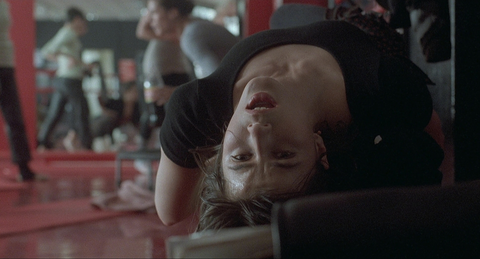
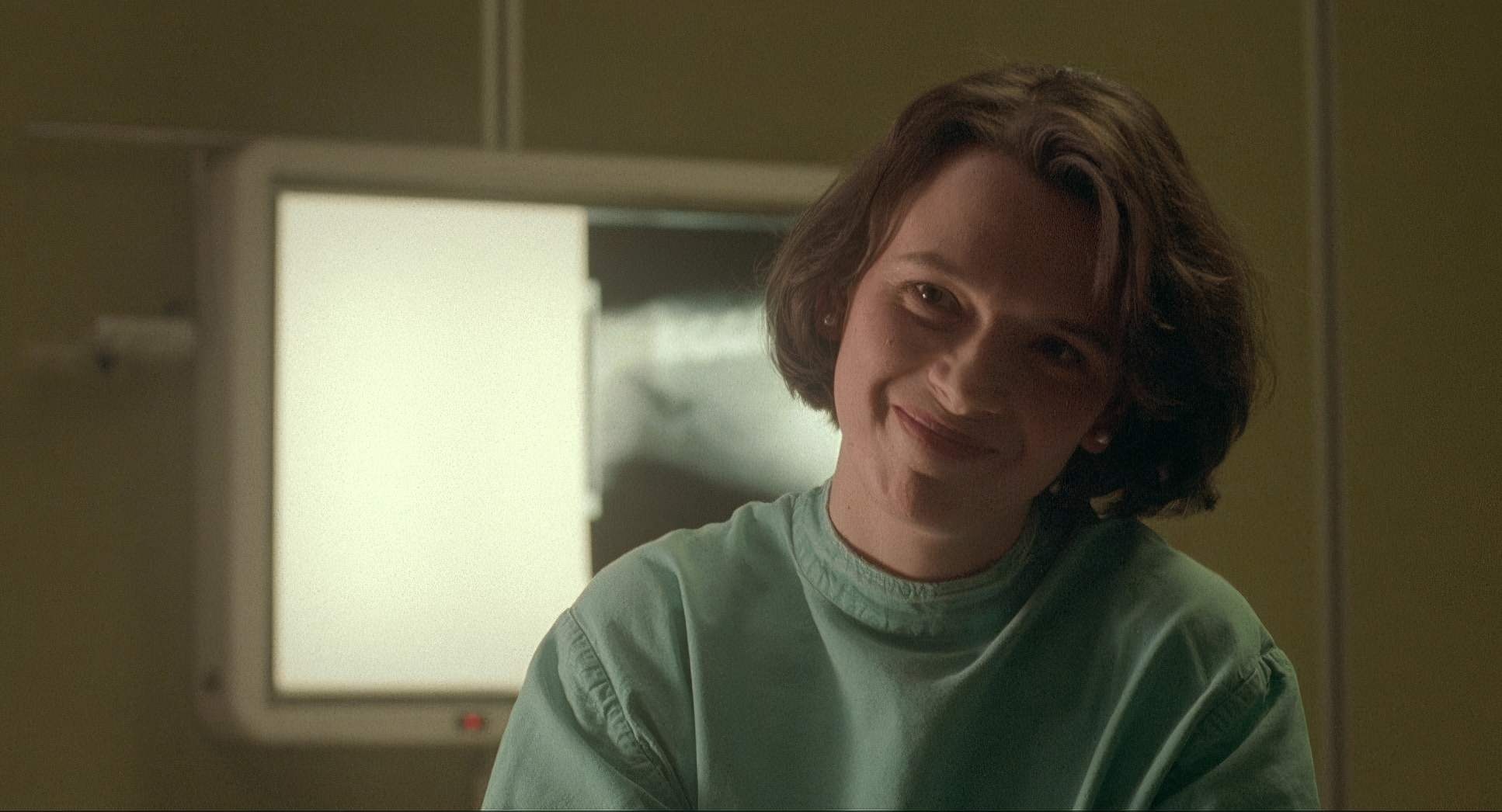
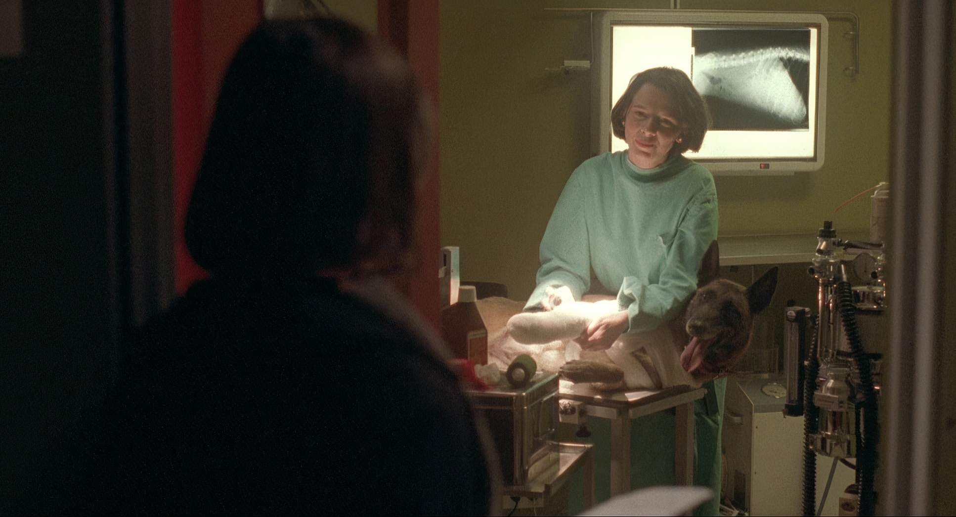
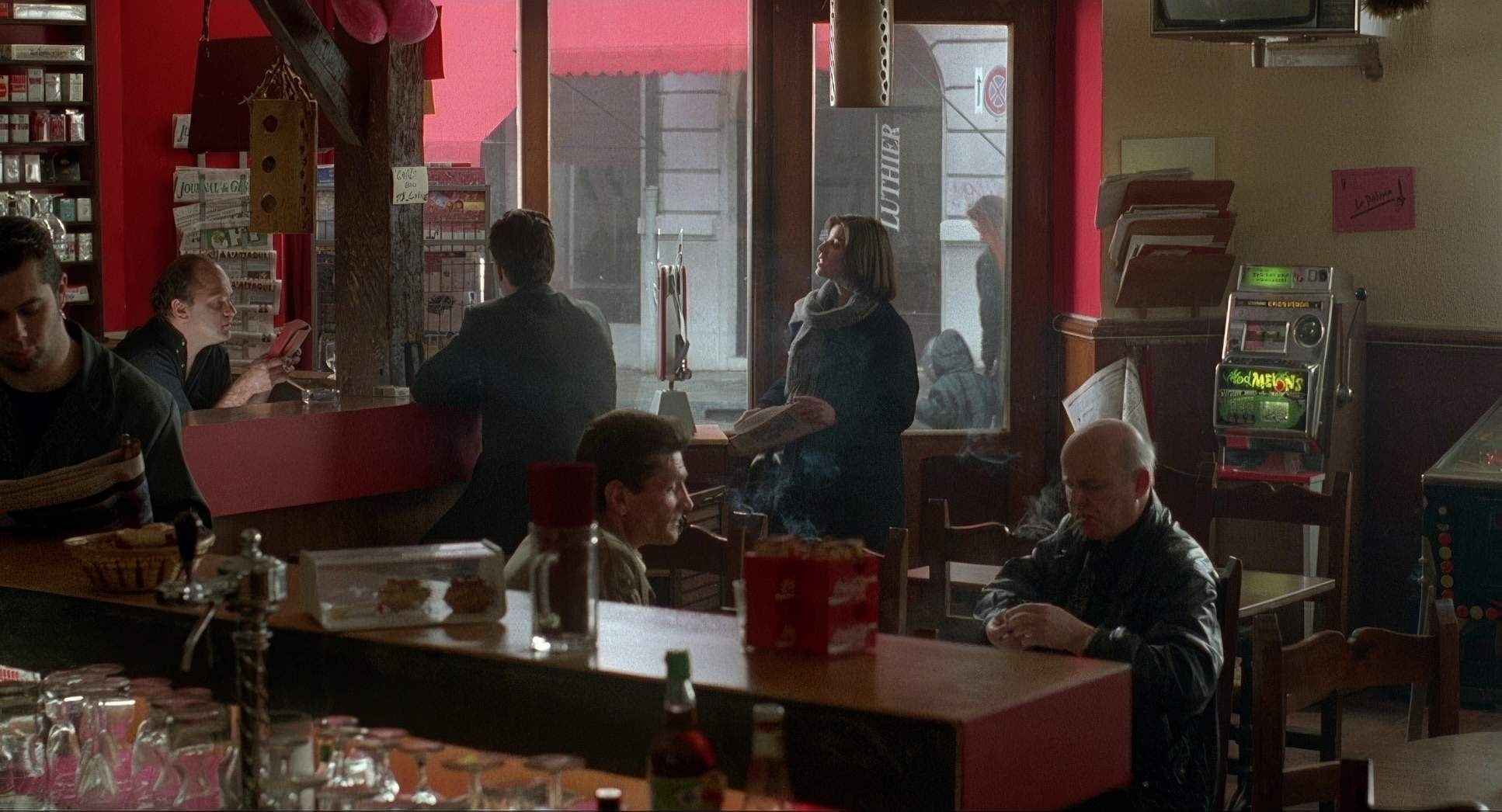
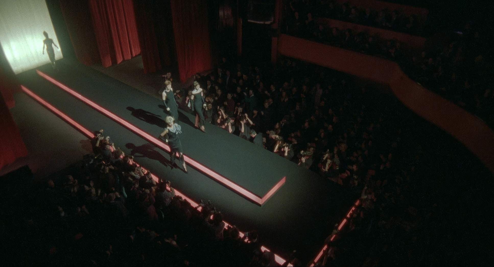
The core of Red is fraternity, but Sobociński explores this through contrast rather than direct action. We see it in the tension between Geneva’s cold reality and the “faked” warmth of Valentine’s modeling world.
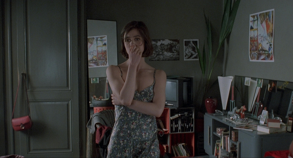
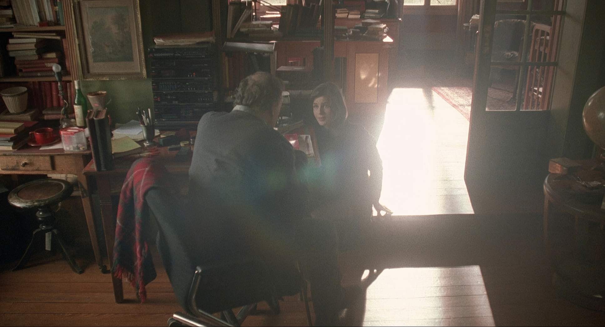
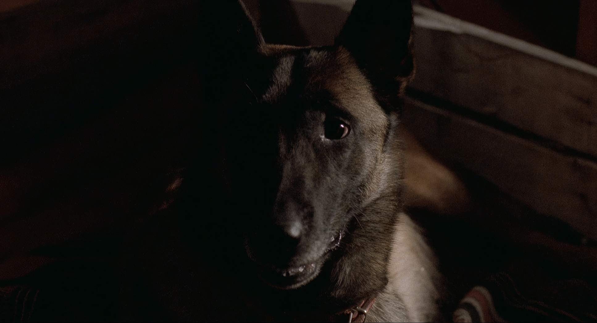
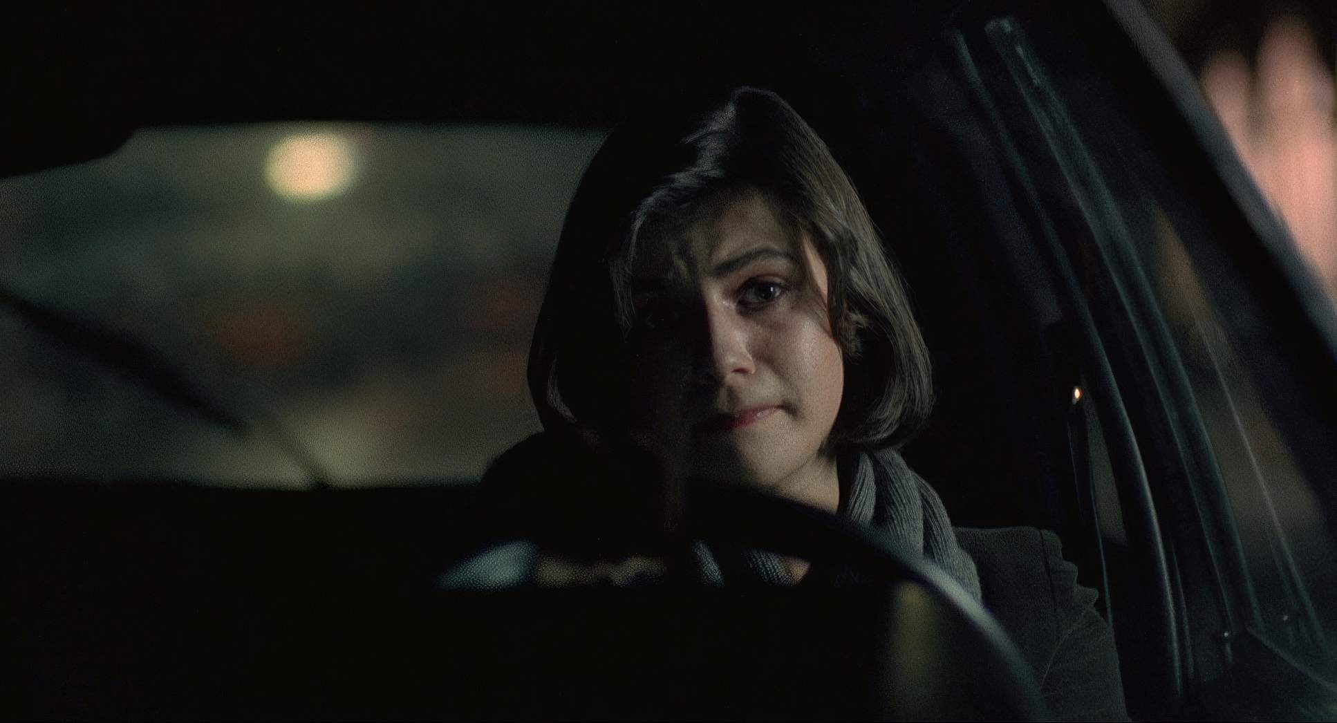
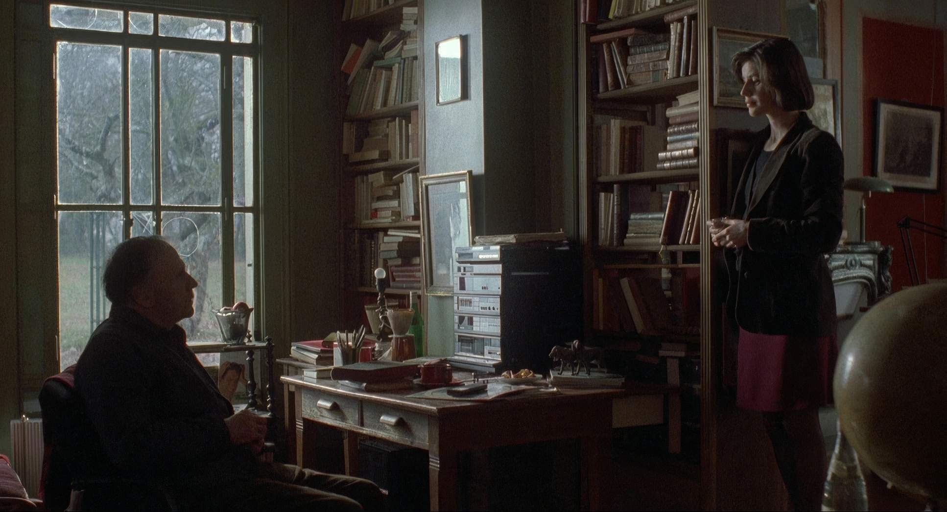
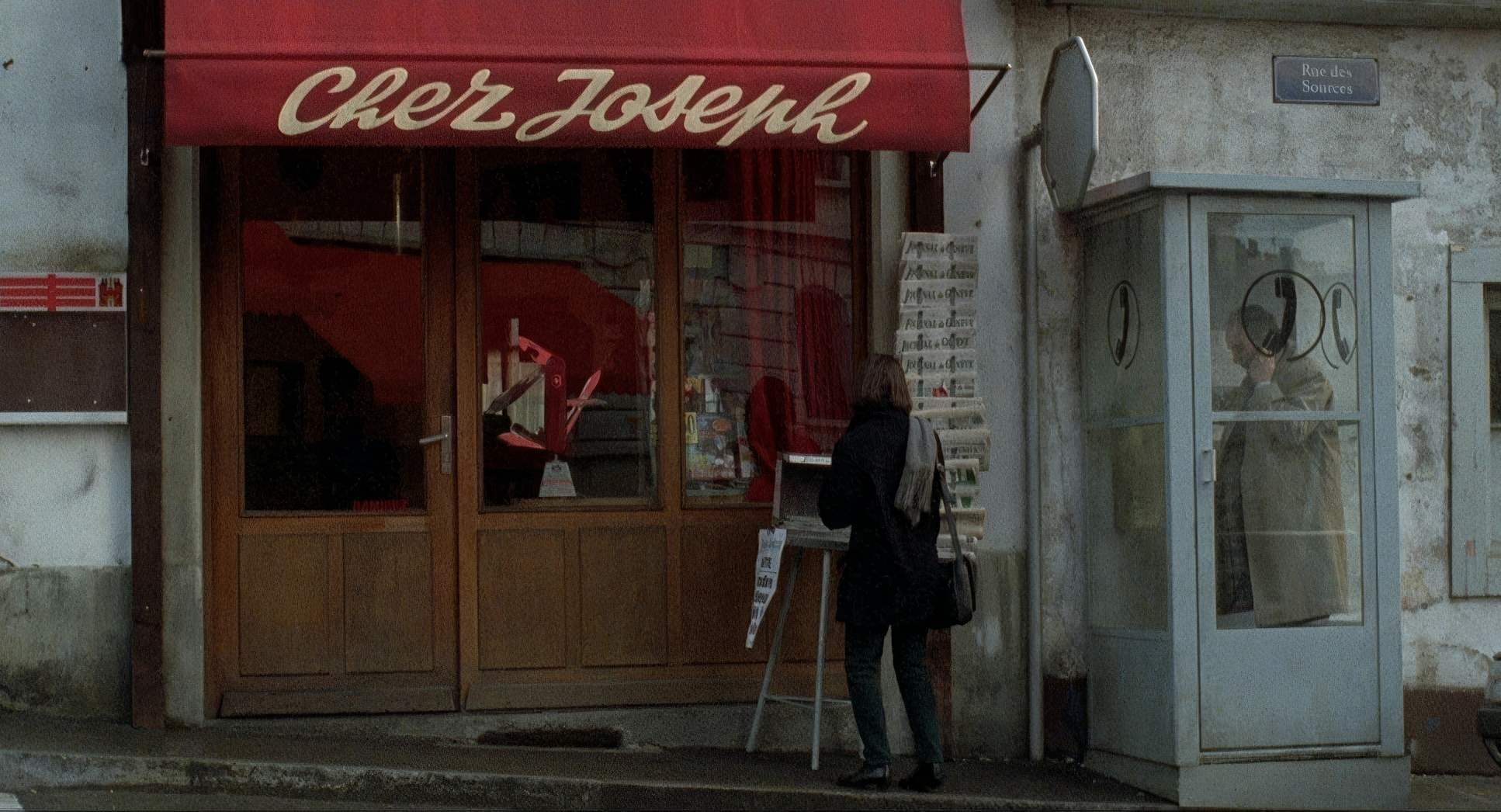
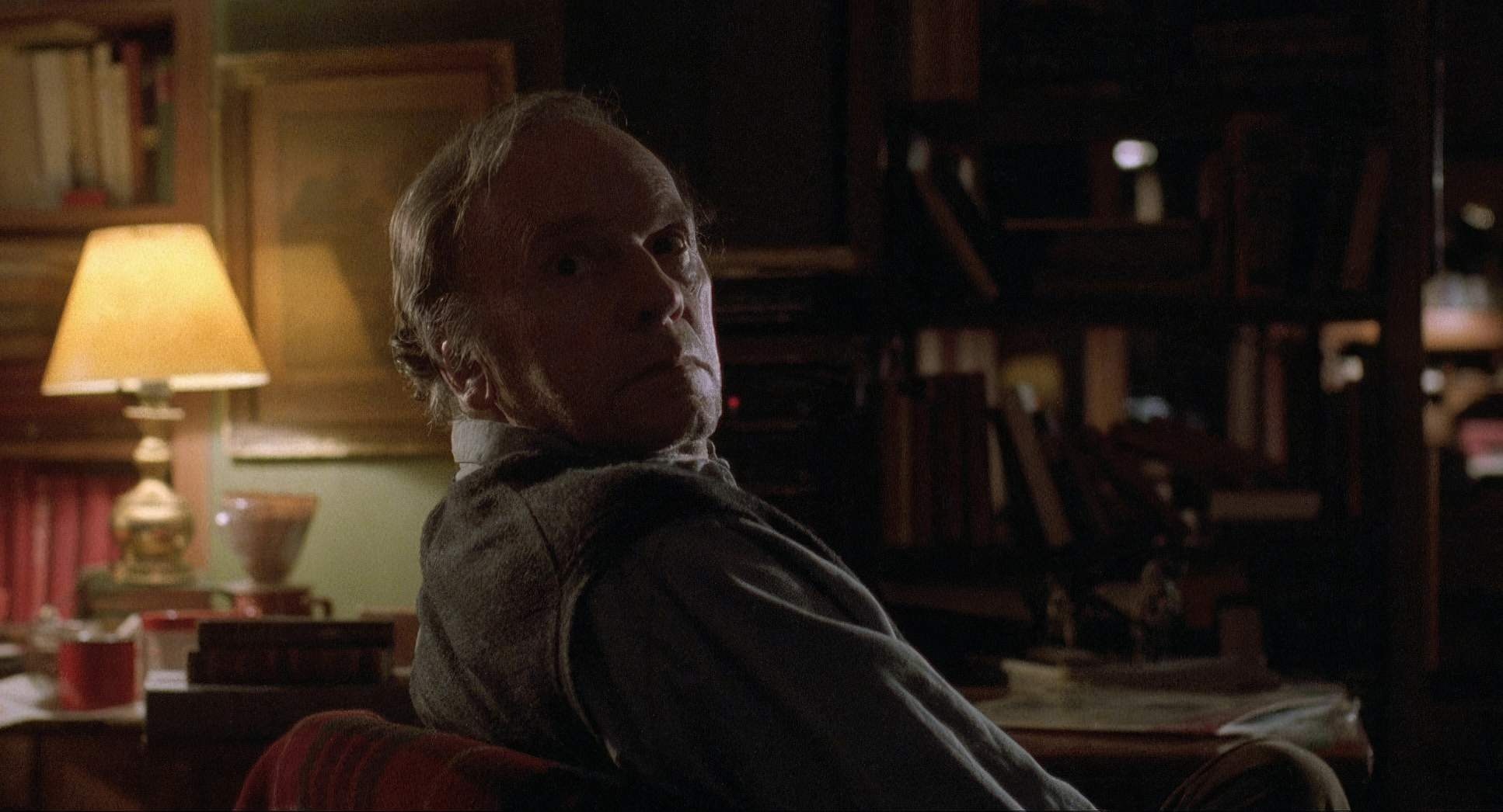
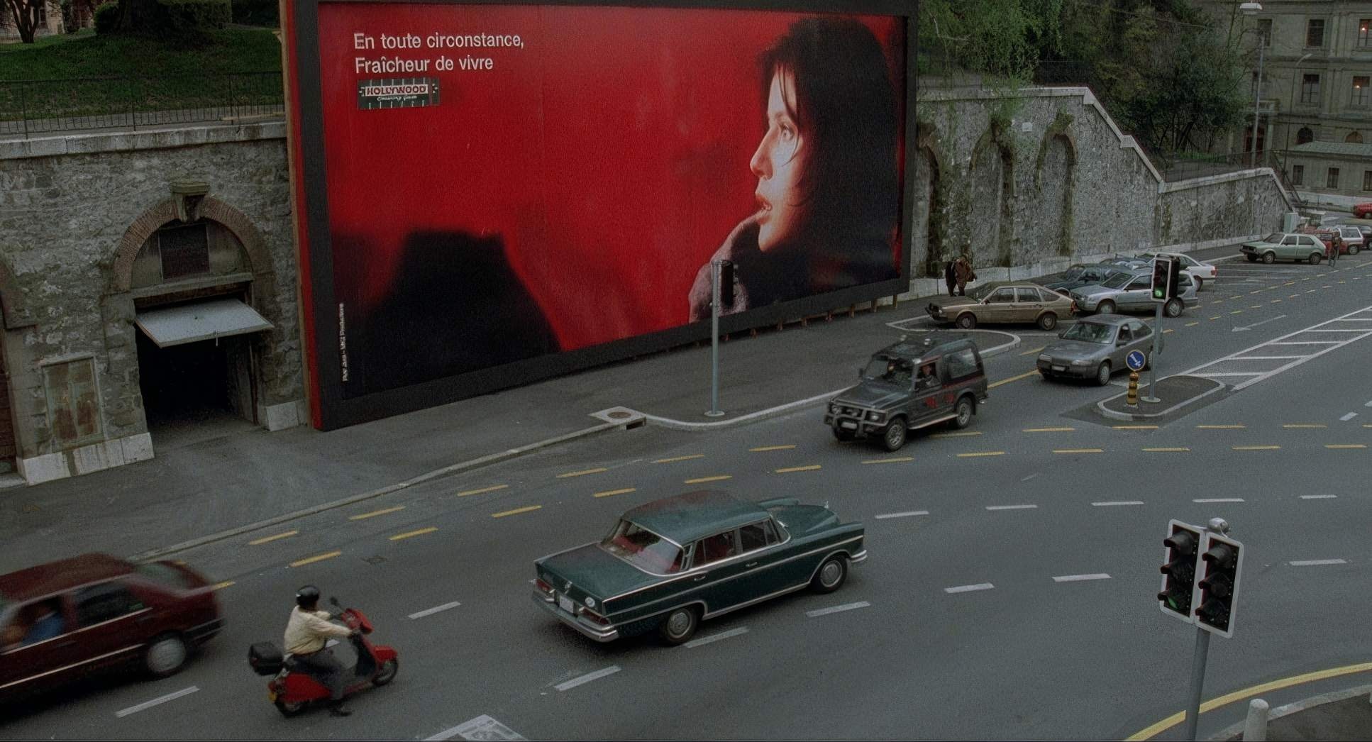
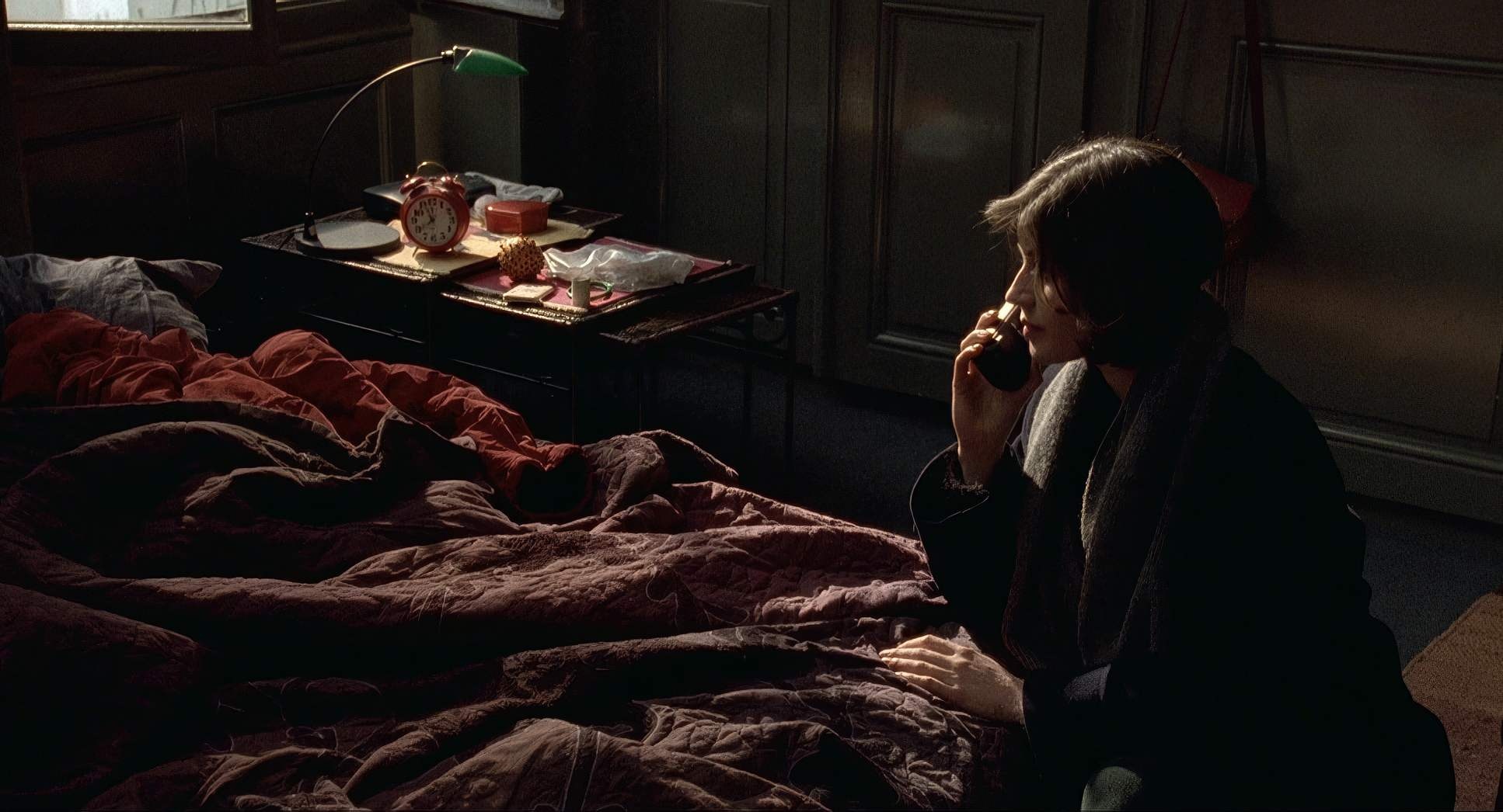
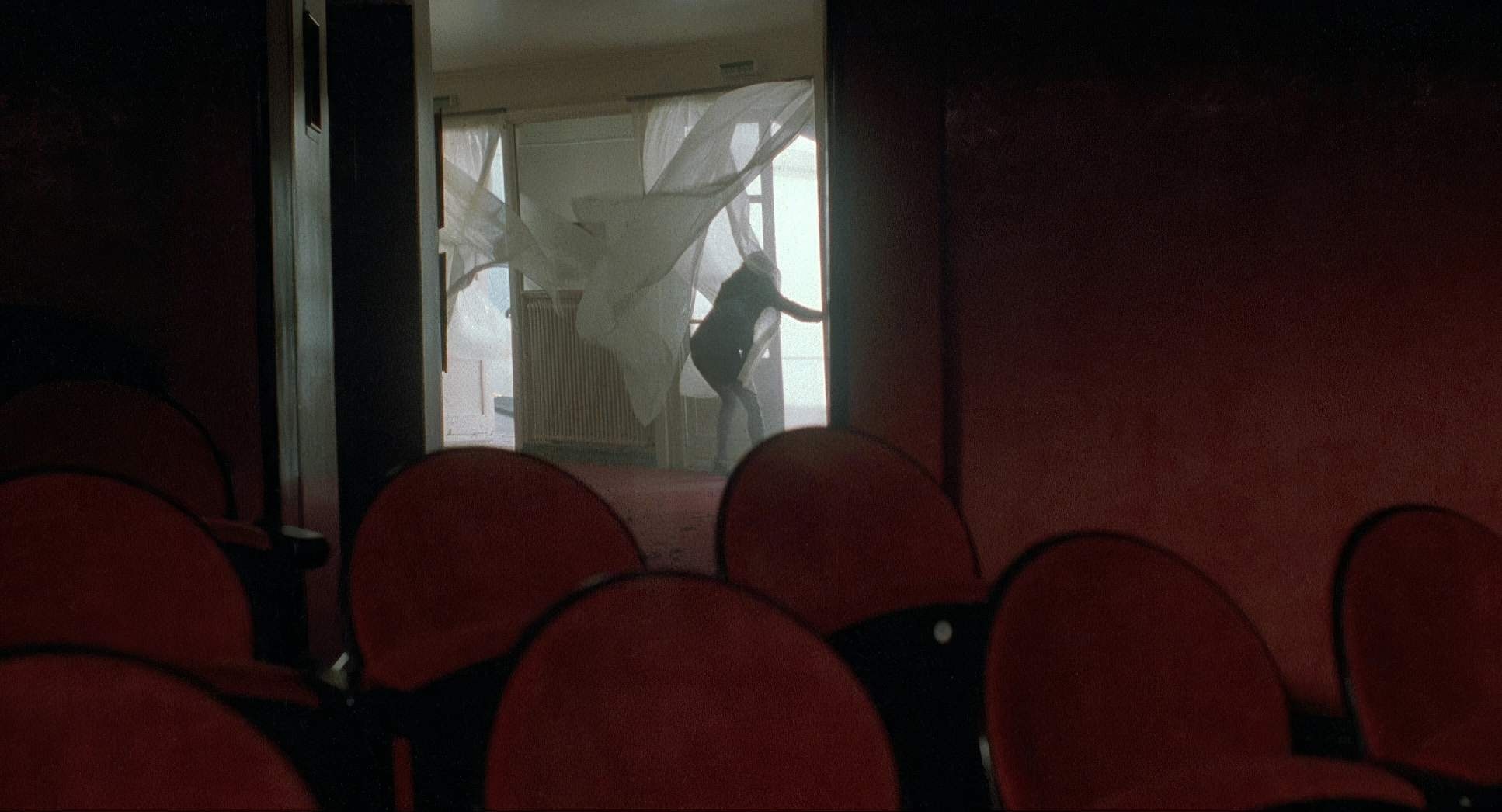
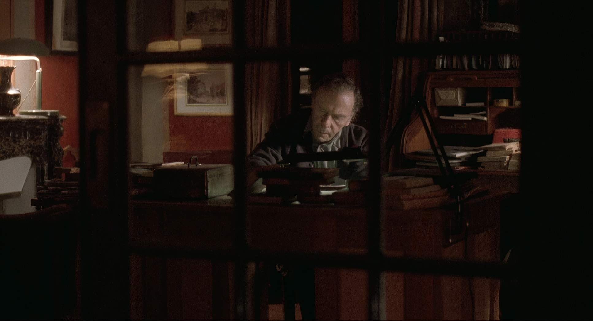
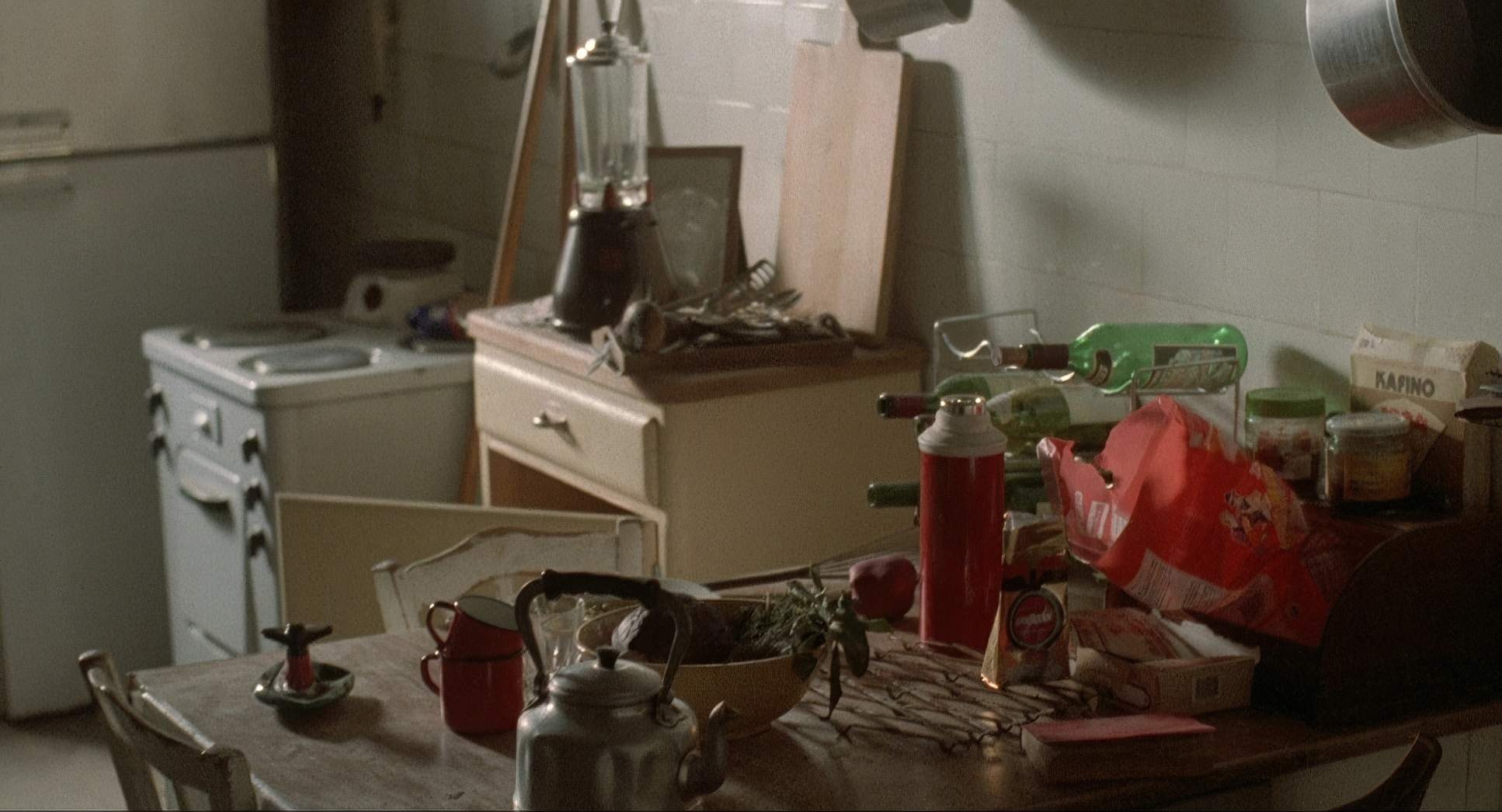
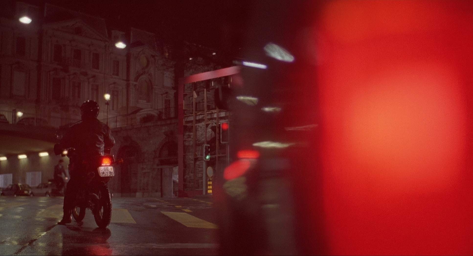
The visual inspiration seems to stem from a desire to make the city feel both stark and spiritually connected. You can feel the shift when the camera moves between Valentine’s life and the judge’s. Her world is open, a bit brighter, and full of possibility. The judge’s house, meanwhile, is a pit of “dollar tones” those muddy greys and browns that tell you everything you need to know about his isolation before he even speaks. The recurring motifs, like the storms and the broken glass, aren’t just metaphors; they are visual anchors that Sobociński uses to ground the philosophical “weight” of the film into something we can actually see.
Camera Movements
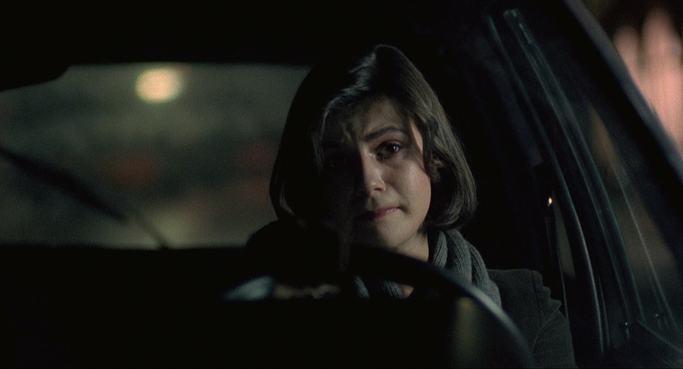
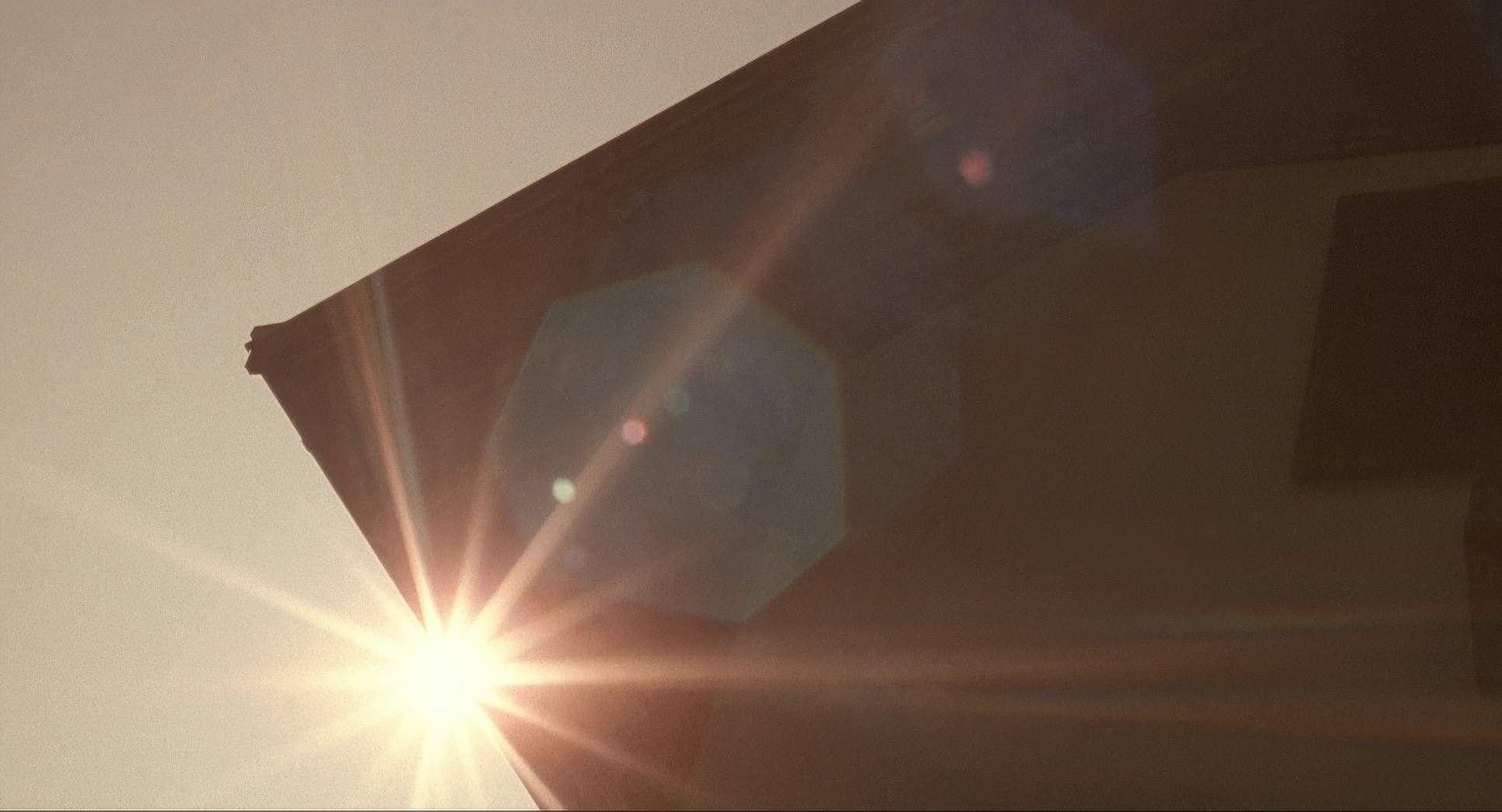
When I analyze the movement in Red, I see a “watchful eye.” The camera doesn’t jump in; it lingers. It’s a patient, almost voyeuristic perspective that fits the theme of interconnectedness perfectly.
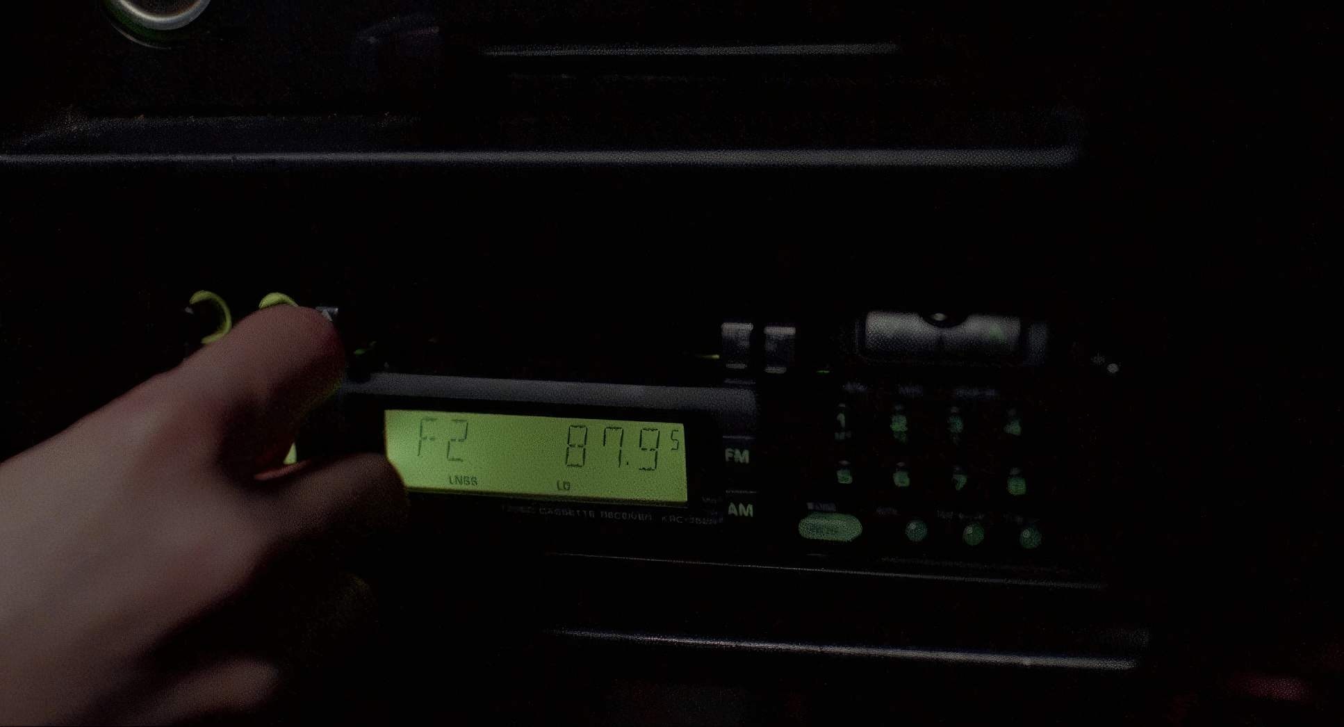
Look at that opening sequence: a dizzying trip through phone lines and satellites. It’s a technical flex, sure, but it sets the stage for a world where we are all connected by wires but isolated in our rooms. Throughout the film, Sobociński uses the Moviecam Compact with a precision that never feels gratuitous. Whether it’s a slow push-in during an intimate conversation between Valentine and the judge or a static wide shot that lets a silence settle, the movement is always motivated. It’s a masterclass in knowing when to move the camera and, more importantly, when to let it stay still.
Compositional Choices

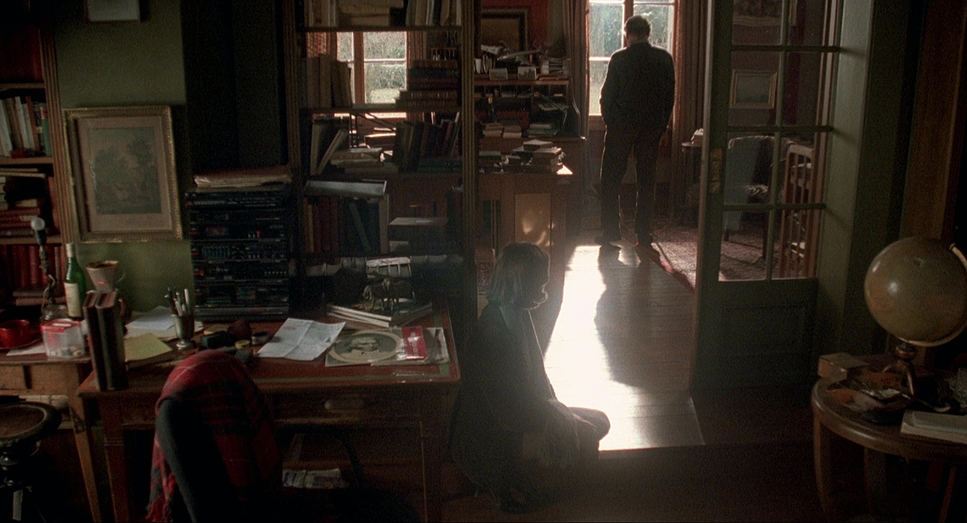
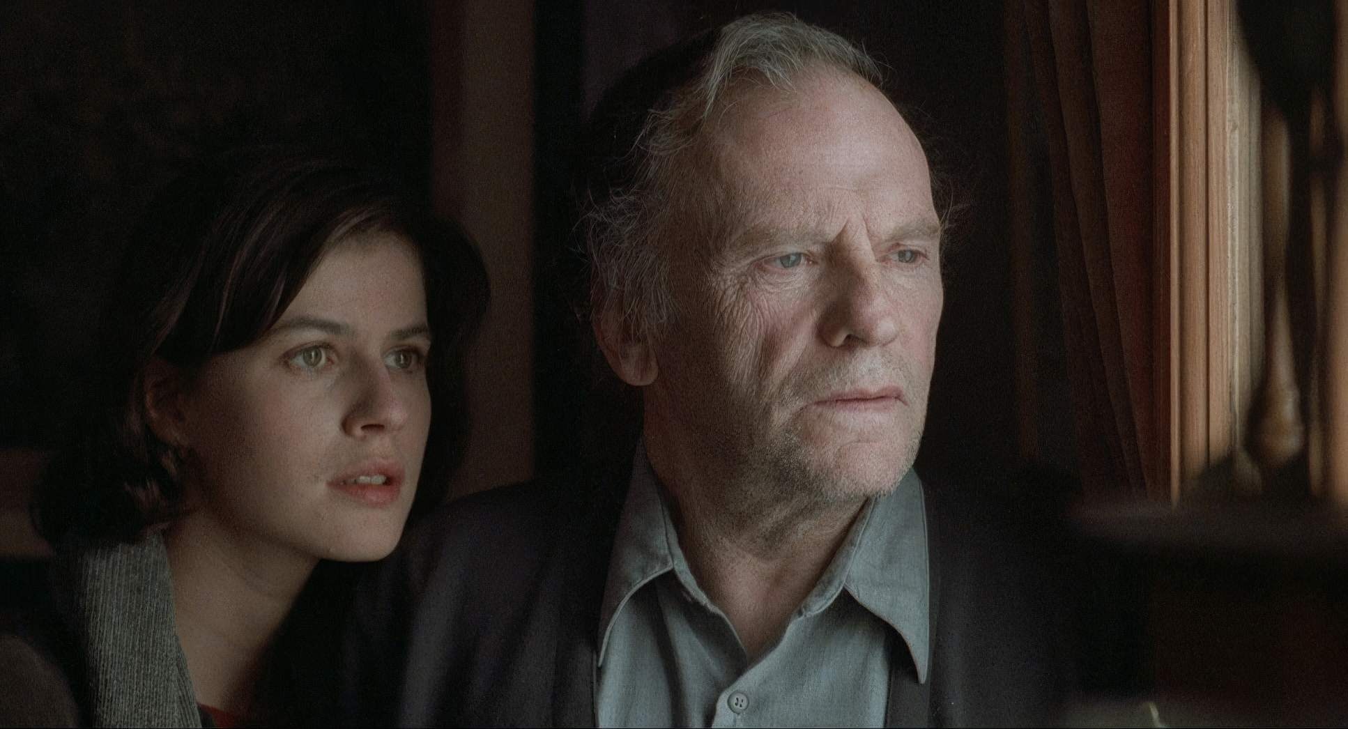
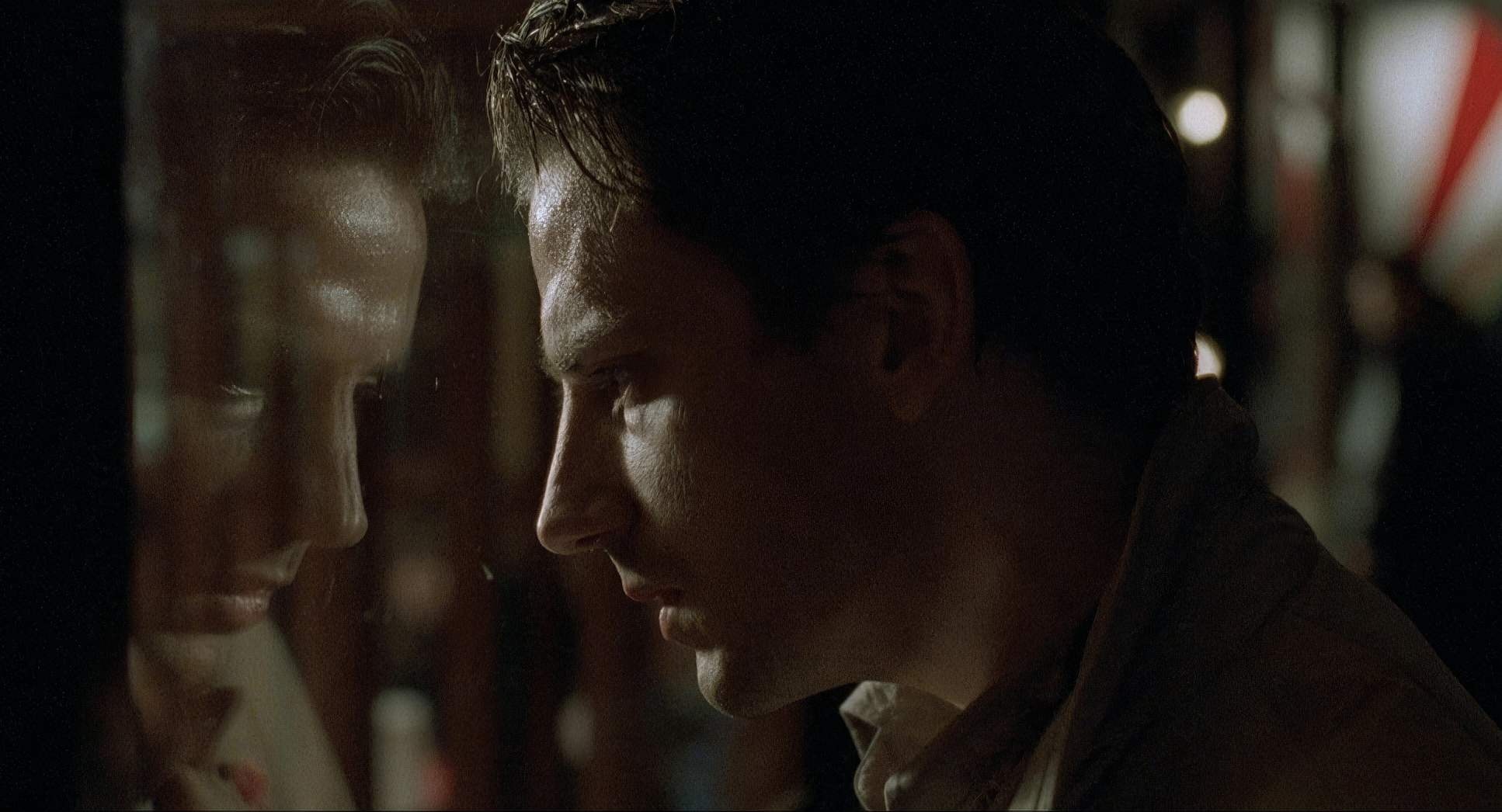
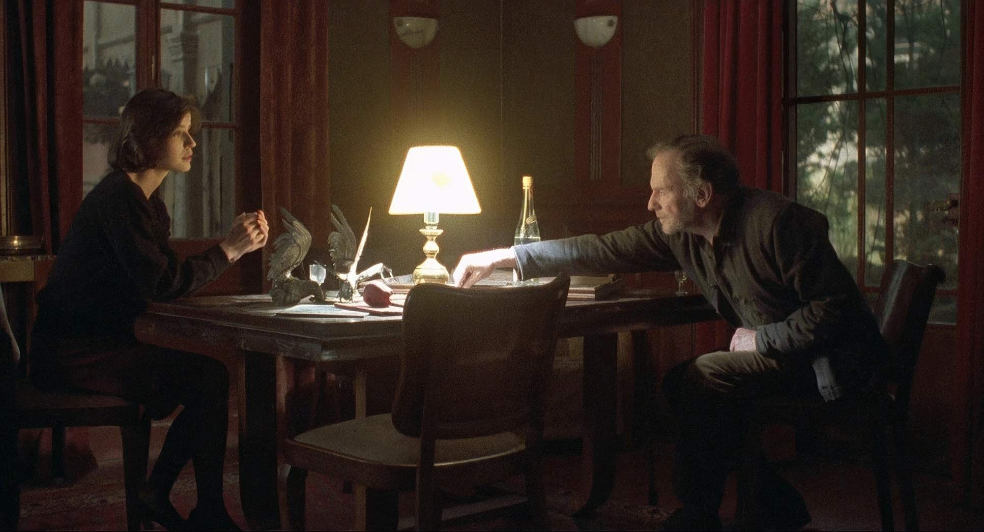
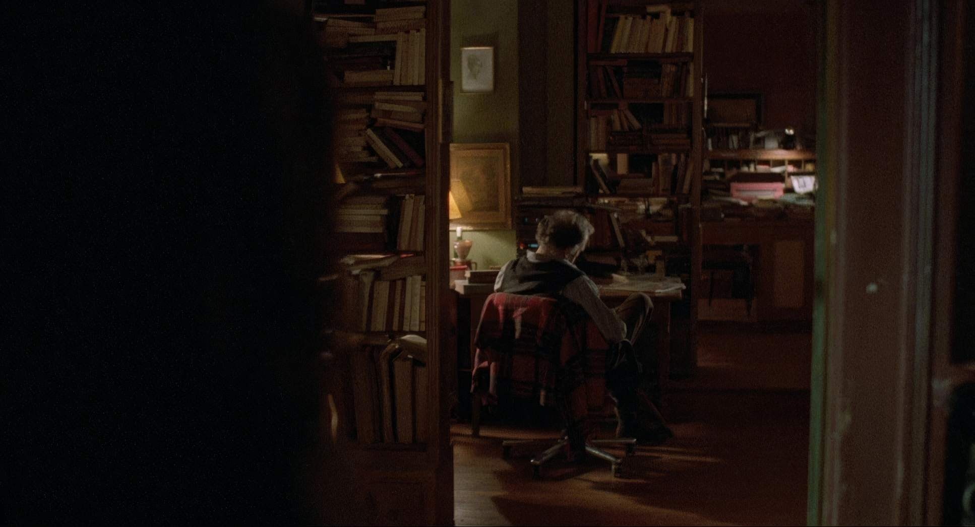
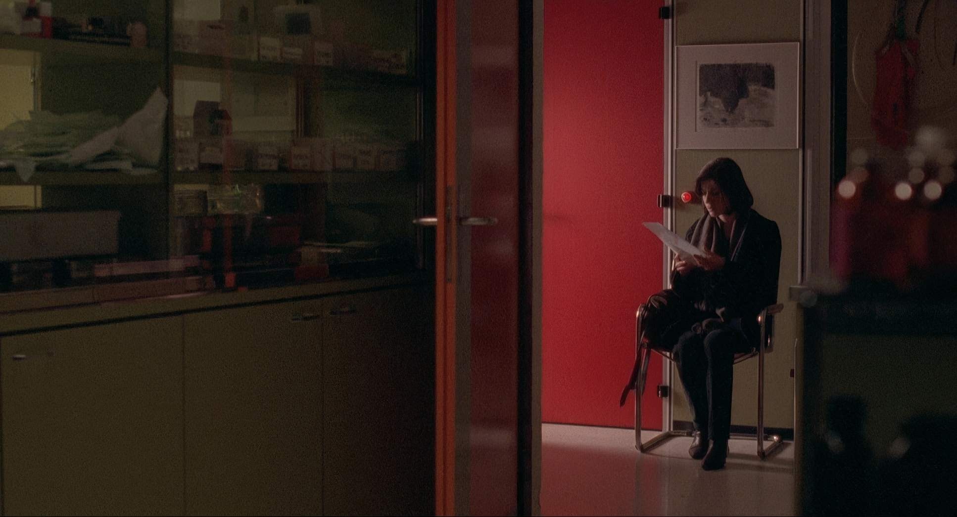
This is where Sobociński’s brilliance really hits home. He uses deep staging to highlight how alone these characters are, even when they’re in the same room. In the scenes at the judge’s house, the framing is often “left heavy” or claustrophobic, using windows as barriers that turn the characters into observers of their own lives.
I’ve spent countless hours in the grading suite trying to “save” a shot where the composition was off, and let me tell you: you can’t fix bad framing with a primary grade. Red is a constant reminder that the emotional logic of a shot is locked in during pre-visualization. The contrast between Valentine’s expansive, hopeful backdrops and the judge’s cramped, dark interiors creates a visual dialogue that color alone couldn’t achieve. It’s about the underlying structure of the frame.
Lighting Style
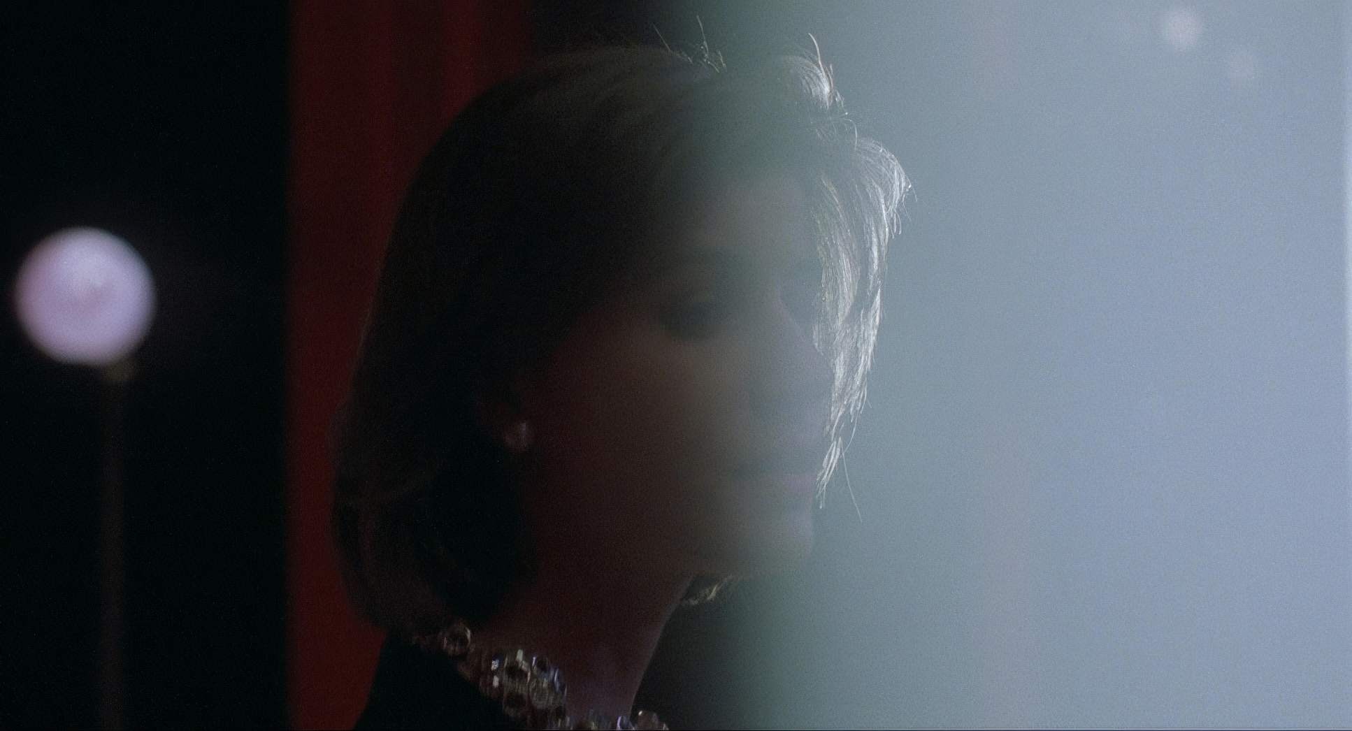
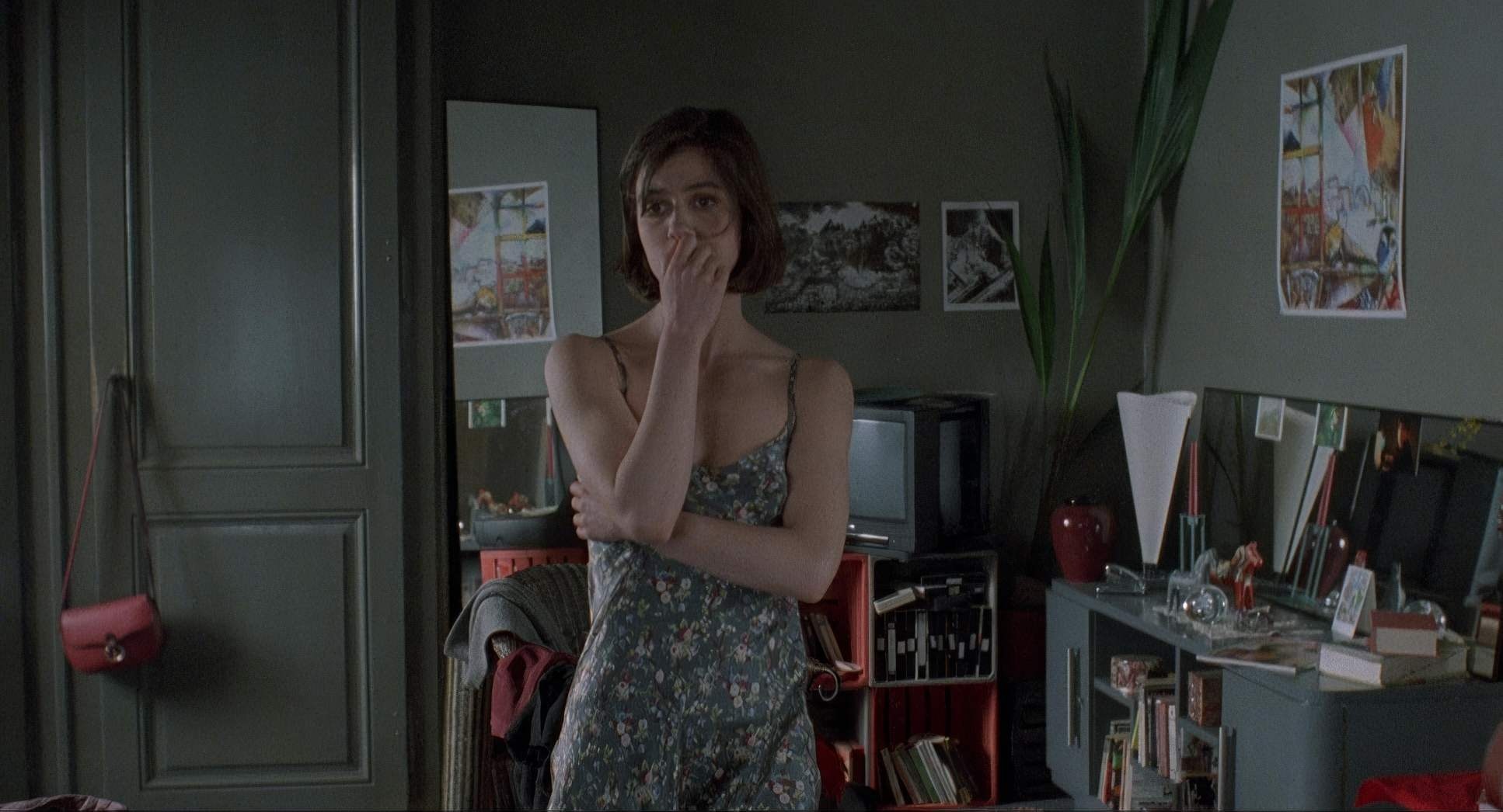
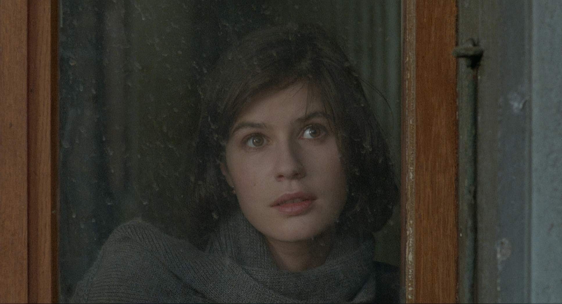
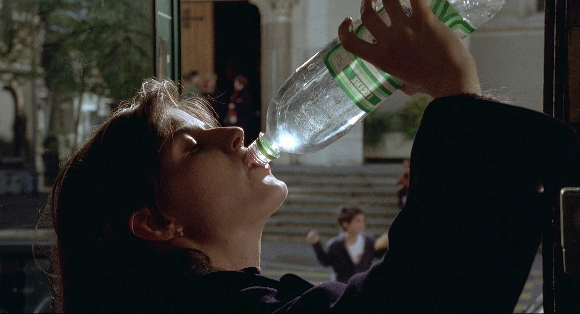
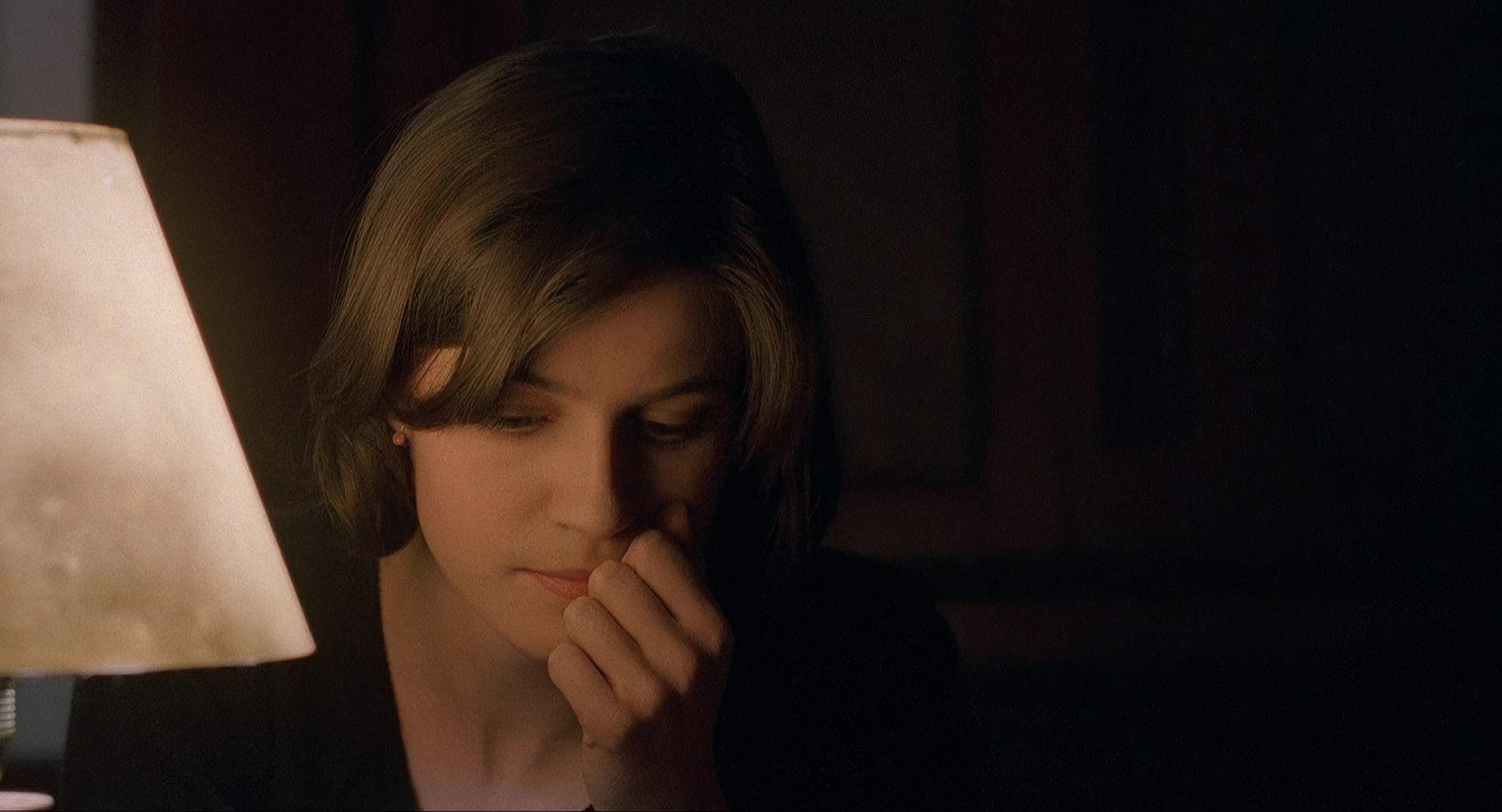
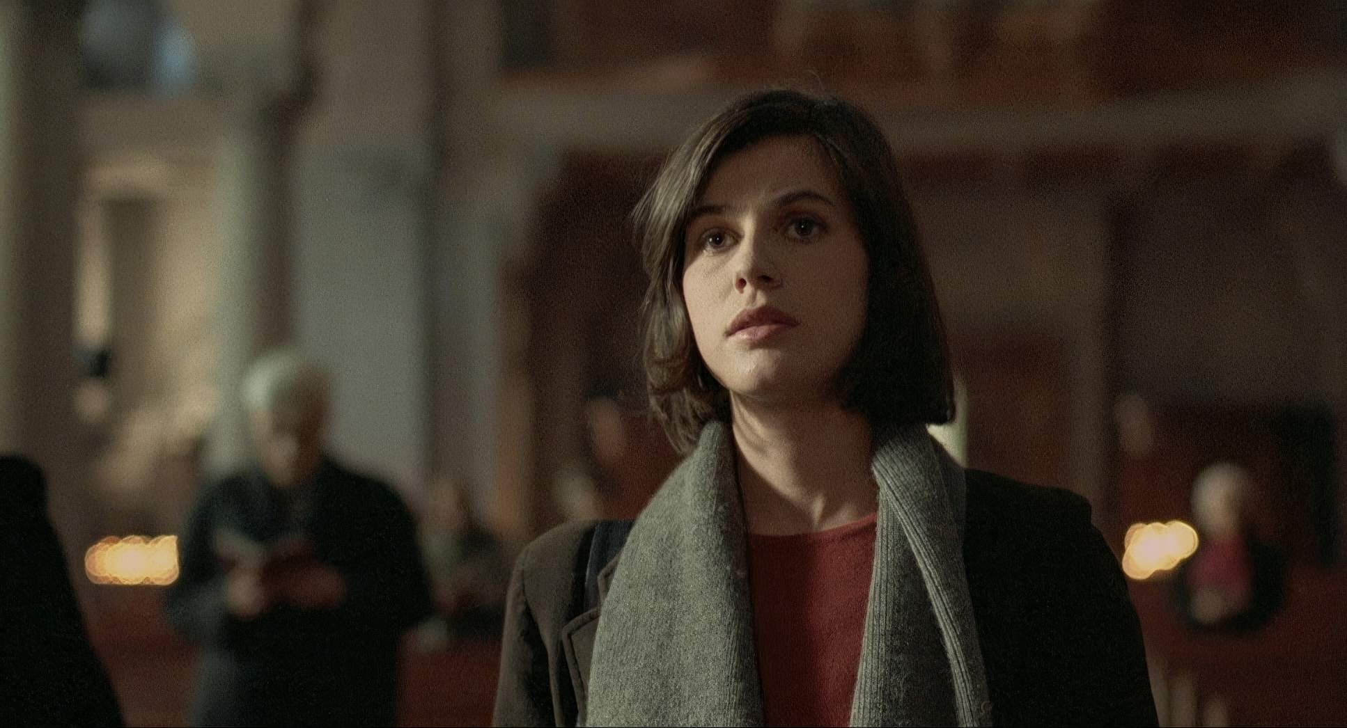
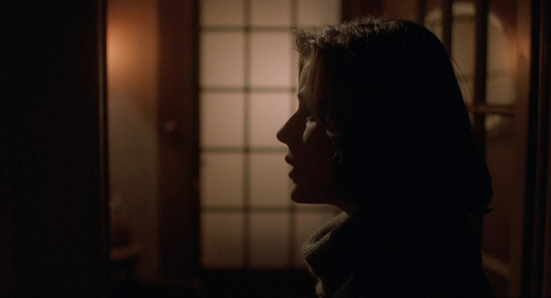
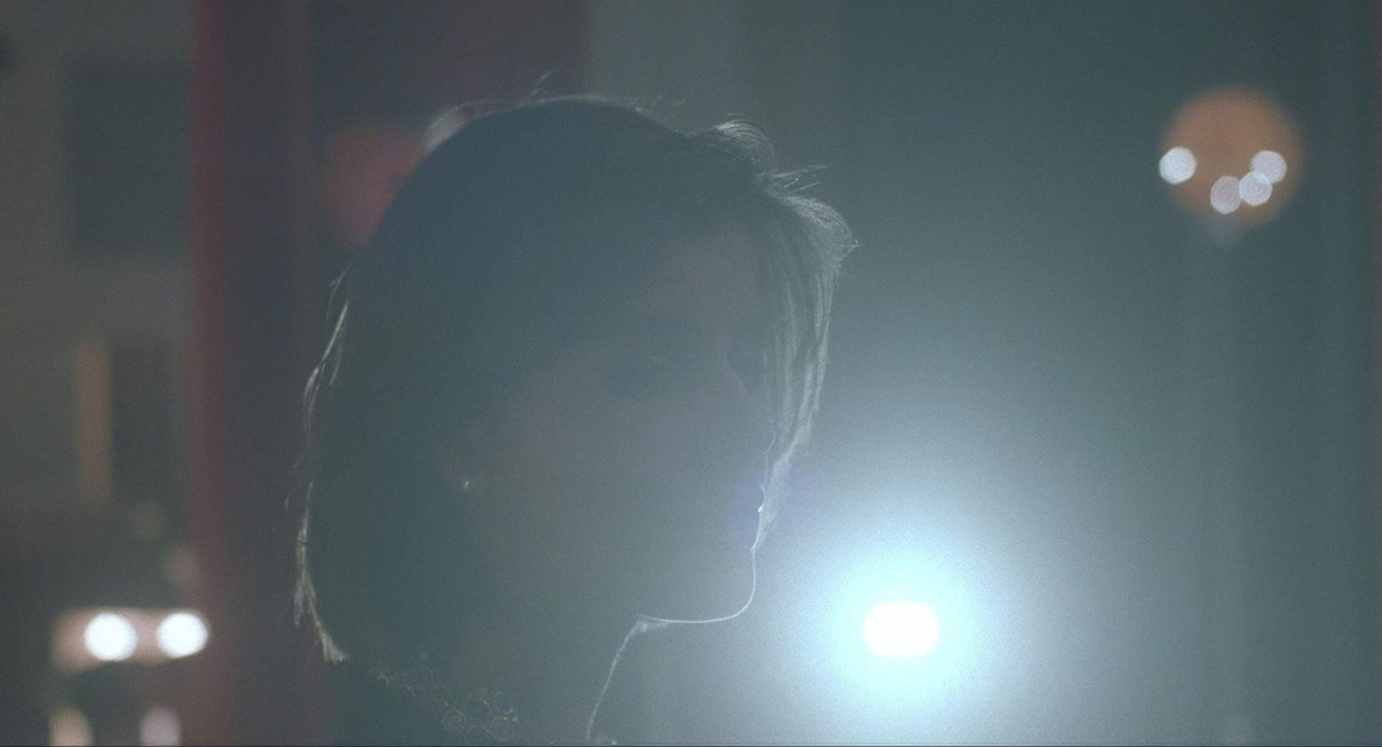
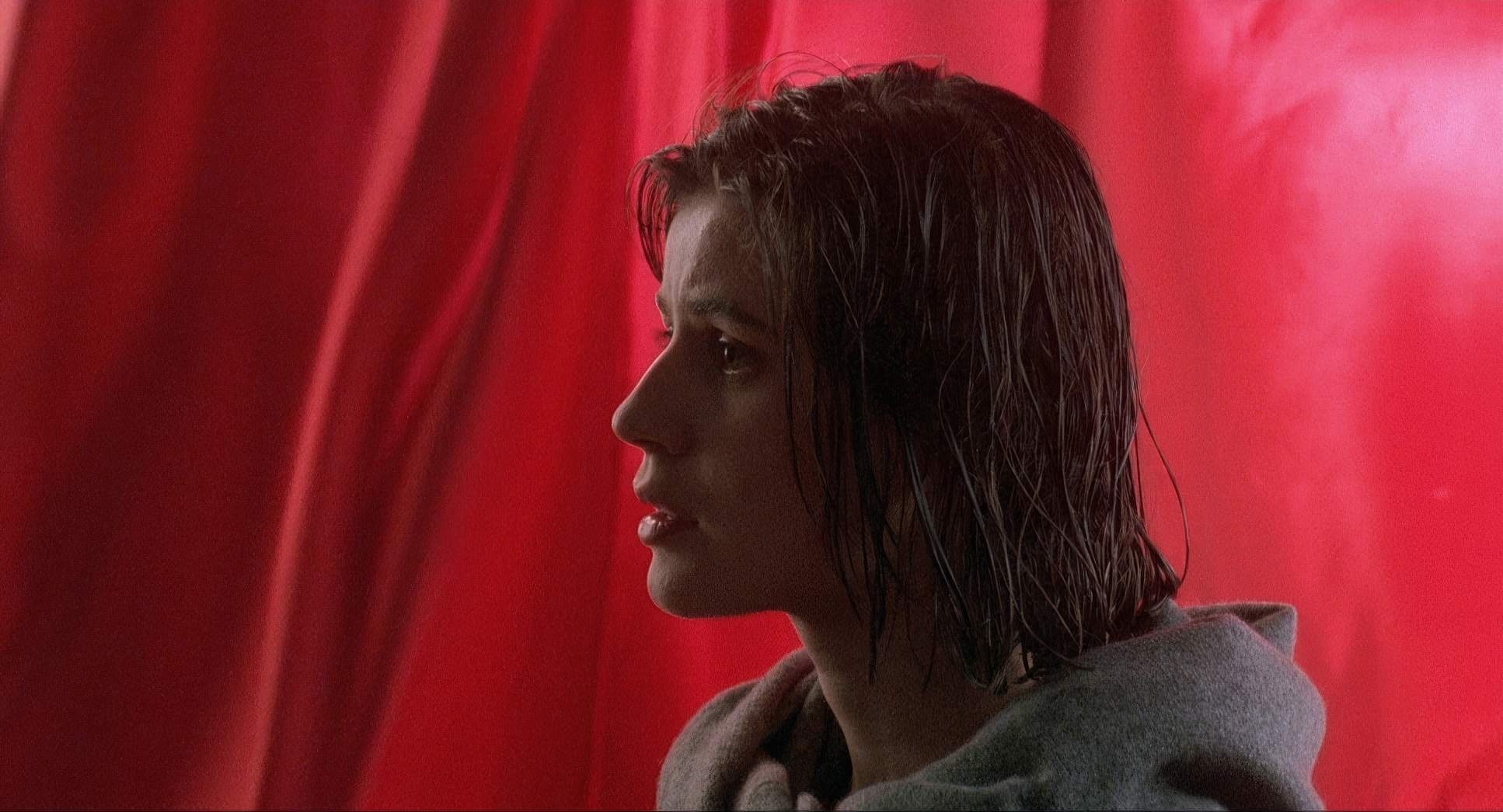
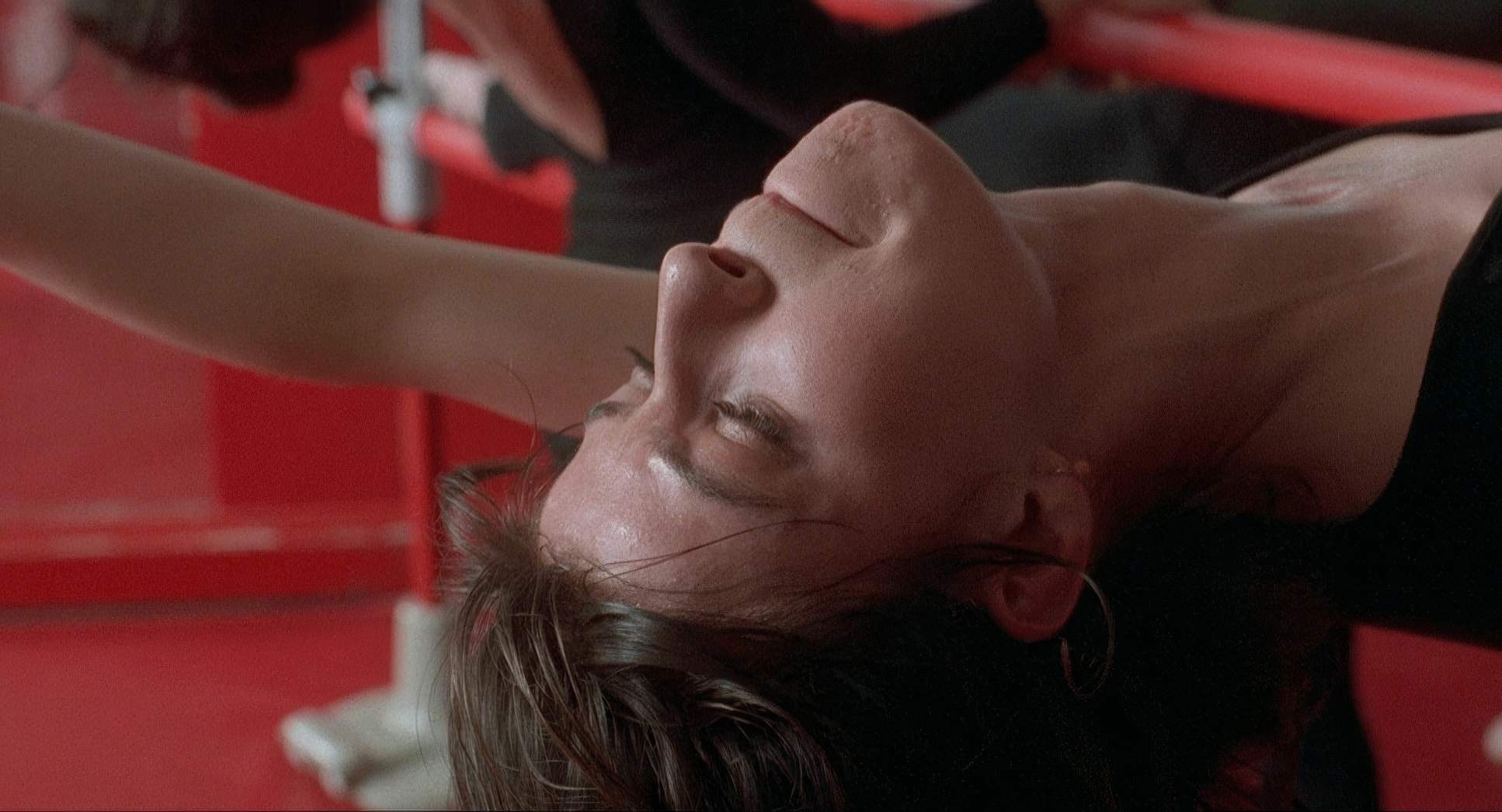
The lighting in Red is basically a character in its own right. Sobociński’s style here is lived-in and naturalistic, but incredibly calculated. For Valentine, the light is soft and diffused often feeling like it’s pouring in from large windows which gives her this gentle, vibrant glow. It’s “bright” in a way that suggests innocence.
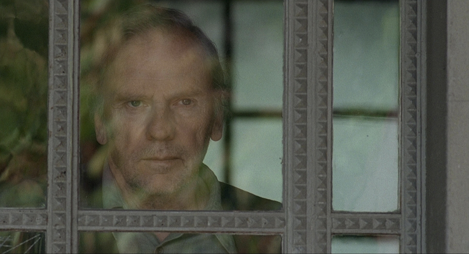
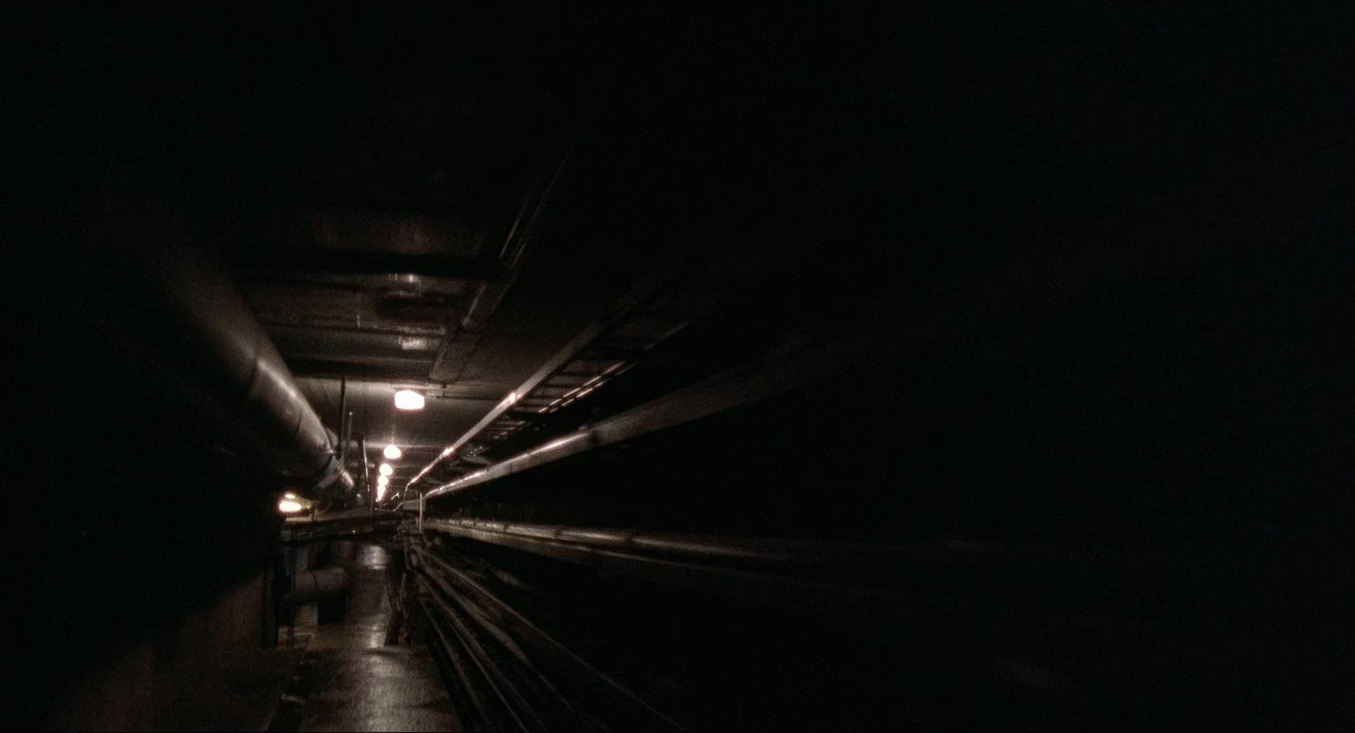
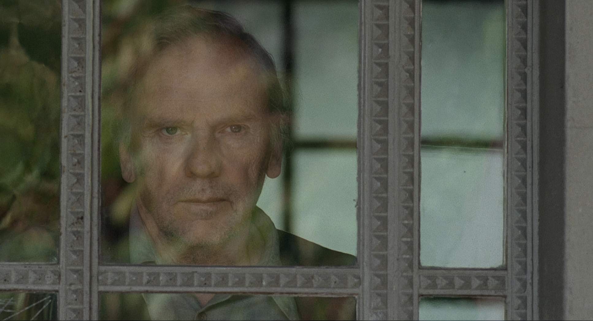
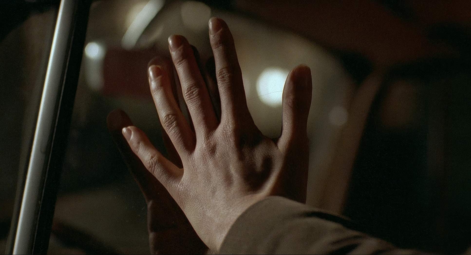
Then you hit the judge’s world, and the lighting shifts to those somber, desaturated browns and greys. He uses motivated lighting to create these little pools of light in the darkness. As a colorist, I look at the highlight roll-off in these scenes and see the beauty of 35mm film; the way the shadows hold detail without feeling “digital” or thin. He’s sculpting the space with light to show us the judge’s cynicism. It’s not just illumination; it’s psychological warfare.
Lensing and Blocking
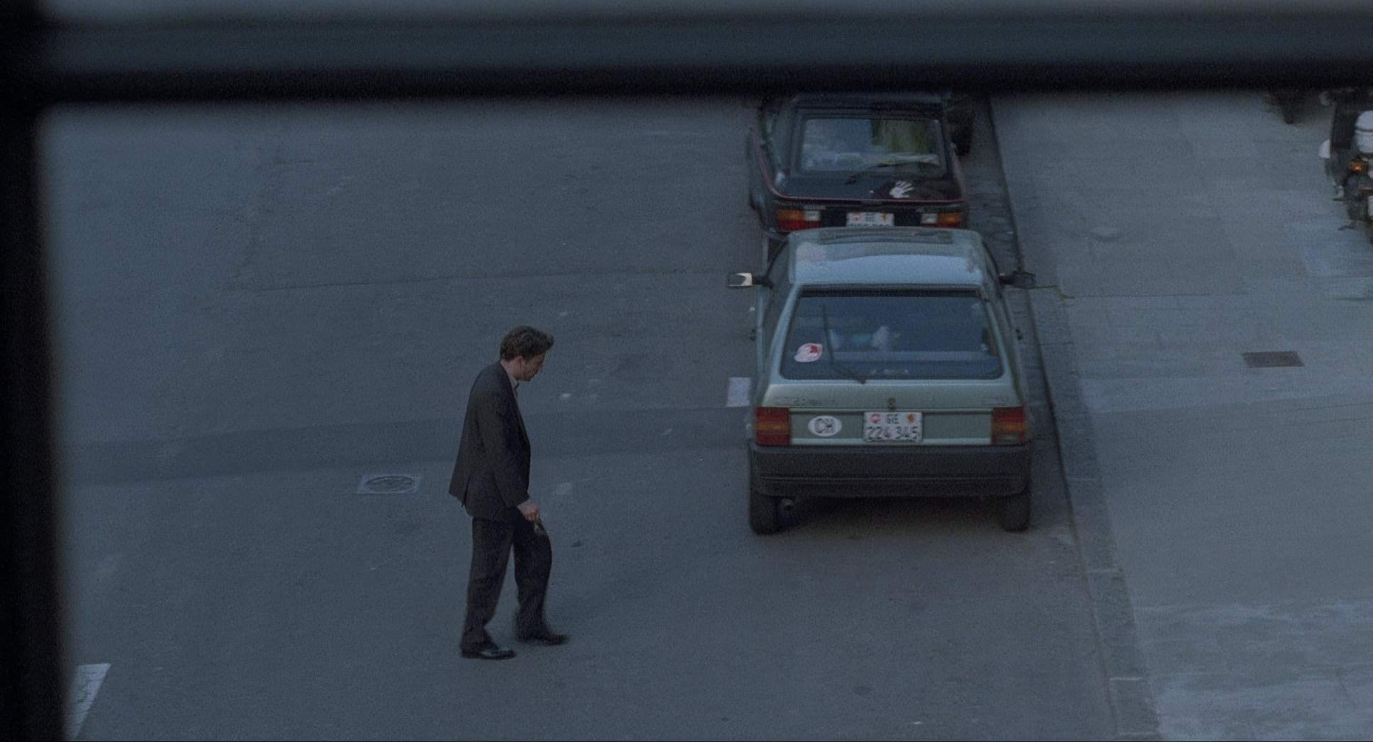
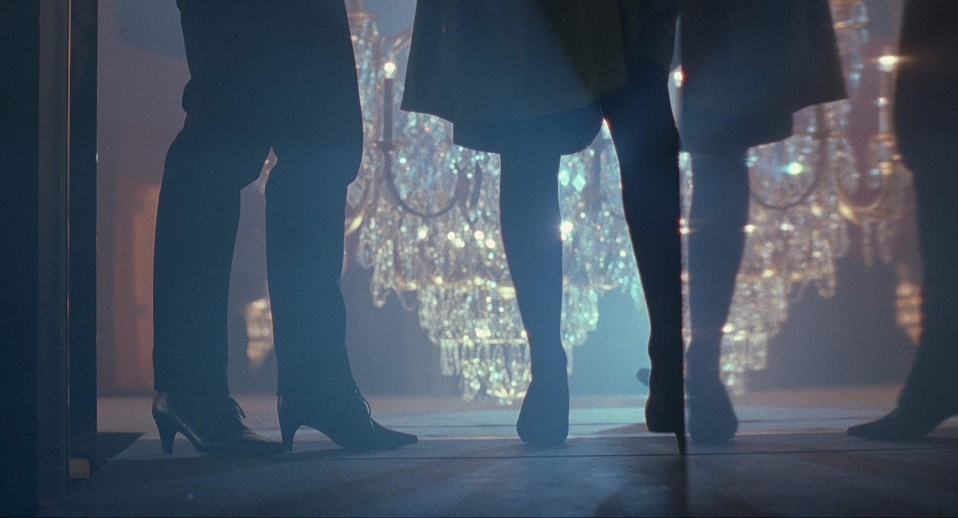
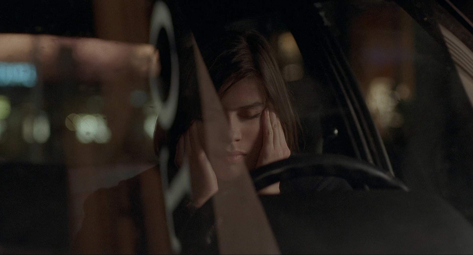
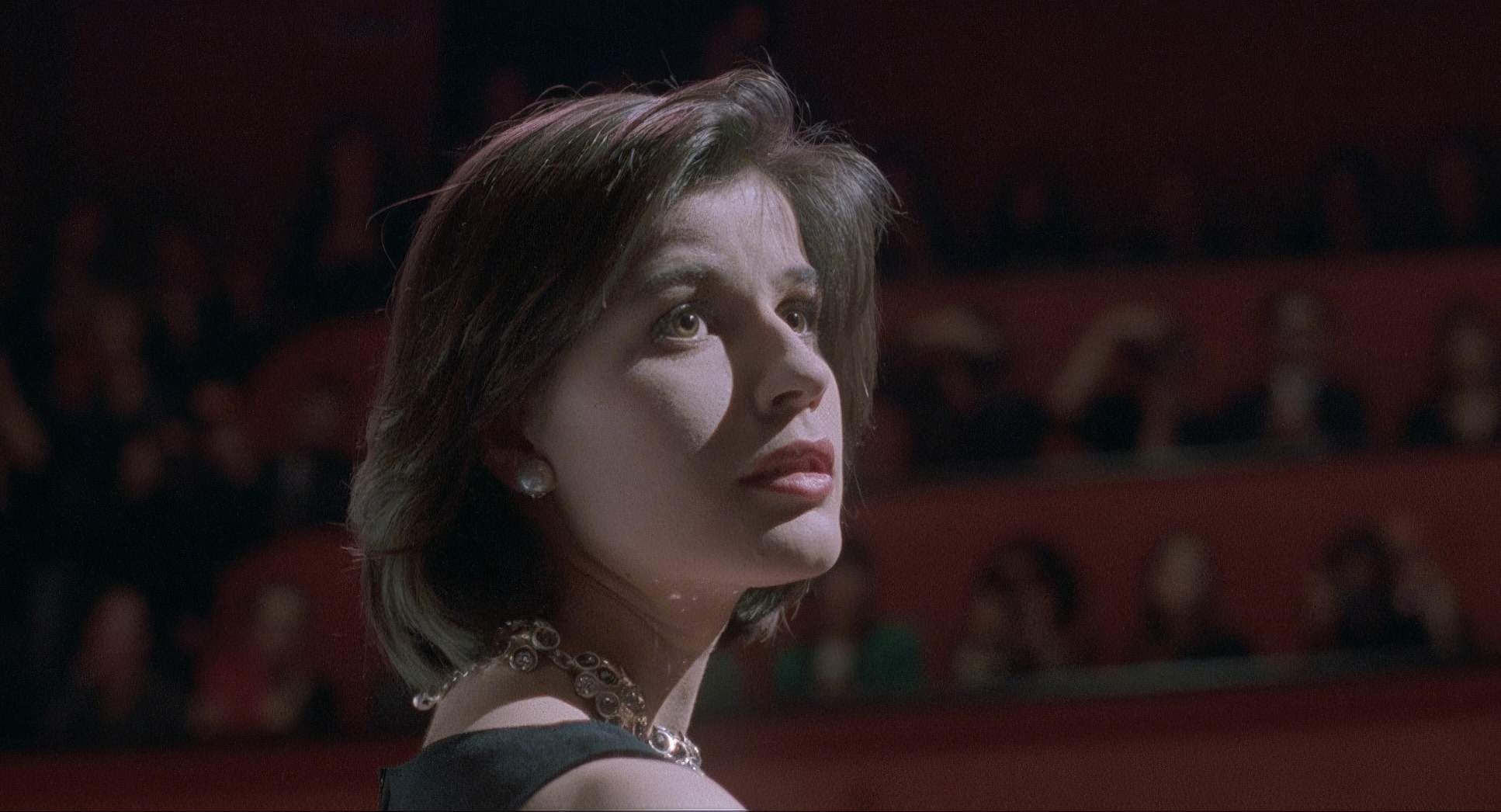
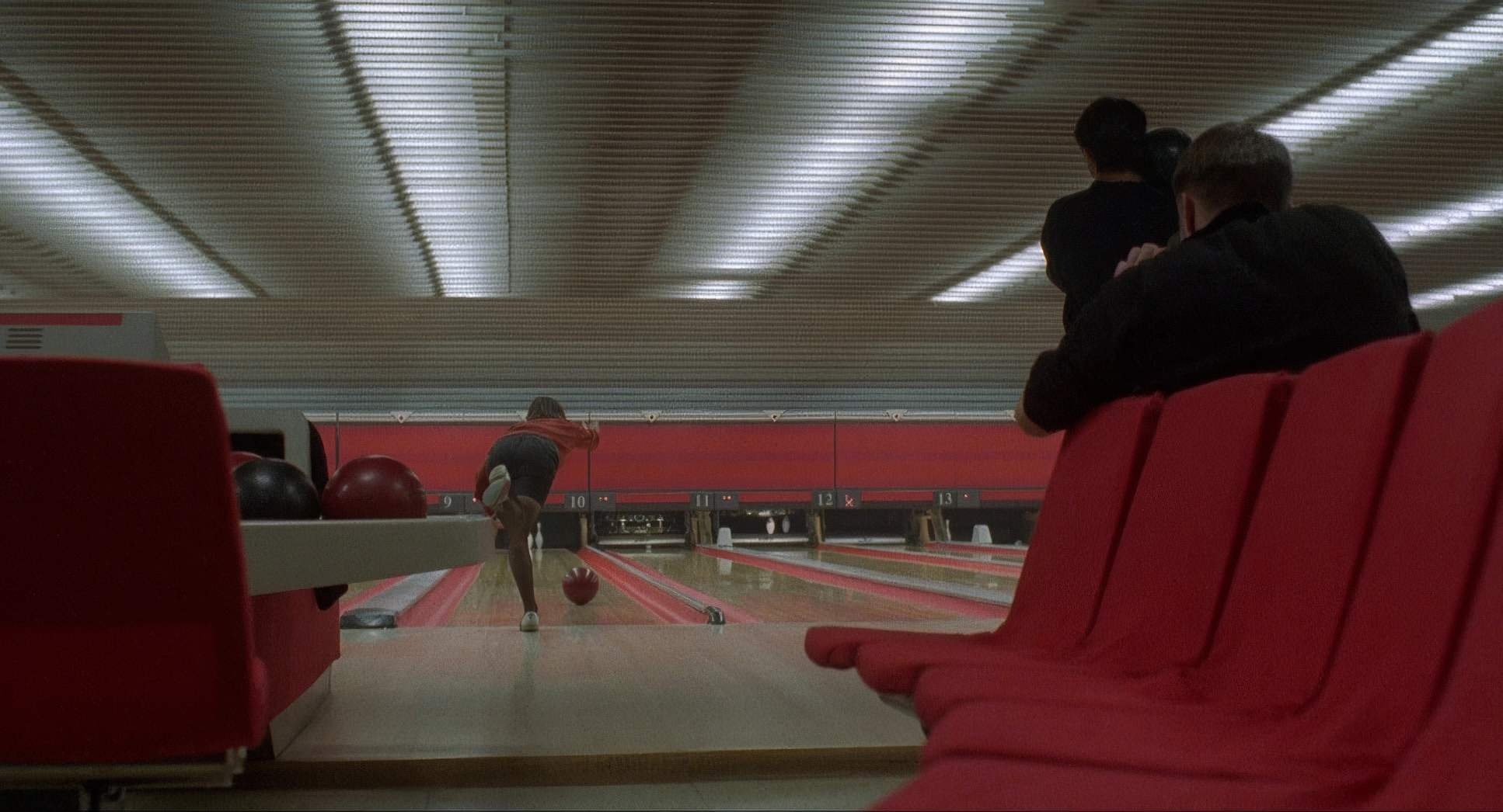
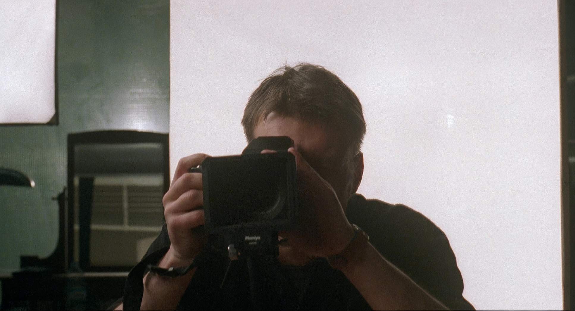
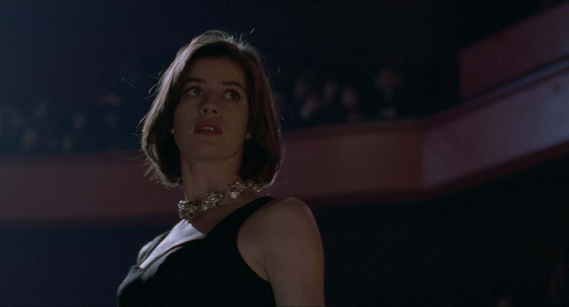
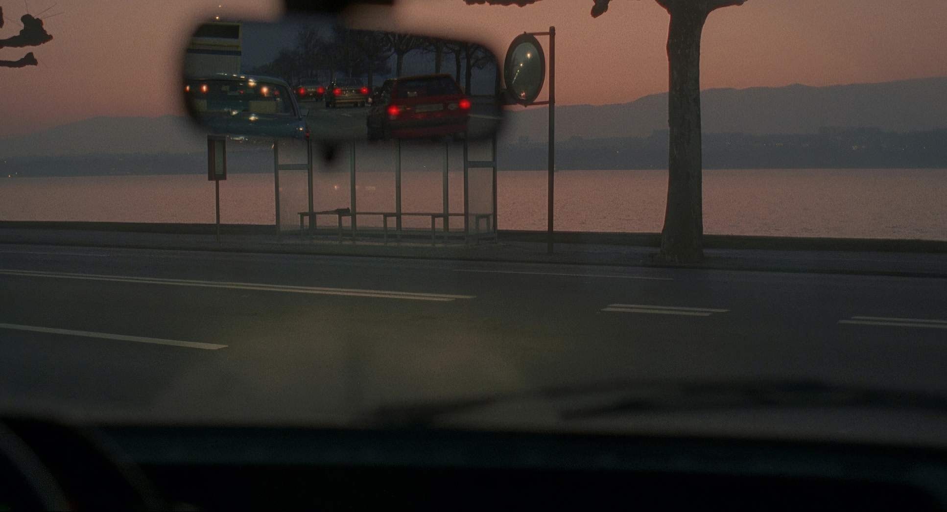
The choice of glass here is vital. Using Zeiss Super Speeds and Cooke Varotal zooms, Sobociński toggles between wide urban landscapes and compressed, intimate close-ups. The wider lenses capture the scale of Geneva and Valentine’s place in it, while the longer lenses are used to “spy” on the characters, compressing the space and making the judge’s voyeurism feel more visceral.
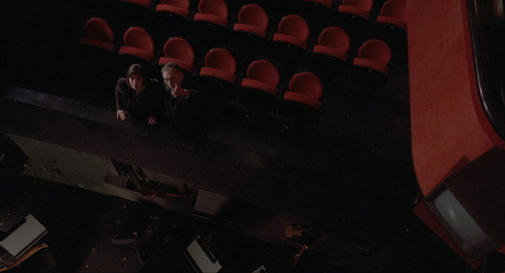
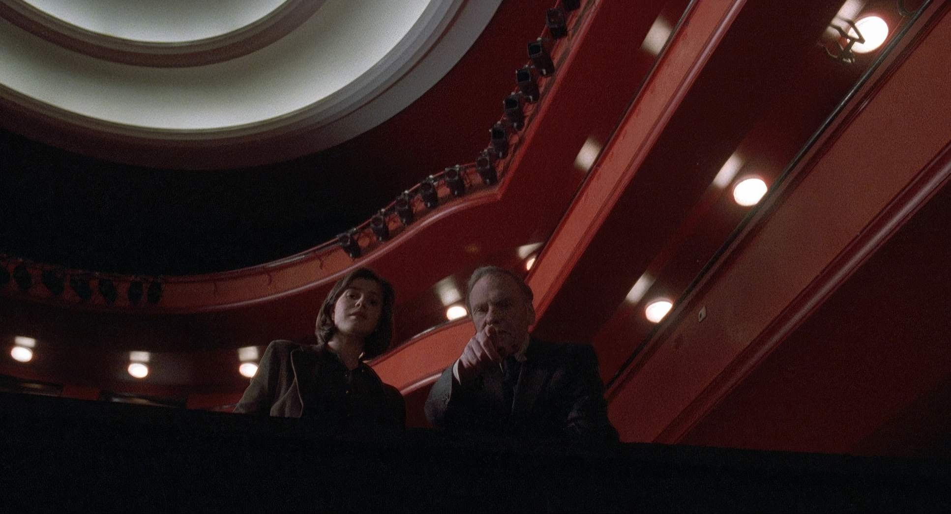
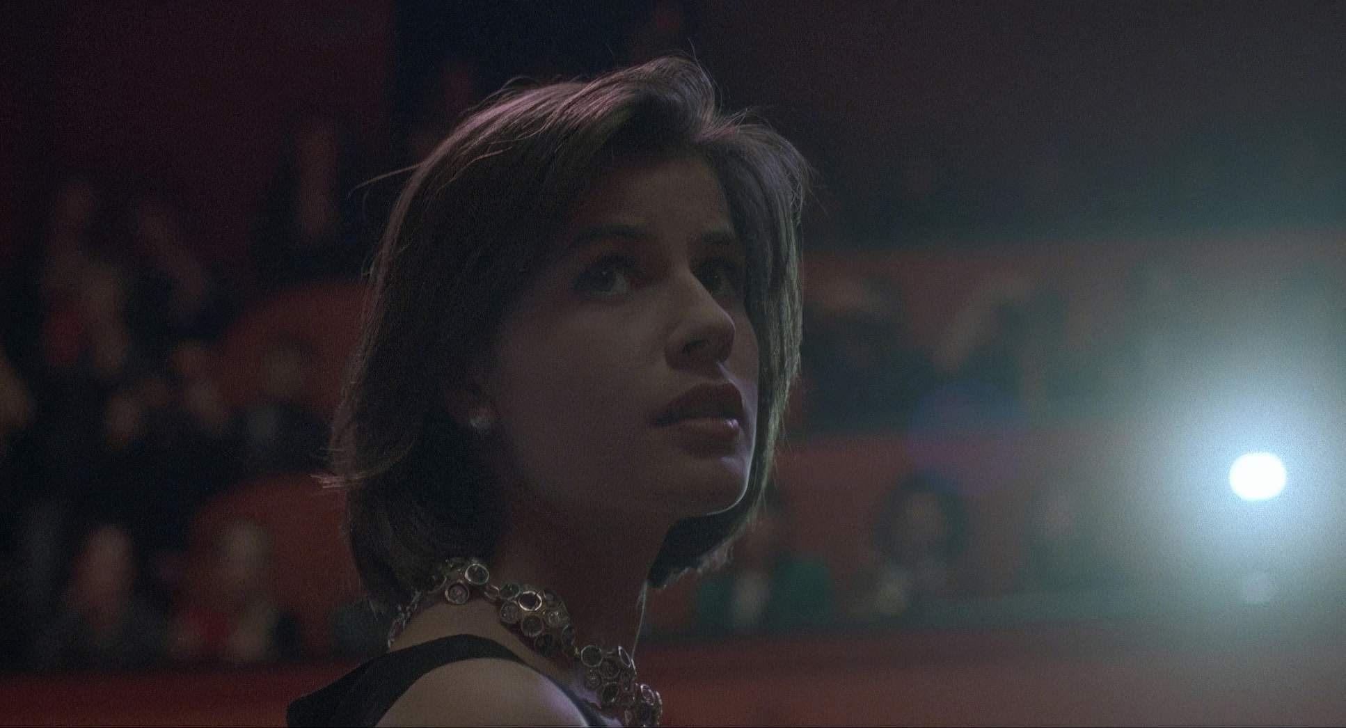
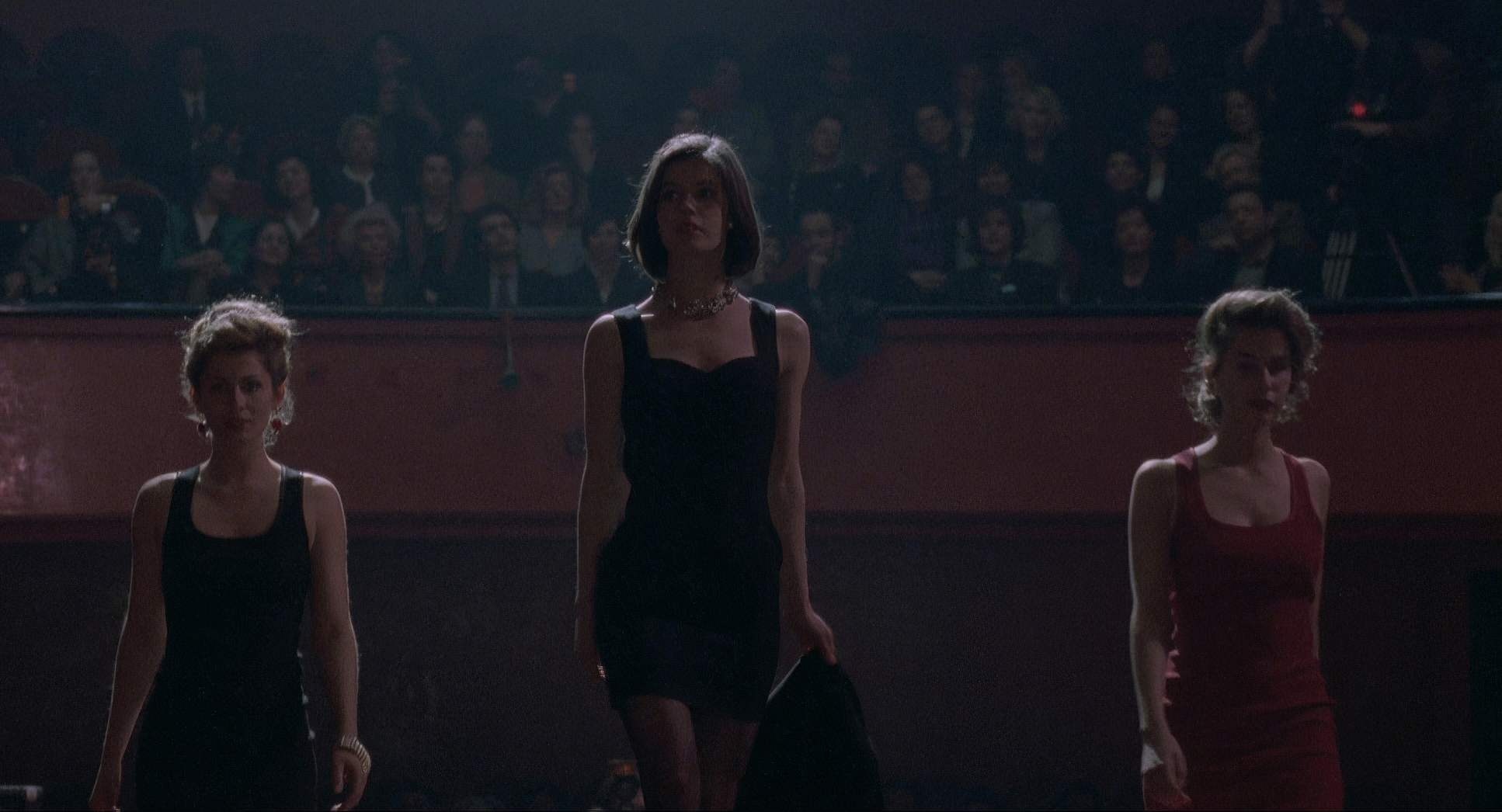
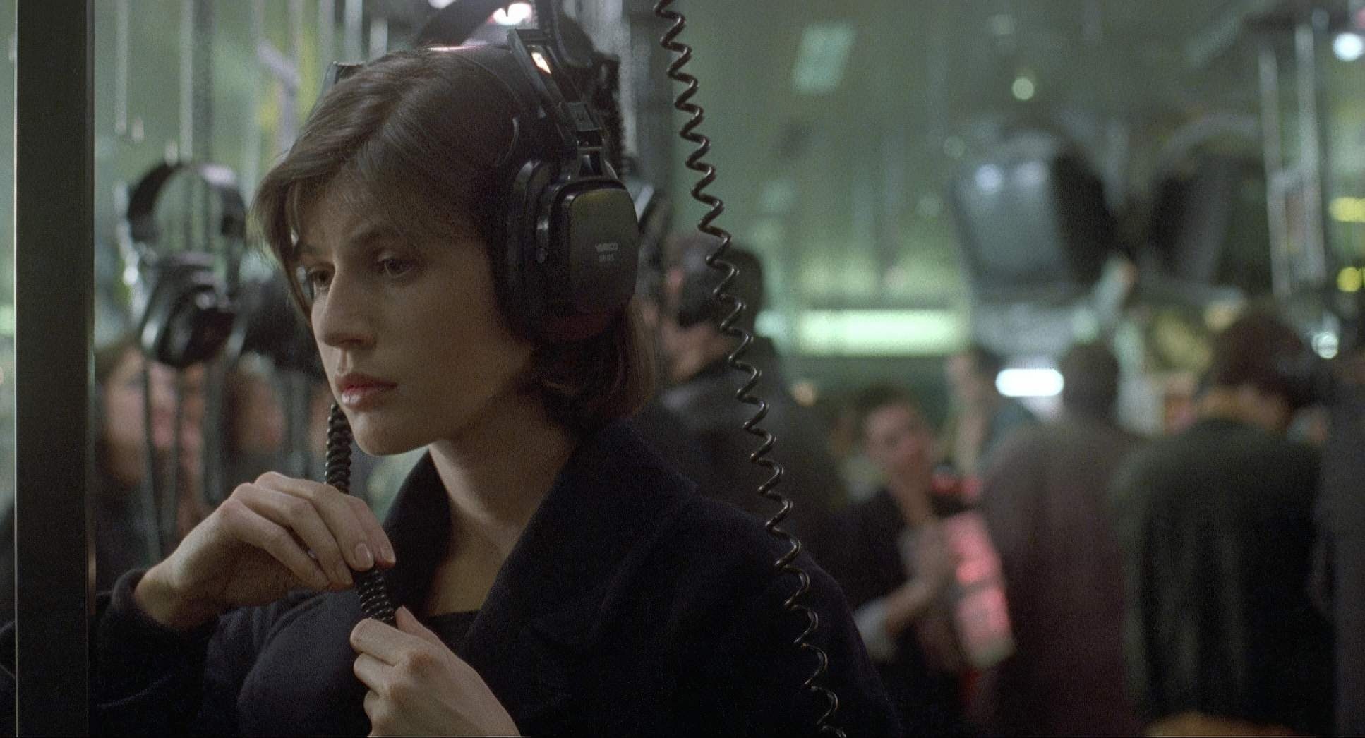
The blocking is just as deliberate. The judge is often tucked behind objects or kept at a physical distance from Valentine. Even when they are at the Lausanne Opera, the way they are positioned tells the story of two people who are “outsiders looking in.” Every movement and every lens choice reinforces that feeling of being an observer who is ultimately alone.
Color Grading Approach
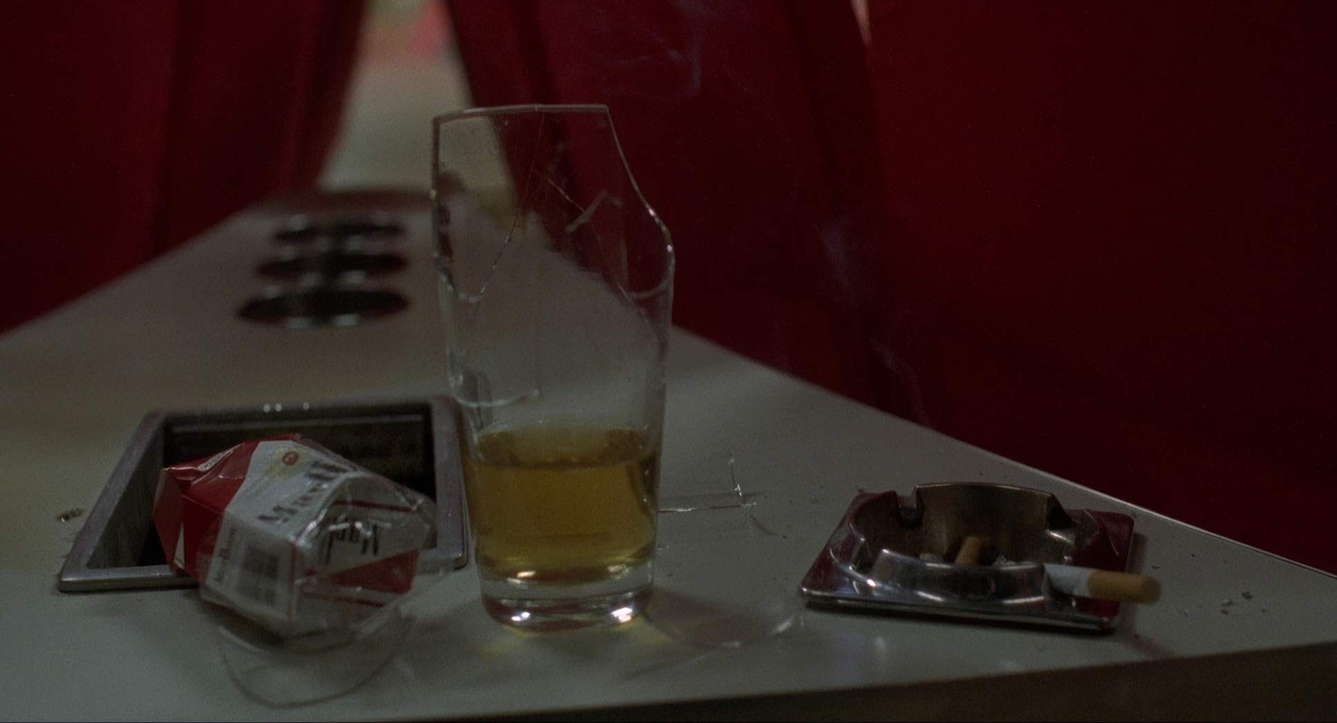
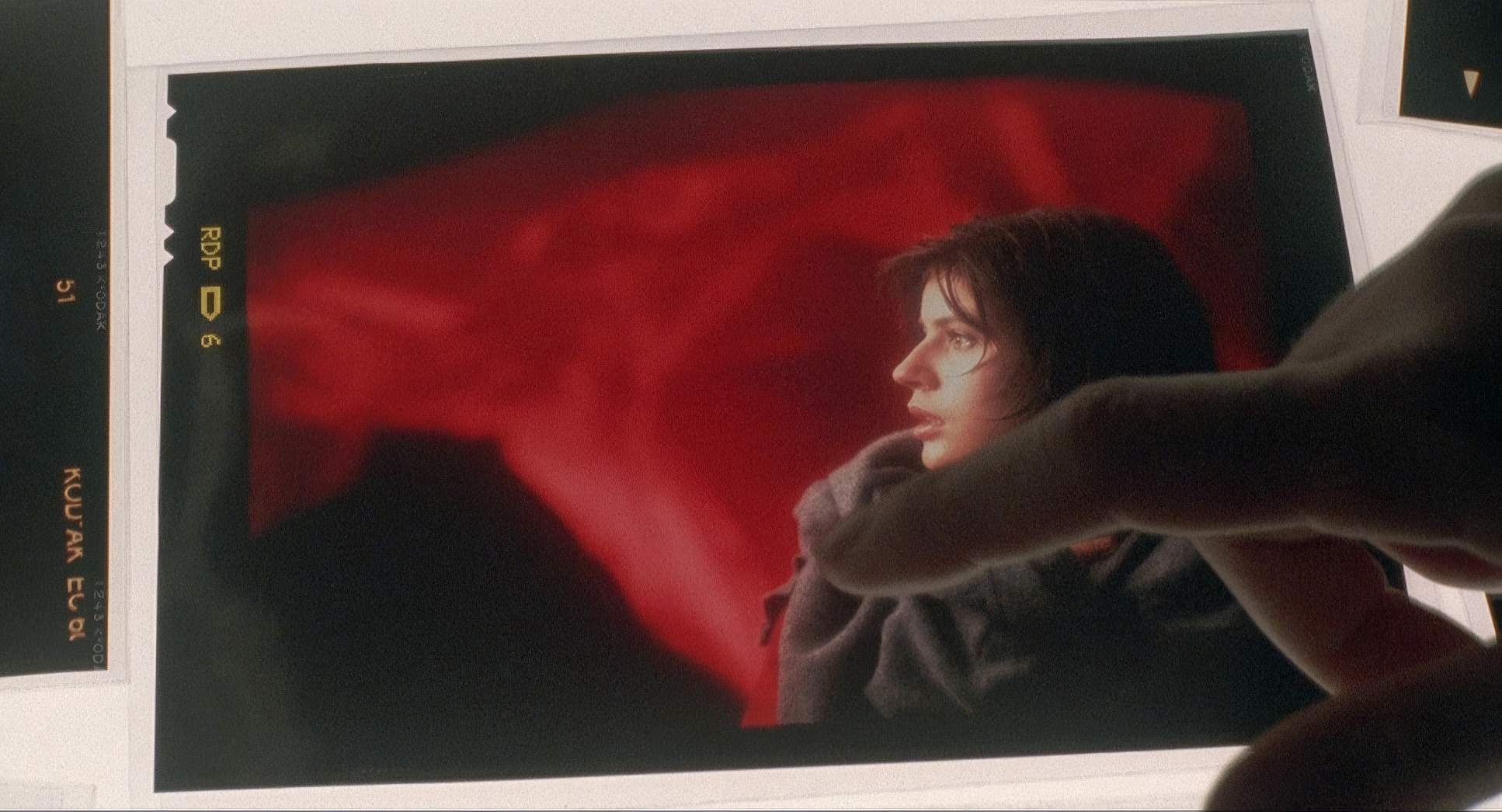
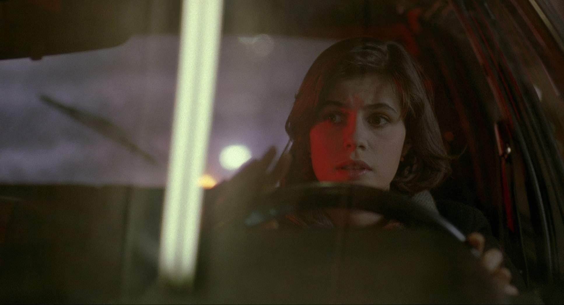
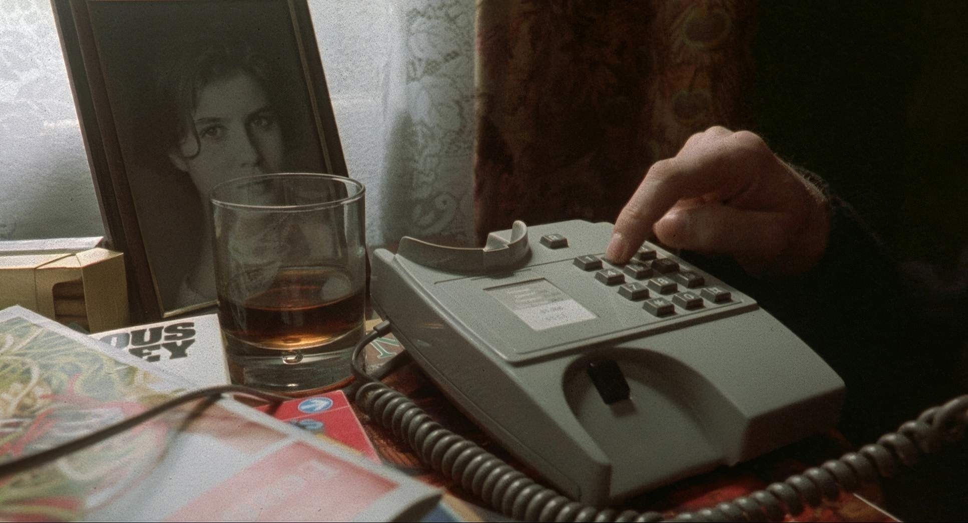
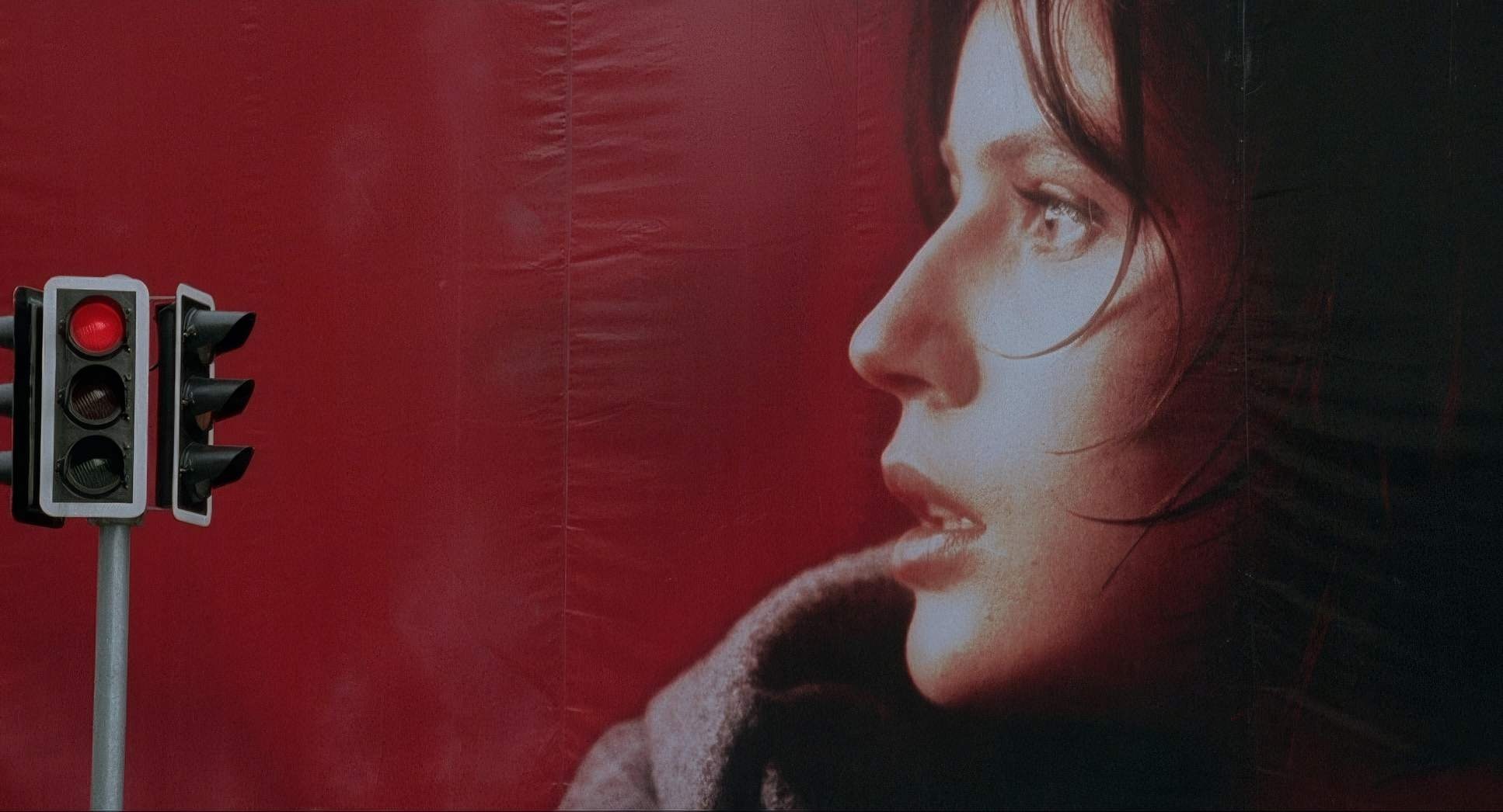
This is the part that makes my colorist heart sing. Red isn’t just a title; it’s a total immersion. If I were grading this today, my main goal would be hue separation. We need those reds Valentine’s car, her jacket, the neon signs to pop with a very specific energy without looking garish or “bleeding” into the rest of the frame.
It’s about shaping the emotional quality of the red. Is it the warm red of a heartbeat or the cooler, threatening red of fate? In the judge’s world, I’d be desaturating the surroundings to let those “dollar tones” take over, making any flash of red feel like a sudden intrusion of life into his grey existence. I’d lean into a cooler overall palette for his house but keep the skin tones natural. For Valentine, I’d open up the dynamic range, letting the highlights glow just a bit more to sell that youthful optimism.
Technical Aspects & Tools
Three Colors: Red (1994) 35mm | 1.85:1 | Spherical
| Genre | Drama, Mystery, Romance |
| Director | Krzysztof Kieślowski |
| Cinematographer | Piotr Sobociński |
| Production Designer | Claude Lenoir |
| Costume Designer | Corinne Jorry |
| Editor | Jacques Witta |
| Time Period | 1990s |
| Color | Warm, Saturated, Red |
| Aspect Ratio | 1.85 – Spherical |
| Format | Film – 35mm |
| Lighting | Soft light, Underlight |
| Story Location | Canton de Genève > Geneva |
| Filming Location | Lausanne > Lausanne Opera – Avenue du Théâtre 12 |
| Camera | Moviecam Compact |
| Lens | Zeiss Super Speed, Cooke Varotal Lenses |
While we live in a digital world now, Red is a 35mm masterpiece. Shooting on film inherently gave Kieślowski a texture that organic grain and “bloom” that we spend half our time trying to emulate in DaVinci Resolve today.
Using the Moviecam Compact and Kodak stock provided a physical veracity to the image. There’s a depth of color information in those negatives that helps the film explore its central question: Can an image ever tell us what’s real? As a colorist, I’m always aware of the inherent dynamic range of film. The subtle imperfections in the emulsion are what give Red its soul. It’s a reminder that sometimes the most beautiful images are the ones that feel a little bit human and “imperfect.”
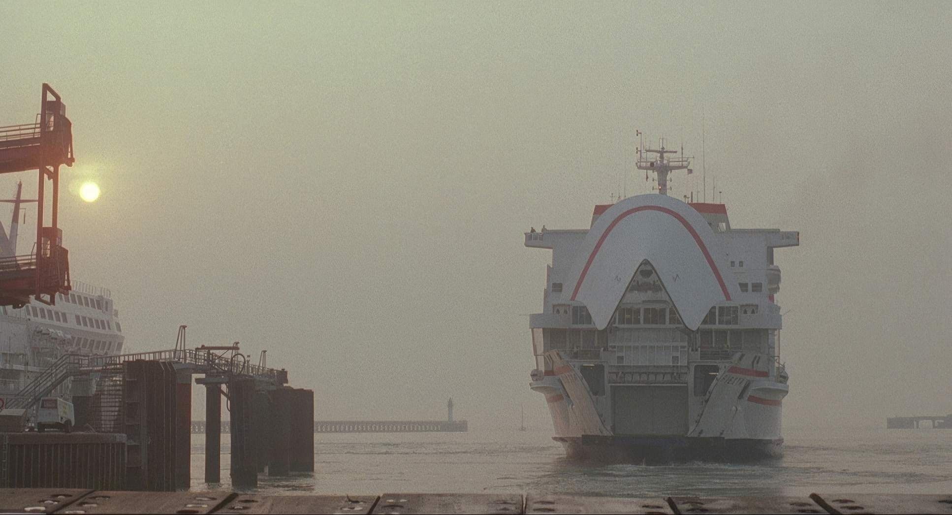
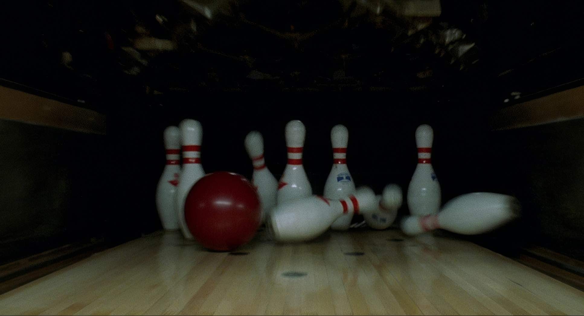
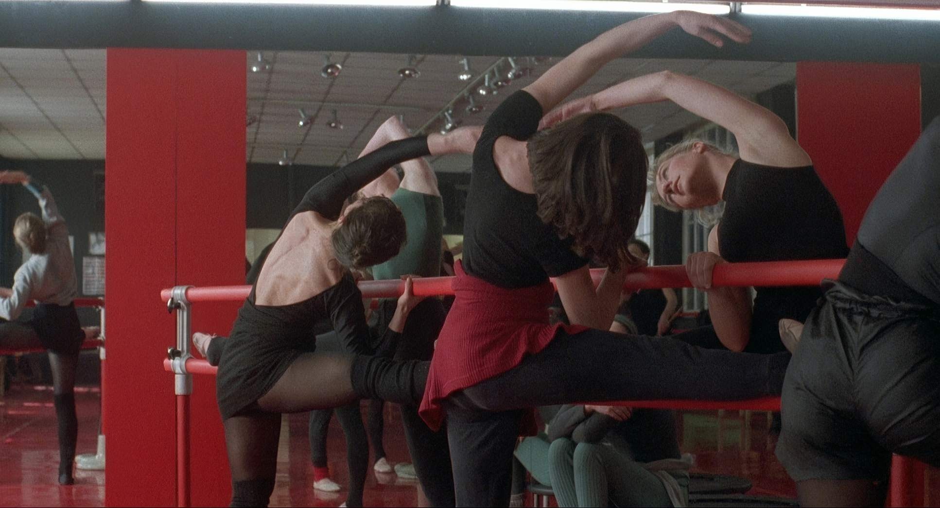
Three Colors: Red Film Stills
A curated reference archive of cinematography stills from Three Colors: Red (1994). Study the lighting, color grading, and composition.

- Also read: ELITE SQUAD (2007) – CINEMATOGRAPHY ANALYSIS
- Also read: IT HAPPENED ONE NIGHT (1934) – CINEMATOGRAPHY ANALYSIS
Browse Our Cinematography Analysis Glossary
Explore directors, cinematographers, cameras, lenses, lighting styles, genres, and the visual techniques that shape iconic films.
Explore Glossary →