Watch This Is Spinal Tap and then you revisit a film like Spinal Tap, and it hits you: sometimes the greatest “vision” a filmmaker can have is the discipline to make it look like there wasn’t one at all.
With the 41st-anniversary re-release hitting theaters remastered and remixed for Dolby it’s the perfect time to look at why this “controlled chaos” still works. We all know the “it goes to 11” jokes, but as a technical nerd, what fascinates me is how brilliantly the technical execution served the gag. It didn’t just birth the modern mockumentary; it perfected a visual language of “unpolished reality” that shows like The Office are still stealing from today.
About the Cinematographer
The unsung hero here is Peter Smokler. While the core trio was busy improvising comedic gold, Smokler was in the trenches meticulously crafting the illusion that he was just trying to keep up. From my perspective in the grading suite, his work is a masterclass in restraint.
Smokler had a background in actual documentaries, and he brought that “no-nonsense” DNA to the set. He understood a fundamental truth that many cinematographers struggle with: for the comedy to land, the image couldn’t be “beautiful.” It had to be subservient to the narrative. He was the silent observer, and frankly, the highest compliment I can pay him is that for years, people actually thought this was a real documentary. That kind of “invisible” craft is incredibly hard to pull off.
Inspiration Behind the Cinematography

The primary target here was the self-serious rock documentary. Rob Reiner (playing Marty DiBergi) was specifically riffing on the vibe of guys like Martin Scorsese and his iconic The Last Waltz. They weren’t just satirizing the band; they were satirizing the way we film the band.
To get that “fly-on-the-wall” feel, Smokler and Reiner embraced the aesthetic of a crew that was perpetually two steps behind. It dictated everything: the choice of lenses, the “haphazard” framing, and the pragmatic lighting. It was about capturing the “sights, sounds, and smells” of the road minus the scratch-and-sniff. They wanted us to believe this was a low-budget, struggling production, which meant leaning into the grit of the 1980s music scene.
Camera Movements
In a mockumentary, the camera is basically another character, and in Spinal Tap, that character is a slightly overwhelmed cameraman. The camera is rarely static; it’s almost entirely handheld, giving us that subtle, organic wobble that signals “truth” to our brains.
It’s all about reactive movement. We see organic pans and tilts that feel motivated by the chaos like the camera is scurrying to follow Nigel as he shows off his amps. There are these functional, slightly “clumsy” zooms that I absolutely love. They feel like a camera op reframing on the fly to catch a reaction. These “purposeful imperfections” provide a rhythmic counterpoint to the deadpan dialogue. When the band is being absurd, the camera’s struggle to keep them in frame makes the scene feel ten times more grounded.
Compositional Choices
This is where my professional brain usually starts to itch, but in a good way. We’re taught about balance, leading lines, and the rule of thirds. Smokler throws most of that out the window. He mimics the “captured” reality of a doc crew that doesn’t have time to set up a perfect frame.
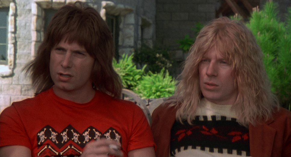
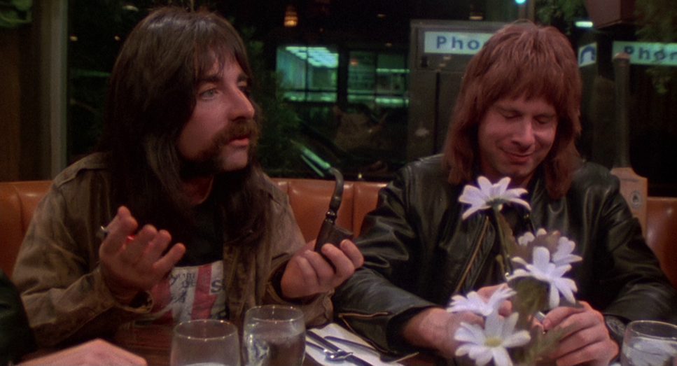
The interview setups are intentionally awkward. Characters are occasionally off-center or slightly cut off by the edge of the frame. You see this perfectly in the shots of the disastrously small Stonehenge prop the composition doesn’t try to hide the failure; it emphasizes the pathetic scale of it. It’s “anti-composition.” It reminds me of those early “run-and-gun” projects we’ve all done where you’re just happy to get the shot. By embracing those “mistakes,” they made the film feel lived-in and honest.
Lighting Style
The lighting here is a masterclass in “motivated realism.” To a colorist, it looks “ugly,” but to a filmmaker, it’s genius. It looks like the crew is relying on whatever harsh practicals or fluorescent hums were already in the room.
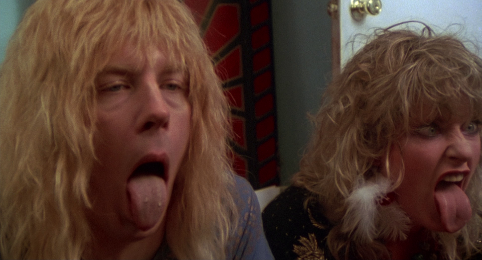
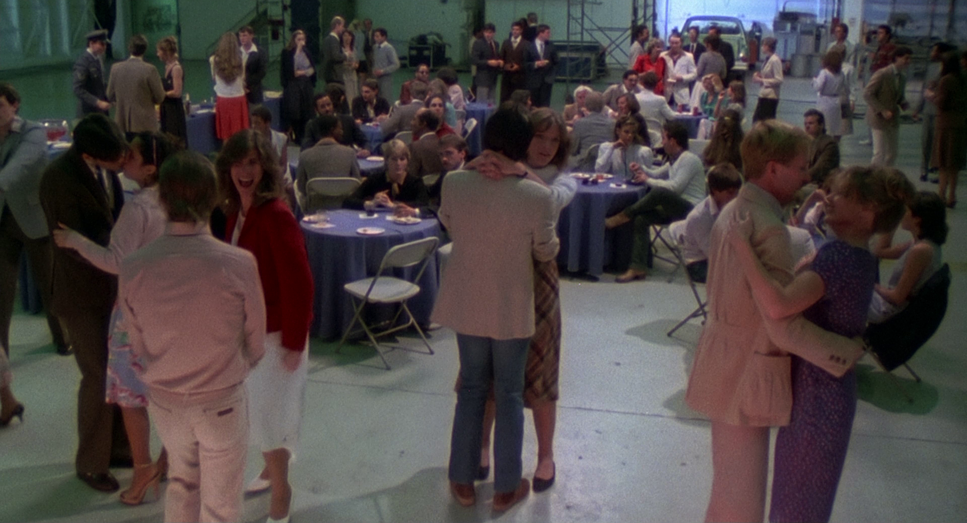
Backstage, it’s all dimly lit corridors and flat, unappealing light. Even the concert scenes feel like actual, messy stage lighting—the kind that blows out skin tones or leaves faces in partial darkness. I was watching a “CinemaSins” style breakdown recently that joked about the contrast between their “glamorous” launch party and an awkward tech debut, and the lighting is what sells that joke. It strips away the rock-star fantasy. In my daily work, I’m usually trying to add “shape” to a face, but here, the flat, direct lighting reveals the mundane, pathetic reality of the band’s fading fame. It’s fabricated truth at its best.
Lensing and Blocking
You can’t talk about the “look” without talking about the lenses. They leaned heavily on zoom lenses, the true workhorse of 16mm documentary filmmaking. You can see the operator making real-time adjustments, which gives the footage that “caught-in-the-moment” energy.
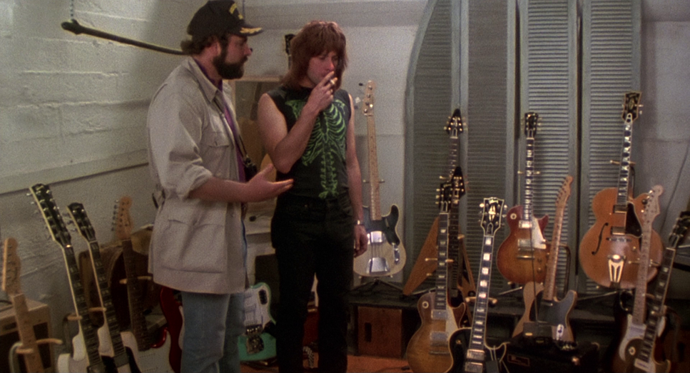
The blocking is where the subtle magic happens. It looks spontaneous, but it’s clearly choreographed to feel cramped. Think about the tight dressing rooms or Derek Smalls getting stuck in that ridiculous hydraulic pod. The camera is often positioned as an intruder, squeezing into these confined spaces with the band. There’s that great sequence where Nigel is showing off his “special” guitar (the one you can’t even look at). The way the camera stays at a respectful, yet confused, distance perfectly mirrors our own reaction. It’s an expert execution of how to use a lens to create a metaphor for the band’s self-importance.
Color Grading Approach
Here’s where it gets interesting for me. Spinal Tap wasn’t shot on the standard 35mm you’d expect for a feature; it was shot on 16mm film. That choice is everything. It gives the image a heavier grain and a specific “news-crew” texture that 35mm just can’t replicate.
If a client came to me at Color Culture today wanting this look, I’d be reaching for a desaturated, utilitarian palette. We’d avoid vibrant, “popping” colors. I’d focus on “print-film” sensibilities: blacks that are deep but retain grain, and highlights that roll off with that organic, soft film feel. For the remaster, the challenge is preserving that “grungy” soul while cleaning it up for 4K. You want it to look “better,” but you can’t make it look “good,” if that makes sense. It needs to stay slightly yellow-green in the shadows and keep that mid-tone warmth characteristic of 80s emulsions. It’s a delicate balance: keep it clean enough for a modern OLED, but dirty enough to keep its heart.
Technical Aspects & Tools
This Is Spinal Tap (1984) — 16mm / 1.85:1
| Genre | Comedy, Mockumentary, Music, Parody |
| Director | Rob Reiner |
| Cinematographer | Peter Smokler |
| Production Designer | Bryan Jones |
| Costume Designer | Renee Johnston |
| Editor | Kent Beyda, Kim Secrist |
| Colorist | Arthur Tostado |
| Time Period | 1980s |
| Aspect Ratio | 1.85 – Spherical |
| Format | Film – 16mm |
| Lighting | Soft light, Low contrast, Top light |
| Lighting Type | Practical light |
| Story Location | California > Los Angeles |
| Filming Location | California > Los Angeles |
In 1984, Smokler was likely lugging around an Arriflex 16SR or a similar 16mm workhorse. Shooting on film provided a texture and depth that digital struggled to mimic for decades. The grain isn’t a “filter” it’s the actual physical makeup of the image.
The lighting wasn’t artfully crafted; it was conventional tungsten and HMI fixtures used sparingly, often looking like they were rigged in five minutes. Even the audio, with its slight ambient hum and occasional “boom mic” feel, adds to the illusion. Today, we’d try to recreate this with an ARRI Alexa and some vintage glass, but there’s something about that original 16mm grain structure that just screams “authentic.”
- Also read: ROPE (1948) – CINEMATOGRAPHY ANALYSIS
- Also read: GHOST IN THE SHELL (1995) – CINEMATOGRAPHY ANALYSIS
Browse Our Cinematography Analysis Glossary
Explore directors, cinematographers, cameras, lenses, lighting styles, genres, and the visual techniques that shape iconic films.
Explore Glossary →