Alright, let’s talk about “The Wrestler (2008)” this film hits differently. It’s a gut punch, sure, but visually, it’s a masterclass in stripping away the pretense and getting right to the raw, pulsating heart of a story. Darren Aronofsky’s work always leaves a mark, whether it’s the psychological intensity of “Black Swan” or the descent into addiction in “Requiem for a Dream,” he’s a director who understands how visual language can articulate the deepest human struggles. “The Wrestler” is no exception, a film that doesn’t just show you Randy “The Ram” Robinson’s world; it drags you into it, skin-first.
About the Cinematographer
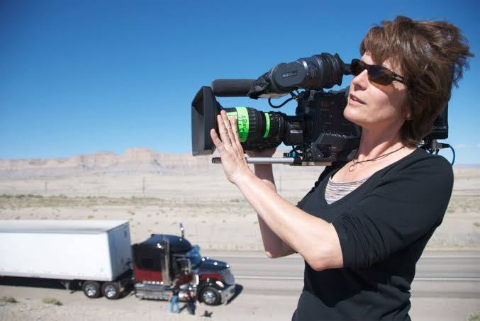
The lens through which we experience Randy’s tragic reality belongs to Maryse Alberti, a cinematographer whose name might not be as universally recognized as some, but whose influence on the modern indie aesthetic is undeniable. Alberti cut her teeth in documentary filmmaking, and honestly, you can feel that lineage coursing through every frame of “The Wrestler.” It’s an approach that favors authenticity over polished artifice, a style that feels less like observation and more like participation. This background perfectly suited Aronofsky’s vision, which aimed for total fearlessness in depicting pro wrestling’s immediate realness. It’s one thing to make a film about a subject; it’s another to make it feellike you’re living inside it, and Alberti’s documentary sensibility was key to achieving that visceral connection.
Inspiration Behind the Cinematography
Aronofsky builds careers on exploring individuals consumed by their passions and addictions. Randy “The Ram” Robinson is the physical embodiment of this recurring theme. The inspiration for the cinematography stems directly from this thematic core: how do you visually represent a man trapped between two worlds the faded glory of his wrestling persona and the bleak reality of his everyday life? The film had the incredible fortune of casting Mickey Rourke, whose own tumultuous career arc eerily mirrored Randy’s, further blurring the line between actor and character.
For me, the inspiration feels like a directive to simply not get in the way. It’s about being a silent observer, letting the environment and the performances speak for themselves. The goal wasn’t to prettify or glamorize; it was to reveal. This meant embracing the inherent grit, the mundane ugliness, and the brief flashes of violent beauty in Randy’s life. It wasn’t about creating a beautiful image for beauty’s sake, but about crafting images that felt truthful, even if that truth was uncomfortable.
Camera Movements
This is where Alberti’s documentary background really shines. The film is predominantly handheld, and I mean reallyhandheld. It’s not the sort of smoothed-out, “stabilized handheld” we often see; it feels raw, a little rough around the edges, like you’re right there, a few feet behind Randy, or sometimes even in front of him, tracking his every move. This constant kinetic energy grounds us in Randy’s subjective experience. When he walks through the drab corridors of a school gym, the camera jostles subtly, mimicking the slight unease or fatigue in his stride. When he steps into the ring, the movement becomes more urgent, following the brutal choreography with an almost voyeuristic intensity.
There’s a distinct “embedded journalist” quality to the camerawork it’s like a report from the front lines of one man’s personal war. The intimacy it creates is profound. You feel the claustrophobia of his trailer, the bustling chaos of the backstage locker rooms, and the isolating expanse of the wrestling arena, all through the lens of a constantly moving, breathing camera. It’s an active participant, drawing you into his moments of vulnerability, his bursts of professional pride, and his quiet despair.
Compositional Choices
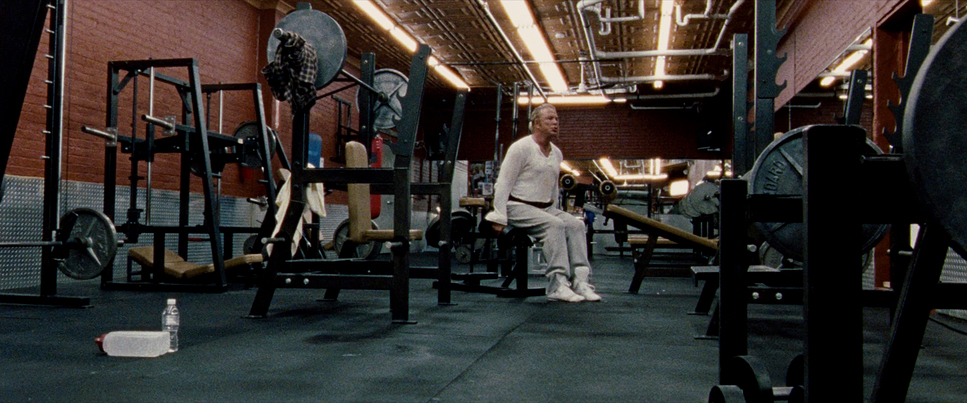
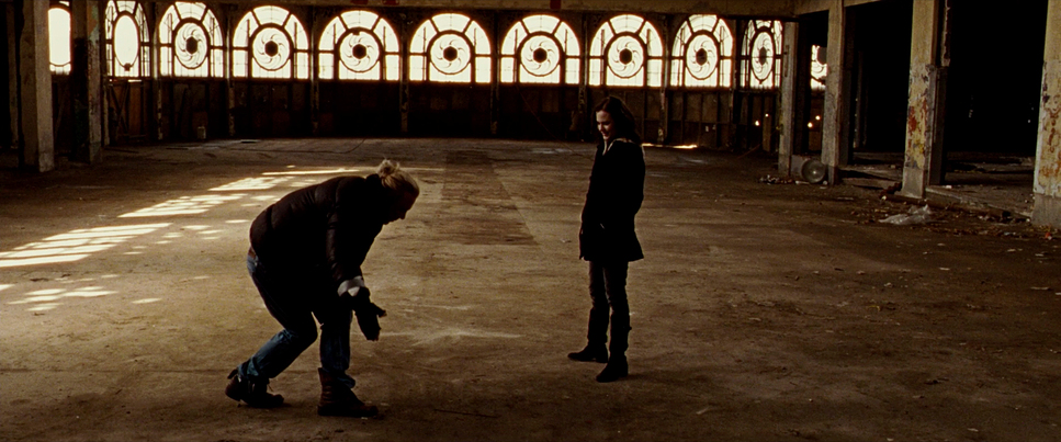
Alberti’s compositional choices are often stark and purposeful. We frequently find Randy isolated within the frame, especially in his personal life. Think of the shots in his ramshackle trailer, or the wide-ish, slightly distant shots of him working at the deli – he’s a small figure in a space that doesn’t quite fit him, emphasizing his alienation. The camera often frames him in doorways, or against stark, unadorned backgrounds, highlighting his solitude.
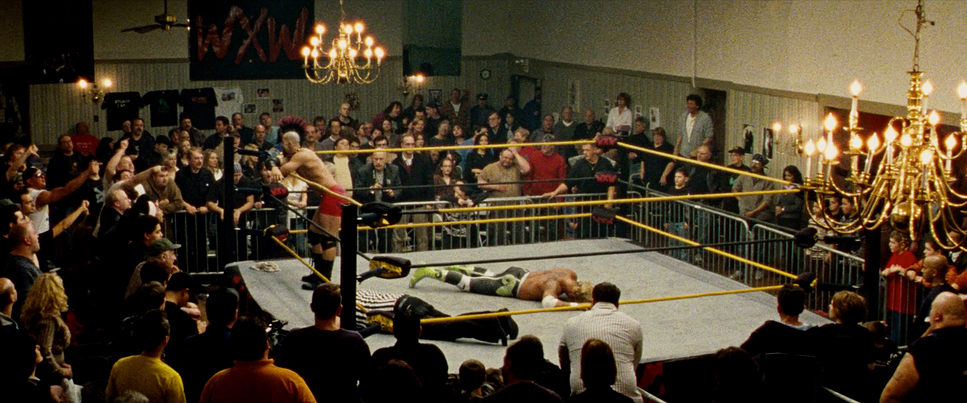
However, when Randy is in his element, the composition shifts. In the wrestling ring, even when the crowd is sparse, he often commands the center of the frame, or is dynamically placed to convey power and movement. The camera often drops low, looking up at him, to restore some of that lost heroic stature. In the locker rooms, we sometimes see wider shots, allowing us to take in the camaraderie he shares with other wrestlers a rare warmth in his otherwise cold existence. These deliberate shifts in compositional approach visually articulate the dichotomy of Randy’s life: a legend in a dwindling niche, a broken man in the real world. It’s an effective use of depth cues and negative space to communicate his emotional state without a single line of dialogue.
Lighting Style
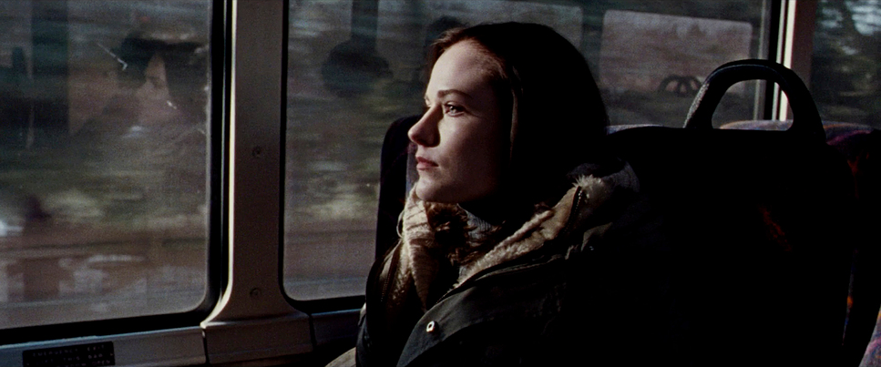
The lighting in “The Wrestler” is, in a word, motivated. It is driven almost entirely by the practical lights present in Randy’s world, primarily hard tungsten sources and mixed artificial lights. We see the harsh fluorescents of the deli and warehouse, casting unflattering, flat light that accentuates the dreary nature of his new existence. In his trailer, the light is dim, often from a single lamp, creating deep shadows that mirror his inner turmoil and isolation.
When Randy is wrestling, the arena lights, though bright, often feel like spotlights on a solitary figure. There’s a rawness to it. This approach makes significant demands on the dynamic range of the stock. Alberti isn’t afraid to let highlights clip a little or shadows fall deep into black, preserving the grittiness and avoiding a “clean” look that would betray the film’s vérité aesthetic. This strategic use of light and shadow, allowing for less “perfect” exposures, contributes significantly to the unvarnished feel. It’s about sculpting reality, not inventing it.
Lensing and Blocking
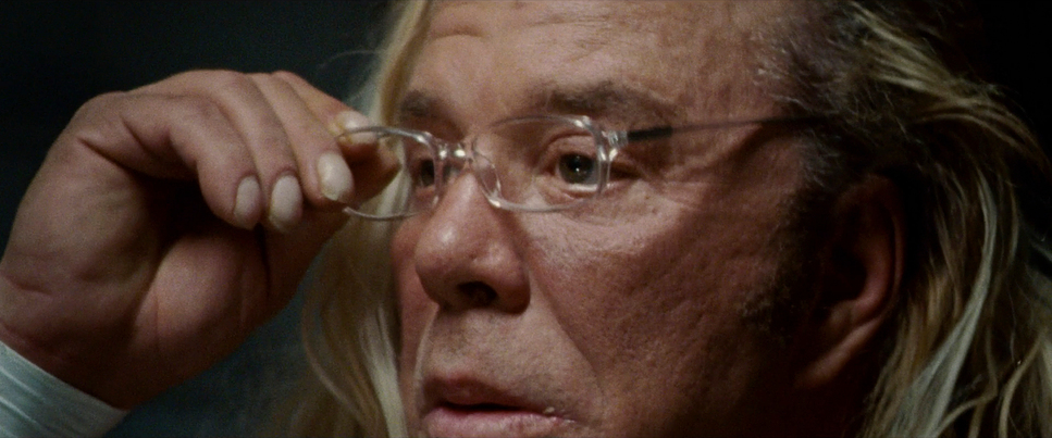
The choice of lenses and how Randy is blocked within the frame are intimately tied to the film’s emotional impact. Alberti utilized Angenieux Optimo Zooms alongside Zeiss Ultra 16mm primes. The use of zooms here is crucial it allowed Alberti to react instantly to Rourke’s improvisation without cutting to change lenses, maintaining the flow of the performance. The wider focal lengths used for close-ups create a slight distortion, enhancing the sense of his aged, battle-worn features, making his pain and exhaustion almost tactile.
Blocking-wise, Randy is often either dominating a space or being dwarfed by it. Consider his grand entrance to the ring a long, continuous shot following him from the back, through the crowd, into the spotlight. He moves with purpose, absorbing the cheers. Then contrast that with how he navigates the grocery store aisles. In these moments, he’s often framed off-center, or with significant headroom, visually diminishing his presence. His blocking reflects his internal struggle the larger-than-life “Ram” versus the shrinking Robin. It’s a subtle but powerful visual metaphor for his identity crisis.
Color Grading Approach
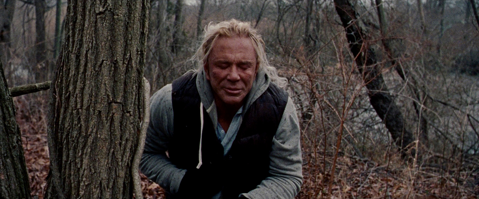
From a colorist’s perspective, the grade on “The Wrestler” is fascinating because it navigates a tricky line between “saturation” and “drabness.” While the environment is undeniably bleak full of grays, browns, and the slushy tones of a New Jersey winter the film stock itself, Kodak Vision3 (500T and 200T), is naturally capable of rich, vibrant color. The grading strategy doesn’t artificially desaturate the whole image; instead, it allows the production design to dictate the palette.
When color does appear the neon green of Randy’s tights, the harsh orange of a spray tan, or the visceral red of blood it pops aggressively against the muted background. This separation isn’t achieved by cranking a saturation knob, but by preserving the natural color contrast inherent in the negative.
Contrast shaping is also crucial here. It’s not an overly crushed look, but there’s a deliberate emphasis on mid-tone contrast to bring out the textures of Randy’s skin and the wear on his clothes. Working with Super 16mm means managing a heavy grain structure, especially in the shadows. The grade embraces this texture rather than trying to noise-reduce it into oblivion. The highlight roll-off is handled beautifully; even in the harsh ring lights, there’s a softness that avoids the digital “clipping” look, giving it that specific organic quality that only film can provide.
Technical Aspects & Tools
The Wrestler – Technical Specs
| Genre | Drama, Romance |
|---|---|
| Director | Darren Aronofsky |
| Cinematographer | Maryse Alberti |
| Production Designer | Tim Grimes |
| Costume Designer | Amy Westcott |
| Editor | Andrew Weisblum |
| Colorist | Don Ciana, Tim Stipan |
| Time Period | 2000s |
| Color | Saturated |
| Aspect Ratio | 2.39 – Spherical |
| Format | Film – 16mm |
| Lighting | Hard light, Backlight |
| Lighting Type | Artificial light, Tungsten |
| Story Location | … United States > New Jersey |
| Filming Location | … United States > New Jersey |
| Camera | Arriflex 416 |
| Lens | Angenieux Optimo Zooms, Zeiss Ultra 16mm |
| Film Stock / Resolution | 5219/7219 Vision 3 500T, 5217/7217 Vision 2 200T |
The aesthetic of “The Wrestler” is defined by the decision to shoot on Super 16mm film using the Arriflex 416. In 2008, digital cameras like the RED ONE were becoming available, but they lacked the organic texture and dynamic range latitude required for this specific look. The choice of 16mm (specifically Vision3 500T 5219 for low light and 200T 5217 for brighter scenes) brings an inherent grain that serves the story perfectly. It feels gritty and unpolished, mirroring Randy’s life.
The 2.39:1 aspect ratio is also a bold choice for 16mm. By cropping the Super 16 negative to a widescreen scope format, they effectively magnified the grain structure even further, intensifying that raw, documentary feeling. The lightweight Arriflex body paired with the Angenieux zooms allowed Alberti the agility to follow Rourke through tight trailer interiors and crowded locker rooms without a cumbersome rig. It’s a testament to the belief that the right tool in this case, a smaller, grainier format can transcend technical perfection to serve the story’s emotional truth.
- Also read: MAGNOLIA (1999) – CINEMATOGRAPHY ANALYSIS
- Also read: MARRIAGE STORY (2019) – CINEMATOGRAPHY ANALYSIS
Browse Our Cinematography Analysis Glossary
Explore directors, cinematographers, cameras, lenses, lighting styles, genres, and the visual techniques that shape iconic films.
Explore Glossary →