Everyone remembers the ending of The Usual Suspects. But as a filmmaker and colorist, what keeps me coming back isn’t the script’s twist—it’s the lies told through the lens. Bryan Singer’s 1995 neo-noir didn’t just deceive us with dialogue; it manipulated us with light, shadow, and a color palette designed to make us trust a narrator who was playing us the whole time.
When I look at this film now, years after my first viewing, I don’t just see a thriller. I see a specific, meticulous visual grammar. Under the direction of cinematographer Newton Thomas Sigel, the camera doesn’t just record the action; it corroborates the lie. Today, I want to break down exactly how they pulled it off—from the telecine grading choices to the blocking that hid the truth in plain sight.
About the Cinematographer: Newton Thomas Sigel
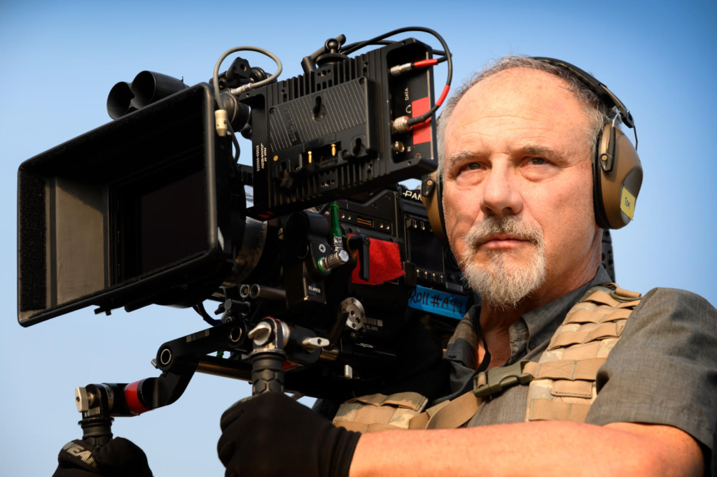
You can’t talk about the look of this film without understanding Newton Thomas Sigel. The man is a chameleon. His background is in documentaries, which explains a lot about the “grit” in The Usual Suspects. He knows how to make a frame look accidental, even when it’s carefully staged.
This documentary grounding is what saves the movie from feeling like a stage play. Sigel and Singer formed a powerhouse duo here, later moving on to massive projects like X-Men and Superman Returns. But look at Sigel’s wider resume—he’s shot everything from Drive (with the moody lighting of Lost River) to Adam Sandler comedies. That versatility matters. It means he doesn’t just have a “style” he imposes on a film; he finds the visual language the story actually needs. For The Usual Suspects, that language was “unreliable realism.”
Inspiration for the Cinematography
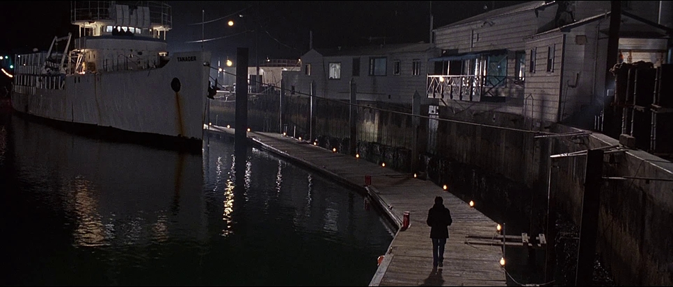
When Singer and Sigel prepped this film, they weren’t trying to invent a new genre. They were looking backwards. The visual lineage here is straight out of the 70s paranoia thrillers. You can feel the heavy hand of Gordon Willis—specifically his work on The Godfather and All the President’s Men.
The Godfather gave them the blueprint for shadows—using darkness not just to hide things, but to suggest moral rot. All the President’s Men provided that clinical, fluorescent dread of institutional spaces. Sigel fused these influences. He took the classic noir contrast and updated it for the 90s. The goal wasn’t just to look “cool”; it was to create a sense of claustrophobia. They needed a world that felt tangible but slippery, mirroring the narrative of Verbal Kint. It’s a classic noir aesthetic, but stripped of the romance.
Camera Movements
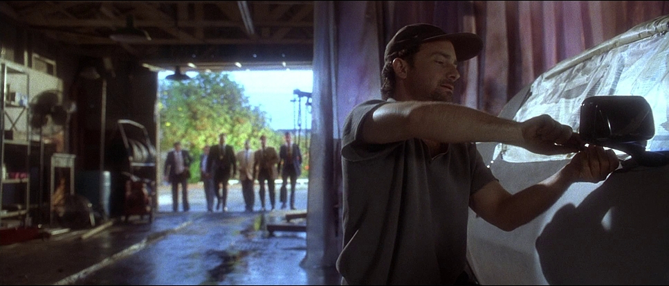
The camera in The Usual Suspects is two different characters.
In the interrogation room, the camera is locked down. It’s observant. Slow, creeping dolly shots. Subtle pans. It mimics the perspective of Agent Kujan—leaning in, listening, trying to catch a lie but missing the forest for the trees. This steadiness makes us feel safe. We feel like we are in a police procedural, a genre where the truth always comes out. That’s the trap.
Cut to the flashbacks, and the language shifts. The camera wakes up. Tracking shots follow the crew, creating momentum. When violence hits, the moves become decisive—snap zooms or quick pans that punctuate the action. Look at the boat massacre sequence: it oscillates between wide, objective shots of the carnage and frantic, tight energy. Sigel uses movement to validate the “action movie” version of events Kint is spinning. If the camera moves like it’s an action movie, we believe it’s an action movie. It’s a brilliant subtle manipulation.
Compositions
Sigel’s framing is rigorous. In the interrogation scenes, he loves a tight close-up on Kint. We are forced to scrutinize his face. But look closer at those frames—Kint is often obstructed. A shadow cuts across his eye; a reflection on the glass blurs his outline. The composition tells us he is hiding something, even when he’s filling the frame.
Then you have the wider shots, specifically the lineup. This is iconic for a reason. The framing isolates them against the height chart, treating them like specimens.
And then there is the visual mythology of Keyser Söze. Notice how Söze is framed in the flashbacks. It’s rarely eye-level. It’s low angles (making him a giant) or Dutch angles (tilting the horizon to create unease). These aren’t just “cool shots.” They are visual code for “Myth.” The composition elevates a criminal into a boogeyman. The empty negative space Sigel leaves in other shots also does heavy lifting—it implies a presence that isn’t there. Söze is in the negative space.
Lighting Style
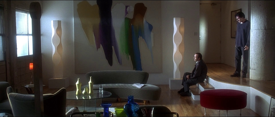
This is where the film earns its neo-noir stripes. The lighting is hard, high-contrast, and unapologetic.
As a colorist, I deal with modern digital sensors that love soft fall-off. But here, Sigel embraces the “hard light” philosophy of the classic era. Hard light creates defined shadows. It draws a line in the sand: you are either in the light, or you are in the dark. There is no gradient.
The interrogation room is the best example. Practical lamps and overheads cast sharp, elongated shadows on the walls. It’s almost expressionist. The shadows behind Kint look like bars, or shattered glass. It visualizes his fractured story. Sigel relies heavily on motivated lighting—light that seems to come from a real source (a streetlamp, a desk light)—but he cheats it for drama. It creates a world that is gritty and hostile. The shadows aren’t just absence of light; they are hiding spots for the truth.
Lensing and Blocking
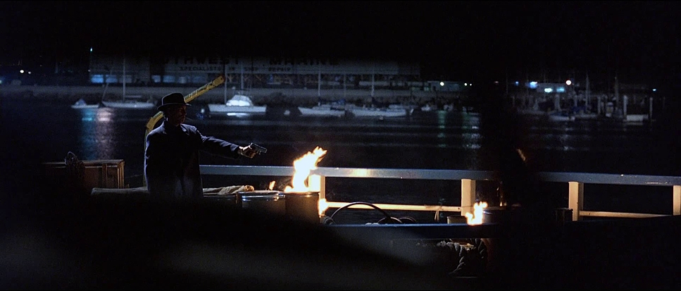
The film was shot largely on anamorphic lenses, giving us that wide 2.35:1 aspect ratio. This was a crucial choice.
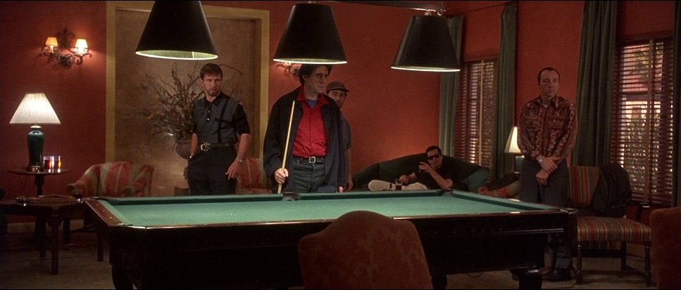
Anamorphic lenses don’t just make the image wider; they change the depth. They allow Sigel to frame the group of five suspects together, letting us see the body language and hierarchy in a single glance. In the holding cell scenes, the wide frame emphasizes the group dynamic. Conversely, when Kint is alone, that wide frame swallows him. He looks small, frail, and harmless in the center of a wide anamorphic shot. It’s a visual lie that supports his “cripple” persona.
The blocking reinforces this. Watch how the suspects are positioned. Sometimes they are a phalanx, a united front. Other times, they are scattered, separated by foreground objects. It’s a chess game. The blocking guides your eye exactly where Sigel wants it, and more importantly, away from where you should be looking.
Color Grading
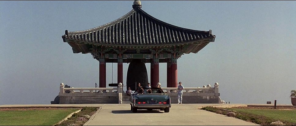
This is my domain, and The Usual Suspects is a fascinating case study of 90s color timing.
We aren’t seeing a modern digital intermediate (DI) here. This is a telecine transfer. The palette is aggressively cool and desaturated. The police station is bathed in sickly greens, cyans, and cold blues. It feels institutional and dead. There is no warmth in the law.
The “noir” feel comes from the lack of color contrast. It’s almost monochromatic. When warmth does show up—usually streetlights or practical tungsten bulbs—it feels foreign. The desaturation does two things: it makes the movie feel gritty and grounded (like a documentary), and it unifies the disparate locations into one cohesive, gloomy world.
From a technical standpoint, the blacks are crushed. In modern grading, we obsess over shadow detail. Here, the shadows are dense black holes. That’s likely a combination of the film stock and the telecine decisions. They weren’t afraid to let information fall off into total darkness. That density adds weight to the image that is hard to replicate digitally.
Technical Aspects
| Genre | Crime, Drama, Thriller, Heist |
| Director | Bryan Singer |
| Cinematographer | Newton Thomas Sigel |
| Production Designer | Howard Cummings |
| Costume Designer | Louise Mingenbach |
| Editor | John Ottman |
| Colorist | Gloria Kaiser |
| Time Period | 1990s |
| Color | Warm, Saturated, Orange |
| Aspect Ratio | 2.35 – Anamorphic |
| Format | Film – 35mm |
| Lighting | High contrast, Side light |
| Lighting Type | Artificial light, Tungsten |
| Story Location | New York City > Ship |
| Filming Location | Los Angeles Harbor > Ship |
| Camera | Panavision Cameras |
| Lens | Panavision Lenses |
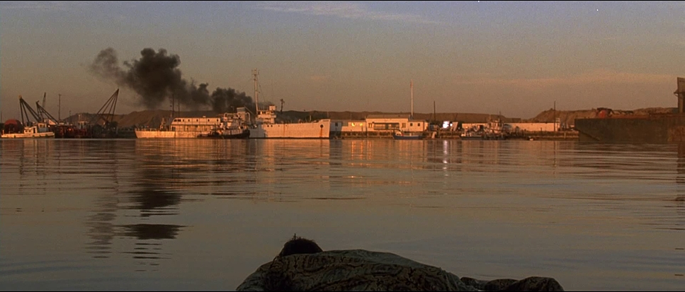
To get this look, they didn’t rely on post-production tricks; they relied on physics and chemistry.
The film was shot on 35mm film, likely a high-speed Kodak stock (like the Vision 500T series of that era). High-speed stock has more grain and handles contrast well, which fits the gritty aesthetic perfectly. You can see the grain structure in the darker scenes—it’s alive.
They paired Arriflex cameras with Panavision anamorphic lenses. Those lenses are responsible for the specific flares and the way the background blurs (the bokeh). Anamorphic lenses squeeze the image onto the film, and when it’s unsqueezed, you get that epic scope. It adds a layer of cinematic gloss to what is otherwise a dirty crime story.
- Also read: AMERICAN HISTORY X (1998) – CINEMATOGRAPHY ANALYSIS
- Also read: LÉON: THE PROFESSIONAL (1994) – CINEMATOGRAPHY ANALYSIS
Browse Our Cinematography Analysis Glossary
Explore directors, cinematographers, cameras, lenses, lighting styles, genres, and the visual techniques that shape iconic films.
Explore Glossary →