I rewatched The Truman Show recently, and honestly? It hits differently now. Spending my days inside a grading suite at Color Culture, staring at waveforms and tweaking curves, I’ve become hyper-aware of how constructed images are. But this movie is the ultimate example of manufactured reality. While most people remember it for the clever plot or Jim Carrey’s performance, visually, it’s a masterclass in making an audience feel uncomfortable. There’s a YouTube video essay I saw a while back that labeled this film a “true horror,” and looking at the cinematography, I completely agree. It’s a nightmare dressed up as a sitcom.
About the Cinematographer
The person responsible for this unsettling look is Peter Biziou. It’s actually a fascinating choice of DP because Biziou was coming off an Academy Award win for Mississippi Burning—a film that was gritty, raw, and incredibly grounded. With The Truman Show, he had to do the exact opposite. He had to make a world that looked fake, but convincingly fake. It’s a hard line to walk. If it looks too cheap, the audience checks out; if it looks too real, the premise fails. Biziou’s genius here was discipline. He didn’t just shoot a movie; he simulated a broadcast.
Inspiration Behind the Cinematography
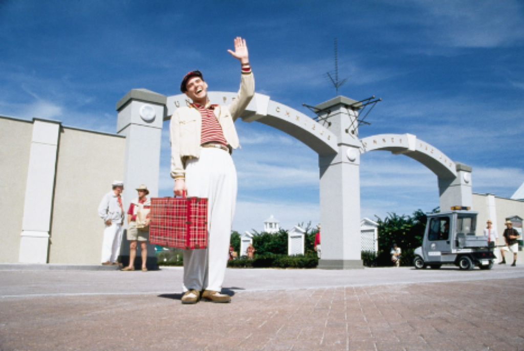
The visual language here borrows heavily from Norman Rockwell paintings and that idealized, mid-century American aesthetic. Everything in Seahaven is manicured. It looks like a catalog. But the real driver behind the visual choices isn’t just “nostalgia”—it’s surveillance.
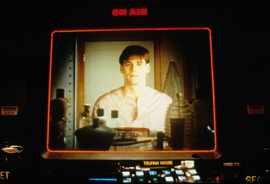
Every shot is designed to remind you that Seahaven is a stage. When the studio light labeled “Sirius 9 Canis Major” falls from the sky, it’s not just a plot point; it’s the set literally falling apart. Biziou had to light and frame this world so that it felt like a cage. As viewers, we are put in the uncomfortable position of being voyeurs. We aren’t just watching Truman; we’re watching the screens that watch Truman.
Camera Movements
In the first act, the camera work is incredibly stiff. It feels robotic because, in the logic of the film, it is robotic. These are supposed to be remote-controlled cameras hidden in dashboards, buttons, and mirrors. You don’t see the usual fluid steadicam moves you’d expect in a 90s blockbuster. Instead, you get these slow, mechanical zooms or static wide shots that feel like CCTV footage.
But watch what happens when Truman starts to figure it out. The camera work starts to break character. When he tries to escape and creates chaos, the visuals become frantic. We see handheld shakes and desperate zooms as the fictional “operators” inside the studio scramble to keep him in frame. It’s a brilliant way to use camera movement to mirror the protagonist’s panic.
Compositional Choices
Biziou constantly frames Truman within other frames. We see him through oval vignettes, through car windows, through the circular fisheye of a button camera. It’s claustrophobic. By putting these barriers between the lens and the subject, the film emphasizes his entrapment.
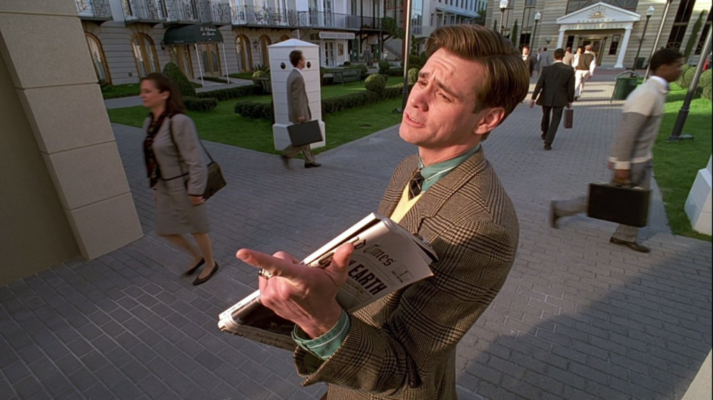
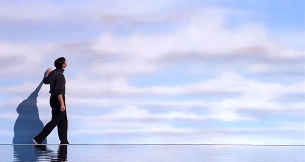
There’s also an overuse of symmetry. Seahaven is perfectly balanced, which feels unnatural. Real life is messy; Seahaven is mathematically precise. When Biziou uses wide shots, they don’t feel epic; they feel exposing. They make Truman look small against the backdrop of this massive, controlled set. It gives you that feeling mentioned in the “True Horror” video—that paranoia that everyone is looking at you. Because in this composition, they are.
Lighting Style
Lighting is usually used to make a scene look natural, but here, it’s used to look “studio perfect.” The lighting in Seahaven is high-key and flat. It mimics the look of a sitcom set where shadows are filled in so the actors look good from every angle. It evokes a perpetual, plastic summer.
The mask slips in the lighting, too. There’s that great scene where the rain falls only on Truman. That’s a lighting cue—a spot rig that missed its mark. Or the climax, where the “sun” turns into a harsh searchlight during the storm. We move from the soft, diffused light of a TV commercial to the high-contrast, dramatic lighting of a thriller. It’s the visual turning point where the show ends and reality begins.
Lensing and Blocking
Biziou uses a mix of very wide lenses and very long telephoto lenses to sell the “spy” concept. The wide angles make the town look cartoonish and distorted, while the long lenses compress the space, making it feel like we are spying on Truman from a hidden tower across the street.
The blocking—how the actors move—is terrifyingly coordinated. The extras in Seahaven don’t move like people; they move like game NPCs. They block Truman’s path perfectly when he tries to leave, or they turn in unison to flash a product placement. It’s not just blocking for the camera; it’s weaponized choreography designed to keep the rat in the maze.
Color Grading Approach
This is my domain, and I love what they did here. The grade in the first half of the film is aggressively saturated. The primary colors—reds, blues, yellows—pop in a way that feels synthetic. As a colorist, if I’m grading a drama, I usually try to separate skin tones from the background to create depth. Here, everything feels like it has a “print” LUT applied that boosts contrast and saturation to make it look like a postcard.
But as Truman’s reality crumbles, the grade shifts. It gets cooler. We start to see more cyan in the shadows, and the warmth gets sucked out of the image. By the time we get to the storm scene, we are in a completely different color space—dark, moody, and blue.
I also read about the 4K HDR restoration. While I’m a purist for the original print look, HDR actually helps this film. It allows those “sunny” highlights to push brighter, making the artificial sun feel even more oppressive, while giving the dark, backstage areas deeper blacks, reinforcing the contrast between the fake world and the real control room.
Technical Aspects & Tools
Since this was 1998, it was a 35mm production. You can’t fake the texture of film from that era. It has a grain structure that grounds the movie. If this were shot digitally today, it might look too clean. The film grain adds a layer of reality to the fake world, which stops it from looking like a video game.
The concept of “advanced cameras” mentioned in the plot is interesting because, while the fictional cameras in Seahaven were high-tech and tiny, the actual movie relies on traditional film techniques. The restoration process usually involves scanning the original negative. Working with scans like that is a joy because you find details in the shadows that the original theatrical prints couldn’t show.
- Also read: BATMAN BEGINS (2005) – CINEMATOGRAPHY ANALYSIS
- Also read:HARAKIRI (1962) – CINEMATOGRAPHY ANALYSIS
Browse Our Cinematography Analysis Glossary
Explore directors, cinematographers, cameras, lenses, lighting styles, genres, and the visual techniques that shape iconic films.
Explore Glossary →