James Marsh’s 2014 biopic The Theory of Everything is often dismissed as a standard, “pretty” period piece. But look closer. Beneath the surface, there’s a sophisticated visual conversation happening. It’s a masterclass in how cinematography can ground an extraordinary life in a way that feels visceral and human, rather than just melodramatic.
The film sidesteps the “three-hanky” exaggeration common in these biopics. By keeping Stephen and Jane’s relationship at the center showing them as flawed, relatable people the visual storytelling found its North Star. It wasn’t about dramatizing a disability; it was about humanizing a genius.
About the Cinematographer
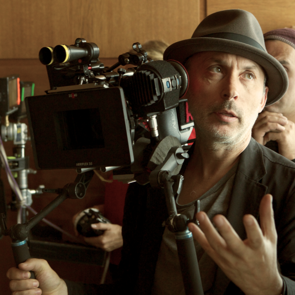
Benoît Delhomme, ASC, was the perfect choice for this. He has this “painterly” instinct, an obsession with natural light that manages to make everyday scenes feel lyrical without feeling fake. He’s the kind of DP who lets a moment breathe. He doesn’t rely on aggressive camera trickery to force an emotion; he just observes. This documentary-style restraint likely clicked perfectly with James Marsh’s own background. Delhomme knows that sometimes the most powerful thing you can do is just stand back and watch a beautifully lit moment unfold.
Inspiration Behind the Cinematography

The visual logic here is built on a brilliant conflict: the expansion of theoretical physics versus the physical confinement of Hawking’s body. Marsh and Delhomme clearly wanted to avoid “Oscar bait” tropes. They wanted reality.
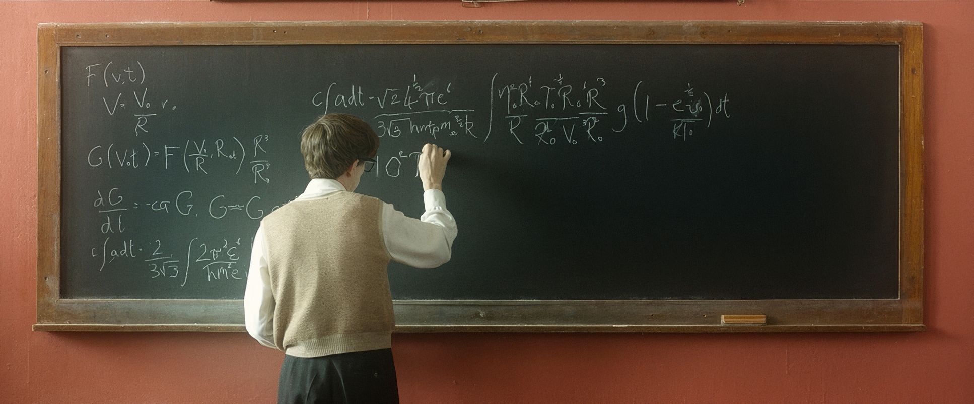
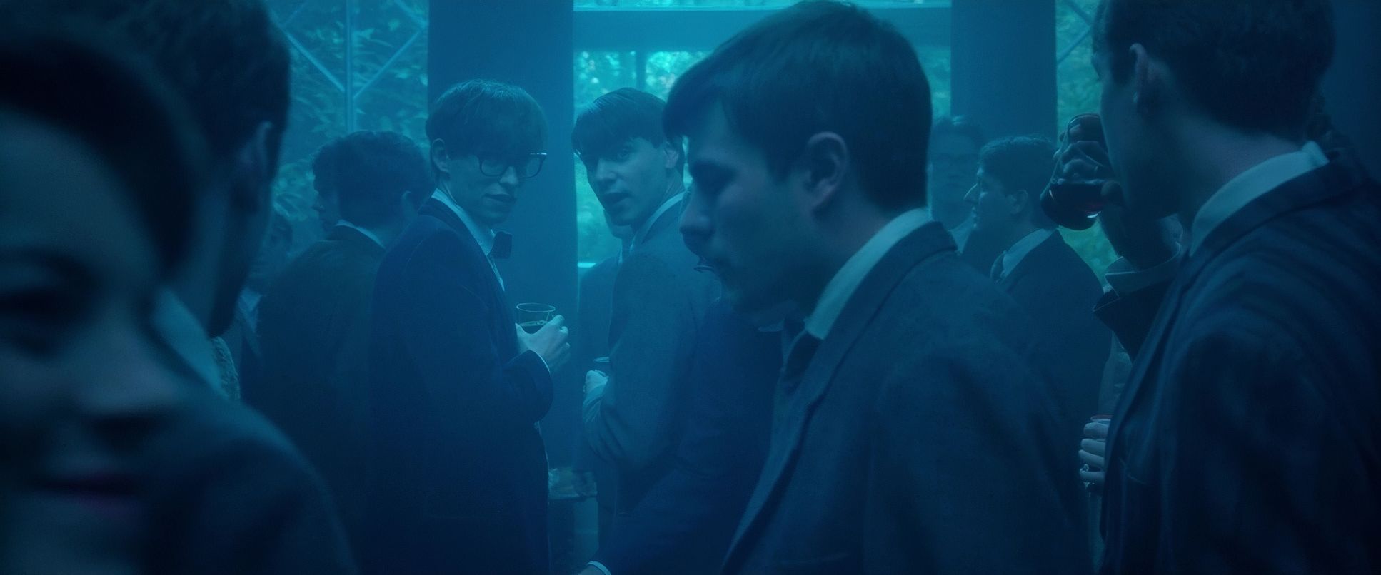
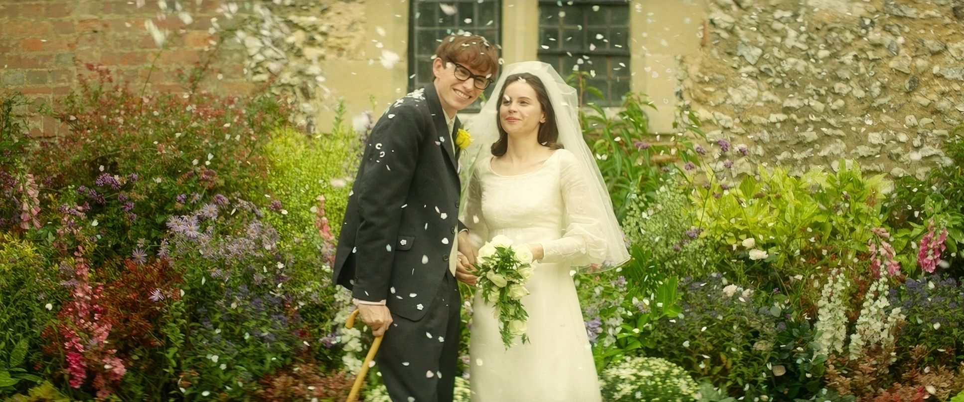
In the first act, the image is alive. It’s vibrant, mirroring Stephen’s intellectual awakening. But as the motor neuron disease takes hold, the texture shifts. Critics have called the film “glossy,” but as a colorist, I see that “gloss” differently. It isn’t superficial; it’s an intentional choice to capture the romanticism of their early love before the shadows closed in. It’s grace under pressure. The goal wasn’t to “trick” the audience into crying, but to pull them into a contemplative state.
Camera Movements
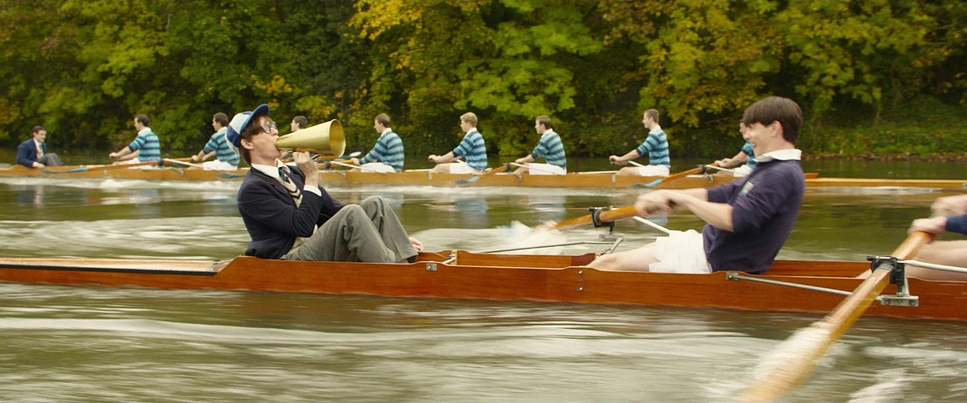
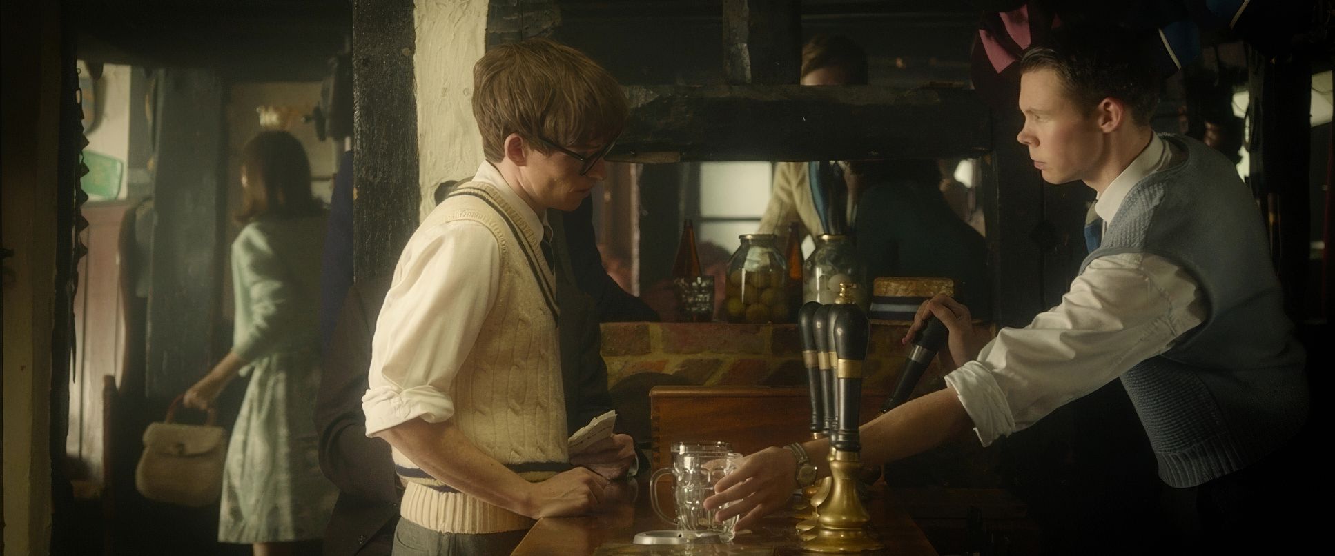
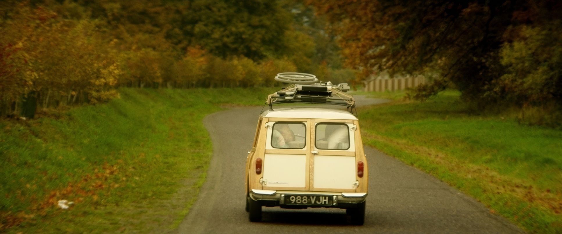
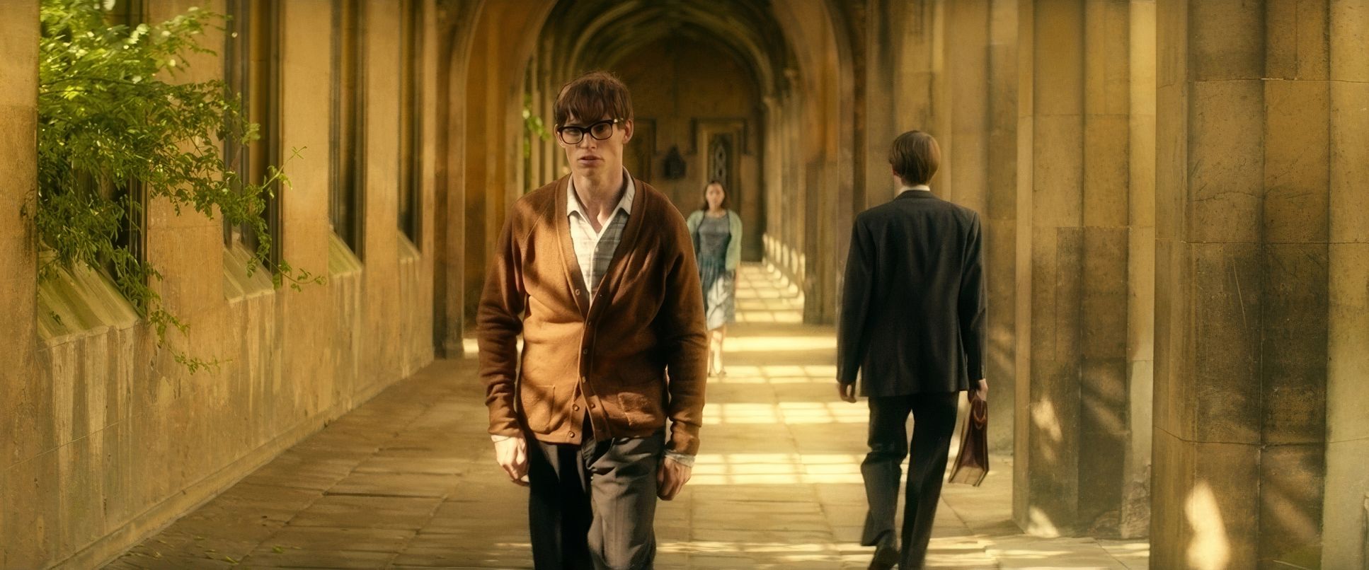
The movement in this film is incredibly deliberate. In the early Cambridge days, the camera is as dynamic as Stephen is. We see fluid tracking shots and handheld work that feels immediate and full of energy. It’s not showing off; it’s immersive.
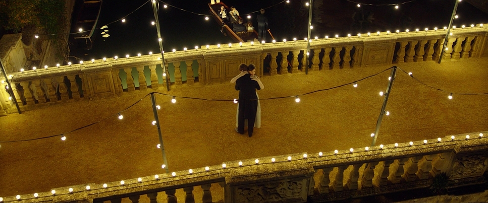
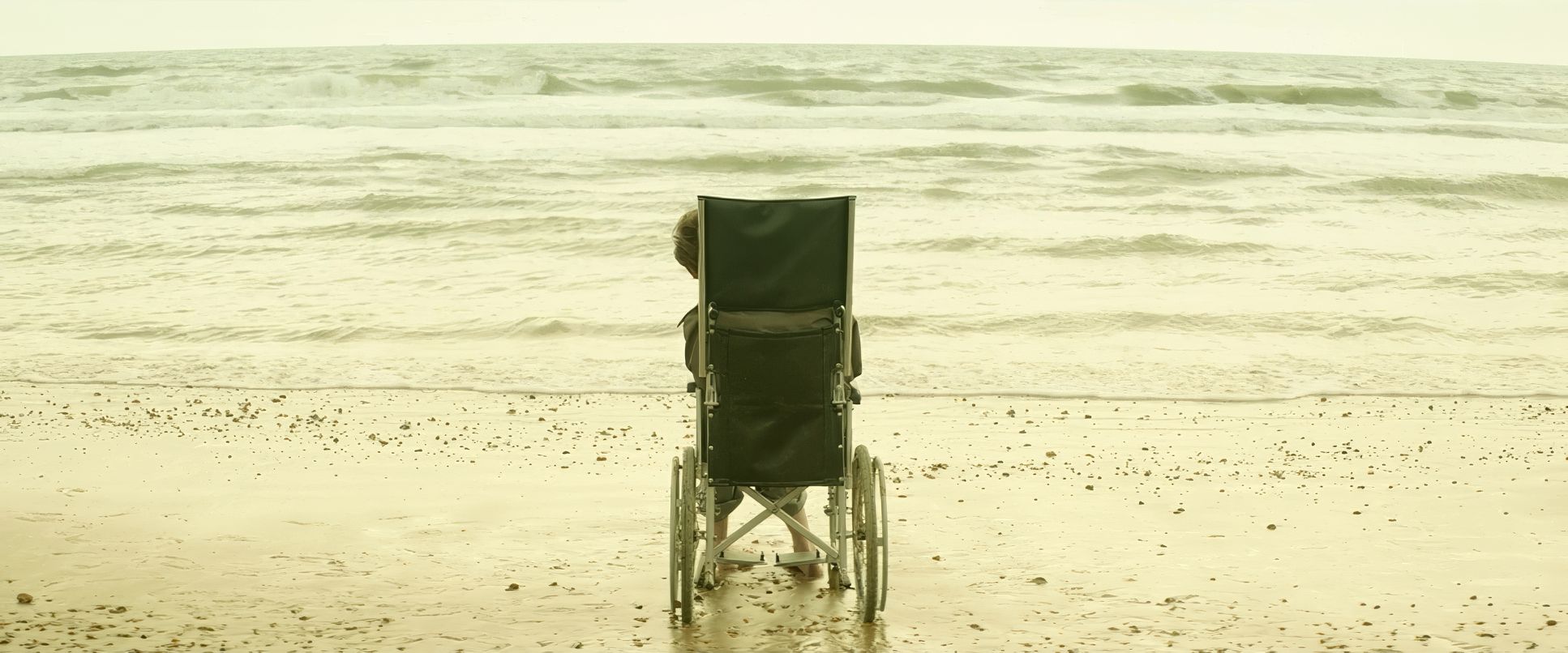
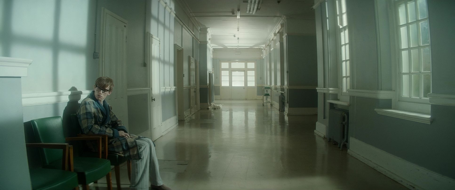
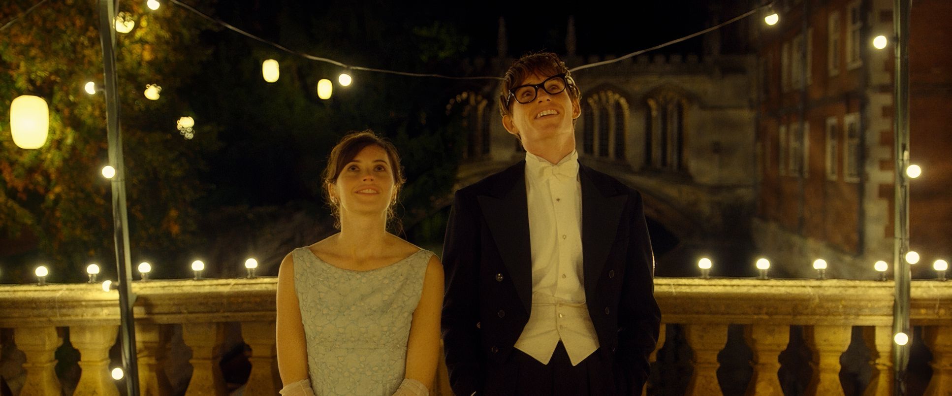
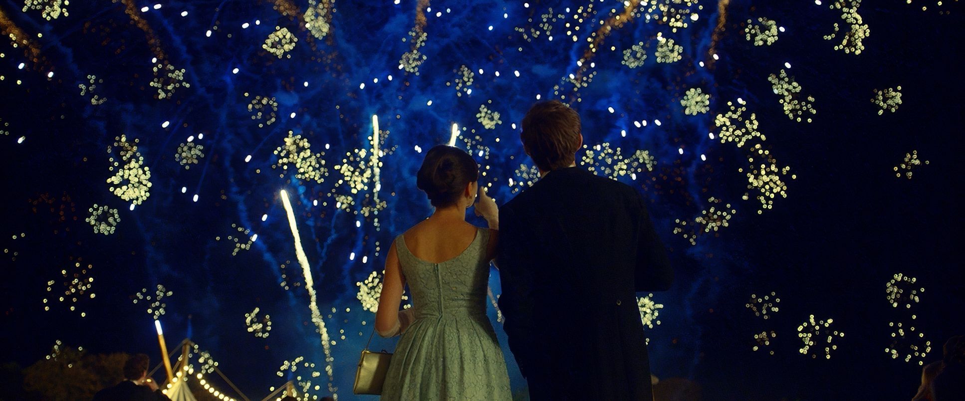
But then, the world begins to shrink. The camera becomes more static, reflecting Stephen’s physical limitations. One moment that always haunts me is that slow crane-out during the May Ball dance. It starts intimately with the two of them, then pulls back to reveal the whole floor. It’s a visual premonition. The universe is expanding around them at the exact moment Stephen’s physical world is about to collapse. It’s an elegant, heartbreaking metaphor for their defiance: they’re going to fight this for as long as they can.
Lensing and Blocking
This is where the technical choices get interesting. Knowing they shot on the ARRI Alexa with Hawk Anamorphics, you can feel that glass working. The anamorphic fall-off and those characteristic flares add a romantic texture to the early scenes.
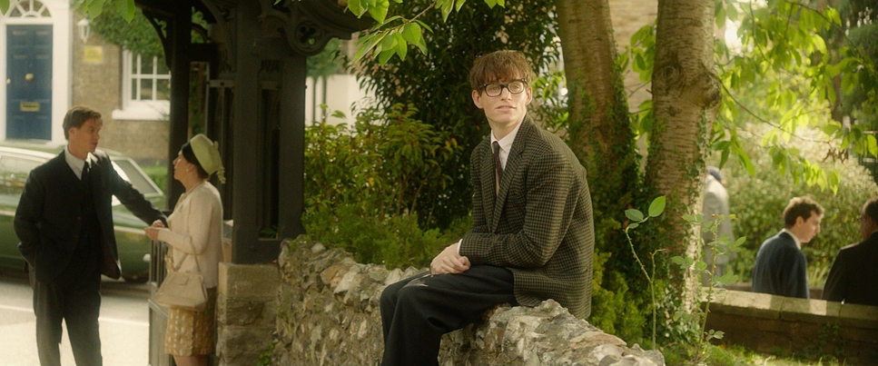
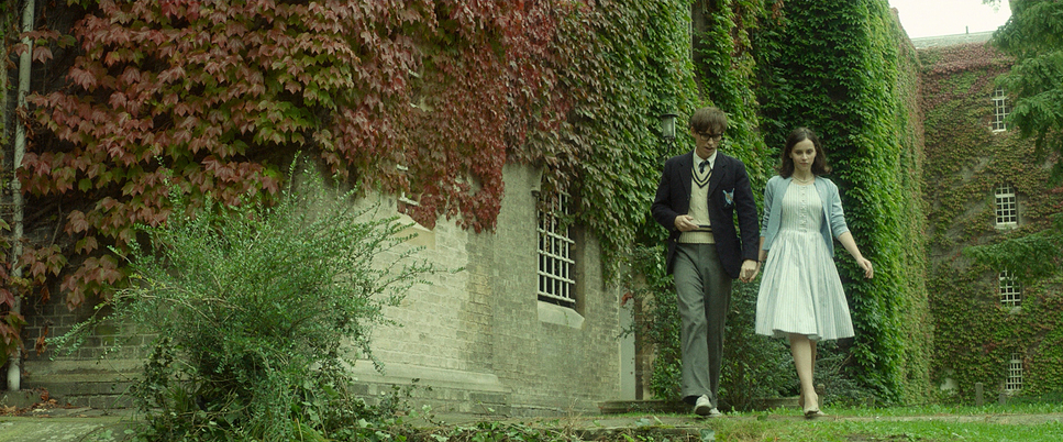
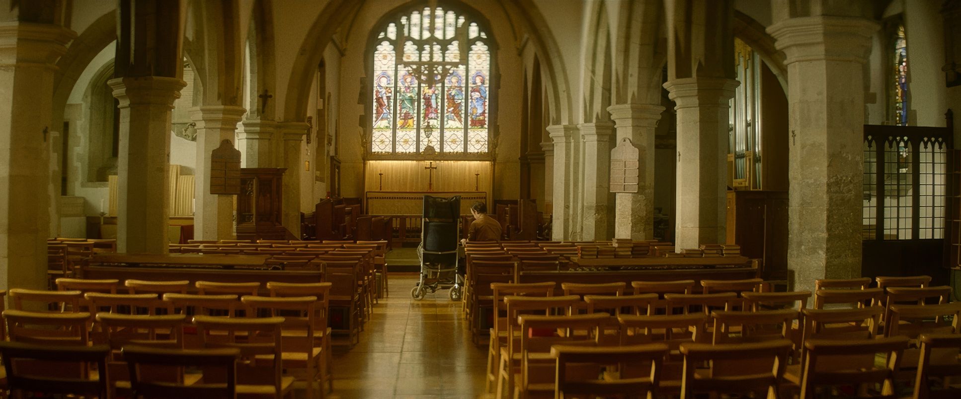
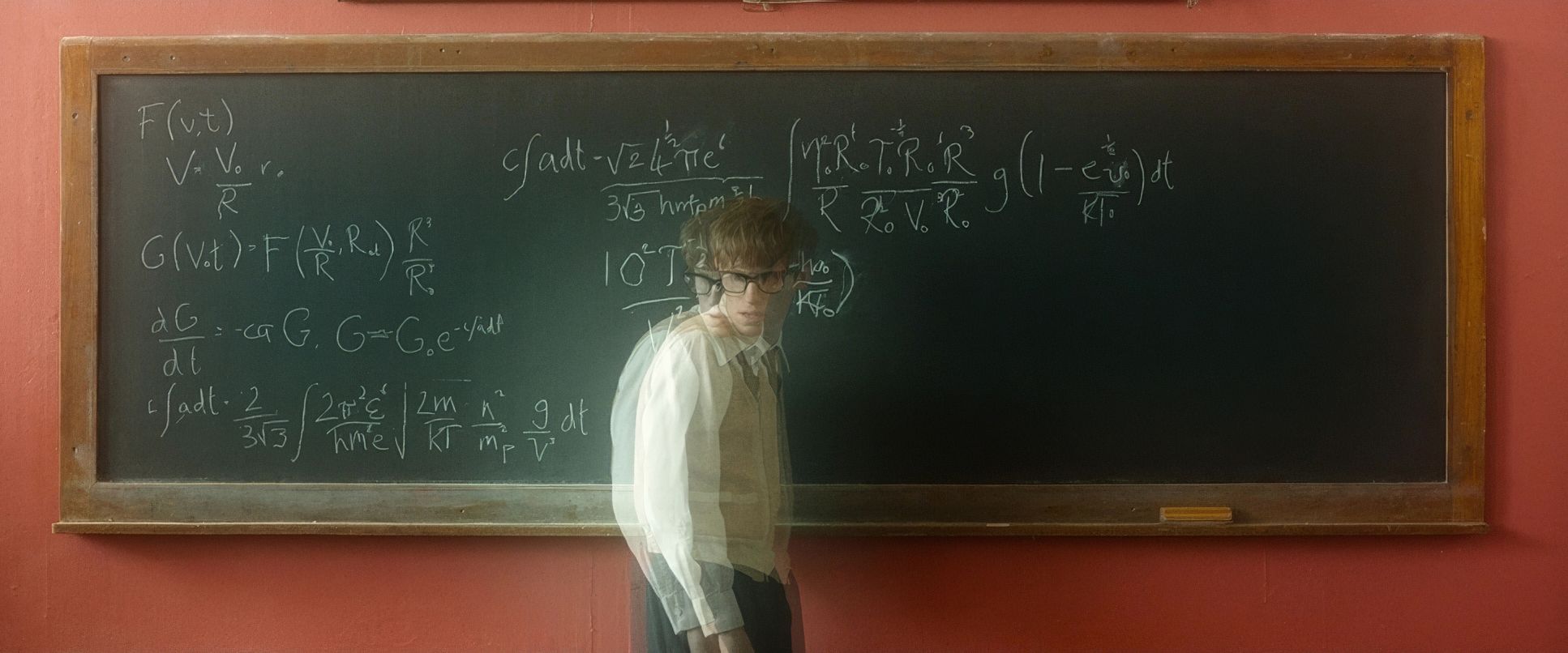
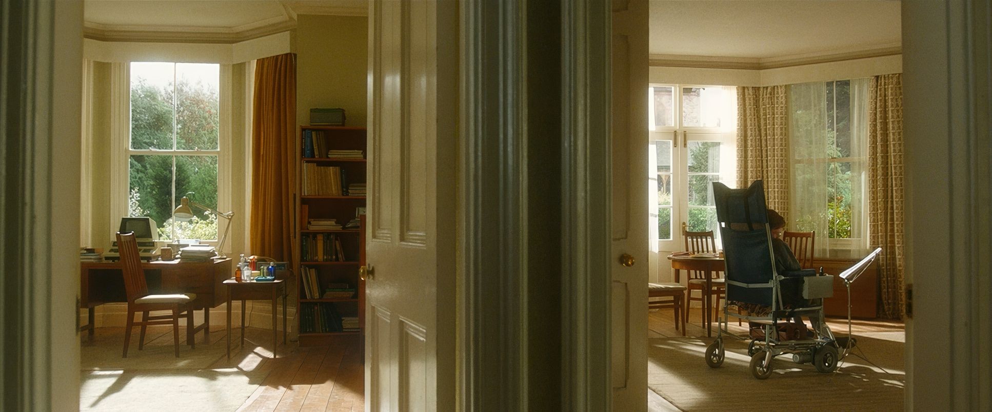
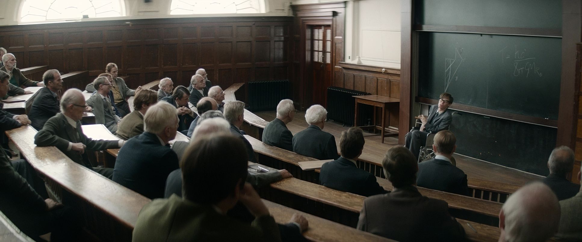
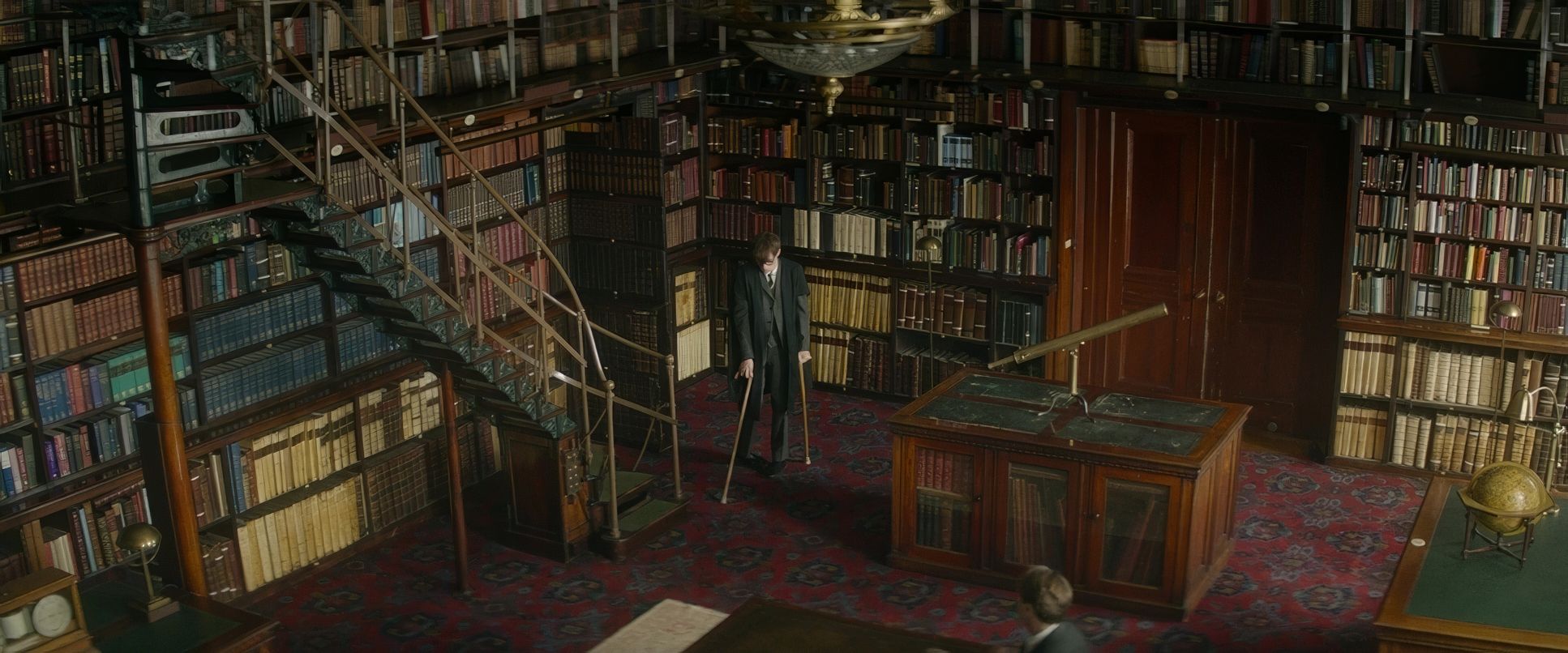
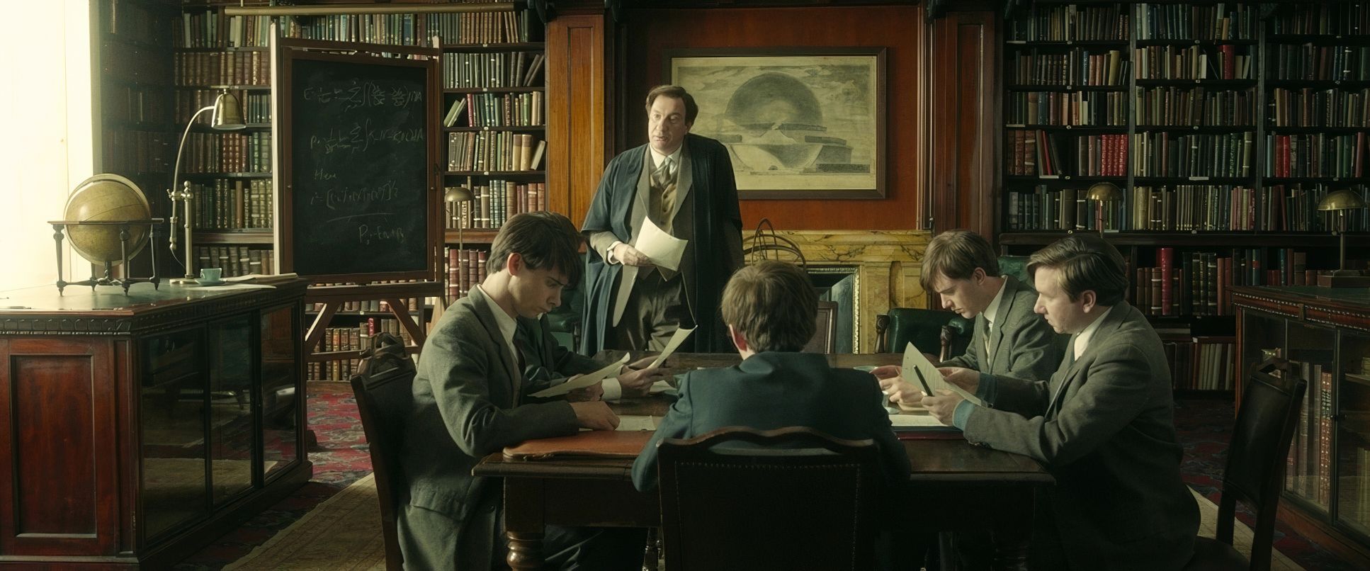
Initially, the blocking is open. We see Stephen in his environment, often shot with wider lenses that suggest a world of possibility. As the disease progresses, the lenses get longer. The space compresses. This isn’t about cheap close-ups; it’s about a gradual visual intimacy that respects his struggle.
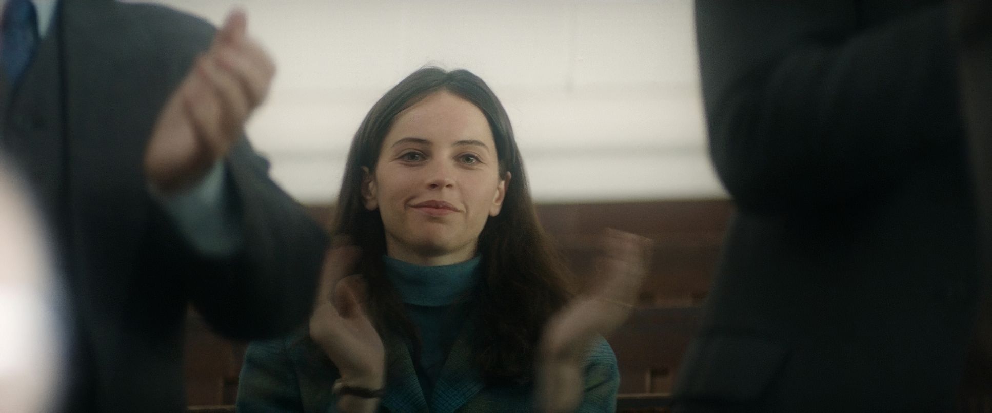
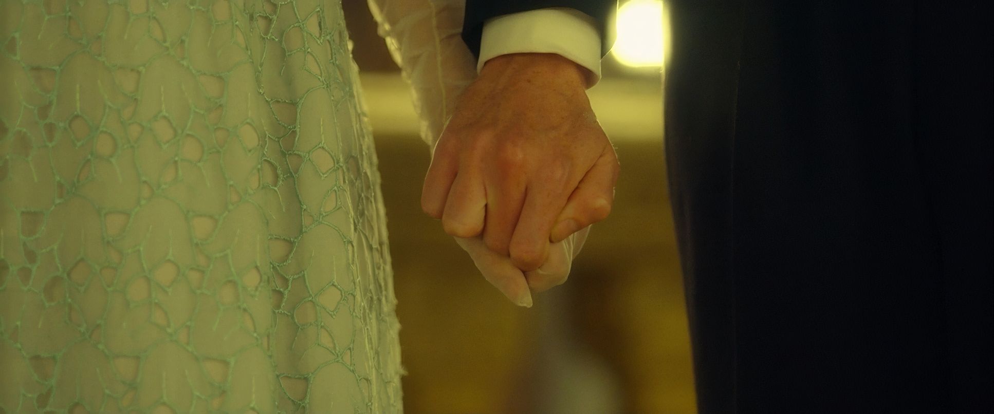
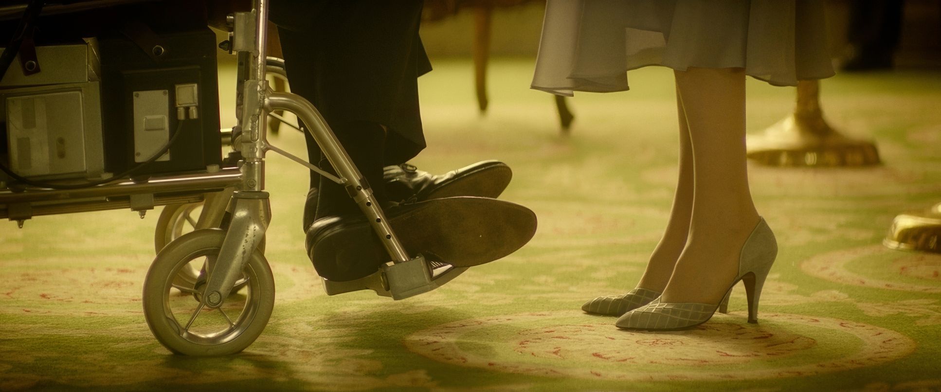
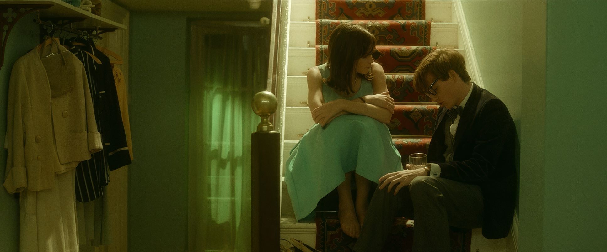
The blocking between Eddie Redmayne and Felicity Jones is where the heart is. Jane is almost always at his eye level, even when he’s in the wheelchair. She’s his pillar, and the camera makes sure we see that physical bond. I remember a prep meeting once where a director wanted to keep a disabled character in the foreground as a “symbol,” but I argued and this film proves that the real empathy is in the interaction.
Compositional Choices
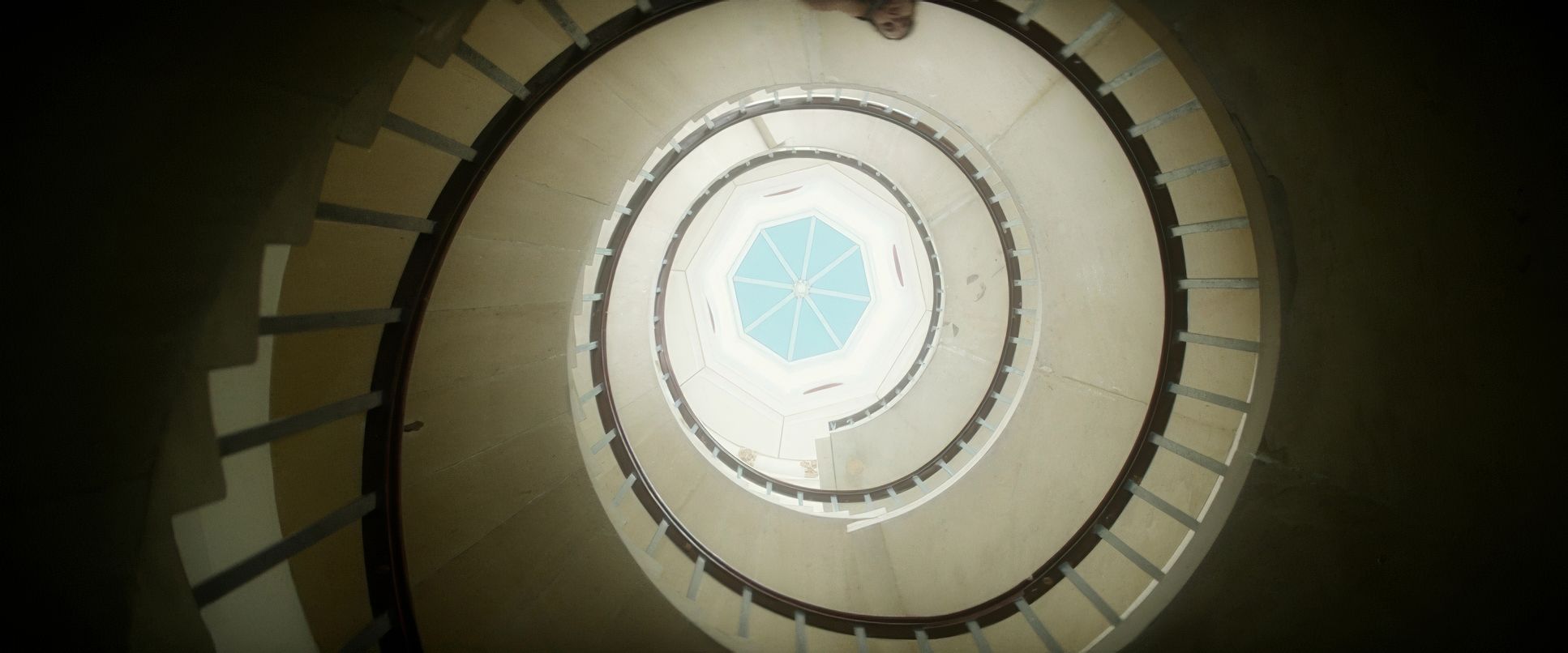
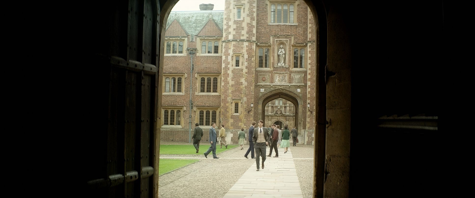
Delhomme’s frames are rooted in a classical aesthetic. Early on, he uses vast backdrops Cambridge architecture, the night sky to underscore Stephen’s cosmic ambitions. He’s literally trying to “reverse time,” and the open space around him reflects that intellectual freedom.
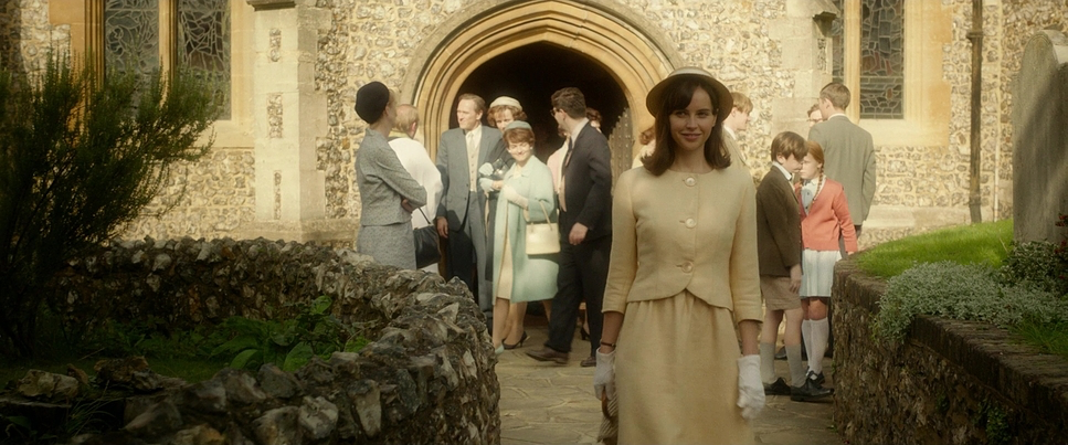
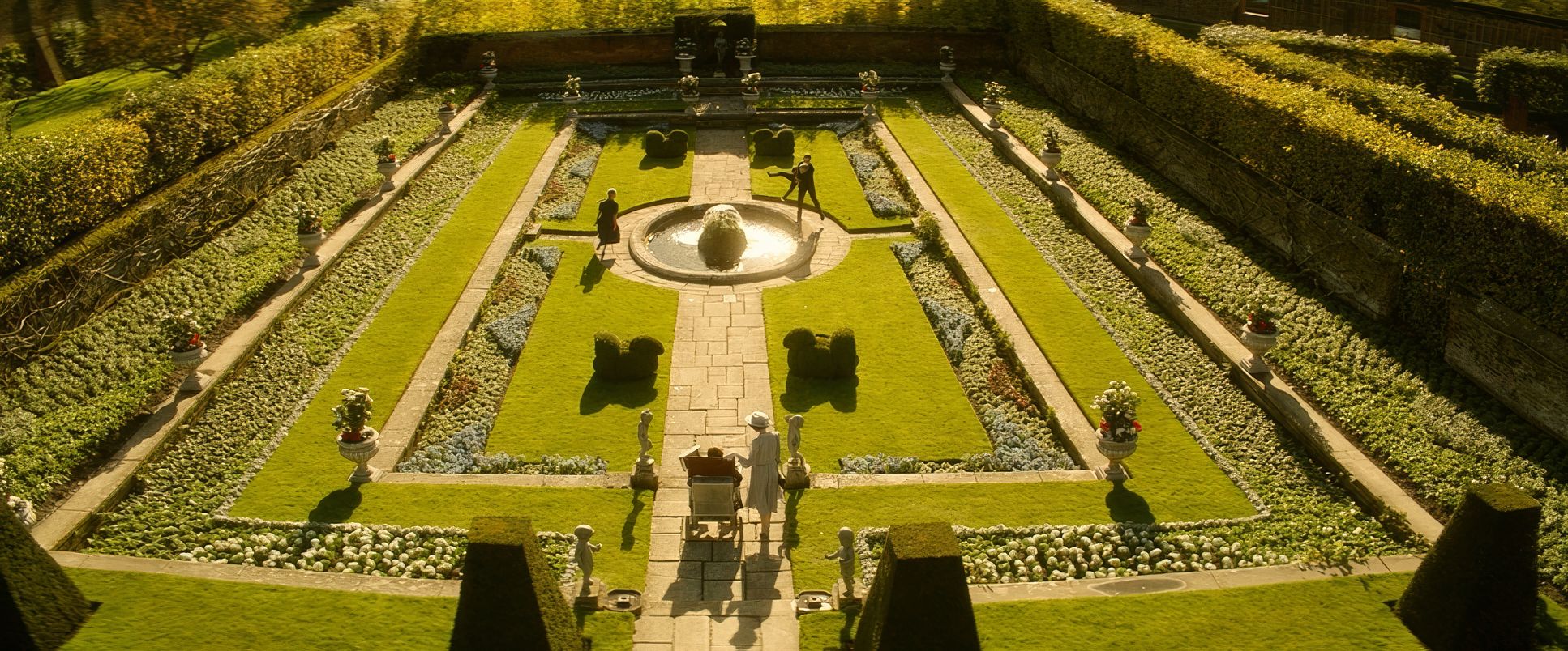
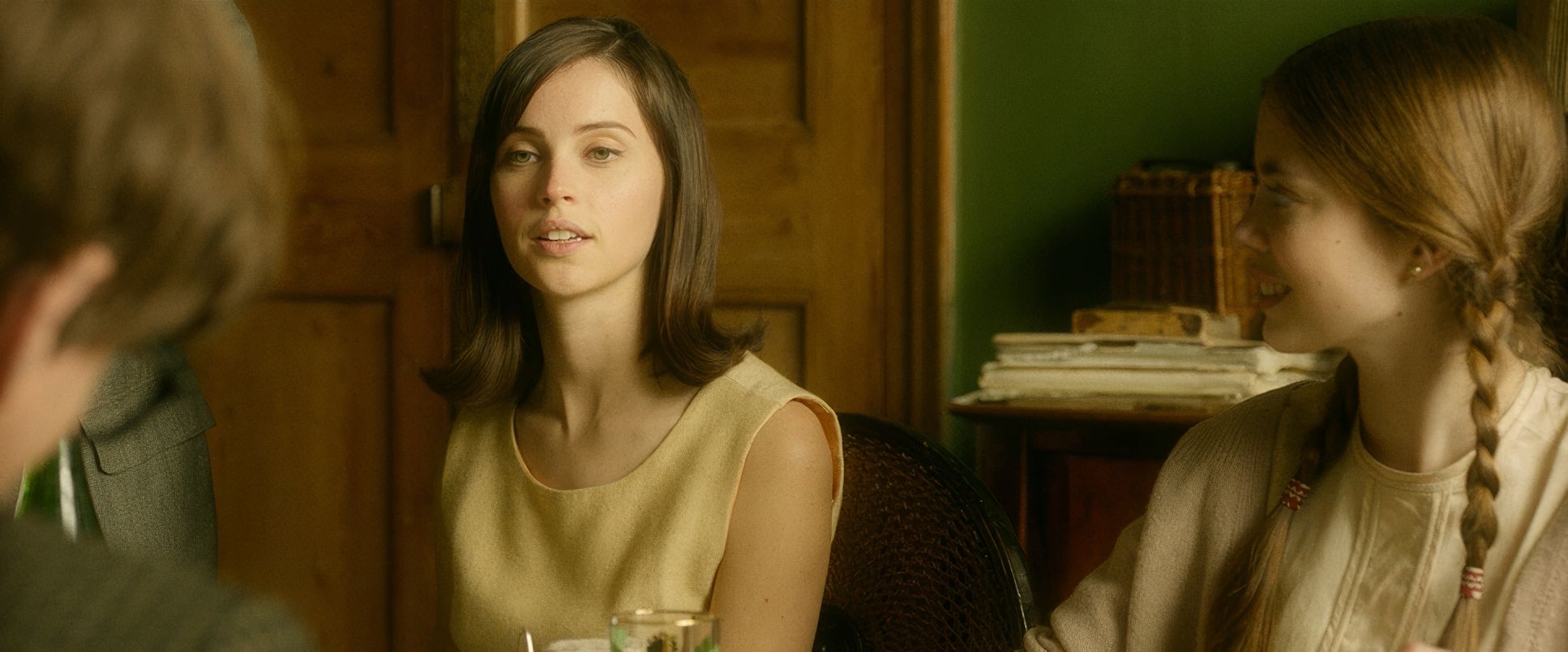
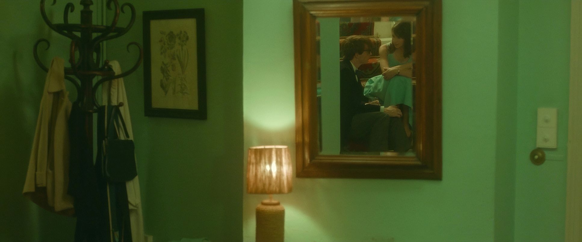
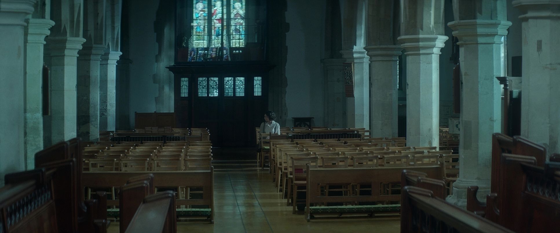
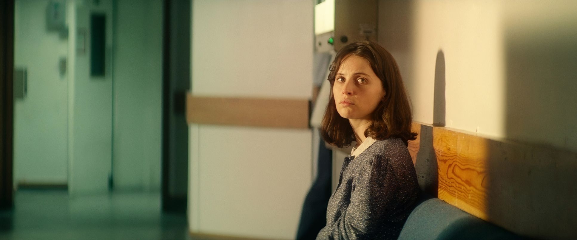
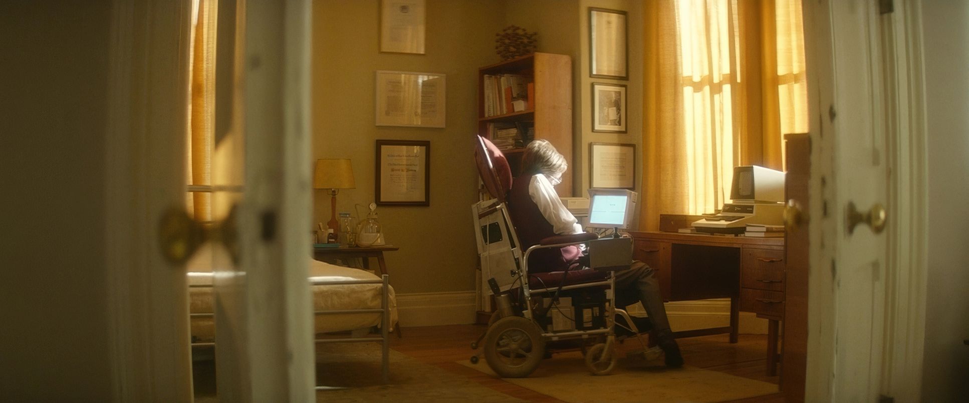
As things get tougher, the compositions tighten. We see Stephen isolated within the frame, but Delhomme avoids making it feel claustrophobic. Instead, he uses negative space to show Jane’s tireless presence. Even when she’s in the background, she’s the anchor. The depth cues here are subtle but vital; it’s never just a “pretty shot,” it’s always a map of their evolving relationship.
Lighting Style
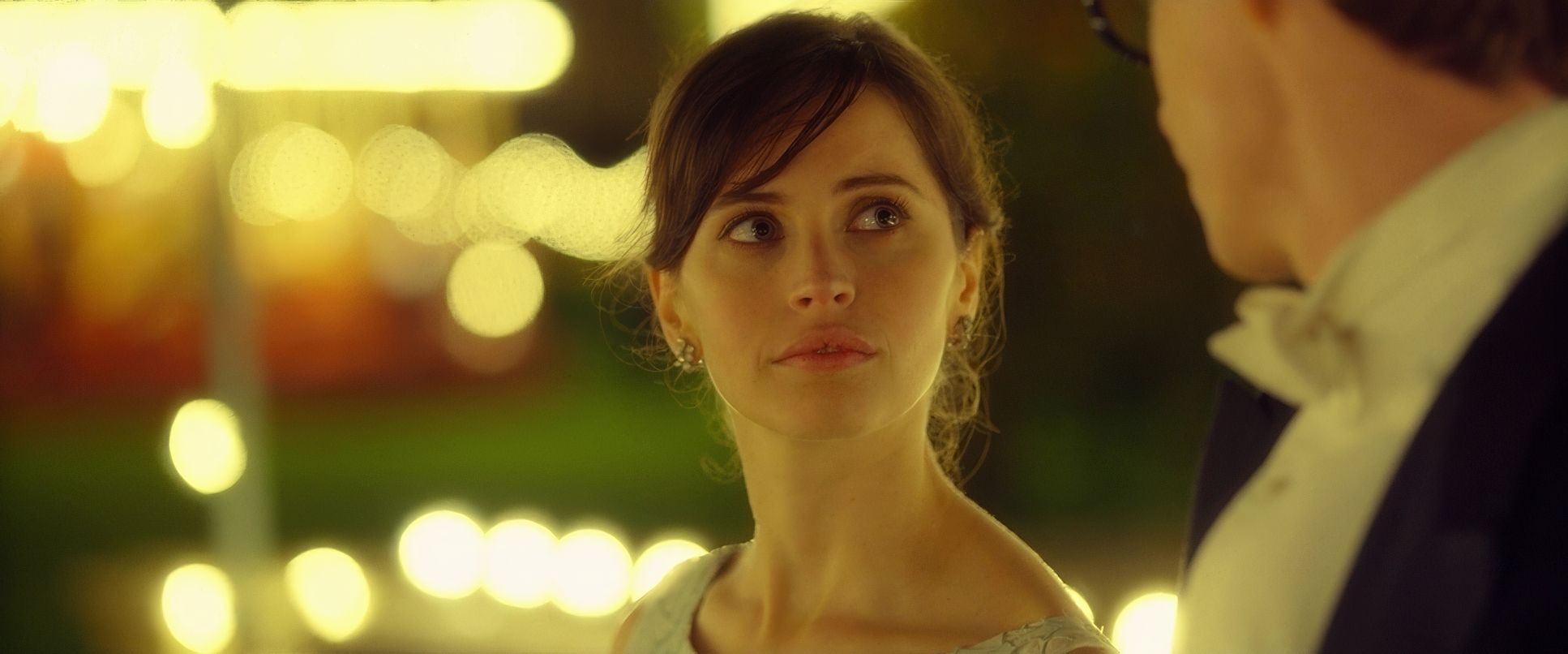
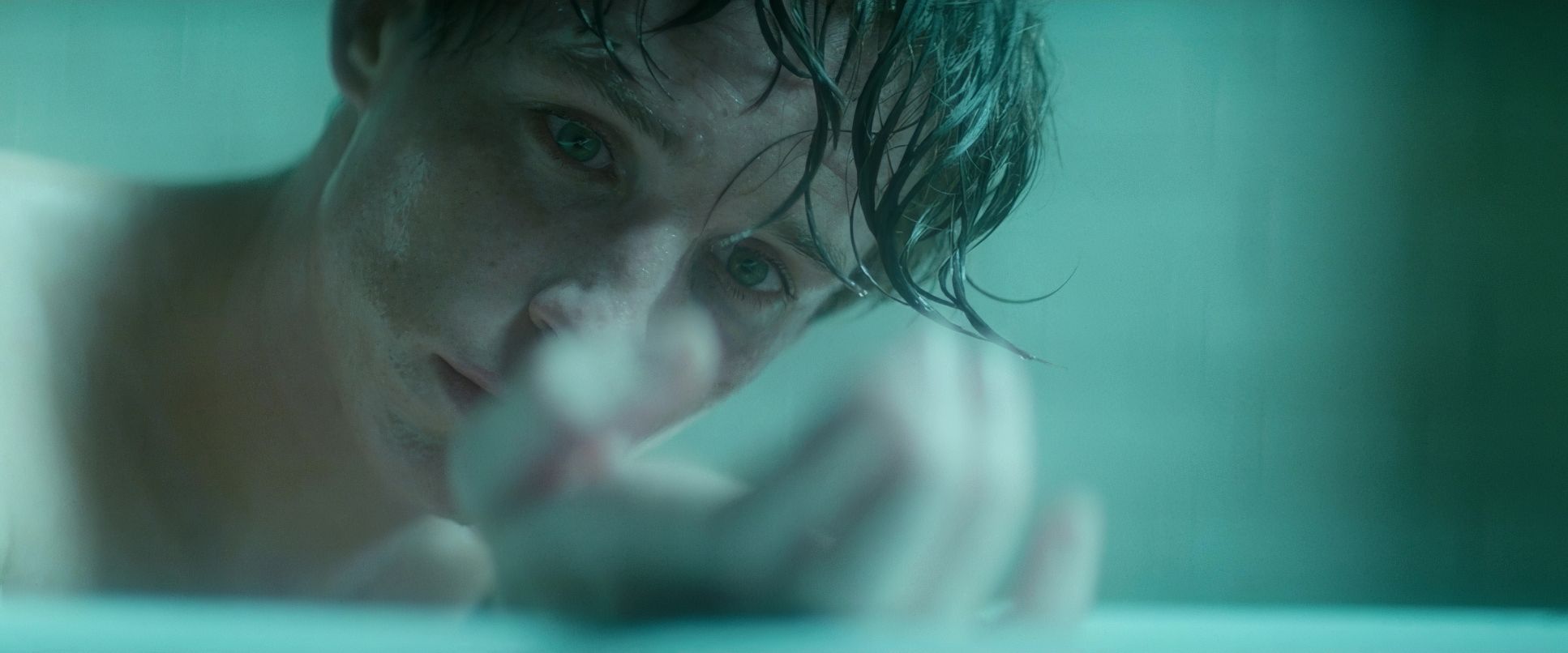
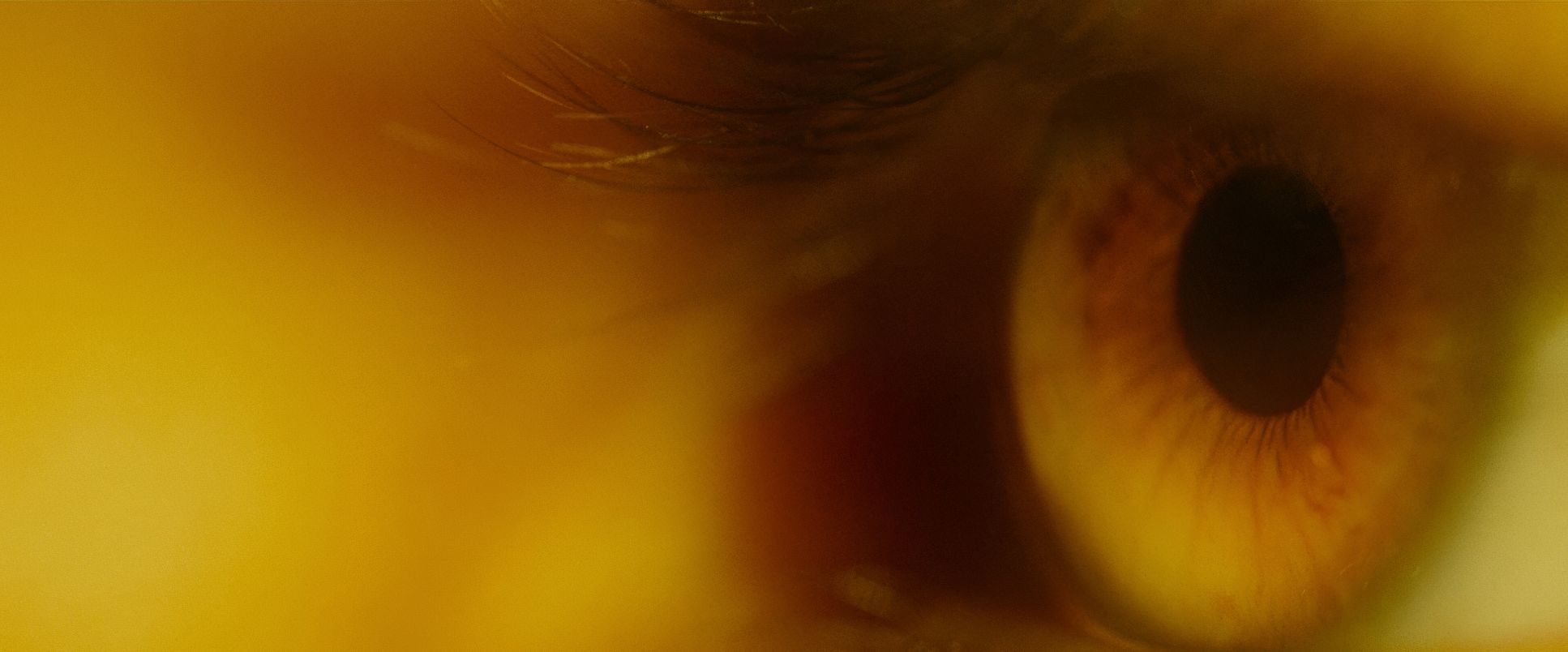
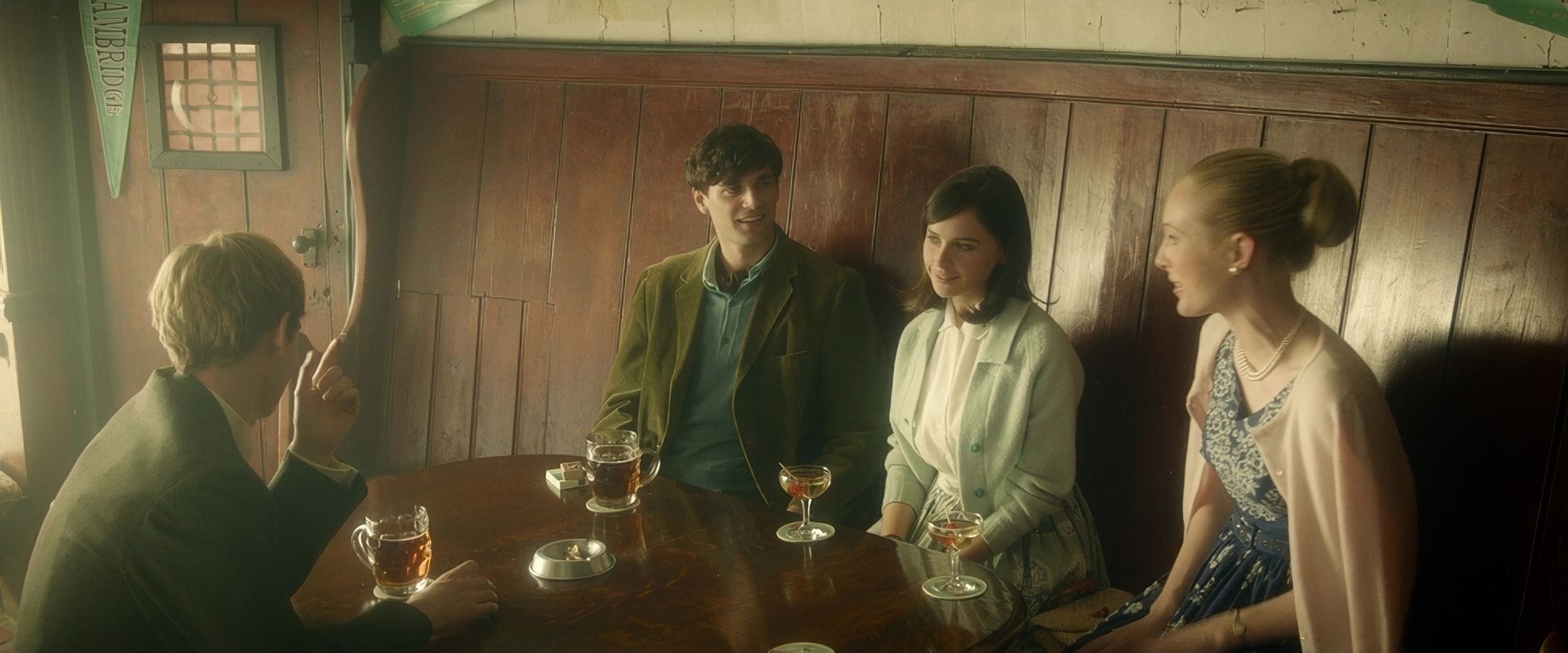
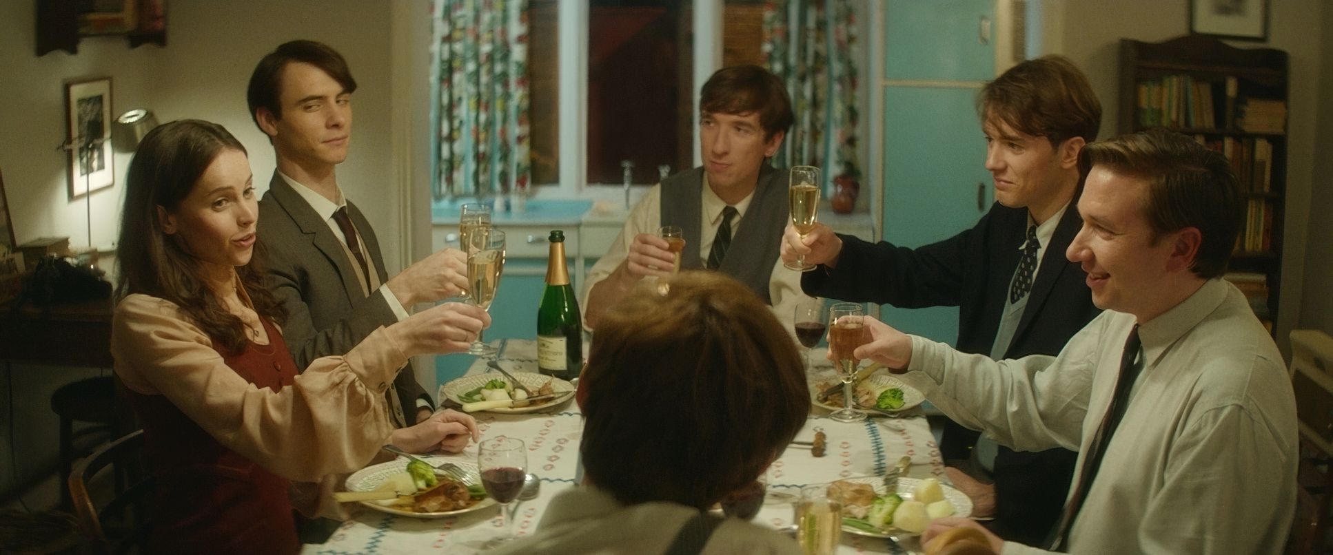
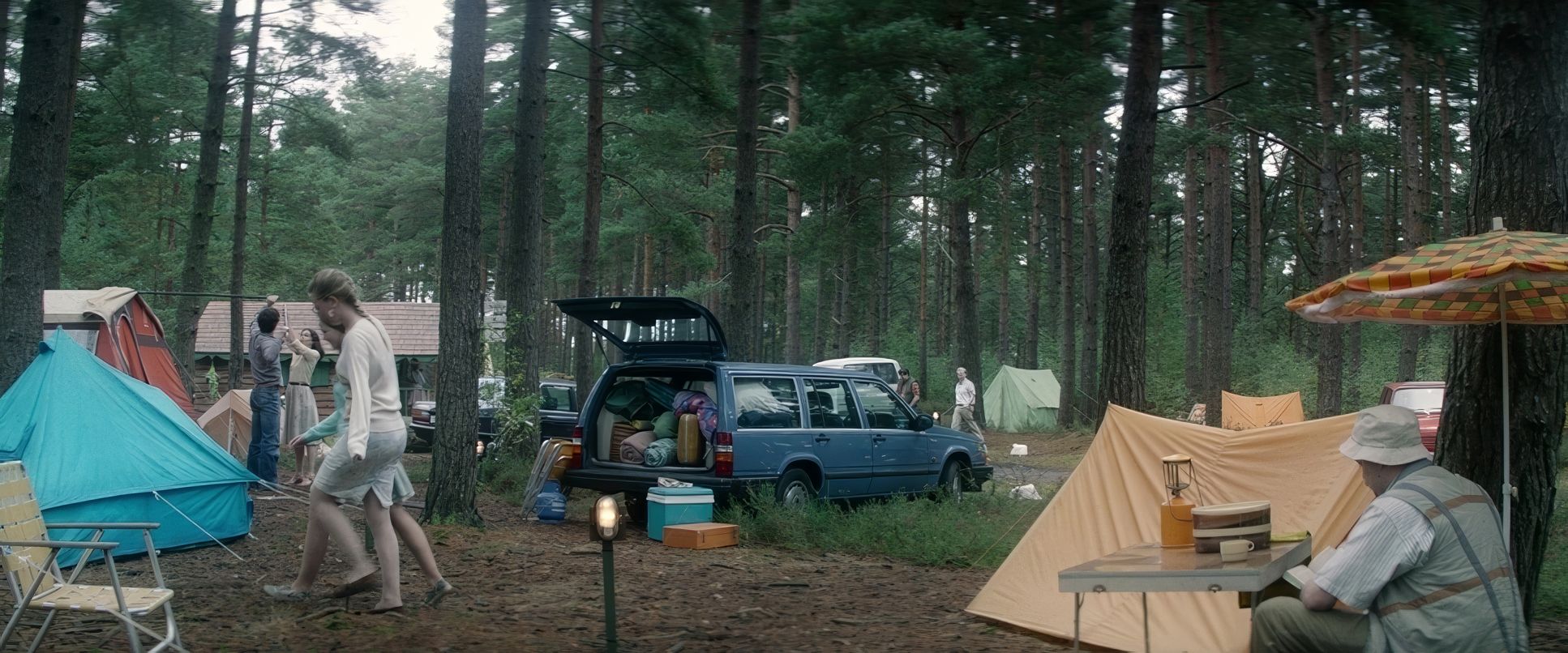
The lighting here is a masterclass in motivated naturalism. Delhomme uses available light or at least makes it lookthat way to create an image that feels lived-in. In the courtship phase, everything is warm. Golden hour sunlight, fireplaces, soft practicals. It’s nostalgic.
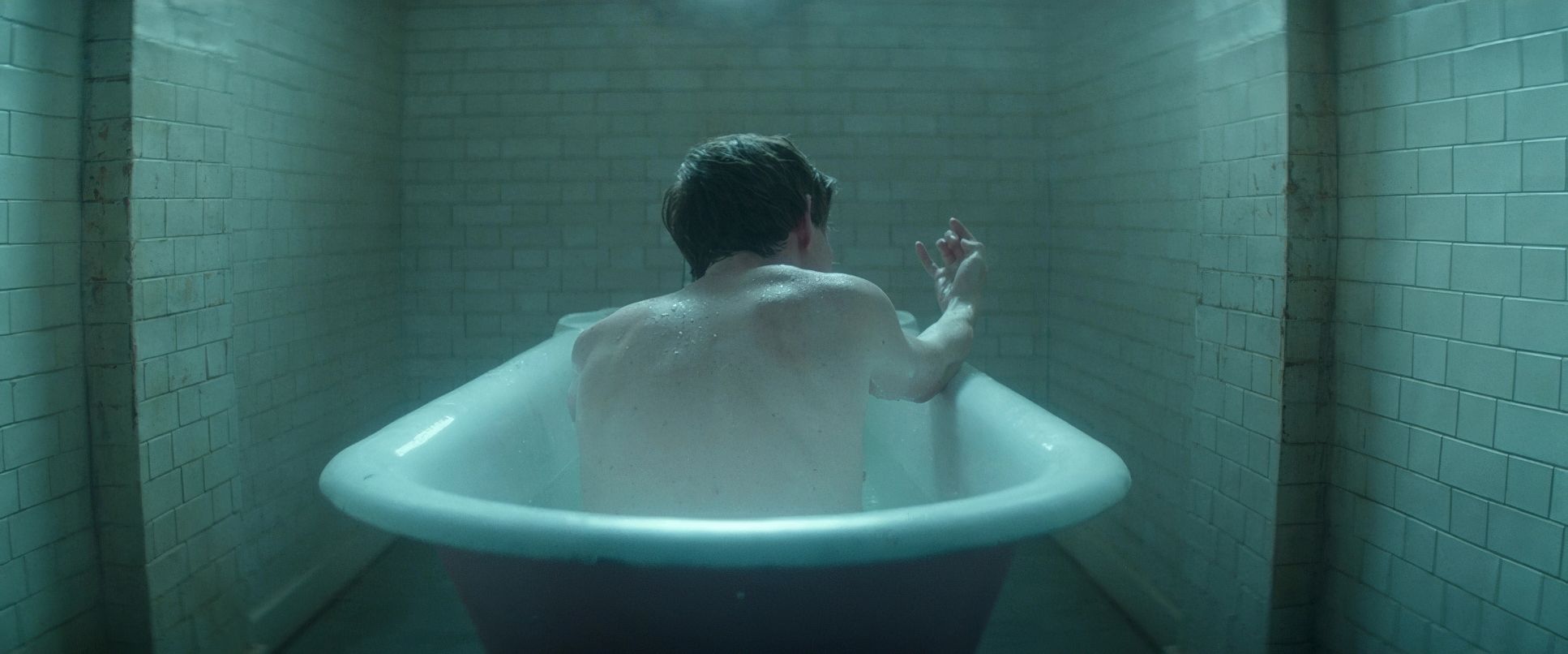
As the story matures, the shadows get deeper. The light feels cooler, reflecting the weight of their reality. But it never turns “gritty” or desaturated. There’s always this persistent, soft illumination that implies resilience. From a technical standpoint, the highlight roll-off is incredibly smooth. It has that organic, film-like feel where the windows don’t just “blow out” into digital white, but retain a soft, luminous quality. It gives the story a timeless, photograph-like polish.
Color Grading Approach
From my seat in the grading suite, this film is a playground. The palette isn’t just “pretty” it’s strategic. The early yellows and oranges provide that classic tonal sculpting, with rich shadows that never feel “crushed.”
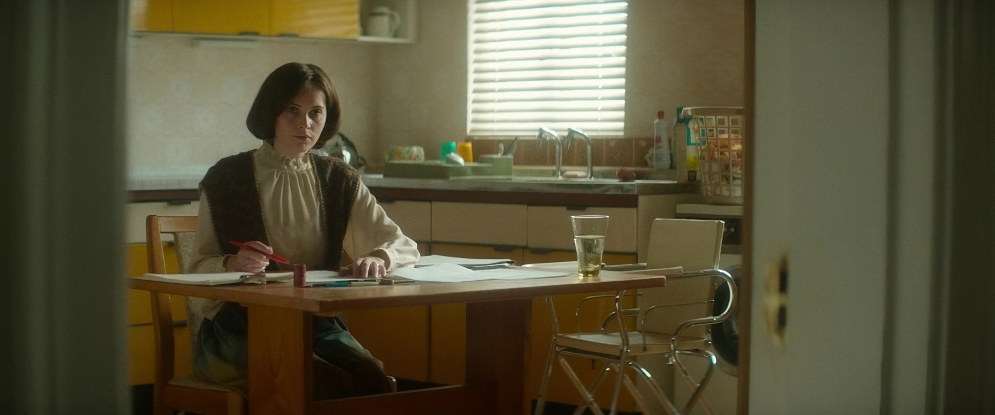
But look at the “ice blue” wardrobe Jane wears. As a colorist, that’s a specific challenge. You have to protect those skin tones while keeping that blue pure. If you’re not careful, the cool tones can make the actor look sickly, but here, the blue acts as a visual anchor a cool counterpoint to the warmth of Stephen’s world. It’s a subtle hue separation that symbolizes her steadfastness. The contrast is never aggressive; it respects the dynamic range of the Alexa sensor, creating a print-film sensibility that invites the viewer in rather than shouting at them.
Technical Aspects & Tools
The Theory of Everything | Technical Specifications
| Genre | Docudrama, Drama, Marriage, History, Romance, Biopic |
| Director | James Marsh |
| Cinematographer | Benoît Delhomme |
| Production Designer | John Paul Kelly |
| Costume Designer | Stephen Noble |
| Editor | Jinx Godfrey |
| Colorist | Peter Doyle |
| Time Period | 1960s |
| Color | Cool, Saturated, Cyan, Blue |
| Aspect Ratio | 2.39 – Anamorphic |
| Format | Digital |
| Lighting | Soft light, High contrast |
| Lighting Type | Daylight, Overcast |
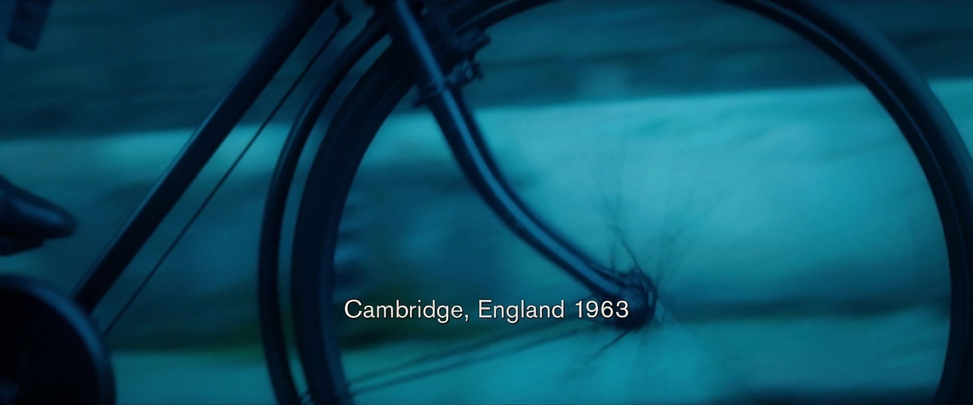
| Story Location | England > Cambridge |
| Filming Location | United Kingdom > England |
| Camera | ARRI ALEXA 4:3 / plus |
| Lens | Leitz SUMMILUX-C, Hawk V-Plus, Hawk V-series Anamorphics |
| Film Stock / Resolution | SxS |
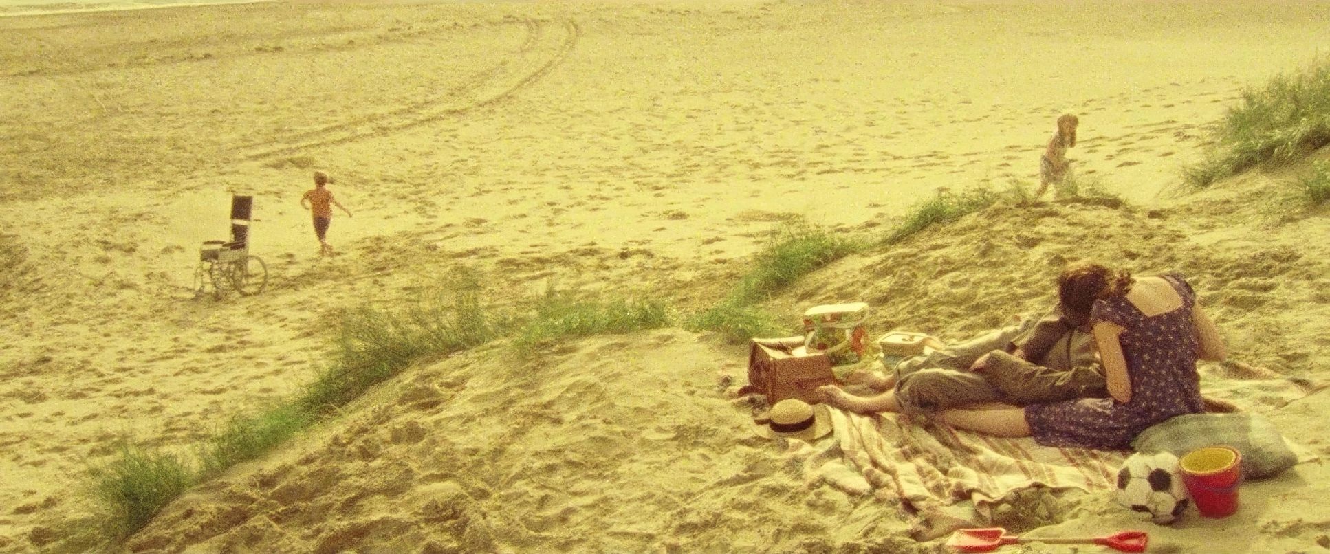
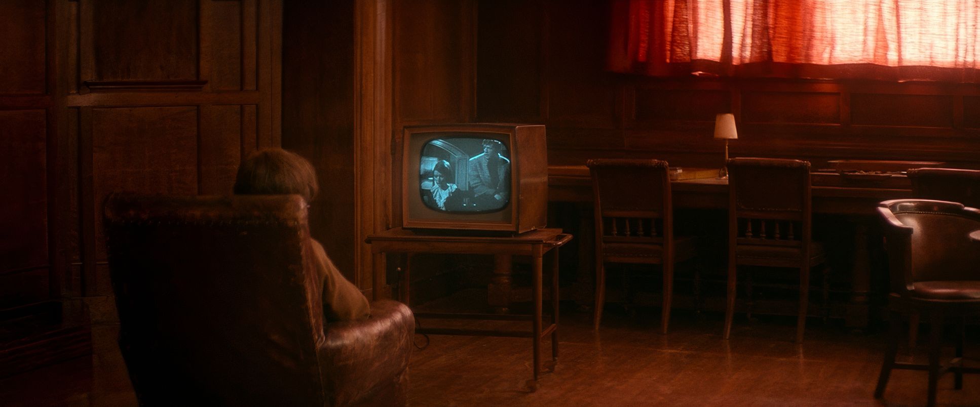
The “fake home movies” are another brilliant touch. Whether they shot Super 8 or processed digital footage in post, the “documentary feel” grounds the story. As a colorist, achieving this involves more than just “adding grain.” It’s about mimicking specific film stocks, lowering resolution, and applying period-accurate color shifts. It acts as a visual shorthand for memory, showing the couple changing “incrementally” through the years. It’s a perfect bridge between Marsh’s documentary roots and Delhomme’s painterly eye.
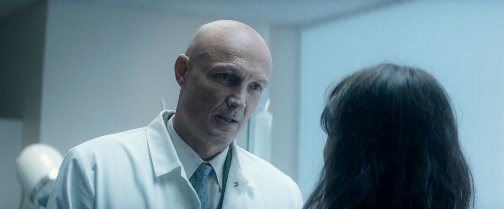
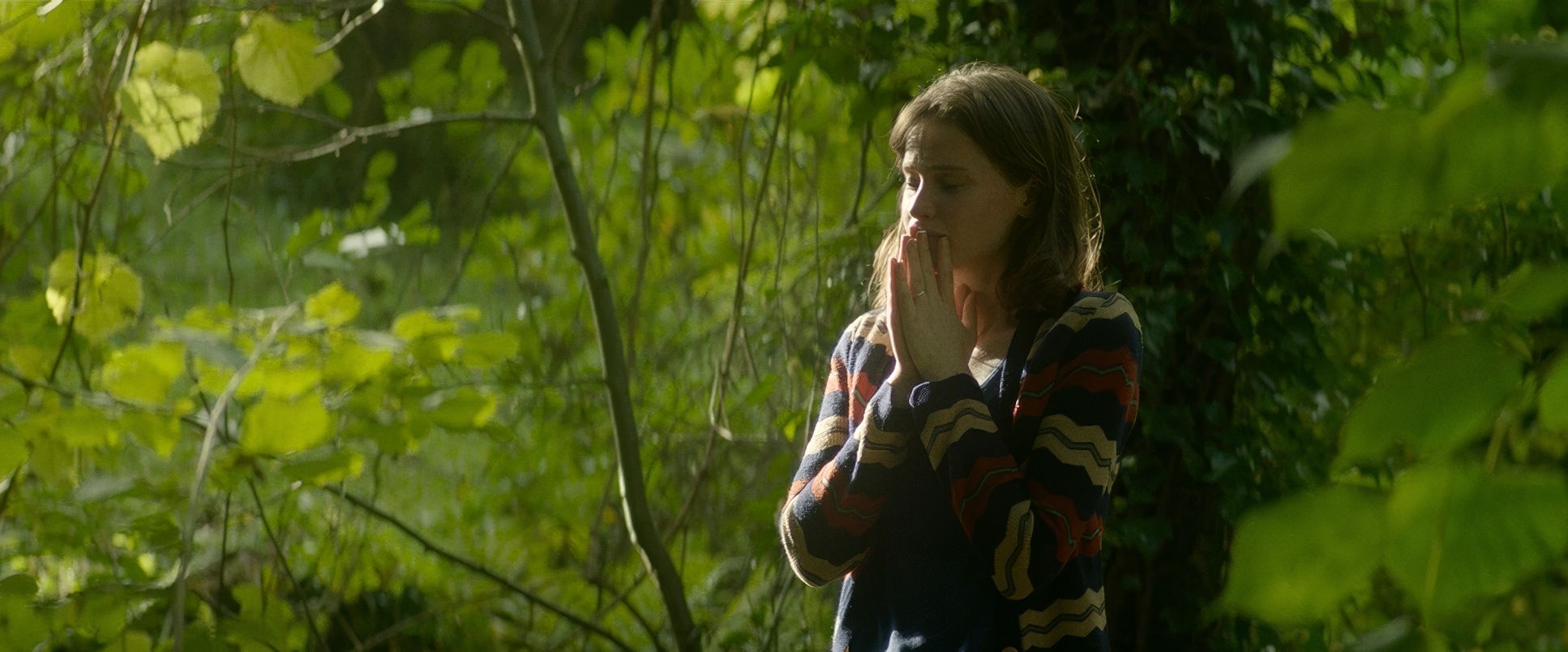
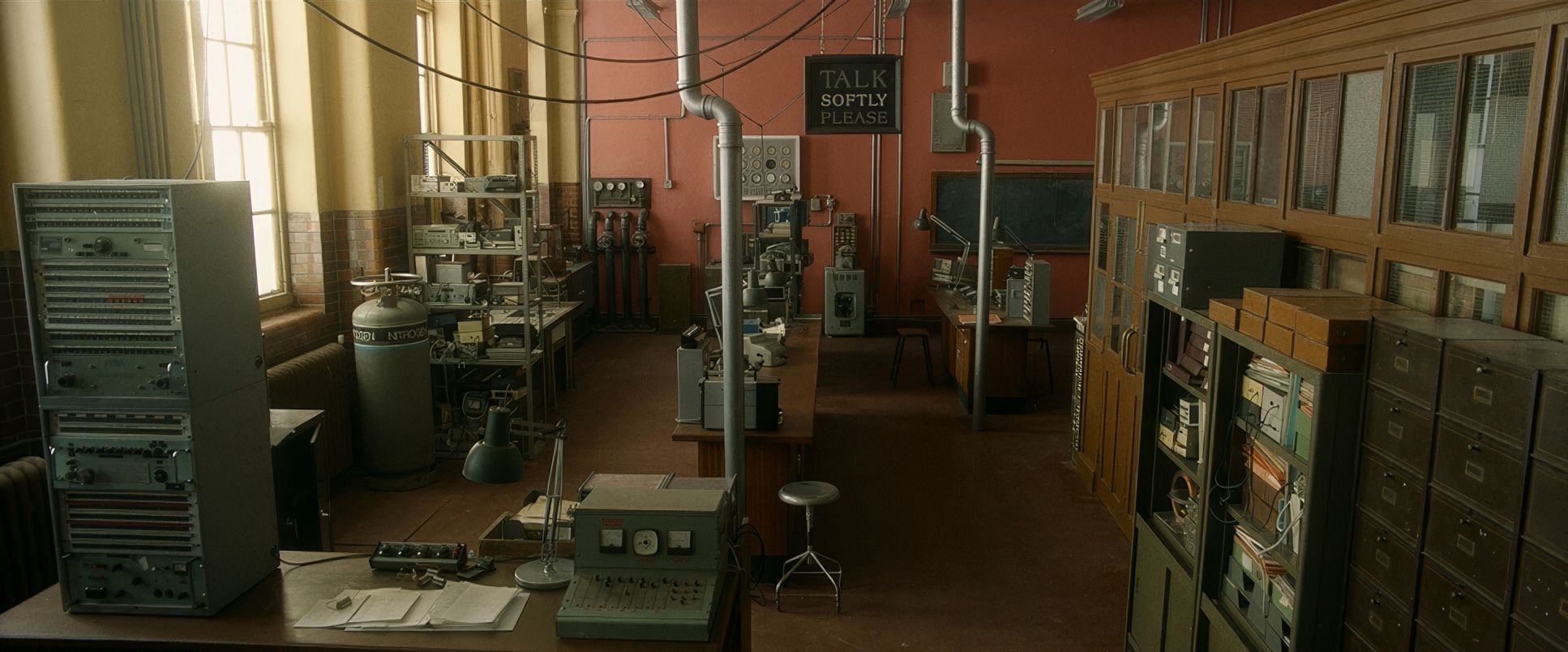
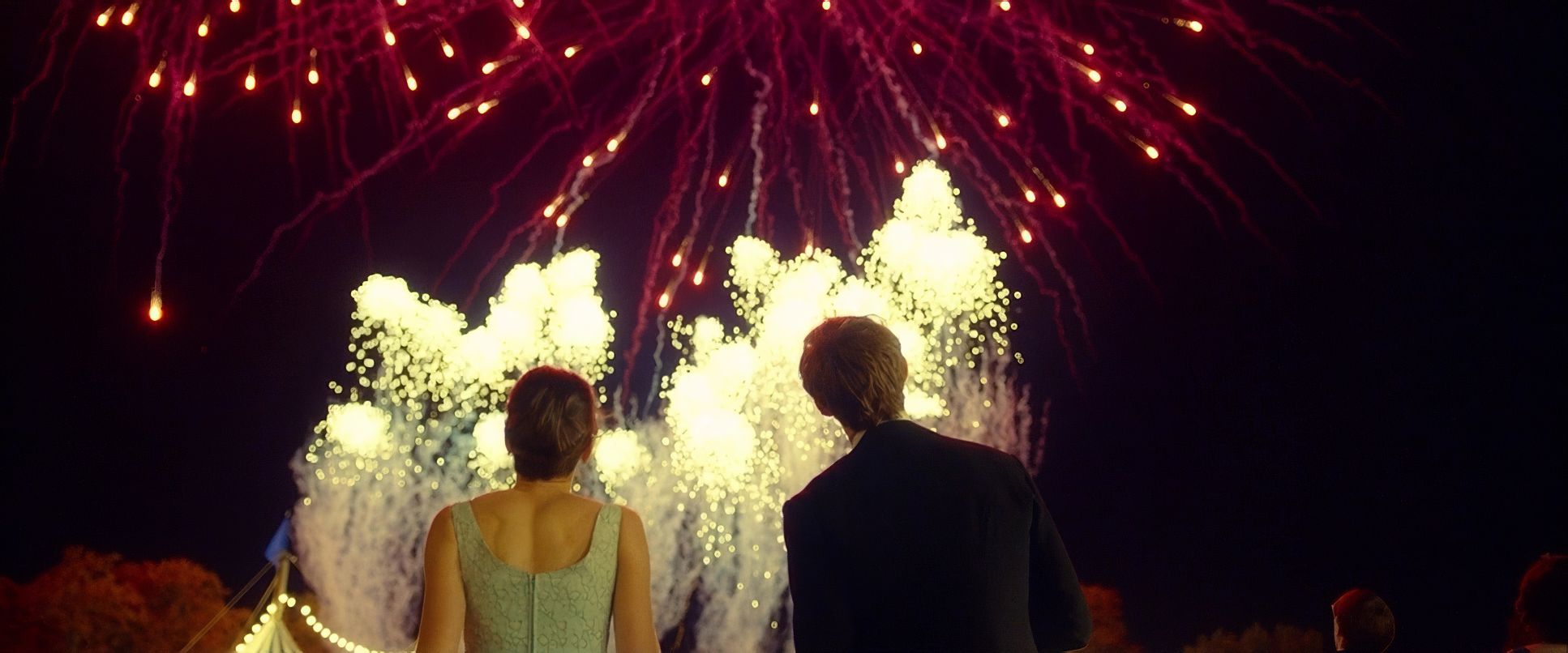
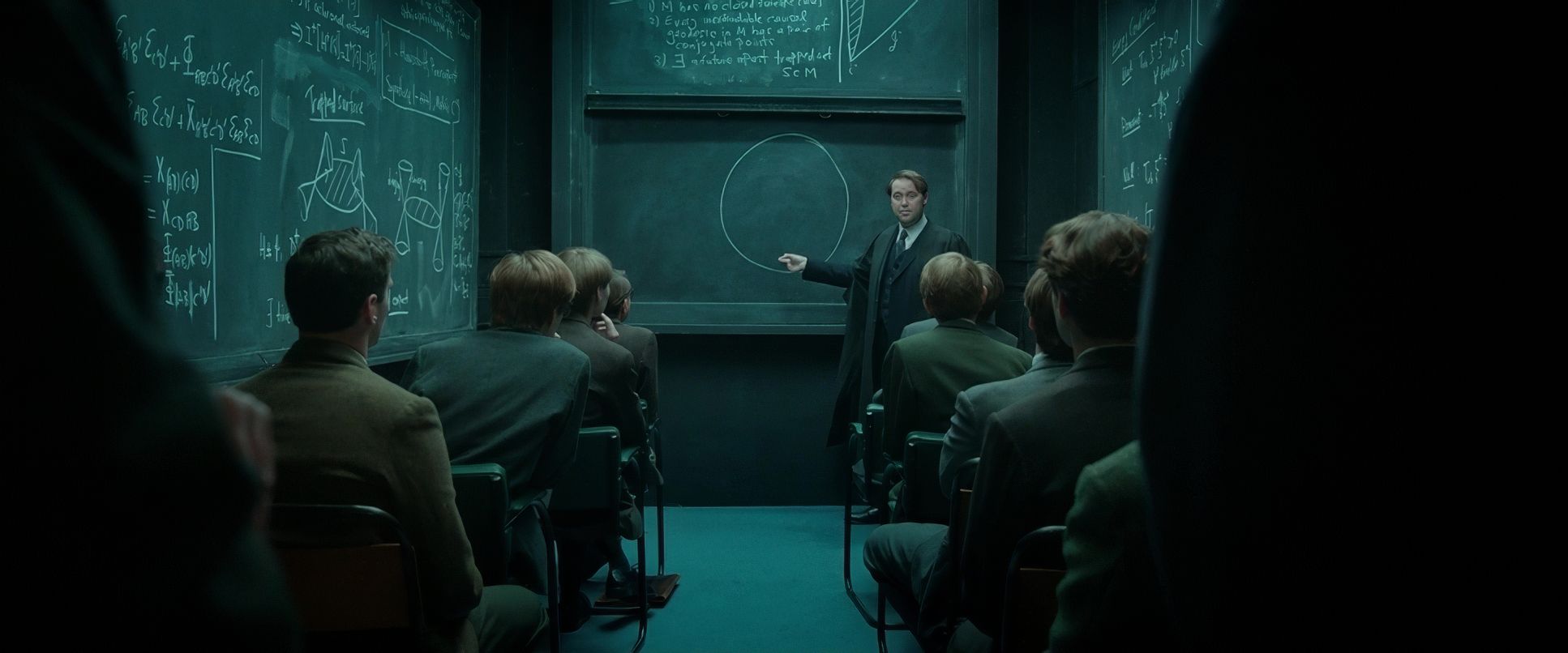
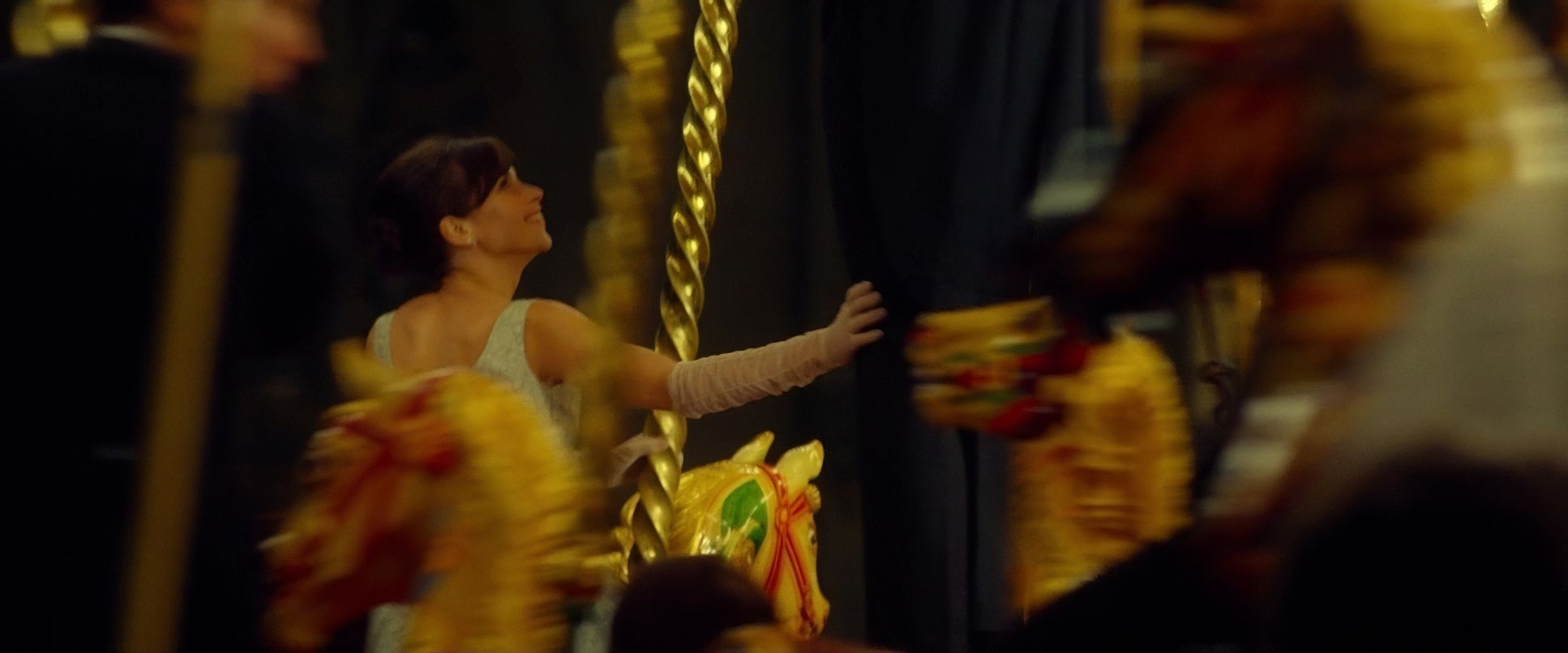
The Theory of Everything (2014) Film Stills
A curated reference archive of cinematography stills from THE THEORY OF EVERYTHING (2014). Study the lighting, color grading, and composition.


- Also read: THE BOURNE SUPREMACY (2004) – CINEMATOGRAPHY ANALYSIS
- Also read: STAR TREK INTO DARKNESS (2013) – CINEMATOGRAPHY ANALYSIS
Browse Our Cinematography Analysis Glossary
Explore directors, cinematographers, cameras, lenses, lighting styles, genres, and the visual techniques that shape iconic films.
Explore Glossary →