I want to talk about a film that most people hear rather than see: The Sound of Music (1965). It’s easy to write this one off as just a nostalgic classic or a holiday staple, but for a filmmaker, it is a serious piece of visual engineering.
I grew up watching this, like many of you. But revisiting it now with a trained eye, I realized it’s not just the songs doing the heavy lifting. The visual storytelling is doing just as much work to sell the emotion. You could watch this film on mute and still understand exactly what is happening purely through the image pipeline. It holds up incredibly well.
About the Cinematographer

The cinematographer responsible for these images was Ted McCord, A.S.C. While director Robert Wise gets a lot of credit for his versatility jumping from West Side Story to Star Trek it was McCord who had to execute the vision on a technical level. McCord was a veteran who understood that cinematography isn’t just about recording a performance; it’s about translating scale. He knew that for this specific story, the environment was as important as the lead actress. He didn’t just light the people; he lit the scope of the world they lived in.
Inspiration Behind the Cinematography
The primary inspiration here is obvious: the Austrian Alps. But the execution goes beyond just pointing a camera at a mountain. The film treats the landscape as a living character. The filmmakers needed the visuals to match the grandeur of the music, and they succeeded.
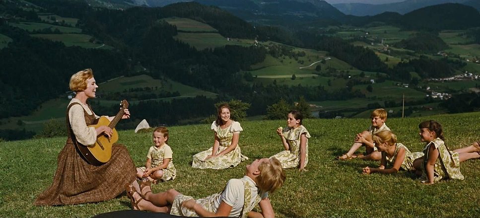
It honestly feels like a visual love letter to Salzburg. The goal was clearly to create an escapist fantasy—a world where the hills are quite literally alive. McCord achieved this by prioritizing depth. He emphasizes sweeping vistas and clear skies to contrast Maria’s boundless spirit against Captain Von Trapp’s initial rigidity. It’s not just “pretty”; it’s a narrative tool. The visuals are designed to pull you into a dreamlike state, offering comfort before the story shifts into the darker political territory of the final act.
Camera Movements
The camera work in The Sound of Music is a choreography in its own right. It breathes with the music. The film establishes a fluid visual language right from that famous opening helicopter shot (which famously created a downdraft that kept knocking Julie Andrews over, though you can’t tell in the final cut). We see massive crane shots that capture the sheer scale of the Alps, sweeping the audience right into Maria’s headspace.
Look at the early scenes where Maria explores the estate or the excursions into the countryside. The camera tracks them smoothly, creating a sense of natural discovery. These movements provide depth cues, letting us feel the three-dimensional space of the location. Even in intimate moments, the camera rarely sits still. It circles characters or dollies in to punctuate a beat of connection. It’s an active participant, guiding our eye with a precision that mirrors the musical timing.
Compositional Choices
McCord’s framing is a lesson in narrative clarity. He frequently uses wide shots to establish the landscape, positioning characters within these grand tableaux to show us how small they are in comparison to the world around them. Think of Julie Andrews, a tiny figure against the massive green slopes, yet her presence still dominates the frame.
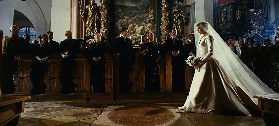
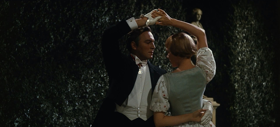
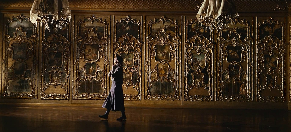
But the composition also does heavy lifting for the character dynamics. When Maria first arrives at the villa, the framing is rigid and symmetrical, reflecting the Captain’s military discipline. As Maria reintroduces joy to the household, the compositions loosen up. Groups become more organic. The framing suggests connection rather than isolation. Close-ups are actually used quite sparingly here. McCord saves those tight shots for moments of genuine emotional breakthrough, which makes them hit harder when they finally happen.
Lighting Style
The lighting is one of the film’s defining characteristics. We are looking at a film shot in the mid-60s on Kodak 5251, a 50 ASA stock. That is incredibly slow by modern standards, which means they needed a lot of light.
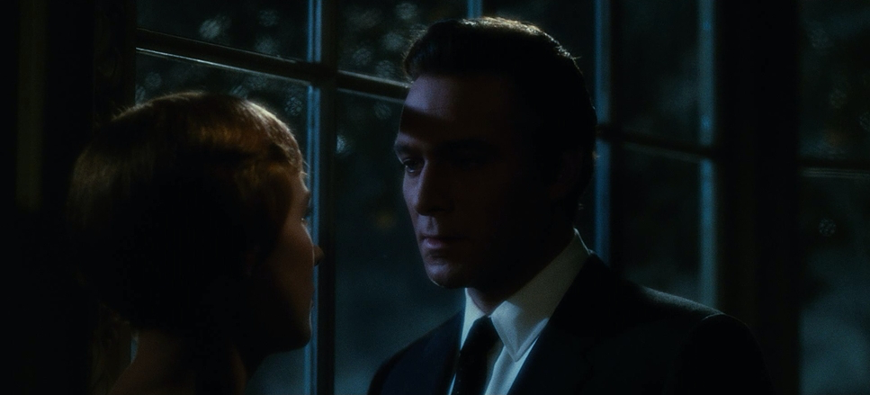
I love how they handled this. They harnessed natural daylight but augmented it with massive fill lights to wrap the subjects in soft, diffused illumination. It gives the film that “high key” look bright, open, and optimistic. There’s a distinct clarity to the images. McCord ensured he held detail in the snow-capped highlights while digging enough into the shadows of the valley floor. Inside the villa, the lighting is motivated by practicals and windows, bathing scenes in a glow that softens the architecture. The highlight roll-off is creamy and smootha characteristic of celluloid that digital still struggles to emulate perfectly.
Lensing and Blocking
Technically, this was shot on 65mm using spherical lenses (likely Mitchell BFC 65). Unlike anamorphic lenses which squeeze the image, spherical lenses on large format film render the world with almost perfect geometry and clarity. They used wide focal lengths to exaggerate the distance and openness of the exteriors.
When the story moves indoors, they shift to standard or short-telephoto focal lengths to compress the background and isolate the actors. But the blocking is where the real magic happens. Initially, the Von Trapp children are blocked in lines, almost like a military formation. Maria, conversely, moves in curves and circles, breaking those lines. The “Do-Re-Mi” sequence is the perfect example: Maria leads the children through dynamic, chaotic blocking, visually demonstrating how she is deconstructing their father’s strict rules. As the family unifies, the blocking tightens up again, but this time as a cohesive family unit rather than a platoon.
Color Grading Approach

As a colorist, this is the part I geek out on. The recent 4K restoration is stellar. They didn’t try to reinvent the wheel; they just polished it. The scan creates a rich, vibrant foundation that honors the original print density.
Looking at the transfer, my immediate observation is the discipline in the skin tones. In modern grading, there’s often a temptation to push teal into the shadows and orange into the skin. Here, the skin tones are naturally warm but separated cleanly from the environment without looking digital.
The greens are the star of the show here lush, deep, and distinct from the blues of the sky. The floral elements pop with organic vibrancy, likely due to the dye-coupler characteristics of the print stock. Black levels are solid deep enough to anchor the image but not crushed, preserving the shadow detail in the night scenes. The HDR pass adds a subtle accentuation to the specular highlights, but it respects the original gamma curve. It’s a delicate grade: enhancing contrast for impact while ensuring the “warmth” of the film remains intact.
Technical Aspects & Tools
The Sound of Music
35mm Film • 2.20:1 Aspect Ratio| Genre | Drama, Family, Marriage, History, Music, Musical, Romance, War, World War II |
| Director | Robert Wise |
| Cinematographer | Ted D. McCord |
| Production Designer | Boris Leven |
| Costume Designer | Dorothy Jeakins |
| Editor | William Reynolds |
| Colorist | John Sellars, Mark Griffith |
| Time Period | 1930s |
| Aspect Ratio | 2.20 – Spherical |
| Format | Film – 35mm |
| Lighting | Soft light |
| Lighting Type | Daylight |
| Story Location | Austria > Salzburg |
| Filming Location | Austria > Salzburg |
| Camera | Mitchell BFC 65, Bell and Howell 2709 |
| Film Stock / Resolution | 5251 Print 50T |
The technical specs of the modern presentation are impressive. The 4K UHD Blu-ray presents the film in its original 2.20:1 aspect ratio, sourced from an 8K scan of the 65mm negative. That is a massive amount of resolution. The image clarity allows you to see the weave in the costumes and the individual blades of grass.
The inclusion of Dolby Vision is a huge plus for preservation. It expands the dynamic range, making the snow brighter and the shadows deeper, while maintaining the artistic intent. Crucially, they kept the film grain. It’s fine, layered, and organic. It hasn’t been scrubbed away with Digital Noise Reduction (DNR), which preserves the texture that makes film feel like film. The 100GB disc size means the bitrate stays high, minimizing compression artifacts. It is, without exaggeration, the best this movie has ever looked.
- Also read: BEFORE SUNSET (2004) – CINEMATOGRAPHY ANALYSIS
- Also read: HACHI: A DOG’S TALE (2009) – CINEMATOGRAPHY ANALYSIS
Browse Our Cinematography Analysis Glossary
Explore directors, cinematographers, cameras, lenses, lighting styles, genres, and the visual techniques that shape iconic films.
Explore Glossary →