As a filmmaker and colorist running Color Culture, I find myself drawn to movies that don’t just tell a story, but show it with profound intention. The Sixth Sense (1999) has always resonated with me—not just for its legendary narrative twist, but for the quiet, almost subliminal mastery of its visual language. While M. Night Shyamalan receives the accolades for the script, for those of us who live and breathe visual craft, the film is a masterclass in controlled perception. The cinematography guides our eyes and emotions without us realizing the full extent of the manipulation until the final revelation. It leverages every visual tool to deepen themes of grief, regret, and the unseen forces that linger in our lives.
About the Cinematographer
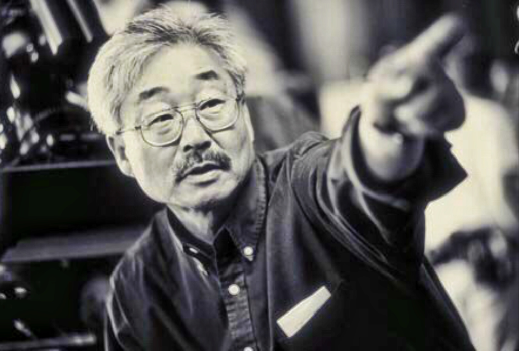
It is crucial to acknowledge the cinematographer who translated Shyamalan’s vision: Tak Fujimoto. A veteran whose diverse filmography includes the clinically terrifying The Silence of the Lambs and the vibrant Ferris Bueller’s Day Off, Fujimoto brought a quiet intensity to The Sixth Sense. While Shyamalan provided the singular authorial voice, Fujimoto was the conduit. The film’s distinct visual signature—its restrained movements, somber palette, and intimate compositions—speaks to a deep collaboration between director and DP. Fujimoto’s work here avoids the flashy tropes of the horror genre; it is deeply psychological, subtly reinforcing the characters’ internal states with a deliberate, almost surgical approach to suspense.
Inspiration Behind the Cinematography
The visual philosophy of The Sixth Sense is rooted in the unseen and the profound weight of human emotion. The film explores regret, remorse, and loss, dictating a somber, often muted aesthetic designed to evoke unease rather than jump-scares. It isn’t just a ghost movie; it is a mature exploration of faith and humanity, requiring a visual style grounded in realism while always hinting at something beyond.
The most famous visual element is the disciplined use of the color red. This wasn’t merely a symbolic choice; it was a strict visual rule. Red is used exclusively to depict the presence of the dead or objects they have interacted with. The production team famously scrubbed scenes of any accidental red—removing red cars from streets or changing background props—so that when the color does appear, it hits the viewer subconsciously. This level of control—removing competing hues to amplify a specific one—is a powerful lesson in color theory. Red becomes a visual breadcrumb, a bridge between worlds, and a silent harbinger of tragedy.
Camera Movements
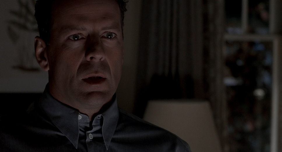
The camera in The Sixth Sense acts as a silent observer, mirroring Malcolm Crowe’s own spectral presence. There is a pervasive stillness to the film. When the camera does move, it is with purpose and restraint, often to reveal a subtle detail or heighten an emotional beat. Consider the scene where Cole finally confesses, “I see dead people.” The camera slowly, almost imperceptibly, creeps in on Malcolm’s face. This isn’t a jarring push-in; it’s a meditative crawl that draws the audience into the weight of Cole’s revelation and, in hindsight, emphasizes the stunning irony of Malcolm’s obliviousness.
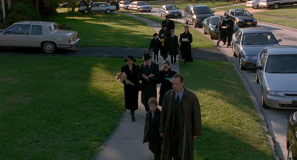
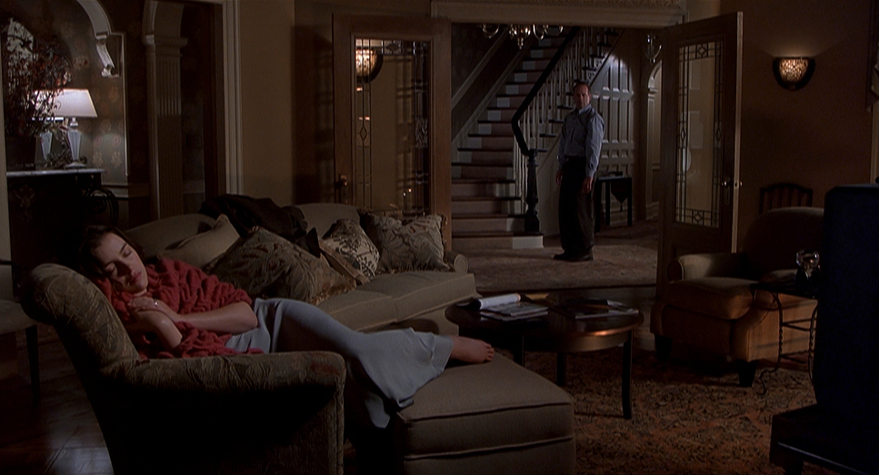
For much of the film, Malcolm is visually isolated. The camera rarely tracks with him in a way that implies true interaction. When he appears to be with his wife, Anna, or Cole’s mother, Lynn, the shots are framed to create distance. We see two-shots that quickly cut to singles, or wider shots that include both characters but lack the parallax and interaction cues that confirm a shared physical space. This lack of fluid, reactive camera movement around Malcolm when he is “interacting” with the living is a subtle, yet potent, clue to his true state.
Compositional Choices
Composition here is a tool for misdirection. The framing often isolates characters, emphasizing their internal struggles. Cole is frequently framed alone in larger spaces, making him appear small and vulnerable against the weight of his affliction. The use of depth cues is carefully managed; when Malcolm is in a room with a living character, the composition places them in the same space, but without the physical depth cues that would confirm a shared reality. In the anniversary dinner scene, for example, the composition allows us to assume interaction based on our cinematic expectations, even though Malcolm never actually moves an object or creates a sound that Anna reacts to.
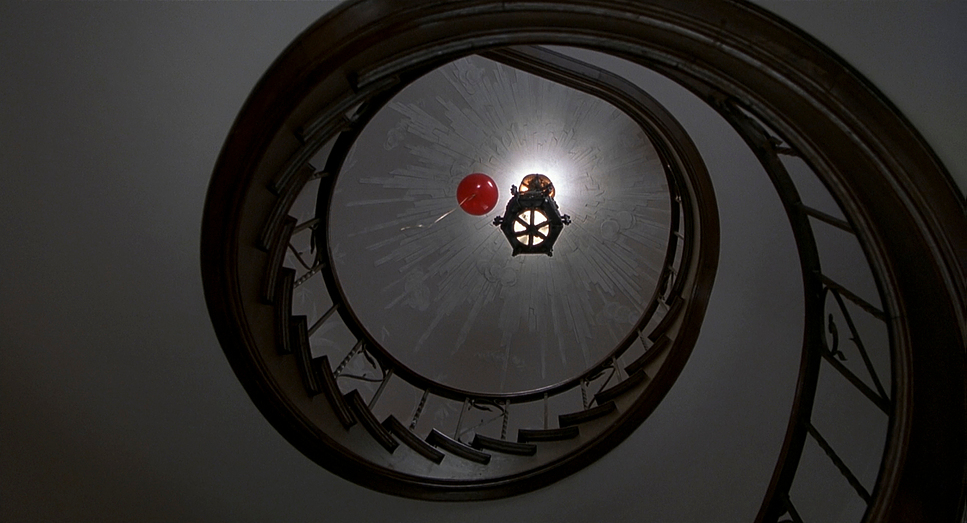
The placement of red objects within the frame creates a recurring visual motif. Whether it’s the red balloon rising through the spiral staircase, the red doorknob on the basement door, or the “poisoned” daughter’s red dress, these elements are deliberate compositional anchors. They draw the eye and signal the supernatural. It is a testament to the film’s visual integrity that these elements feel naturally integrated into the mise-en-scène rather than overtly symbolic, making their collective impact profound on a rewatch.
Lighting Style
The lighting style is predominantly naturalistic but somber, leaning on soft light and underlighting to create a mood of intimacy and foreboding. Shadows play a significant role—not just to hide monsters, but to deepen the psychological atmosphere. Fujimoto relies heavily on motivated practicals within domestic spaces—table lamps and overheads—but often supplements this with fluorescent sources to create a slightly sickly, sterile wash in public spaces like the hospital or the school.
When Cole is grappling with his visions, the lighting emphasizes his isolation. His bedroom feels both safe and claustrophobic. In the “red fort” scene, the lighting utilizes soft, diffused sources, likely underexposed, to create a cloistered, vulnerable feeling. The contrast is muted; we don’t see harsh, noir-style hard light. Instead, the film lives in the mid-tones and shadows, preventing the visuals from becoming too stark while maintaining a slow-burn tension.
Lensing and Blocking
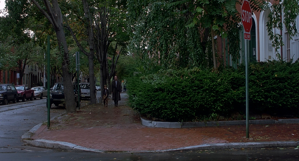
Shot on Panavision Millennium cameras, the film avoids the distortion of anamorphic glass, opting instead for spherical Panavision lenses. The aspect ratio is 1.85:1, which feels tighter and more intimate than a widescreen 2.39:1 scope, fitting the domestic drama at the film’s core. Fujimoto often favored longer focal lengths, compressing the background and isolating the characters in the frame. This shallow depth of field keeps our focus strictly on the emotional performance, blurring out the world around them—a perfect visual metaphor for characters trapped in their own grief.
Blocking, however, is where the film’s brilliance truly shines. Malcolm’s movements are meticulously designed to avoid physical interaction. We see him near people, looking at them, but the blocking, combined with careful editing, always leaves just enough ambiguity. We might see Malcolm reach for a door, but the cut happens before his hand touches the knob, or the door is already open in the next shot. This is precise staging working in concert with editing to create a false impression of agency. Malcolm is always slightly out of sync, a phantom moving through the world, underscored by his spatial relationships within the frame.
Color Grading Approach

From my perspective as a colorist, The Sixth Sense offers a fascinating case study in photochemical timing and selective color separation. The overall look leans towards a cool, desaturated aesthetic—a “printer light” choice that pulls warmth out of the skin tones and environments to underscore the melancholy. Blues and grays dominate the shadows, reinforcing the sense of loss. This desaturation is critical because it lowers the “visual noise” of the frame, allowing the specific wavelengths of red to pop with undeniable force.
The decision to scrub red from the set design is genius color strategy. It isn’t just symbolism; it is hue separation executed with extreme precision. When red appears—be it a sweater or a doorknob—it punches through the muted, cool background because there is no competing color contrast. In terms of the curve, the film exhibits the classic characteristics of late 90s stocks (likely Kodak Vision 500T): deep, rich blacks that hold texture without crushing, and a gentle highlight roll-off that avoids digital clipping. The film’s grade creates a world where things are not quite right, an emotionally cool palette that allows the few vibrant reds to sing their spectral song.
Technical Aspects & Tools
The Sixth Sense – Technical Specifications
| Genre | Drama, Mystery, Thriller |
| Director | M. Night Shyamalan |
| Cinematographer | Tak Fujimoto |
| Production Designer | Larry Fulton |
| Costume Designer | Joanna Johnston |
| Editor | Andrew Mondshein |
| Colorist | Dan Valliere |
| Time Period | 1990s |
| Aspect Ratio | 1.85 – Spherical |
| Format | Film – 35mm |
| Lighting | Soft light, Underlight |
| Lighting Type | Artificial light, Fluorescent |
| Story Location | United States, Pennsylvania |
| Filming Location | United States, Pennsylvania |
| Camera | Panavision Millennium / Millennium XL / XL2 |
| Lens | Panavision Lenses |
Shot in 1999, The Sixth Sense is a product of high-end analog acquisition. The production utilized Panavision Millennium and Millennium XL cameras, the workhorses of that era. By shooting on 35mm film with spherical lenses, the image retains a natural geometry and sharpness that grounds the supernatural elements in reality. The choice of 1.85:1 aspect ratio focuses the viewer’s attention on the verticality of the actors’ faces and the domestic interiors, rather than the sprawling horizontal landscapes of a widescreen format.
- Also read: JURASSIC PARK (1993) – CINEMATOGRAPHY ANALYSIS
- Also read: FINDING NEMO (2003) – CINEMATOGRAPHY ANALYSIS
Browse Our Cinematography Analysis Glossary
Explore directors, cinematographers, cameras, lenses, lighting styles, genres, and the visual techniques that shape iconic films.
Explore Glossary →