I’ve been grading a lot of digital footage lately, and revisiting The Perks of Being a Wallflower was a refreshing reminder of why I still love the texture of 35mm film. It isn’t just a “coming-of-age” story; it’s a specific visual translation of memory. When I watch this film, I don’t just see the plot; I see a texture that feels authentic to the early 90s setting without falling into the trap of over-stylized nostalgia. Stephen Chbosky, directing his own novel, clearly understood that the visuals needed to feel as fragmented and raw as Charlie’s mind. It’s rare to see an adaptation where the cinematography does as much heavy lifting as the dialogue, transforming internal anxiety into something we can actually look at.
About the Cinematographer
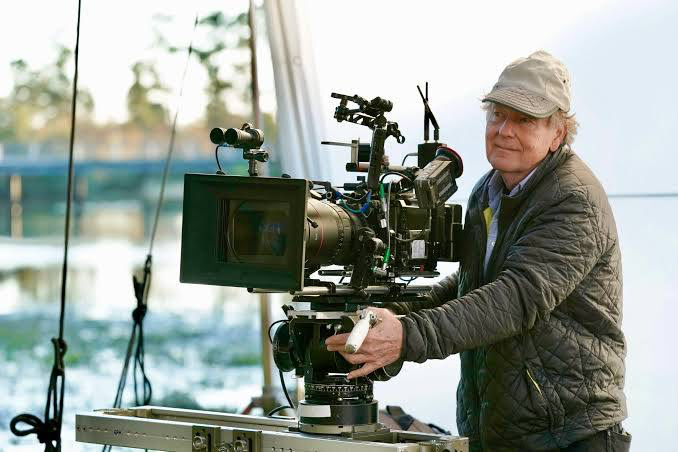
The look of the film rests on the shoulders of Andrew Dunn (BSC, ASC). Dunn is interesting because he knows how to shoot character-driven dramas (Precious, The Messenger) without making them look like stage plays. In a film like this, where the director is also the author, the cinematographer has a tricky job: he has to protect the author’s vision while ensuring it actually works cinematically. Dunn’s approach here was smart he didn’t over-light. He allowed the shadows to exist. He didn’t try to polish the “high school” experience into a glossy TV commercial; he leaned into a naturalism that grounds the more melodramatic moments of the script.
Inspiration Behind the Cinematography
The primary inspiration here seems to be “subjective reality.” The goal wasn’t to capture high school as it objectively looks, but how it feels when you are invisible. The visual choices are strictly tethered to Charlie’s perspective. If you look closely, the film avoids the high-key, flat lighting typical of the teen genre. Instead, it favors a “dramatic isolated perspective.” It feels lived-in, sometimes stifling, and occasionally massive. The inspiration was clearly to replicate the feeling of a memory where the edges are a bit blurred, the lights are a bit too bright, and the emotions dictate the exposure.
Camera Movements
The camera work is surprisingly restrained. It’s largely observational, mirroring Charlie’s role as the “wallflower.” We spend a lot of time on static shots, just holding on Charlie’s reaction while life happens around him. When the camera does move, it’s usually motivated by his integration into the group. The handheld work is used sparingly, mostly for anxiety or the chaotic energy of the parties, which makes those moments pop against the stillness of the rest of the film. It’s invisible cinematography it never screams “look at this cool shot,” except perhaps for the tunnel sequence, which earns its grandeur by being the moment Charlie finally stops observing and starts participating.
Compositional Choices
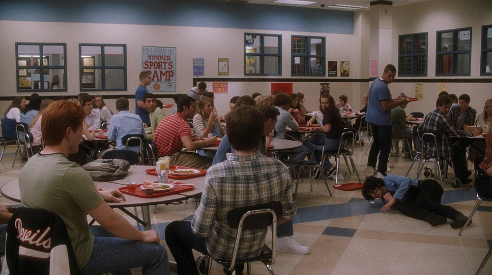
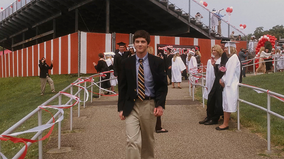
Compositionally, the film uses negative space to scream “isolation.” Early on, Charlie is framed on the edges, often with a lot of empty room or out-of-focus students pushing him into the background. As he finds his tribe, the framing tightens. The symmetry in the shots with Sam and Patrick isn’t just aesthetic; it’s narrative.
The “stadium light” shot of Sam standing in the pickup truck is the standout here. It’s a low-angle POV shot from Charlie, backlit by hard sodium vapor (or similar industrial) lighting. It flares the lens, creating a halo. A less confident filmmaker might have corrected that flare or filled in her face, but keeping her silhouetted and glowing perfectly visualizes Charlie’s idealization of her. He isn’t seeing a girl; he’s seeing an angel, and the composition forces us to see her that way too.
Lighting Style
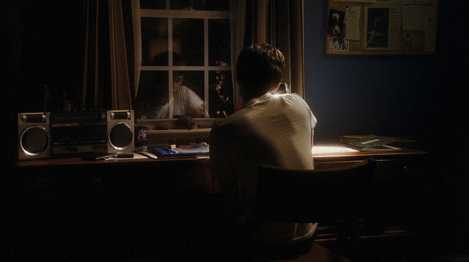
The lighting is where the mood really shifts. Dunn and Chbosky utilized a “cold then warm” contrast that is textbook but effective. The school scenes are often lit with cooler, greenish-blue hues mimicking the uninviting wash of institutional fluorescent tubes. It feels clinical and detached.
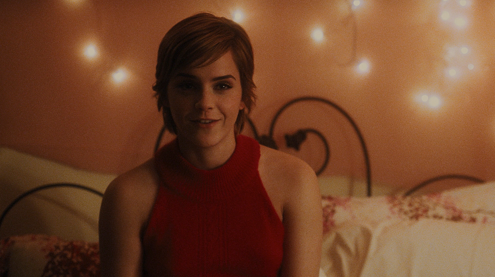
In contrast, the scenes with Sam and Patrick the basement parties, the living room are bathed in tungsten warmth. We see motivated practicals everywhere: table lamps, string lights, fireplaces. As a colorist, I appreciate that they didn’t clean up the “dirty” light. They let the mixed color temperatures exist, which makes the safe spaces feel genuinely warm and the scary spaces feel genuinely cold.
Lensing and Blocking
Dunn shot this on Panavision lenses, and you can feel the spherical glass at work. There is a specific fall-off and softness to the image that you don’t get with modern sharp clinical glass. They likely used medium focal lengths for the dialogue to keep it intimate, but wider lenses to emphasize Charlie’s smallness in the school hallways.
The blocking in the “Tunnel” scene (Timecode 00:27:43) is the highlight. Placing Sam in the back of the truck, arms out, while the truck moves through a tunnel of hard, rhythmically passing overhead lights creates a dynamic energy that a static conversation never could. The decision to shoot this low-angle makes the tunnel lights feel like passing stars. It’s a perfect marriage of blocking, location, and lens choice.
Color Grading Approach
This is where I really connect with the film. The colorist, Natasha Leonnet, did a fantastic job of translating the 35mm negative into the final DI (Digital Intermediate). The grade supports the emotional arc: when Charlie is low, the image is desaturated, with the shadows leaning into cooler cyans and greens. It feels thin.
But when the “Perks” come into play, the saturation ramps up. The film is noted for being “Warm and Saturated,” and you see it in the skin tones. They are dense and rich something film does naturally well. The highlights in the tunnel scene aren’t clipped white; they have a creamy roll-off that retains color information even in the brightest parts of the frame. The use of a print emulation LUT (or a print-down workflow) gives the blacks a nice density without crushing them completely. It captures that specific “2010s indie” look where the warmth felt organic, not just a digital sepia filter slapped on top.
Technical Aspects & Tools
The Perks of Being a Wallflower — Technical Specs
| Genre | Drama, Romance, Suburbia |
|---|---|
| Director | Stephen Chbosky |
| Cinematographer | Andrew Dunn |
| Production Designer | Inbal Weinberg |
| Costume Designer | David C. Robinson |
| Editor | Mary Jo Markey |
| Colorist | Natasha Leonnet |
| Time Period | 2010s |
| Color | Warm, Saturated |
| Aspect Ratio | 1.78 – Spherical |
| Format | Film – 35mm |
| Lighting | Hard light |
| Lighting Type | Artificial light, Fluorescent |
| Filming Location | … Pennsylvania > Pittsburgh |
| Camera | Panavision Millennium / Millenium XL / XL2 |
| Lens | Panavision Lenses |
Correcting a common misconception: this wasn’t shot on digital. This was 2011/2012, and while the Alexa was available, they chose to shoot on 35mm film using Panavision Millennium cameras. This decision was crucial.
Film handles highlights differently than digital sensors. In the tunnel scene, with those hard overhead fluorescent lights zipping by, film stock reacts with a chemical halation that creates a sense of speed and dreaminess that digital sensors of that era would have rendered too harshly. The grain structure adds a subconscious layer of “texture” that feels like a memory. The 1.78 aspect ratio keeps the focus tight on the characters, avoiding the epic wideness of scope in favor of intimacy. The choice of film over digital provided the necessary latitude to handle the high-contrast night scenes without the image falling apart.
- Also read: STAR TREK (2009) – CINEMATOGRAPHY ANALYSIS
- Also read: BOHEMIAN RHAPSODY (2018) – CINEMATOGRAPHY ANALYSIS
Browse Our Cinematography Analysis Glossary
Explore directors, cinematographers, cameras, lenses, lighting styles, genres, and the visual techniques that shape iconic films.
Explore Glossary →