When I sit down to analyze a film like The Nightmare Before Christmas, I’m not just looking at the aesthetics. I’m looking at the grind. This film is a visual anomaly a paradox of cheer and macabre that proves aesthetic principles matter more than genre tropes. It’s a constant reminder that the most impactful stories usually rely on the most deliberate visual language.
About the Cinematographer
There’s a common misconception one the marketing department definitely didn’t discourage that The Nightmare Before Christmas was directed by Tim Burton. But while Burton provided the character designs and the fever-dream vibe, the actual frame-by-frame orchestration of this world belongs to director Henry Selick and his cinematographer, Pete Kozachik.
Kozachik, who had previously worked on films like RoboCop and Honey, I Shrunk the Kids, was tasked with a unique challenge: lighting a miniature world as if it were a full-scale live-action set. He didn’t just light puppets; he treated them like actors, using specific lenses and motivated lighting to give them psychological depth. While Selick drove the performance and blocking, it was Kozachik who created the film’s distinct “noir-meets-storybook” atmosphere. It was a massive collaboration, or as Selick put it, “Burton laid the egg and I sat on it and hatched it.” But without Kozachik’s lighting design, that egg would have hatched into a much flatter, less immersive world.
Inspiration Behind the Cinematography
The look of The Nightmare Before Christmas is basically Tim Burton’s subconscious brought to life through Kozachik’s lighting and Selick’s direction. It’s a mix of Burton’s time at Disney and his obsession with the gothic. He openly cited Ray Harryhausen, Dr. Seuss, and German Expressionism as his north stars. You can also see the scratches and cross-hatching of illustrators like Edward Gorey and Ronald Searle in the texture of the puppets themselves.
For me, though, the German Expressionist influence is the one that does the heavy lifting. That era of cinema was all about using distorted perspectives and stark lighting to show psychological states rather than reality. You see it everywhere in Halloween Town: the twisting buildings, the absence of right angles (a literal rule on set), and the jagged horizons. It’s a world designed to feel off-kilter.
Then you have the Dr. Seuss influence, which brings that whimsical, elastic exaggeration to the silhouettes. It creates a visual grammar where you understand the world’s strangeness before a character even speaks. It’s a perfect mashup: Seuss gives it the charm; Expressionism gives it the edge.
Camera Movements

In stop-motion, the camera isn’t just recording; it’s a participant that has to be micromanaged. Moving a camera in live-action is hard enough; doing it frame-by-frame on a miniature set is a logistical nightmare. Yet, the film flows with a fluidity that rivals high-end live-action.
Look at the opening “This is Halloween” sequence. The camera isn’t static; it glides and swoops through the town. We get intricate dolly moves and sweeping pans that establish the geography. It’s not just showing off; it pulls you into the energy of the song. It feels like a chaotic carnival ride.
The camera work also does a lot of character development. When Jack sings “What’s This?” in Christmas Town, the framing goes wide and the movements become expansive, matching his excitement. Compare that to Sally. Her camera work is often constrained, observing from behind objects or through windows. She is the voice of reason, and the camera treats her as the quiet observer. It’s a great example of using motion control to articulate emotion.
Compositional Choices
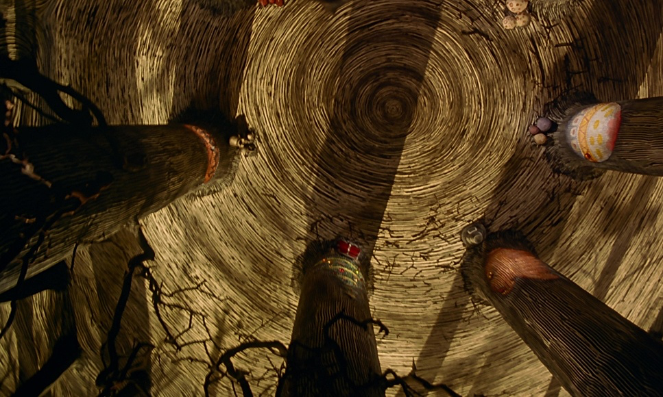
The framing in this film is aggressive. Selick, Kozachik, and the team used composition to strictly define the two worlds. In Halloween Town, everything is asymmetrical. They lean heavily on Dutch angles and distorted perspectives to create unease. They aren’t afraid of negative space, often framing Jack against vast, empty backgrounds to emphasize his isolation.
That iconic shot of Jack on the spiral hill, silhouetted against the moon? It’s powerful because it’s stark. It uses the negative space to make his internal conflict feel massive. Even the group shots feel slightly unorganized and chaotic.
Then you hit Christmas Town, and it’s a shock to the system. The compositions suddenly snap into a grid. The lines are clean, the structures are geometric, and the framing is almost aggressively symmetrical. When Jack arrives, his gangly, spider-like limbs look alien against those perfect backdrops. It’s a visual clash that tells you he doesn’t belong there, long before the script does.
Lighting Style
As a colorist, I know that the “look” of a film is baked in on set, not in the grading suite. The lighting here is the MVP, especially considering Disney was terrified the film would be “too dark.”
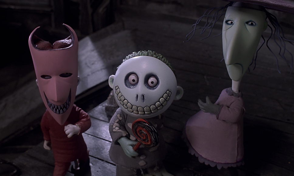
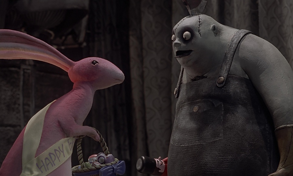
Halloween Town is a textbook example of low-key lighting. It relies on stark contrast and deep shadows. The “moonlight” acts as a harsh key light, sculpting the clay faces and casting long, dramatic shadows. They use practicals brilliantly too flickering candles, the green glow of Oogie Boogie’s lair, or the scientific equipment in Finkelstein’s lab. These pools of light amidst the darkness create the texture. There is almost no ambient fill; if it’s not lit, it falls off into black.
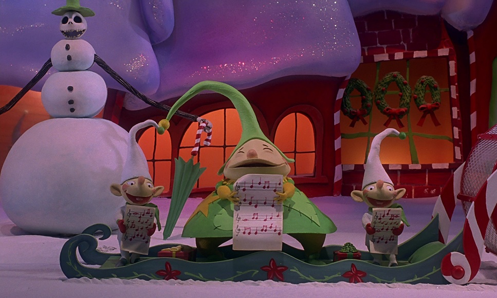
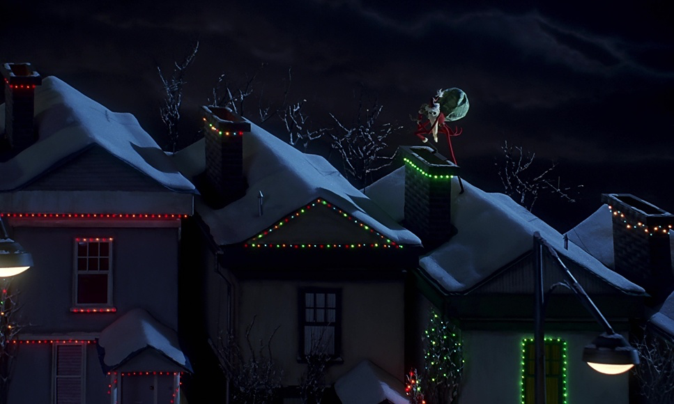
Christmas Town is the inverse. It’s high-key, soft, and diffused. It mimics the feeling of a cozy winter morning. The challenge there isn’t creating drama, but creating separation so the bright colors don’t flatten out. The lighting catches the texture of the fake snow and the glitter on the ornaments, making the world feel tactile and inviting. It helps sell Jack’s emotional journey from a cold, dark place to a warm, vibrant one.
Lensing and Blocking
When you are shooting miniatures, lens choice is critical to sell the scale. They used a lot of wide-angle lenses in Halloween Town, which exaggerates the perspective and makes the sets feel towering and imposing. When Jack walks through the graveyard, the wide lens pushes the background away, visually isolating him.
Conversely, they use longer lenses for intimate moments, compressing the space between the viewer and the characters. This is often used with Sally, bringing us into her internal world without physically invading her space.
The blocking—where characters are placed—is just as precise. Finkelstein is often placed high in the frame, literally looming over Sally to show his control. Jack is usually center-frame, commanding attention. And the decision to put Jack in a pinstripe suit rather than all-black? That was a technical necessity. An all-black puppet would have turned into a blob of crushed blacks on film. The pinstripes catch the light, defining his geometry and adding a layer of detail that the lens can actually resolve.
Color Grading Approach
This is where I find myself leaning in closest. While The Nightmare Before Christmas was finished photochemically (using 5248/7248 EXR 100T stocks), if I were grading this in DaVinci Resolve today, the philosophy would remain the same.
Halloween Town relies on a tightly controlled, desaturated palette: muted blues, sickly greens, and deep grays. The blacks are dense velvety, not crushed. You want to see detail in the shadows, but you want the feeling of darkness. The highlights have that specific print-film roll-off; they don’t clip harshly like digital, they have a creamy, soft compression. If I were grading this, I’d be using a print emulation DCTL to catch that specific halation you see on the high-contrast edges.
Christmas Town is a stress test for color separation. It explodes with saturated reds, greens, and golds. The challenge here is volume management keeping those colors intense without them bleeding into each other or looking like a cheap cartoon. You want a cheerful saturation, but it still needs to feel like film, holding onto that organic warmth rather than a digital sheen. The transition between the two worlds is abrupt and jarring by design. It’s not just a location change; it’s a complete shift in the color engine of the film.
Technical Aspects & Tools
The Nightmare Before Christmas: Technical Specs
| Genre | Animation, Family, Fantasy, Occult, Music, Musical, Stop-Motion Animation, Satire, Puppetry, Holidays, Claymation |
| Director | Henry Selick |
| Cinematographer | Pete Kozachik |
| Production Designer | Deane Taylor |
| Costume Designer | N/A |
| Editor | Stan Webb |
| Color Palette | Cool, Desaturated, Yellow |
| Aspect Ratio | 1.66 – Spherical |
| Format | Animation |
| VFX | Miniature, Stop Motion |
| Story Location | Halloween Town |
| Filming Location | United States of America > California |
| Camera | Mitchell |
| Film Stock / Resolution | 5248/7248 EXR 100T |
We talk a lot about “rendering” in my line of work, but the rendering time on this film was human labor. The technical achievement here is mind-bending. This was the era before digital erasure or easy rig removal.
The scale is massive: 200 sets, nearly 230 puppets. But the stats that really break my brain are the timeframes. It took a full week of shooting to get one minute of footage. The production lasted 18 months just for animation. That requires a level of patience that is almost extinct in modern workflows.
Jack Skellington had about 400 replacement heads for different expressions. Imagine the continuity tracking required to swap those out frame by frame. Oogie Boogie was a two-foot puppet filled with bugs animating that without the rig collapsing was a nightmare. What I love most, though, is the “charming imperfection.” If you look closely, you can sometimes see the shimmer of the fabric or a slight thumbprint in the clay. In an age of pristine, lifeless CGI, that tactile, human evidence is what makes the image feel expensive.
- Also read: MULHOLLAND DRIVE (2001) – CINEMATOGRAPHY ANALYSIS
- Also read: GUARDIANS OF THE GALAXY VOL. 3 (2023) – CINEMATOGRAPHY ANALYSIS
Browse Our Cinematography Analysis Glossary
Explore directors, cinematographers, cameras, lenses, lighting styles, genres, and the visual techniques that shape iconic films.
Explore Glossary →