Revisiting The Mountain II (Dağ II) is always a lesson in budget maximization. As a filmmaker, you watch big-budget war epics and expect a certain polish, but this film manages to punch well above its weight class. It’s a raw, visceral experience that throws you right into the grinder of conflict. I remember catching this a while back, and it stuck with me not because it was perfect, but because the visual language did the heavy lifting to sell the emotional toll of the narrative.
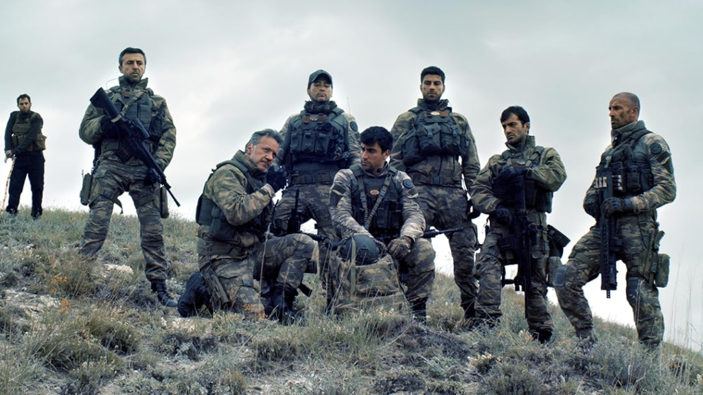
The story pits seven Turkish Special Forces soldiers against two hundred terrorists. That kind of setup requires cinematography that does more than just capture the action; it has to ground the ridiculous odds in a gritty reality. It’s brutal, heroic, and visually, it refuses to hold your hand.
About the Cinematographer
The Director of Photography behind The Mountain II is Mehmet Basbaran. If you follow Turkish cinema or Alper Çağlar’s work, you know Basbaran doesn’t aim for glossy perfection. He understands that in a war film, the lens is a participant, not just an observer. He leans into a style that feels immediate and lived-in, translating the chaos and fear of the subjects directly to the viewer. He forgoes the clean, commercial look for something much rawer a choice that aligns perfectly with a narrative about desperate survival rather than glorified combat.
Inspiration Behind the Cinematography
The visual inspiration here clearly stems from a desire for “boots on the ground” authenticity. It’s not a polished Hollywood epic; it’s a production aiming for a documentary-like texture. You can see strong influences from contemporary war dramas like Lone Survivor or Black Hawk Down, where grit is prioritized over glamour.
The camera acts like an embedded journalist dirty, reactive, and often uncomfortably close. The visuals highlight the grueling training, the aftermath of violence, and the claustrophobia of close-quarters combat without romanticizing them. Even the grade, which I’ll break down later, reflects this commitment to a non-idealized reality. It’s about evoking a response through stark, uncomfortable truth rather than cinematic spectacle.
Camera Movements
The camera movement in The Mountain II is all about “reactive framing.” Basbaran utilizes a specific palette of movement to keep the audience off-balance.
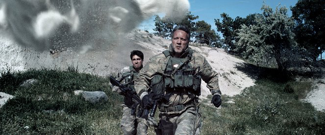
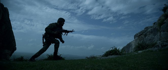
For the combat sequences, the handheld work is dominant. But this isn’t just shaky-cam to hide missed blocking marks; it feels motivated by the soldiers’ breathing and adrenaline. When Lieutenant Colonel Veysel and his team are infiltrating or moving through contested territory, the operator is reacting to them, not leading them. This grants the audience a sense of visceral presence you feel the uneven ground and the sudden shifts in direction. It’s a key ingredient in making a small team fighting a small army feel believable.
Conversely, the tracking shots often following a soldier through a skirmish maintain spatial coherence. Instead of cutting rapidly, Basbaran lets the shot ride, helping us understand the geography of the fight. When the team retreats to their central line, the fluid track underscores the shrinking perimeter and the relentless pressure.
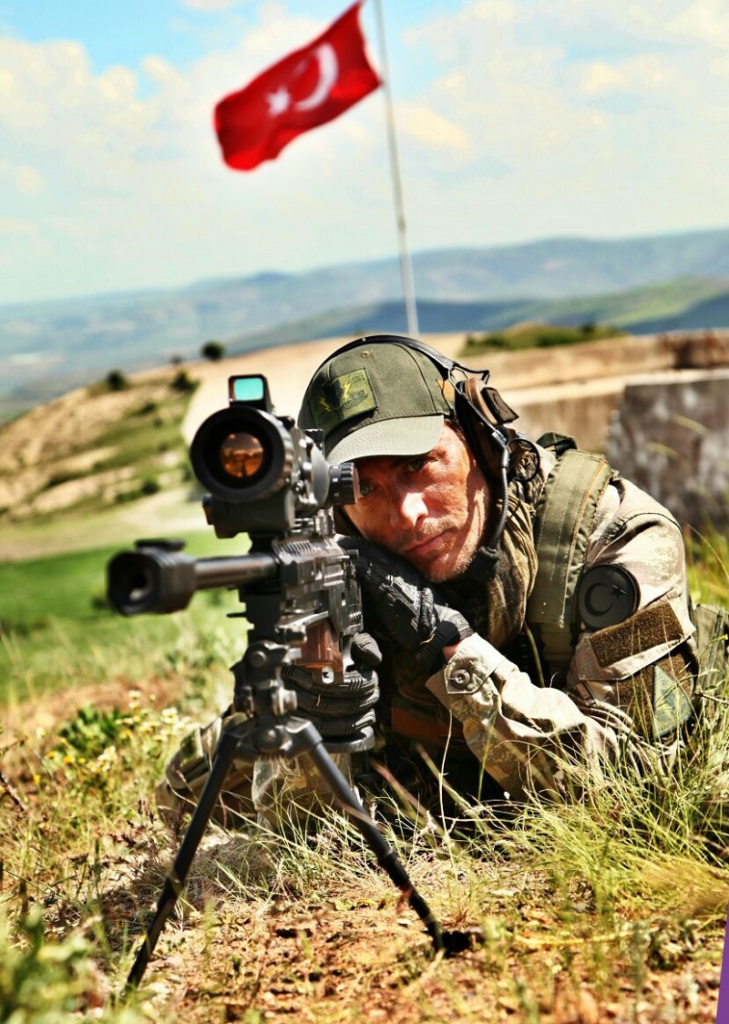
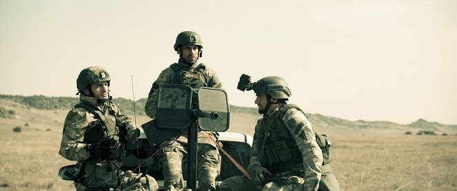
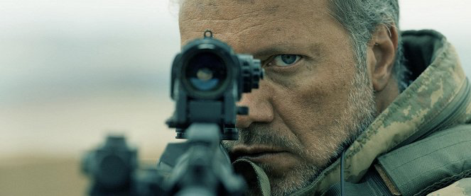
There are also moments of “operative” dolly or crane moves. These are subtle, used for establishing context rather than showing off production value. A slow push-in on Arif in the sniper tower creates a breath of tension before the chaos resumes. These locked-off or smooth moments provide a necessary rhythmic break from the handheld intensity.
Compositional Choices
Compositionally, the film balances the expansive scale of war with intimate human drama. Basbaran knows how to use the frame to isolate his subjects.
In the desolate landscapes, wide shots are used to establish scale and vulnerability. The use of negative space here acts as a psychological element, emphasizing the daunting isolation of the Special Forces unit against the indifferent terrain. When the threats are called out 200 insurgents, tanks, vehicles the wide compositions have already primed us for the magnitude of the odds.
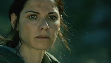
In the tight quarters, the cinematography shifts to tight singles and chokers. This is where the depth cues kick in foreground debris and racking focus pull us into the immediate danger. For instance, in moments of near-execution or intense dialogue, the shallow depth of field isolates the soldier from the terrifying background, making the stakes personal. The framing often utilizes leading lines via weaponry or trench lines to guide the eye through the chaos, ensuring that even in the most frenetic sequences, the viewer knows exactly where to look.
Lighting Style
The lighting leans heavily towards a motivated, high-contrast naturalism. It’s the kind of lighting that feels like there isn’t a film crew standing five feet away.
In the exterior day scenes, Basbaran embraces hard sunlight. He doesn’t seem to be flying massive overhead silks to soften the blow; instead, he uses that hard source to cast deep, ugly shadows that accentuate the rugged terrain and the exhausted faces of the soldiers. This high dynamic range approach conveys the oppressive heat. It gives the visuals a photojournalistic quality unfiltered and direct.
For night or interior sequences, the approach shifts to low-key, relying on practicals like firelight, tactical torches, or moonlight. This creates a “chiaroscuro” effect where shadows are dangerous. The night infiltration of the tomb is a prime example; the limited, directional light builds suspense because you can’t see what’s in the fall-off. As a colorist, I appreciate that they didn’t try to lift the shadows too much; they let the blacks crush where necessary to maintain the mood.
Lensing and Blocking
Technically, the film feels shot on spherical glass, likely keeping to a 2.39:1 aspect ratio for that cinematic sweep.
For the wide establishing shots, the crew utilizes wider focal lengths (likely 24mm or 32mm equivalents). This deepens the depth cues, exaggerating the distance between the team and safety. Conversely, during the sniper sequences with Arif, the shift to long telephoto lenses (85mm+) compresses the background. This telephoto compression brings the distant enemy dangerously close in the frame, while the shallow depth of field isolates the sniper in his own world of focus.
The blocking is functional and tactical. Characters move in standard military formations—checking corners, covering sectors. It doesn’t look like movie blocking; it looks like drill. The camera operator has to dance around this tactical movement, using the environment as dynamic foreground.
Color Grading Approach
From a grading perspective, The Mountain II is a great example of a “Bleach Bypass” emulation. The grade is aggressively desaturated, stripping away the vibrancy to leave a palette of muted earth tones, stark greys, and dried blood.
The look relies on density. The mid-tones are pulled down, and the contrast curve is aggressive shaping the image with strong blacks while retaining texture. It’s not a flat log look; it’s punchy. There’s a clear split-tone usually present in this genre: the shadows are pushed toward cool cyans or teals to simulate the harshness of the environment, while the highlights (sun, fire, skin highlights) retain a dirty warmth.
Skin tones are a key area here. They are desaturated but separated from the background tones, likely through specific hue vs. sat curves or keying. This ensures that the soldiers don’t blend entirely into the brown/beige landscape. The highlight rolloff is smooth, avoiding that “video” clip, mimicking the response of film stock. It’s a grade designed to fatigue the viewer slightly, mirroring the exhaustion of the characters.
Technical Aspects & Tools
While official specs for regional films can be hard to pin down, the image texture screams RED Cinema, likely the Epic Dragon or a similar sensor available around 2016. The sharpness, the dynamic range retention in the highlights, and the way the noise floor handles low light are characteristic of that ecosystem.
Post-production likely involved a heavy RAW workflow to manage the exposure shifts in the desert sun. Managing the latitude between the bright Turkish sky and the shadows of a trench requires a robust codec (like R3D) and a color pipeline capable of retrieving highlight detail. The VFX work muzzle flashes, blood hits, and explosions is integrated well into the grade. Often, bad VFX stands out because the black levels don’t match the plate, but here, the compositing feels cohesive with the overall gritty aesthetic.
- Also read: I’M STILL HERE (2024) – CINEMATOGRAPHY ANALYSIS
- Also read: MR. SMITH GOES TO WASHINGTON (1939) – CINEMATOGRAPHY ANALYSIS
Browse Our Cinematography Analysis Glossary
Explore directors, cinematographers, cameras, lenses, lighting styles, genres, and the visual techniques that shape iconic films.
Explore Glossary →