Few Westerns get under my skin quite like John Ford’s 1962 masterpiece, The Man Who Shot Liberty Valance. I find myself returning to it constantly, not just for the powerhouse lineup of Stewart, Wayne, Miles, and Marvin, but for its deceptively simple visual storytelling.
When the 4K UHD release was announced, I’ll be honest: I was a bit skeptical. Do we really need a high-fidelity, high-dynamic-range scan of a black-and-white film from the twilight of the studio era? My interest was piqued, though. I wanted to see how that classic cinematography would translate to a modern display. It’s one thing to hear a reviewer call it a story about “law and order,” but as someone who looks at pixels and grain for a living, I wanted to see the visual meditation on myth-making itself. Ford and William H. Clothier weren’t just shooting a movie; they were crafting an aesthetic that serves every complex layer of a very cynical narrative.
About the Cinematographer
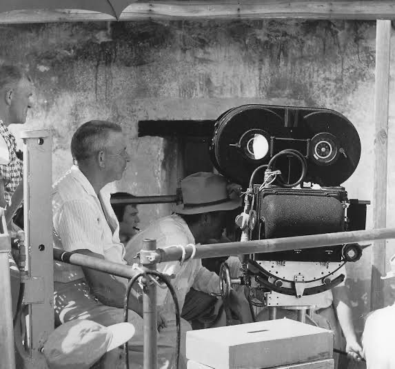
The visual architect here was William H. Clothier. He was Ford’s “late-period” guy, shooting everything from The Alamo to Donovan’s Reef. Now, Ford was notoriously dictatorial on set, but Clothier was the essential translator for that vision. He had this no-nonsense, functional style. He wasn’t interested in flashy “look-at-me” technique; he prioritized clarity, which fit Ford’s matured, almost weary style in Liberty Valance perfectly.
The decision to shoot in black and white in 1962 is the real talking point here. Color was the standard by then, especially for epic Westerns. Going monochrome was a deliberate, almost defiant artistic choice. For me, it strips away the distraction of a blue sky or a red shirt and forces you into the stark moral contrasts of the story. It places the characters in this shadowy limbo between savagery and civilization. When you take color off the table, the audience has to engage with texture and shadow in a way that’s much more visceral.
Inspiration Behind the Cinematography
The inspiration for the look seems to bleed directly from the film’s central theme: the clash between the legend and the fact. Ford was eulogizing the “days before statehood,” and the visual language had to feel grounded in that transition from primal violence to codified law.
You really feel the walls closing in here. Unlike the sweeping, epic vistas of Monument Valley we saw in The Searchers, the cinematography in Liberty Valance is surprisingly claustrophobic. It’s all dusty, tight interiors and cramped exterior shots of Shinbone. It’s not grand; it’s gritty. At times, it feels almost like a historical document, which makes total sense given the framing device of Senator Stoddard’s narrative. The visuals aren’t just showing you the past; they’re recounting it.
There’s also a heavy theatricality to the inspiration. You have these archetypes Wayne’s man of violence versus Stewart’s man of law. Clothier frames them with a certain weight, almost like a stage play. It’s why the performances feel so “top notch” the camera gives them the space to be iconic.
Camera Movements
This is where the The Man Who Shot Liberty Valance really shows its brilliance through restraint. From a cinematographer’s perspective, the lack of camera movement is striking. There are no gratuitous dollies, no sweeping cranes, nothing “flashy.”
In my early days, I might have looked at this and thought it was just a limitation of the era or a director getting tired. Now? I see it as a masterclass in visual economy. By keeping the camera static, Ford forces us to lean in. We have to pay attention to the blocking, the nuances of a facial expression, or the spatial tension between two men in a room. When the camera does move a slow pan or a gentle tilt it actually means something. It’s not just noise. This discipline creates a sense of gravitas that modern “shaky-cam” or constant drones just can’t replicate. The stillness builds a tension that makes the final gunfight feel inevitable and heavy.
Compositional Choices
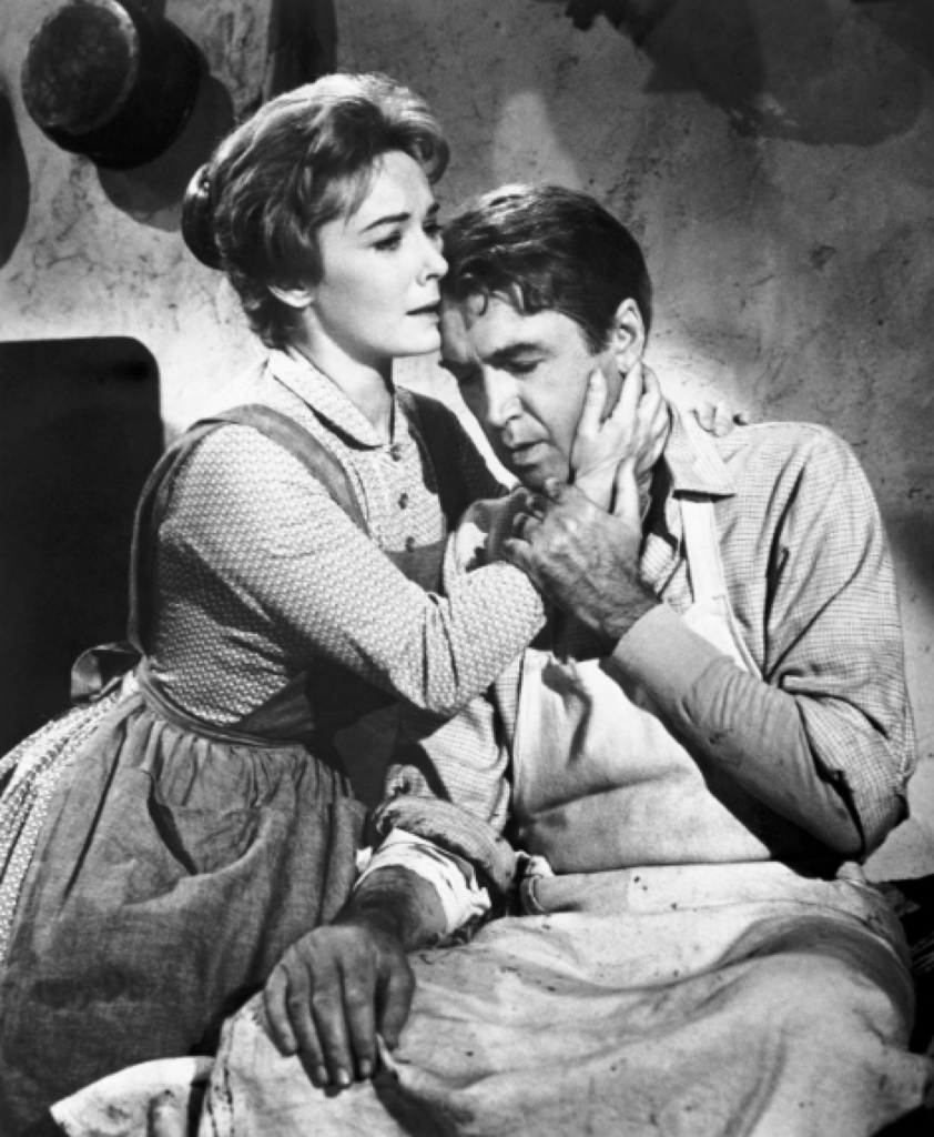
Clothier and Ford leaned heavily into classical framing, but with a sharp edge. The compositions are all about power dynamics. Take the scenes with Rance, Tom, and Hallie they’re often arranged in these triangular formations that shift as the emotional leverage moves between them.
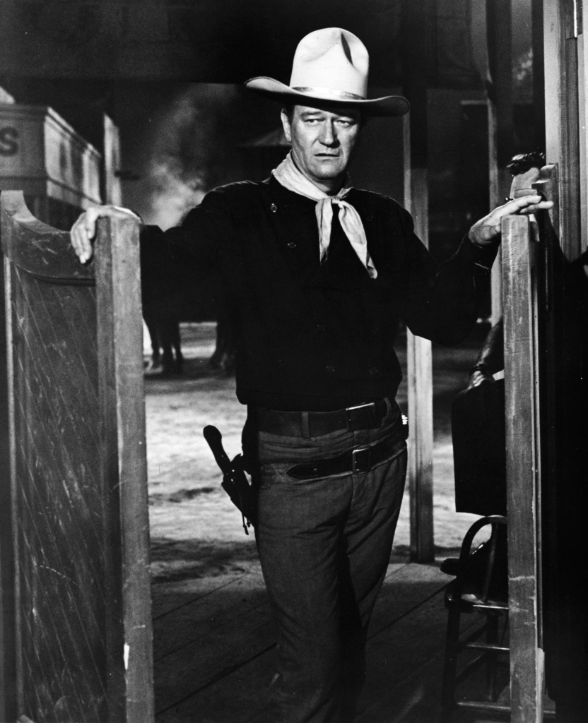
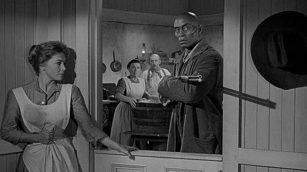
Then you have Lee Marvin. His Liberty Valance is “super menacing,” and while his performance is legendary, the framing does a lot of the heavy lifting. He’s often placed slightly off-kilter or positioned so he absolutely dominates the frame, establishing him as a destabilizing force the moment he appears. Even on these relatively shallow sets, the depth is meticulously managed. You’ve always got layers foreground bars, mid-ground conversations, and the life of Shinbone in the background. It makes the town feel like a living, breathing character, rather than just a backlot set.
Lighting Style
This is the part of The Man Who Shot Liberty Valance that makes my “colorist brain” light up. In black and white, lighting is the story. Clothier’s work here is a masterclass in tonal sculpting.
During the day, it feels naturalistic sunlight through windows that has a clear, motivated direction. But at night, or in the saloon, he goes full chiaroscuro. Shadows aren’t just dark spots on the screen; they’re narrative tools. Look at Tom Donovan. He lives in that “shadowy limbo,” and his silhouette against a distant light source tells you everything you need to know about his influence before he even speaks.
As a colorist, I’m always looking at highlight roll-off. I want to see how the brightest parts of the frame transition into pure white. In Liberty Valance, the control is incredible. The highlights rarely clip. Even with practical lamps in the frame, there’s texture and nuance. It’s never washed out; it’s just a rich, sophisticated range of grays.
Lensing and Blocking
Clothier likely stuck to a standard set of prime lenses here, avoiding the “zoom-heavy” trends that were starting to emerge. This gives the The Man Who Shot Liberty Valance an intimate, slightly compressed feel. They used deep depth of field, keeping multiple planes in focus, which allowed Ford to get really creative with his blocking.
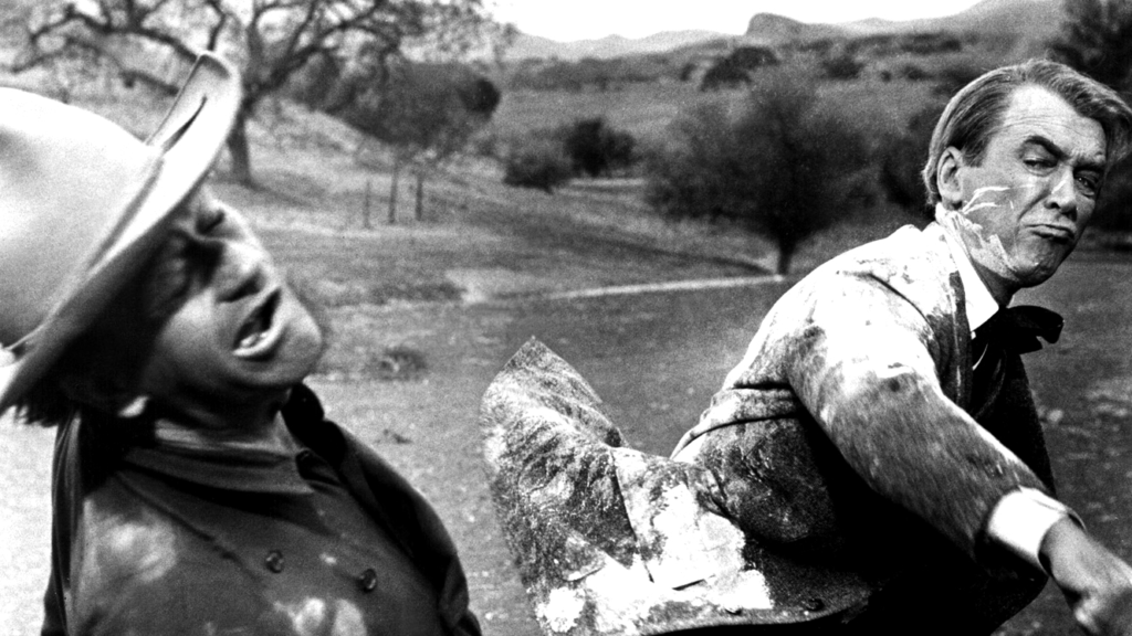
Ford’s genius is in how he moves people, not the camera. Think about the scene where Tom teaches Rance to shoot. Tom is physically dominant, literally guiding Rance’s hand. Or the famous paint-can moment. When that white paint splashes on James Stewart, it’s a pivotal bit of blocking. Rance is literally covered in the evidence of Tom’s forceful methods. It’s a beautifully choreographed dance where every position and every step is imbued with narrative meaning.
Color Grading Approach
It sounds like a paradox to talk about “color grading” a black-and-white film, but in the digital age, our tools are all about manipulating luminance, contrast, and grain. When I look at this new 4K remaster, the goal isn’t to change the film, but to “sculpt” the tones to match what was originally on that negative.
The 4K transfer with HDR10 is a game-changer. On an old Blu-ray, black-and-white films often look “milky” or flat. But with the expanded dynamic range of modern displays, we can dial in those truly deep blacks without crushing the detail. It adds an extra layer of depth that makes the image feel three-dimensional. It’s about recovering that “painted picture” quality and making it feel like you could actually step into the saloon. We’re not just making it darker; we’re using that extra headroom in the highlights to preserve the detail in a bright sky or a lantern flame, ensuring the grain looks organic and filmic rather than like digital noise.
Technical Aspects & Tools
Even though this was a relatively modest production for Ford, the craft is top-tier. They shot on 35mm stock (likely Kodak Double-X), which gave them that signature fine grain. The cameras were Mitchell BNCs heavy, stable studio workhorses.
There’s some talk about the 1.5:1 aspect ratio on this release, which is a bit of an oddity since 1.85:1 was becoming the widescreen standard and the negative was 1.37:1. It’s likely a specific framing choice for this remaster to bridge the gap between “Academy ratio” and a theatrical widescreen feel.
But the real headline is the native 4K transfer with Dolby Vision. It’s not just about the pixel count; it’s about the purity of the grays. The contrast between the old releases and this one is night and day. The audio also got a bump with a Dolby True HD 5.1 track, though for my money, the Restored Mono Mix is the way to go it’s the most faithful to what Ford intended.
- Also read: MY OCTOPUS TEACHER (2020) – CINEMATOGRAPHY ANALYSIS
- Also read: FANNY AND ALEXANDER (1982) – CINEMATOGRAPHY ANALYSIS
Browse Our Cinematography Analysis Glossary
Explore directors, cinematographers, cameras, lenses, lighting styles, genres, and the visual techniques that shape iconic films.
Explore Glossary →