Hey everyone, Salik Waquas here from Color Culture. I’ve been wanting to sit down and dissect the cinematography of The Lives of Others (2006) for a while now. As a colorist, I spend most of my days staring at waveforms and stressing over skin tones, but sometimes a film comes along that reminds me why visual language matters in the first place. This isn’t just a great movie; it is a textbook example of how to build tension and empathy through composition, light, and color. It’s a film I recommend everyone watch—and then watch again with the sound off just to see how the images do the talking.
The film drops us into 1980s East Germany, a society suffocated by the Stasi. It’s a world built on paranoia, where neighbors spy on neighbors to survive. The film is technically a period piece, but the visual storytelling makes the oppression feel immediate and claustrophobic. It’s an Orwellian nightmare, but beneath the political coldness, it’s a story about a quiet, internal transformation, driven entirely by the act of listening and observing.
About the Cinematographer

The DP behind The Lives of Others is Hagen Bogdanski. His work here is the opposite of flashy. He isn’t trying to impress you with wild camera moves; he’s trying to make you feel the weight of the atmosphere. Bogdanski’s approach is restrained and almost invisible, which is exactly what a story about surveillance needs. He treats the camera as a cold, bureaucratic observer that slowly gains a conscience. It’s a brilliant exercise in visual psychology—he forces us to inhabit the uncomfortable space of the voyeur, making us complicit in the spying before shifting the perspective to align with the protagonist’s growing humanity.
Inspiration Behind the Cinematography
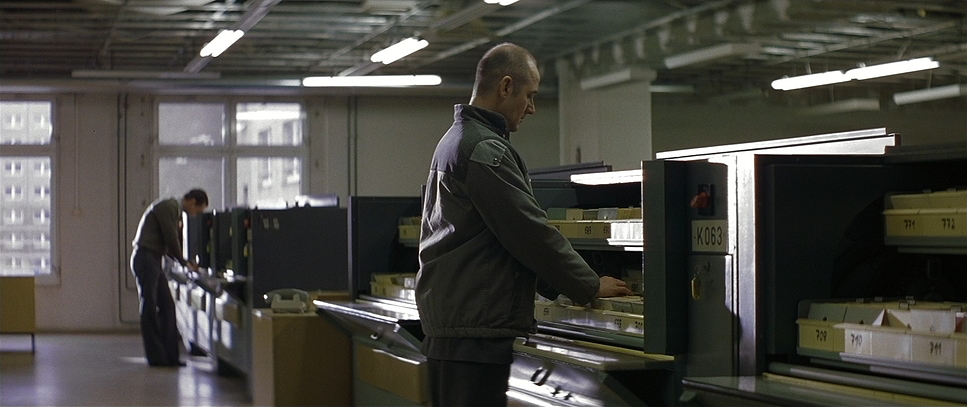
The core inspiration here is the drab reality of the GDR (East Germany). Bogdanski and director Florian Henckel von Donnersmarck didn’t want a “movie” version of the 1980s; they wanted the texture of memory. The visual palette is dominated by wintry grays, cyans, and sickly greens—colors that feel institutional and drained of life.
The lighting and set design mirror the mechanical existence of the characters. In a totalitarian state, individuality is suppressed, so the visuals reflect that uniformity. The environments feel staged and rigid because the characters themselves are constantly performing “good behavior” for the microphones hidden in their walls. The cinematography emphasizes this “one-party state” aesthetic: anything vibrant or happy is instantly suspicious.
Camera Movements
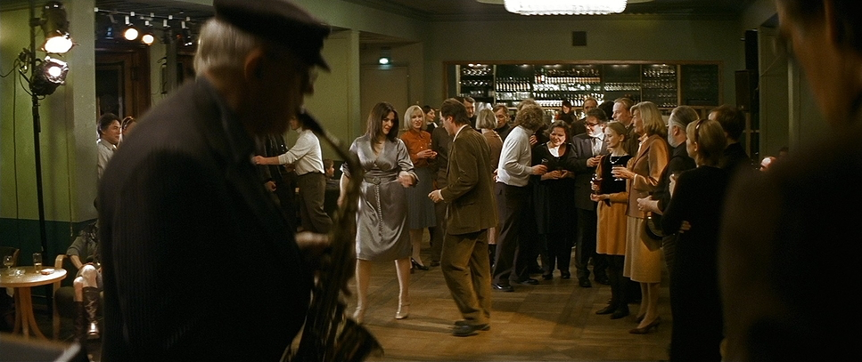
In a film about being watched, the camera’s stillness is more powerful than its movement. The early scenes rely heavily on static, locked-off shots, mimicking the fixed perspective of a surveillance camera or the unmoving stance of Vizler in his attic. When the camera does move, it’s clinical—slow slides rather than sweeping pans, reinforcing the feeling of a lurking presence.
Take the scenes where Vizler is listening to the playwright Dremon. The camera often sits wide, encompassing the cold emptiness of the attic, or lingers on Vizler’s face with zero movement. This lack of kinetic energy mirrors Vizler’s physical stagnation, but it forces the audience to focus entirely on his micro-expressions. As his empathy for Dremon grows, the camera language subtly softens. We start getting gentle push-ins during moments of emotional resonance—a visual cue that his rigid, static worldview is beginning to crack.
Compositional Choices
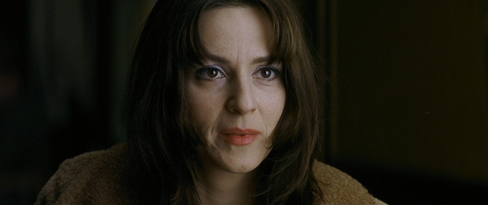
Bogdanski’s framing is rigorous. He frequently uses “frames within frames”—shooting through doorways, windows, or the glass of the monitoring booth—to emphasize isolation. Characters are often pushed to the edges of the frame or short-sided (looking out of the frame rather than into it), which creates a subconscious sense of entrapment.
One thing to note is the use of negative space. In the Stasi offices or Vizler’s apartment, the characters are often small within the frame, swallowed by gray walls. It visually represents their powerlessness despite their position in the regime. When we switch to Dremon’s artistic world, the composition becomes slightly more intimate, but the recurring motif of the puppet strings in Dremon’s apartment reminds us that even in their private moments, they are being pulled by unseen forces.
Lighting Style
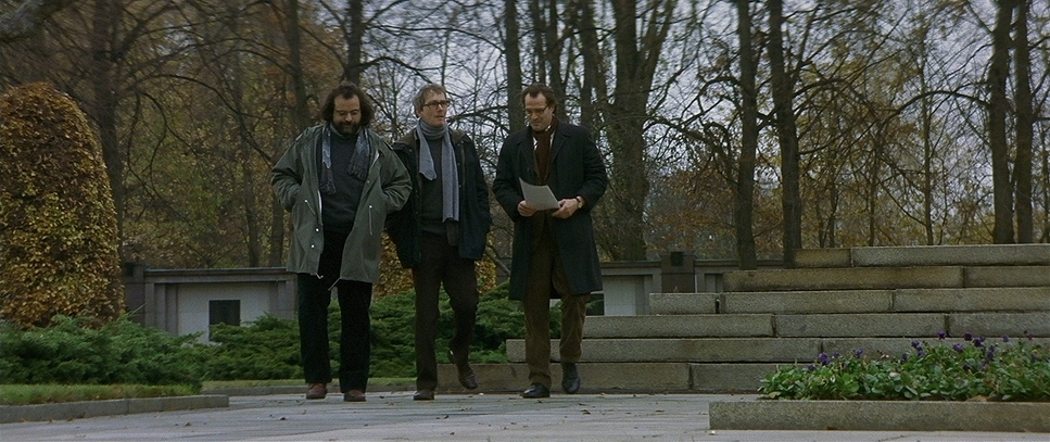
The lighting is where the mood is truly set. Bogdanski avoids the polished “Hollywood” look for something much grittier. It’s a low-key lighting setup, relying heavily on practical sources and soft, gloomy window light. The Stasi headquarters are lit with harsh, unflattering fluorescents that cast a greenish-cyan spill, draining the blood out of the actors’ faces.
Even in the “warm” spaces, like Dremon’s apartment, the light feels filtered and weak, as if the sun can’t quite break through the Berlin overcast. This is a masterclass in motivated lighting—every shadow feels like it belongs to the room. The contrast ratios are kept fairly naturalistic but lean toward the dark side, ensuring that even moments of joy feel fragile, constantly threatened by the shadows in the corners of the room.
Lensing and Blocking
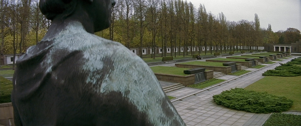
This is where the technical choices get interesting. Contrary to the standard spherical look of many dramas, The Lives of Others was shot using Hawk C-Series and V-Series Anamorphic lenses. You can tell by the way the background falls off and the subtle barrel distortion on the wide shots.
Using anamorphics for a claustrophobic story is a bold choice, but it works perfectly. The 2.35:1 aspect ratio allows Bogdanski to isolate characters in a wide expanse of emptiness. It emphasizes the distance between people. When Vizler is alone in the attic, the anamorphic format stretches the space around him, making him look even lonelier.
The blocking reinforces this. Vizler is almost always positioned behind barriers—desks, equipment, glass. He is physically separated from the world. In contrast, Dremon and his partner Christa-Maria are often blocked closer together, with overlapping limbs, visually establishing their human connection against the sterile blocking of the state officials.
Color Grading Approach
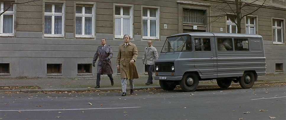
Now, this is where my colorist brain really lights up. The grade on this film is disciplined. The prevailing look is a desaturated “East German” palette—heavy on cyans, greens, and grays. As a colorist, I can see they were careful not to just desaturate globally; they sculpted the image.
The blacks aren’t crushed to oblivion; they are lifted slightly, keeping detail in the shadows. This is crucial—you need to see into the dark corners to maintain the paranoia that someone might be hiding there.
The hue separation is the real storytelling device here. The film is largely monochromatic, which makes the introduction of Red incredibly powerful. Initially, red is associated with the state (banners, flags), but as the film progresses, the color is reclaimed by the artists. The red typewriter ribbon, which becomes the tool of Dremon’s rebellion, pops violently against the gray surroundings. If I were grading this, I’d be using a secondary qualifier to isolate that red, pushing the saturation to ensure it acts as a visual anchor for “freedom.”
Technical Aspects & Tools
The Lives of Others: Technical Specs
| Genre | Drama, Thriller, History, Political, Spy, Science-Fiction |
| Director | Florian Henckel von Donnersmarck |
| Cinematographer | Hagen Bogdanski |
| Production Designer | Silke Buhr |
| Costume Designer | Gabriele Binder |
| Editor | Patricia Rommel |
| Colorist | Maik Strauch |
| Time Period | 1980s |
| Color Palette | Cyan, White |
| Aspect Ratio | 2.35 – Anamorphic |
| Format | Film – 35mm |
| Lighting | Backlight |
| Lighting Type | Daylight, Overcast |
| Story Location | … Germany > East Berlin |
| Filming Location | … Germany > Berlin |
| Camera | Arriflex 535B |
| Lens | Hawk C-series Anamorphics, Hawk V-series Anamorphics |
| Film Stock / Resolution | 5205/7205 Vision 2 250D, 5218/7218 Vision 2 500T |
Looking at the specs, the texture of this film makes perfect sense. It was shot on 35mm film using the Arriflex 535B, but specifically, they used Kodak Vision2 stocks (5218 for tungsten/interiors and 5205 for day/exteriors).
Vision2 (which preceded the modern Vision3 we use today) had a specific grain structure that was a bit grittier and less “clean” in the shadows. That grain is essential here—it gives the image a tactile, lived-in feeling that digital sensors struggle to replicate. It feels like a document of the time.
The choice to pair Vision2 500T (a high-speed stock) with Hawk Anamorphics allowed them to shoot in those dim, practical-lit apartments while maintaining distinct optical character. The older anamorphic glass takes the “edge” off the sharpness, contributing to that slightly soft, period-correct patina. It doesn’t look like a glossy modern production; it looks like it was found in a vault, which is exactly the vibe they needed.
- Also read: AMADEUS (1984) – CINEMATOGRAPHY ANALYSIS
- Also read:DR. STRANGELOVE OR: HOW I LEARNED TO STOP WORRYING AND LOVE THE BOMB- CINEMATOGRAPHY ANALYSIS
Browse Our Cinematography Analysis Glossary
Explore directors, cinematographers, cameras, lenses, lighting styles, genres, and the visual techniques that shape iconic films.
Explore Glossary →