Peter Bogdanovich’s The Last Picture Show. It’s a 1971 classic that serves as a cold, hard reminder of why I got into this craft. It isn’t just a movie; it’s a deep dive into the soul of visual storytelling. It’s raw. It’s honest. And for a colorist, it’s a masterclass in what happens when you stop trying to make things look “good” and start making them look “true.”
The Anti-Pretty Film

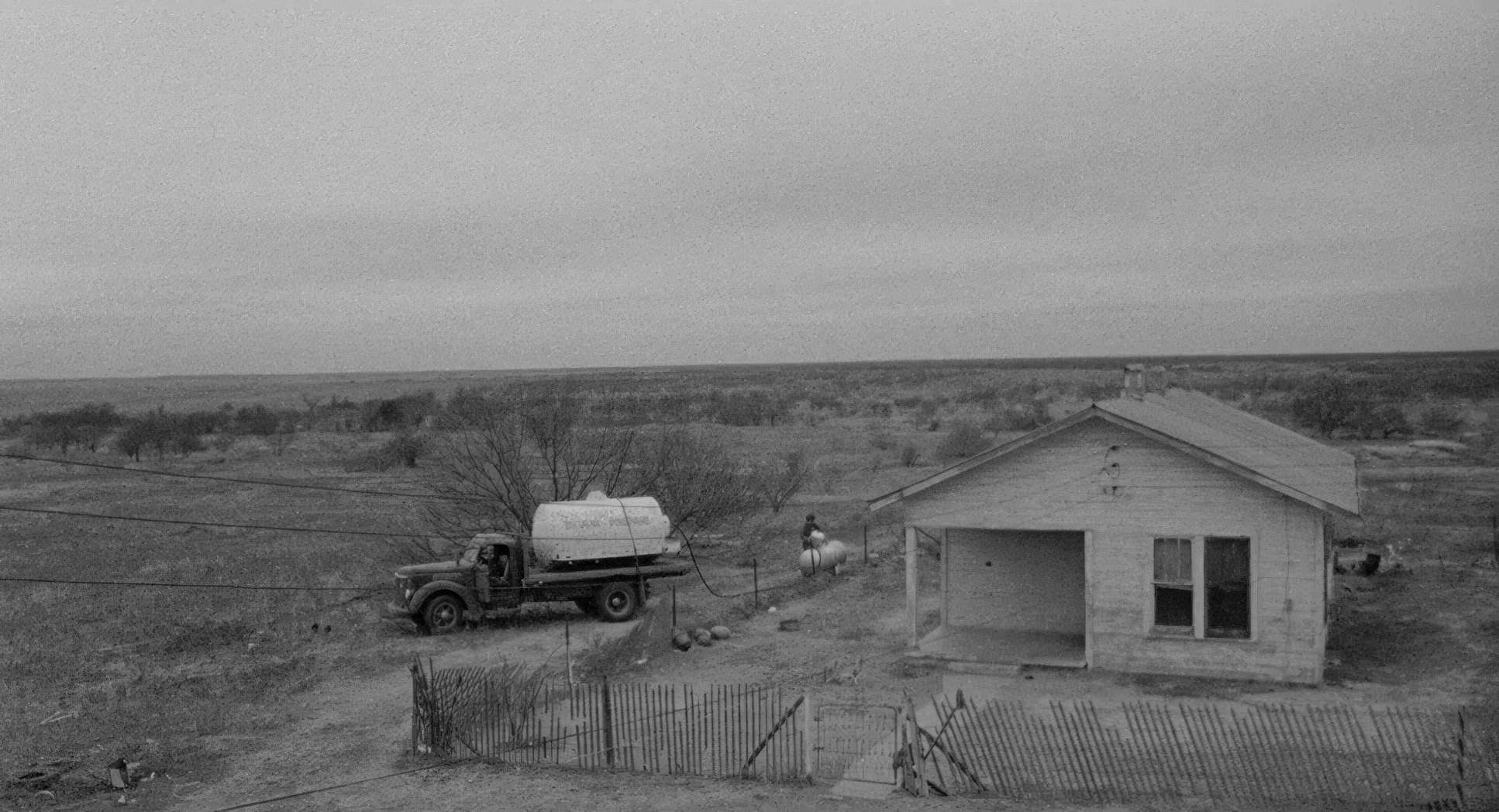
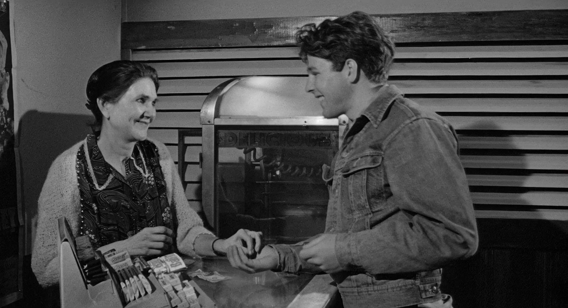
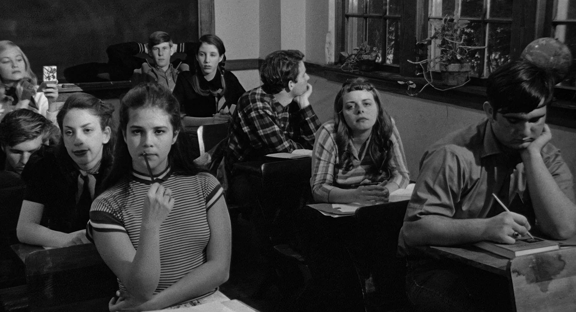
The Last Picture Show is a tough watch, and it’s supposed to be. It’s a coming-of-age story set in a dying Texas town called Anarene a place where you’re either leaving or you’re already dead while standing still. Bogdanovich doesn’t give us a traditional hero or a mustache-twirling villain. Instead, he gives us an “unvarnished observation” of loneliness and petty cruelties. It isn’t a story with a neat arc; it’s an atmosphere. It’s the echo of a town that simply refuses to move forward. The film achieves its gut-punching honesty by using a visual language so perfectly tied to its themes that you can’t separate the look from the feeling. It’s about using light and the total absence of color to sculpt the human experience in a forgotten corner of the world.
Surtees, Bogdanovich, and the Welles Obsession

While Bogdanovich’s vision is the engine here, the man behind the glass was the legendary Robert Surtees. Surtees was a chameleon. He could do classic Hollywood glamour, but here, he adapted perfectly to Bogdanovich’s neo-realistic itch. You have to remember: Bogdanovich was a film historian before he was a director. He was obsessed with Orson Welles. He actually set a goal to make a masterpiece by 25 because that’s when Welles made Citizen Kane. He missed it by two years and felt like a “real flop.” That’s the kind of ego we’re dealing with and it shows in the confidence of the frames. Surtees was the perfect collaborator to take that historical reverence and turn it into something that felt like a raw documentary.
The Defiant Choice of Black and White

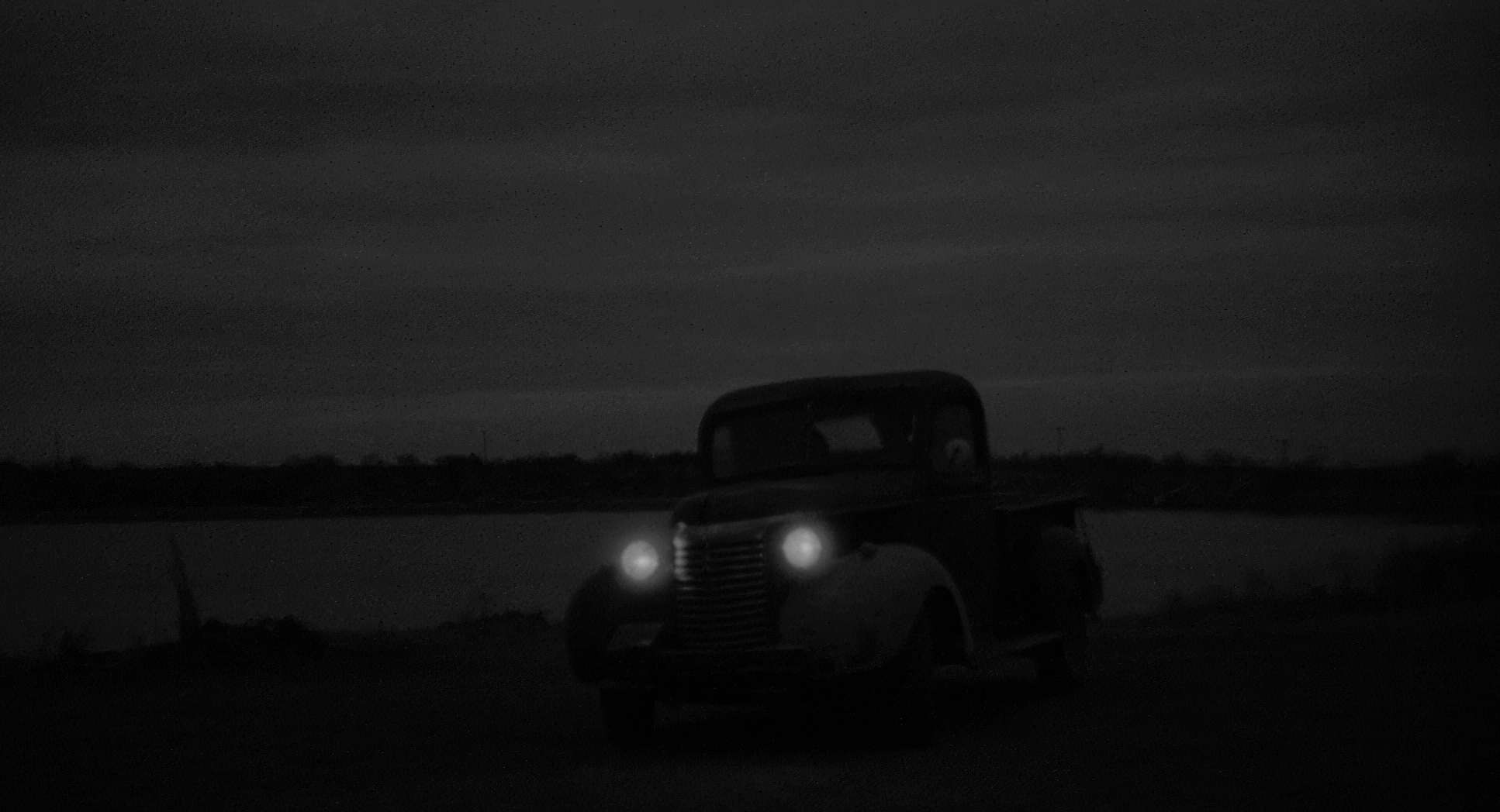
In 1971, shooting in black and white was a middle finger to the industry. Color was king because of television sales. As Bogdanovich famously told Dick Cavett, the studios hated the idea because “it would kill the television.” But he had a very practical, very “filmmaker” reason for the choice. They took color test footage of those dreary Texas towns, and the problem was simple: they all looked “pretty.” Color has a way of romanticizing decay.
Bogdanovich didn’t want “artistic” for the sake of being fancy; he wanted authenticity. Stripping the color away revealed the dust, the cracks in the wood, and the exhaustion on the faces. It turned Anarene into a ghost town in real-time. It allowed them to focus on the “bones” of the image texture and contrast without the distraction of a blue sky or a red brick.
The Stagnant Lens: Why the Camera Refuses to Move

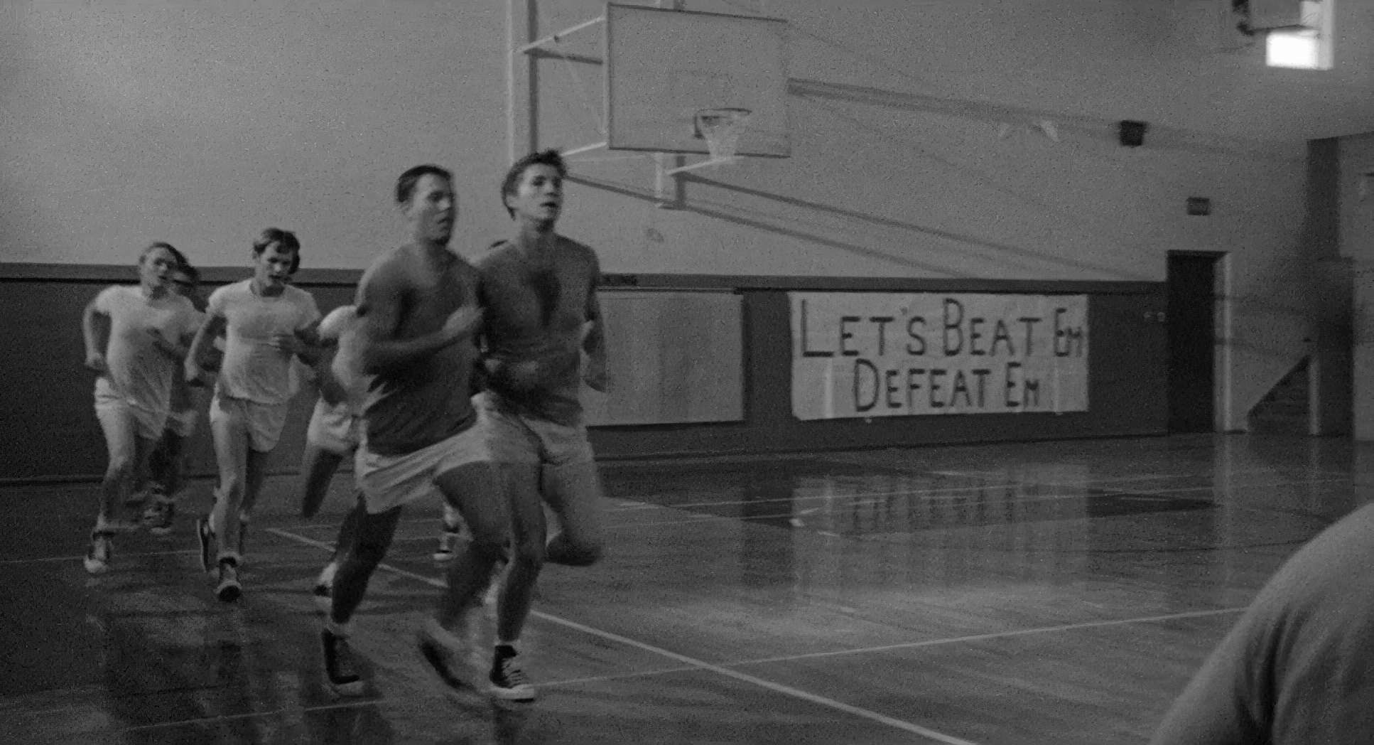
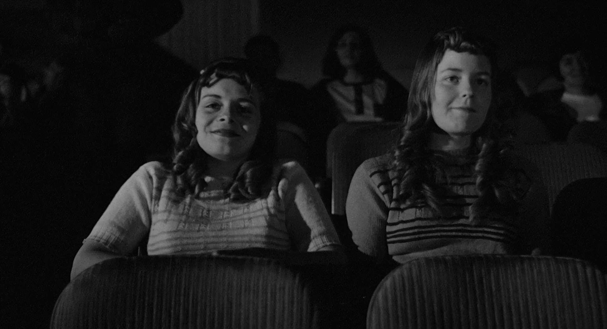
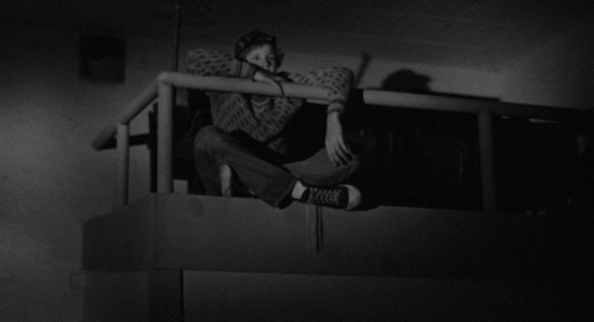
The camera in this film doesn’t narrate; it witnesses. You won’t see any flashy “look at me” crane shots or aggressive handheld work. It just sits there. It waits. This deliberate stillness mirrors the grinding pace of the town. When the camera does move, it’s with a quiet dignity a gentle dolly or a slow pan.
Think about the way the lens follows Sonny through those empty streets. It’s not a dramatic “push-in” for a big movie moment; it’s a contemplative gaze. These movements are never self-serving. They are always in service of the stagnation. Things don’t change in Anarene, and the camera’s refusal to get “creative” underscores that feeling of inevitable decay.
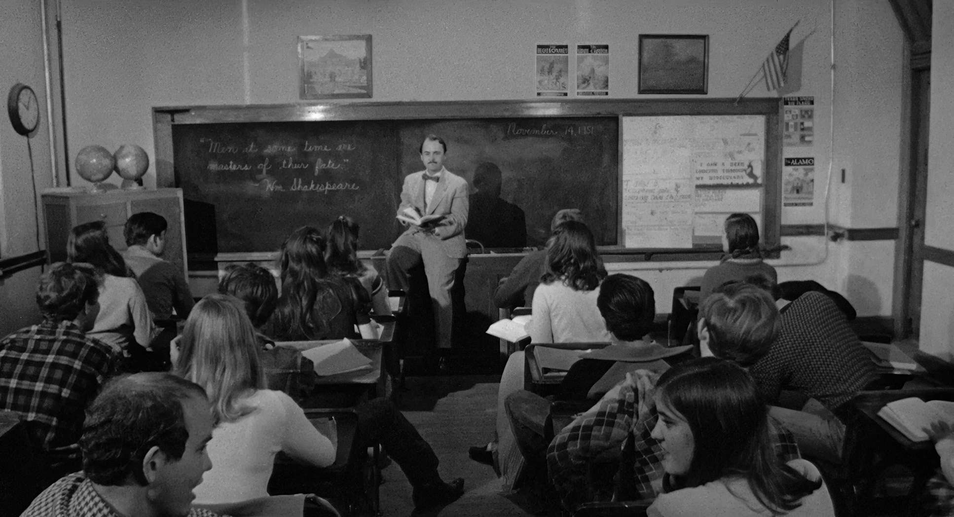
Framing the Death of the West

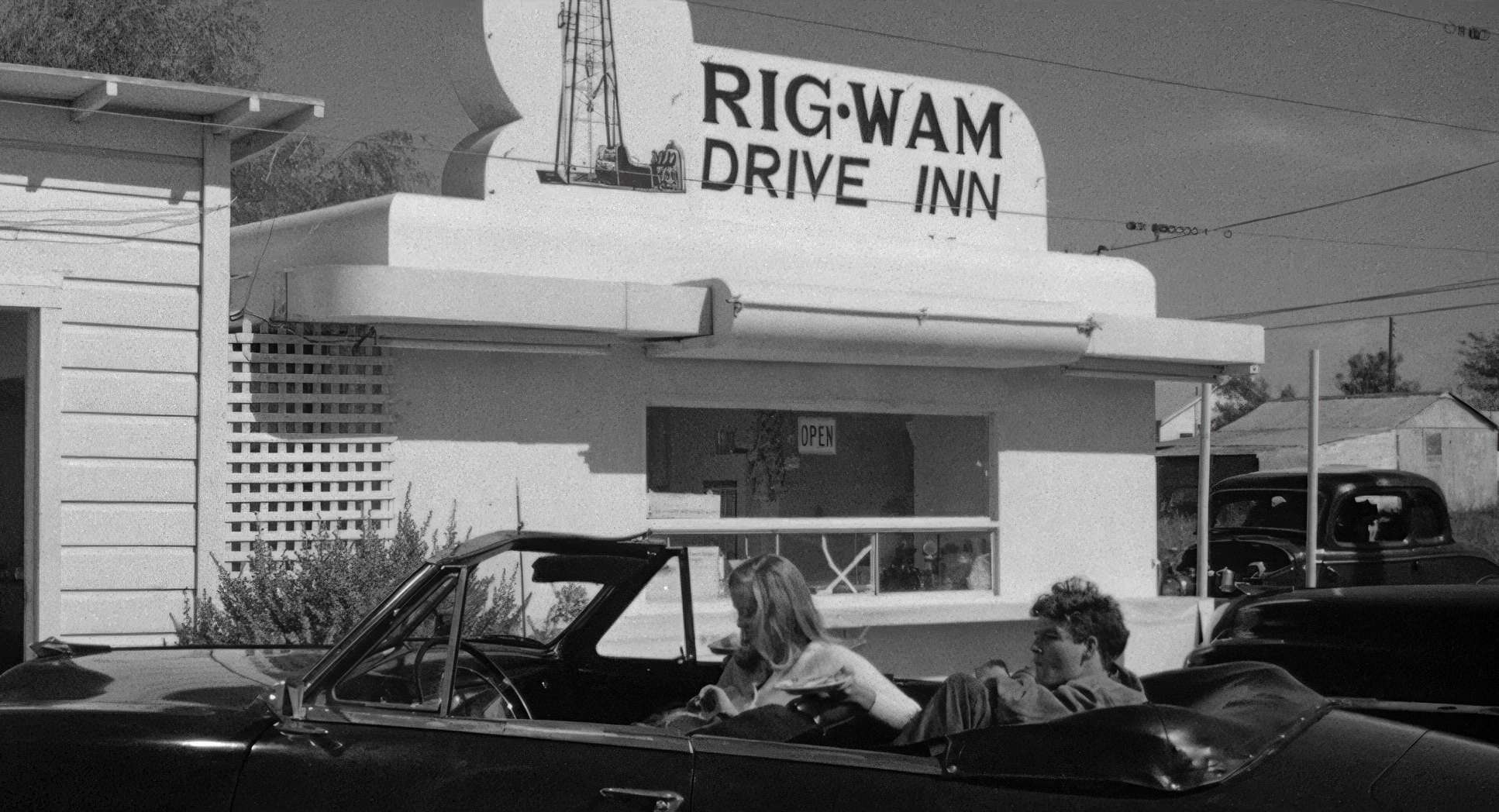
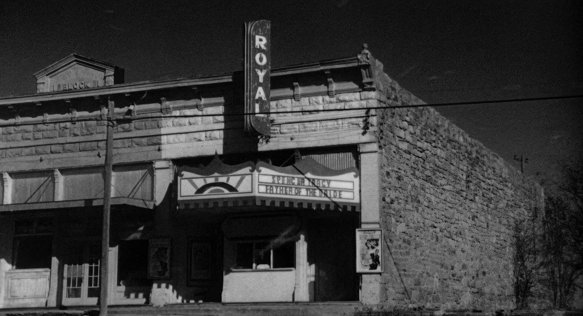
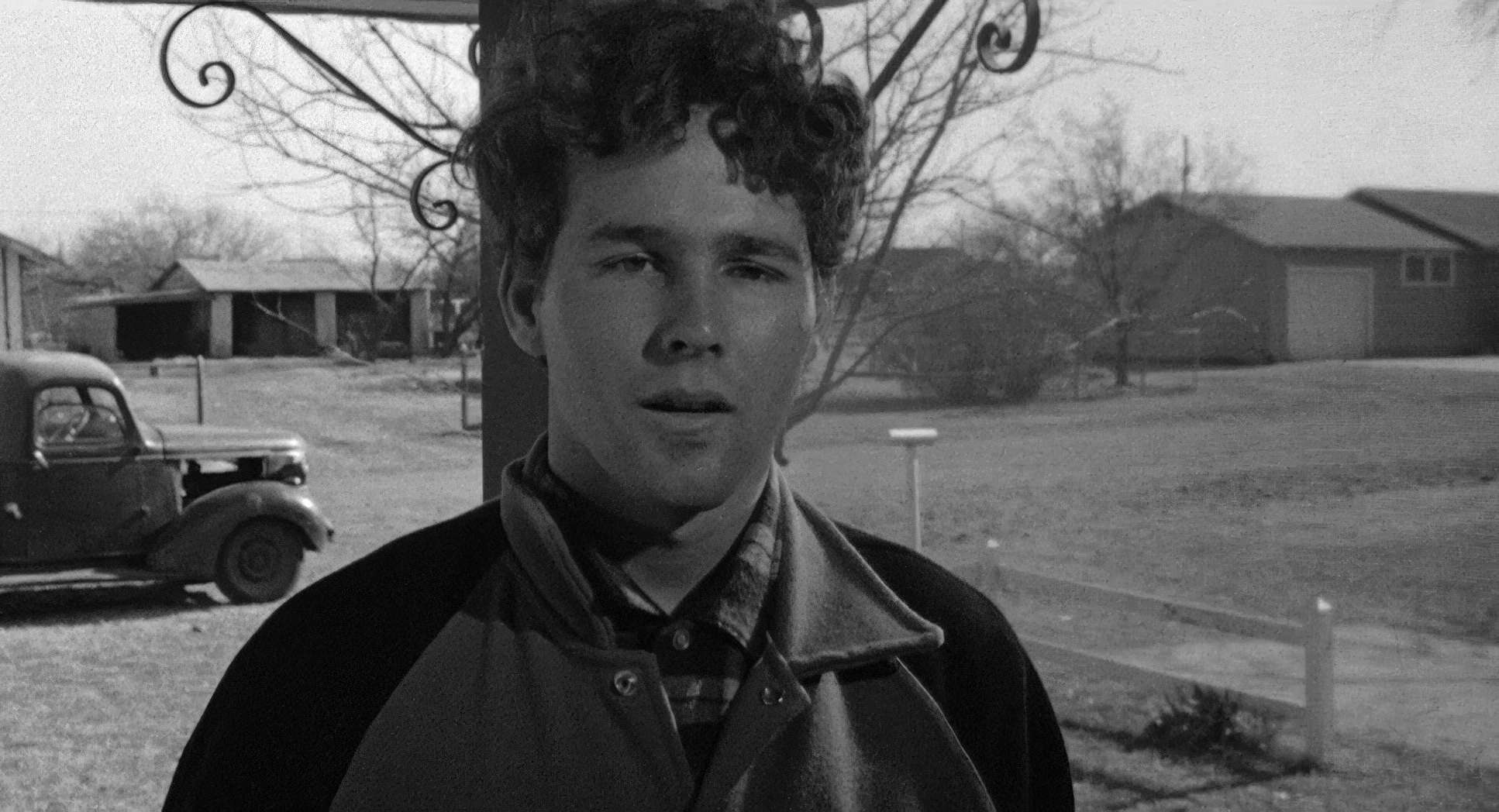
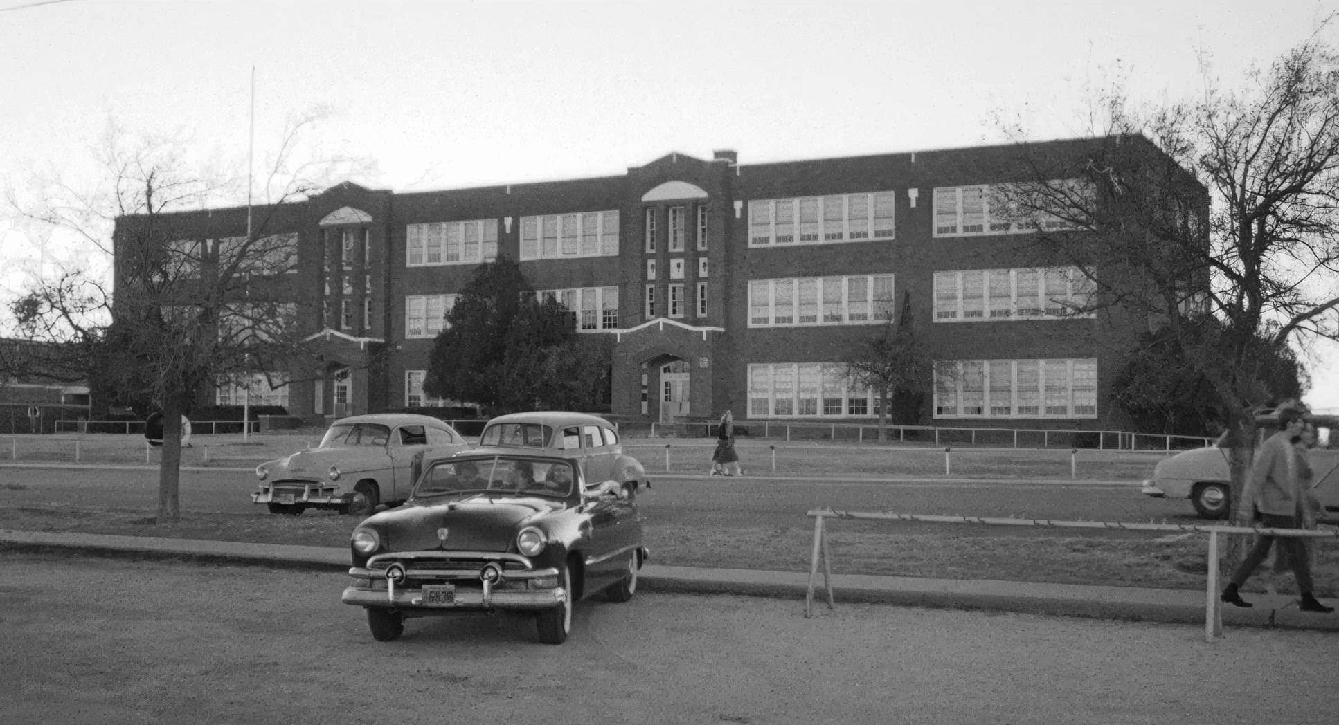
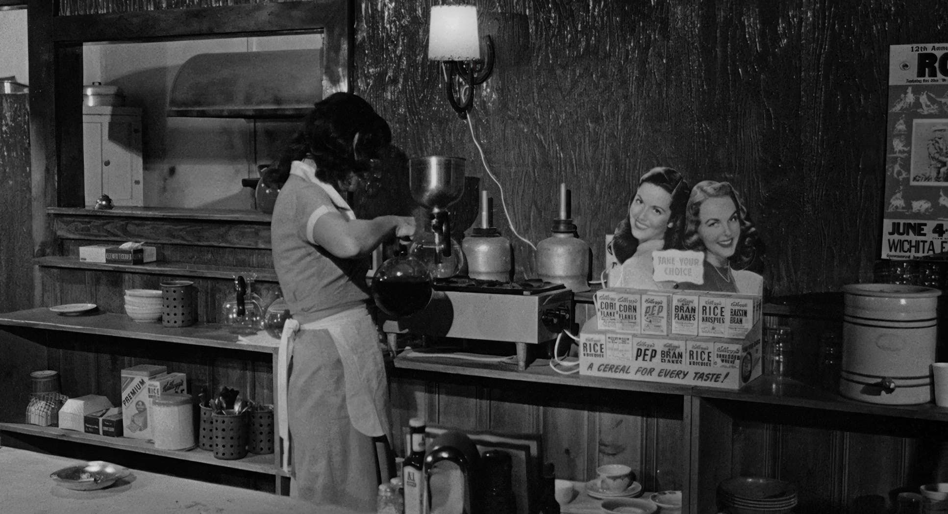
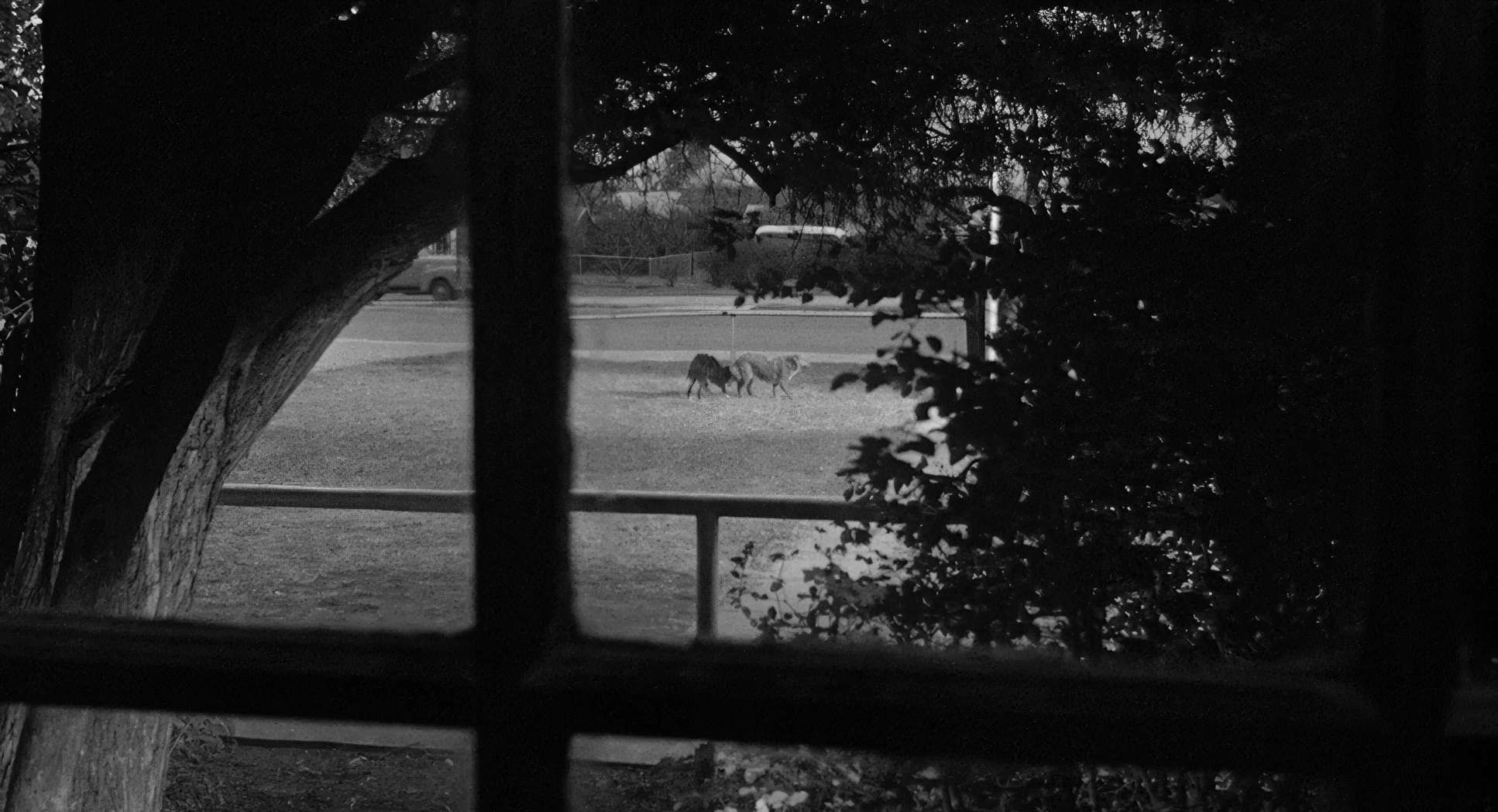
The compositions here are a masterclass in deep focus, a direct nod to Welles. Surtees and Bogdanovich used wide angles to make sure you saw everything the characters in the foreground and the oppressive emptiness of the Texas sky behind them. In many ways, this is a “Contemporary Western,” but instead of heroes riding into the sunset, we see people dwarfed by a horizon that offers them nothing.
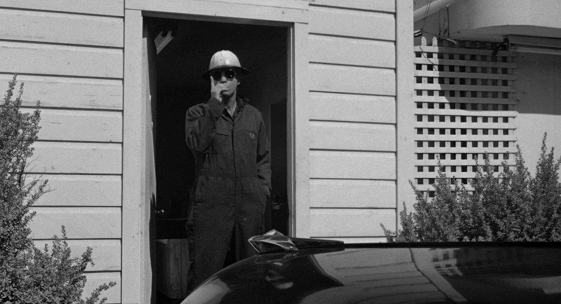
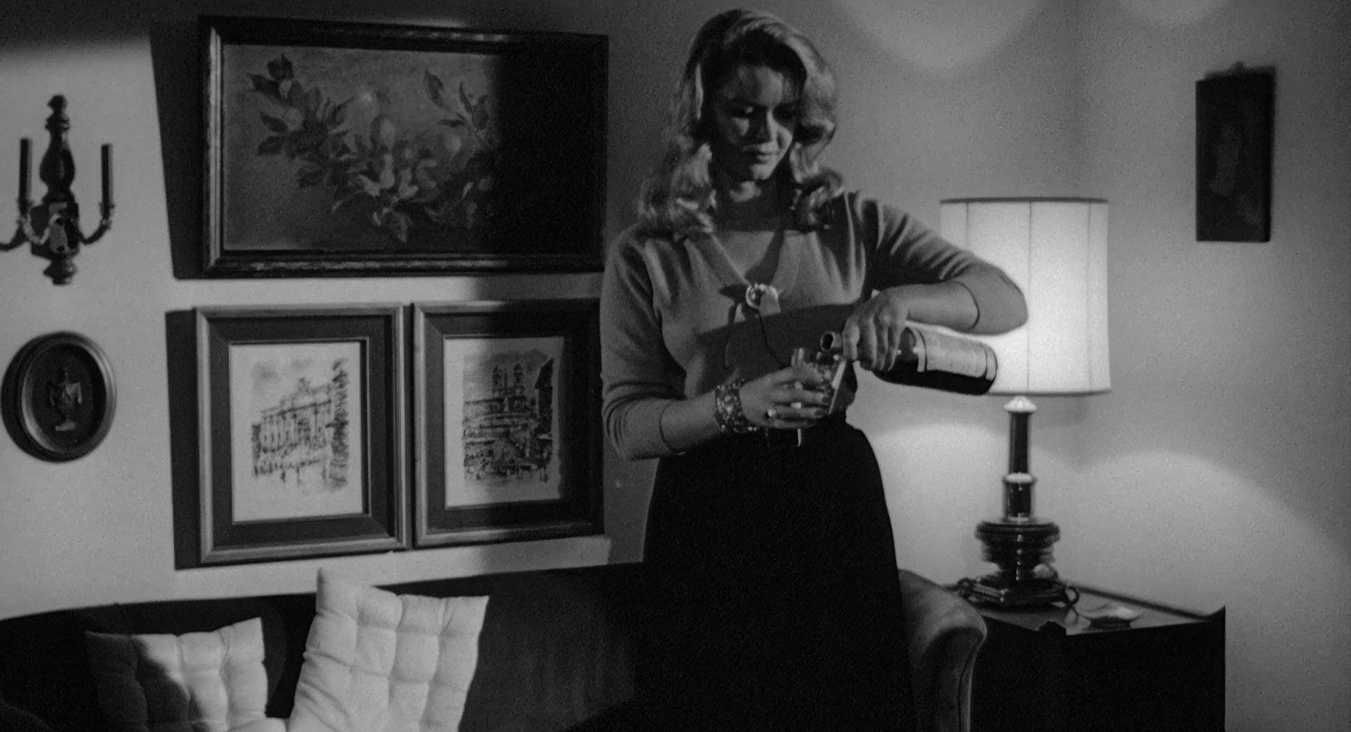
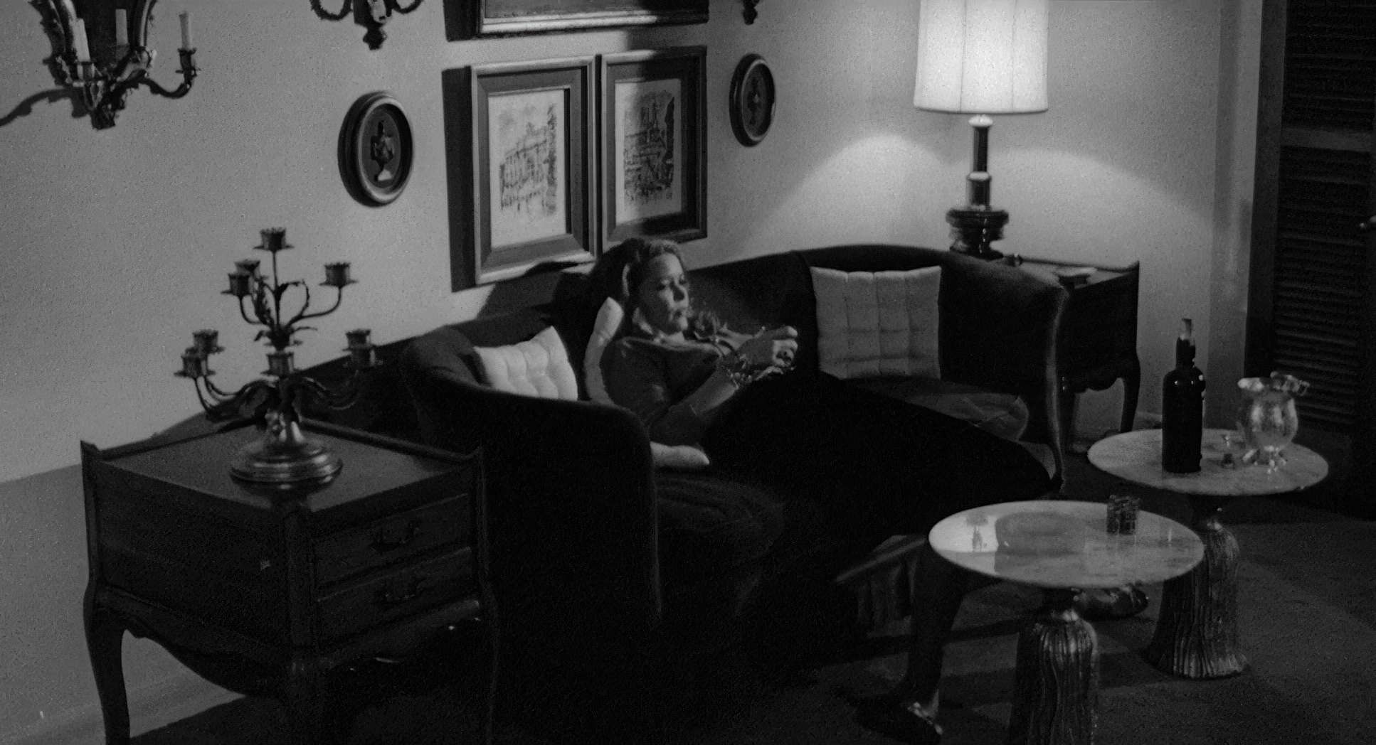
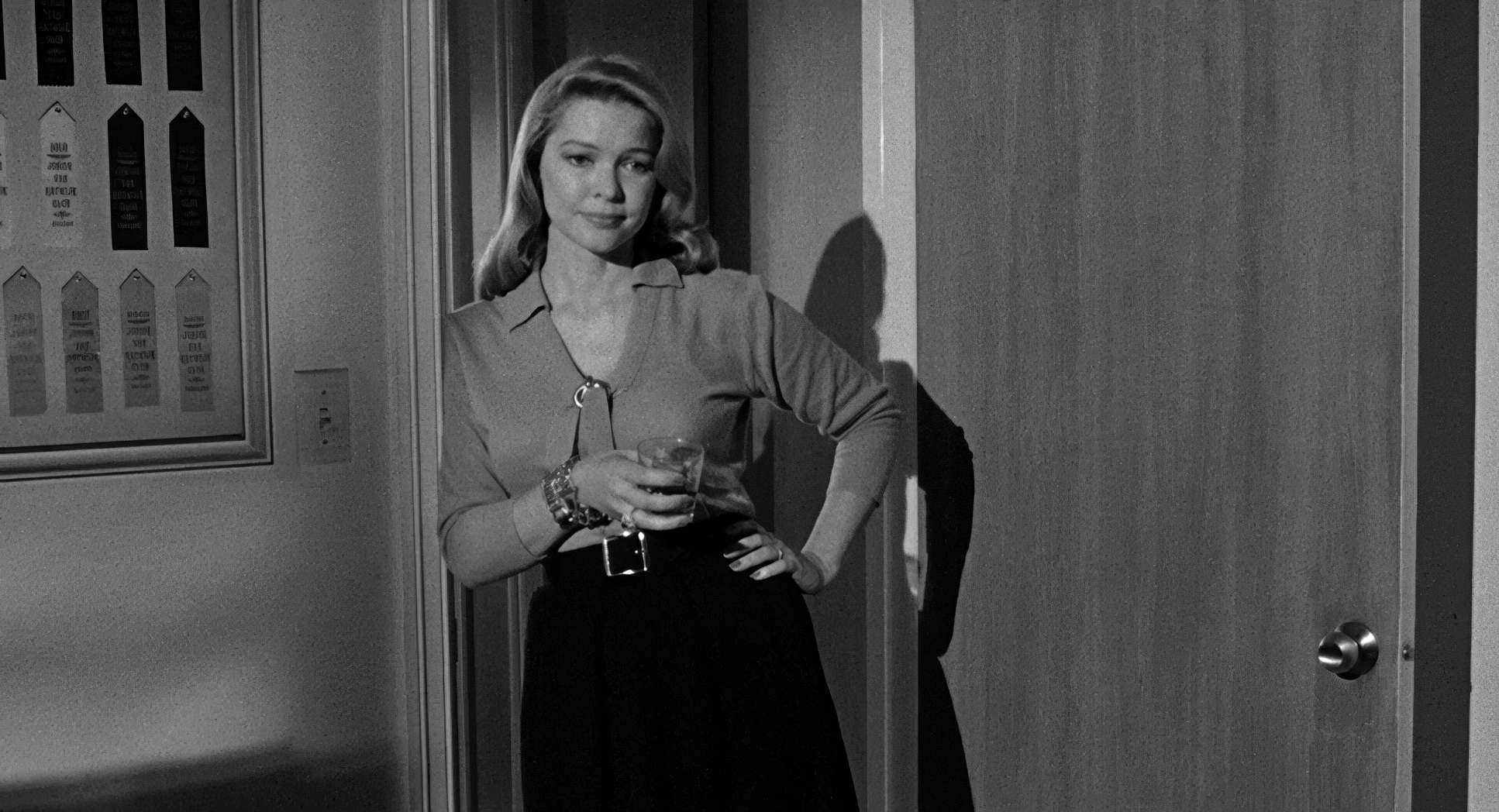
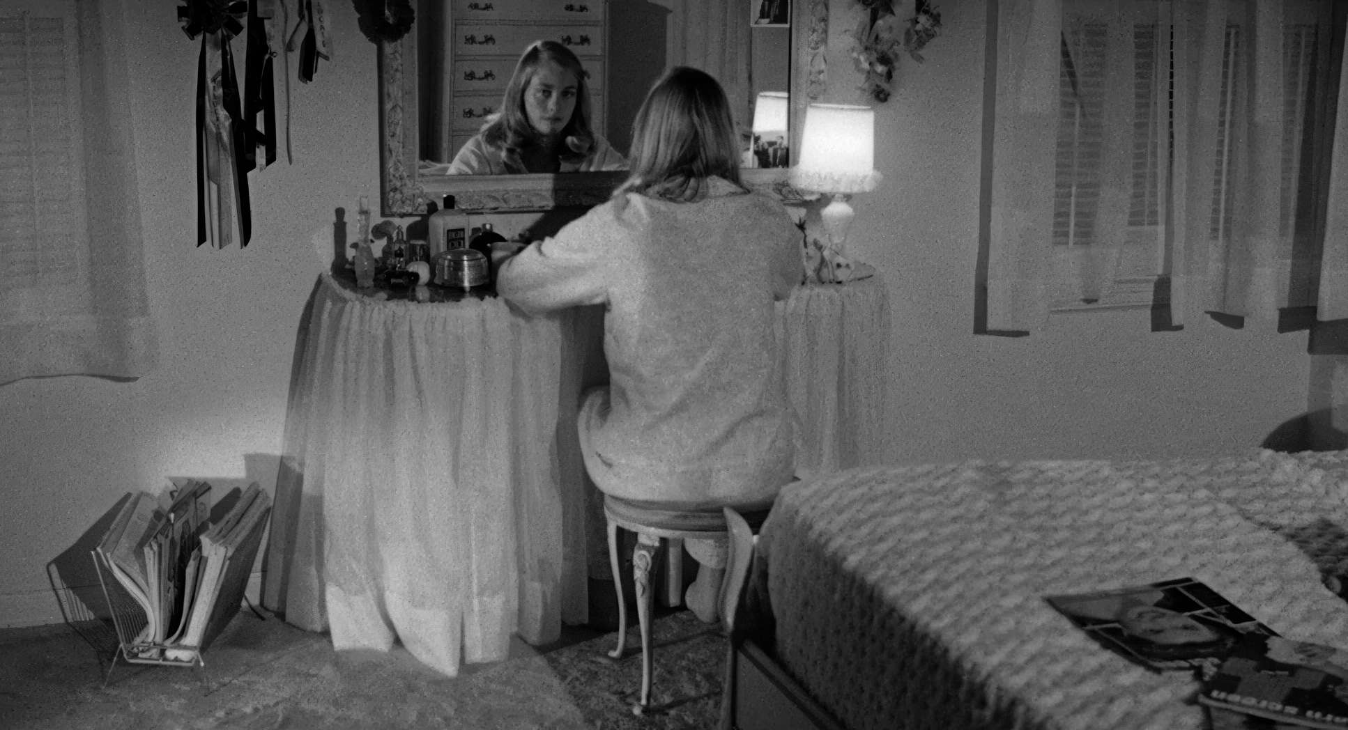
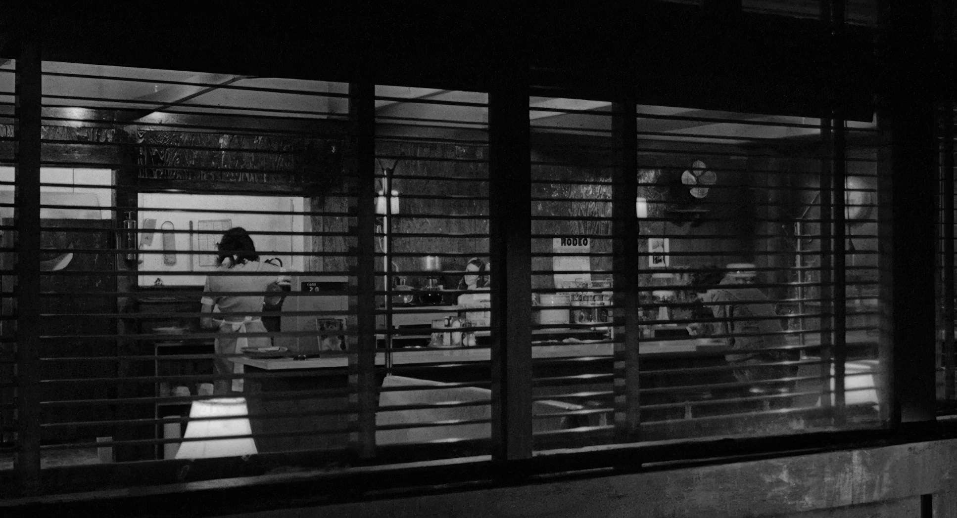
They used negative space to make the characters look small and isolated. You often see them framed by windows or doorways, looking like they’re trapped in a cage. Even the geometry of the town the sharp, brutal angles of the collapsing buildings feels like it’s closing in on them. It’s a visual language that refuses to soften the blow.
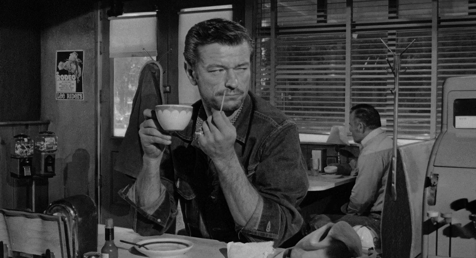
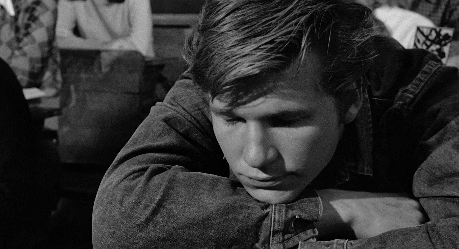
Harsh Suns and Honest Shadows

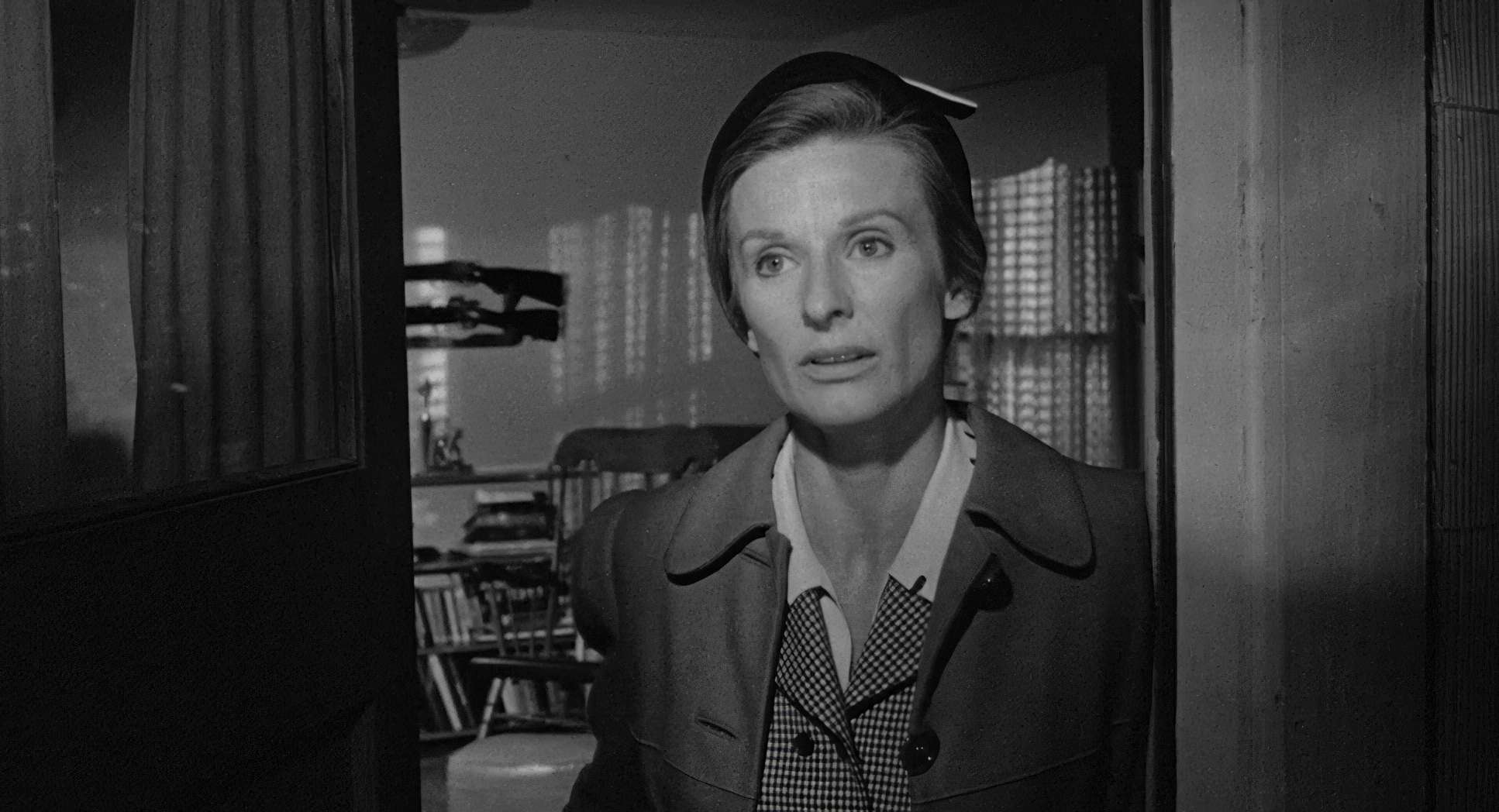
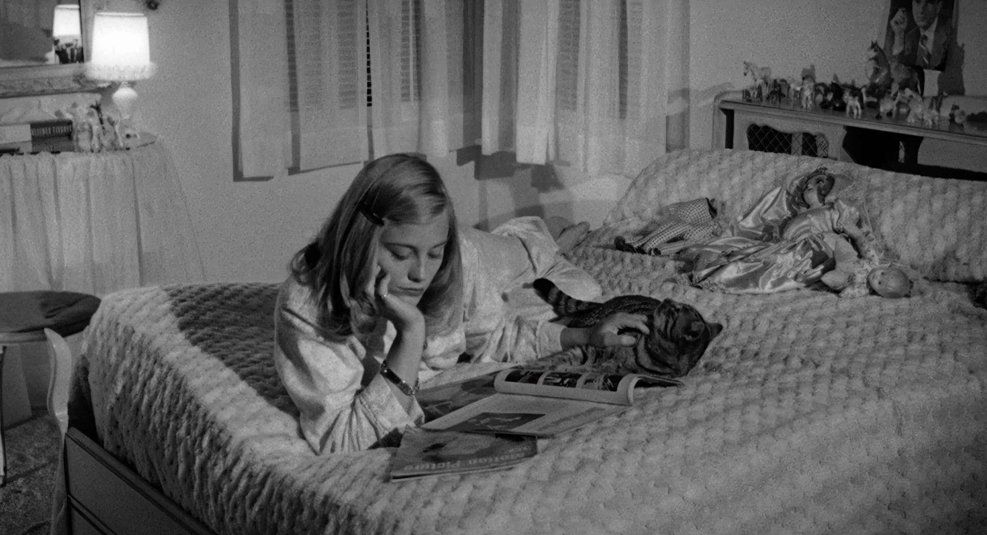
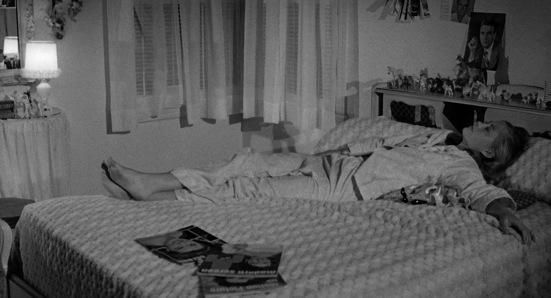
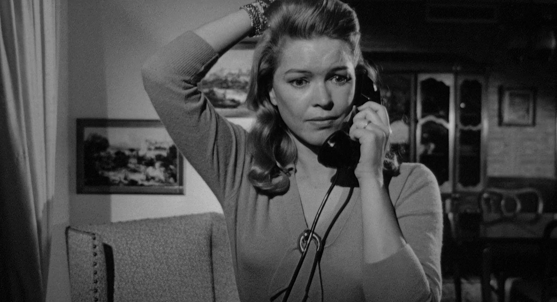
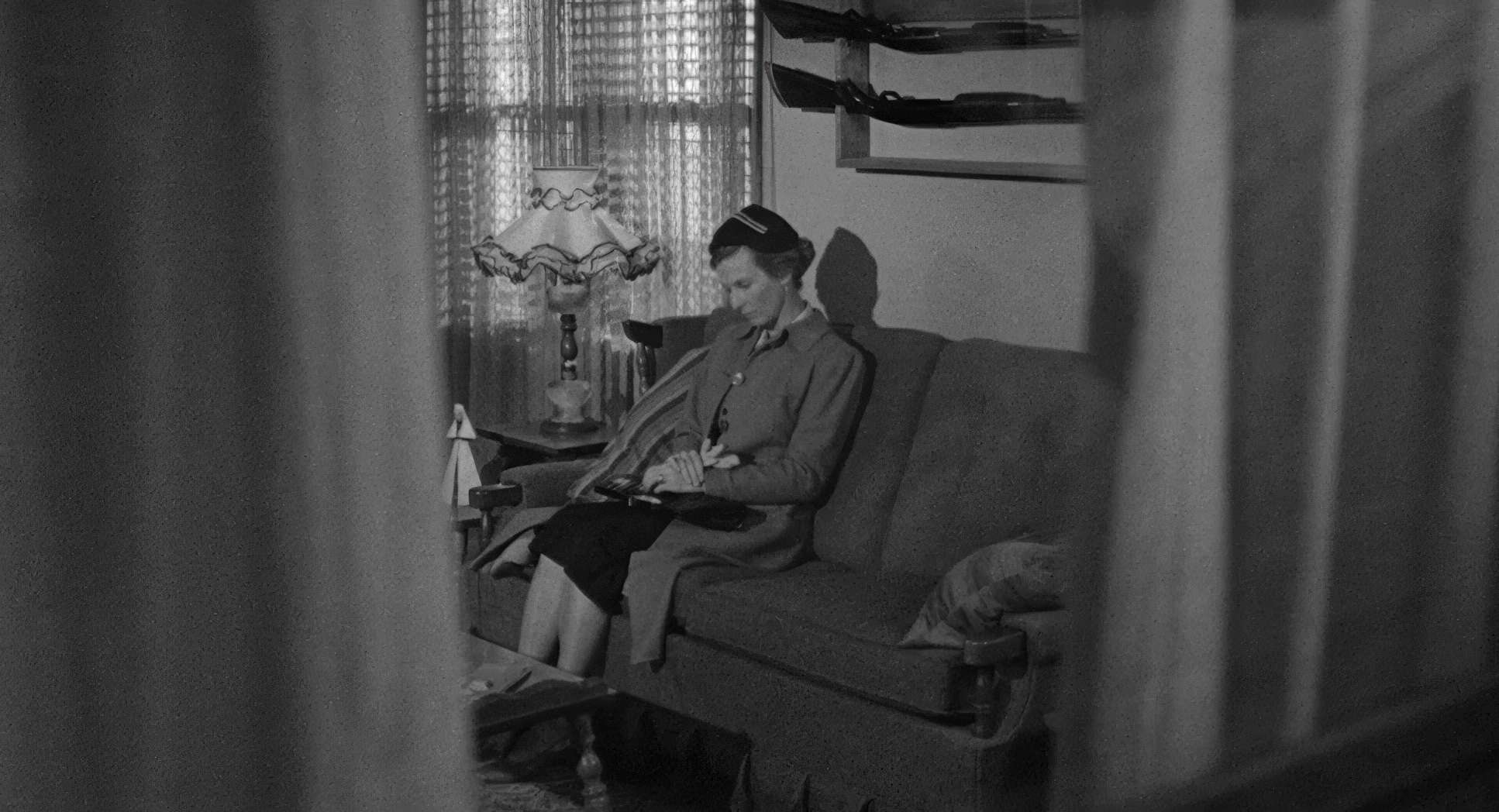
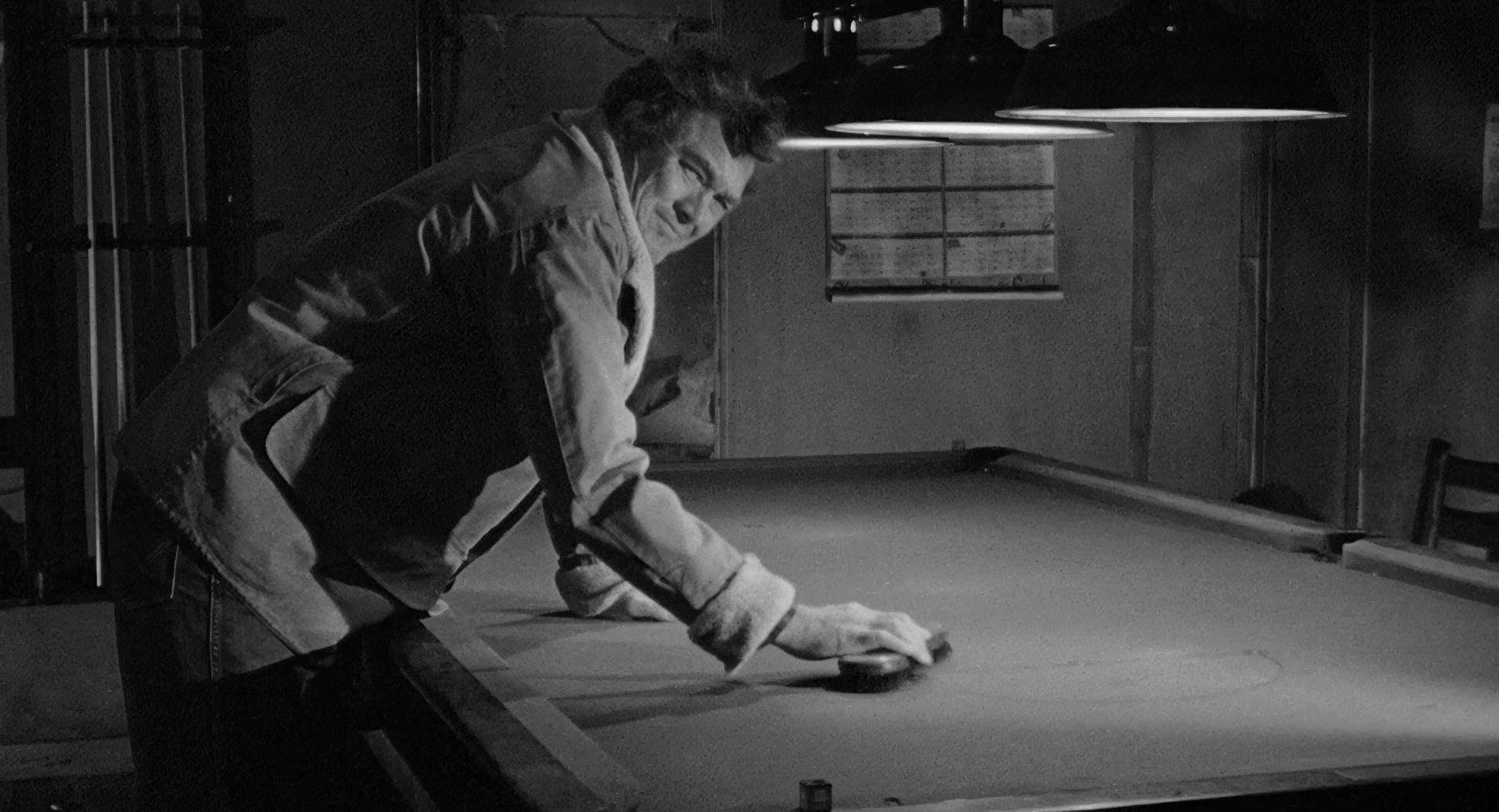
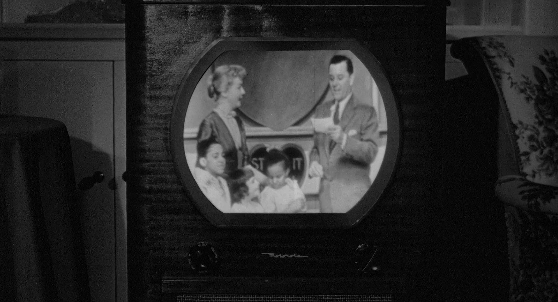
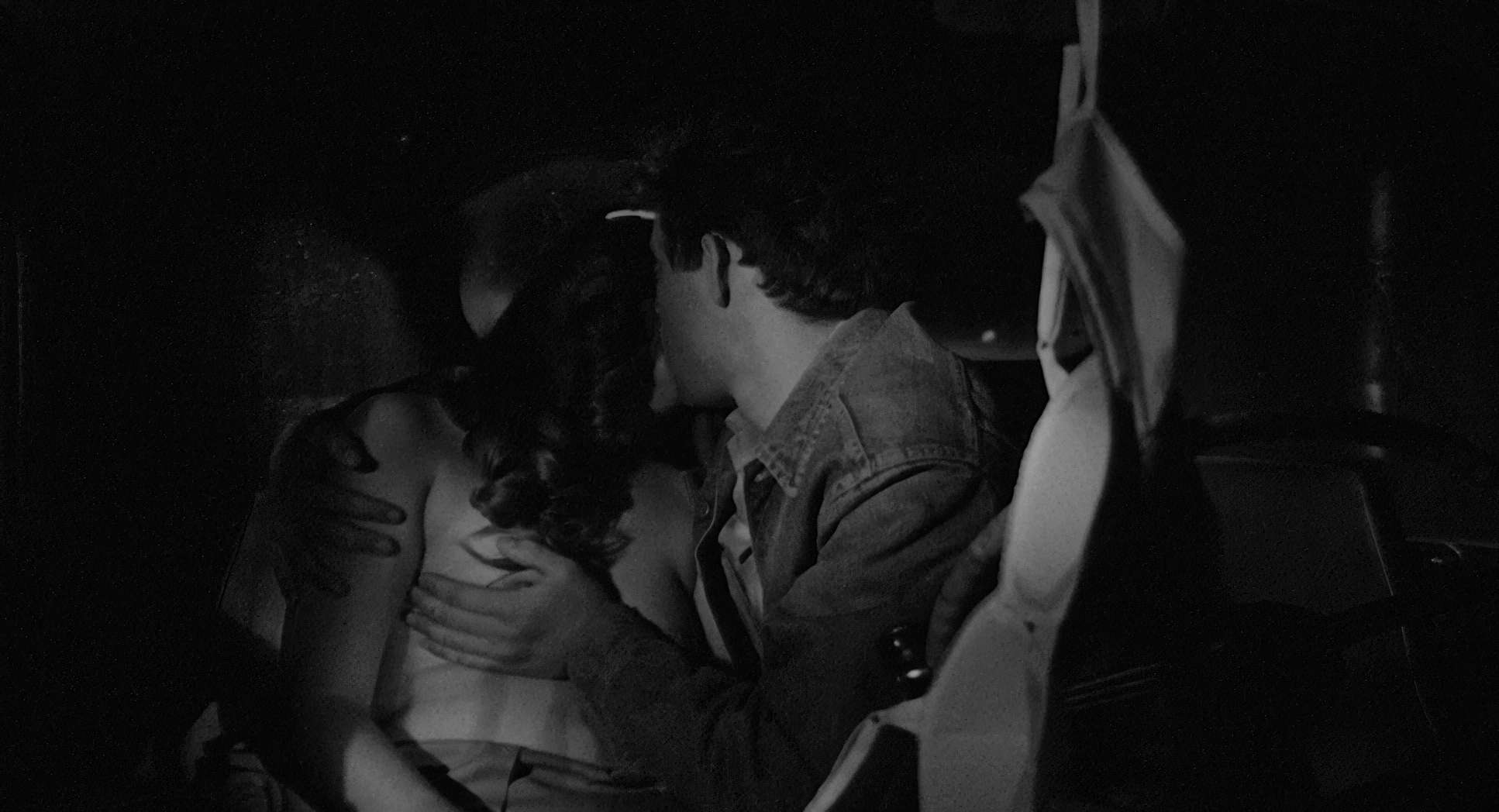
The lighting is as unvarnished as the performances. It’s naturalistic, but don’t mistake that for “easy.” Surtees used the harsh, unforgiving Texas sun to create long, sharp shadows that feel almost cruel. Indoors, the light is softer, usually motivated by a single window or a lonely lamp, but it never feels “glamorous.”
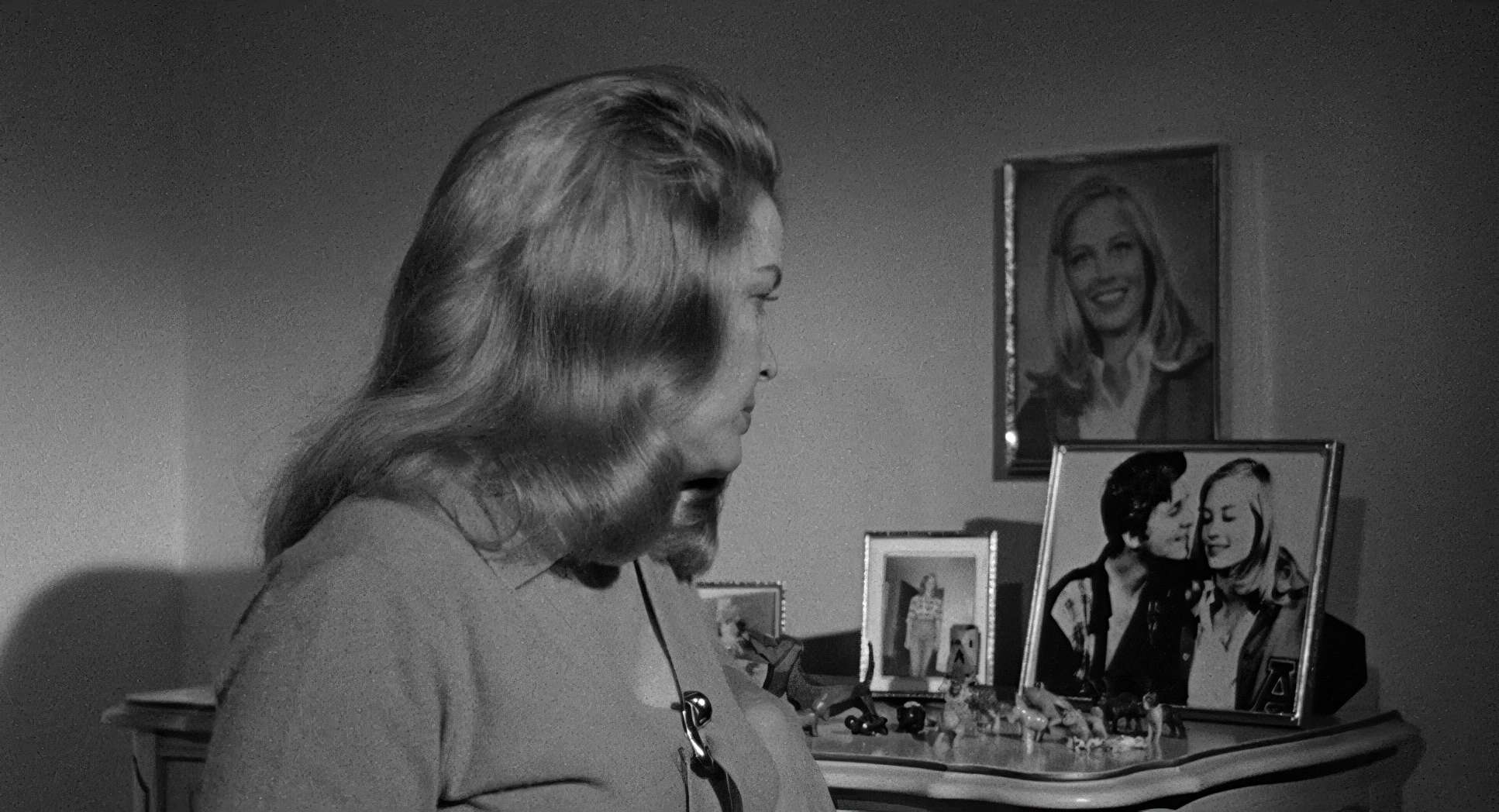
Look at the scenes in Ruth Popper’s house. The light is gentle, but it doesn’t hide the lines of weariness on her face. It’s about shaping the absence of light as much as the presence of it. As a colorist, I love how they used the full dynamic range of the film stock to render every shade of gray. Shadows aren’t just “black holes” here; they have texture.
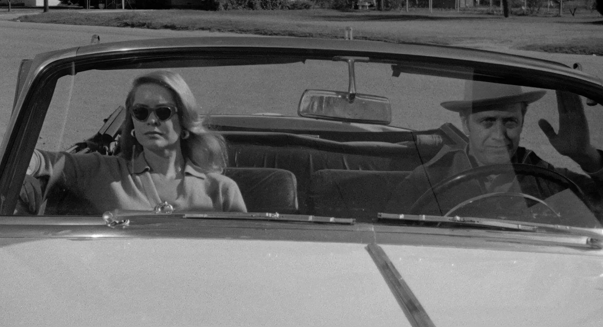
Distance as Dialogue

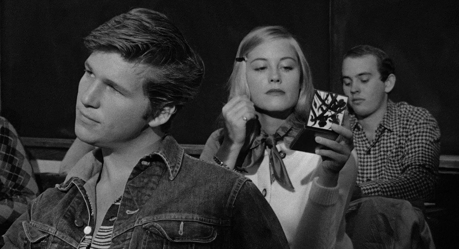
The lensing and blocking choices really drive home the isolation. They used wide-angle lenses for the town to make it feel expansive yet suffocating. For the intimate moments, they likely swapped to primes with slightly longer focal lengths to compress the space and pull us into the characters’ inner worlds.
The blocking is meticulously crafted but looks effortless. Characters are often physically close but emotionally miles apart. Take the confrontation between Sonny and Duane the way they are positioned in the frame tells the story of their fractured brotherhood before a single word is even spoken. Bogdanovich trusted the audience to read the body language rather than hitting them over the head with it.
Tonal Sculpting: A Colorist’s Perspective
Now, some people think “color grading” doesn’t apply to black and white. They’re wrong. In my world, this is where “tonal sculpting” becomes everything. The Last Picture Show is the gold standard for this. They likely used Kodak Double-X 5222, which has a beautiful, thick grain and incredible latitude.
When I watch this, I’m looking at the highlight roll-off. It’s stunning. The highlights on the skin tones in the exterior scenes don’t just “hit” white; they have that milky, organic density we spend hours trying to emulate with digital OFX plugins today. The blacks are rich and deep solid anchors but they never “crush” into nothingness. There’s a vast range of mid-tone grays that define the depth. This isn’t just a “black and white movie”; it’s a masterpiece of tonal separation that defines the foreground from the background with a clarity that modern digital sensors still struggle to match.
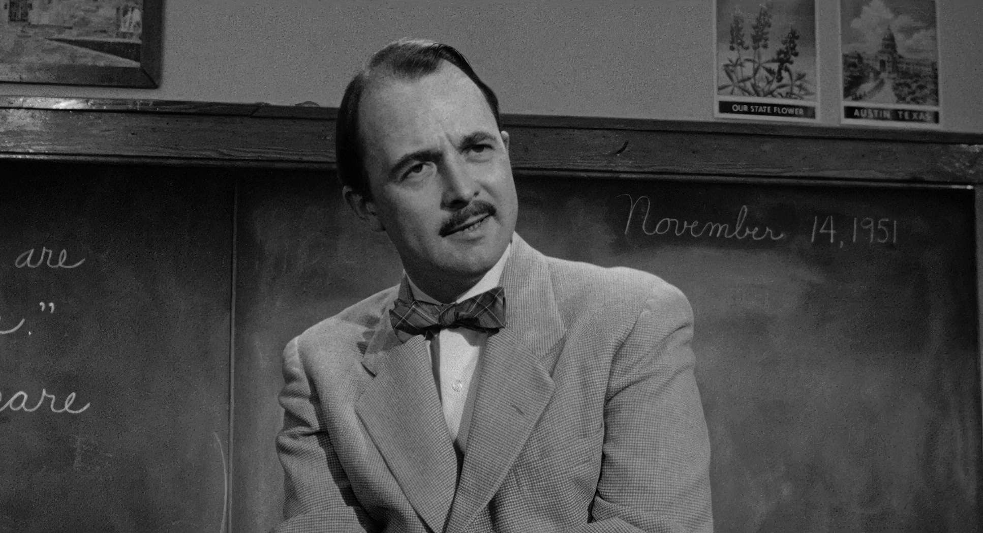
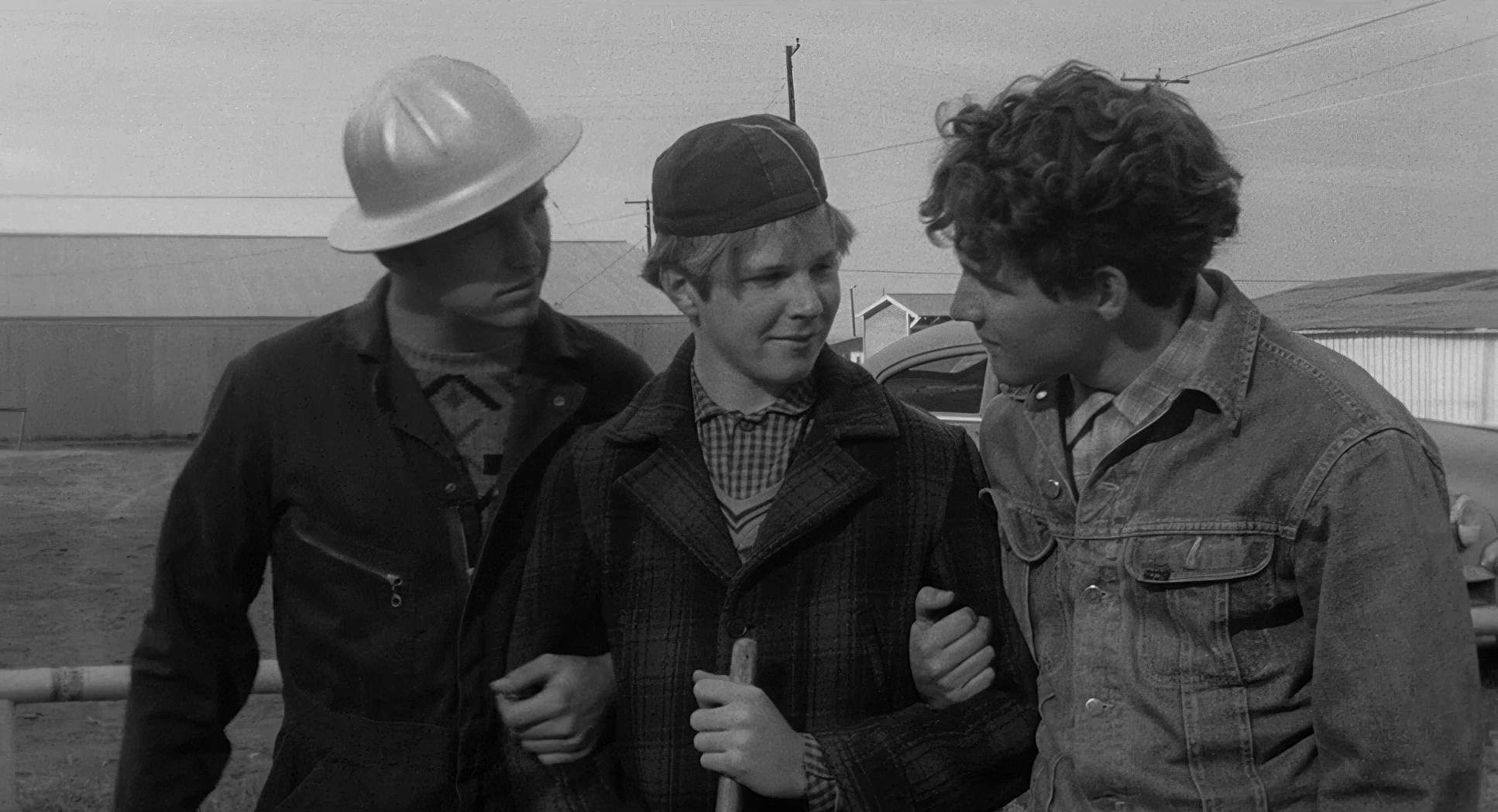
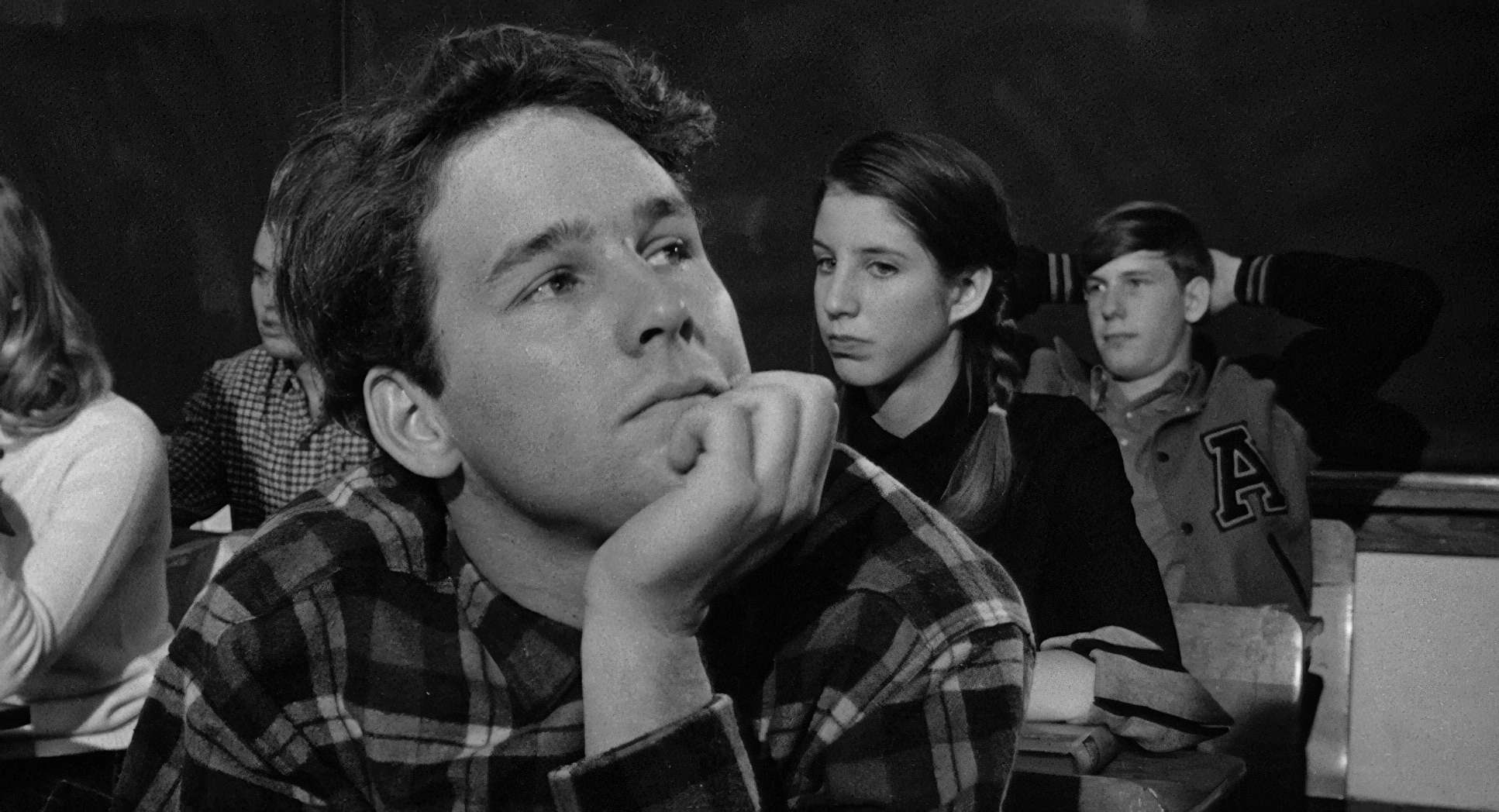
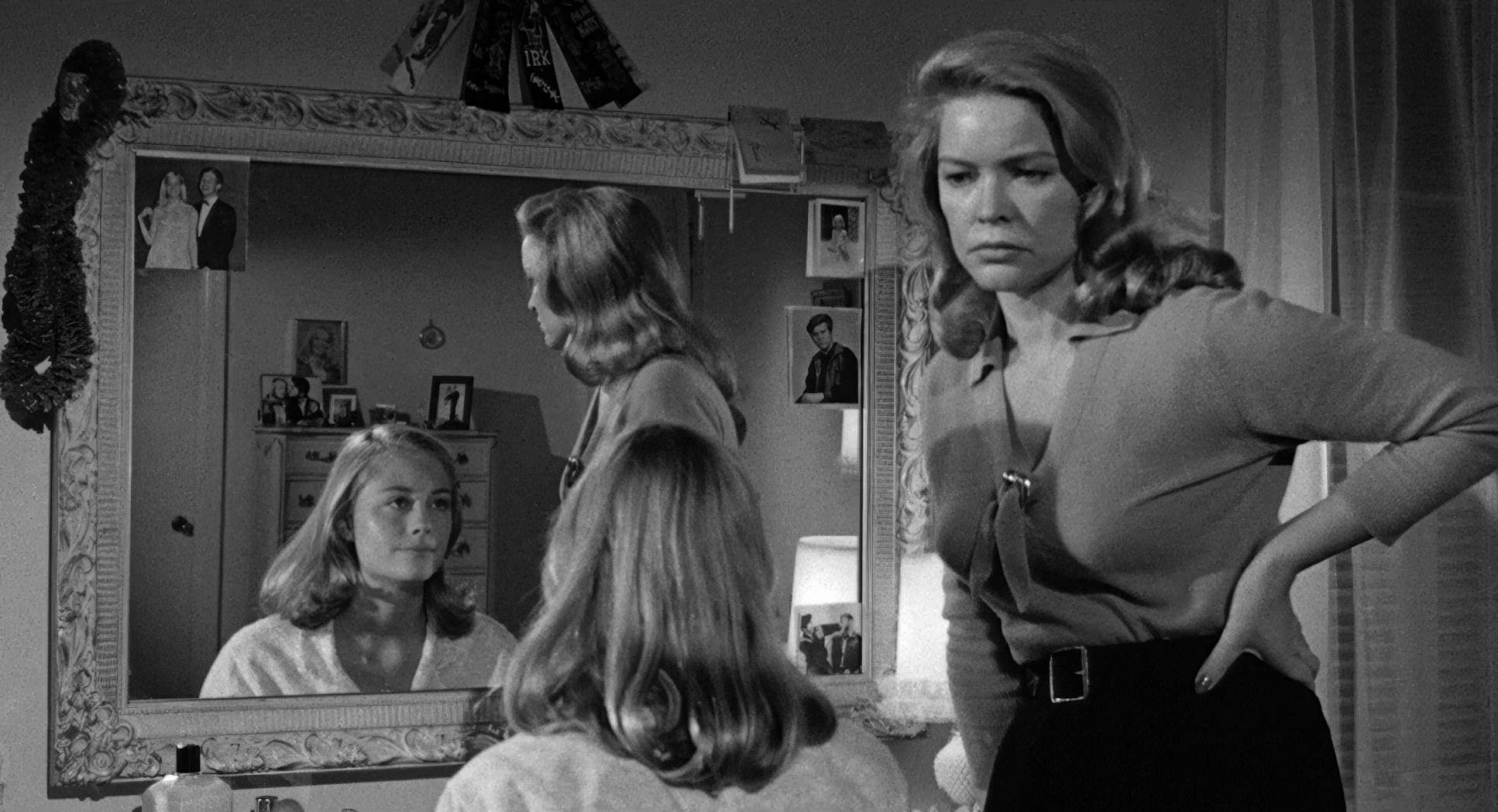
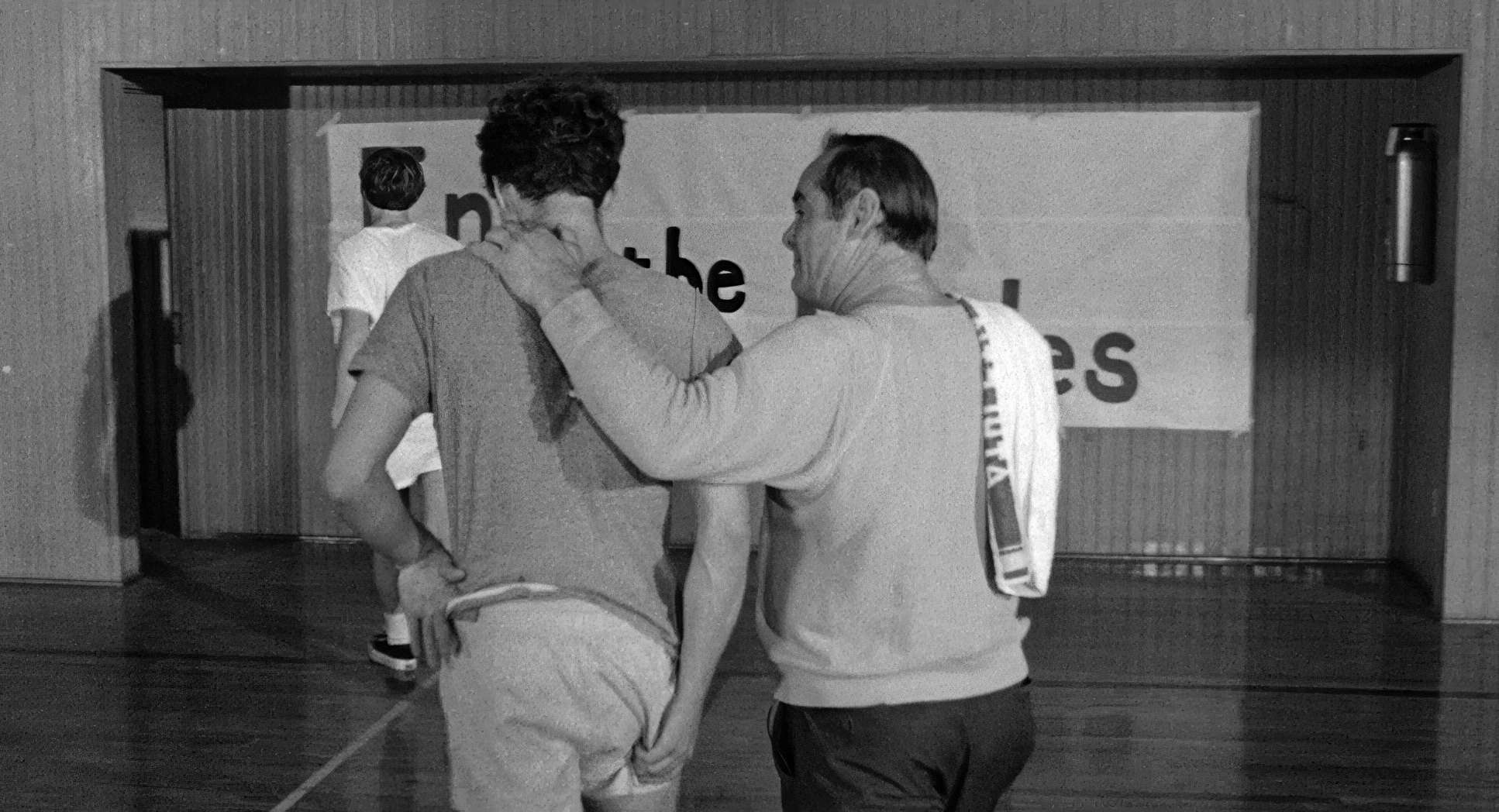
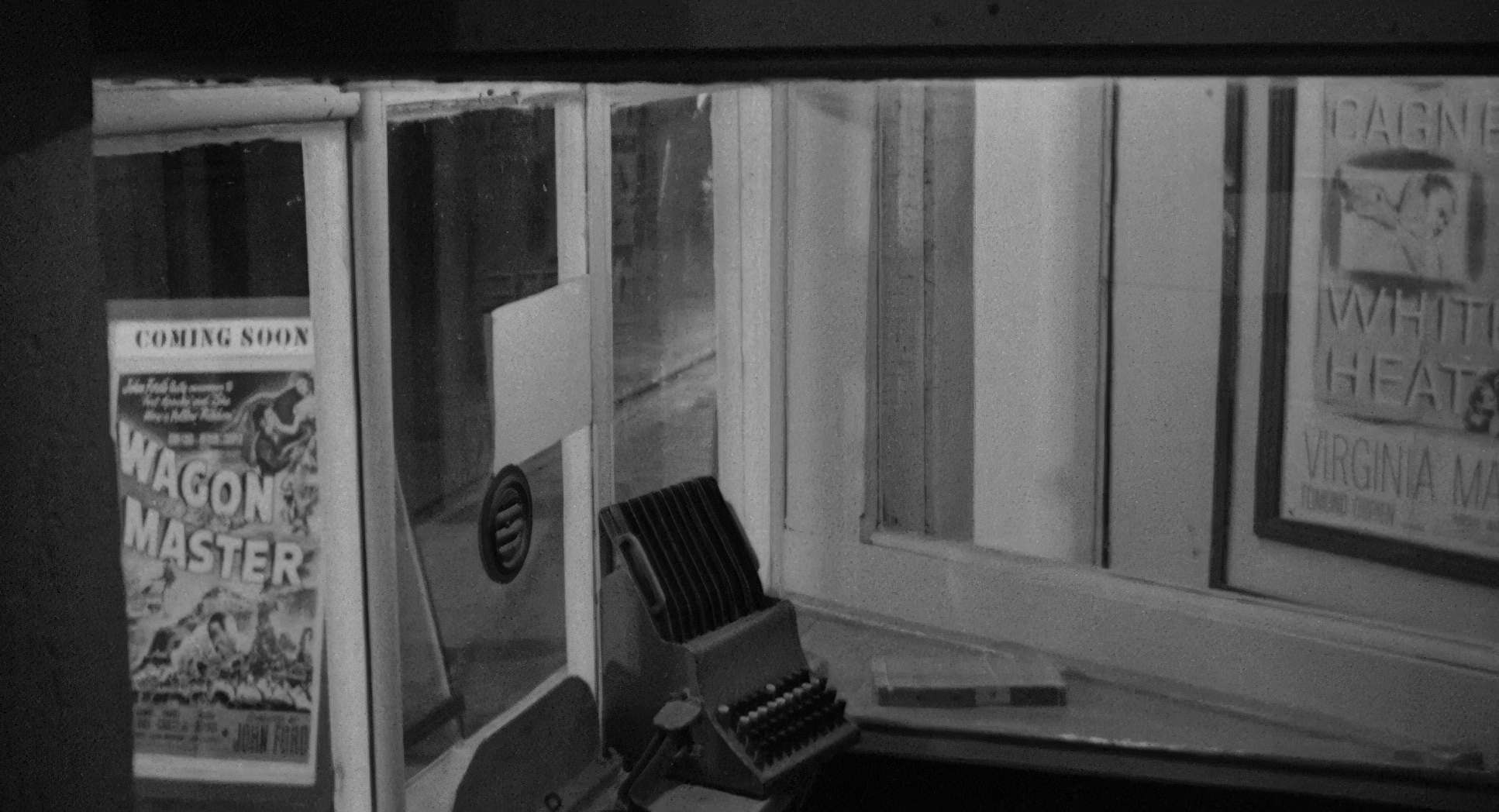
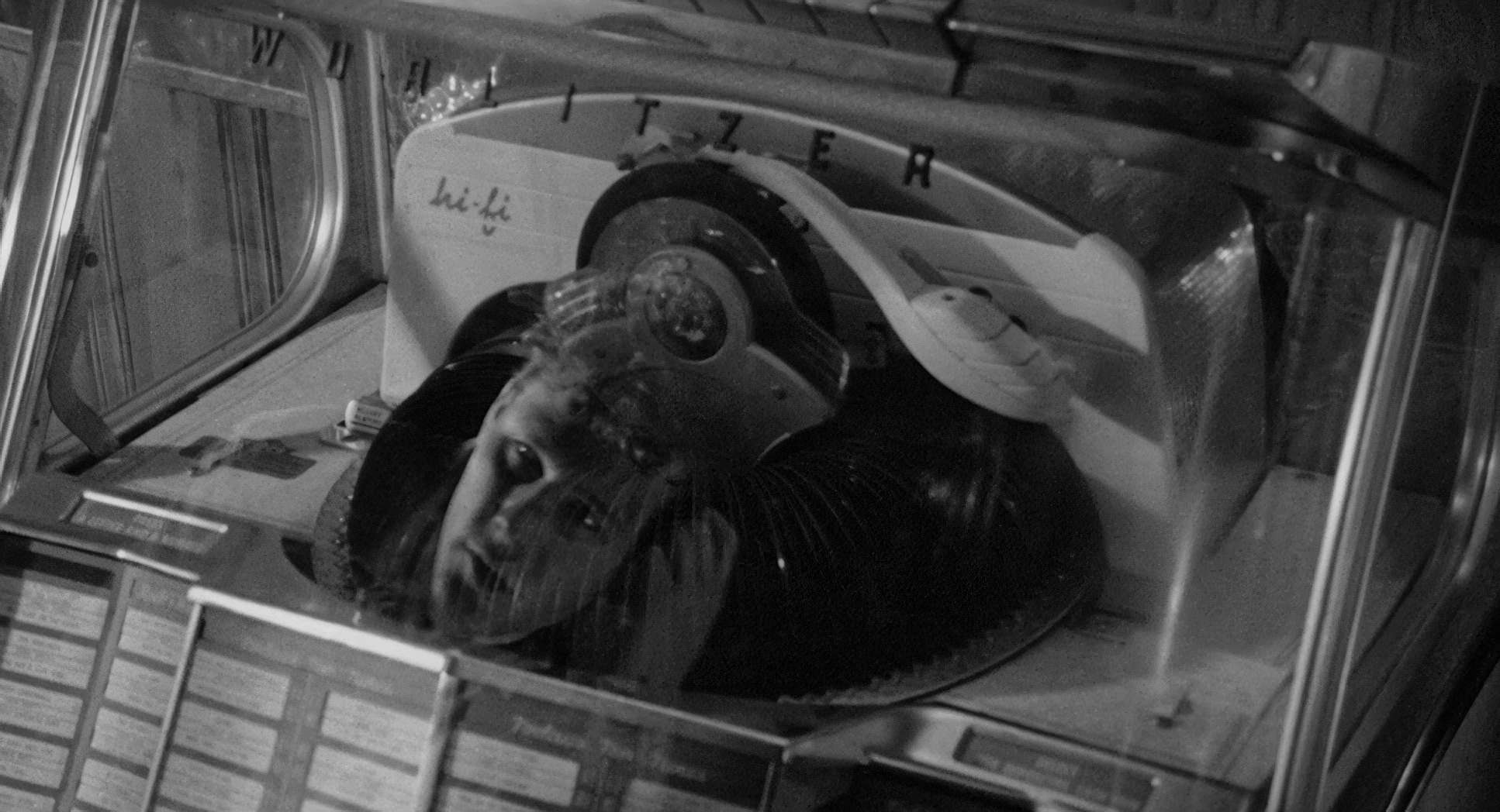
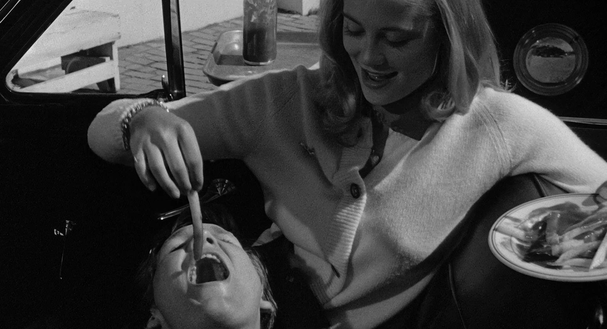
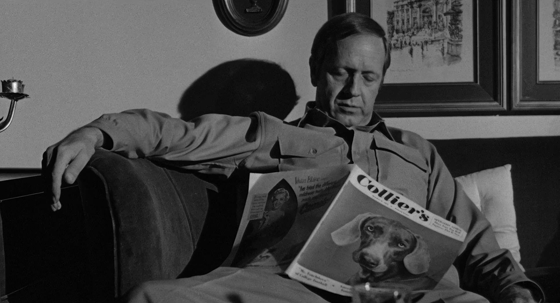
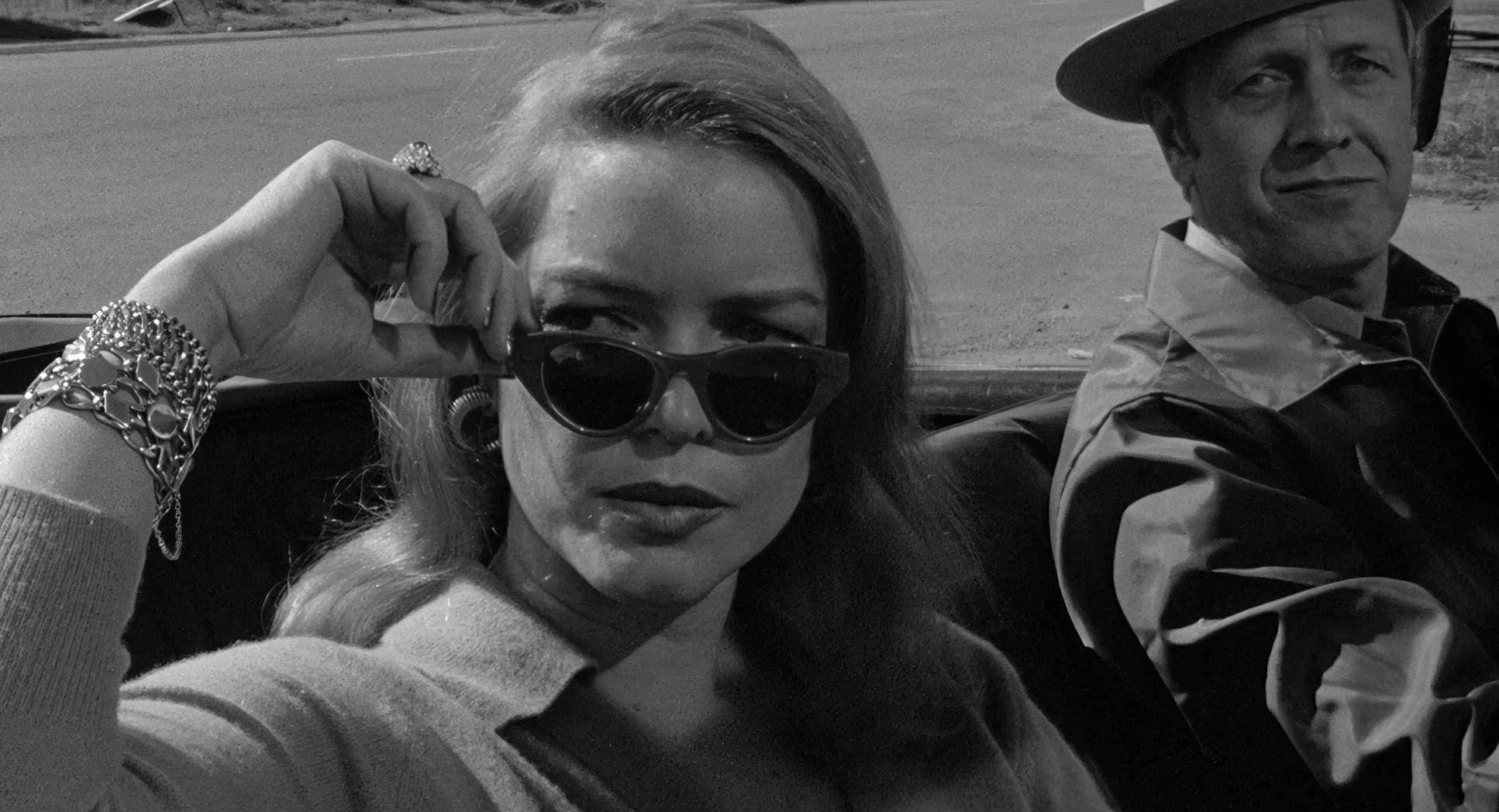
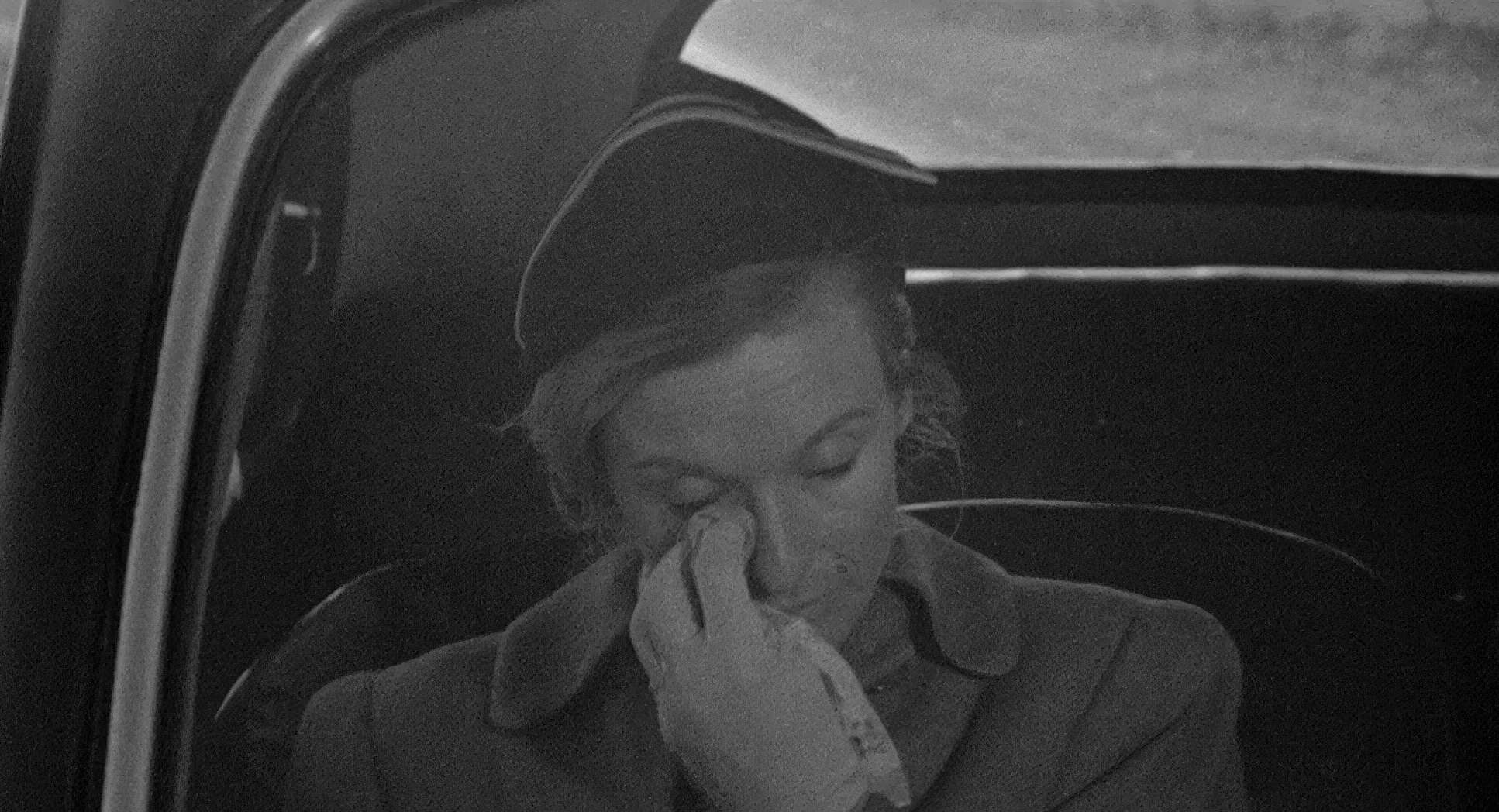
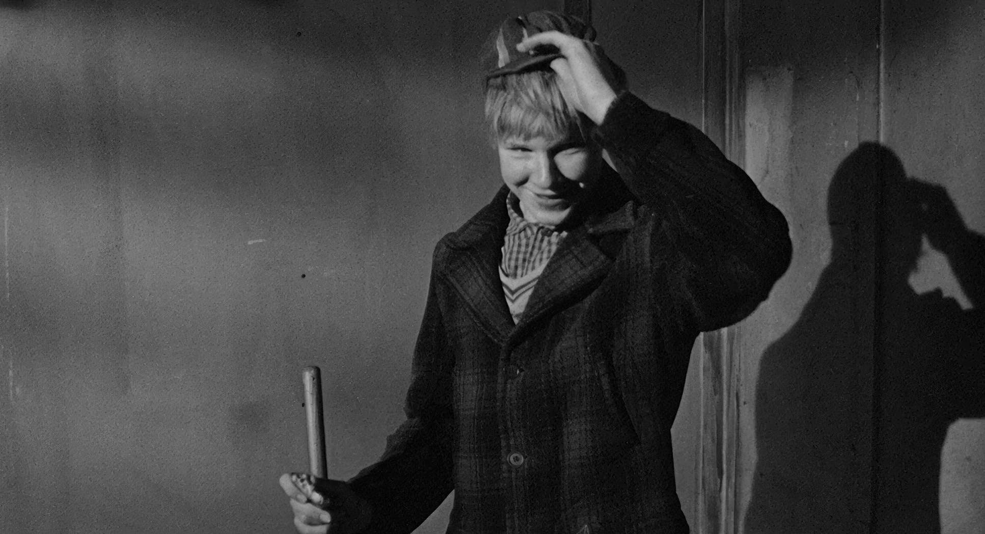
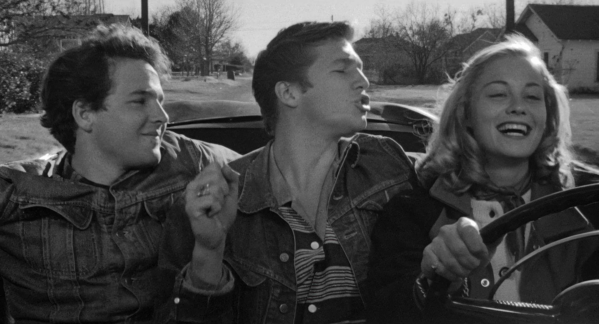
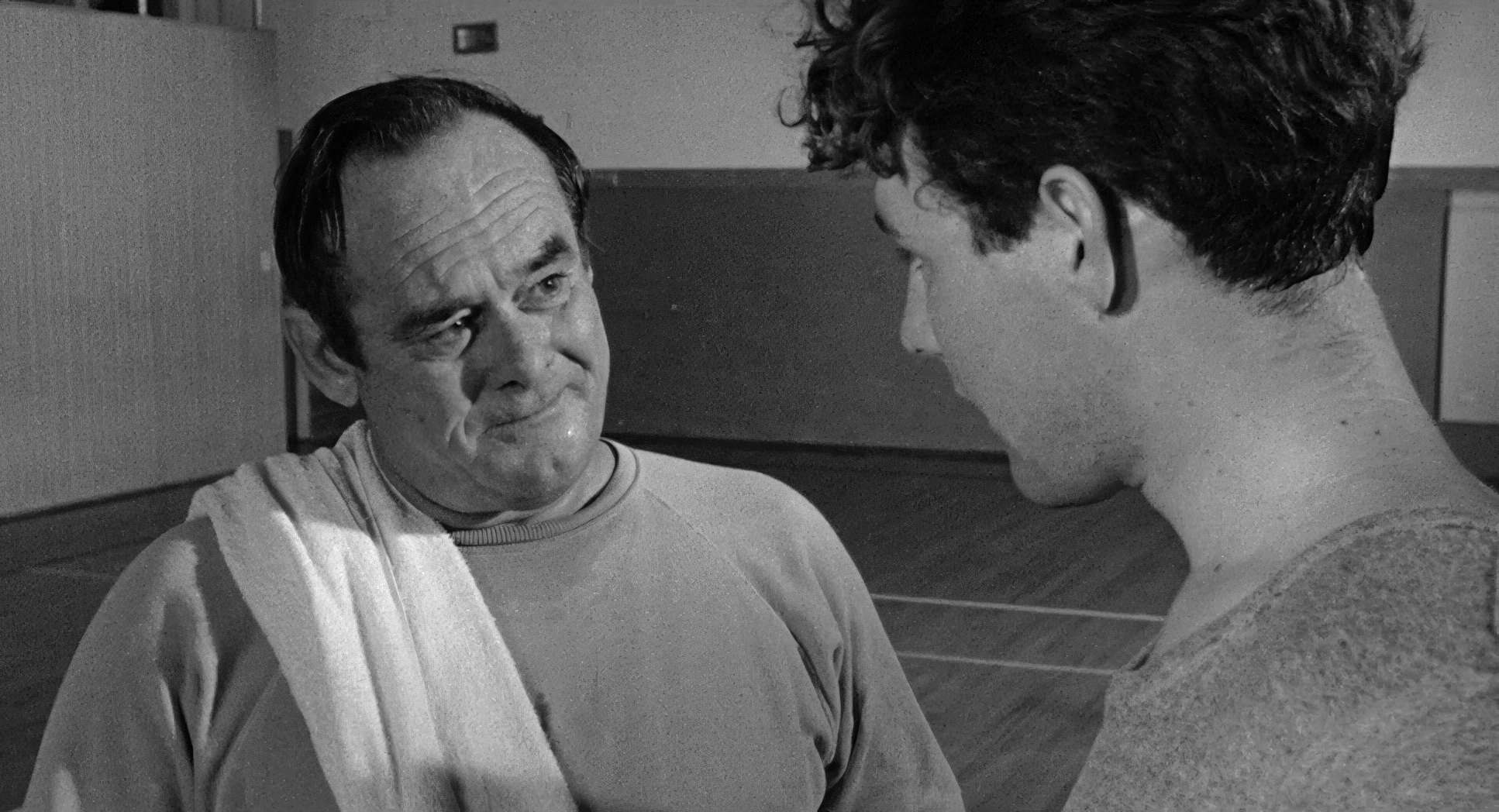
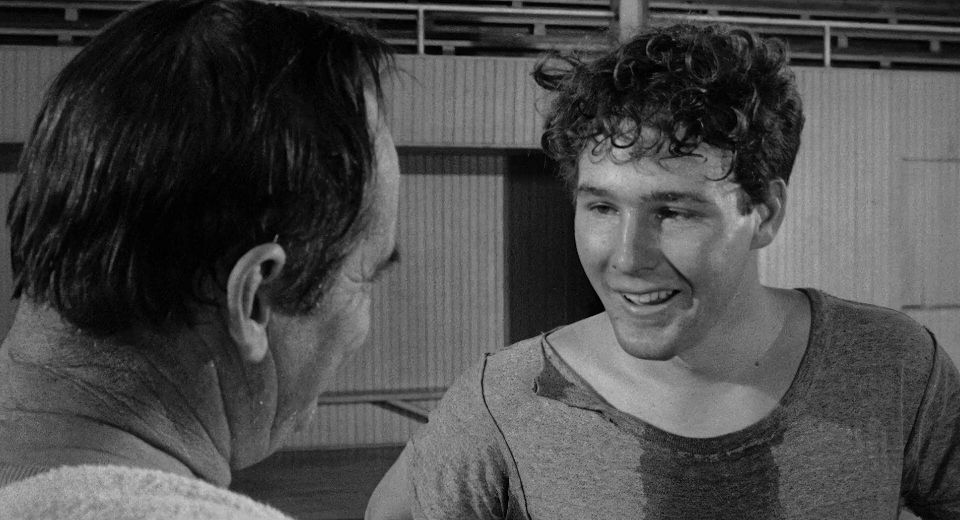
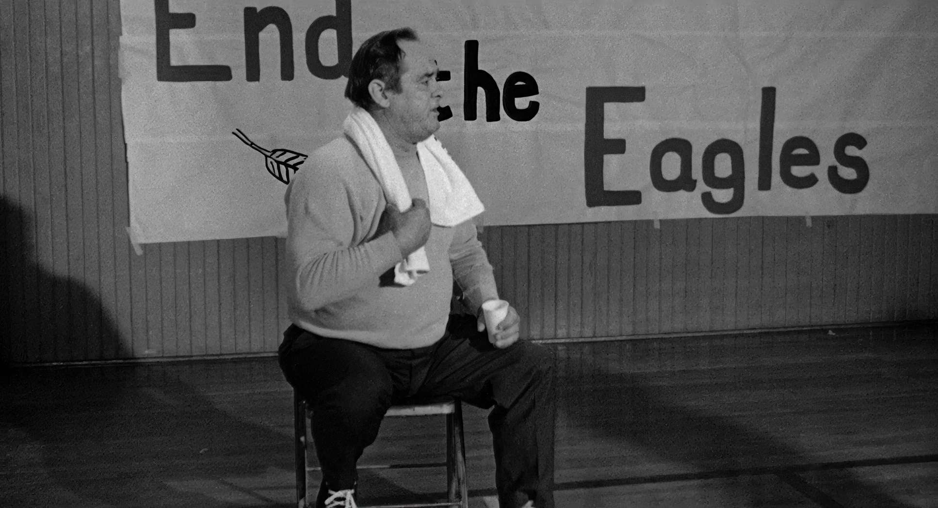
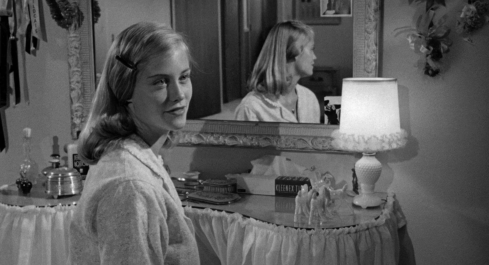
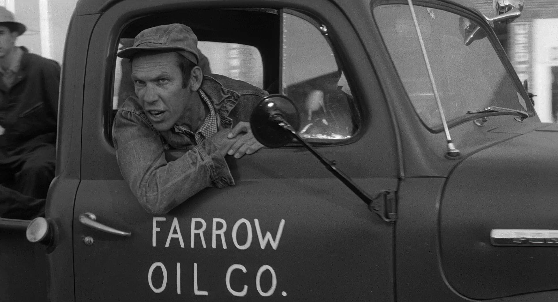
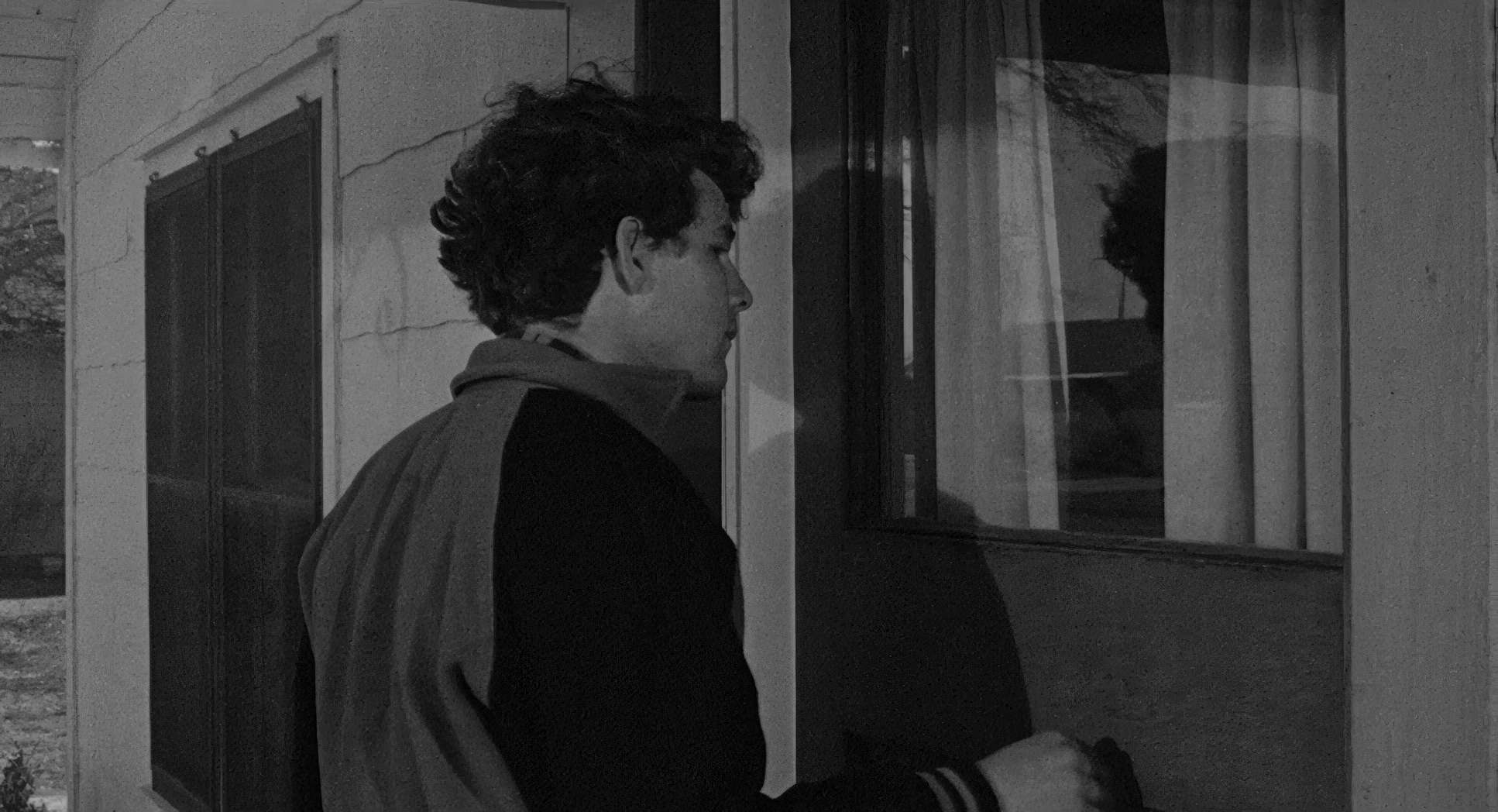
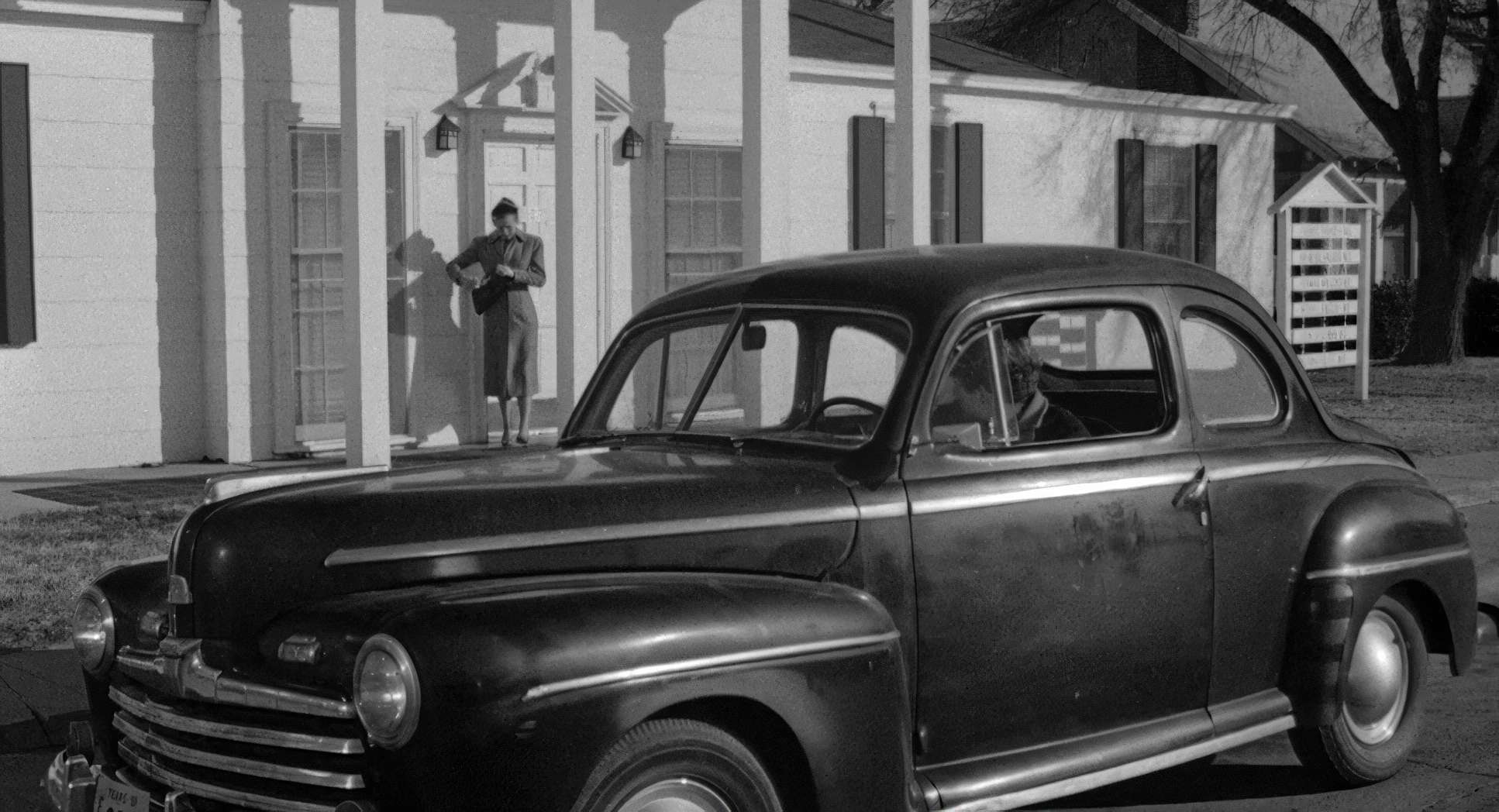
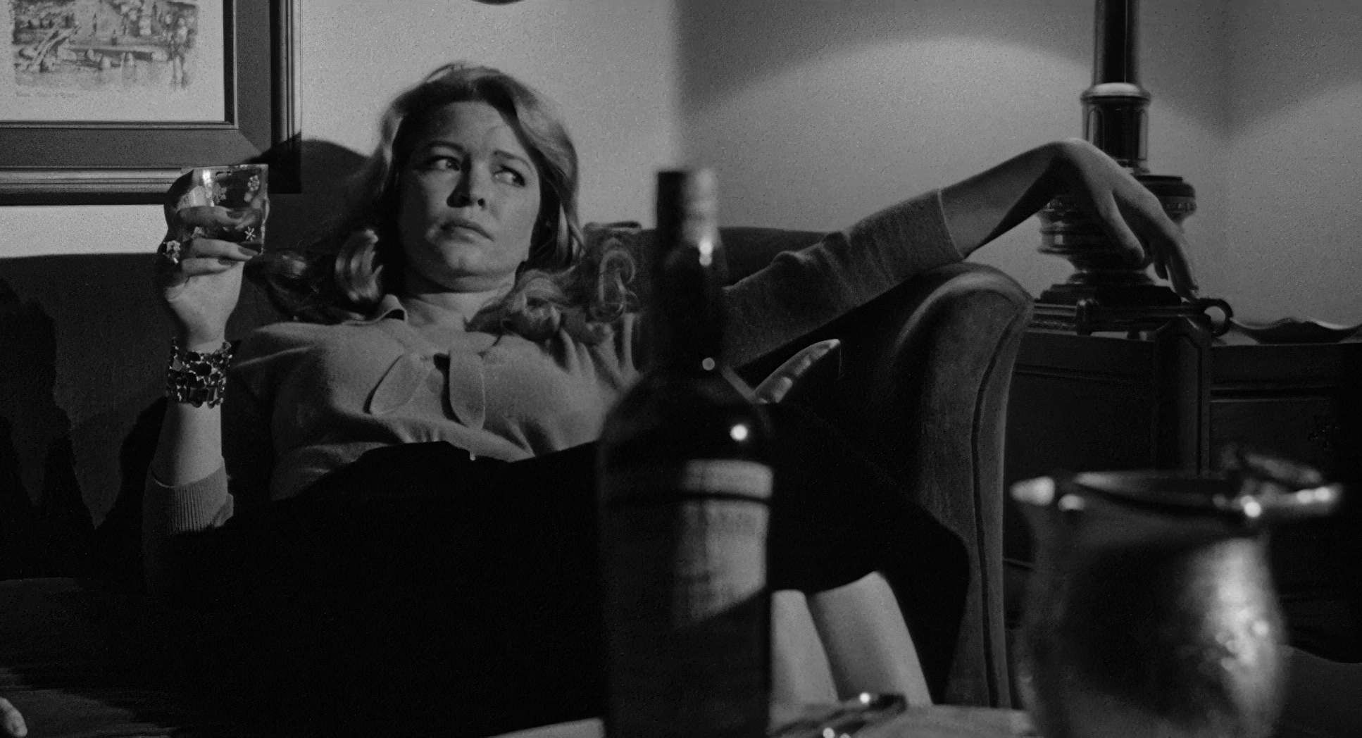
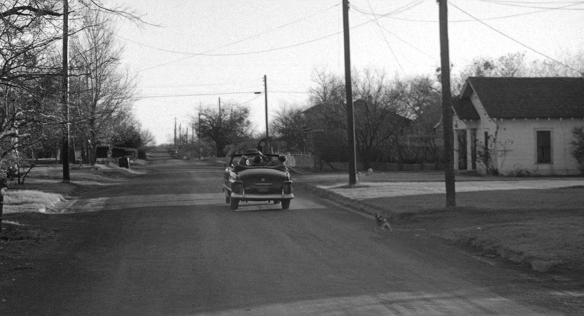
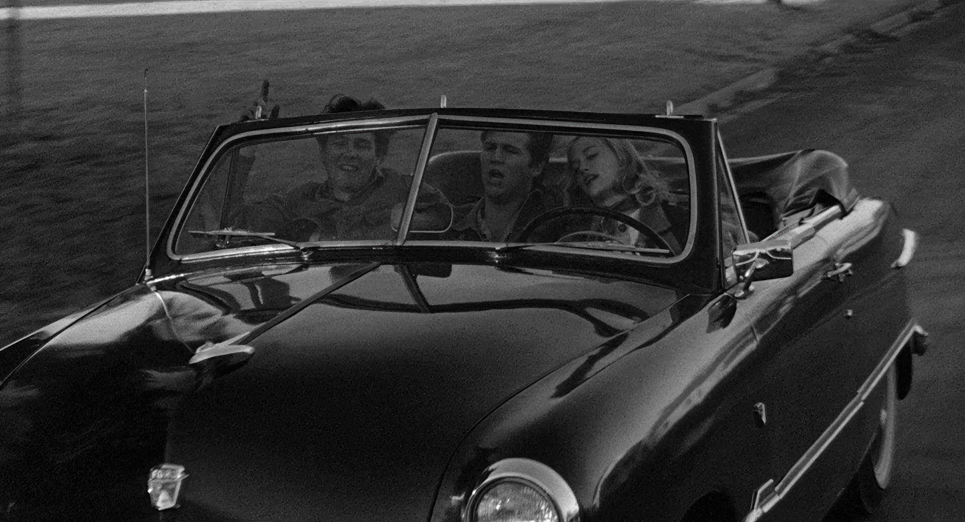
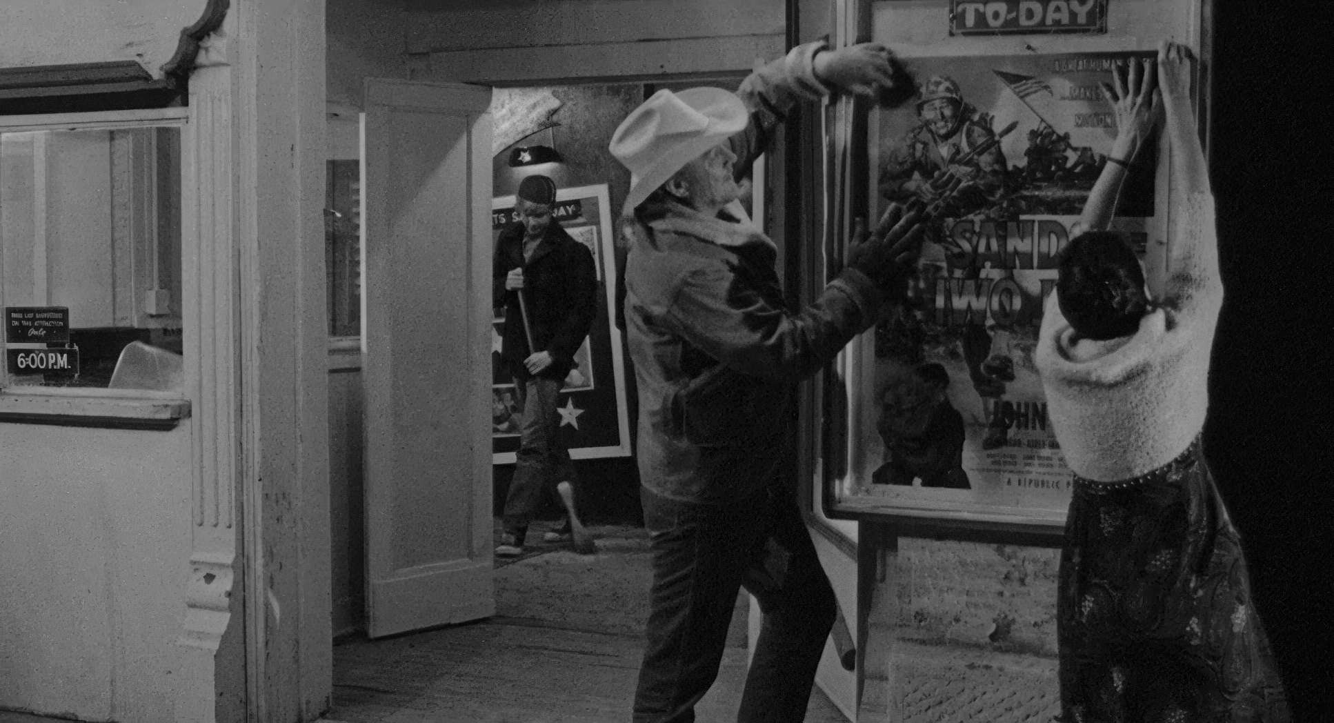
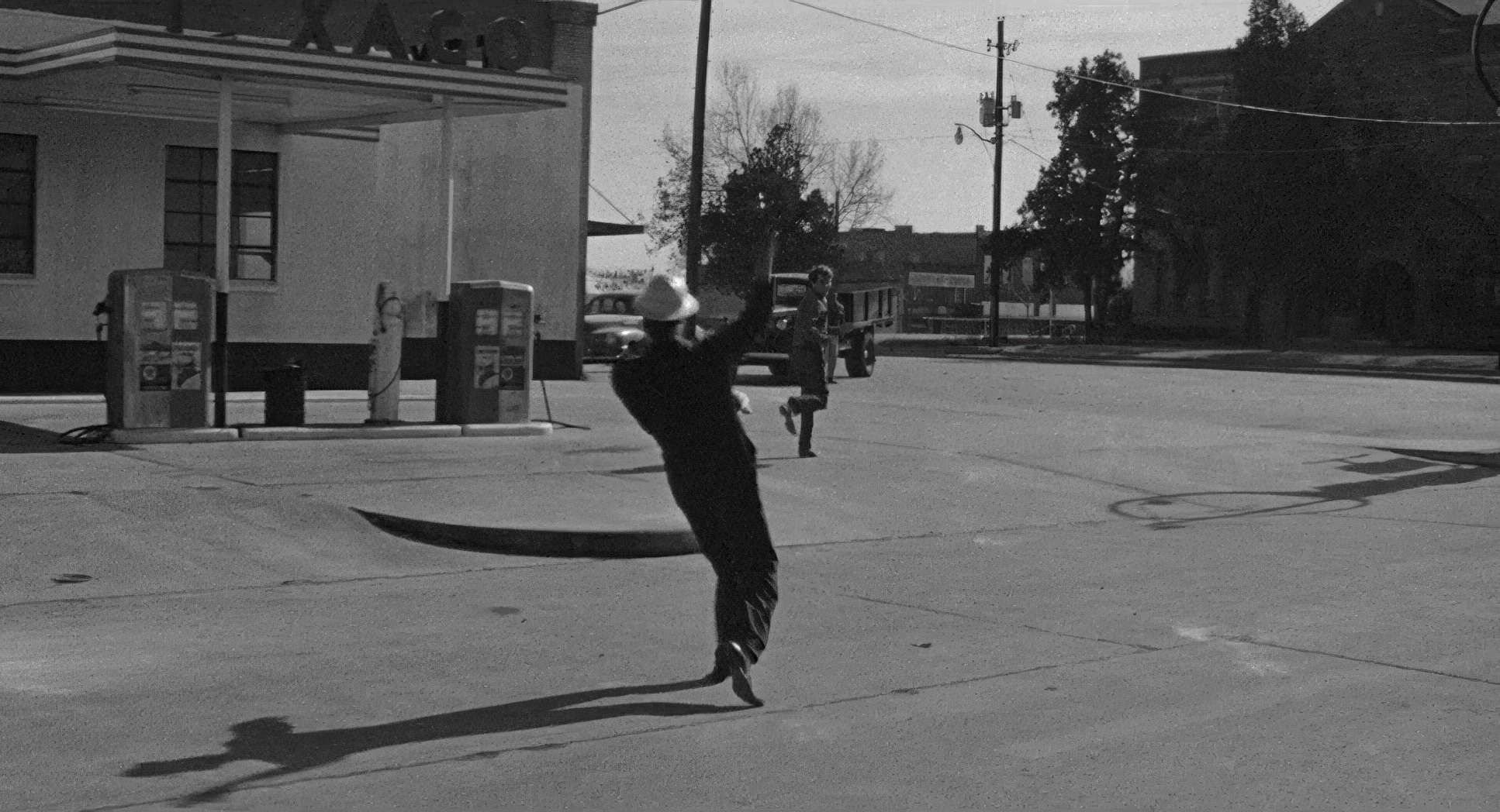
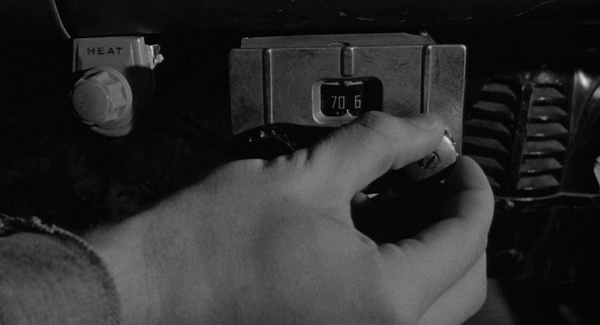
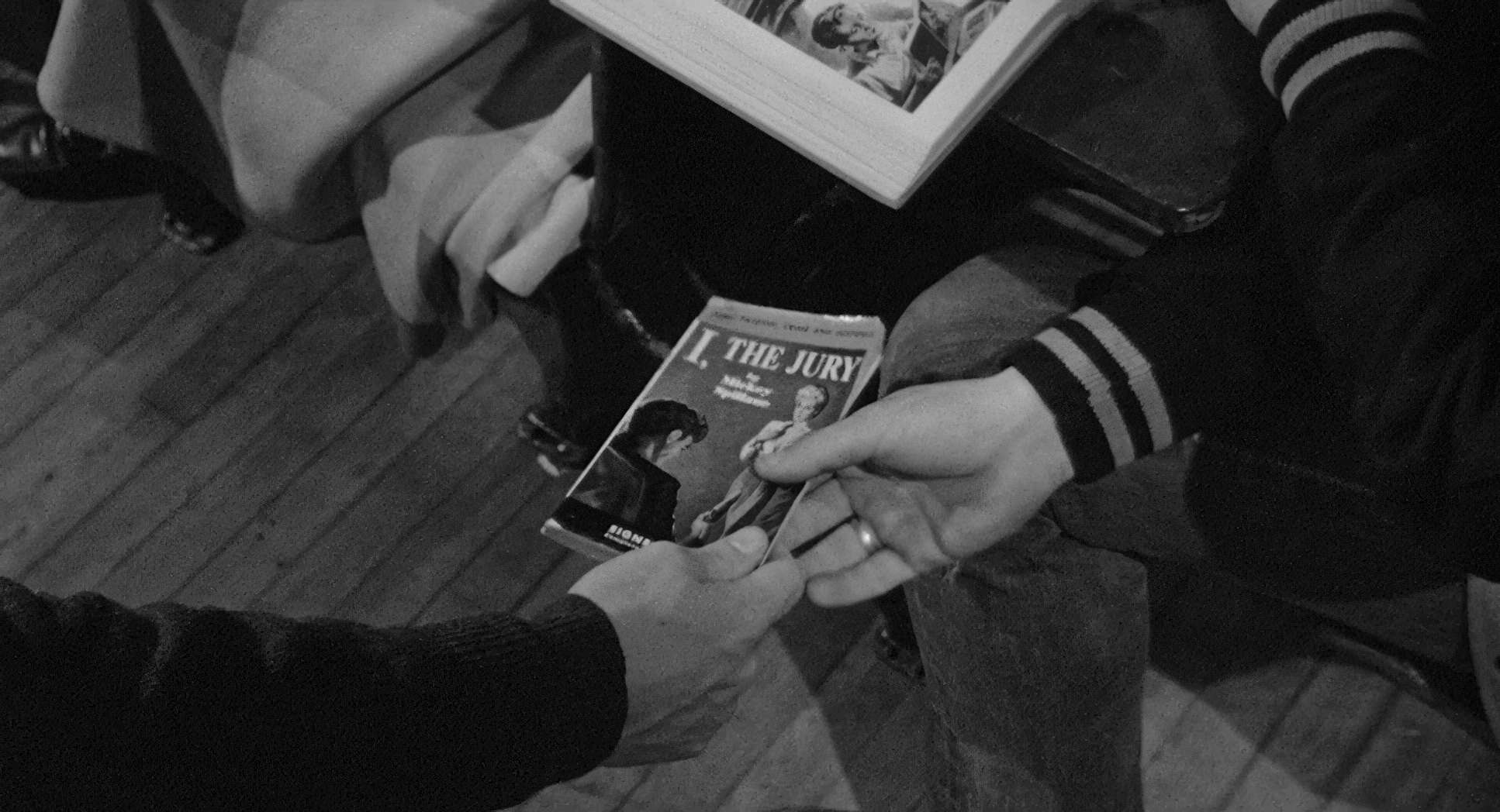
The Last Picture Show (1971) Film Stills
A curated reference archive of cinematography stills from The Last Picture Show (1971). Study the lighting, color grading, and composition.


- Also read: NIGHTS OF CABIRIA (1957) – CINEMATOGRAPHY ANALYSIS
- Also read: PAPER MOON (1973) – CINEMATOGRAPHY ANALYSIS
Browse Our Cinematography Analysis Glossary
Explore directors, cinematographers, cameras, lenses, lighting styles, genres, and the visual techniques that shape iconic films.
Explore Glossary →