Usually, when I dissect a film, I’m looking for the flashy stuff. But Tom Hooper’s The King’s Speech (2010) is different. On paper, it’s a standard period drama about a stammering royal. But visually? It’s a clinic on how to make an audience feel physically uncomfortable.
When I revisited this film recently, I wasn’t just watching a story about a speech impediment; I was watching a camera system designed to suffocate the protagonist. It’s rare to see a “prestige” drama take such weird, specific risks with framing. It doesn’t just show you Bertie’s fear it forces you to sit in it.
About the Cinematographer
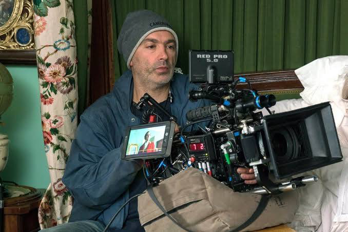
The look comes from Danny Cohen BSC, a DP who knows exactly how to walk the line between “classical” and “modern.” Cohen is a frequent collaborator with Hooper (they did Les Misérables and The Danish Girl together), and he has this specific talent for making historical settings feel urgent rather than dusty.
What I respect about Cohen here is his restraint. He could have shot this like a typical BBC drama pretty, safe, perfectly lit. Instead, he pushed the aesthetic to be slightly off-kilter. He serves the story, sure, but he does it by breaking a few traditional rules of filmmaking, giving the movie a distinct visual signature that feels grand but also intensely claustrophobic.
Inspiration Behind the Cinematography
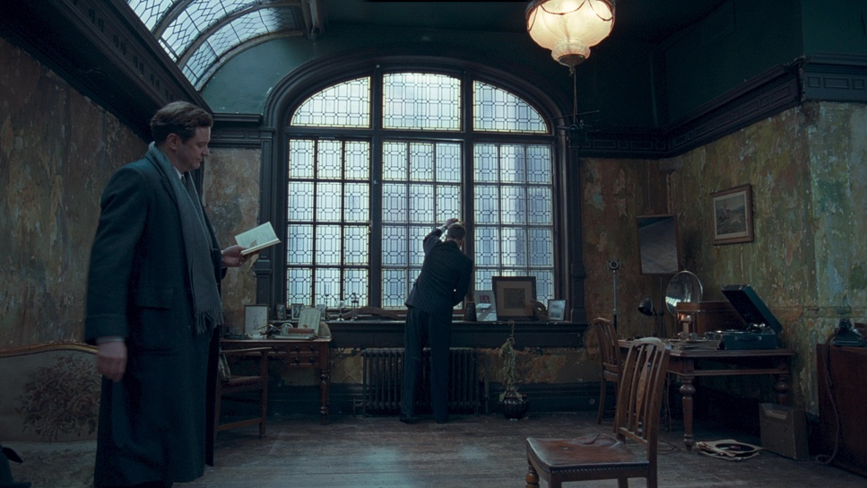
The entire visual strategy is built around one thing: the stammer. The cinematography isn’t just capturing the action; it’s mimicking Bertie’s psychological state.
I remember reading that early reviews called the direction “less naturalistic” than Hooper’s other work. They were right. The film moves away from realism because Bertie’s reality is distorted by anxiety. The camera acts like a psychological lens. Imagine every time you speak, you feel like you’re under a microscope. Cohen translates that feeling by turning the environment into an antagonist. The microphone isn’t just a prop; visually, it’s framed like a weapon. The goal was clearly to externalize that internal prison, making the audience feel the pressure of the silence before the words come out.
Camera Movements
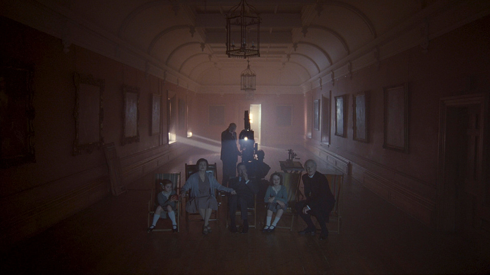
In a movie about a guy who can’t speak, the camera creates tension by refusing to move.
For Bertie, the world is rigid. Cohen mirrors this with a lot of locked-off, static shots. The panning is slow, almost surgical. It feels judgmental. When Bertie is in the palace or performing duties, the camera is formal and stiff. It creates a sense of entrapment, even in those massive rooms.
But then look at the scenes with Logue. The camera loosens up. We get a bit of handheld movement, a little more breath in the frame. It’s a subtle shift, but it signals to the viewer that this is a safe space. As Bertie finds his voice, the camera stops gripping him so tightly. It’s a visual progression from that “rusty gate” stiffness to something fluid.
Compositional Choices
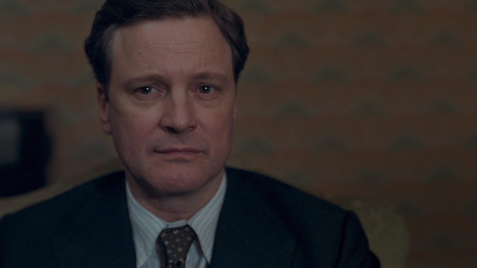
This is where the film takes its biggest risks. If you freeze-frame random shots, you’ll notice Cohen constantly ignores the rule of thirds.
Instead, he “short-sights” the characters. He shoves Bertie to the extreme edge of the frame, leaving a massive amount of dead space (negative space) behind or beside him. Psychologically, this is brilliant. It makes Bertie look small. It makes the room look like it’s swallowing him whole.
That empty space hanging over his head represents the weight of the crown and his own inadequacy. It creates immediate visual tension. As a viewer, you want to “fix” the framing, to center him, but you can’t. It’s a visual stammer awkward, off-balance, and refusing to resolve until the very end. It keeps a period piece from feeling tedious because your eye is constantly working to make sense of the composition.
Lighting Style
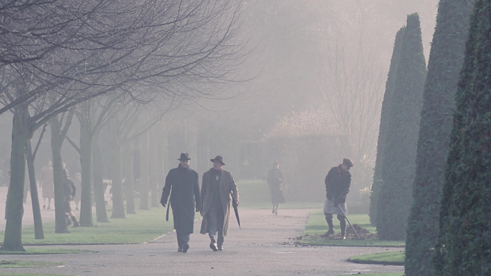
Lighting a period piece is tricky; you want it to look natural (candles, window light) but you need enough shape to sell the drama. Cohen nails the motivation here.
In the royal residences, the light is cool and unforgiving. It feels like a mix of heavy overcast daylight and grand, distant chandeliers. The contrast creates silhouettes, carving Bertie out against these dark, imposing backgrounds. It feels cold.
Then you cut to Logue’s office. The lighting temperature shifts completely. It’s warmer, softer, likely lit with more practical sources and side-lighting that wraps around the face rather than flattening it. It feels intimate. As a colorist, I love looking at the contrast ratios here the shadows in the palace are crushed and heavy, while the shadows in Logue’s office have more detail and breath. It tells you everything you need to know about the emotional safety of the two environments.
Lensing and Blocking
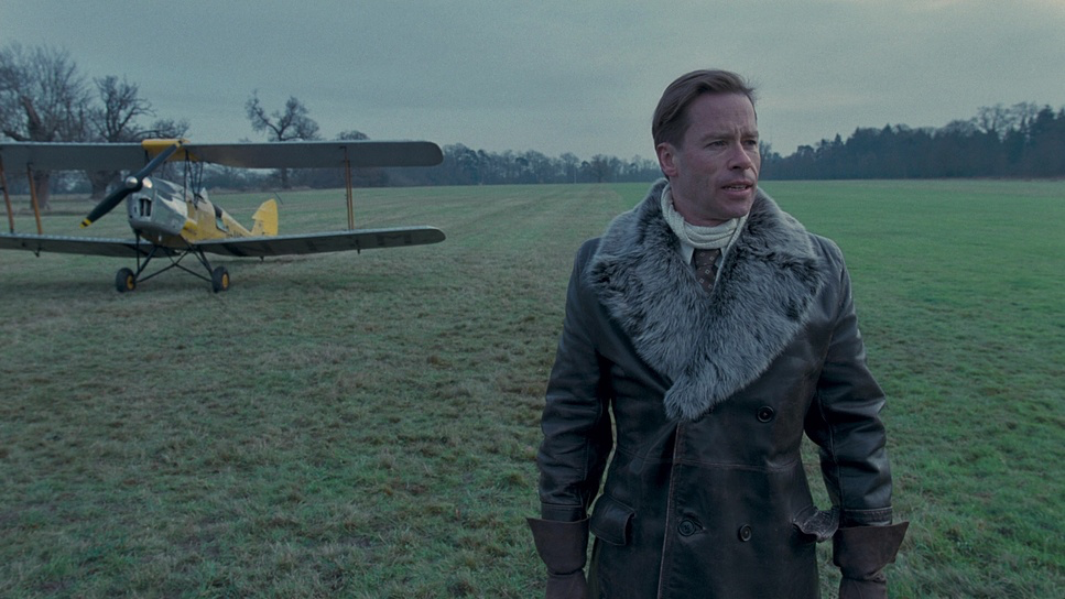
Cohen and Hooper made a bold choice to shoot interiors with wider lenses than you’d typically expect for a character drama.
Usually, wide lenses open a space up. But here, they use them to distort the perspective just enough to make the walls loom over the actors. When you put a wide lens in a small room and frame tight, the background seems to wrap around the subject. It physically boxes Bertie in.
The blocking emphasizes this isolation. Bertie is rarely standing comfortably in the middle of a room. He’s in corners, or dwarfed by furniture. Compare that to Logue, who moves dynamically, even sitting on the coronation throne at one point. That shot captured wide to show the scale of the Abbey is a perfect visual summary of their relationship: Logue comfortable in his skin, breaking protocol, while Bertie is stiff and paralyzed by the sheer size of the space.
Color Grading Approach
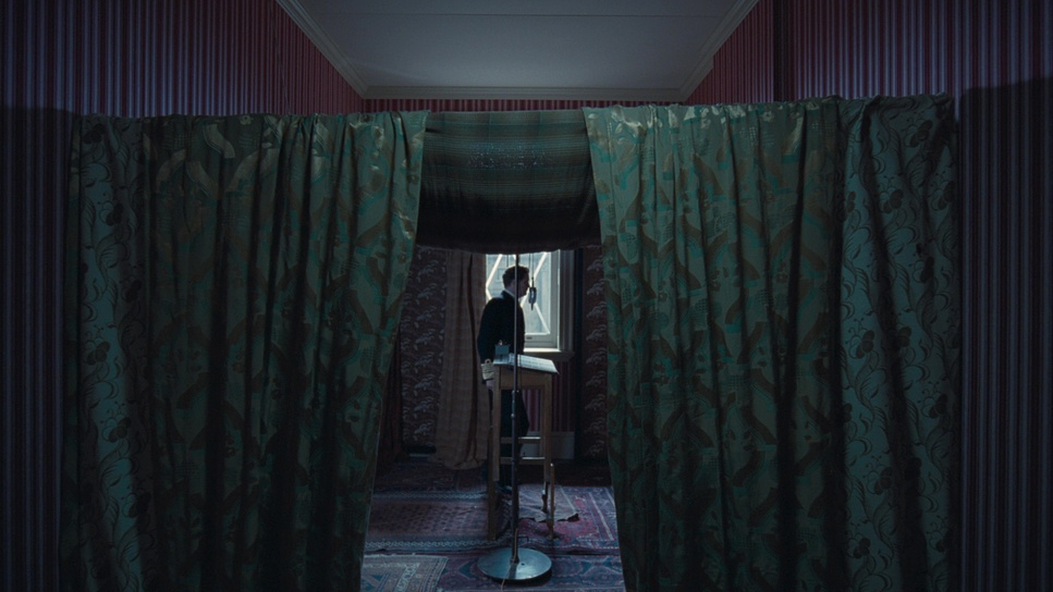
This is my favorite part. The grade on The King’s Speech is a masterclass in density.
The palette is distinctly 1930s desaturated, but not dead. It has that “print film” density where the colors feel thick and weighted. The shadows lean into a cool, almost metallic teal, while the highlights hold a subtle, creamy warmth. It’s not the teal-and-orange blockbuster look; it’s more refined, like an old photograph that’s faded just right.
Specific elements are allowed to pop the deep red of a velvet carpet or the gold on a uniform but they are restrained. They don’t scream; they exist within the texture of the world. The separation comes from luminance and hue contrast rather than saturation.
The highlight roll-off is what really sells the period feel. In digital grading, we fight hard to stop highlights from clipping harshly. Here, the whites roll off into a soft, milky haze. It avoids that sharp “video” look and keeps the image feeling organic and historical. It’s a grade that respects the shadows, letting them be heavy and slightly gritty, which fits the mood perfectly.
Technical Aspects & Tools
The King’s Speech (2010) — Technical Specifications
| Genre | Drama, History, Biopic, Marriage |
|---|---|
| Director | Tom Hooper |
| Cinematographer | Danny Cohen |
| Production Designer | Eve Stewart |
| Costume Designer | Jenny Beavan |
| Editor | Tariq Anwar |
| Colorist | Gareth Spensley |
| Time Period | 1930s |
| Color | Cool, White |
| Aspect Ratio | 1.78 – Spherical |
| Format | Film – 35mm |
| Lighting | Hard light, High contrast, Silhouette, Backlight |
| Lighting Type | Daylight, Overcast |
| Story Location | England > London |
| Filming Location | London > Regent’s Park, Avenue Garden |
| Camera | Arricam LT |
| Lens | Zeiss Master Primes |
| Film Stock / Resolution | 8522/8622 F-64D, 8543/8643 Vivid 160T, 8547/8647 Vivid 500T |
While the film feels timeless, the tech specs matter. This was shot on 35mm film using ARRICAM LT cameras, and you can feel it. They used stocks like the Kodak Vision3 500T (5219/8547) for those darker interiors, which gives us that beautiful, natural grain structure.
That choice of photochemical capture is why the dynamic range looks so good. Film handles those bright windows in the palace and the dark corners of the study better than the digital sensors of 2010 ever could.
The Digital Intermediate (DI) process was likely focused on maintaining that filmic texture while refining the palette. Hooper might come from TV, but this doesn’t look like TV. It looks cinematic because they leaned into the format using the grain, the halation, and the chemical color response of the stock to do the heavy lifting.
- Also read: GROUNDHOG DAY (1993) – CINEMATOGRAPHY ANALYSIS
- Also read: CASINO ROYALE (2006) – CINEMATOGRAPHY ANALYSIS
Browse Our Cinematography Analysis Glossary
Explore directors, cinematographers, cameras, lenses, lighting styles, genres, and the visual techniques that shape iconic films.
Explore Glossary →