It’s easy to overlook The Killing in favor of Kubrick’s later, more symmetrical epics, but The Killing is where he truly found his visual legs. It’s a lean, mean heist film that functions with the precision of a ticking bomb. For me, it isn’t just a classic noir; it’s a definitive guide on how to tell a story through light and shadow, even when you don’t have a single drop of color to work with.
About the Cinematographer
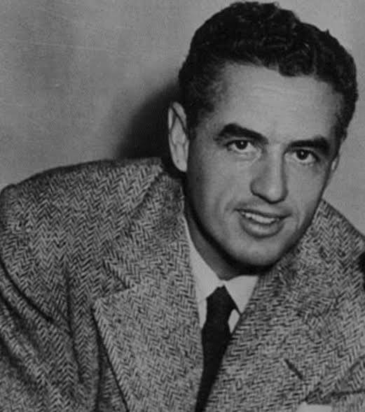
We can’t talk about this film without talking about Lucien Ballard. By the time he stepped onto the set of The Killing, Ballard was a seasoned veteran who had been shooting since the 1930s. Kubrick, on the other hand, was the “new kid” on his third feature.
There’s a specific grit to this film that I attribute to Ballard’s “newsreel” sensibility. He brought a journalistic immediacy that grounded Kubrick’s emerging obsession with meticulous planning. It’s the perfect marriage: Ballard understood the deep-focus conventions of noir, and Kubrick knew how to push those conventions to support his directorial vision. You can see the growth here this is the moment Kubrick “hit his stride,” and he did it by leaning on Ballard’s professional hand to execute a look that feels both observational and deeply expressive.
Lighting Style
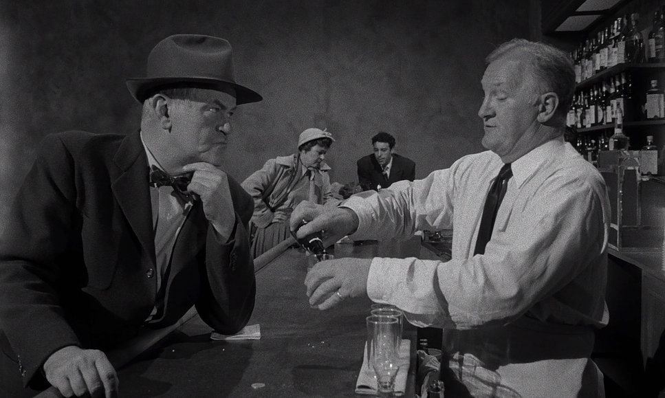
The lighting in The Killing is textbook film noir, but it’s executed with a sharpness that feels incredibly modern. We’re talking about a high-contrast world sculpted by hard light and “inky” blacks.
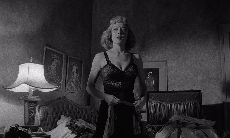
As a colorist, I’m always looking at the “motivation” of the light. Here, every street lamp and practical lamp feels real, but they are manipulated to hide secrets or reveal character anxieties. Think of Johnny Clay in the locker room or the airport terminal at the end; those scenes aren’t just dark they’re strategically shadowed to isolate him. The “beautifully rich” grayscale here is key. It’s not just black and white; it’s the thousands of tones in between that give the film its texture.
Color Grading Approach
People often ask why a colorist cares about a monochromatic film. My answer is always the same: Because B&W is the purest form of tonal sculpting.
When I look at the recent Kino Lorber 4K UHD release, I’m looking at how they handled the “grade” for modern HDR displays. The 4K scan from the original negative is a revelation. It offers incredible tonal separation, meaning the different shades of gray don’t just bleed together they have depth.
- Highlight Roll-off: The whites are bright and punchy, but they never look “blown out.” You can still see the texture in a white shirt or the glint off a racetrack window.
- Shadow Detail: The blacks are deep and “true,” but they aren’t “crushed.” You can still see what’s lurking in the corners of the frame. For a colorist, this is the gold standard. It’s about mapping luminance values so perfectly that the image feels “razor sharp” without ever looking artificial.
Lensing and Blocking
Kubrick’s control over blocking is where you can see the “future master” at work. He already had a total grip on how to position actors to tell a story. While we don’t have the exact lens data, the image quality suggests high-end glass that resolved every pore and bead of sweat on the actors’ faces.
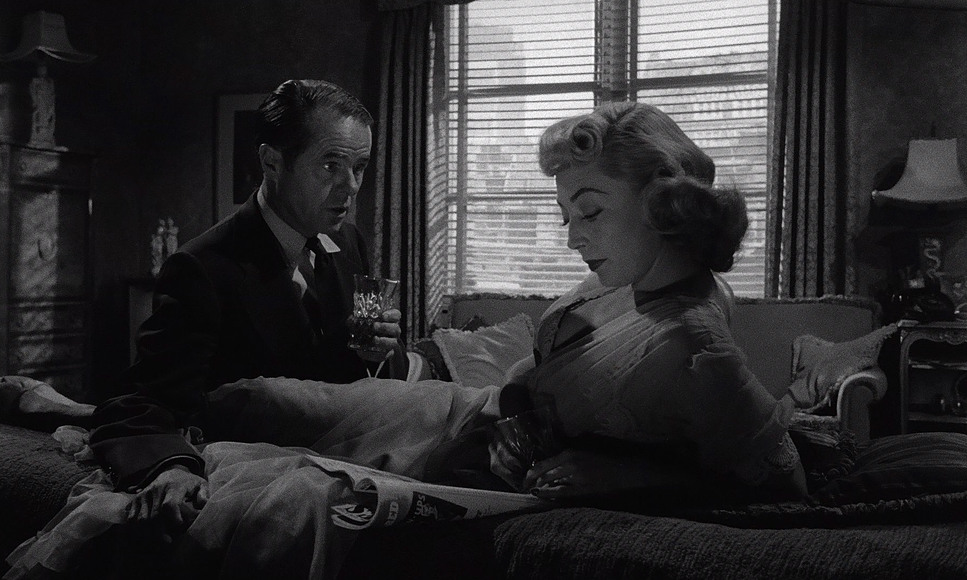
The blocking does the heavy lifting for the dialogue. Take the scenes with Marie Windsor; she’s often positioned higher in the frame or standing while others sit, visually dominating the space before she even says a word. Kubrick uses the lens to trap his characters, ensuring that their physical proximity or lack thereof articulates the power dynamics of the heist.
Compositional Choices
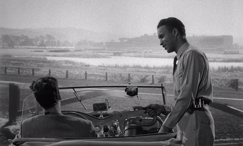
Composition in The Killing is where the “chess player” in Kubrick really comes out. He uses the 1.66:1 aspect ratio a slightly taller widescreen format to create frames that feel incredibly claustrophobic.
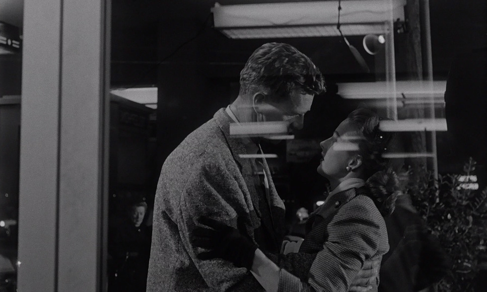
He loves deep focus. He’ll keep the foreground, mid-ground, and background all sharp at once, which mimics the complexity of the heist itself. It forces the viewer to process a lot of information at once, just like the characters are trying to do. Whether it’s framing a character through a doorway or using leading lines in an alley, every shot feels like a “box” that the characters are trying and failing to escape.
Camera Movements
The camera movement here isn’t “flashy” it’s purposeful. We don’t see the elaborate Steadicam work of his later years, but we get something just as effective: controlled dynamism.
Most of the film is shot from a static, observational perspective, reflecting the calculated nature of the plan. But when the camera moves, it’s chilling. Those slow tracking shots don’t just follow the characters; they feel like an unseen hand guiding them toward their fate. During the heist, the camera glides along with Johnny, putting us right in his perspective as the trap begins to close.
Inspiration Behind the Cinematography
The visual heart of this film is the struggle for control. Kubrick treats the narrative like a grand gambit where every move is calculated but vulnerable to “the monster” of coincidence.
The cinematography reinforces this. Characters are often framed like pawns on a board. Johnny Clay wants a “perfect” life, but the visual language constantly places him in constrained environments that suggest he was never actually in charge. The idea that “society, fate, and coincidence conspire against him” isn’t just a plot point it’s baked into the very way the film is shot.
Technical Aspects & Tools
The Killing (1956) | Technical Specifications
| Genre | Crime, Drama, Thriller, Action |
| Director | Stanley Kubrick |
| Cinematographer | Lucien Ballard |
| Production Designer | Ruth Sobotka |
| Editor | Betty Steinberg |
| Time Period | 1950s |
| Color | Desaturated, Black and White |
| Aspect Ratio | 1.66 – Spherical |
| Format | Film – 35mm |
| Lighting | Hard light |
| Lighting Type | Artificial light, Tungsten |
| Story Location | California > Los Angeles |
| Filming Location | California > Los Angeles |
| Camera | Mitchell BNCR |
Shooting on 35mm with Mitchell BNCR cameras, Ballard and Kubrick stayed within the robust tools of the 1950s studio system. But what they did with those tools was “rather impressive.”
The modern 4K restoration respects the original film grain, keeping it “light to medium” and very cinematic. It hasn’t been scrubbed clean by heavy-handed digital noise reduction, which is a relief for those of us who value organic texture. Even the DTS mono mix is solid it’s not a modern surround-sound experience, but it’s clean and consistent, preserving that mid-century theatrical feel.
- Also read: THE NIGHT OF THE HUNTER (1955) – CINEMATOGRAPHY ANALYSIS
- Also read: SING STREET (2016) – CINEMATOGRAPHY ANALYSIS
Browse Our Cinematography Analysis Glossary
Explore directors, cinematographers, cameras, lenses, lighting styles, genres, and the visual techniques that shape iconic films.
Explore Glossary →