Alexander Payne’s The Holdovers (2023) is a rare case where the technical craft is so intentional that it becomes a character itself. One YouTube reviewer nailed it when they said, “you don’t want to leave it. You want to bask in it.” That feeling isn’t an accident it’s the result of some very ballsy choices in cinematography and post-production.
Inspiration Behind the Cinematography
The primary goal here wasn’t just to make an “old-fashioned” movie. Payne and DP Eigil Bryld were specifically hunting for the DNA of 1970s American cinema. This wasn’t about clicking a “vintage” preset; it was a deep dive into how film stocks and projection artifacts shaped our collective memory of that era.
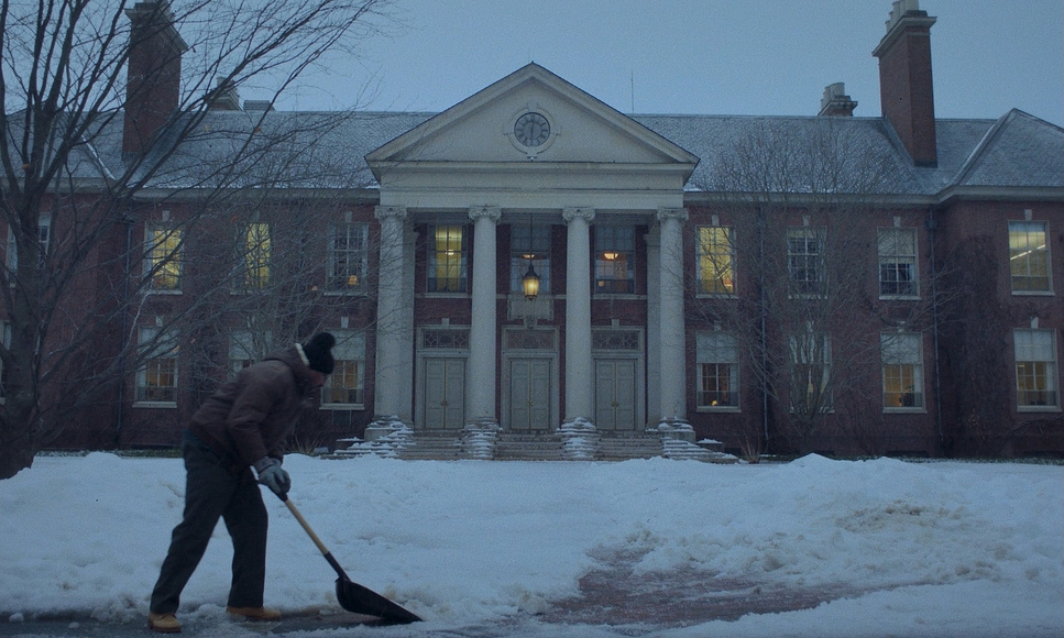
They wanted to put the audience in a “time machine.” To do that, they had to embrace things modern digital cinema usually tries to kill: desaturated earth tones, organic grain, and a heavy, soft highlight roll-off. They understood that the story’s themes loneliness and the friction of forced connection needed that nostalgic warmth to land emotionally. It feels like looking at a family photo from 1971; the “imperfections” are exactly what make it feel real.
Technical Aspects & Tools
| Genre | Comedy, Drama |
| Director | Alexander Payne |
| Cinematographer | Eigil Bryld |
| Production Designer | Ryan Warren Smith |
| Costume Designer | Wendy Chuck |
| Editor | Kevin Tent |
| Colorist | Joe Gawler |
| Time Period | 1970s |
| Color | Cool, Cyan |
| Aspect Ratio | 1.66 – Spherical |
| Format | Digital |
| Lighting | Soft light, Side light |
| Lighting Type | Daylight, Overcast |
| Story Location | Massachusetts, USA |
| Filming Location | Massachusetts, USA |
| Camera | ARRI ALEXA Mini |
| Lens | Panavision H series |
Here’s the part that fascinates me as a pro: The Holdovers looks like it was shot on 35mm, but it was actually captured on the ARRI ALEXA Mini.
Choosing digital for a period piece like this is a strategic move. It gives you the dynamic range and latitude needed to “break” the image in post without it falling apart. The team didn’t just stop at the color; they added “page wipes” (those classic optical transitions) and even simulated gate weave and print noise. It’s an inverse process—instead of cleaning up the image, they spent a massive amount of effort adding artistic “dirt” back in. From the era-accurate Universal logo to the “pops and crackles” in the sound, the technical commitment to the bit is total.
About the Cinematographer

The man behind this look is Danish DP Eigil Bryld. You might know his work from House of Cards, where he won an Emmy, but The Holdovers required a different part of his brain. He wasn’t just lighting a scene; he was reverse-engineering a defunct visual language. For a cinematographer, the challenge of making a clinical digital sensor feel “decidedly analog” is a massive undertaking. Bryld’s ability to capture psychological depth within these restrictive aesthetic parameters is what makes the film feel so intimate.
Lensing and Blocking
To get that 70s texture, you can’t use modern, sharp glass. They paired the Alexa Mini with Panavision H Serieslenses. These are vintage-inspired lenses known for their “glamour” and organic fall-off. When you see those subtle chromatic aberrations and the way the focus gently rolls away, that’s the H Series doing the work.
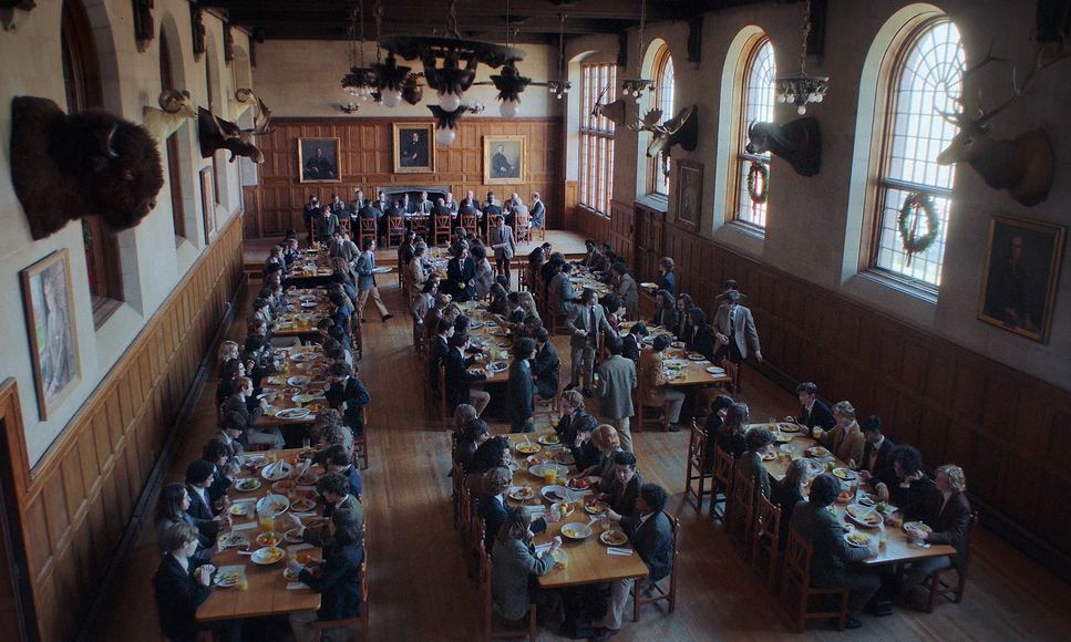
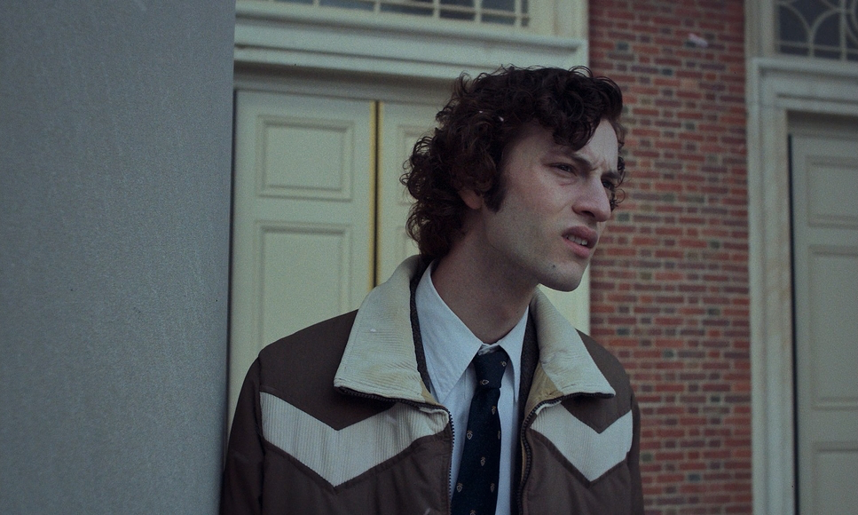
The blocking is just as deliberate. Early on, Paul Giamatti and Dominic Sessa are physically separated—placed on opposite ends of tables or divided by the massive architecture of Barton Academy. As the film progresses, the blocking brings them into the same visual space. It’s a quiet, physical metaphor for their growing bond, and it’s handled with a restraint that you don’t often see in modern “hit-you-over-the-head” filmmaking.
Lighting Style
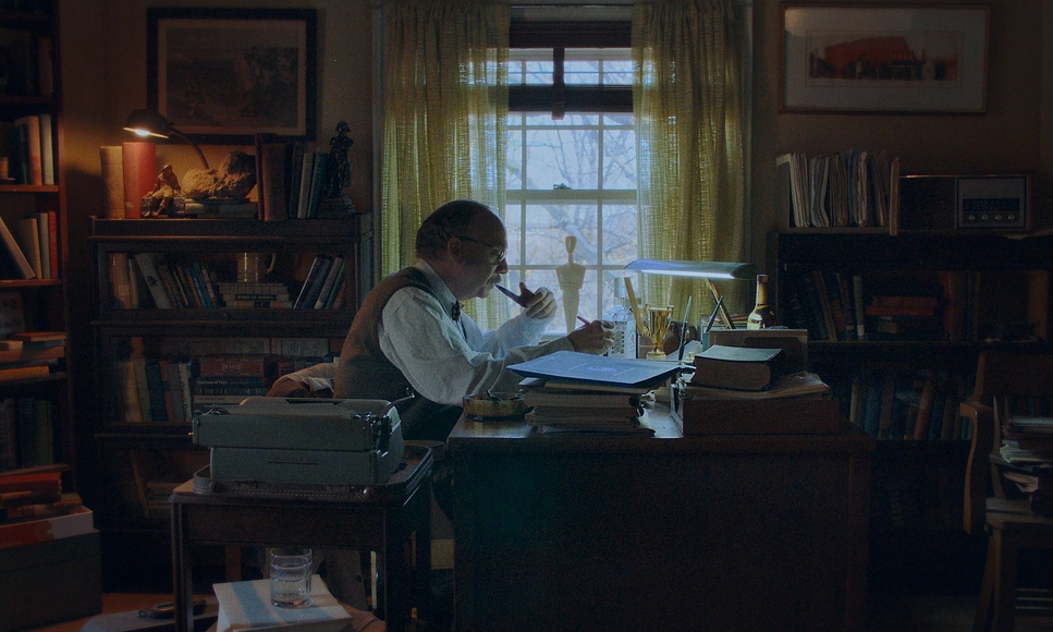
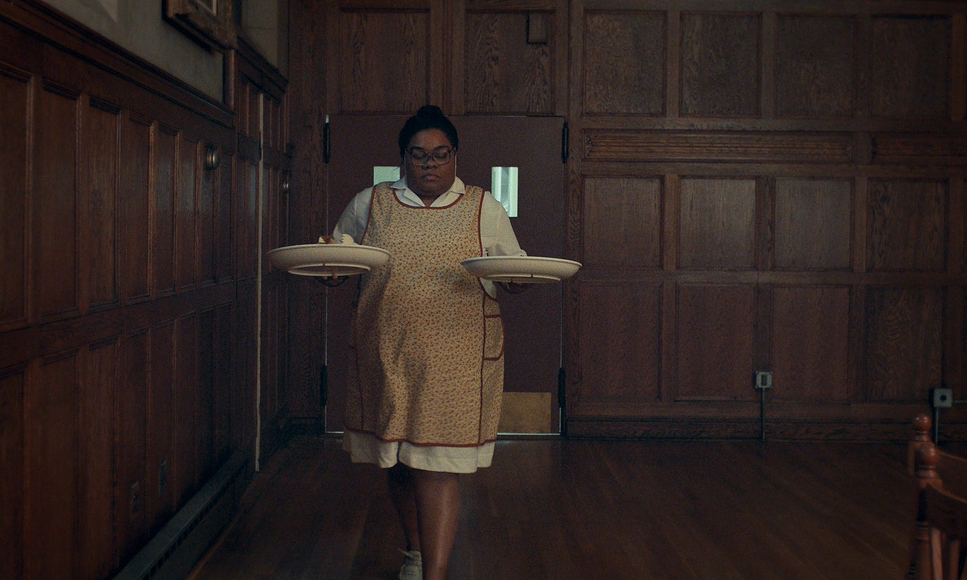
The lighting in The Holdovers is arguably its strongest suit. It’s almost entirely motivated. Bryld uses soft side-lighting that feels like it’s coming purely from a window, a fireplace, or a desk lamp.
The contrast here is beautiful. You have the cold, overcast daylight of a Massachusetts winter bleeding through the windows, clashing with the pools of warm, tungsten-heavy light inside. As a colorist, I love that the shadows aren’t “crushed” to pure black. They retain detail and texture, much like an old film print. That “cozy for the holidays” vibe is achieved by letting those warm wooden walls and practical lamps do the heavy lifting, creating a safe haven against the stark, blue-toned exterior.
Compositional Choices
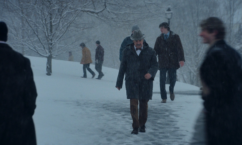
Bryld opted for a 1.66:1 aspect ratio (spherical), which is a classic European and indie standard that feels much more “human” and vertical than the wider 2.39:1 anamorphic looks we see in blockbusters. The compositions are balanced and often use “deep focus,” meaning the backgrounds those isolating, snow-covered campuses are always present.
Initially, the wide shots emphasize how small and alone these characters are in the massive, empty school. But as the relationship deepens, the framing shifts. Two-shots become the norm. The negative space that used to feel “empty” starts to feel like a shared bubble. It’s a masterclass in using the frame to tell a story about isolation versus connection.
Camera Movements
The camera in The Holdovers is a patient observer. You won’t find rapid-fire cuts or shaky handheld work here. Instead, you get slow, deliberate pans and tilts. One reviewer mentioned the film “felt the time,” and that’s exactly right.
The camera lingers on environments, allowing the locations to breathe. When it does move, like a slow push-in during a tense dinner conversation, it’s used as a punctuation mark rather than an exclamation point. It shows a level of confidence in the actors and the script the visuals are there to support the performance, not to distract from it.
Color Grading Approach
This is my favorite part. The grade, handled by Joe Gawler, is where the 1970s “anthem” really comes together. This wasn’t a simple LUT. This was a sophisticated emulation of 35mm print-film sensibilities.
As a colorist, I’m looking at how they handled the highlight roll-off. In digital, whites usually just clip and look “dead.” Here, the highlights bloom and transition gracefully, mimicry of how chemical film reacts to light. The palette is a beautiful mix of ambers, forest greens, and muted browns. The skin tones are particularly impressive they have a natural warmth that doesn’t feel “digital” or overly rosy. They added a fine, uniform grain structure that feels like it’s part of the image rather than a layer sitting on top of it. It’s a perfect digital interpretation of film’s magic.
- Also read: THE BLUES BROTHERS (1980) – CINEMATOGRAPHY ANALYSIS
- Also read: CARLITO’S WAY (1993) – CINEMATOGRAPHY ANALYSIS
Browse Our Cinematography Analysis Glossary
Explore directors, cinematographers, cameras, lenses, lighting styles, genres, and the visual techniques that shape iconic films.
Explore Glossary →