Take The Hangover (2009). On the surface, it’s a high-octane raunchy comedy that raked in $469 million and became a cultural staple. But when you strip away the Mike Tyson cameos and the “Wolfpack” quotes, there’s a sophisticated visual strategy at work. It’s a film that captured lightning in a bottle, and a huge part of that success comes down to how the cinematography sold the disorientation and escalating madness of a Vegas night gone wrong. It’s a masterclass in using high-end craft to elevate a genre that usually gets a “point-and-shoot” treatment.
About the Cinematographer
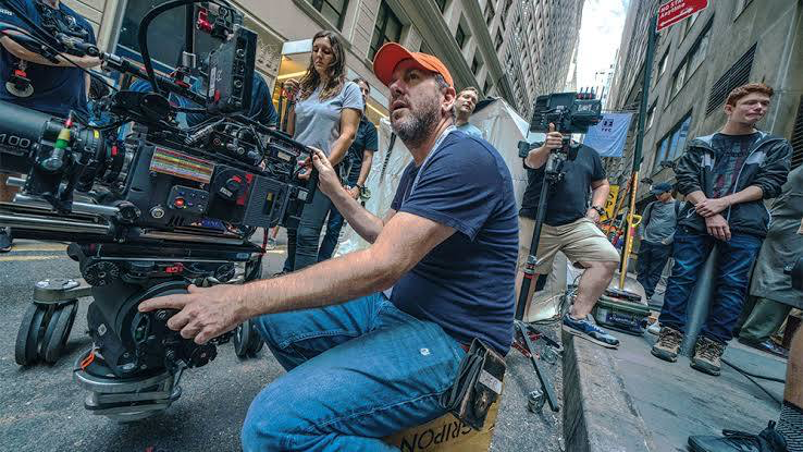
The look of The Hangover was crafted by Lawrence Sher, ASC. If that name sounds familiar, it’s because he’s the same eye behind the gritty, atmospheric world of Joker. Sher is a DP I deeply respect because he doesn’t have a “one size fits all” style. He’s a frequent collaborator with director Todd Phillips, and he understands that comedy shouldn’t look flat or cheap. With The Hangover, Sher had to balance two versions of Las Vegas: the aspirational, neon-soaked playground of a bachelor party and the terrifying, sun-bleached wreckage of the morning after. He uses visual grammar to underscore character dynamics rather than just chasing the next laugh.
Technical Aspects & Tools
In 2009, we were right on the cusp of the digital revolution, but The Hangover stayed true to 35mm film. They used the Panavision Millennium XL2 and ArriCam Studio, paired with Panavision Primo and C-Series lenses.
As a colorist, I love that they went with Kodak Vision 2 500T (5218) stock. Film handles the extreme dynamic range of Vegas the piercing neon lights against deep desert shadows with a natural highlight roll-off that digital struggled with at the time. The choice of Primo primes gave them a clean, sharp image that didn’t distract from the physical comedy, but still retained that organic “movie” texture that makes the film feel grounded and “expensive.”
Color Grading Approach
This is where the movie really lives for me. The grade, handled by Mark Sachen, is doing a massive amount of narrative heavy lifting.
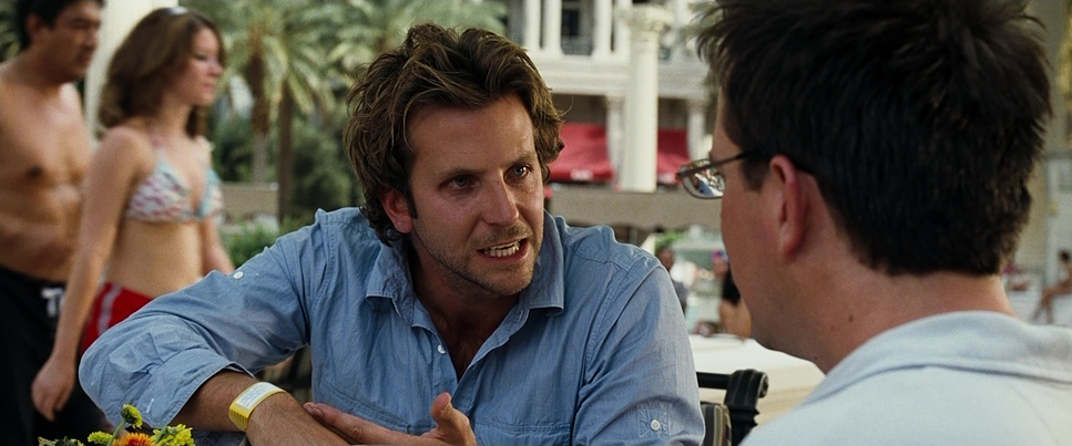
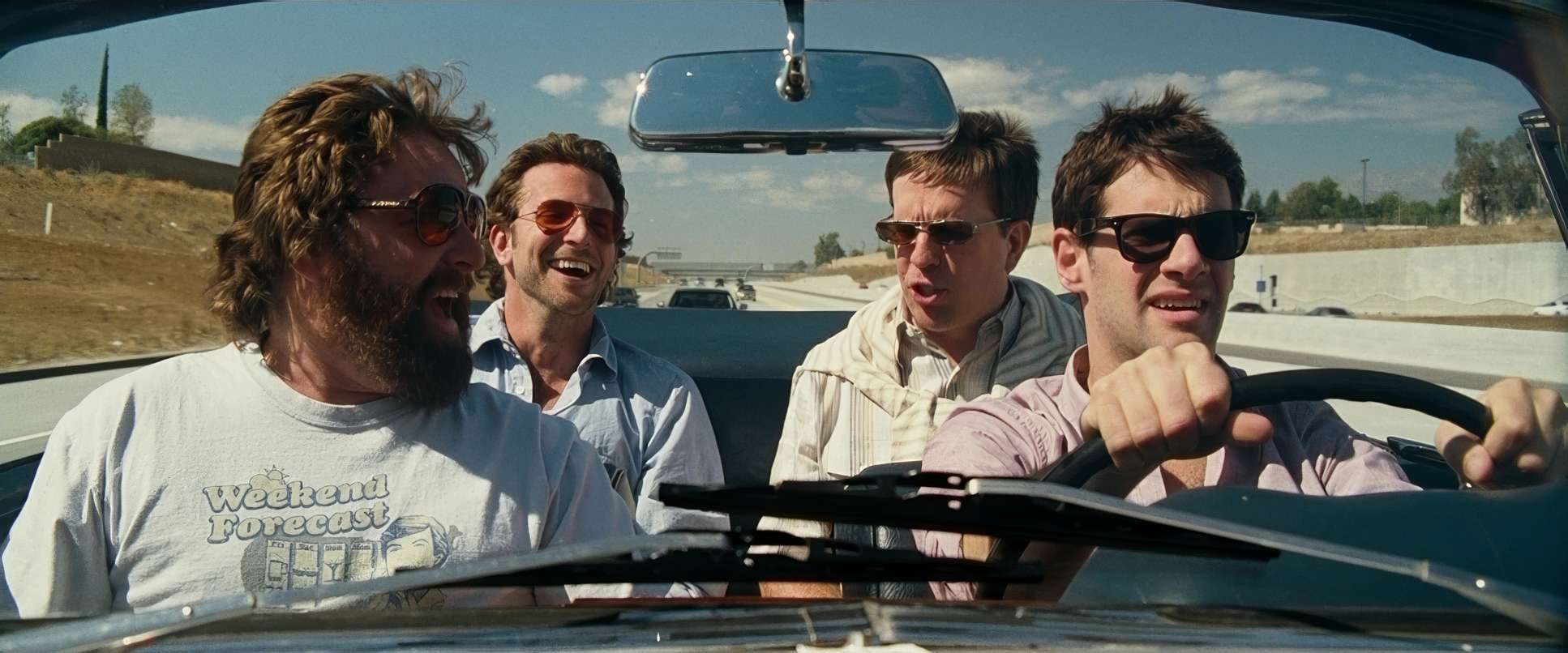
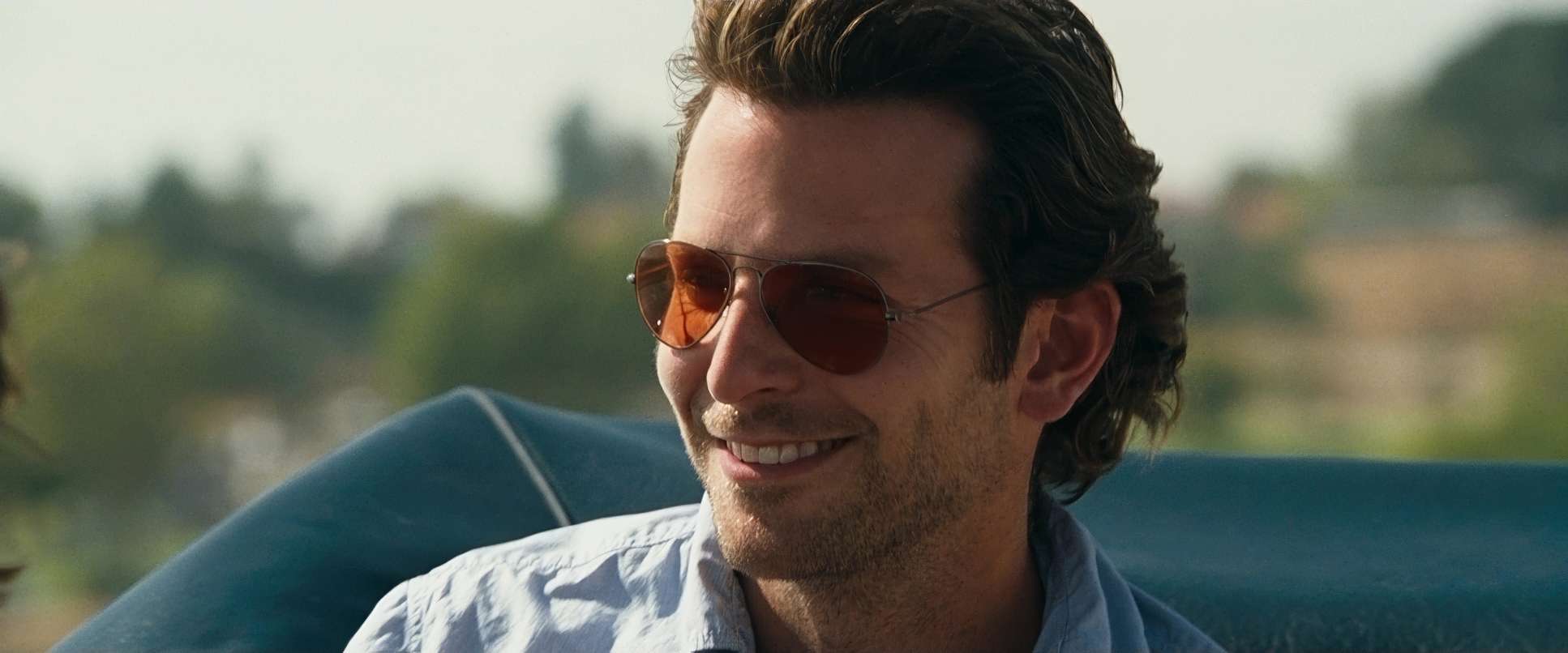
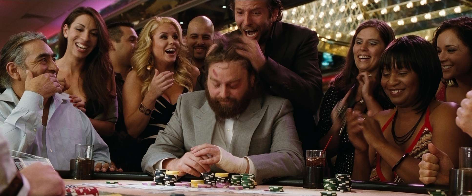
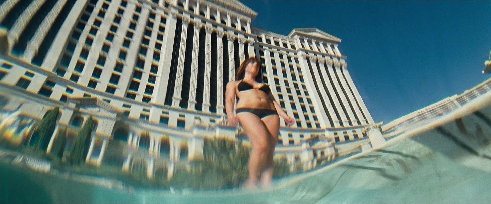
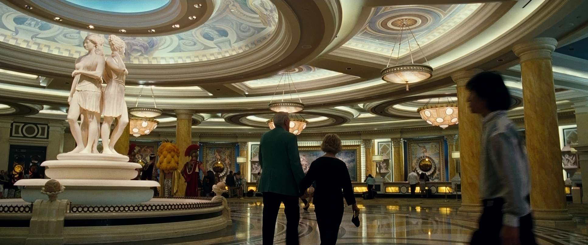
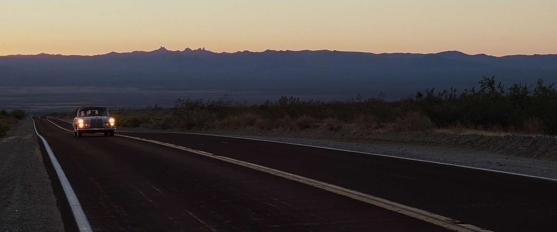
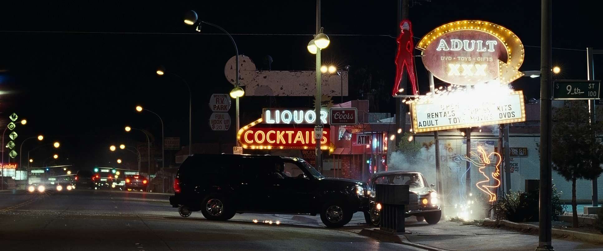
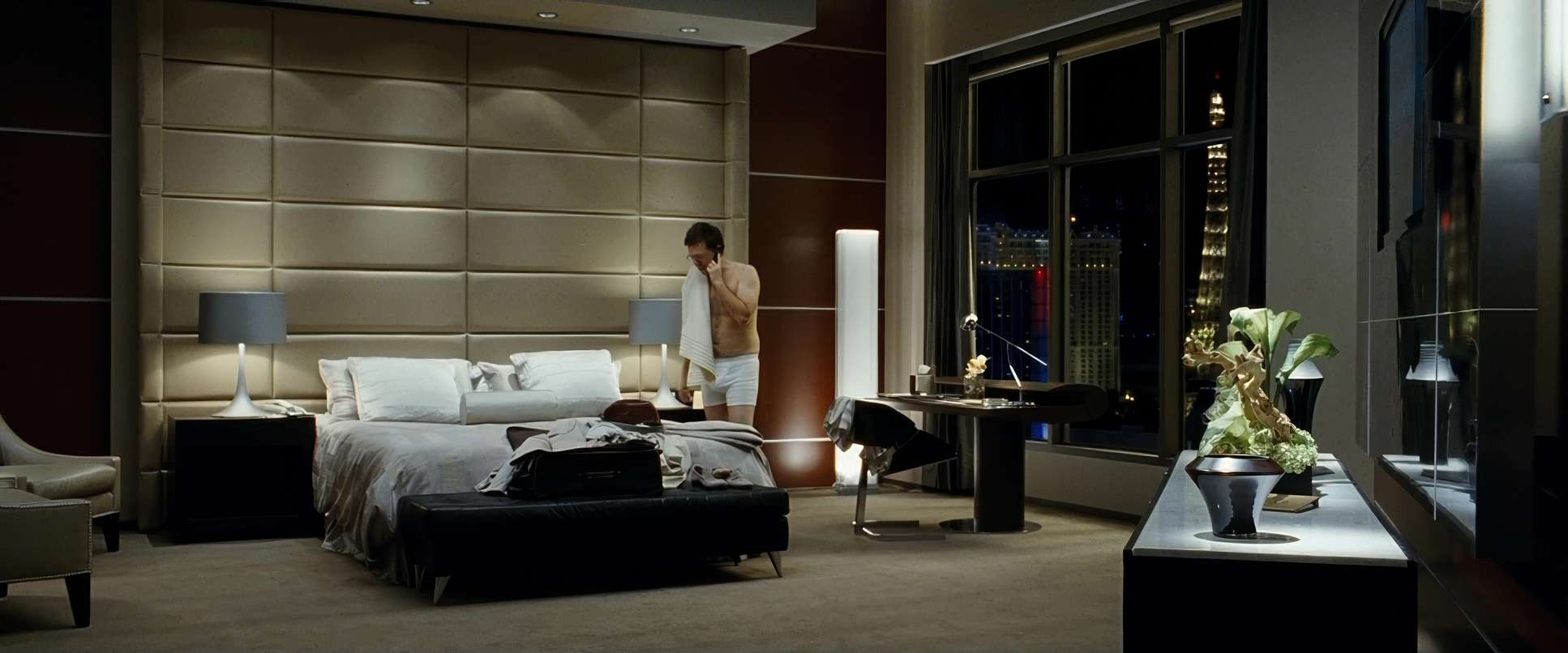
The first act is all about “The Lie.” The Vegas scenes are pushed with high-density saturation vibrant reds, punchy blues, and warm, healthy skin tones. It feels like an invitation; it’s the polished fantasy of what a “wild night” is supposed to look like.
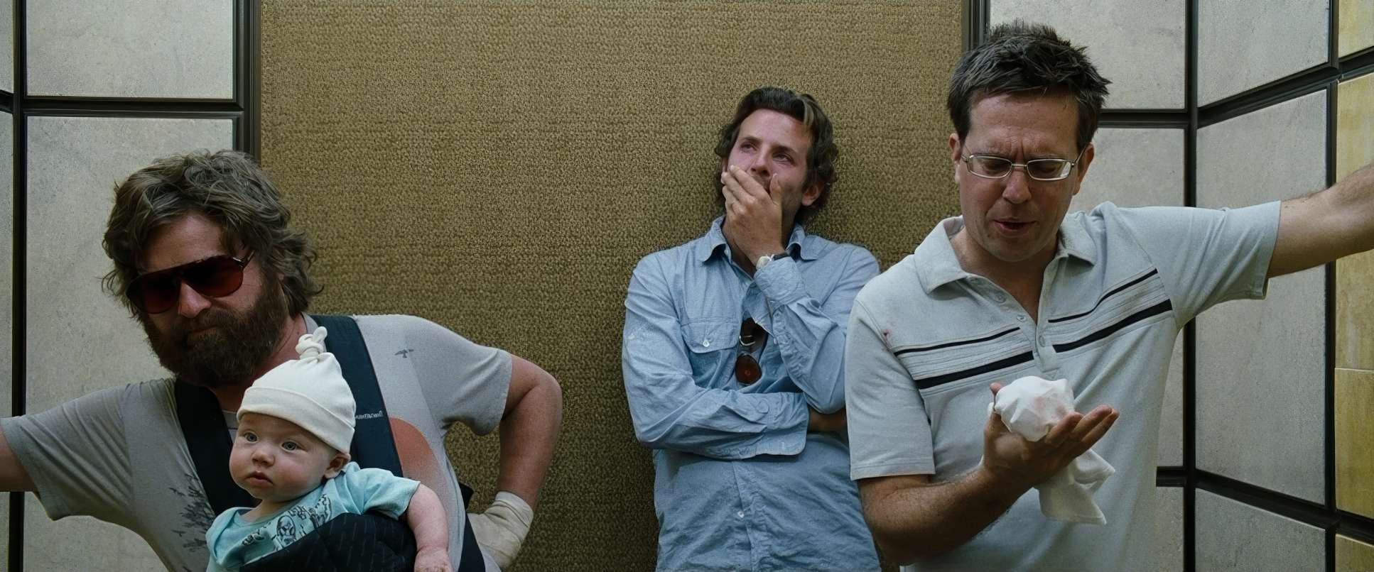
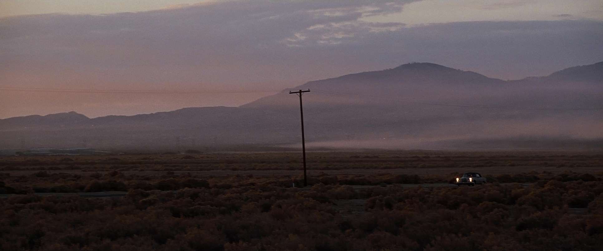
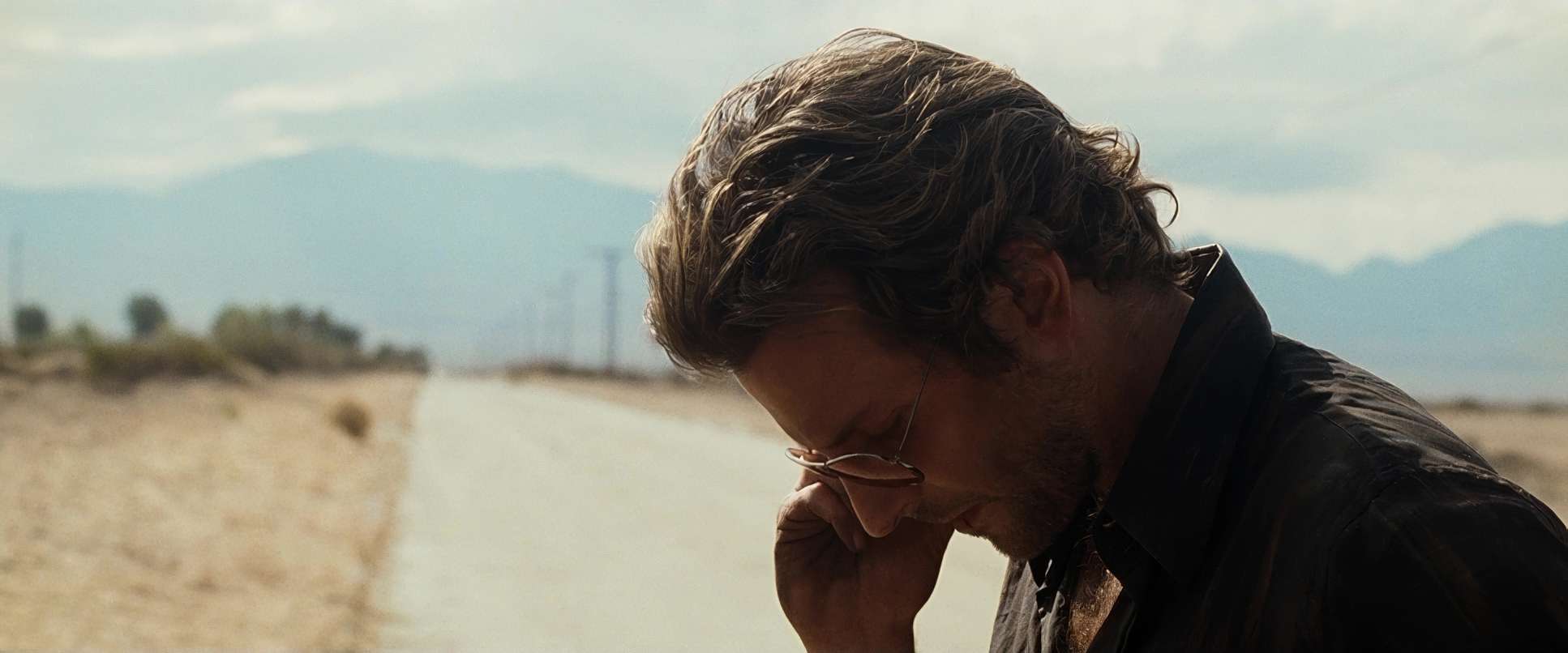
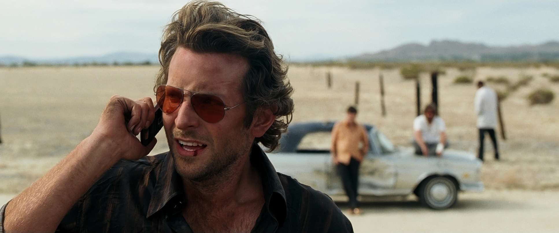
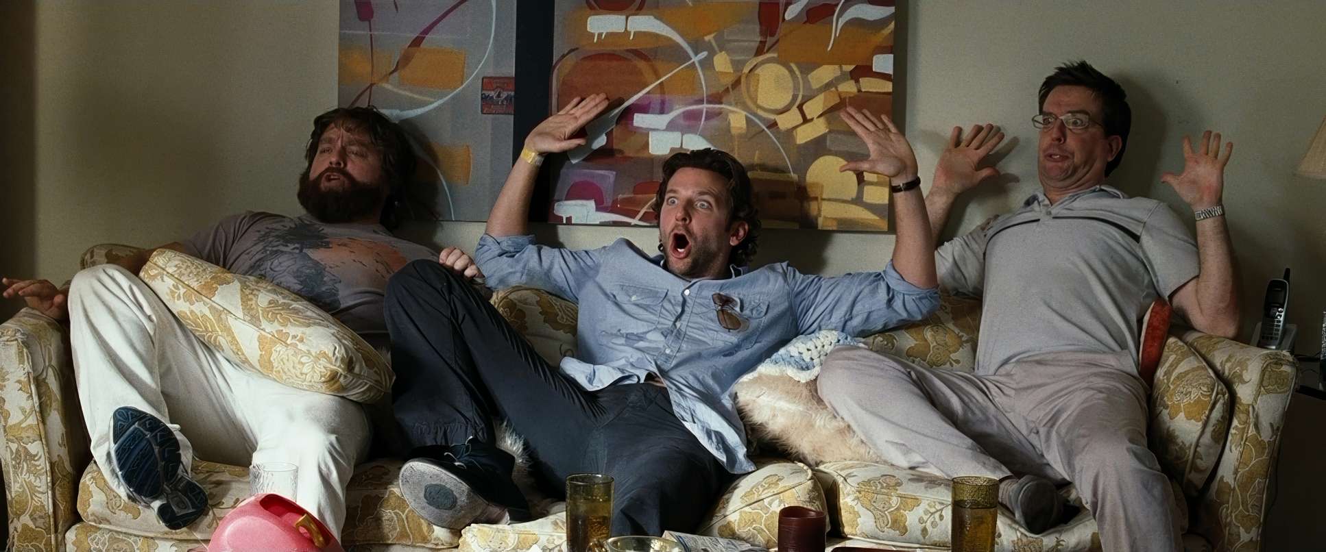
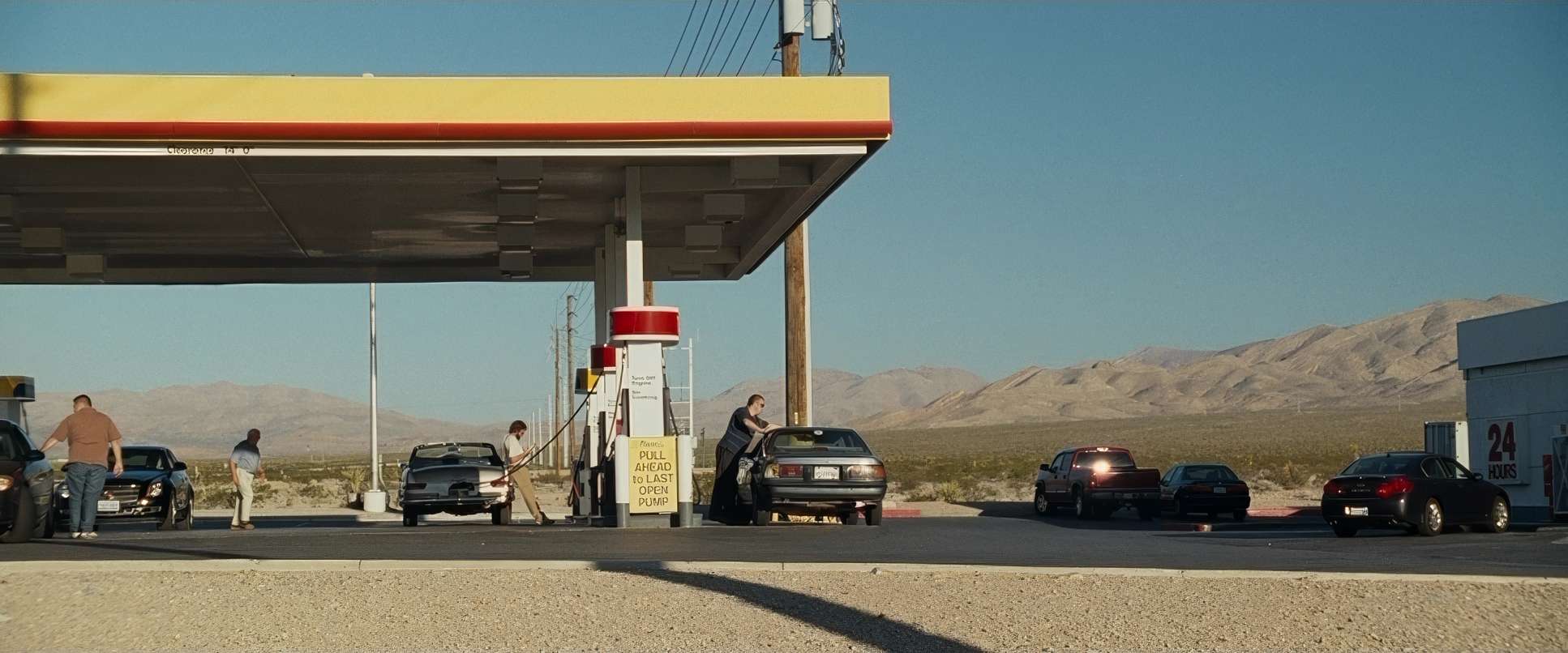
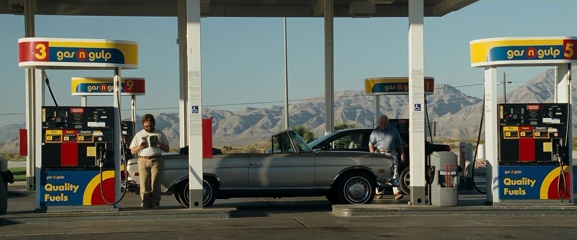
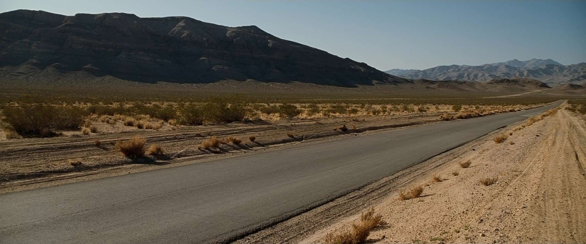
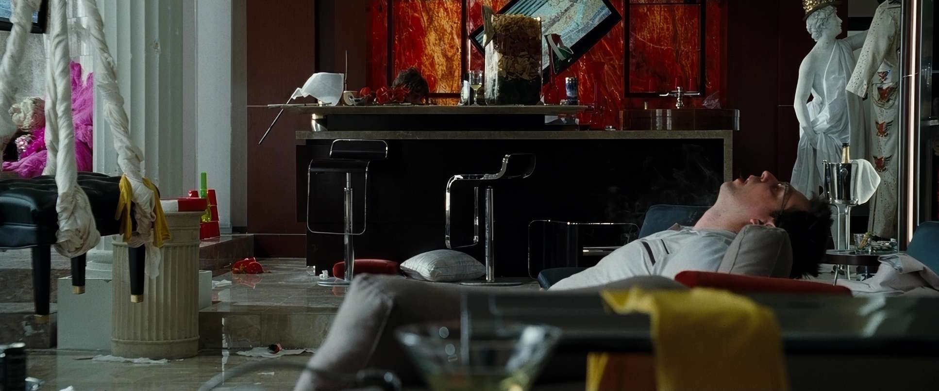
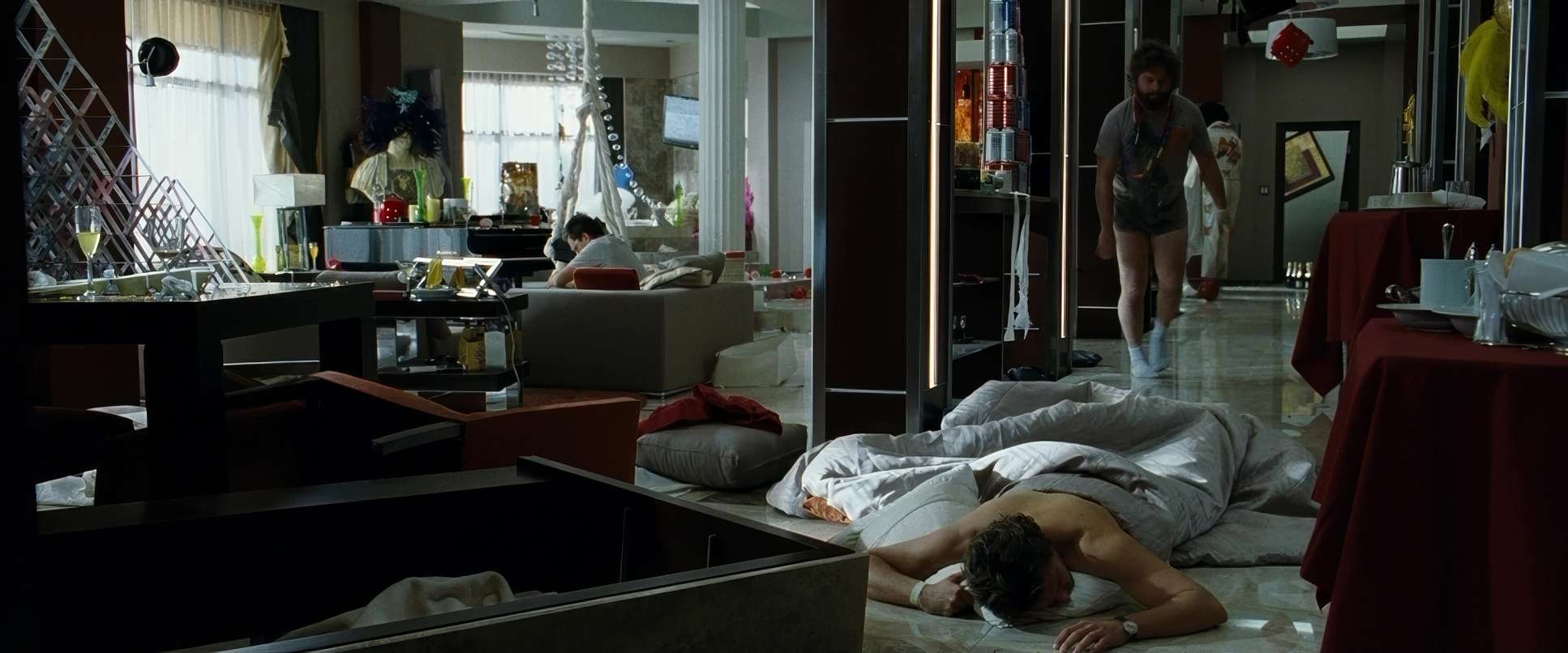
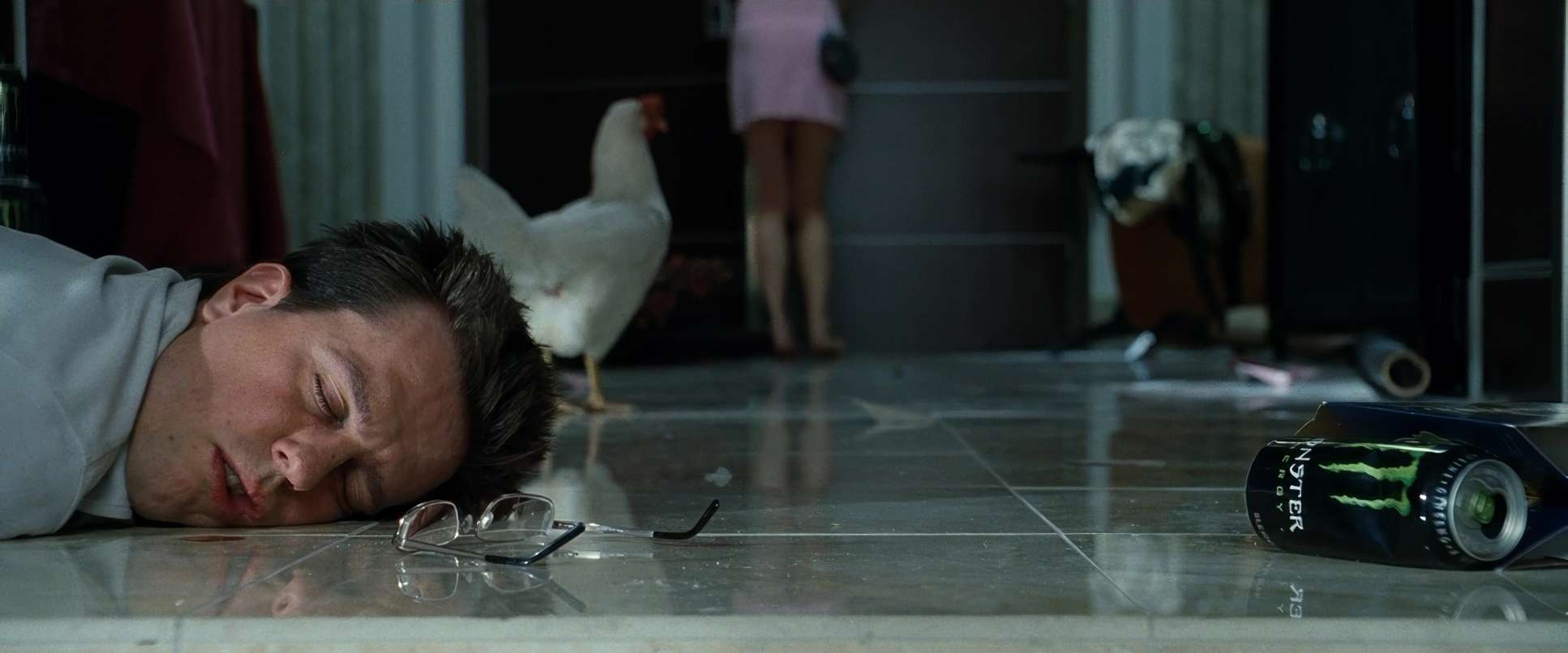
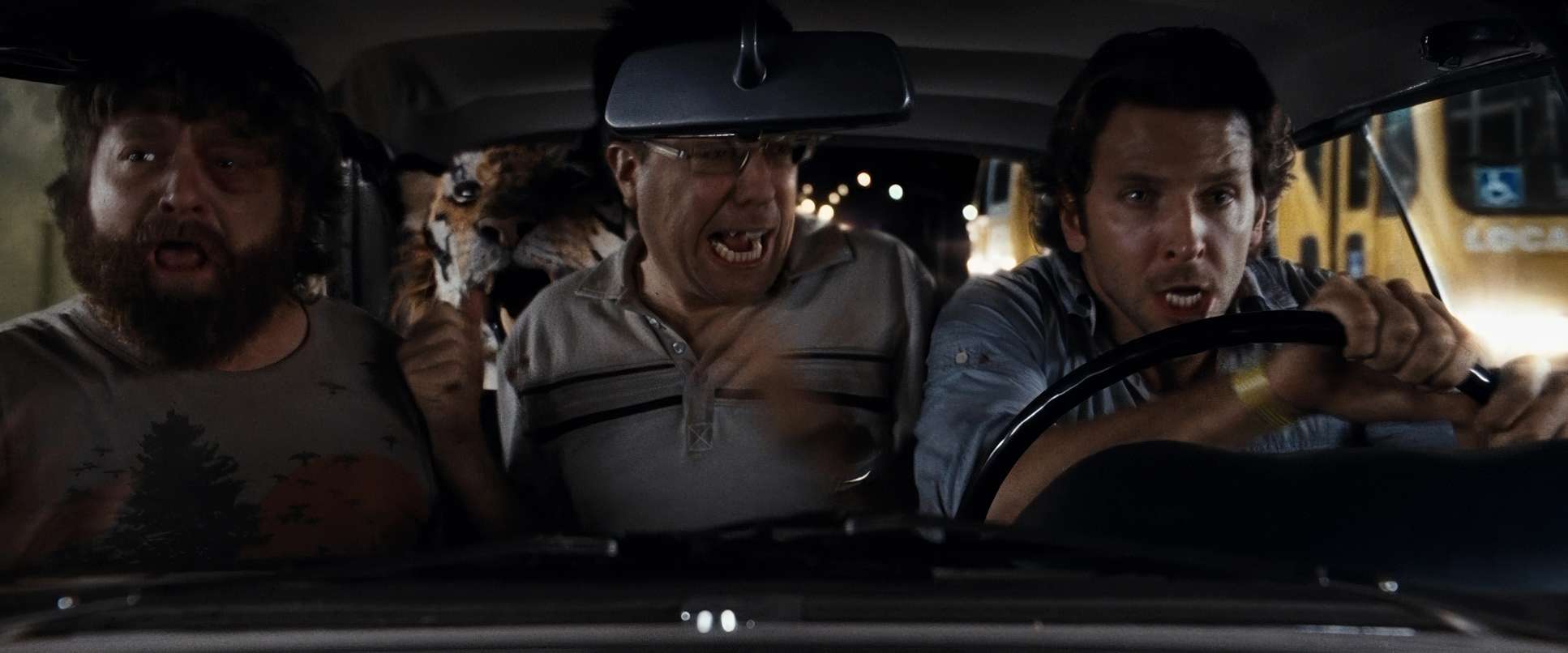
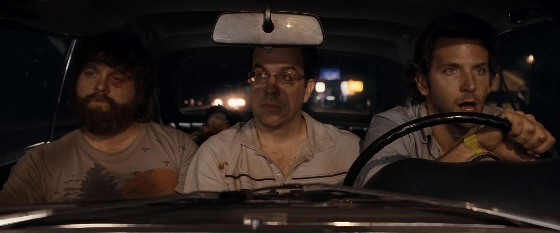
But the moment the morning hits, the LUT effectively changes. We move into a desaturated, almost sickly palette. The skin tones lose that warmth, replaced by sallow, dehydrated yellows and muted reds. The contrast gets dialed up, and the highlights feel harsher, reflecting the “brutal reality” of their predicament. It’s a profound shift; the color tells the audience that the party is over and the bill has arrived, long before the characters even realize they’re missing a tooth.
Inspiration Behind the Cinematography
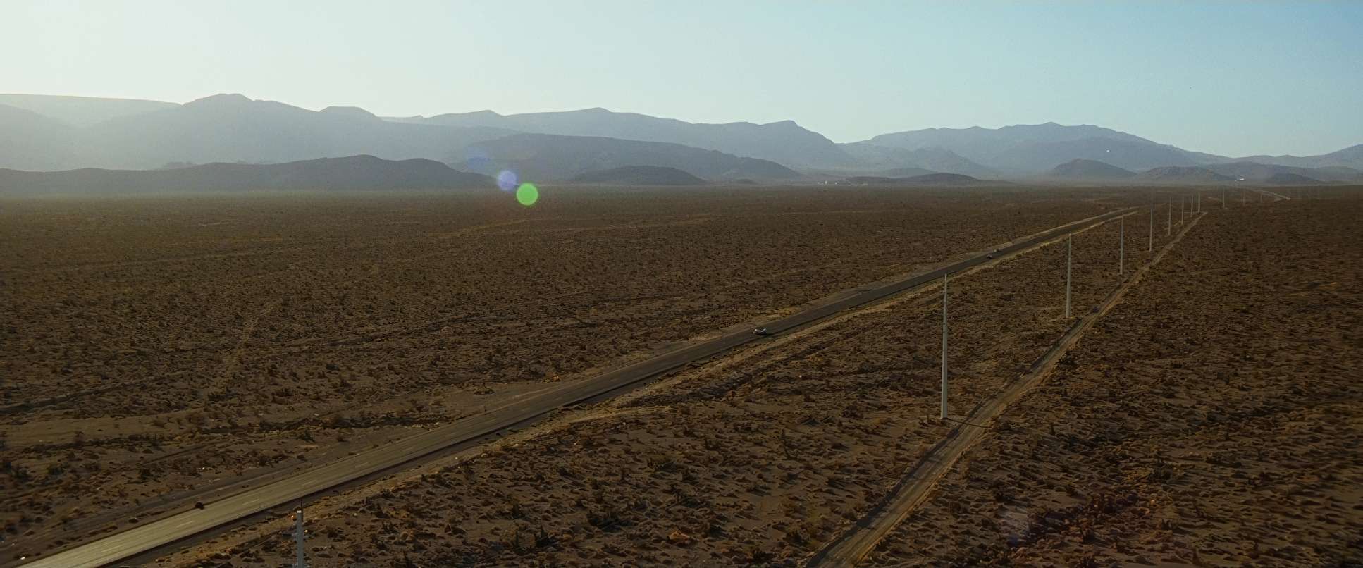
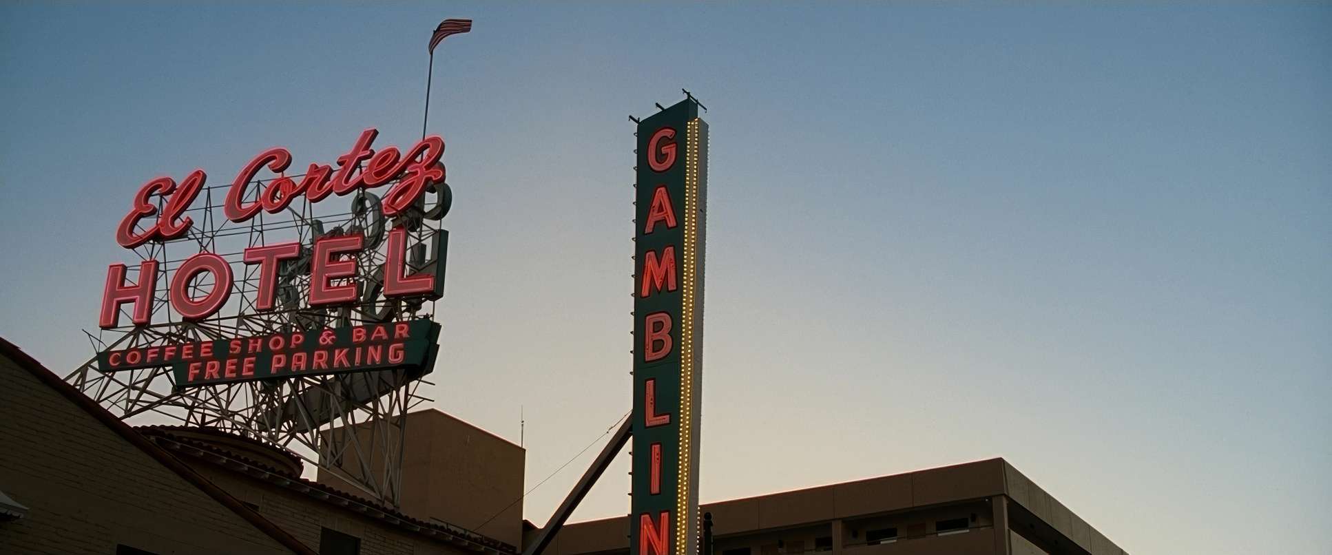
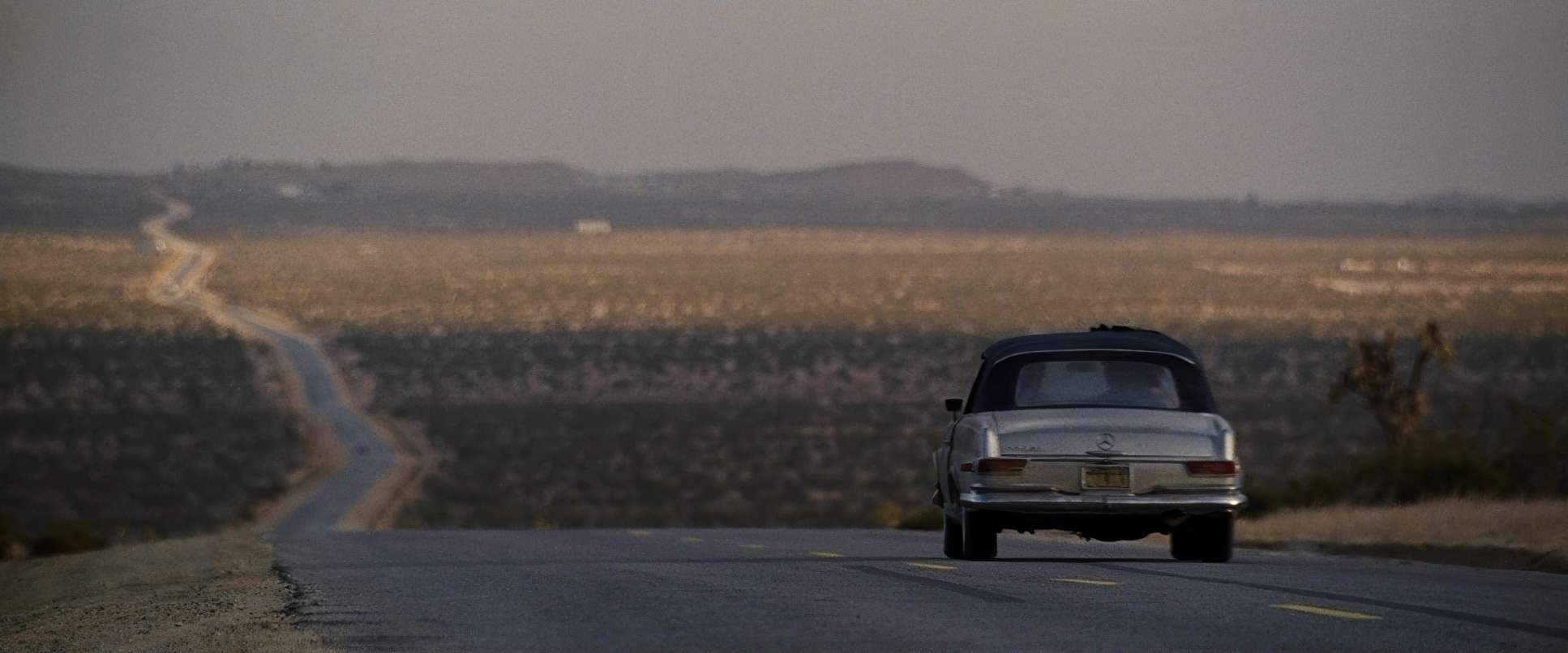
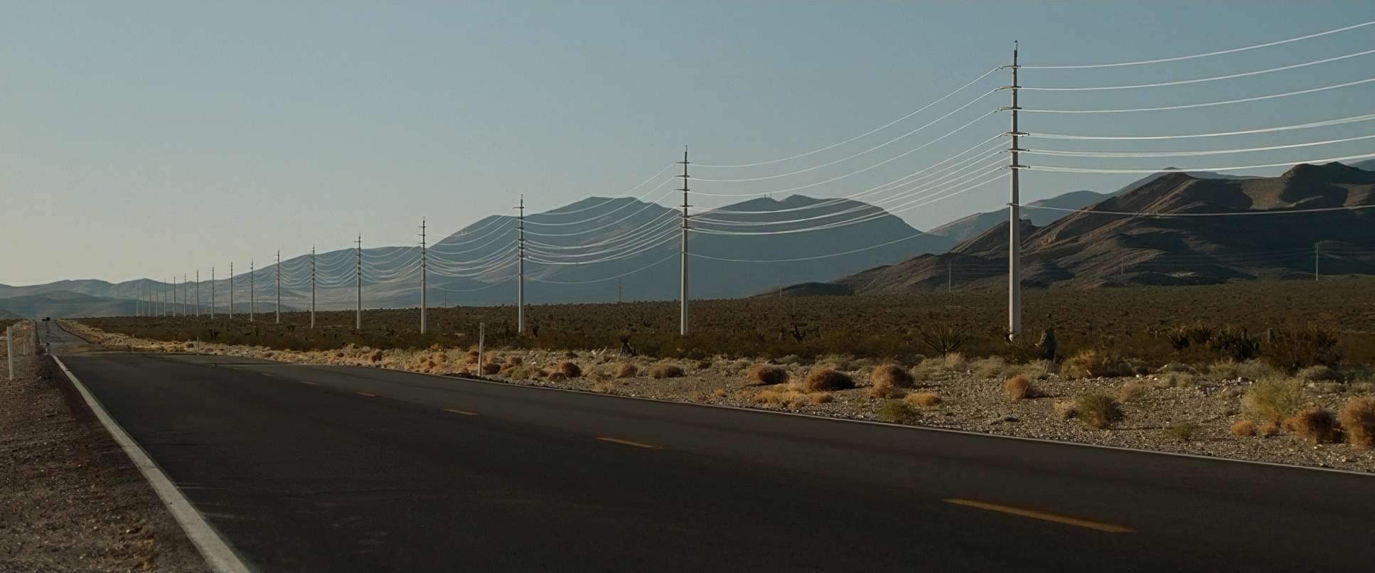
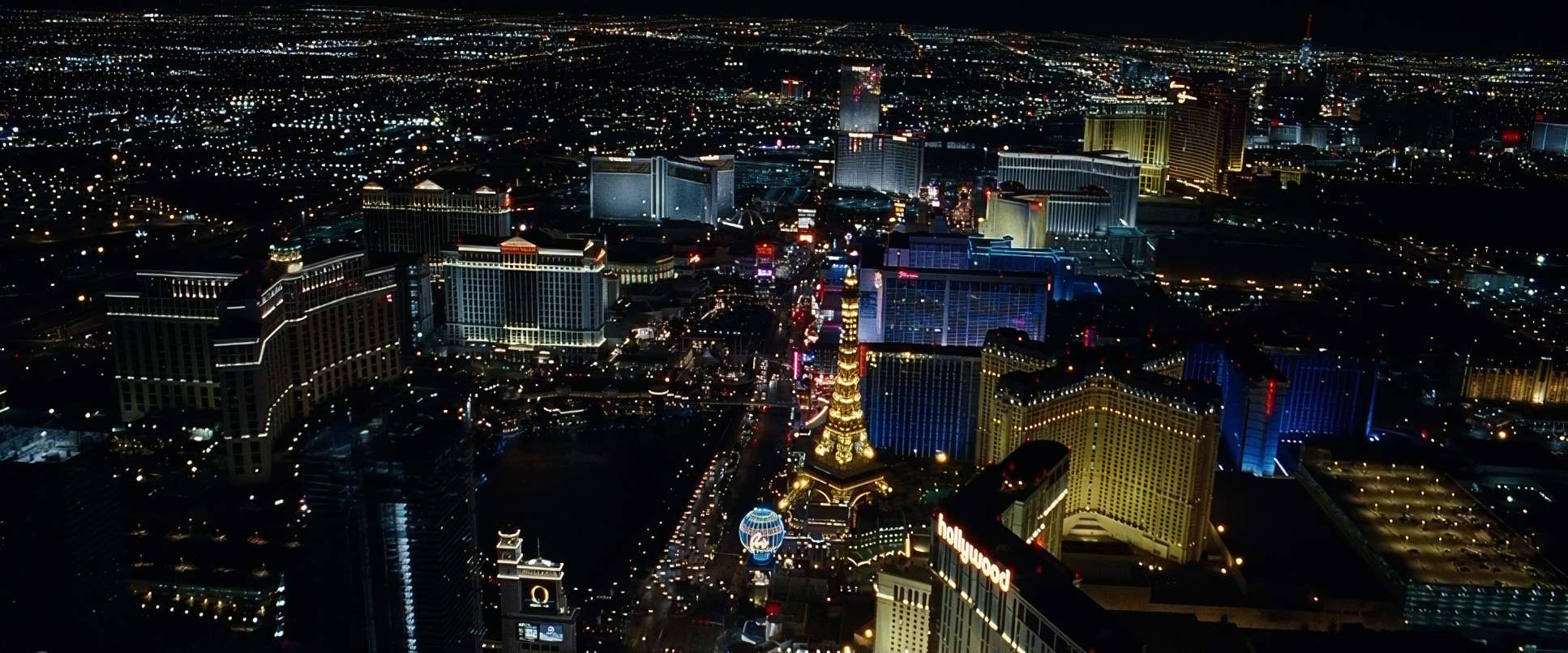
The core of this movie is actually a “who-done-it” mystery. Phillips and Sher took inspiration from that narrative void: the “blackout.” The visual language was designed to mirror the characters’ fragmented experience. They didn’t want a sitcom look; they wanted a cinematic mystery. The inspiration wasn’t other comedies it was films that used a strong sense of place to tell a story. They wanted to show Vegas as a character that starts as a best friend and ends as an antagonist.
Lighting Style
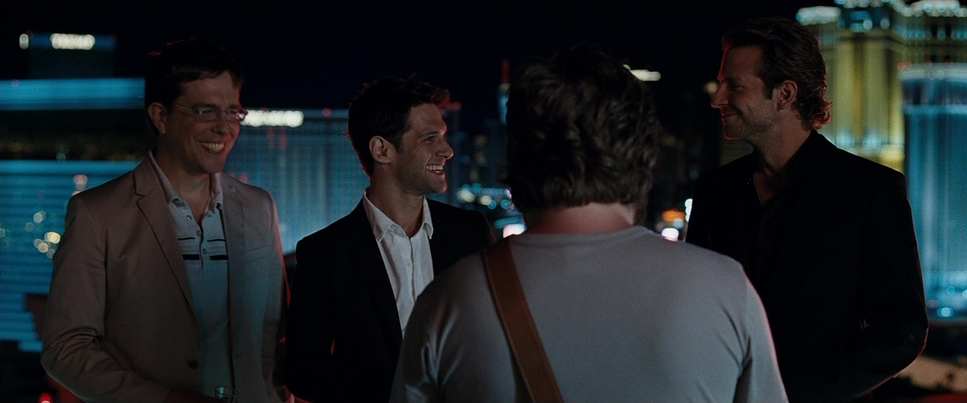
The lighting follows the same “before and after” logic as the color. The nighttime exteriors are a symphony of practical neon and high-key, exciting highlights. It’s meant to feel electrifying.
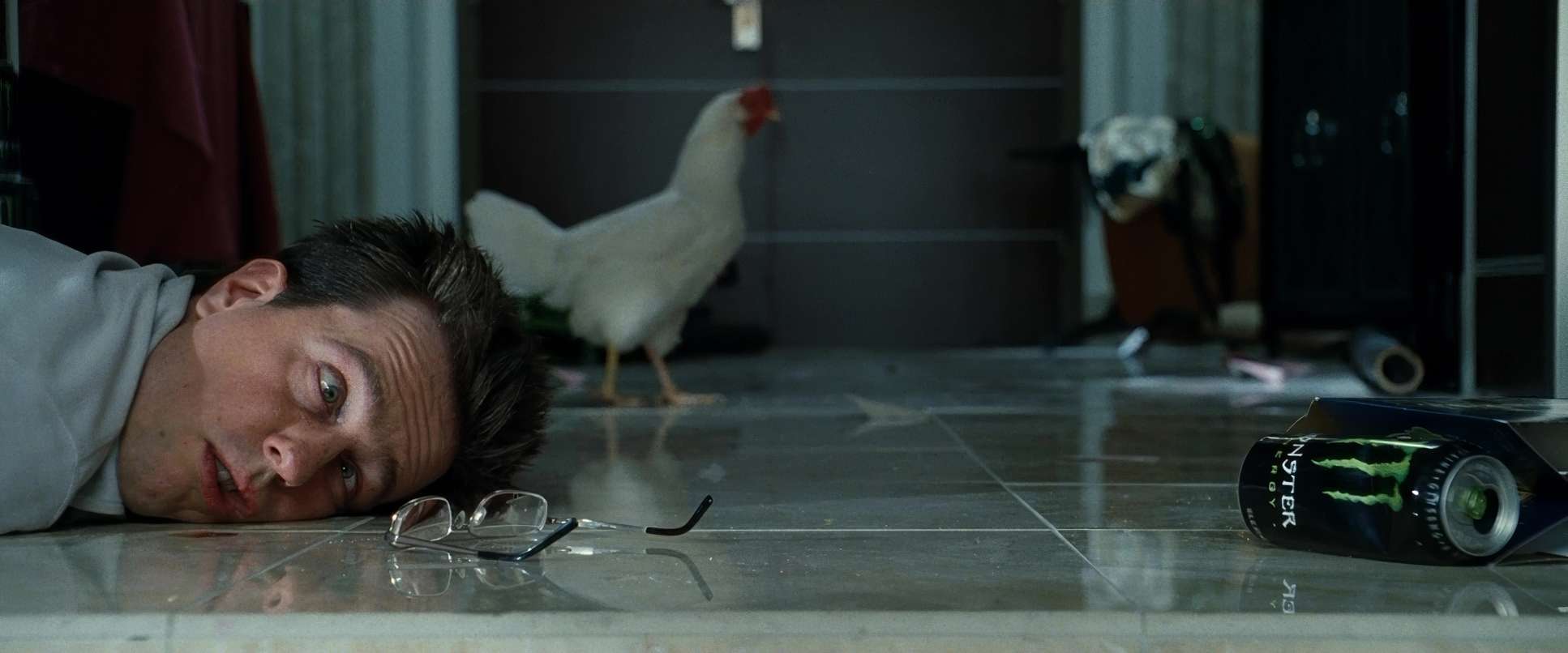
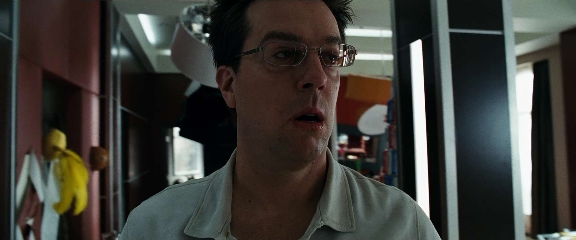
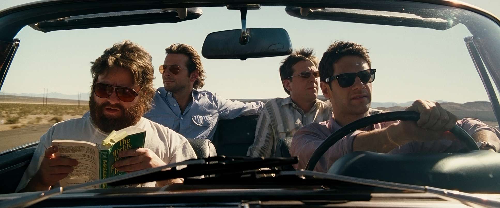
Then comes the hotel suite reveal. Sher used harsh, unflattering top light and side light that exposes every stain and piece of debris in the room. In the desert scenes, the lighting is unforgiving. We see edge lights that make the heat feel palpable. Sher wasn’t afraid to let the highlights blow out slightly in the Vegas sun to create that dazzling, disorienting effect. It’s motivated lighting at its best using the environment to make the audience feel the characters’ headache.
Camera Movements

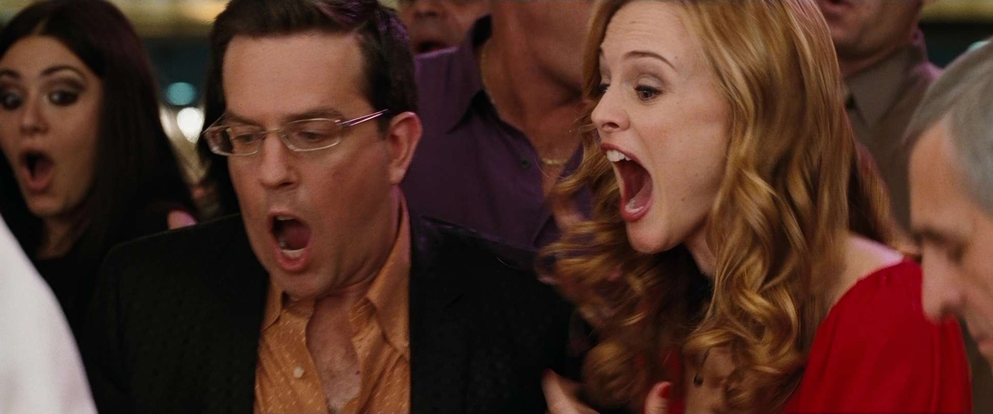
The camera work is a “controlled chaos” that keeps the energy high without ever feeling messy. You see a lot of motivated handheld work during the “freak-out” moments, which adds a layer of urgency and stress.
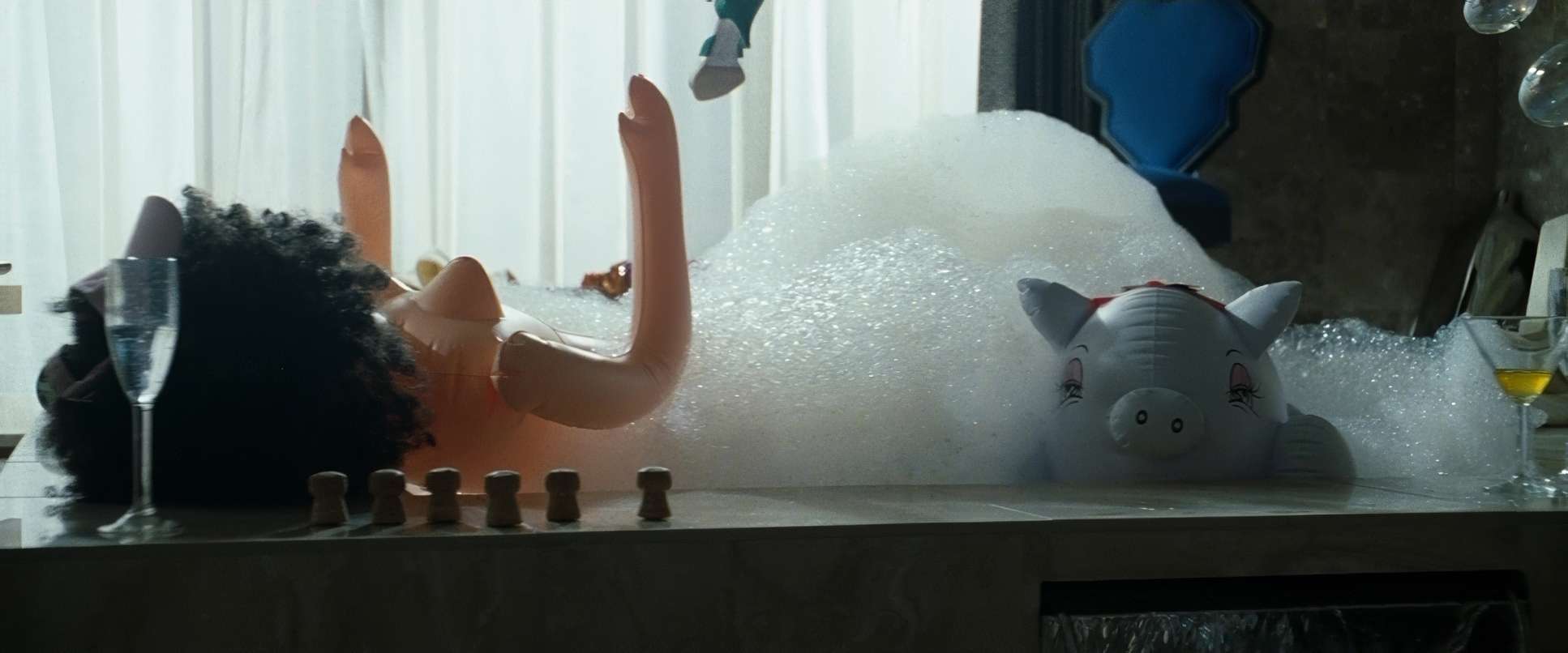
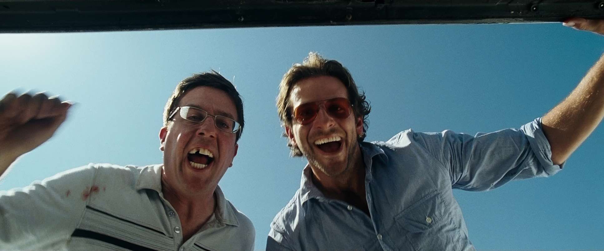
However, Sher is smart enough to know when to lock it down. When there’s a big comedic reveal like the tiger in the bathroom the camera often uses a steady, observational dolly or Steadicam move. It lets the absurdity breathe. That push and pull between the kinetic energy of the trio and the stable frame of the environment is what keeps the pace from feeling monotonous.
Compositional Choices

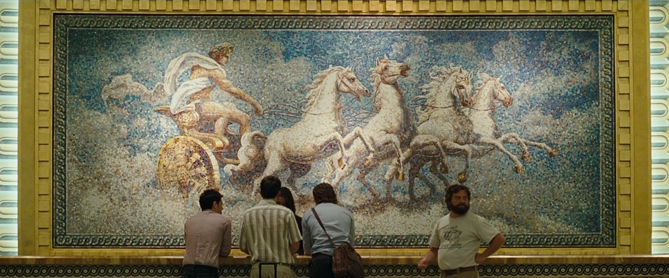
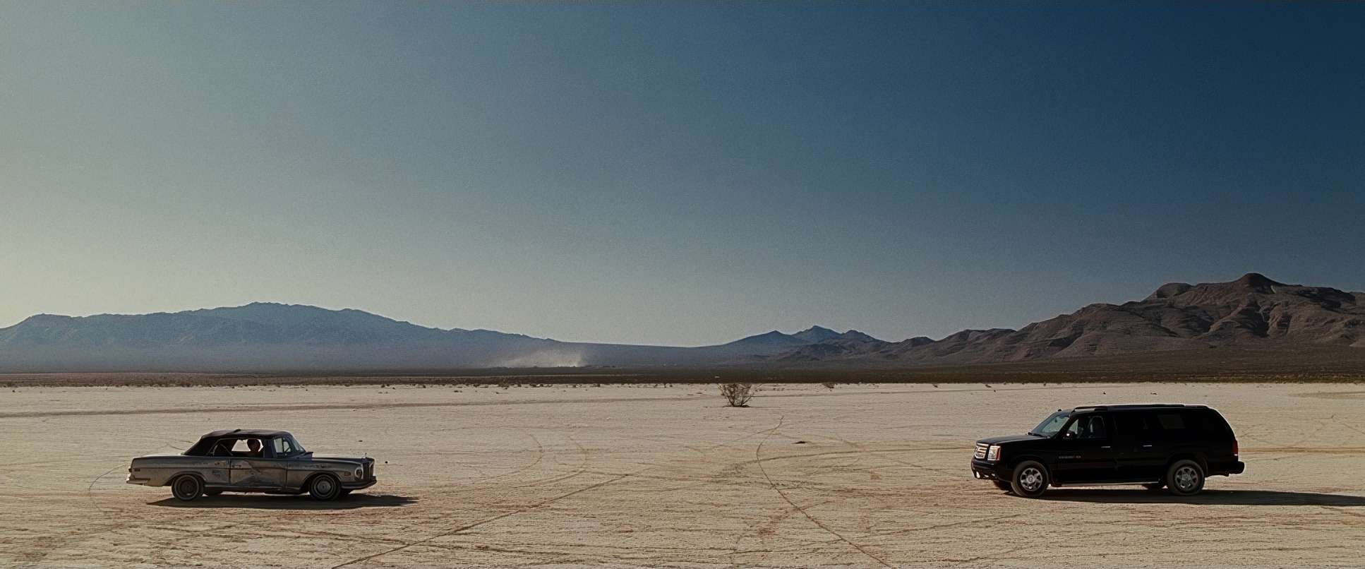
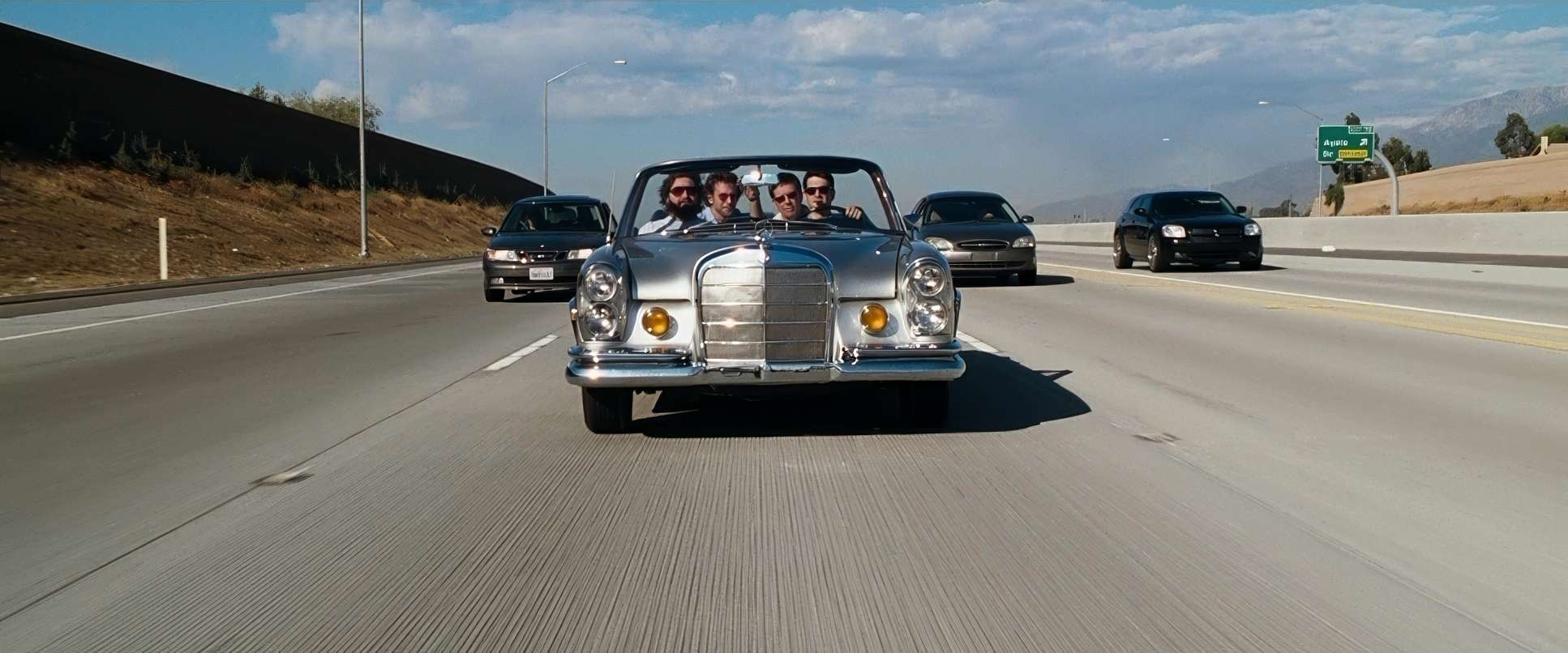
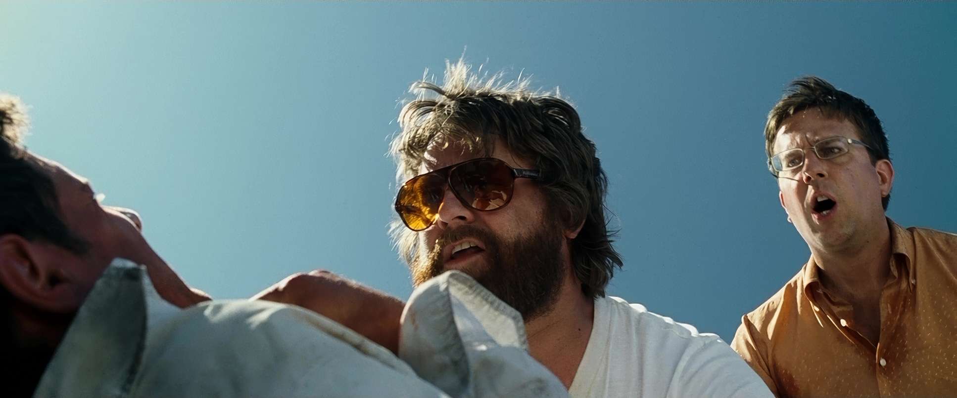
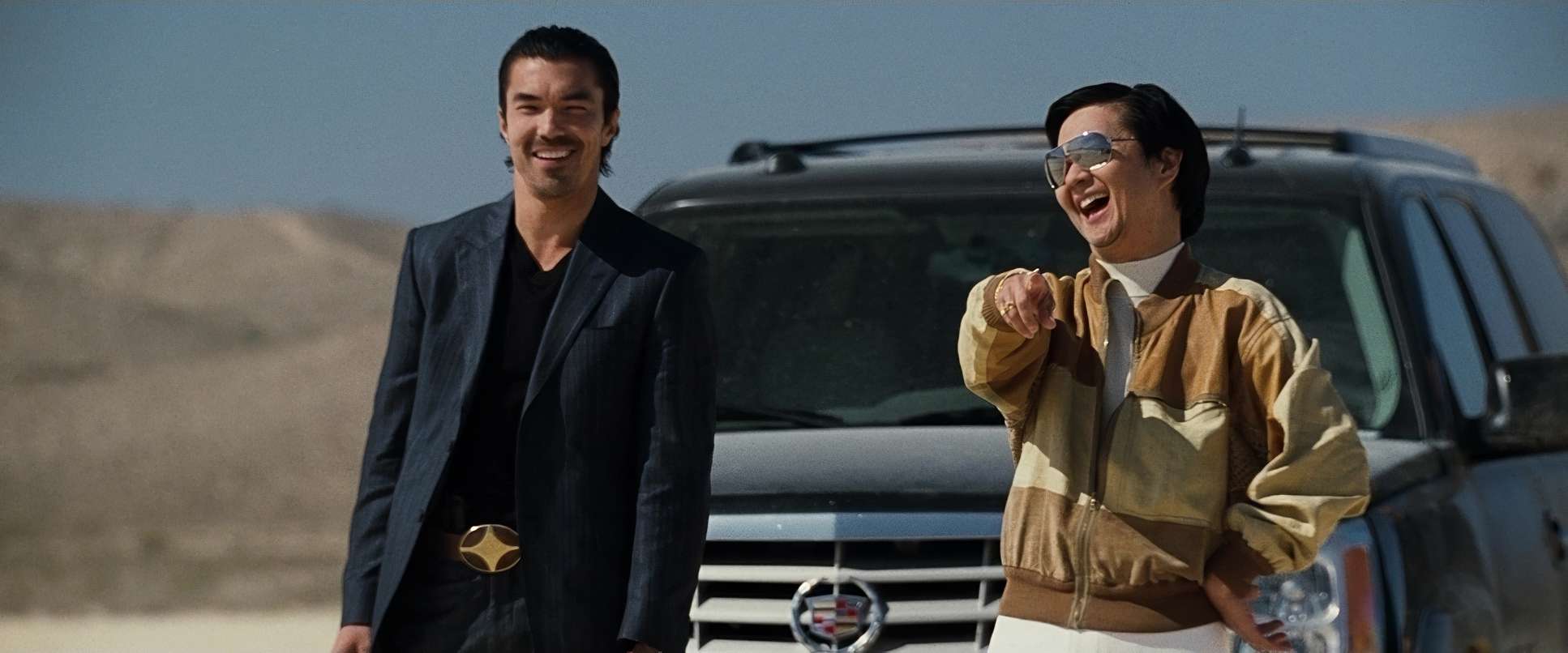
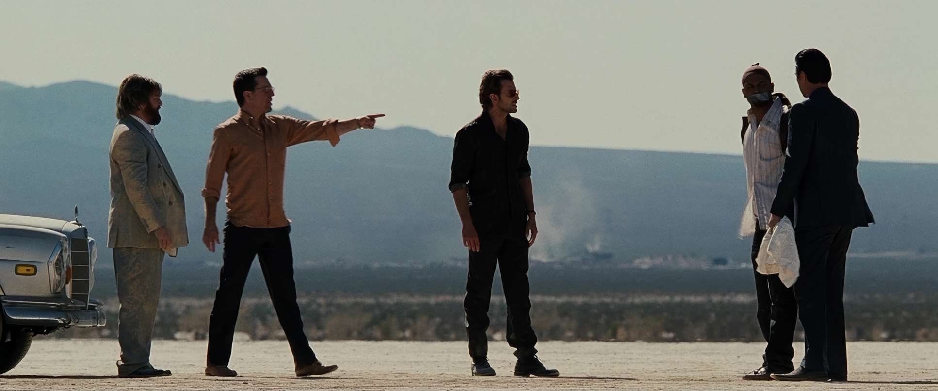
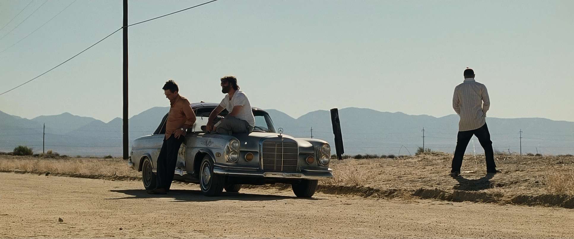
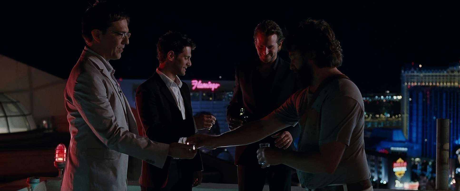
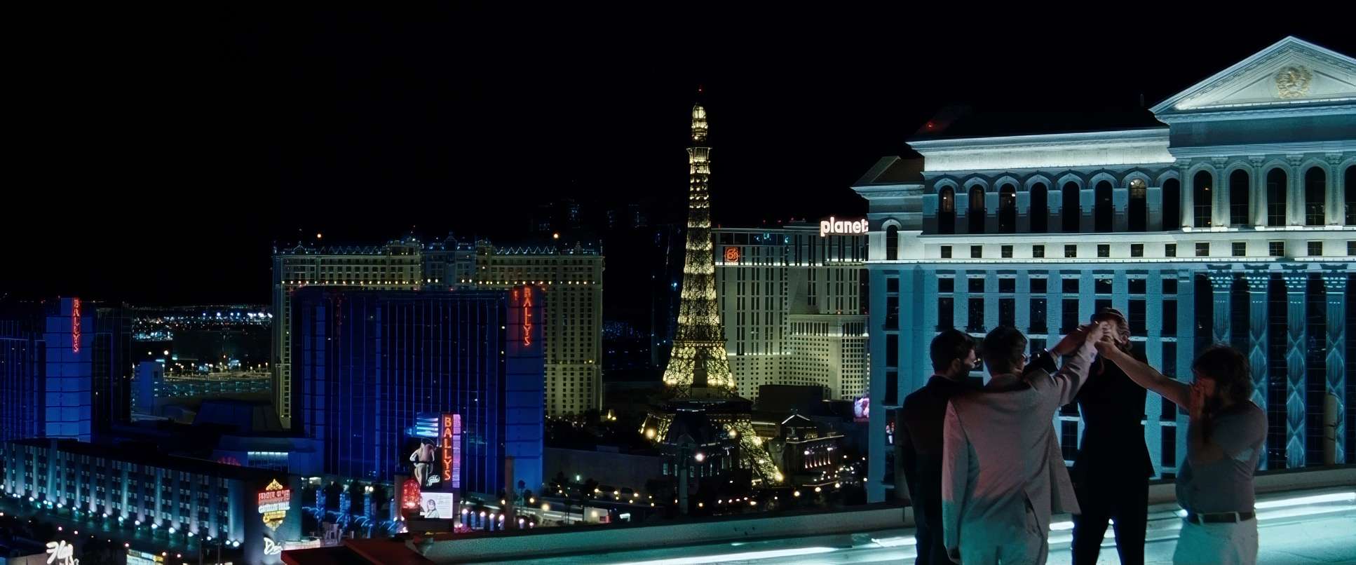
Despite the chaotic plot, the compositions are incredibly precise. Sher uses the 2.39:1 anamorphic-style frame to emphasize the “Wolfpack” as a unit. You’ll often see wide shots used to establish the scale of their mistakes, like the wide reveal of the trashed suite.
He also uses “left-heavy” compositions and negative space to make the characters look small or overwhelmed by the Vegas landscape. The framing isn’t just about showing the actors; it’s about showing how lost they are within the frame.
Lensing and Blocking
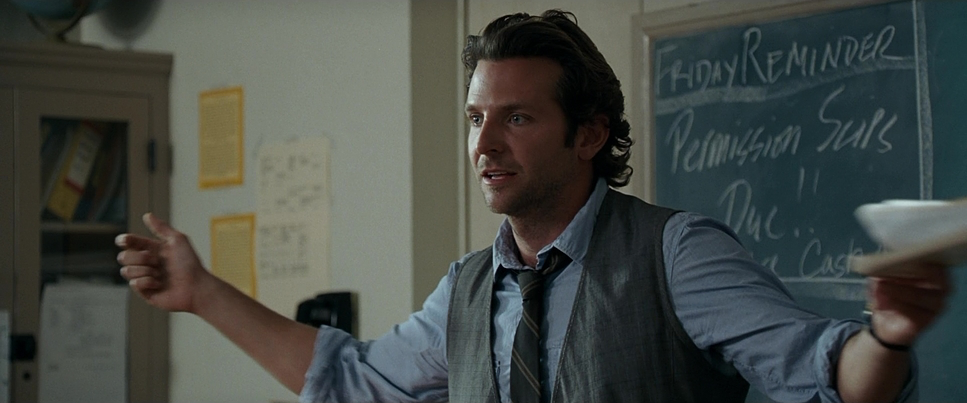
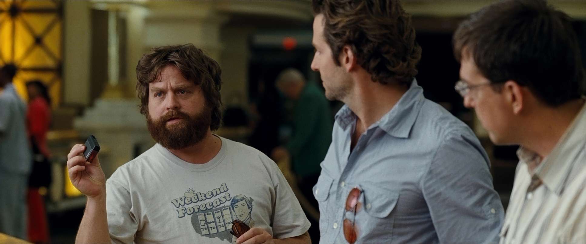
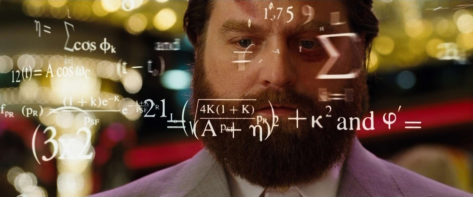
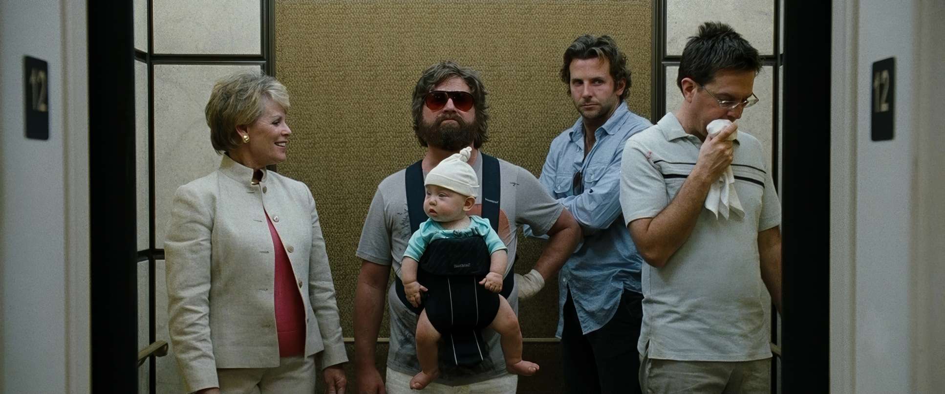
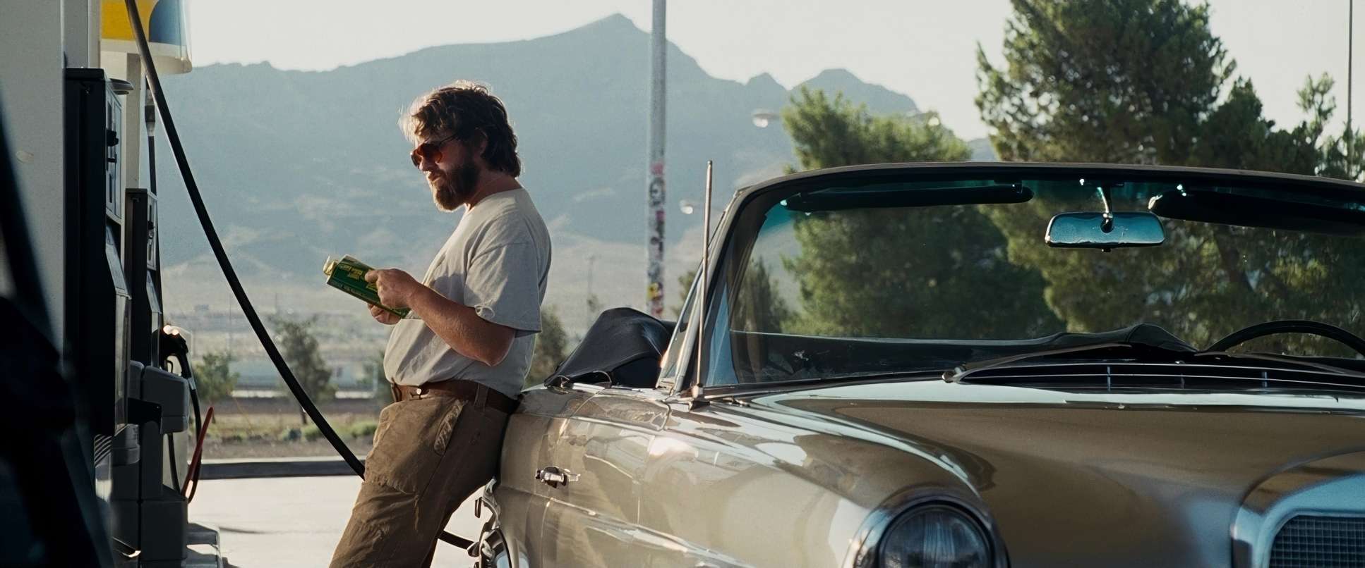
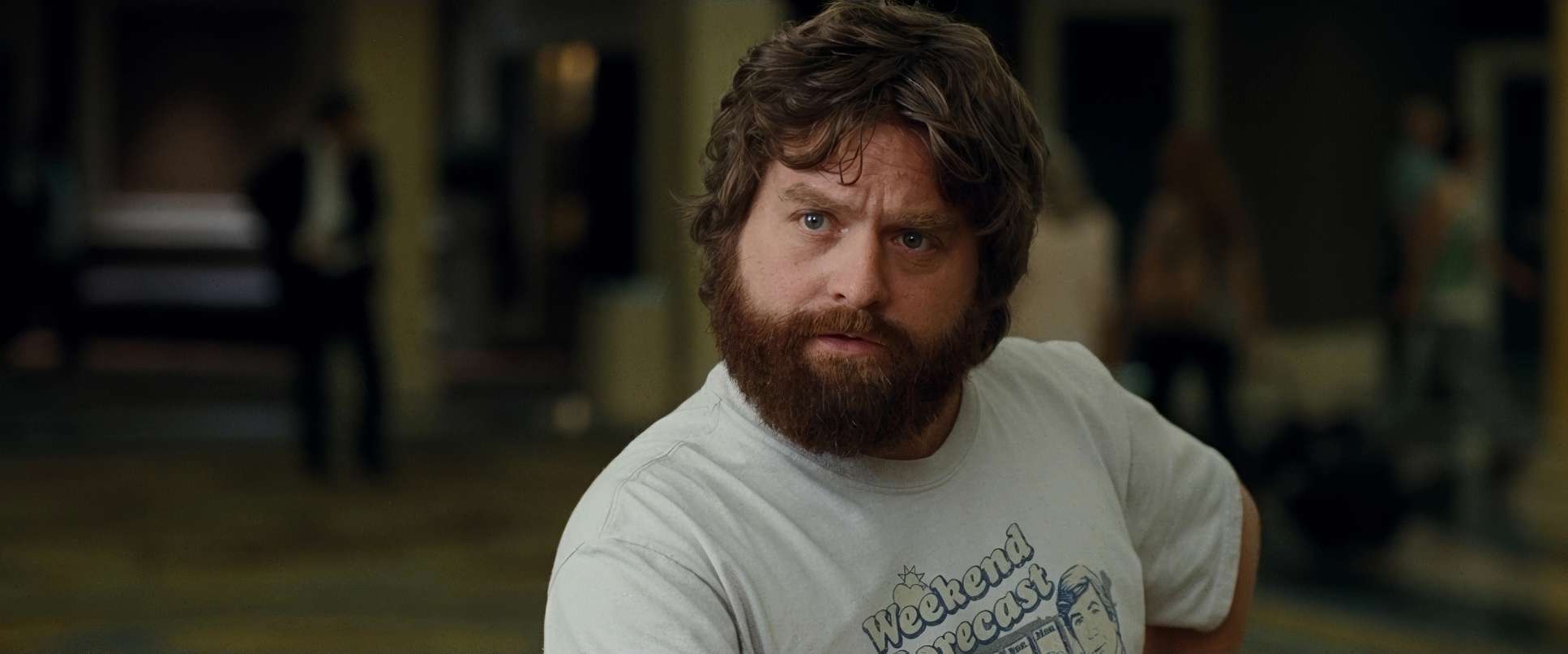
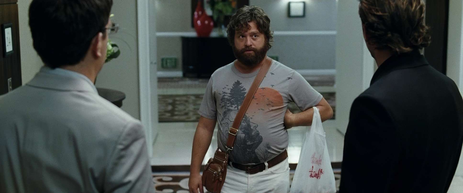
The way Sher and Phillips block the trio is essential to the comedy. Phil (Bradley Cooper) usually takes the center, authoritative position. Stu is often framed to look physically smaller or more boxed-in to show his anxiety. And then there’s Alan.
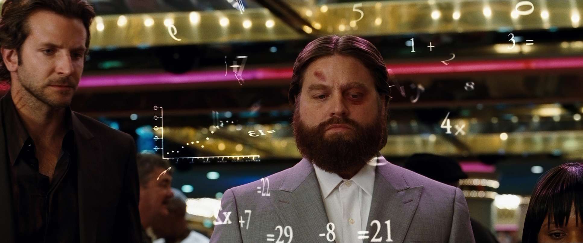
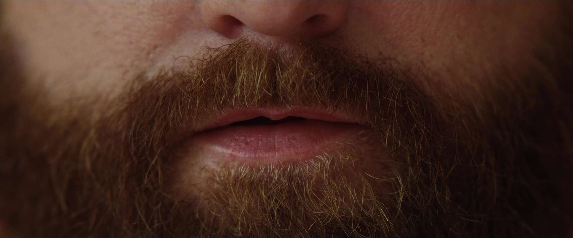
Alan is frequently positioned slightly off-kilter or in the foreground with a wide lens, which subtly exaggerates his oblivious expressions. Using medium-to-wide lenses for Alan allows the audience to see his “cluelessness” in relation to the chaos happening right behind him. It’s a nuanced way of using optics to reinforce character traits.
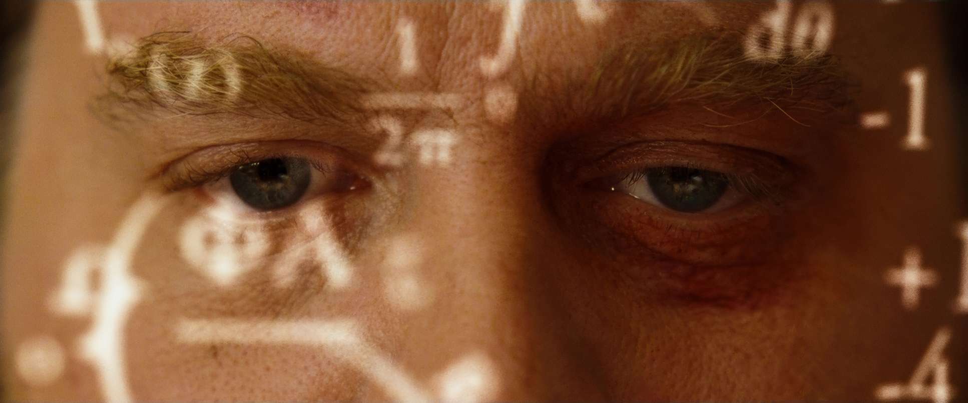
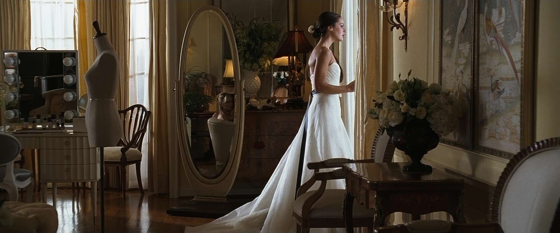
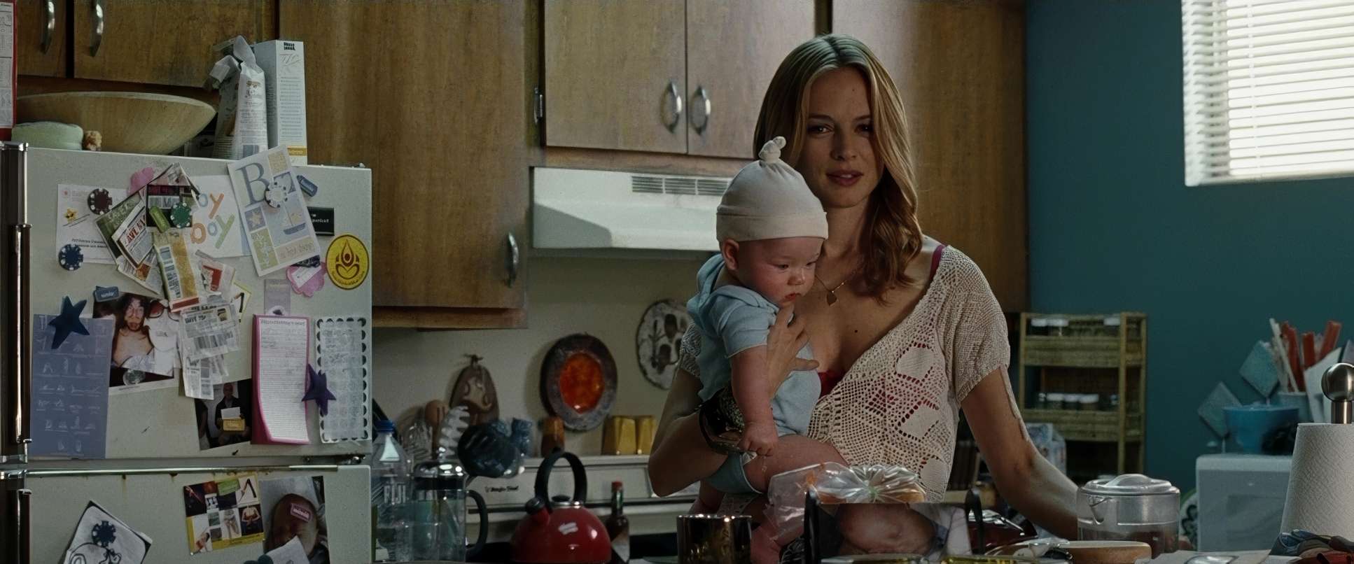
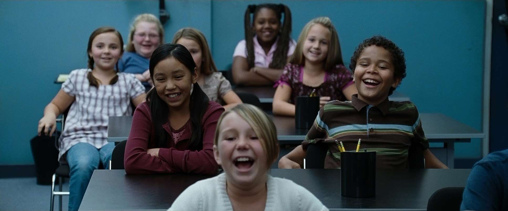
The Hangover (2009) Film Stills
A curated reference archive of cinematography stills from The Hangover (2009). Study the lighting, color grading, and composition.


- Also read: HARRY POTTER AND THE SORCERER’S STONE (2001) – CINEMATOGRAPHY ANALYSIS
- Also read: CAPTAIN AMERICA: THE WINTER SOLDIER (2014) – CINEMATOGRAPHY ANALYSIS
Browse Our Cinematography Analysis Glossary
Explore directors, cinematographers, cameras, lenses, lighting styles, genres, and the visual techniques that shape iconic films.
Explore Glossary →