Park Chan-wook’s “The Handmaiden” (2016), While casual viewers might get caught up in the labyrinthine plot or the “erotic thriller” label, for me, this film is a study in precision a “painterly” experience where every frame feels intentional. It is a testament to how cinema manipulates the audience not just through script, but through the physics of light, color science, and optical characteristics.
About the Cinematographer
The visual architect behind “The Handmaiden” is Chung Chung-hoon, whose collaboration with Park Chan-wook has become one of modern cinema’s most distinct visual signatures. Chung-hoon isn’t just capturing performance; he is translating Park’s “operatic” and psychologically intense narratives into a specific image structure. He understands the emotional logic of exposure and composition. His work here masters the balance between exquisite beauty and a palpable undercurrent of unease. It’s a visual language that feels both classical and daringly modern, utilizing the camera to mirror the story’s intricate layers of deception.
Inspiration Behind the Cinematography
While based on Sarah Waters’ “Fingersmith,” the transposition to 1930s Japanese-occupied Korea provided a unique texture for the cinematography. The production design by Ryu Seong-hee specifically the mansion which is “Western style on one side, Japanese on the other” became a cornerstone for the lighting strategy. This architectural hybridity allowed Chung-hoon to explore an “uneasy alliance” of lighting styles: the deep, shadow-heavy corridors of the British wing versus the diffused, paper-filtered light of the Japanese quarters.
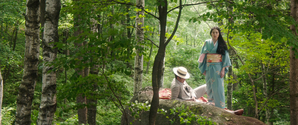
Visually, the film draws from a “Gothic tradition” reminiscent of Hitchcock’s Rebecca, but filters it through the flatness and composition of traditional Asian art. This creates an aesthetic that is opulent yet strangely ethereal. The costumes, with their rigid corsets and delicate lace, serve as “visual symbols” of repression, juxtaposed against the fluid aesthetics of the kimonos. Chung-hoon captures this duality by treating the wardrobe almost like a landscape, letting the textures inform the contrast of the scene.
Camera Movements
The camera in “The Handmaiden” acts as a silent “voyeur.” Chung-hoon’s movement is incredibly precise, characterized by elegant, controlled dollies and fluid tracking shots that feel choreographed rather than reactive. This contributes to the film’s “kaleidoscopic” feel, guiding our gaze and shifting perspective as the narrative rewinds to reveal new angles on the same scene.
I am particularly drawn to how the camera navigates the mansion’s geometry. It never feels handheld or arbitrary. When it tracks through the corridors, it reveals layers of information a glance, a hidden door, a shift in power. These movements function like a “cascading river,” constantly flowing and revealing. A perfect example is the “isolating push-in”: the camera slowly creeps in on a character to trap them in their private thoughts, only to pull back wide to reveal they are being watched. This interplay of proximity and distance makes the camera a vital tool in establishing the film’s moral ambiguity.
Compositional Choices
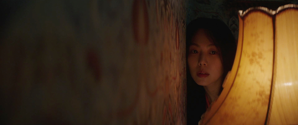
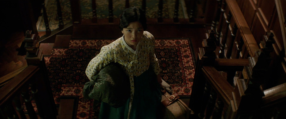
Compositionally, Chung-hoon leans into the 2.39:1 aspect ratio, using the width of the frame to isolate characters within their lavish surroundings. It is a lesson in “framing within frames.” He constantly utilizes architectural elements doorways, screens, and mirrors to box characters in, reinforcing themes of entrapment and voyeurism. Lady Hideko is often centrally framed in vast, empty rooms, highlighting her gilded cage, while Sook-hee is frequently positioned off-center or obscured, reflecting her role as the infiltrator.
The film’s mantra that “people are their true selves when they are on their own” is conveyed through these choices. We often view scenes through obstructed foregrounds peeping through windows or behind screens making the viewer complicit in the act of spying. The precision is deceptive; it feels natural, yet the geometry is rigid. It’s like a balanced sculpture where tampering with one element would cause the visual structure to collapse.
Lighting Style
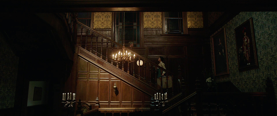
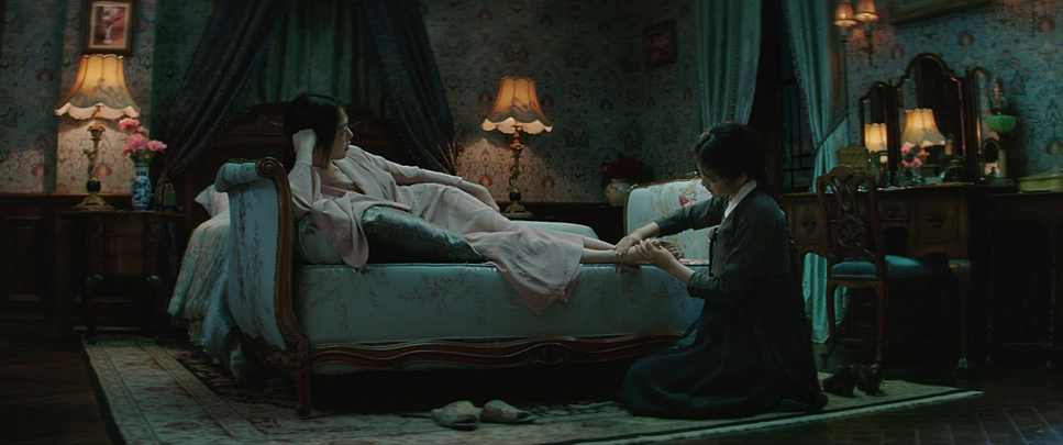
The lighting strategy is sophisticated, favoring soft sources and low contrast ratios to create a “daylight” feel that retains a sinister edge. Chung-hoon uses light to sculpt faces with a remarkable delicacy. Interiors are motivated by practicals soft window light filtering through shoji screens, oil lamps, or candlelight but amplified to enhance the drama.
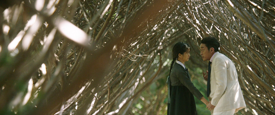
There is a distinct separation in light quality based on location. The private chambers of Hideko and Sook-hee are bathed in soft, wrapping light that emphasizes skin texture and intimacy. In contrast, the Uncle’s library features sharper, side-lit setups that accentuate the grotesque nature of his readings. The exteriors are rendered in bright, diffused light, giving the gardens an “enchanted” quality. This careful management of the highlight roll-off and shadow detail gives the image a three-dimensional, “sumptuous” quality, reinforcing the film’s sparkling energy.
Lensing and Blocking
Contrary to the modern trend of using clean spherical glass for digital sensors, Chung-hoon made a deliberate choice to shoot anamorphic. He utilized Hawk V-Plus and Hawk V-Lite Vintage ’74 lenses. This was a crucial decision. These lenses don’t just provide the widescreen aspect ratio; they introduce a specific optical texture a subtle barrel distortion and a painterly fall-off in focus that spherical lenses cannot mimic. It gives the period piece a “lived-in” feel, softening the clinical sharpness of the digital sensor.
The blocking is orchestrated to work with these anamorphic characteristics. Because anamorphic lenses have a shallower depth of field, the staging of characters becomes paramount. Characters are constantly moving in relation to one another to hold the focus plane or drift out of it, creating visual cues about their status. A wide shot might frame a character in a vulnerable position, utilizing the anamorphic width to emphasize the emptiness around them, while a sudden shift to a tight insert shot forces the audience to confront a specific emotion or lie.
Color Grading Approach
As a colorist, I look at “The Handmaiden” as a benchmark for how a grade can support a narrative without overpowering it. The credit here goes to colorist Park Jin-ho. While the film feels incredibly rich, the fact sheet notes that the color is actually quite desaturated. This is a common misconception in high-end grading: “richness” often comes from color separation, not saturation.
The palette leans toward deep emerald greens, rich burgundies, and earthy browns. My analysis suggests a workflow that prioritized hue separation ensuring the green of the wallpaper didn’t bleed into the skin tones. The skin tones themselves are kept natural but with a slight warmth, likely leveraging the ArriRaw data to maintain a creamy, flattering roll-off even in the shadows.
The grade employs meticulous contrast shaping. The blacks are deep but detailed, anchoring the image, while the highlights have a soft, filmic roll-off that prevents the digital capture from feeling harsh. It mimics a print-film emulation, giving the digital footage the weight and density of celluloid. This approach enhances the “aching eroticism” of the film, making the textures of fabrics and skin feel tactile.
Technical Aspects & Tools
| Genre | Drama, Romance, Thriller, Psychological Horror, Murder Mystery, Crime, Erotic |
|---|---|
| Director | Park Chan-wook |
| Cinematographer | Chung Chung-hoon |
| Production Designer | Ryu Seong-hee |
| Costume Designer | Cho Sang-Kyung |
| Editor | Kim Sang-bum, Kim Jae-Bum |
| Colorist | Park Jin-ho |
| Color | Desaturated |
| Aspect Ratio | 2.39 – Anamorphic |
| Format | Digital |
| Lighting | Soft light, Low contrast, Side light |
| Lighting Type | Daylight |
| Story Location | Asia > Korea |
| Filming Location | Kuwana > Rockka-en |
| Camera | ARRI ALEXA XT / XTplus |
| Lens | Angenieux Optimo Zooms, Hawk V-Plus, Hawk V-Lite Vintage ’74 |
| Film Stock / Resolution | 2.8K / 2.8K ArriRaw |
The technical execution provides the foundation for this artistry. The film was shot on the ARRI ALEXA XT and XT Plus in Open Gate, capturing in 2.8K ArriRaw. This choice provided the maximum data rate and dynamic range necessary for the heavy post-production and visual effects work.
The pairing of the Alexa sensor with Hawk Anamorphic lenses (and occasionally Angenieux Optimo Zooms for specific focal length flexibility) creates a hybrid aesthetic: the reliability and dynamic range of digital, with the organic imperfections and flare characteristics of vintage glass. The 2.8K resolution was sufficient for a 2K finish, prioritizing pixel quality and dynamic range over sheer pixel count. This technical package served as a robust canvas, ensuring the artistic intentions of Park Chan-wook were translated to the screen with absolute fidelity.
- Also read: MARY AND MAX (2009) – CINEMATOGRAPHY ANALYSIS
- Also read: BARRY LYNDON (1975) – CINEMATOGRAPHY ANALYSIS
Browse Our Cinematography Analysis Glossary
Explore directors, cinematographers, cameras, lenses, lighting styles, genres, and the visual techniques that shape iconic films.
Explore Glossary →