Hi there, I’m Salik Waquas. If you’ve ever hung around the indie film circuit or spent way too many hours staring at a waveform monitor in a dark room, we’ve probably crossed paths. I’m a filmmaker by passion and a full-time colorist by trade, running a shop called Color Culture. Usually, I’m the guy complaining about unmatched cameras or obsessing over skin tone consistency. But today, I want to step back from my DaVinci Resolve control panel and talk about a film that wrecked me emotionally and visually: The Green Mile.
I know what you’re thinking: “Salik, that movie is three hours of sadness.” You’re right. But visually? It is a masterclass in atmospheric storytelling. Sitting at an 8.6 on IMDb, it’s a film that melds magical realism with the gritty texture of death row. As a colorist, I can tell you that balancing those two opposing tones—the “magic” and the “rot”—is usually a nightmare. Yet, this film does it effortlessly. So, let’s break down the visual language of the Mile.
About the Cinematographer
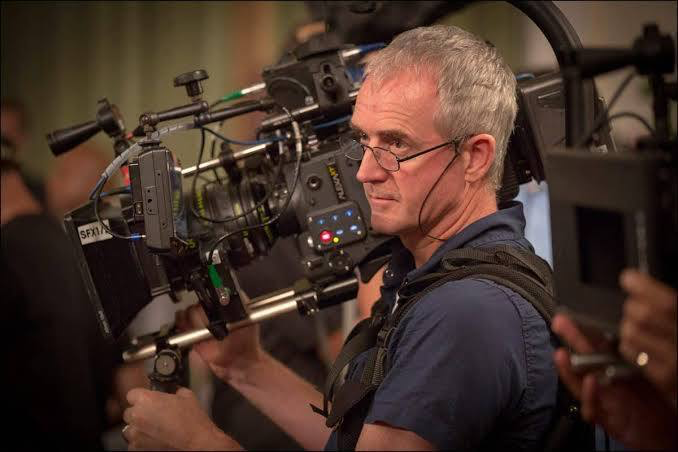
You can’t talk about the look of this film without crediting the Director of Photography, David Tattersall (BSC). While director Frank Darabont had the ironclad vision (having already adapted Shawshank), it was Tattersall who executed the lighting strategy. Tattersall is interesting because he also shot the Star Wars prequels, which were incredibly clean and digital-looking. But here? He went the opposite direction.
The cinematography in The Green Mile is all about “service to the narrative.” In my line of work, we call this “invisible technique.” Tattersall wasn’t trying to make a flashy reel; he was grounding a supernatural story in the heavy, sweaty atmosphere of 1930s Louisiana. If the visuals were too gritty, the magic would look ridiculous. If they were too ethereal, the electric chair scenes wouldn’t hurt as much. Tattersall nailed a classic, spherical lens look that feels timeless rather than stylized.
Inspiration for the Cinematography
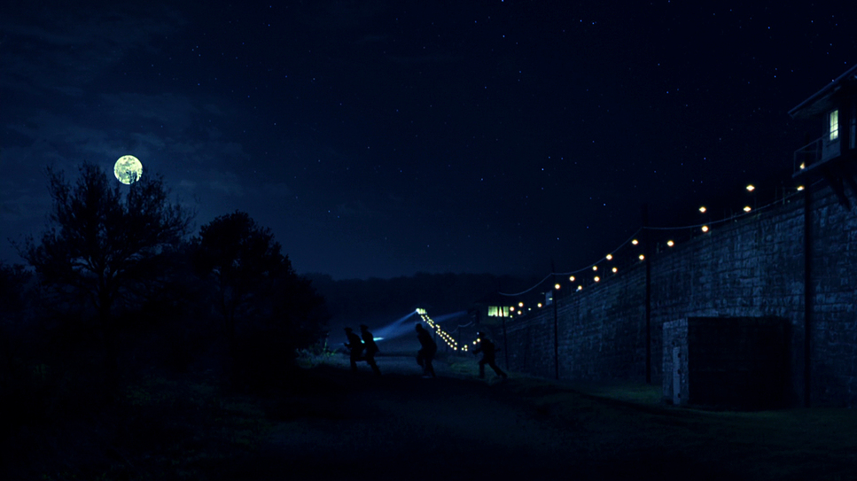
The visual inspiration here comes directly from the clash between the sacred and the industrial. We are looking at a story steeped in religious subtext, set against the backdrop of Depression-era infrastructure. Visually, this translates to heat.
When I look at this film, I see the influence of Edward Hopper paintings—isolated figures in spaces that feel lived-in and lonely. The film deals with the concept of a “ghost story,” and the atmosphere reflects that. The air looks thick. You can almost feel the humidity on the lens. The first shot of the prison is framed to look like the spiers of a cathedral, which is no accident. The lighting treats the prison not just as a cage, but as a twisted place of worship, preparing us for the arrival of John Coffey.
Camera Movements
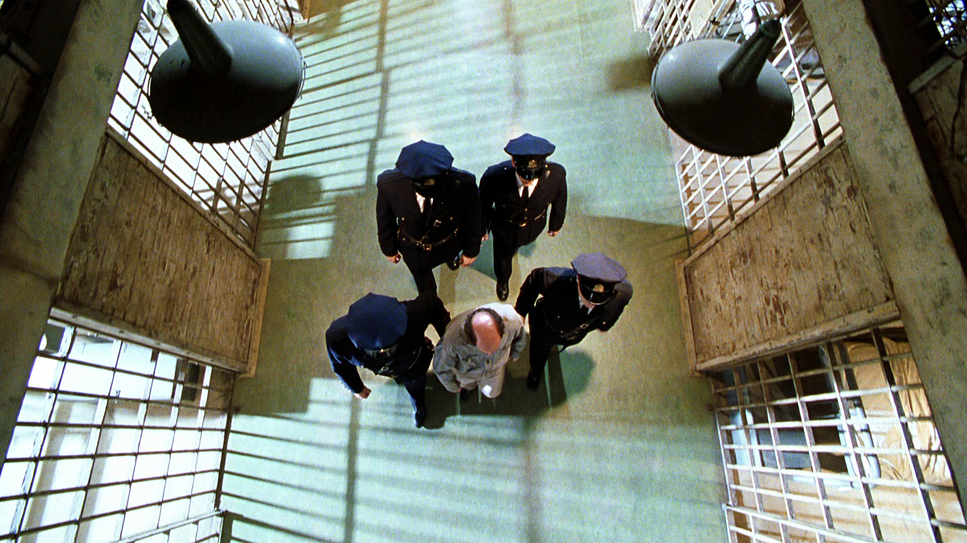
used As a colorist, I spend a lot of time looking at static frames, but as a filmmaker, I know that movement dictates the pulse of the scene. In The Green Mile, the camera is surprisingly restrained. We don’t see shaky handheld work or chaotic whip-pans.
Instead, Tattersall relies on slow, creeping tracking shots—gliding down the “Green Mile” (the linoleum floor). This stability reflects the regimented, slow-motion life of death row. The camera moves with the heavy, solemn pace of a funeral procession. However, they break this rule brilliantly for emotional impact. Notice the “God’s eye view” shots and the subjective angles when the supernatural elements kick in. The camera forces us to be steady observers, refusing to look away from the cruelty of the chair, making us complicit in the execution.
Compositions
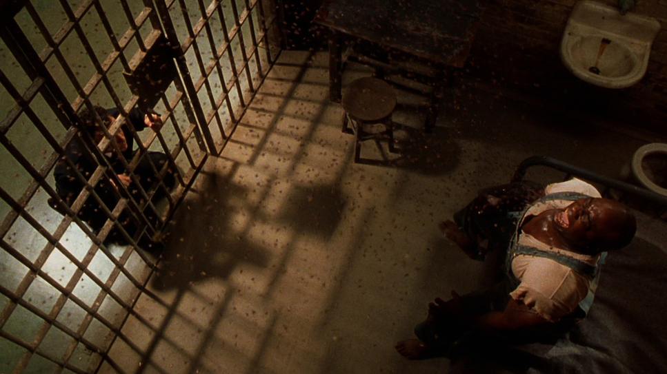
Composition is about power dynamics. Since the film was shot with spherical lenses (1.85:1 aspect ratio), the frame is taller, which allows the vertical bars of the cells to dominate the image. The cinematographer constantly uses “frame within a frame” techniques. By shooting through the bars, he reminds us of the separation between the guards and the condemned, while paradoxically showing how trapped the guards are in their own guilt.
One specific choice that stands out to me is the Linear Perspective down the Mile itself. The lines of the green linoleum floor converge in the distance, drawing the viewer’s eye inevitably toward the execution chamber at the end of the hall. It creates a visual funnel—there is literally nowhere else for these characters to go. It’s a simple geometric trick, but it creates a subconscious sense of doom.
Lighting Style
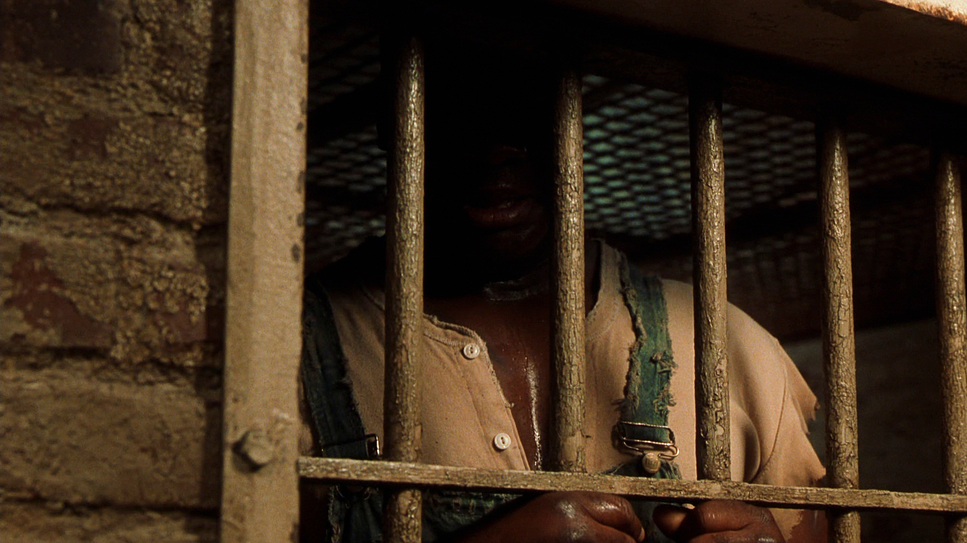
If I were grading this film today, I’d be obsessing over the contrast ratios. The lighting tells the story of good versus evil. The prison is generally lit with practicals—hanging bulbs that cast long, heavy shadows (classic low-key lighting). It feels dusty and warm.
But look at how the lighting shifts when John Coffey performs a miracle. Tattersall allows the highlights to “bloom.” When Coffey heals Paul or the warden’s wife, the light intensifies, almost blowing out the whites. In modern grading, we might try to recover those highlights, but here, the blowout is the point—it’s “magical realism” rendered through lumens. Conversely, the execution scenes use harsh, flat, top-down lighting. There are no romantic shadows in the death chamber—just the brutal reality of the electric chair. It’s a brilliant use of lighting contrast to separate the spiritual world from the institutional one.
Lensing and Blocking
Blocking is where the film sells the scale of John Coffey. Michael Clarke Duncan was a big man, but the camera made him a giant. To sell his size, they used forced perspective and specific focal lengths. We often see Low Angle shots of Coffey, likely on wider lenses (24mm or 35mm), which exaggerates his height and makes him loom over the lens. This doesn’t just make him look scary; it forces the audience (and the guards) to literally “look up” to him, hinting at his divinity.
Conversely, we often see High Angle shots looking down on the prisoners in the chair, making them look small and defeated. The blocking also emphasizes isolation. Coffey is frequently framed with significant negative space around him, visually carrying the weight of the world alone.
Color Grading
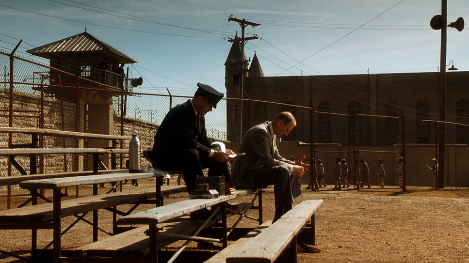
Okay, let’s talk shop. If I loaded The Green Mile into my timeline at Color Culture, the first thing I’d notice is the palette discipline. This is a period drama, so it leans into earthy tones—browns, beiges, and specifically that sickly, desaturated lime green of the floor.
The grade reinforces the heat. We aren’t seeing cool, crisp blues; we are seeing warm, oppressive tones that suggest a lack of air conditioning. Technically, what impresses me most is the skin tone separation. You have high-contrast scenes with Tom Hanks (pale complexion) and Michael Clarke Duncan (deep, rich skin tone). Today, I’d use a Magic Mask in Resolve to isolate and expose them individually. Back then, this had to be done with precise lighting ratios on set and careful printer-point timing. They maintained the texture in the shadows of Coffey’s face without blowing out Hanks, which is much harder than it looks.
Technical Aspects
Technically, the film pulls off some impressive feats for 1999. First, the mouse—Mr. Jingles. They didn’t just use one mouse; they used over 15 different mice, each trained for specific actions, along with some animatronics. Integrating a small animal into complex scenes with actors requires patience and seamless editing continuity.
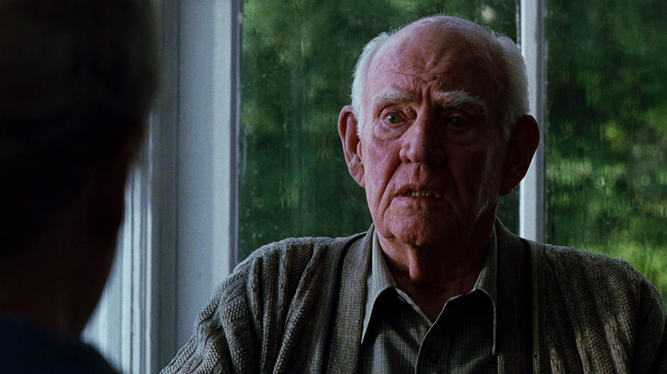
Then there are the supernatural effects—the “flies” or the sickness that Coffey sucks out of people. This visual effect (the particulate matter) holds up because it feels organic, like dust motes in a light beam, rather than bad CGI. Finally, the aging makeup on Dabbs Greer (playing the older Paul Edgecomb) helps sell the bookend structure of the film. It grounds the “ghost story” in a physical reality, bridging the gap between the 1930s and the present day.
Need visual references? Browse our curated archive of The Green Mile Film Stills to see the lighting and composition breakdowns in detail
- Also Read: CINEMATOGRAPHY ANALYSIS OF THE PIANIST & STILLS
- Also Read: CINEMATOGRAPHY ANALYSIS OF NOSFERATU (2024) & STILLS
Browse Our Cinematography Analysis Glossary
Explore directors, cinematographers, cameras, lenses, lighting styles, genres, and the visual techniques that shape iconic films.
Explore Glossary →