When I want to look at a film that gets the digital medium exactly right, I always go back to David Fincher’s The Girl with the Dragon Tattoo (2011).People love to compare this to the original Swedish version. Look, the original was fine, but Fincher’s iteration is a different beast entirely. It’s a surgical piece of filmmaking. It doesn’t just “look good” it’s a calculated, cold, and incredibly controlled visual experience that guides you through a grim world with zero wasted frames.
About the Cinematographer
The look of this film is the result of the legendary partnership between Fincher and Jeff Cronenweth, ASC. These two are basically the blueprint for modern digital filmmaking. Cronenweth has this uncanny ability to take Fincher’s rigid, planned-out frames and give them a haunting, rich texture. It’s not just a director-DP relationship; it’s a shared language. You can see it in how they use deep shadows and sculpted light to lean into the dark, heavy subject matter of the story. It’s moody, it’s sharp, and it’s exactly what a story about buried secrets needs.
Inspiration Behind the Cinematography
Fincher didn’t want a standard serial killer flick; he wanted an “adult, challenging” franchise. That mandate filtered down into every visual choice. The goal was to make the audience feel the Swedish winter not just see it, but feel that bite in the air and that sense of isolation.
They used the camera to “stretch the moment.” Instead of quick cuts, the camera holds. It lingers on things that make you uncomfortable. It forces you to wait for answers, which builds a level of tension that’s hard to pull off. Personally, I find this inspiring. It’s a reminder that when a director commits to a specific “feeling,” it frees the rest of the crew to be bold. When you aren’t just “checking boxes” for a studio, you can take real risks with light and shadow.
Camera Movements
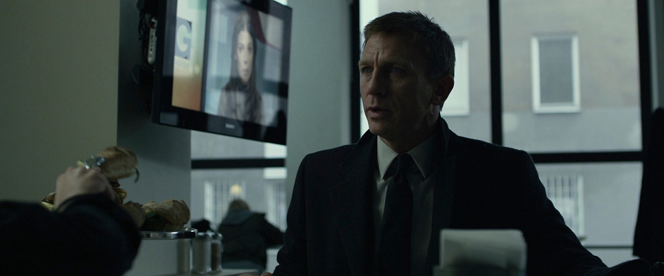
Fincher’s camera is famously steady. You won’t find shaky, handheld “documentary-style” shots here. Everything is handled with slow, deliberate pushes and lateral tracking. It’s all about revealing information at a specific pace.
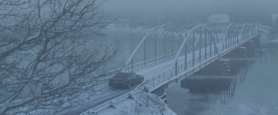
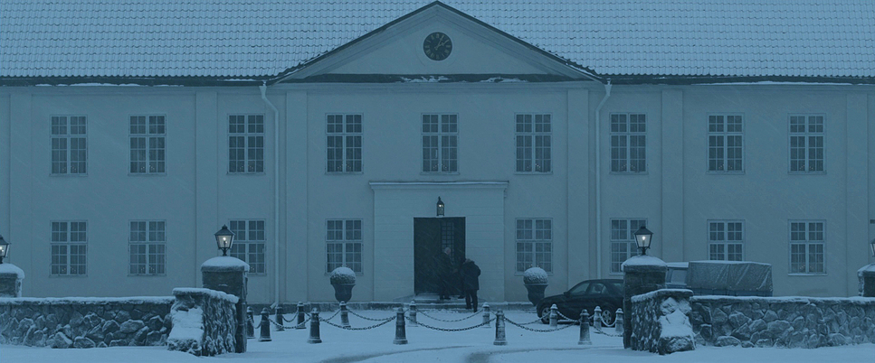
Take Mikael Blomkvist’s arrival at the Vanger estate. The camera doesn’t just follow him; it observes the landscape, the car, and the chilling environment. It’s a slow-burn technique. The camera becomes an active participant in the mystery, making the characters’ “suffering” whether it’s the physical cold or the emotional weight of the case feel much more immediate and heavy.
Compositional Choices
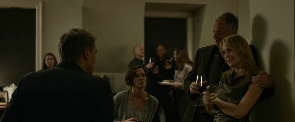
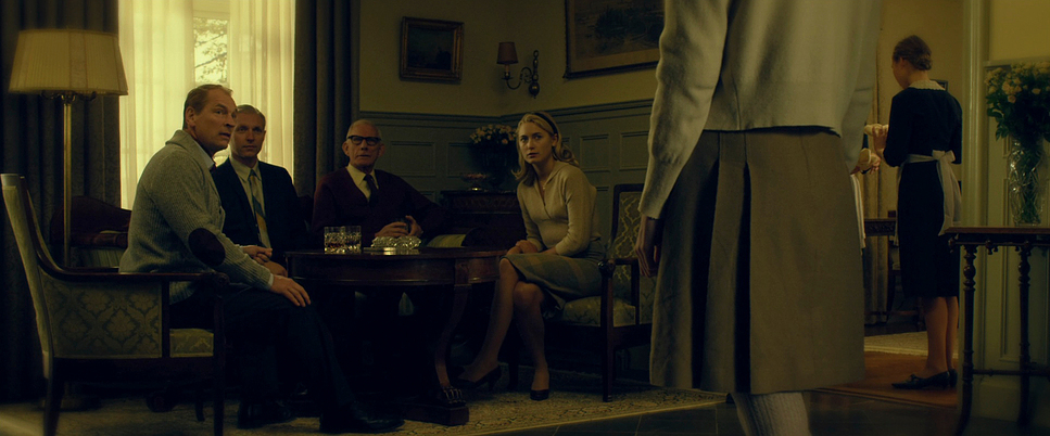
The framing in this movie is surgical. Every shot feels like it was measured with a ruler. Fincher and Cronenweth love wide, symmetrical compositions that make the characters look tiny and vulnerable against the massive, cold Swedish backdrop.
They also use “negative space” and “frames within frames” brilliantly. You’ll often see characters through doorways or reflections, which makes you feel like you’re spying on them. It adds to that theme of surveillance. For example, Lisbeth Salander’s introduction through office blinds is a masterclass in using composition to tell us she’s a mystery someone who is there, but always out of reach.
Lighting Style
This is where the movie really gets its teeth. The lighting is “controlled naturalism.” It looks real, but it’s actually highly stylized. It’s a low-key look with deep, velvety blacks. Cronenweth uses motivated light windows, computer screens, desk lamps but he manipulates them to skim across textures like snow or concrete.
The palette is dominated by cool, desaturated blues and cyans, which makes the world feel uninviting. But then, they’ll throw in a burst of warm light like a fireplace or a lamp as a “visual punctuation mark.” As a colorist, I love this because those warm hits don’t actually provide comfort; they just make the surrounding cold feel even more intense.
Lensing and Blocking
Fincher and Cronenweth went with Zeiss Master Primes for this, and you can tell. Those lenses are incredibly sharp and clean, which fits Fincher’s aesthetic perfectly. They used wider lenses to keep the backgrounds in focus, which means you’re always aware of the oppressive environment. It feels like the island itself is watching.
The blocking is just as precise. Movements are subtle but they mean everything. When you see Blomkvist absorbing information, the lens choice and his placement in the frame tell you exactly how his “gears are turning.” It’s a level of intentionality that you just don’t see in most big-budget thrillers.
Color Grading Approach
Now, let’s talk about the grade my favorite part. This film is a massive achievement for colorists, specifically the work of Ian Vertovec. It’s got that iconic, almost metallic look: desaturated, with those steely blues and muted greens.
As a colorist, I’m floored by how they handled the contrast. The blacks are heavy and dense, but they never “crush” into a muddy mess. There’s still detail in the shadows. The highlight roll-off is also beautiful, almost like it was shot on film even though it’s digital. Vertovec used “tonal sculpting” to define faces with hard light while keeping the rest of the frame dark. And those occasional pops of saturated red (like blood) or amber light? They’re placed perfectly to guide your eye. It’s a grade that doesn’t just sit on top of the image; it carves the mood into every pixel.
Technical Aspects & Tools
The Girl with the Dragon Tattoo (2011) — Technical Specifications
| Genre | Crime, Drama, Mystery, Thriller |
| Director | David Fincher |
| Cinematographer | Jeff Cronenweth |
| Production Designer | Donald Graham Burt |
| Costume Designer | Trish Summerville |
| Editor | Kirk Baxter, Angus Wall |
| Colorist | Ian Vertovec |
| Time Period | 2010s |
| Color | Cool, Cyan, Blue |
| Aspect Ratio | 2.39 – Spherical |
| Format | Digital |
| Lighting | Soft light, Side light |
| Lighting Type | Daylight, Overcast, Artificial light, Mixed light, Tungsten |
| Story Location | Europe > Sweden |
| Filming Location | Europe > Sweden |
| Camera | RED Epic, RED One / OneMX |
| Lens | Zeiss Master Primes |
| Film Stock / Resolution | Redcode raw 5K |
This was a pioneer for the digital era, shot on the RED One (MX) and the RED Epic. This wasn’t about following a trend; it was about the control that RAW digital files provide. Fincher needed that 5K resolution and the latitude of Redcode RAW to push the image in post-production without it falling apart.
Using these tools allowed the team to create an “expert set” image. They could manipulate exposure and color with surgical precision. It’s a perfect example of how the right tech, in the hands of masters like Fincher, Cronenweth, and Vertovec, can push cinema into a place that traditional film simply couldn’t reach at the time.
- Also read: THE BIG SHORT (2015) – CINEMATOGRAPHY ANALYSIS
- Also read: BIG HERO 6 (2014) – CINEMATOGRAPHY ANALYSIS
Browse Our Cinematography Analysis Glossary
Explore directors, cinematographers, cameras, lenses, lighting styles, genres, and the visual techniques that shape iconic films.
Explore Glossary →